What is Swiss Punk?
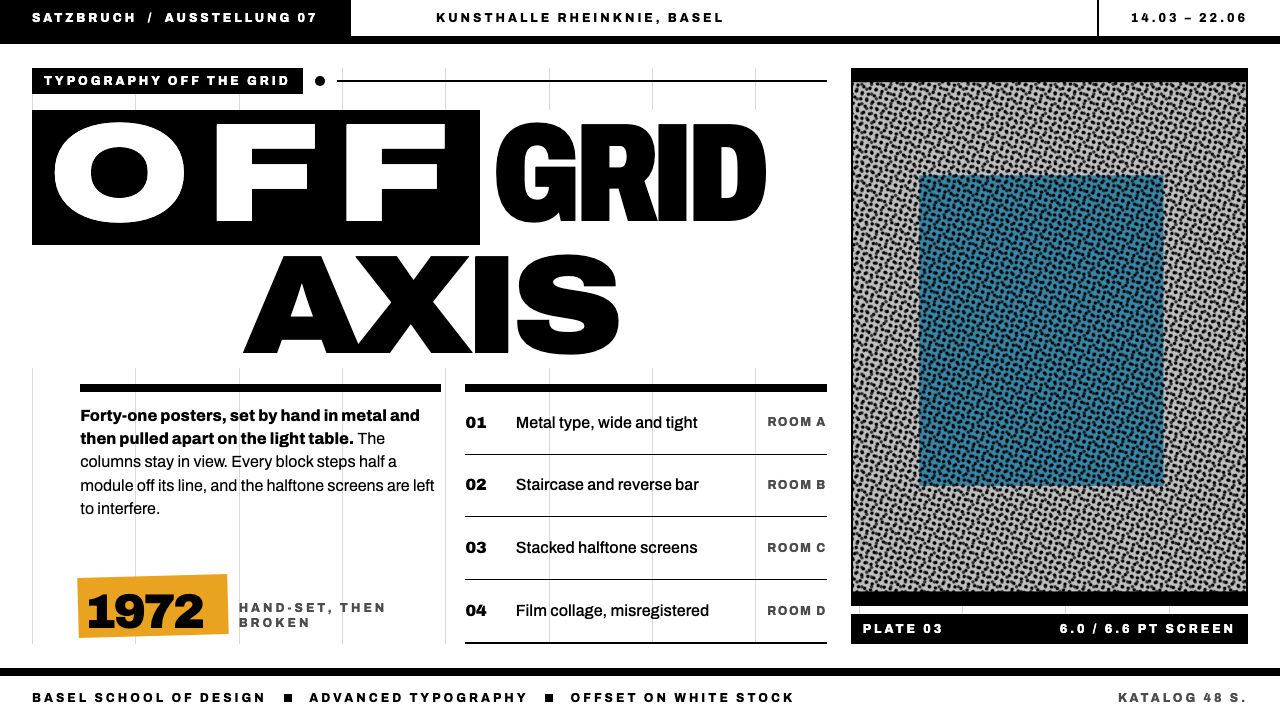
Swiss Punk is the Swiss grid with its discipline kept and its obedience removed: every element pushed half a module off its line, words falling in staircases, halftone dots overlapping into moiré.
Swiss Punk in brief
Swiss Punk is the typographic approach that Wolfgang Weingart developed and taught at the Basel School of Design from the late 1960s onward. It starts from the Swiss grid in which he was trained, and keeps it visible, but then shoves every element a half-module off its line. Words step down in staircases. The letter-spacing of one word runs very wide while the next sits tight. Captions are printed in reverse inside heavy black bars.
The palette is the print shop's own. Black ink on white paper, a flat grey screen, marigold for a single warm overprint and process blue for a rare second film. Texture does not come from filters but from halftone dots and the moiré that appears where screens overlap. Film is cut and pasted by hand, and edges that do not quite align are left as they are.
The result is a layout that looks disobedient but is not careless. The grid is still there, and the structure is still legible; what has changed is that rules are used as something to push against. It is a style with a temper, suited to work that wants to be looked at closely rather than skimmed.

Where does Swiss Punk come from?
Wolfgang Weingart began teaching typography at the Basel School of Design in 1968. Basel was one of the two great centres of Swiss design, alongside Zürich, and its programme had been shaped by teachers such as Emil Ruder and Armin Hofmann, who built a rigorous, systematic approach to type: clean grotesques, strict grids, flush-left setting and a deep respect for the white space around letters. Weingart was trained inside that tradition and taught within it, which is the reason his work is so often described as Swiss design pushed to its limit.
What he did was to question the rules from the inside. Rather than abandon the grid, he let it show and then deliberately moved elements off it, letting words step down in a staircase, opening up the spacing of one line while closing another, and running text in reverse out of black bars. These were not random gestures. Each was a typographic experiment about how far a layout could be pushed before it stopped being readable, and about what extra meaning that pushing could add.
The work is usually dated by its printing technology as much as by its look. His covers for the journal Typographische Monatsblätter, known as TM, in 1972 and 1973 are among the best-known early examples. From 1979 to 1984 he and his students made posters from offset film collage, in which pieces of film were cut and assembled by hand and exposed together, so that halftone screens, overprinted inks and slightly misaligned edges became part of the visible design.
Weingart's students carried the approach well beyond Basel. April Greiman, who studied with him, took the vocabulary to California and combined it with early digital tools, and the broader movement is often called New Wave typography. The nickname Swiss Punk reflects how the attitude was read: a refusal of polite neutrality, a delight in visible process, and a belief that a page could be argued with. Yet it never abandoned the training it came from, and that tension between order and disorder is what the style is really about.
What defines the Swiss Punk look?
Grid visible, then broken
The Swiss grid is still there, with its columns and modules readable, but elements are moved half a module off their lines. The offset is deliberate and repeated, so it reads as a system of misalignment rather than as an error. The eye senses both the order and its violation at once.
Staircase type
Lines of type step down and to the side in a staircase, each line starting a little further along than the last. The text keeps its sense and its reading order, but its silhouette becomes a diagonal. It is the most recognisable gesture of the style.
Contrasting letter-spacing
Within one line, one word may be spaced very wide while the next sits tight. The variation gives the text a rhythm of breathing and clenching, and it draws attention to individual words. It is used for emphasis, not as a random effect.
Reverse type in black bars
Captions and short statements are printed in reverse, white letters on a heavy black bar. The bars act as structural anchors on the page, giving the loose type something solid to hang from, and they set up a strong contrast with the white paper around them.
Print-shop palette
The base is black ink on white paper with a flat grey screen. Marigold appears as one warm overprint, and process blue as a rare second film. Colours are overprinted rather than blended, so where two layers overlap you see a third tone. There are no digital gradients.
Halftone and moiré texture
Texture comes from visible halftone dots and from the moiré patterns formed where two screens overlap at slightly different angles. These are produced by the printing process itself, not applied as filters. Enlarging the dots until they are plainly visible is part of the look.
Hand-assembled edges
Because the film is cut and pasted by hand, edges do not quite line up, and the seams and overlaps are left visible. The imperfection is part of the evidence of making. It keeps the strict geometry from feeling cold.

Who shaped Swiss Punk?
Typographer who taught at the Basel School of Design from 1968 and developed the approach. His 1972–73 covers for TM and his 1979–84 offset film-collage posters are among its best-known work.
Basel typographer and teacher whose rigorous, systematic approach to type formed the tradition that Weingart trained in and then pushed against.
Basel graphic designer and teacher, a central figure of the Swiss school, whose hard-edged geometry and attention to white space shaped Weingart's training.
Designer who studied with Weingart and carried the vocabulary to California, combining it with early digital tools as part of the broader New Wave movement.
How do you use Swiss Punk today?
On slides, Swiss Punk is best for covers and section openers that want character. A white page with a block of staircase-set title, one black bar carrying reversed text and a single marigold overprint is enough. Content slides can keep a visible grid of columns and let one or two elements step off it. For data, keep charts in plain black and grey with one marigold highlight, and avoid decorative effects: the dots and overprints should look like print, not like a filter.
On the web, it suits sites that want to behave like a printed publication: exhibition pages, magazine covers, cultural institutions, studios and portfolios. Headlines can step down the page in a staircase and body text can stay in a clean, readable column. Reverse captions in black bars can serve as labels and section markers. Keep the underlying structure responsive and the reading order clear, since the offsets are visual, not structural.
In editorial and marketing work, the style comes into its own on posters, journal covers and exhibition graphics. Halftone photographs, enlarged until the dots show, sit comfortably beside tight type. A single warm overprint can pick out one word or image. Because the look depends on a print aesthetic, it translates especially well to physical media and to screens that imitate it carefully.
The most common mistake is to treat it as randomness. The style depends on a visible grid and on consistent, repeated offsets; scatter the type without a structure and it becomes noise. A second mistake is to fake the texture with soft digital filters rather than real-looking halftone and overprint. A third is to add too many colours, since the print-shop palette of black, grey, marigold and an occasional blue is what keeps it coherent.

Swiss Punk — FAQ
What is Swiss Punk?
Swiss Punk is the typographic approach developed by Wolfgang Weingart at the Basel School of Design. It keeps the Swiss grid visible but pushes elements half a module off their lines, with staircase type, contrasting letter-spacing, reverse captions and halftone texture.
How is it different from classic Swiss design?
Classic Swiss design treats the grid as something to obey, with strict alignment and neutral type. Swiss Punk was built by people trained in that tradition and keeps the grid, but uses it as something to push against, with deliberate misalignment and visible printing processes.
What colours does the style use?
It uses a print-shop palette: black ink on white paper, a flat grey screen, marigold as one warm overprint and process blue as a rare second film. Colours are overprinted rather than blended, and there are no digital gradients.
What is moiré and why does the style use it?
Moiré is the interference pattern that appears when two halftone screens overlap at slightly different angles. The style uses it, along with visible halftone dots, because it is a natural product of the print process, which gives texture without any filter.
What is the most common mistake when using it?
Treating it as random scatter. Without a visible grid and consistent offsets the layout becomes noise. Faking halftone with soft digital filters, or adding many colours beyond black, grey and the one warm overprint, also weakens the effect.
Related design styles
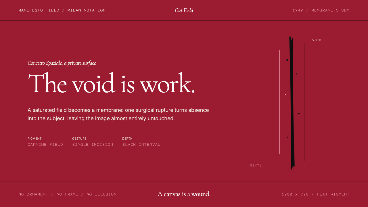 Spatialism (Fontana Cut, 1949)Absence becomes medium. Carmine field, Garamond restraint, one black incision.
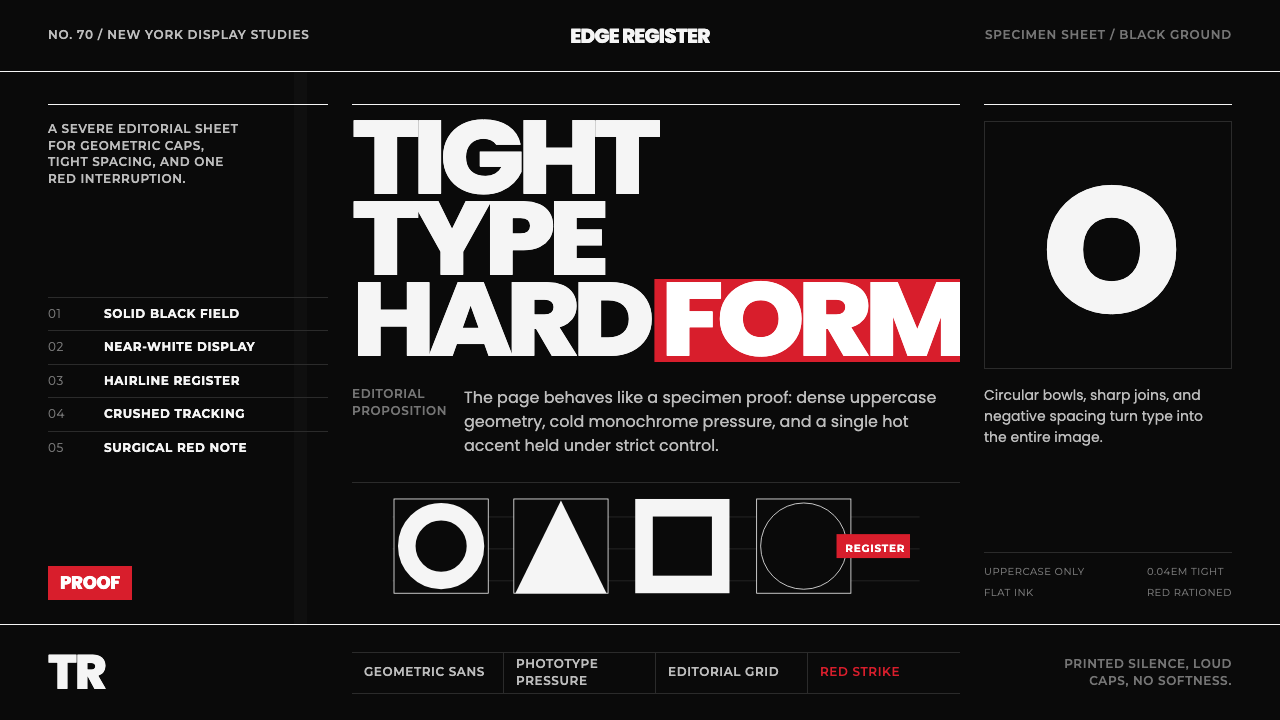 Avant Garde GothicType is the image. Tight white caps on black, ruled grids, one hot red strike.
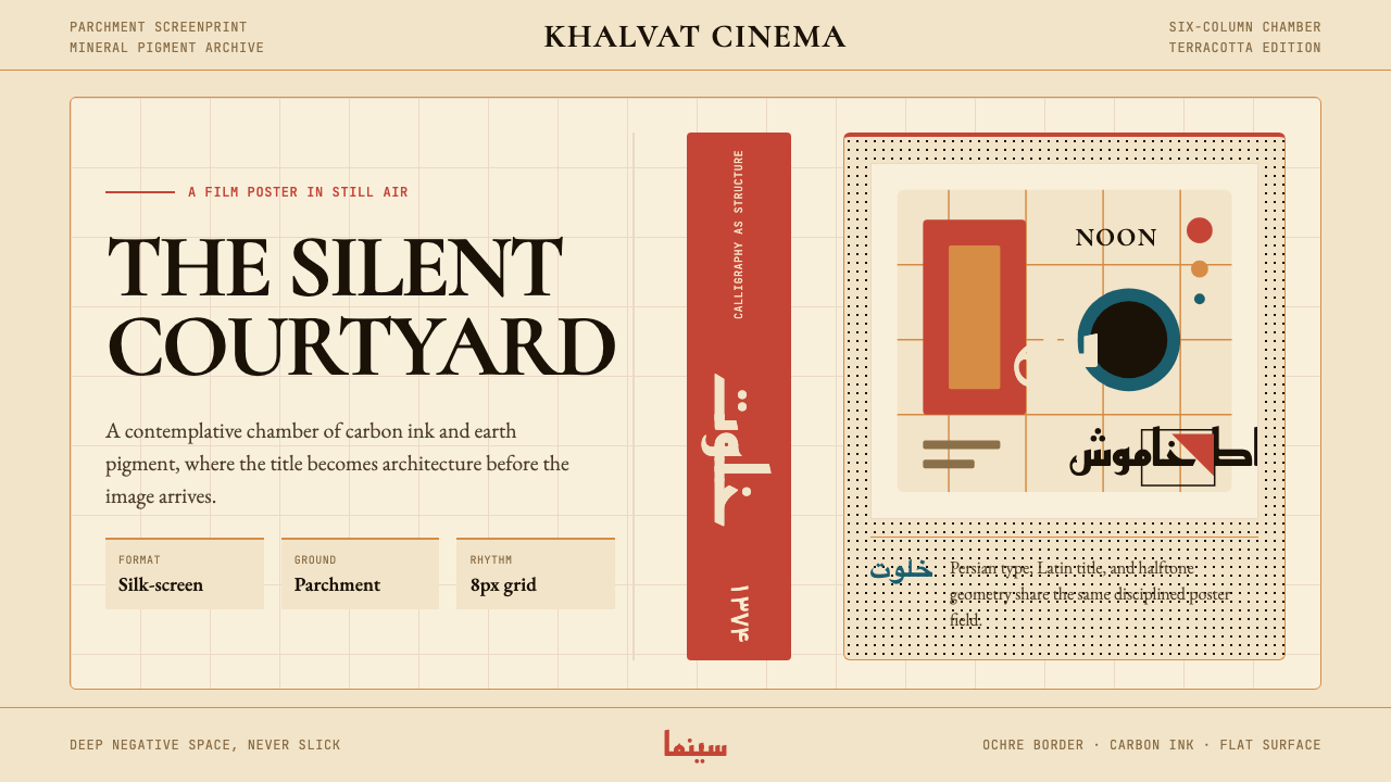 Iranian Modernist Cinema PosterStillness becomes monumental. Terracotta Kufi type breathes inside a Swiss pa…
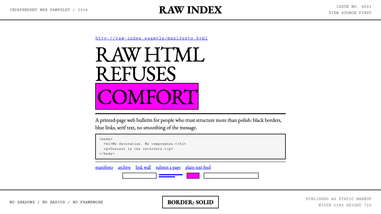 Brutalist Web 2014Browser defaults, weaponized. Times New Roman, electric-blue links — raw HTML…
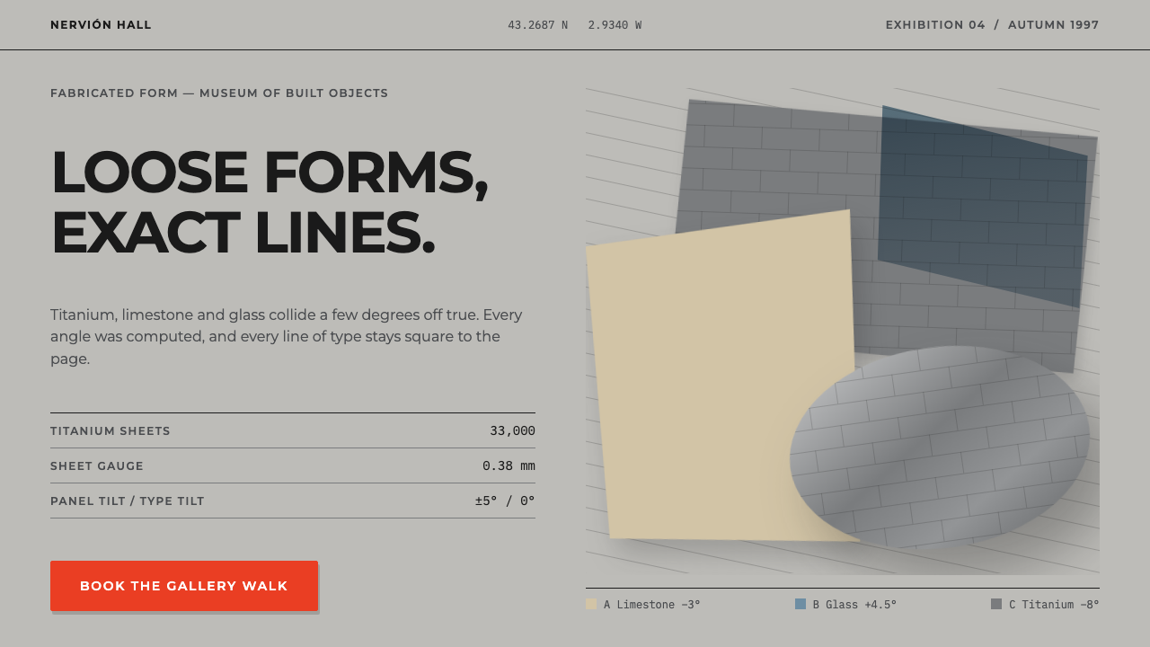 DeconstructivismBroken apart, fully resolved. Tilted pewter, limestone and glass panels with…
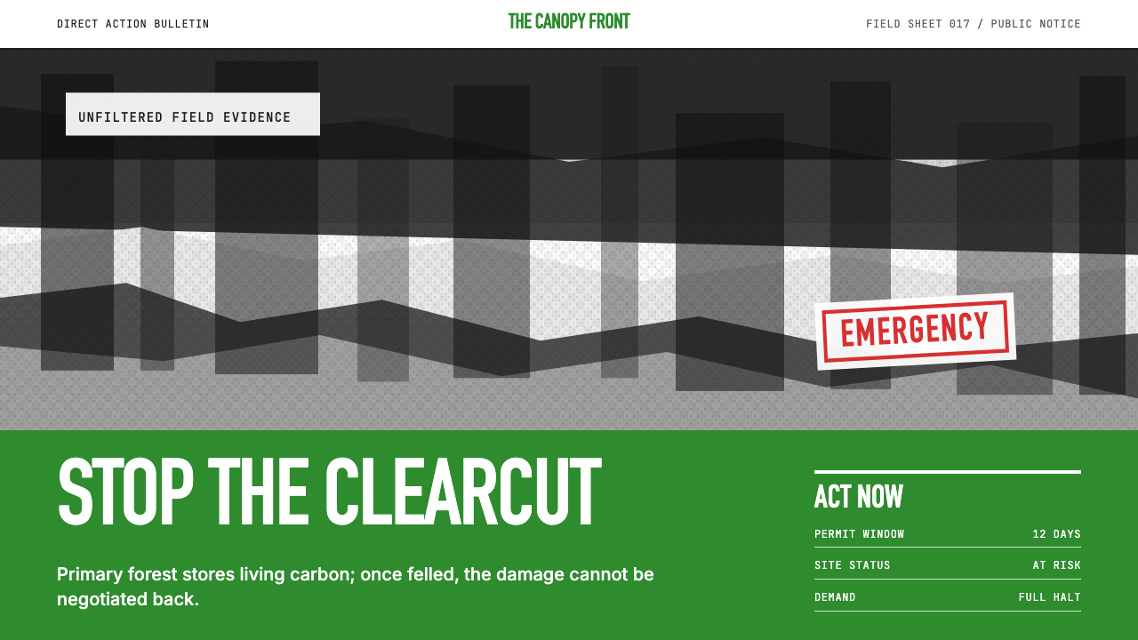 Greenpeace (Activist Poster)Protest without softness. Forest-green caps over monochrome newsprint, one de…