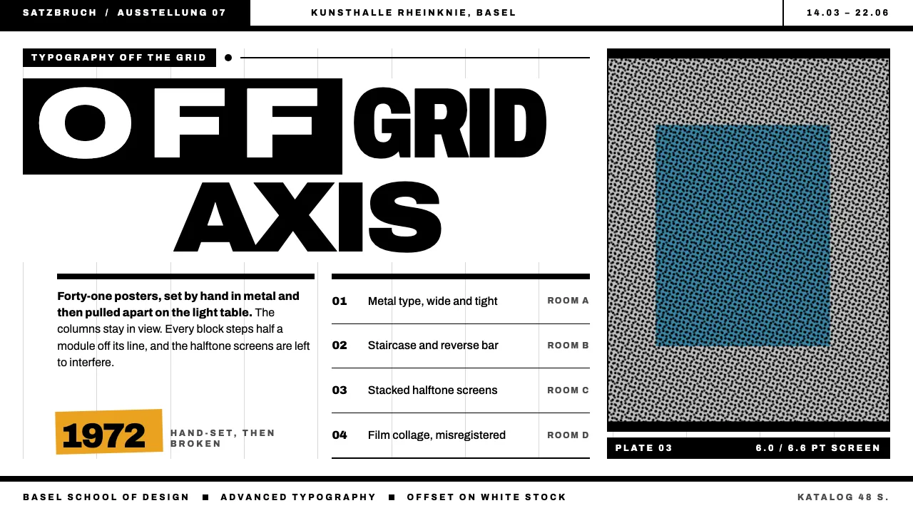
About Swiss Punk
Swiss Punk is the typography Wolfgang Weingart worked out at the Basel School of Design: the grid he was trained in, still visible, with every element shoved a half-module off its line. Words step down in staircases, the spacing of one word runs very wide while the next sits tight, and captions are printed in reverse inside black bars.
The palette is the print shop's. Black ink on white paper, a flat grey screen, marigold for one warm overprint and process blue for a rare second film. Texture comes from halftone dots and the moiré where screens overlap. Nothing here is a filter.
- Origin
- Basel and Zürich, Switzerland
- Era
- 1968–1984; Weingart teaching in Basel from 1968, TM covers 1972–73, offset film-collage posters 1979–1984
- Key figures
- Wolfgang Weingart · Emil Ruder · Armin Hofmann · April Greiman
- Movements
- Swiss Punk · New Wave typography
Swiss Punk design spec
Colors
Typography
The other 11 sections — buttons, cards, spacing, motion, techniques and more — open once you unlock. Download the DESIGN.md or send it to your AI in one click. Unlock once, yours forever.
Sign up nowStyles similar to Swiss Punk
Also inspired by print & type, with a close feel.
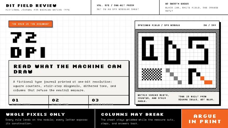 Emigre / Zuzana LickoThe pixel grid argues back. Black bitmap type, dithered grey, and one orange interruption.
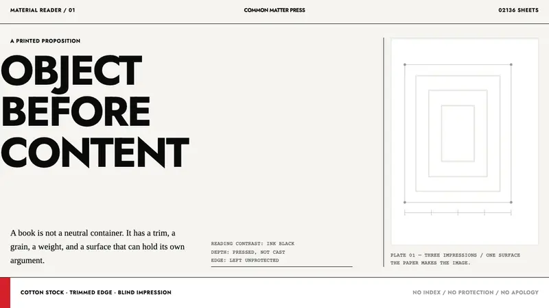 Irma Boom Book ObjectsPaper becomes the argument. Ink-black trim type and blind-embossed white make depth physical.
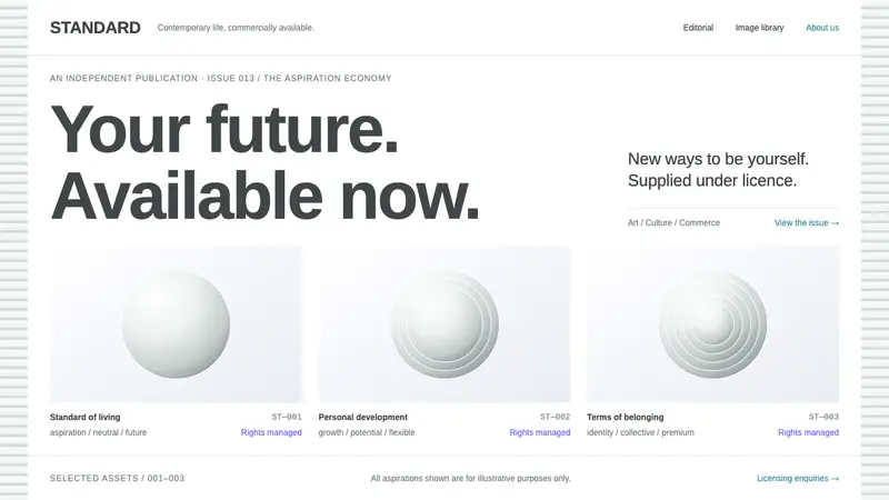 DIS MagazineArt speaks corporate. White sheets, neutral Arimo and clinical specimen grids keep a straight face.
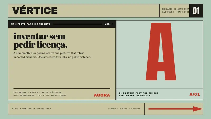 Semana de Arte ModernaType refuses politeness. Black and vermilion lock one giant letter onto mint card.