About DIS Magazine
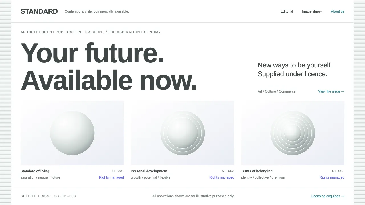
DIS Magazine looked like the website of a company that sold nothing in particular. White pages, Helvetica-grade type, a teal link colour and a grid of retouched, high-key pictures that could have been stock photos, product renders or art, and usually were all three.
This system keeps that deadpan surface intact: generic corporate UI, flat rectangular buttons, keyword tags and image IDs, a faint office-blinds photo behind the page, and the electric blue of the 2016 Berlin Biennale for campaign moments.
- Origin
- New York, USA; Berlin, Germany
- Era
- 2010 founded; DISimages c. 2013–2014; 9th Berlin Biennale 2016
- Key figures
- Lauren Boyle · Solomon Chase · Marco Roso · David Toro
- Movements
- post-internet art · stock-image and corporate-aesthetic parody · online art publishing
DIS Magazine design spec
Colors
Background
Surface
Primary
Secondary
Accent
Text
Typography
ArimoHeadings
CousineMono
Unlock for 1 credit
The other 11 sections — buttons, cards, spacing, motion, techniques and more — open once you unlock. Download the DESIGN.md or send it to your AI in one click. Unlock once, yours forever.
Sign up nowHave an account? Sign in
Styles similar to DIS Magazine
Also inspired by print & type, with a close feel.
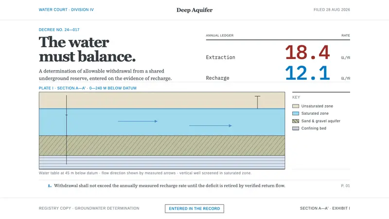 Deep Aquifer Water CourtRestraint makes the deficit undeniable. White bond, book serif, and a keyed aquifer section frame two rates.
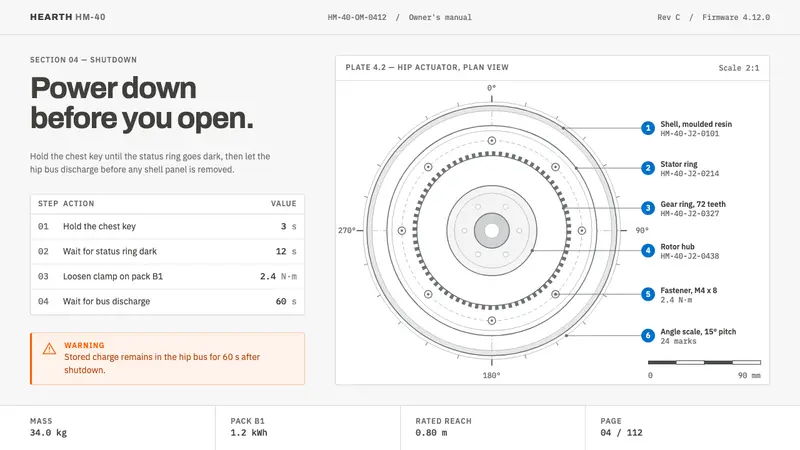 Home Robot ManualDocumentation, not a launch. Graphite line-art, blue callout numerals, one orange warning.
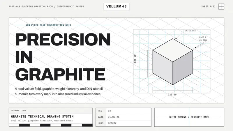 Graphite Technical DrawingDrafting-room precision. Non-photo-blue grid and graphite DIN lettering do the work.
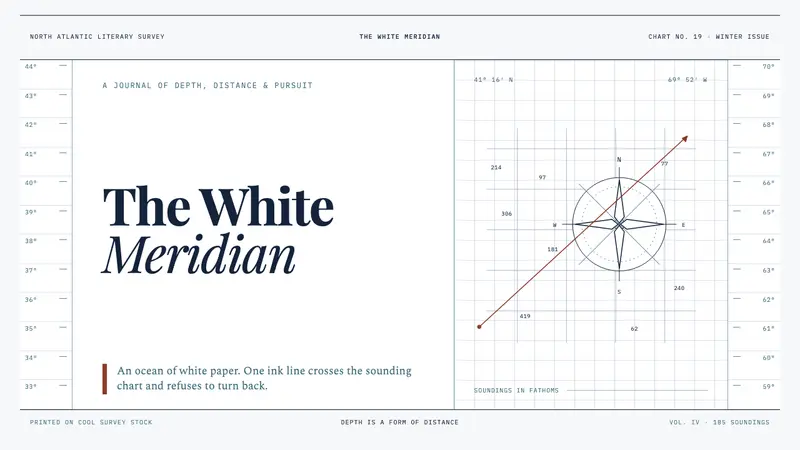 Moby-Dick (1851)White space becomes open sea. Ink-navy rules and oxblood bearings pull across a cold chart.