What is DIS Magazine?
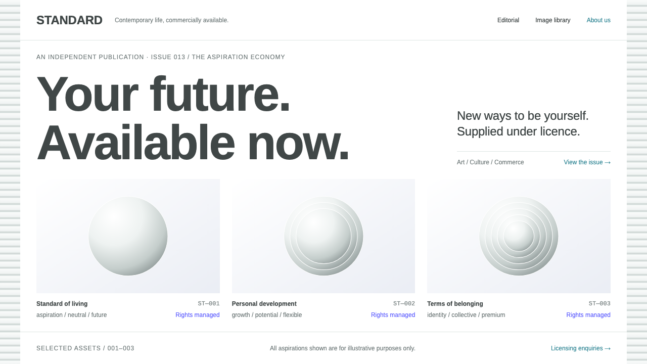
DIS Magazine looked like the website of a company that sold nothing in particular, and the joke only works if the surface never once winks.
DIS Magazine in brief
DIS Magazine is the visual language of an online art magazine that deliberately looked like the website of a corporation. White pages, Helvetica-grade type, a teal link color and a grid of retouched, high-key pictures that could have been stock photos, product renders or art, and usually were all three. The surface is generic on purpose, and the meaning lives in the gap between how it looks and what it is.
The system keeps that deadpan intact. Its parts are generic corporate UI: flat rectangular buttons, keyword tags, image identifiers, a faint photograph of office blinds behind the page, and clinical specimen grids that present pictures like catalogue items. For campaign moments it adds an electric blue, taken from the 2016 Berlin Biennale identity, which acts as a single loud note against an otherwise bland field.
It is a style about commercial language as material. It suits art and culture projects, design studios with a critical edge, portfolio sites that want to play with brand-speak, and any product that wants to be read as a knowing parody of corporate interfaces. The less it appears to try, the better it works.

Where does DIS Magazine come from?
DIS was founded in 2010 as an online magazine by a New York art collective, whose members included Lauren Boyle, Solomon Chase, Marco Roso and David Toro. It belongs to post-internet art, a current of the early 2010s that treated the internet and its commercial image culture as the ordinary condition of making art, rather than as a special subject. In that spirit, DIS addressed fashion, stock imagery, branding and consumer culture with a straight face.
The magazine's page design did much of the work. Instead of the look of a gallery or a zine, it adopted the neutral template of a business website: white background, grey text, a clean sans-serif, a restrained link color that turns teal on hover. Its pictures were evenly lit, polished portraits and renders that could pass for stock photography. A viewer could take it for a company's site at a glance; closer reading revealed that the brand language itself was the subject.
The project then extended its own joke into a business. Around 2013 to 2014 it launched DISimages, a stock-image library of photographs made by artists, offered for licensing with prices attached, so that the parody of the stock photo became a functioning stock photo service. In 2016, DIS curated the 9th Berlin Biennale and presented the event online in the manner of an investment-bank advertisement, topped with an electric blue mark.
The system's tradition is therefore one of mimicry: stock-image and corporate-aesthetic parody carried out through the form of a perfectly ordinary website. Its geography, New York and Berlin, reflects the art world it addressed, and its legacy is the idea that a template can be an artwork, provided it is executed without any visible irony.
What defines the DIS Magazine look?
White sheets
Pages are plain white with generous empty margins. There are no tinted backgrounds, no textures and no decorative flourishes. The whiteness is the corporate whiteness of a product page or an annual report, intended to feel official and slightly sterile. It gives the retouched images a clean stage and makes any deviation, such as the electric blue, feel significant.
Neutral grotesque type
Type is a neutral grotesque of the Helvetica kind, here Arimo, a metrically similar face. It is set in grey and black at ordinary sizes, with modest weight changes. There is no personality in the lettering, which is exactly the point: the text sounds like a press release, a product description or a navigation label, and the lack of voice is the voice.
Teal link color
Links sit quietly in the text and gain a touch of teal on hover. The color is calm and corporate, the sort used for a utility link on a business site, not a statement. It is the only accent in everyday use, which keeps the page neutral while giving interactive elements a recognizable signal.
Specimen grids
Pictures are arranged in a clinical grid of equal tiles with consistent spacing, each labelled with a keyword tag or an image identifier. The treatment resembles a stock library or a product catalogue: images are specimens, filed and numbered. Pictures themselves are retouched and high-key, with even light, glossy skin and surfaces and no sign of mood. The grid is where the parody becomes visible.
Generic corporate UI
Buttons are flat rectangles. Tags are plain, small and boxy. Navigation is a simple row of words. Nothing is rounded for charm, nothing has a shadow for depth, and there are no animations to delight. Every component looks as if it had been lifted from a template, which is exactly what makes it convincing as a corporate surface.
Office-blinds backdrop
Behind the page sits a faint photograph of office window blinds, barely visible, giving the white ground a trace of the corporate interior. It works as atmosphere rather than image: a ghost of the workplace behind the content, so the page feels like a screen in an open-plan office. It must stay faint enough not to compete with the text.
Electric blue campaign mode
For campaign moments, the system borrows an electric blue from the 2016 Berlin Biennale identity. It appears as a flat, saturated field or mark, a single loud note against the bland white. It is used rarely and decisively, in the manner of an investment-bank advertisement, and should never be diluted with gradients or secondary colors.

Who shaped DIS Magazine?
Boyle is named among the members of DIS, the New York collective that founded the magazine in 2010. The group's approach, treating fashion, stock imagery and branding as legitimate material for art, defines the style the system preserves.
Chase is another member of DIS. The collective's editorial voice, in which commercial language is delivered without comment, is carried by the neutral surface the system reproduces.
Roso is a member of the DIS collective. Its projects, from the online magazine to the stock-image library DISimages, share the same logic of adopting a corporate form and filling it with art.
Toro is also a member of DIS. The group's curation of the 9th Berlin Biennale in 2016, presented online in the manner of an investment-bank advertisement, shows how far the template-as-art idea could be pushed.
DISimages, launched around 2013 to 2014, was the group's own stock-image library of photographs made by artists and offered with licensing prices. It turned the parody into a working service, and its catalogue-like grids are the direct source of the system's specimen layout.
How do you use DIS Magazine today?
DIS Magazine works best in contexts where the audience understands the game and appreciates deadpan: art projects, cultural institutions with a critical edge, design studios, fashion or media experiments and portfolio sites that want to comment on brand language. It requires discipline, because the effect depends on the surface being convincingly generic.
For presentation slides, a cover can be a plain white sheet with a neutral grotesque title in black, a small grey subtitle and a faint office-blinds photograph behind it. Content slides should resemble a corporate deck: a keyword tag at the top, a short headline and a clean specimen grid of images with identifiers. Data slides can use flat grey bar charts with a single teal series, and a campaign slide can switch to a full field of electric blue.
For web interfaces, use flat rectangular buttons, plain tags and a simple row of navigation words. Lay out portfolios and galleries as a strict grid of equal tiles with image IDs and keyword tags beneath. Teal appears on link hover only. Dashboards benefit from the absence of ornament, with neutral greys and thin dividers, and pricing pages can read as an authentic corporate plan table whose very blandness is the statement.
For editorial and marketing work, write in the dry register of a press release or a product description and let the images do the strange work. Pair high-key retouched photography with captions that read as catalogue entries. Reserve the electric blue for a single campaign element per page, such as a banner or a mark, so that it lands with force.
The most common mistake is to wink. Adding visible irony, jokey copy, playful fonts or decorative flourishes breaks the effect, because the deadpan only works when nothing signals that it is a joke. The second mistake is to go too minimal in the wrong way: a sparse black-and-white page without the specimen grids, tags and corporate components reads as generic minimalism rather than as parody. Finally, do not spread the electric blue; it is a siren, not a theme color.

DIS Magazine — FAQ
What is post-internet art?
Post-internet art is a current of the early 2010s that treats the internet and its commercial image culture as the ordinary condition in which art is made, rather than as an exotic subject. DIS is associated with it. In design terms, it often borrows the look of stock photography, advertising and corporate websites, and the aesthetic here comes from that borrowing.
Why does it look like a corporate website?
Because that is the point. The magazine adopted the neutral template of a business site, with white pages, a plain grotesque and a restrained link color, so that the language of branding could be examined from inside its own form. The images, which could pass for stock photography, and the catalogue-like grids reinforce the impression, and the joke works only if the surface never signals that it is one.
When should I use the electric blue?
Use it for campaign moments only, in the way the 2016 Berlin Biennale identity did: a flat saturated field or a single mark against an otherwise neutral page. It should appear rarely, once per page at most, and without gradients or tints. If it becomes a background color or a recurring accent, the system loses the contrast that makes it effective.
Can the style work on a dark background?
The reference is a white corporate sheet, and the whiteness carries the deadpan. A dark version risks reading as a moody tech product, which is the opposite of the intended blandness. If a dark mode is required, keep it flat, neutral and low-drama, and avoid any glow or gradient.
What typeface should I use?
A neutral grotesque of the Helvetica kind. The system uses Arimo, a metrically similar face, set in grey and black at ordinary sizes. Avoid display faces and expressive weights; the lack of personality in the lettering is what sustains the corporate impression.
Related design styles
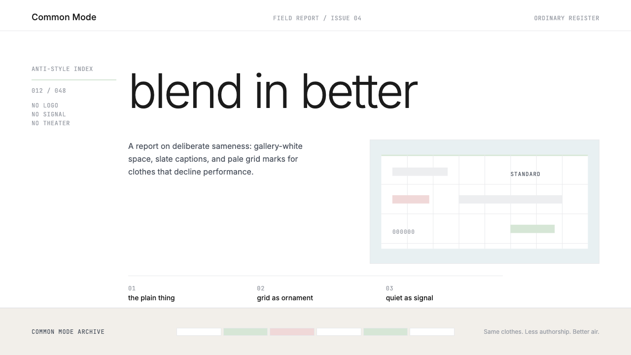 Normcore (2014)Quiet is radical. Inter, slate captions, and pale mint grid marks make refusa…
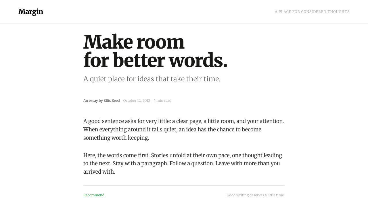 MediumWords come first. A narrow Merriweather column, warm grey ink and one quiet g…
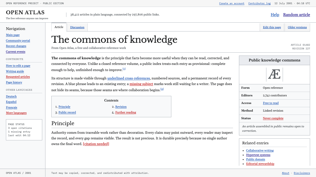 Wikipedia (2001)Content needs no ornament. Black serif text, gray hairlines, and blue links e…
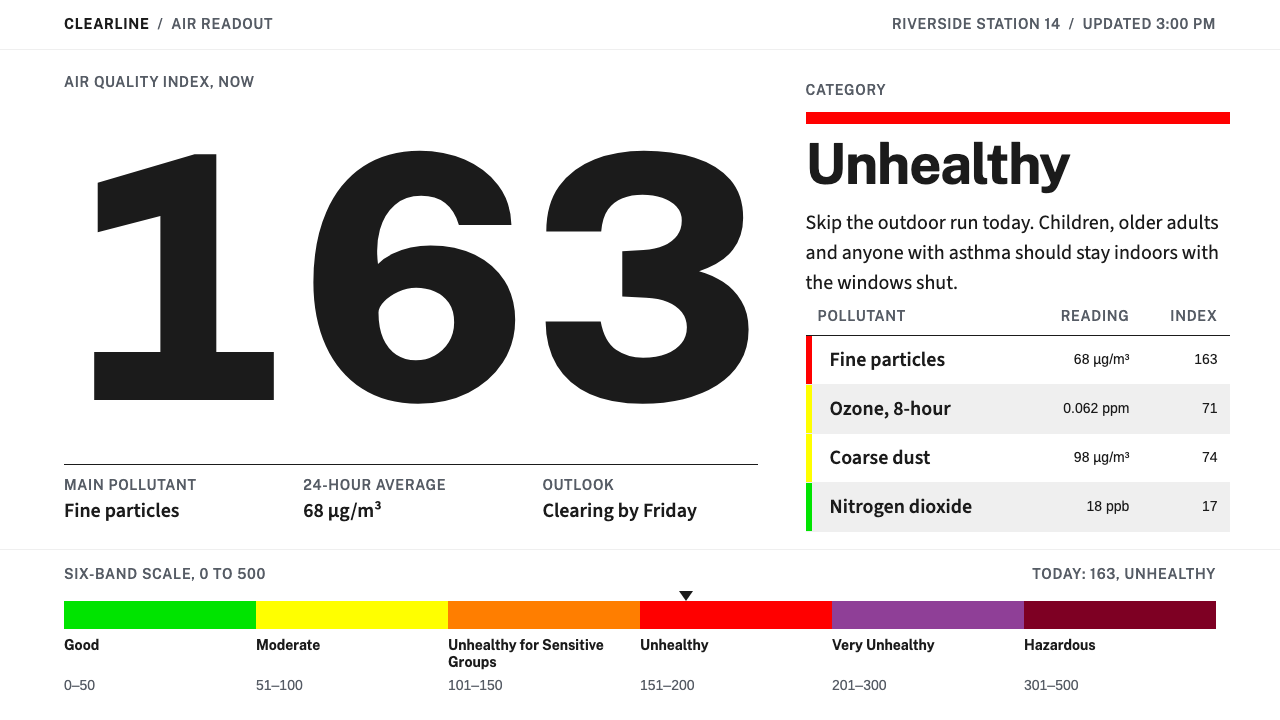 Air Quality IndexA public notice, not a pitch. One giant numeral and a six-band bar, the only…
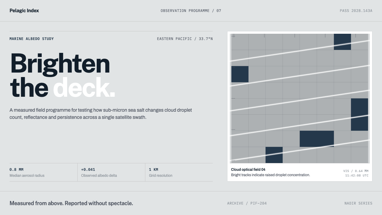 Cloud Brightening FleetBrightening becomes evidence. White ship-track lines score a cool-grey satell…
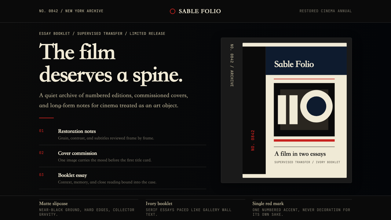 Criterion CollectionMuseum-grade cinema. Matte black, ivory serif, and one red numbered spine set…