What is Medium?
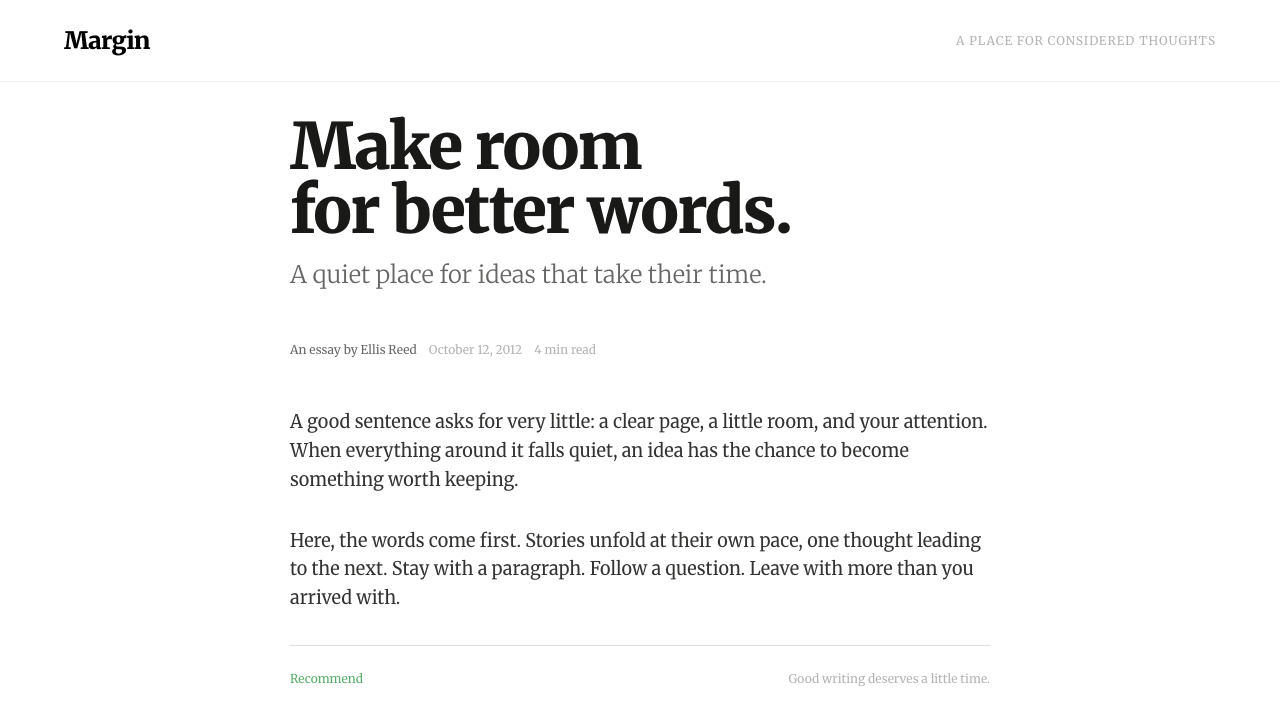
Medium's reading-page style argues that the web's most valuable design decision is subtraction: a white sheet, one narrow serif column and a single quiet green.
Medium in brief
The Medium reading serif style is the visual language of the publishing platform Medium as it appeared when it launched in 2012. Its premise is that a post should look like a well-set page of a book, only on a screen. The page is a plain white sheet. A single column of text sits in the centre, roughly the width that books and newspapers have long used for comfortable reading, with generous empty space on both sides. The body type is a serif, set in a warm near-black grey rather than pure black, at a size large enough to be read without effort.
Everything else is deliberately quiet. The only colour in the interface is a soft green that appears on actions such as Recommend and Follow. Dates, reading times and author lines fade to light grey so that they are available but never compete with the text. Dividing rules are hairline-thin, almost invisible. Photographs are allowed to run large and clean, with no frames, shadows or decoration behind or around them.
The style is best understood as an argument against the cluttered blog of the previous decade, with its sidebars, widgets, badges and stacks of links. Medium removed everything not related to reading. What is left is not austere so much as calm: the layout does not ask for attention, and so it gives attention back to the writer.

Where does Medium come from?
Medium launched in 2012 in San Francisco, founded by Ev Williams with Biz Stone, two people who had already helped shape earlier ideas of what publishing on the web could be. The launch was invite-only, and the reading page that people saw in those first months defines this style. The product arrived when blogging had become noisy. Personal sites had accumulated sidebars, advertising slots and feature badges, and social networks had pushed text into short, fast streams. Medium positioned itself in the gap between them: a place for longer writing, treated with care.
The design belongs to a broader movement that can be called reading-first content design, and to what some writers called the slow web: a counter-current that valued long-form text, quiet interfaces and deliberate pacing over the endless scroll. In this tradition, typography is the main interface. Line length, type size, spacing between lines and the contrast of ink on paper carry the experience, and the visual identity is built from those choices rather than from a logo, a pattern or an illustration style.
That choice made Medium unusual among technology brands. Rather than defining itself through a loud colour or a mascot, it made the act of reading the brand. A post by an unknown writer looked as dignified as one by a famous author, because the container was the same: a clean sheet, a careful column, an unhurried rhythm. The platform's promise to writers was effectively visual: your words will be presented well.
The reading-page visual of 2012 and 2013 has since been widely imitated, by newsletters, note-taking tools, documentation sites and other publishing platforms. As a result its signature features — the narrow centred column, the serif body, the pale metadata line, the single accent — are now part of the common vocabulary of web reading. This style preserves the early, uncluttered form before later feature layers were added.
Seen in this light, the style is less a brand than a stance. It treats the writer's text as the main product and the interface as a servant. That stance is why it still reads as contemporary more than a decade later: the features that looked radical in 2012, such as removing sidebars and letting the page breathe, have become the default expectation of a good reading experience.
What defines the Medium look?
Single narrow column
Text is set in one centred column, narrow enough to keep lines short and the eye moving comfortably from line to line. The width is closer to a book page than to a conventional web layout. Margins on either side are left empty on purpose, so that the white space does the work that borders and sidebars did on older blogs.
Warm near-black ink
The text colour is not pure black but a warm, slightly softened grey that is very dark. On a white ground it keeps strong contrast while avoiding the harshness of black on white. It resembles printed ink on paper, which is part of why long passages are tiring to read less than they would be in a stark, high-contrast setting.
Serif body, quiet sans for chrome
Body copy uses a readable serif, Merriweather in this system, chosen for sturdy letterforms that stay clear on a screen. Titles can share the serif for a literary feel, while small interface labels use a restrained sans-serif so that the tools are visibly separate from the writing.
One green accent
The entire interface uses a single colour: a calm green on affirmative actions such as Recommend and Follow. Because nothing else competes with it, the accent reads clearly without being loud. It also signals a tone, friendly and encouraging rather than urgent or promotional.
Fading metadata
Dates, reading time, author names and counts are set in a light grey and a smaller size. They remain easy to find but never fight with the headline or the first paragraph. The hierarchy is therefore driven by tone: text first, then supporting facts, then tools.
Hairline rules
Dividers between sections are extremely thin and pale, closer to a suggestion than a boundary. There are no boxes, borders around cards or heavy lines. Separation comes mainly from spacing, which keeps the page feeling open and unified.
Large, clean imagery
Photographs and illustrations are allowed to run wide, often wider than the text column, without decorative frames or drop shadows. They act as pauses in the reading rhythm. Captions are small and quiet, in the same pale grey as the other supporting lines.

Who shaped Medium?
Ev Williams launched Medium in San Francisco in 2012. His starting point was a simple observation, that blogs had become too noisy, and his answer was to remove everything not related to reading. The restraint of the interface reflects that founding argument more than any particular visual trend.
Biz Stone is listed alongside Ev Williams as a key figure of the platform's founding. Both were already known for earlier ideas of how people publish on the web, and their shared interest in making writing easy and respected is part of the background for the reading-first approach seen here.
How do you use Medium today?
For slides, this style suits decks that are mostly about ideas rather than data: essays turned into talks, product principles, strategy memos, or any presentation where the speaker wants the audience to read a sentence and think. A cover can be a white slide with a single large serif title and a small grey line beneath it. Content slides work as one sentence or one short paragraph, set generously, with a lot of surrounding white. Use the green accent only once per slide, for the single thing you want the audience to act on.
On the web, the style is a natural basis for blogs, newsletters, documentation, long-form journalism, personal essays and knowledge bases. Keep the single narrow column, make the metadata pale, and place actions in a quiet row beneath the title or at the end. For dashboards and product pages the style is less direct, but it can still inform them: use it for onboarding text, help content, release notes and email templates, where the writing is the product.
In editorial and marketing work, the style signals thoughtfulness and trust. A founder letter, a long case study or an opinion feature gains credibility when it looks like a well-set page. Images should be large and clean, with no decorative treatment, and the call to action should be a single green link or button at the end of the piece. The style works because it promises that the reader's time is respected.
The common mistake is to treat the style as only a font choice. Adding a serif to a busy layout does not make it a reading page. The style depends on a narrow column, large empty margins, soft ink, pale supporting text and one accent colour, all together. Another mistake is to widen the column to fill the screen, or to add extra colours and cards. Either change destroys the calm that makes long text easy to read.

Medium — FAQ
Why is the text column so narrow?
A narrow measure keeps lines short enough that the eye can find the start of the next line easily. Books and newspapers have used similar widths for centuries for exactly this reason. The empty margins that result are part of the design, not wasted space.
Which font does the style use?
Body text is set in Merriweather, a sturdy serif that stays clear on screens. Small interface labels use a restrained sans-serif so that tools look different from the writing.
Can I add more accent colours?
You can, but the style is built on having only one. The single green on affirmative actions is what lets it stay quiet and still be noticed. Adding more colours turns a reading page into a generic content site.
Is it suitable for dashboards and product interfaces?
Not directly. It is designed for reading, so it fits long text, help content, release notes and editorial pages. For data-heavy interfaces, use its restraint, pale metadata and generous spacing as principles, but expect to add structure that a reading page does not need.
Related design styles
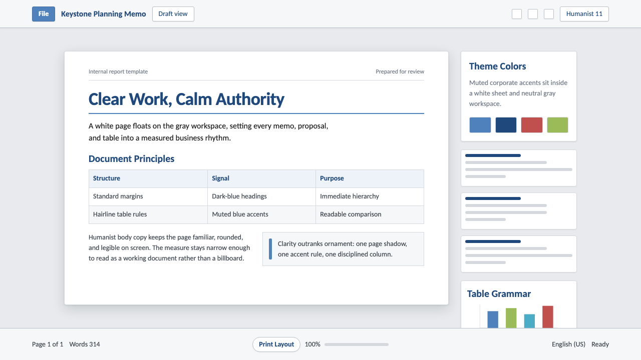 Office DocumentQuiet authority. White page sheet, muted blue rules, and humanist-sans rhythm.
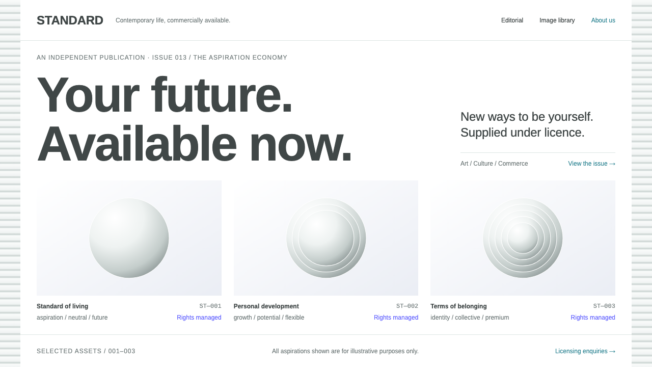 DIS MagazineArt speaks corporate. White sheets, neutral Arimo and clinical specimen grids…
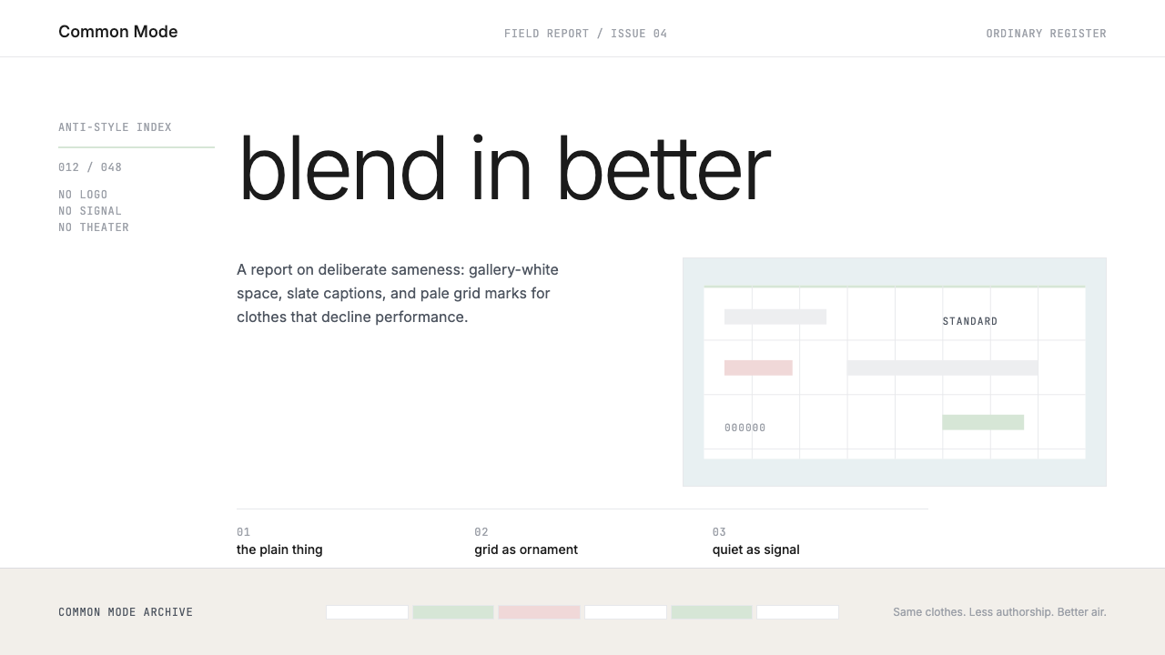 Normcore (2014)Quiet is radical. Inter, slate captions, and pale mint grid marks make refusa…
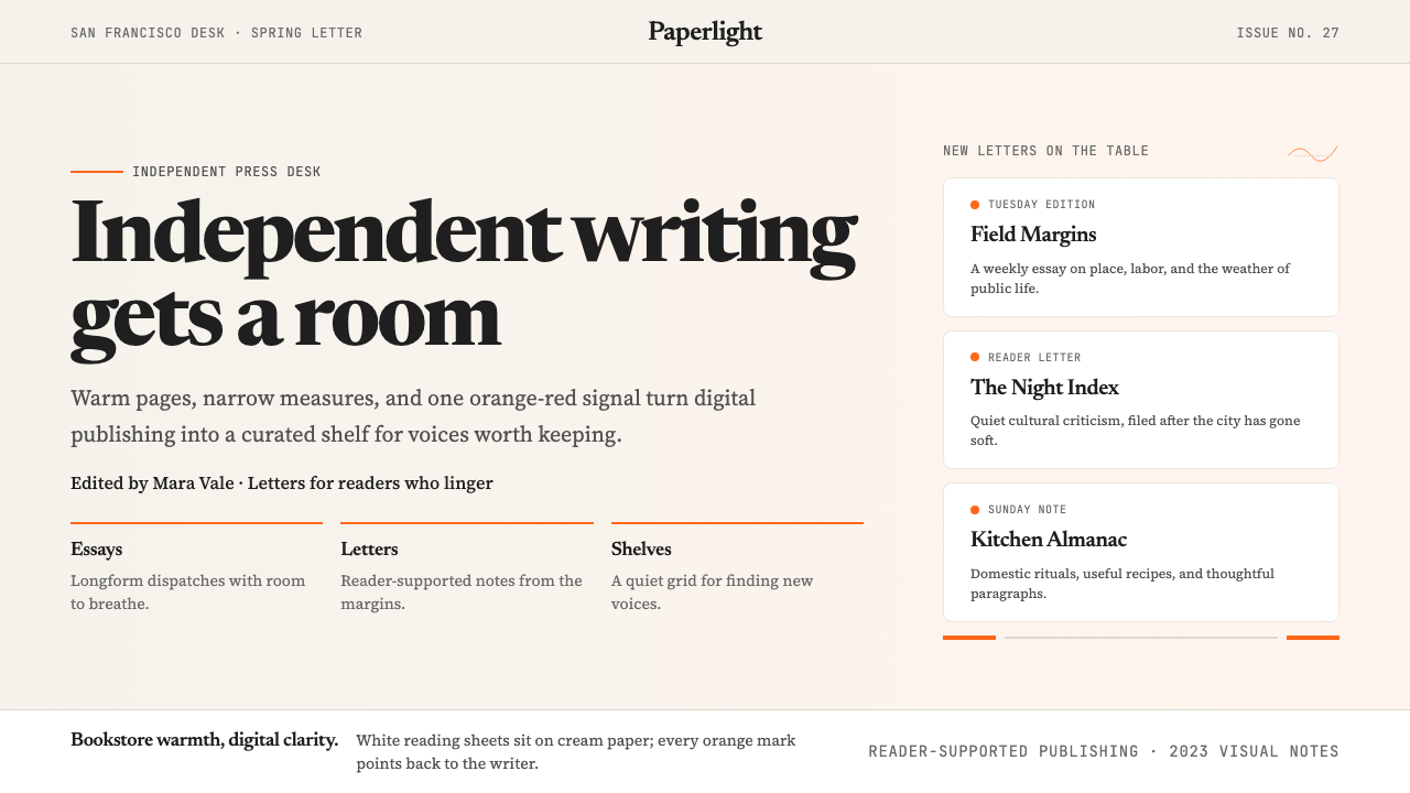 Substack 2023Writing feels shelved, not streamed. Cream paper, Newsreader serif, and one o…
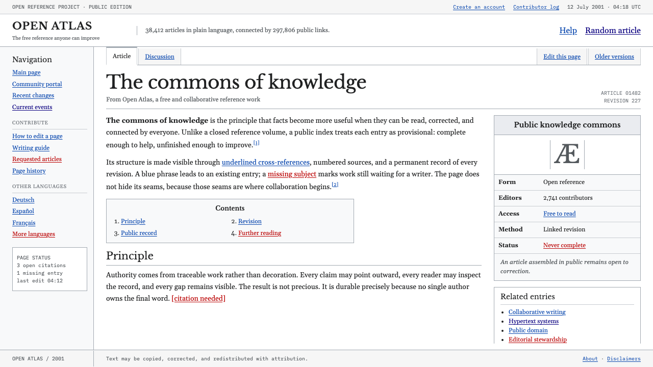 Wikipedia (2001)Content needs no ornament. Black serif text, gray hairlines, and blue links e…
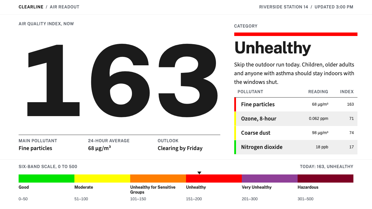 Air Quality IndexA public notice, not a pitch. One giant numeral and a six-band bar, the only…