What is Deconstructivism?
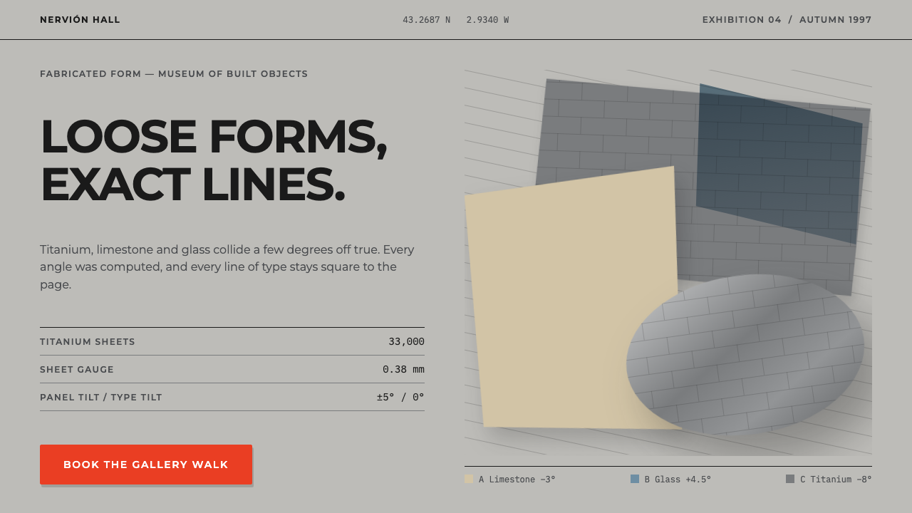
Deconstructivism looks like a building coming apart, yet every fragment is calculated, which is why its design language is broken in shape and exact in logic.
Deconstructivism in brief
Deconstructivism, in this system, is drawn from the Guggenheim Museum Bilbao, which Frank Gehry designed from 1991 to 1993 and which opened in October 1997. Its skin is made of roughly thirty-three thousand very thin titanium sheets, wrapped over curves that were computed in CATIA, and set against rectilinear blocks of Spanish limestone and a glass curtain wall. Curved against straight, metal against stone, the building is built from contrast.
The visual language that follows is one of tilted, overlapping, clipped planes that nevertheless feel resolved. Panels lean by a few degrees and cut into one another, but the text on them never tilts: every line of Montserrat stays square to the page. The fragments look loose, but they are fully resolved. This tension between a restless surface and a stable reading line is the central idea.
The palette follows the materials. The ground is daylight titanium, large panels turn pewter like the metal under Basque cloud, cards take the warm cream of limestone, and links and interactions borrow the grey-blue of glass. One red button is allowed, and nothing else on the page shouts.

Where does Deconstructivism come from?
The movement's public starting point is the 1988 exhibition at MoMA, which put the name deconstructivism into circulation. Philip Johnson and Mark Wigley are the two names associated with that moment, Johnson as the architect and Wigley as the theorist whose writing helped frame what the label meant. In the years that followed, the term stuck to a cluster of architects whose work seemed to break apart the orderly box of modernism, and the movement stayed active from 1990 until 2020.
Frank Gehry's Guggenheim in Bilbao is the building that carried the idea to a wide audience. The commission is associated with Thomas Krens, who is listed among the key figures here. Design ran from 1991 to 1993 and the museum opened in October 1997, in Bilbao in the Basque Country, Spain. It is often treated as the clearest demonstration that a form that looks improvised can be rigorously built.
The second movement named in this style's background is computer-aided free-form architecture, and it matters as much as the first. The curves of the Bilbao skin were computed in CATIA, software that came from the world of aircraft design. Without that tool the shapes would have been very difficult to document and build. Deconstructivism's look of freedom therefore rests on exact computation, a point the design system keeps by making every layout decision deliberate.
Placed together, these threads explain the style's character: a theoretical idea of fragmentation from the late 1980s, a particular museum in a particular city, and a new relationship between drawing and calculation. The result is a language that is easy to caricature as chaos and hard to execute well, because each apparently random tilt needs to be backed by a clear order.
What defines the Deconstructivism look?
Color
The palette is taken from materials rather than from a colour theory. The page ground is the grey of daylight titanium, large panels use the darker pewter that the metal turns under overcast Basque skies, cards use the warm cream of limestone, and links and interactions use a grey blue borrowed from glass. Red appears only once, on a single button, so it works as the one point of emphasis.
Typography
Headlines are set in Montserrat, a geometric sans in capitals. The type is the stable element of the system: while panels tilt, headings and body lines remain level and perfectly square to the page. That fixed baseline gives the reader a place to stand while everything around it moves.
Layout
Panels tilt a few degrees, overlap, and clip each other, producing a composition that appears to be breaking apart. Underneath, each panel is positioned deliberately, and the overlaps follow a logic. The layout is a collage of calculated fragments rather than a loose scatter, so the eye reads depth and movement without losing the content.
Curve against rectilinear
The source building sets computed curves against rectilinear blocks, and the system keeps this pairing. Angled and flowing shapes sit beside square, stable ones. Each makes the other more legible, and the contrast is the engine of the style rather than a side effect.
Material and surface
Surfaces suggest metal, stone and glass: a cool and slightly reflective grey, a warm matte cream, and a clear grey blue. Because the thinness of the original titanium is part of its character, panels feel like skin laid over a form rather than like solid blocks. This gives the page a sense of tension between the light envelope and the weighty structure beneath.
Restraint in emphasis
With so much geometry in motion, the system avoids further noise. There is a single red button and nothing else shouts. This discipline is what keeps the style from becoming merely busy: the more energetic the layout, the more restrained the signals of importance have to be.

Who shaped Deconstructivism?
Gehry designed the Guggenheim Museum Bilbao between 1991 and 1993, and it opened in October 1997. His building is the direct model for this system: thin titanium sheets over computed curves, set against limestone and glass. It is the work that made deconstructivist form familiar to a general audience.
Krens is listed among the key figures connected to the Bilbao project. His name is a reminder that the museum was a commission with institutional backing, and that a radical form needed an organisation willing to build it.
Johnson is associated with the 1988 MoMA exhibition that brought the name deconstructivism into circulation. That show is the movement's public starting point, and it gave a loose group of architects a shared label.
Wigley is the theorist connected to the 1988 exhibition. His role in framing what the term meant is part of why deconstructivism is understood as a movement with ideas behind it, not only as a way of bending metal.
How do you use Deconstructivism today?
On slides, the style suits decks about architecture, urban culture, innovation, and anything where a structural idea matters more than a list of bullets. A cover can use a few tilted pewter and cream panels with the title in level capitals across them. Content slides can place a single card on a slightly angled panel, and data slides can use clipped panels as frames for charts, with the chart itself kept square and legible.
In web interfaces, it fits portfolio sites, cultural institutions, studios, and campaign pages. A hero section can carry two or three overlapping panels in titanium and pewter, with limestone-coloured cards for content and glass-blue for links. Interactive controls should stay predictable, with one red button as the primary action. It works less well for dense data tools, where tilted panels reduce readability.
In editorial and marketing, it can frame stories about buildings, cities, material, and technology. Because the palette follows real materials, it also gives product pages for architecture-adjacent goods a credible, grounded feel. Photography of metal, stone and glass pairs naturally, and a single red accent can carry a call to action.
The most common mistake is to tilt the text. The whole system depends on the contrast between moving panels and level type, and once the lines of text lean, the page reads as chaotic rather than resolved. A second mistake is to add more red accents; the strength of one red button disappears when there are several. A third is to tilt everything: a few angled panels against stable ones is the language, while a page of nothing but angles loses its logic.
A helpful check is to look at the page with the panels imagined as flat rectangles. If the content and hierarchy still make complete sense, the tilt is adding energy without damaging structure. If the page only works because of the tilt, the design is relying on effect instead of order.

Deconstructivism — FAQ
What is deconstructivism in design?
It is a style that looks fragmented, tilted and overlapping while remaining carefully resolved. In architecture it is linked to the 1988 MoMA exhibition and to buildings such as Frank Gehry's Guggenheim Museum Bilbao, and in this system it is translated into angled panels with level type.
Why is the text never tilted?
The text is the stable element that makes the tilted panels readable as intentional. Every line of Montserrat stays square to the page, so the fragments look loose but are fully resolved, which is the central idea of the style.
What colors does this style use?
The colours come from the building's materials: daylight titanium grey for the ground, pewter for large panels, warm limestone cream for cards, and a grey blue taken from glass for links and interaction. A single red button is the only loud note.
Is it the same as the Guggenheim Bilbao look?
It is drawn from that building, which opened in October 1997, but it translates its materials and logic into a page rather than copying its shape. The thin titanium, limestone blocks and glass curtain wall become colours, panels and contrasts.
Related design styles
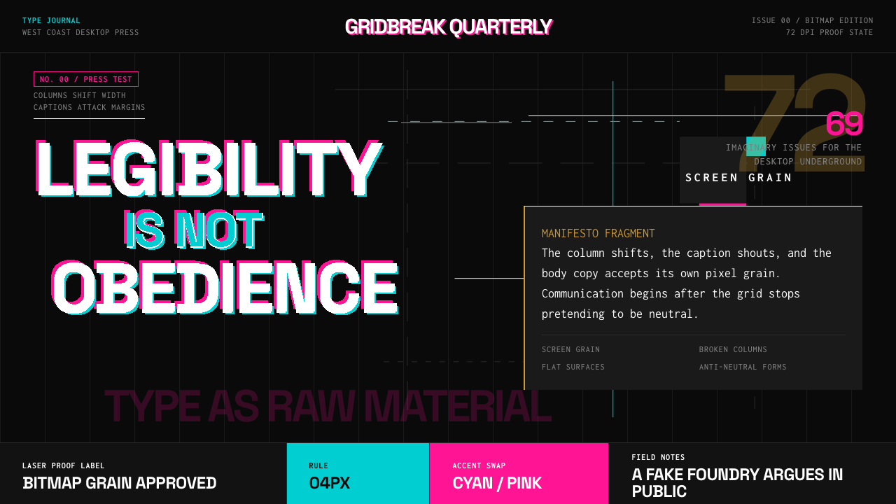 Emigre Magazine (1984–2005)Defies the tidy grid. Cyan, ochre, and hot-pink bitmap type collides on black.
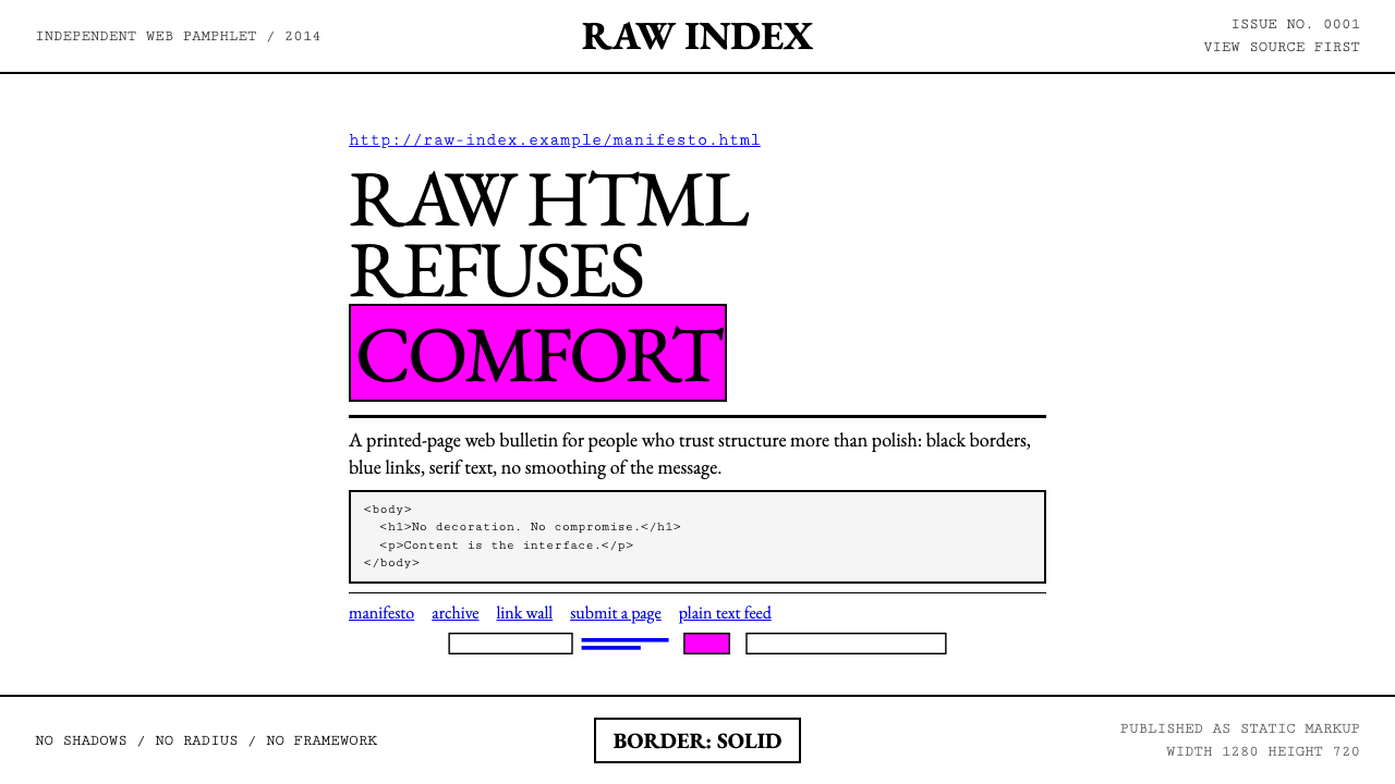 Brutalist Web 2014Browser defaults, weaponized. Times New Roman, electric-blue links — raw HTML…
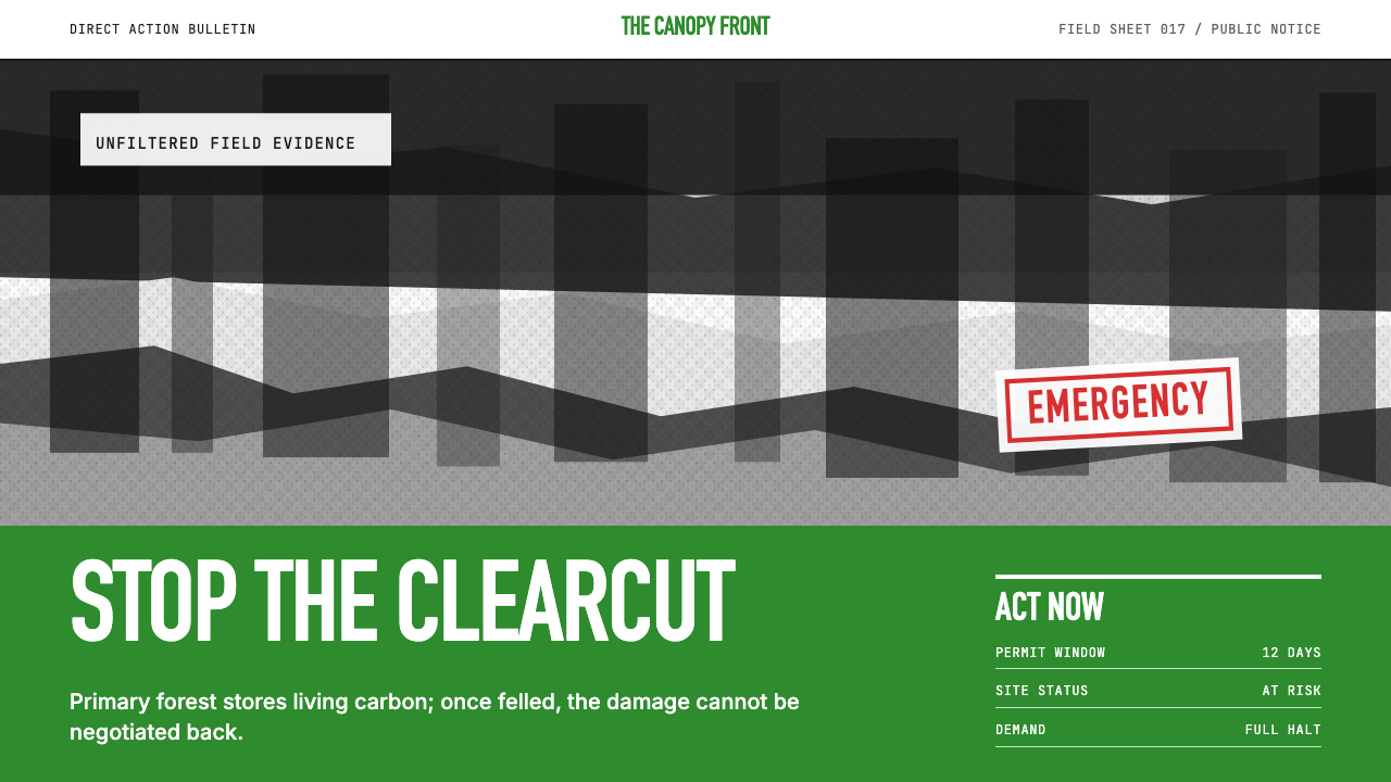 Greenpeace (Activist Poster)Protest without softness. Forest-green caps over monochrome newsprint, one de…
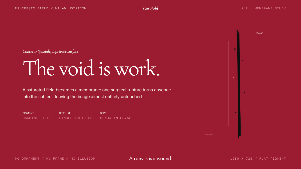 Spatialism (Fontana Cut, 1949)Absence becomes medium. Carmine field, Garamond restraint, one black incision.
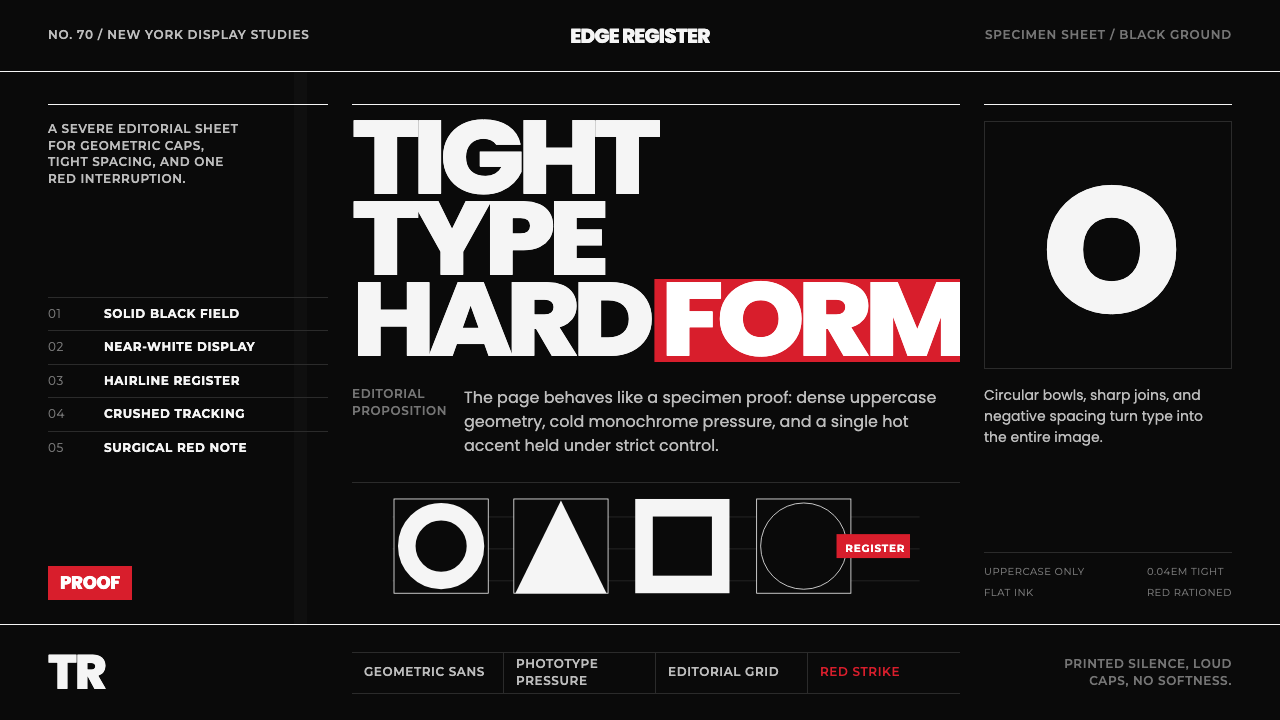 Avant Garde GothicType is the image. Tight white caps on black, ruled grids, one hot red strike.
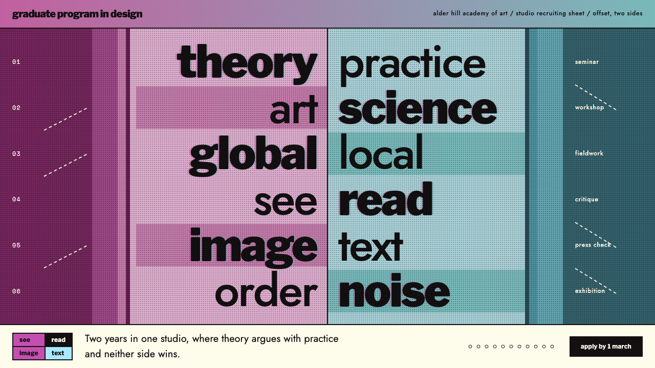 CranbrookNo single reading order. Black Franklin word pairs on a central axis, magenta…