What is Kurbits Dalarna Painting?
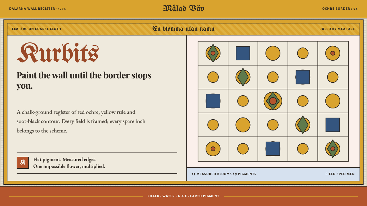
In the farmhouses of Dalarna no wall was left blank: red ochre flowers grown from a gourd vine crowd a chalk ground inside ruled yellow borders, and the density is the whole point.
Kurbits Dalarna Painting in brief
Kurbits Dalarna Painting is a design style drawn from dalmålning, the painted decoration of farmhouse interiors in the Swedish province of Dalarna. It was painted on paper and coarse woven cloth glued over the log walls, in limfärg, a paint made of chalk, water, glue and pigment. A scheme could run the whole length of a room and stop only at a ruled yellow border.
Its central motif is the kurbits, the gourd vine. Out of the vine grows a flower that no botanist could name: it swells until it fills the picture, and Biblical figures walk through it dressed in the wool coats and aprons of a Swedish farm. The style is flat, bold and packed. Colour is applied with a brush in solid areas, there are no blends, and every panel is boxed and captioned with a strip of hand-lettered inscription.
As a design language, it takes all of this literally. The ground is chalk, the colour is flat and brush-drawn, the borders are measured, and density is the point. The wall was painted from corner to corner, and so is the page. White space is not left for the content to breathe in; it is simply the part that has not been painted yet.
Where does Kurbits Dalarna Painting come from?
Dalmålning belongs to Dalarna in central Sweden and to the period from about 1780 to 1870. It is a part of allmogekonst, the art of the rural common people, and it was made by painters who worked in farmhouses, decorating the rooms in which families lived and celebrated. The paint was limfärg, a chalk-based distemper, and the support was paper or coarse woven cloth pasted onto the logs. Because the material was cheap and the labour was local, a whole room could be covered, and the aim was exactly that.
The kurbits itself emerges around 1780. At first it appears as a modest plant motif, but through the 1790s it grows until it floods the composition, becoming the dominant element of the picture. From the 1820s it lightens and settles into a stylised bouquet, more decorative and less crowded. That arc, from the first appearance of the gourd vine to its flooding of the wall and then to its tidy bouquet, is the historical frame of this style. The version the design most wants to evoke is the full flood: swollen, red and covering everything.
Biblical scenes were painted in the same idiom. The painters worked after printed figurbiblar, illustrated Bibles whose engravings supplied the compositions, and they translated those images into local terms. The prophets and apostles walk through the flowers in wool coats, aprons and boots, as if the Gospel had taken place on a Dalarna farm. This domestication of sacred subjects, rendering them in the clothes and surroundings of the people who lived with the paintings, is a defining feature of the tradition.
Within Dalarna there were regional differences of hand. Painters of the Leksand school drew with almost mathematical regularity, while those of the Rättvik school worked more loosely and with more visible brushwork. The source material names Winter Carl Hansson, Back Olof Andersson, Björ Anders Hansson and Mats Persson Stadig among the key figures of the tradition. The style as a whole is a synthesis: it keeps the regularity of ruled borders and boxed panels while allowing the flowers a looser, hand-painted energy.
What defines the Kurbits Dalarna Painting look?
Chalk Ground
The page is a matte, warm, chalky off-white, the colour of limfärg dried on a wall or paper. It is not glossy or bright; it absorbs light. Colour sits on it as pigment bound in glue would, in solid patches with a slightly dry, powdery finish. The ground is also the only neutral, so everything painted on it has to be painted decisively.
Red Ochre Blooms
The dominant colour is a deep red ochre, used for the huge flowers that swell out of the gourd vine. The blooms are built from simple repeated brush shapes, rounded petals, clusters and curls, and they are large relative to everything around them. They do not look botanical. Smaller touches of yellow, green and blue support the red, but the flowers are what the eye reads first.
Measured Yellow Border
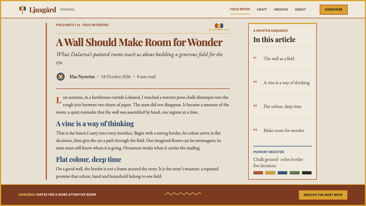
Every area is enclosed by a ruled border in yellow ochre, drawn straight with a rule, and often accompanied by a sawtooth line running just inside it. The border is the only truly geometric element in the painting, and it gives the dense, curling interior something firm to press against. In a layout this becomes a clear, regular frame around every block of content.
Flat, Brush-Drawn Colour
Colour is laid down in flat areas with visible brush logic. There are no gradients and no blends, and shapes are defined by edges and by dark linework rather than by modelling. Slight irregularities in outline are part of the charm: this is paint applied by a hand, not a vector shape. Shading and shadow simply do not exist.
Boxed Panels with Inscription Strips
Each scene or block sits in its own box, and along the upper edge runs a strip of hand-lettered inscription in a gothic-looking script. The caption names or comments on what is shown. This gives the composition a modular logic, like a set of framed pictures, and it makes the lettering an integral decorative element rather than a separate layer of text.
Density, No Blank Wall
Every gap is filled with leaves, tendrils, small flowers and dots until nothing is left unpainted. The effect is rich and slightly overwhelming by design: abundance as a form of generosity and festivity. In a layout, spacing is tight and blocks sit close together, so any emptiness is deliberate and small. The page reads as a surface that has been worked from corner to corner.
Sacred Figures in Farm Dress
Human figures are small, simplified and flatly painted, and they wear contemporary local clothing: wool coats, aprons and leather boots. They are placed among the flowers rather than in front of them, so they belong to the decoration as much as to the story. In design terms, this means that people and illustrations should be integrated into the pattern, not set apart on neutral photographic backgrounds.
Who shaped Kurbits Dalarna Painting?
Winter Carl Hansson is listed in the source material as a key figure of the tradition. His name works here as a reminder of what dalmålning looks like at its fullest: large red blooms, tightly packed compositions and a confident, painterly hand. That full-flood character, which the tradition reached in the 1790s, is the version of the style this design most wants to recall.
Back Olof Andersson is another of the painters the source names as key to dalmålning. His work belongs with that of his contemporaries in showing the discipline underneath the abundance: the ruled borders, the boxed panels and the neat inscription strips. Looking at a painter of this kind is a reminder that all the apparent exuberance rests on a firm and orderly framework.
Björ Anders Hansson is named among the painters of the tradition, and he is useful to the style as a reminder of its range. Dalmålning was made by many individual hands who shared a vocabulary of flowers, borders and Biblical figures but gave it different weights and energies. A design in this style should likewise allow personality inside a strict set of repeated parts.
Mats Persson Stadig is the fourth painter the source names among the key figures. The tradition he belongs to also had a lighter, tidier chapter: from the 1820s the kurbits settled into a stylised bouquet that was more decorative and less crowded. Designers who prefer a cleaner version of the style can look to that later register, while keeping the chalk ground, flat colour and ruled borders.
How do you use Kurbits Dalarna Painting today?
Kurbits Dalarna Painting is a warm, festive and heavily ornamented style, and it works wherever abundance, community and handmade character are the message. Its strength is that it is unmistakable: dense red flowers, chalk ground and yellow ruled borders say 'folk tradition' at once. Applying it well depends on keeping the discipline inside the density.
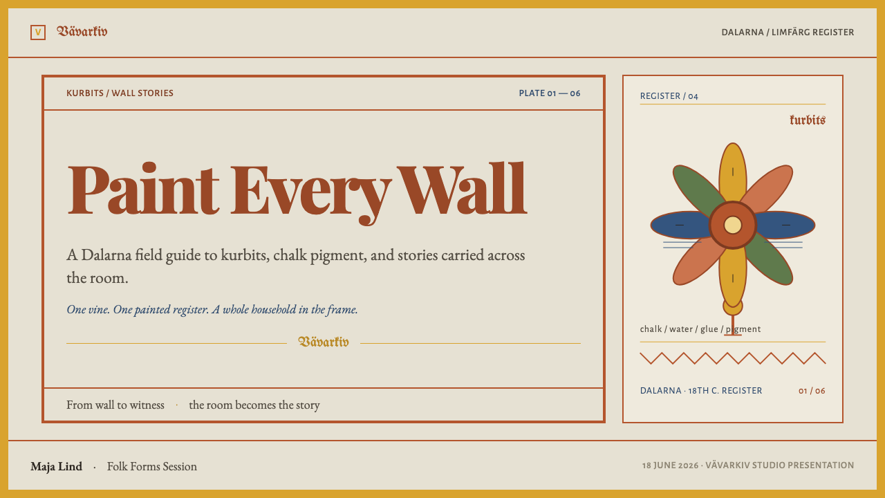
For presentation slides, a cover can be a chalk-coloured page enclosed by a ruled yellow border with a saw-tooth line inside it, a large red ochre bloom spreading from one corner and the title set on an inscription strip above. Content slides should be treated as boxed panels, each with its own border and caption strip, filled with the content up to the edges rather than floated in empty space. Data slides can use flat bars and simple shapes in the ochre palette, framed and captioned like a painted panel.
For web interfaces, the style fits craft and food brands, cultural and community sites, festival pages, children's and family products, local tourism, and editorial storytelling. Use a chalk ground, border frames around every card, and caption strips for section headings. Keep the palette limited to red ochre and yellow ochre with small touches of green and blue, and make sure text blocks remain clean and legible against the matte ground, with ornament confined to borders and margins.
For editorial and marketing work, the style supports articles about folk art, regional heritage, food, festivals and design history, and it makes lively seasonal campaign material. A page can use the painted wall as a model: a run of framed panels, each captioned, linked by tendrils and flowers at the edges. Marketing pages benefit from the style's sense of generosity, with abundant, bordered offers and a single bold red call to action.
The most common mistake is to treat the style as Scandinavian minimalism with a few flowers added. Large expanses of white, light sans-serif type and a few scattered floral icons miss the point, which is density. A second mistake is to add gradients, soft shadows or glossy highlights that contradict the flat, chalky paint. A third is to make the flowers realistic or delicate: the kurbits bloom is large, simple and slightly improbable, and it should look painted, not drawn from a botanical plate.
Kurbits Dalarna Painting — FAQ
What does kurbits mean, and why is the flower not botanical?
Kurbits is the Swedish word for the gourd, and it names the vine that is the starting point of the motif. Out of the vine grows a flower that corresponds to no real species. It is an invention of the painters, built from simple, repeated brush shapes, and it swells as the tradition develops until it fills the picture. Its purpose is decorative abundance, not botanical accuracy, which is why it can be so large and so improbable.
How is this style different from Scandinavian minimal design?
They come from the same region but belong to opposite traditions. Scandinavian minimal design is associated with white space, pale materials and a few carefully chosen objects. Kurbits painting is a folk idiom of saturated colour, ornament and horror of empty surfaces. If minimal design says 'less', dalmålning says 'more, and put a border round it'. The two are different answers to the question of what makes a room or a page feel like home.
Why does the style avoid empty space?
Because the original paintings were made to cover a wall, from corner to corner, and an unpainted area looked unfinished rather than restful. Density here signals care, labour and generosity. In a layout, that translates into tight spacing, framed blocks that come close to each other and small gaps filled with ornament. The discipline is that the density is organised by borders and panels, so the page feels full but not chaotic.
Can the style work in modern digital interfaces?
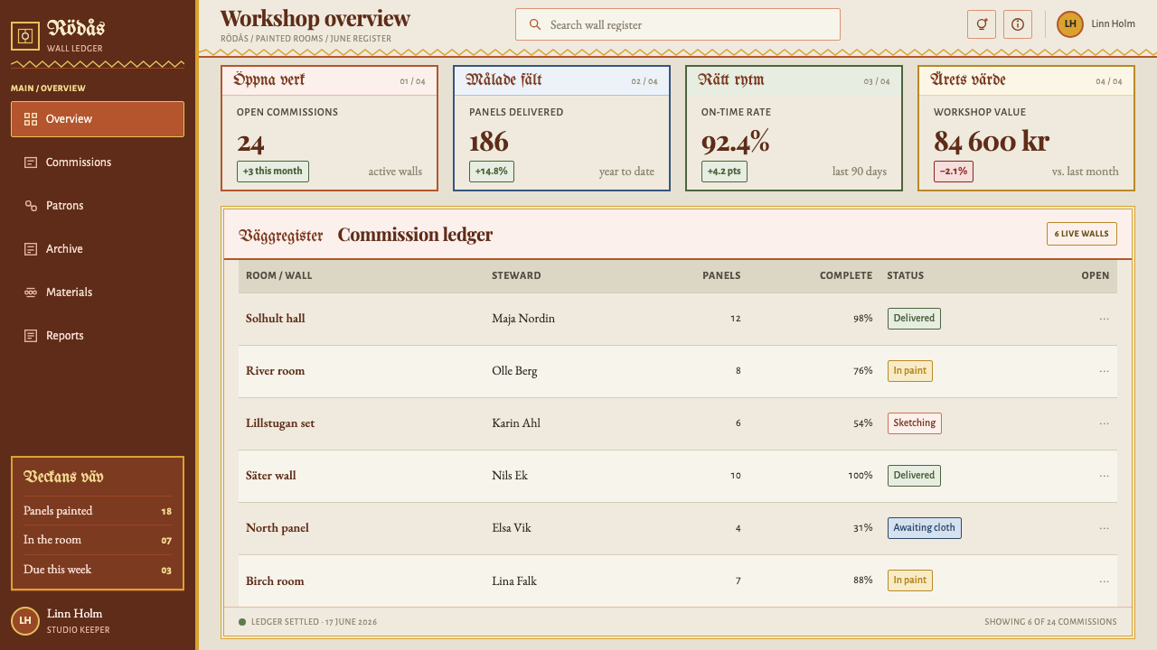
Yes, with care. The best approach is to use the ornament at the level of frames, headings and illustration while keeping reading areas clean. Cards with painted-looking borders, caption strips as section titles, flat illustrations in ochre colours and a chalky background give the right identity. Interactive elements such as buttons should be simple flat shapes with strong borders, so that function stays clear within the decoration.
Where does the style struggle?
It struggles in contexts that call for quiet precision, technology polish or corporate neutrality: financial tools, enterprise dashboards, medical interfaces and anything that needs to feel cool and uncluttered. Its density can also tire the eye on long text-heavy pages unless the reading areas are kept plain. It shines in places where handmade warmth and festive abundance are the goal.
Related design styles
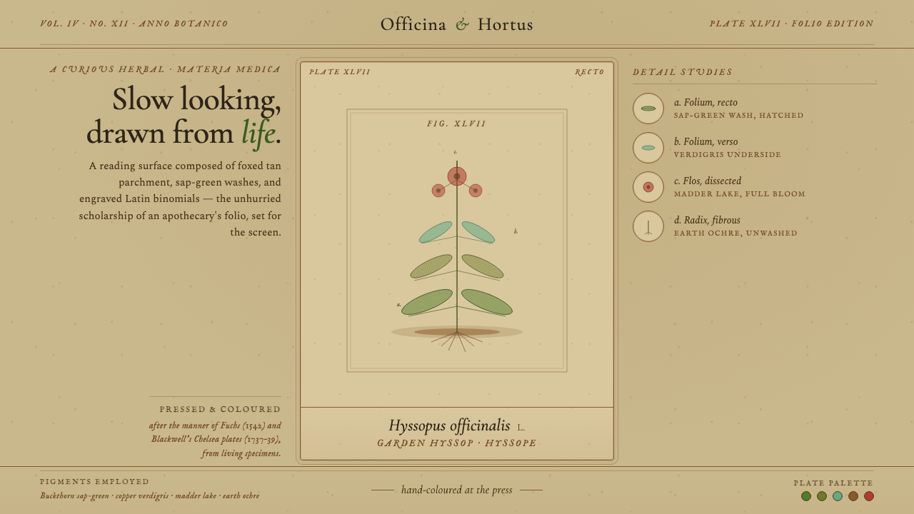 Herbal PharmacopoeiaSlow scholarship of the apothecary folio. Foxed tan parchment, sap-green wash…
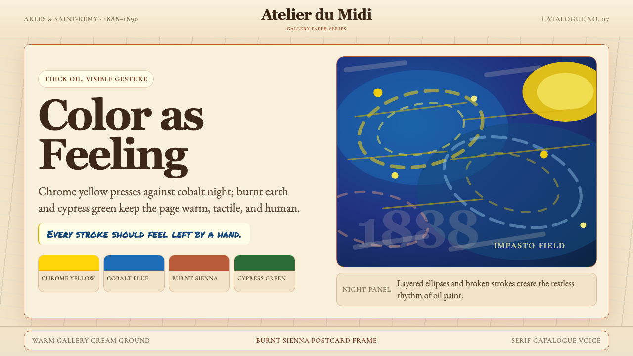 Van Gogh Post-ImpressionistFeeling made visible. Chrome yellow meets cobalt swirls on warm gallery cream.
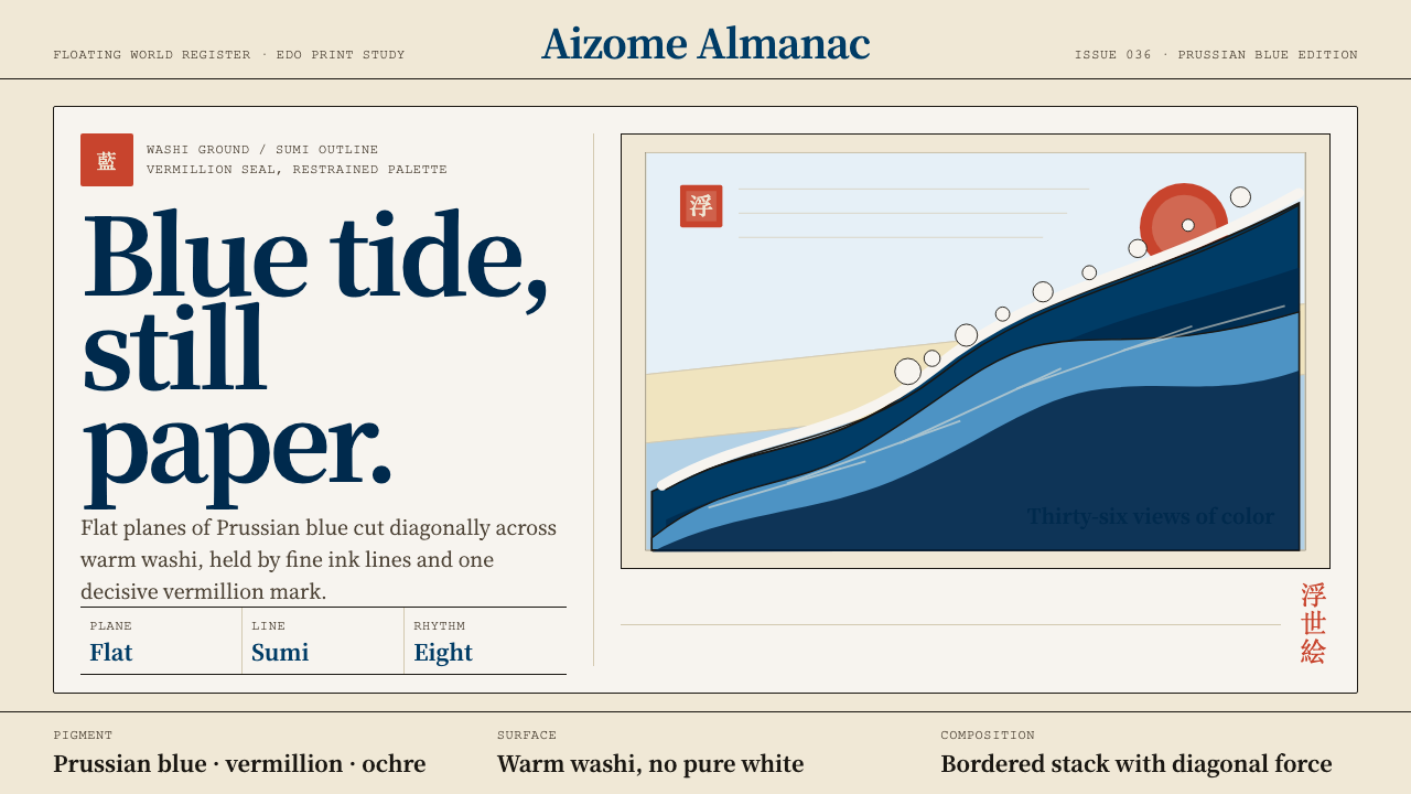 Edo Ukiyo-e (Hokusai)Flat power on paper. Prussian blue diagonals and vermillion seals cut across…
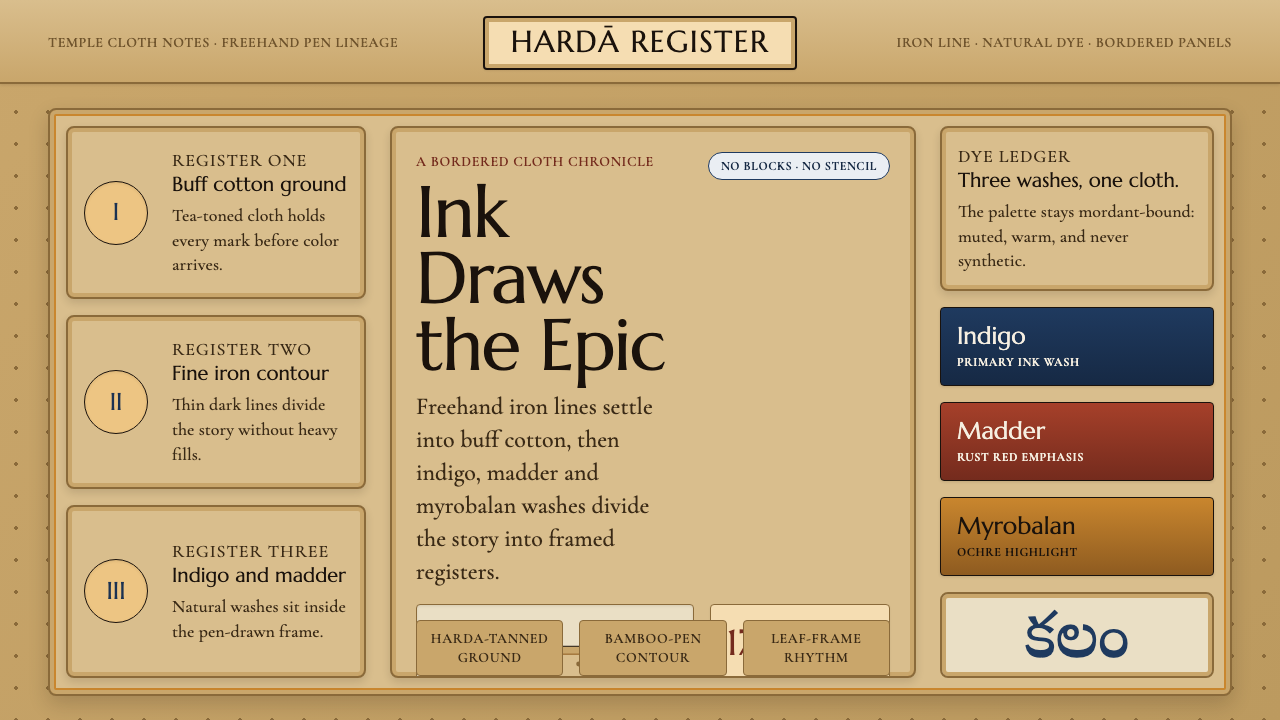 Srikalahasti Kalamkari Pen-WorkHand-drawn cloth storytelling. Buff tan ground, iron lines and indigo-rust pa…
 Caspar David FriedrichSilence becomes vast. Prussian blue depth, pearl mist, and parchment framing…
 Charcoal & Conté DrawingAtelier calm, in middle value. Gray-taupe tooth, smoky charcoal, and chalk-wh…