What is Herbal Pharmacopoeia?
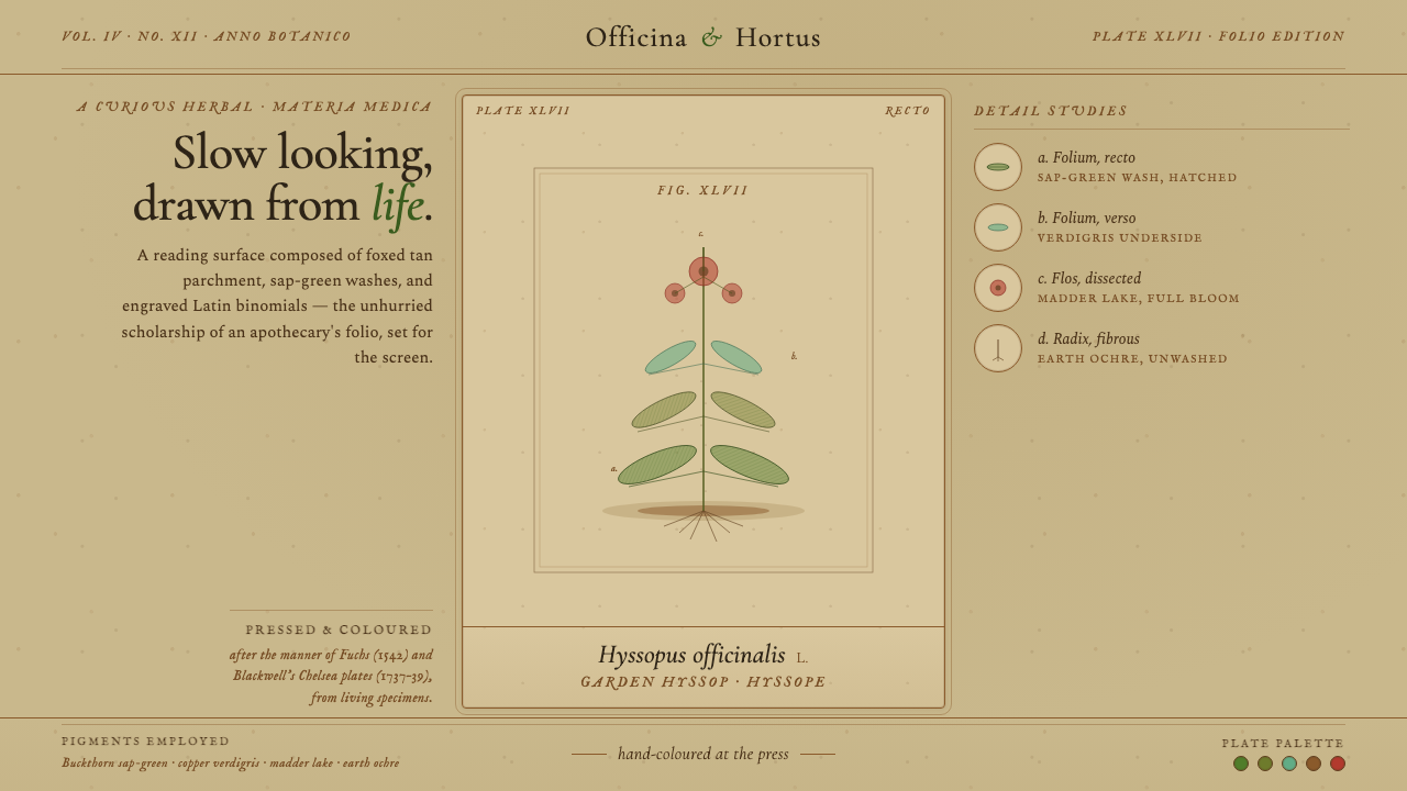
Herbal Pharmacopoeia turns the page into an apothecary folio — aged parchment, engraved medicinal specimens, sap-green washes, and Latin names recorded with patient authority.
Herbal Pharmacopoeia in brief
Herbal Pharmacopoeia is a design style distilled from Western European herbals produced between the early modern period and the Victorian age. Its central image is the medicinal plant presented as a single specimen: isolated for examination, rendered through fine engraved lines and stippling, then selectively colored by hand. Italic Latin names, humanist serif text, and the deliberate pacing of a scholarly folio make the page feel observed and catalogued rather than decorated.
The style depends on material age. Its ground is foxed tan parchment or rag-fiber paper, darkened by time and marked by the interaction of moisture, fibers, and copper pigments. It should never resemble fresh cream stationery. Sap-green foliage, madder-red fruit, and verdigris washes sit within this weathered field as translucent deposits rather than brilliant digital color. Their restraint keeps attention on botanical structure: branching, leaf rhythm, roots, flowers, fruit, and the small variations that distinguish one specimen from another.
Although richly atmospheric, Herbal Pharmacopoeia is fundamentally an information system. Illustration identifies the specimen; the Latin binomial establishes scholarly authority; captions, notes, and ruled divisions organize observation. Its beauty comes from the tension between exact description and physical imperfection. Engraved contours seek precision, while uneven washes, darkened edges, scattered foxing, and visible fibers disclose the human and material processes through which knowledge was preserved.
Where does Herbal Pharmacopoeia come from?
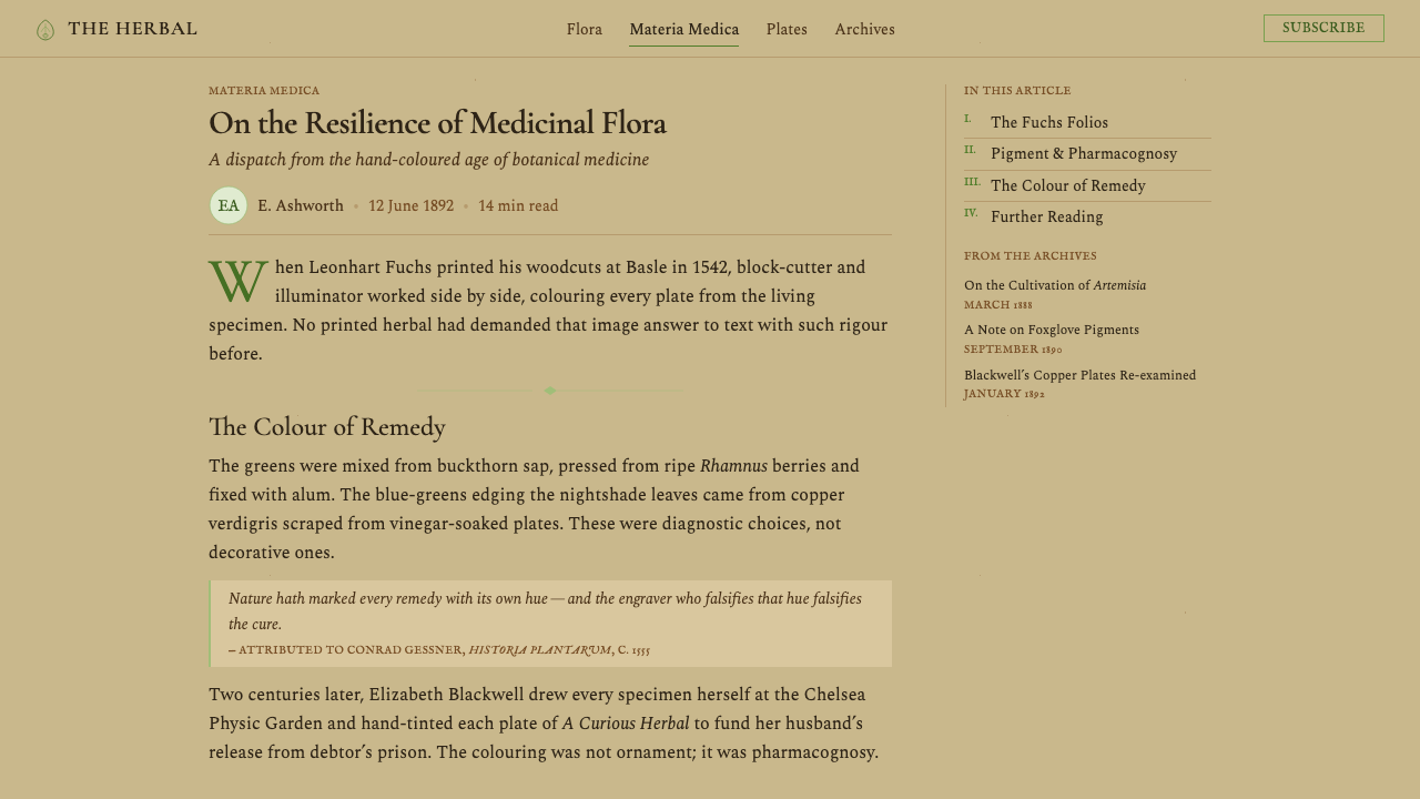
The visual lineage of Herbal Pharmacopoeia begins in the Western European herbal: a book that gathered medicinal knowledge around recognizable plant forms. From roughly the middle of the sixteenth century, such volumes belonged simultaneously to botanical illustration, pharmacopoeia, and herbal medicine. Their purpose was practical as well as scholarly. A plant had to be distinguished from similar species, connected to a stable name, and preserved on the page for readers who might encounter the living specimen under different local conditions.
Leonhart Fuchs stands at the early-modern end of this lineage. The source tradition identifies his work of 1542 as a representative foundation: medicinal plants appear as discrete subjects whose forms deserve sustained attention. The specimen plate establishes the governing hierarchy later inherited by the style. The plant occupies the visual field, the name anchors interpretation, and surrounding text supports identification rather than competing with it. This arrangement gives botanical observation the dignity normally associated with learned books.
Copperplate engraving later intensified the tradition's descriptive character. Fine incised lines could articulate veins, serrated edges, stems, roots, and the turning surfaces of leaves, while stippling suggested gradual tonal change without dissolving the specimen into painterly softness. Hand coloring added another layer of interpretation. Sap-green washes clarified foliage, madder-red distinguished fruit, and verdigris supplied cool mineral color. Because these washes were laid over printed linework, drawing remained the intellectual skeleton and color acted as evidence, emphasis, and material presence.
Elizabeth Blackwell, represented by work from 1737–39, belongs to the later development of this pharmacopoeial language. By then, the combination of specimen image, engraved description, hand-applied color, and Latin naming had become a durable format for communicating medicinal plants. The tradition continued across Germany, Britain, France, and the Low Countries into the Victorian period, even as individual books varied in finish and emphasis. Over time, rag-fiber sheets browned, copper-bearing greens contributed to foxing, and once-fresh pigments settled into muted tones. Those changes were originally consequences of material history; in Herbal Pharmacopoeia, they become essential parts of the visual vocabulary.
What defines the Herbal Pharmacopoeia look?
Aged Ground
The reading field is a deep, foxed tan associated with parchment and old rag-fiber paper. It carries irregular warmth, darkened margins, faint stains, and scattered oxidation marks rather than a uniform beige fill. The ground must feel absorbed into the sheet, not printed on top of it. Bright cream, immaculate white, and evenly distressed novelty paper all miss the particular gravity of a volume that has aged around its knowledge.
Botanical Color
Color is botanical, mineral, and restrained. Sap green dominates foliage; madder red appears in berries, seeds, or limited accents; verdigris introduces a cooler green-blue wash. Pigments should seem translucent and slightly uneven, allowing engraved marks and paper tone to remain visible beneath them. Large areas of saturated color weaken the documentary character. The palette describes plant parts and pigment behavior before it creates mood.
Engraved Line
Fine contour lines form the specimen before color is introduced. Parallel hatching describes curvature, stippling creates restrained shade, and short directional marks clarify veins, bark, petals, and root fibers. The drawing should remain crisp enough to reward close inspection but never become mechanically sterile. Slight variation in line density suggests the pressure and judgment of an engraved plate, giving the image both scientific concentration and handmade tension.
Scholarly Typography
Humanist serif typography gives prose the cadence of a learned volume, while italic Latin binomials identify specimens with ceremonial clarity. Titles should feel composed rather than advertised: measured, dignified, and closely related to the body text. Typographic hierarchy comes from changes in scale, posture, capitalization, and spacing, not from loud color shifts or ornamental display faces. Marginal labels may be compact, but they must remain legible and calm.
Single-Specimen Composition
One plant is treated as the primary object of attention. It is isolated from landscape and habitat so that branching, leaf arrangement, flowers, fruit, and roots can be compared without narrative distraction. Supporting labels orbit the specimen or gather beneath it, but they do not fragment its silhouette. Empty paper around the plant is active scholarly space: it separates evidence, slows the eye, and makes each botanical distinction easier to inspect.
Patina, Not Decoration
Foxing, pigment bloom, paper fibers, and softened edges belong to the material narrative, but they must remain subordinate to information. A convincing page does not scatter stains everywhere merely to appear old. Wear gathers where handling, moisture, pigment, and time would plausibly leave traces. This discipline separates an apothecary folio from generic vintage styling: age explains the object and enriches its authority instead of becoming a decorative filter.
Who shaped Herbal Pharmacopoeia?
Fuchs represents the early-modern foundation of the Herbal Pharmacopoeia lineage. His work of 1542 established the medicinal plant as a subject worthy of concentrated visual description and scholarly presentation. Within this design tradition, his importance lies in the clarity of the specimen principle: the plant stands apart, its morphology directs the composition, and naming and commentary support the act of recognition.
Blackwell represents the mature eighteenth-century pharmacopoeial plate. Her work from 1737–39 stands within a format where engraved botanical description, hand-applied color, medicinal purpose, and learned naming reinforce one another. For contemporary designers, this synthesis is especially instructive: neither illustration nor typography acts as a decorative afterthought, because both participate in the preservation and transmission of botanical knowledge.
Copperplate engraving is the technical figure at the center of the style. Its fine incised marks make close botanical discrimination possible, while hatching and stippling provide depth without obscuring structure. Because hand coloring is laid over the printed plate, the method naturally produces the defining hierarchy of Herbal Pharmacopoeia: disciplined line first, translucent pigment second, and aged paper as the material field holding both.
How do you use Herbal Pharmacopoeia today?
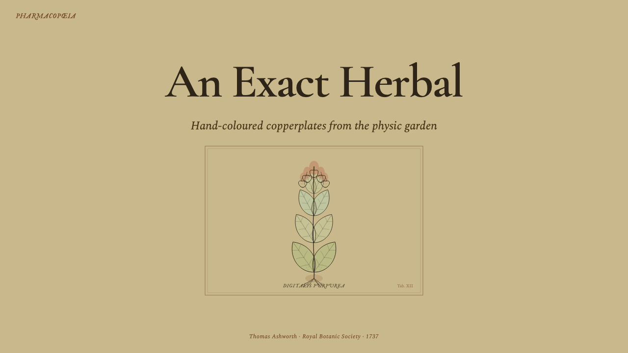
For presentation slides, Herbal Pharmacopoeia works best when the deck behaves like a sequence of collected plates. A cover can feature one large medicinal specimen rising from an aged tan ground, accompanied by an italic Latin name and a restrained humanist title. Content slides should preserve generous paper around text and imagery, using engraved rules, compact annotations, and small botanical details to guide reading. Avoid filling every page with separate antique motifs; continuity should come from paper, typography, linework, and the repeated logic of classification.
Data slides require translation rather than literal imitation. Tables can resemble indexed pharmacopoeial records, with quiet ruled divisions and serif labels. Comparative diagrams may treat each category as a specimen entry, pairing a fine line illustration or botanical marker with concise evidence. Charts should use sap green as the principal information color, madder red for exceptional or cautionary states, and verdigris for a cooler secondary distinction. The result should remain legible as data first and historical atmosphere second.
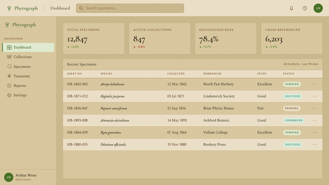
For web interfaces, the style suits dashboards, archives, ingredient libraries, and pricing pages that benefit from a sense of accumulated knowledge. Panels can behave like mounted plates or catalogue leaves, with clear borders, parchment fields, italic taxonomic labels, and restrained pigment accents. Dashboard summaries should feel indexed rather than glossy. On pricing pages, each tier can be framed as a separate entry in a reference volume, while the preferred action receives a controlled madder-red or sap-green emphasis instead of an oversized modern promotional treatment.
Editorial and marketing applications should use the style's authority without turning every surface into costume. Long-form articles benefit from spacious serif text, specimen-led section openings, marginal notes, and captions that distinguish common descriptions from Latin names. Marketing pages can build a narrative from discovery to identification to application, using one plant plate as the recurring visual witness. Product imagery should be integrated as evidence or catalogue material, not pasted over parchment merely to make a contemporary object appear old.
The most common mistake is equating Herbal Pharmacopoeia with generic vintage botanical decoration. Sepia filters, dense floral borders, ornamental scripts, random stains, and bouquets of unrelated plants replace scholarship with nostalgia. The authentic system is slower and more selective: one specimen, precise engraved structure, limited hand-applied color, disciplined naming, and wear that follows material logic. If the page would collapse after its antique texture is removed, its hierarchy was never strong enough.
Herbal Pharmacopoeia — FAQ
Is Herbal Pharmacopoeia simply a vintage botanical style?
No. Vintage botanical styling is a broad decorative category, while Herbal Pharmacopoeia is tied specifically to Western European medicinal herbals, copperplate engraving, hand coloring, Latin binomials, and the classification of single specimens. Its atmosphere follows from a knowledge-making process. A generic floral print may celebrate abundance or beauty; a pharmacopoeial plate isolates a plant so its identity, structure, and medicinal context can be studied.
Why must the background be aged tan rather than bright cream?
Because the ground carries historical and material meaning. Rag-fiber paper and parchment darkened with age, handling, moisture, and interaction with copper-bearing pigments. Bright cream suggests contemporary stationery and removes the visual pressure that makes engraved lines and muted washes feel embedded in an old volume. The tan should still support reading, but it must possess irregular depth, foxing, and a sense of accumulated time.
How should Latin names be used in a contemporary layout?
Latin names should function as identifiers, not as decorative pseudo-scholarship. Set them in an italic humanist serif and place them close to the specimen, caption, or corresponding record. They may introduce a section or distinguish a botanical entry from ordinary prose, but they should not be scattered across unrelated imagery. Their authority depends on consistent placement and a clear relationship to the information being classified.
Can photography replace engraved botanical illustration?
Photography can be incorporated, but it changes the character of the system. Engraving selects and clarifies morphology through line, whereas photography records light, environment, and incidental detail. To remain compatible, a photograph should behave like a specimen record: isolated, carefully cropped, subdued in color, and surrounded by disciplined naming and annotation. If lush scenery or dramatic lighting becomes dominant, the result moves away from pharmacopoeial study toward botanical lifestyle imagery.
Where does Herbal Pharmacopoeia work poorly?
It struggles where speed, technological immediacy, or playful spontaneity is the primary value. The style communicates patience, accumulated authority, close observation, and material age; those qualities may feel heavy in rapid transactional flows or products that depend on energetic novelty. It is strongest when the subject benefits from cataloguing, provenance, ingredients, education, archives, or deliberate comparison. The product should share the style's respect for slow attention.
Related design styles
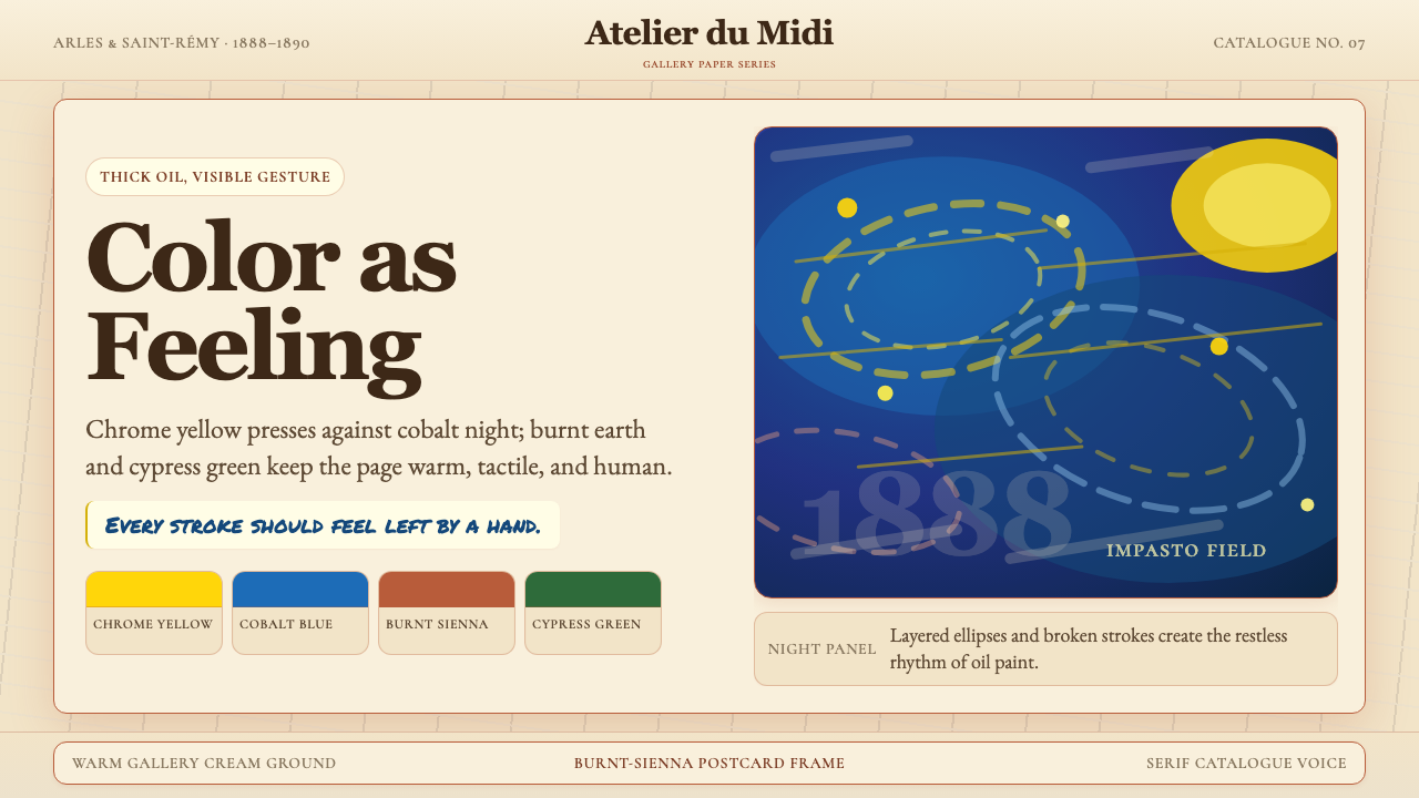 Van Gogh Post-ImpressionistFeeling made visible. Chrome yellow meets cobalt swirls on warm gallery cream.
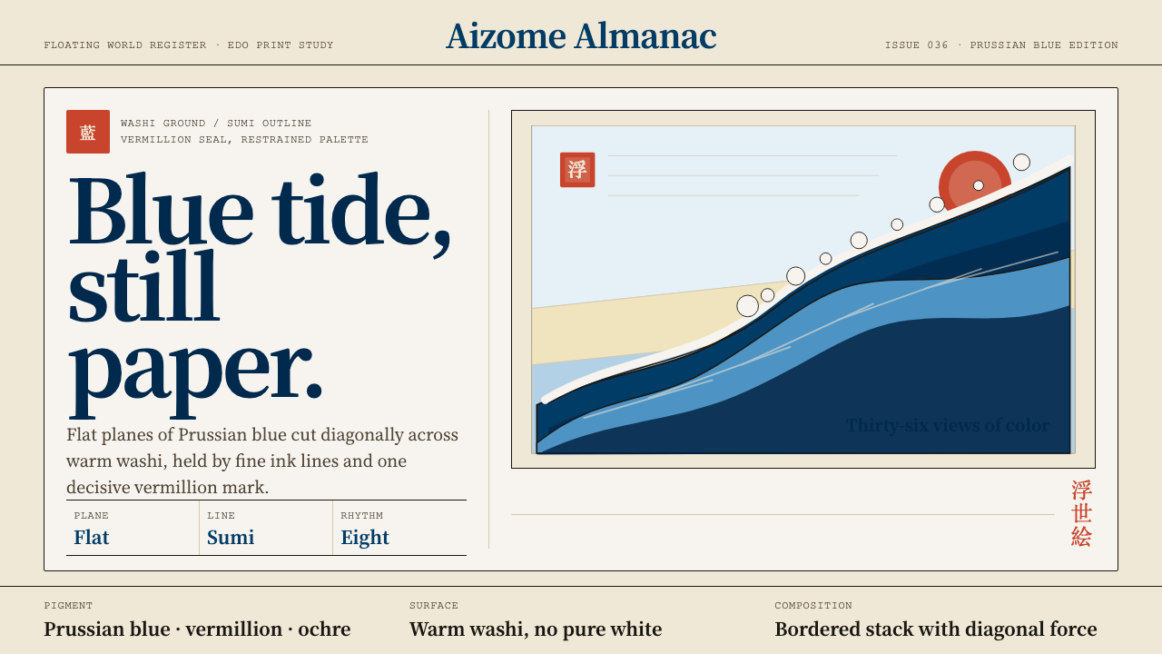 Edo Ukiyo-e (Hokusai)Flat power on paper. Prussian blue diagonals and vermillion seals cut across…
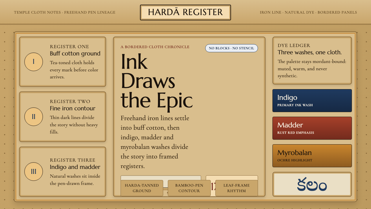 Srikalahasti Kalamkari Pen-WorkHand-drawn cloth storytelling. Buff tan ground, iron lines and indigo-rust pa…
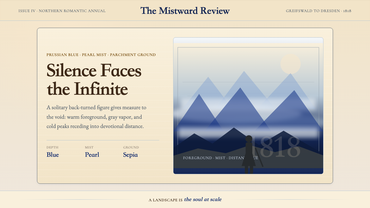 Caspar David FriedrichSilence becomes vast. Prussian blue depth, pearl mist, and parchment framing…
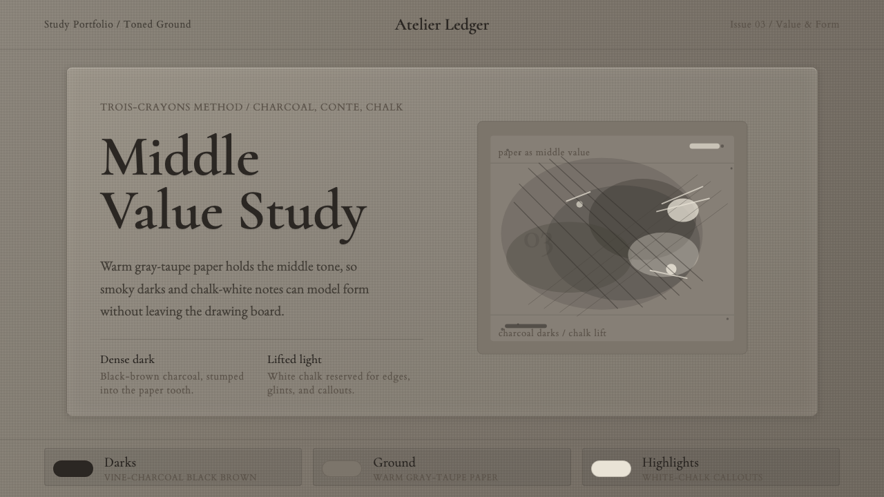 Charcoal & Conté DrawingAtelier calm, in middle value. Gray-taupe tooth, smoky charcoal, and chalk-wh…
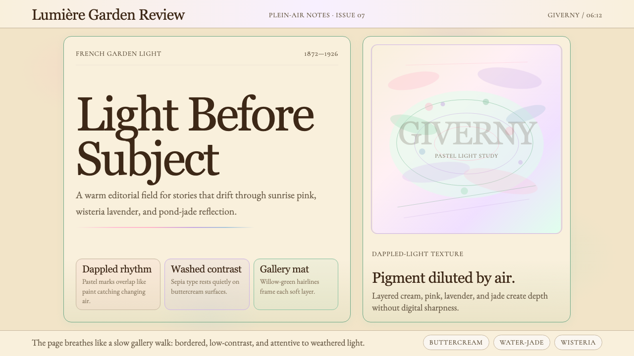 Claude Monet ImpressionistLight becomes the subject. Buttercream, pastel dapples, and Cormorant serif s…