What is Srikalahasti Kalamkari Pen-Work?
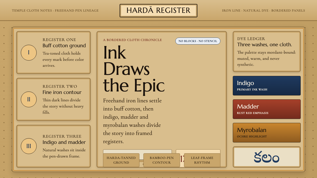
Srikalahasti Kalamkari turns cloth into a hand-drawn epic: iron-dark contours, earthy dye, and mythological scenes unfolding across a warm tea-toned ground.
Srikalahasti Kalamkari Pen-Work in brief
Srikalahasti Kalamkari is a narrative textile tradition from Srikalahasti in Andhra Pradesh, South India. Its defining method is freehand pen-work: artisans draw every contour directly on cotton with a kalam made from bamboo or date-palm material. There are no wood blocks and no stencils mediating the image. The hand remains visible in the line, which may tighten around a face, loosen into a vine, or travel continuously across a crowded episode.
The visual language is built for storytelling. Scenes from the Ramayana and the Mahabharata are arranged within dense borders of leaves and vines, so the image reads both as an individual episode and as part of a larger textile field. Figures, foliage, ornament, and narrative action are connected by the same drawn contour. Nothing feels isolated: a border can frame a scene, fill an empty passage, and carry the eye toward the next event at once.
Its color comes from the dye process as much as from pictorial choice. Fine outlines begin in iron-acetate black, then areas are filled with natural indigo blue, madder-root rust red, and myrobalan yellow. Before dyeing, cotton is soaked in myrobalan and buffalo milk, producing the tradition’s characteristic saturated buff-tan ground. The result is not a clean pale field with color applied on top, but a cloth whose warm base tone binds every line and panel into one material presence.
Where does Srikalahasti Kalamkari Pen-Work come from?
The Srikalahasti pen-work lineage belongs to the temple-cloth Kalamkari tradition of South India and is associated with Srikalahasti, a temple town in Andhra Pradesh. The source tradition is dated to the seventeenth century, while its freehand kalam practice continues into the present. That continuity matters: the style is not simply a historical visual archive, but a living process in which drawing, mordant color, cloth preparation, and narrative composition remain inseparable.
Its identity rests on the distinction between freehand pen-work and mechanically repeated pattern. In Srikalahasti Kalamkari, the artisan does not transfer a pre-made image through a block or stencil. The kalam makes the contour directly, allowing the image to respond to the scale of the cloth and the density of the story. This makes variation part of the tradition rather than a departure from it. Repeated motifs may return, but they return through the hand.
Temple narrative-cloth painters developed a visual field capable of carrying epic material across textile panels. Episodes from the Ramayana and Mahabharata are not treated as detached illustrations. They are woven into a system of borders, vines, figures, and dyed passages, where decorative density gives narrative scenes their enclosure and rhythm. The craft therefore joins literary memory to surface design: story is carried not only by recognizable figures, but also by the route a line takes across the cloth.
The material preparation establishes the visual conditions for this storytelling. Cotton treated with myrobalan and buffalo milk takes on the warm buff-tan tea tone that distinguishes the ground from pale cream. Iron-acetate black creates the drawing framework, while indigo, madder-root red, and myrobalan yellow establish the colored intervals within it. The palette is limited, but it is not sparse. Its richness comes from the contrast between dark line, earth-warm ground, and deeply rooted natural dye.
What defines the Srikalahasti Kalamkari Pen-Work look?
Freehand Contour
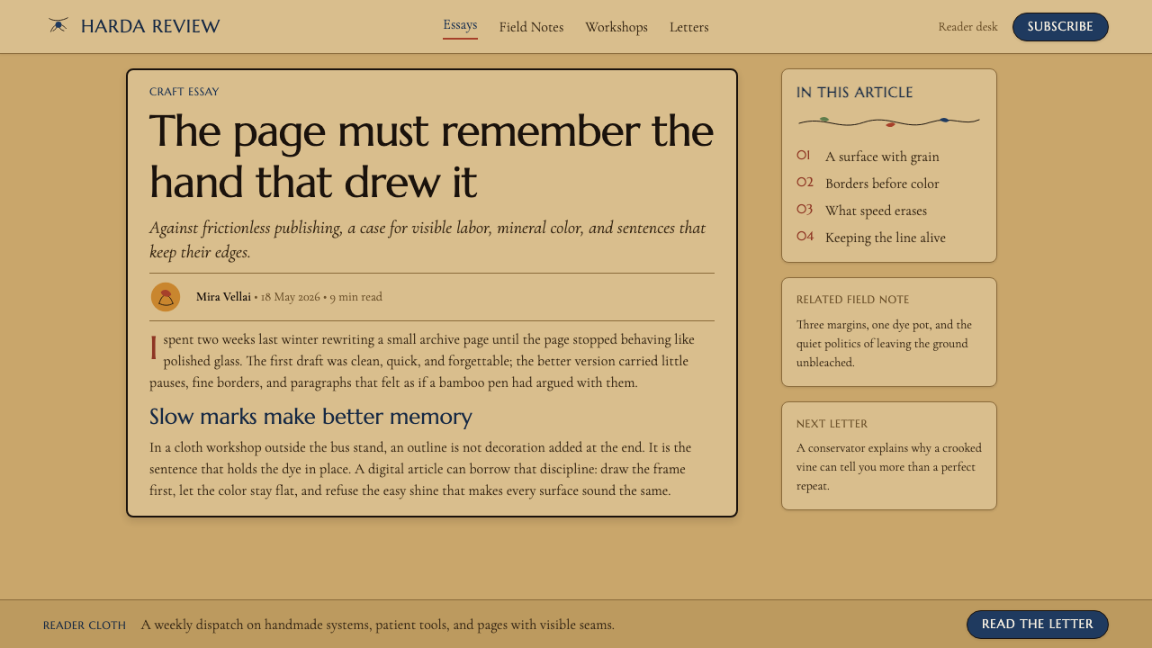
Every image begins with a kalam-drawn contour rather than a transferred repeat. The line is fine, iron-dark, and descriptive: it defines figures, separates dyed areas, and threads through foliage. Because it is laid by hand, it has an alert, living quality. A successful application should preserve that sense of continuous authored motion instead of replacing it with rigidly uniform vector-like outlines.
Buff-Tan Ground
The cotton ground is warm, saturated, and materially present. Prepared with myrobalan and buffalo milk, it reads as a tea-toned buff rather than an empty neutral backdrop. This ground gives dark outlines gravity and lets blue, rust red, and yellow feel embedded in cloth. It should be understood as an active color field, not as blank space waiting to be decorated.
Natural Dye Contrast
Iron-acetate black, indigo blue, madder-root rust red, and myrobalan yellow establish a palette of mineral, plant, and earth associations. The contrast is strong without becoming synthetic or glossy. Dark contour carries definition, indigo creates cool depth, rust red concentrates warmth, and yellow brings lighter emphasis. The palette works best when each color has a narrative or structural role.
Narrative Panels
The style treats the textile as a sequence of story-bearing zones. Panels can hold a scene, but their boundaries are rarely empty or purely mechanical. They are activated by drawn borders and organic motifs, allowing one episode to feel enclosed while still belonging to a wider field. The composition rewards slow looking: the eye moves from contour to figure, figure to border, and border back into story.
Leaf and Vine Borders
Dense leaves and vines are not incidental decoration. They make the margins active, create transitions between scenes, and amplify the hand-drawn character of the surface. Their density can be generous, but it should remain directional. A vine is most convincing when it guides attention around a panel rather than becoming a detachable ornamental filler.
Cloth-Bound Imperfection
The visual system belongs to treated cotton, natural dye, and direct drawing. Its appeal is not polished digital symmetry but the meeting of absorbed color and hand-led detail. Edges can remain expressive, contours can subtly vary, and the surface should retain a sense that it has been made on cloth. Excessive smoothness weakens the tradition’s central evidence: a person drew this story by hand.
Who shaped Srikalahasti Kalamkari Pen-Work?
The artisans of the Srikalahasti pen-work lineage are the essential makers of this tradition. Their role is not limited to applying ornament: they draw the narrative contours freehand, organize figures and borders across cloth, and work through the natural dye vocabulary that gives the textile its characteristic iron-dark, indigo, rust-red, yellow, and buff-tan presence.
Temple narrative-cloth painters represent the storytelling dimension of Kalamkari. Their work brings Ramayana and Mahabharata episodes into textile form, using line, panel, and border as connected narrative devices. They demonstrate that the tradition is not simply pattern-making: the cloth is a surface for sequencing events, sustaining attention, and carrying epic material through image.
The bamboo or date-palm kalam is the instrument that gives Srikalahasti Kalamkari its defining freehand character. It allows the line to be both precise and responsive, moving from facial contour to plant detail to panel boundary without changing the basic language of the surface. In the tradition, the tool is inseparable from the aesthetic: direct drawing is the source of its visual authority.
How do you use Srikalahasti Kalamkari Pen-Work today?
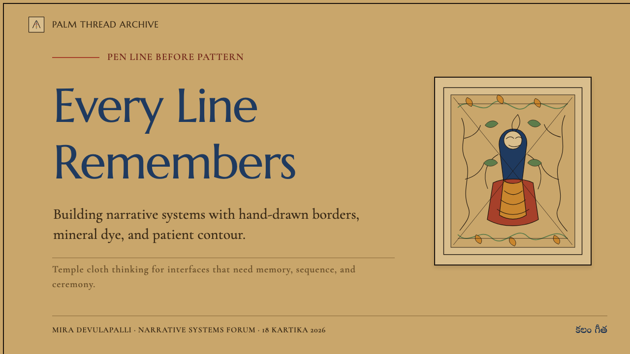
For presentation covers, borrow the tradition’s narrative framing rather than treating it as a generic ethnic pattern. Place a title within a broad buff-tan field, then let a hand-drawn leaf-and-vine border enter from one edge or encircle a single illustrated focal area. Keep the title calm enough that the line work can remain visible. The cover should feel like the opening of a story cloth, not like a background texture with text placed over it.
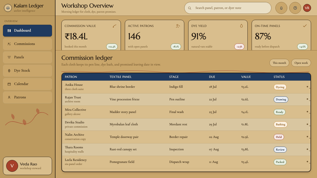
For presentation content and data slides, use panels as an organizational idea. A sequence of topics can occupy adjacent story zones linked by a continuous drawn border, while charts can sit inside clearly bounded areas that echo textile compartments. Use the iron-dark line to establish hierarchy, then reserve indigo, rust red, and yellow for categories requiring distinction. Data should remain legible first; the style contributes through framing, sequence, and material warmth rather than through ornamental density everywhere.
For web interfaces, the approach works best in editorial dashboards, cultural archives, collection browsers, and product pages that benefit from a sense of authored narrative. Let the buff-tan ground provide atmosphere, use dark drawn contours for cards, dividers, and navigation landmarks, and introduce dye colors as meaningful status or content accents. A dense border is more effective around a featured story, collection, or hero area than repeated behind every control. Interactive elements should remain clear enough to preserve usability.
For editorial and marketing work, Srikalahasti Kalamkari can make long-form material feel sequential and tactile. Feature sections can alternate between a large scene-like illustration area and quieter written passages, while vine motifs bridge transitions or mark related chapters. Product storytelling can use the panel logic to reveal a process, an origin, or a collection gradually. The most convincing layouts let imagery and copy participate in the same route across the page instead of assigning decoration to one side and information to the other.
The common mistake is reducing the style to a busy floral border plus a small palette of earthy colors. That removes its most important quality: freehand narrative drawing on prepared cloth. Avoid sterile symmetry, generic repeated motifs, shiny synthetic color treatment, and borders that do not guide attention anywhere. A stronger interpretation begins with one story-bearing focal scene, uses line to connect its parts, and lets the warm ground and restrained natural-dye contrast carry the rest.
Srikalahasti Kalamkari Pen-Work — FAQ
Is Srikalahasti Kalamkari the same as block-printed Kalamkari?
No. The defining feature of the Srikalahasti tradition in this source material is freehand pen-work. Artisans use a bamboo or date-palm kalam to draw contours directly on cloth, without wood blocks or stencils. That direct method gives the work its fluid line, individual variation, and narrative responsiveness.
Why is the ground buff-tan rather than pale cream?
The cotton is soaked in myrobalan and buffalo milk before dyeing. This preparation gives the cloth a warm, saturated tea-toned buff character. The ground is therefore part of the craft process and the dye environment, not a neutral background chosen after the image has been designed.
What stories appear in Srikalahasti Kalamkari?
The tradition narrates episodes from the Ramayana and the Mahabharata. These scenes are carried across panels surrounded by dense leaf-and-vine borders, so narrative action and decorative framing work together. The textile can be read through figures and episodes, but also through the visual route established by line and border.
How should contemporary designers use this style respectfully?
Begin with the craft logic: direct hand-drawn contour, prepared cotton ground, natural-dye contrast, and storytelling through panels and borders. Do not detach a vine motif from the system and treat it as interchangeable decoration. If a project cannot preserve the sense of narrative, material warmth, and authored line, it is better to use a quieter reference than to imitate the surface density alone.
Related design styles
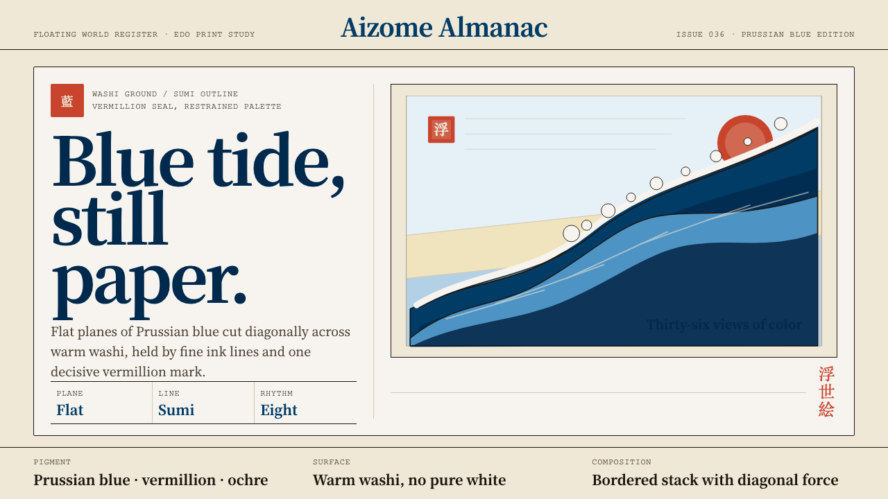 Edo Ukiyo-e (Hokusai)Flat power on paper. Prussian blue diagonals and vermillion seals cut across…
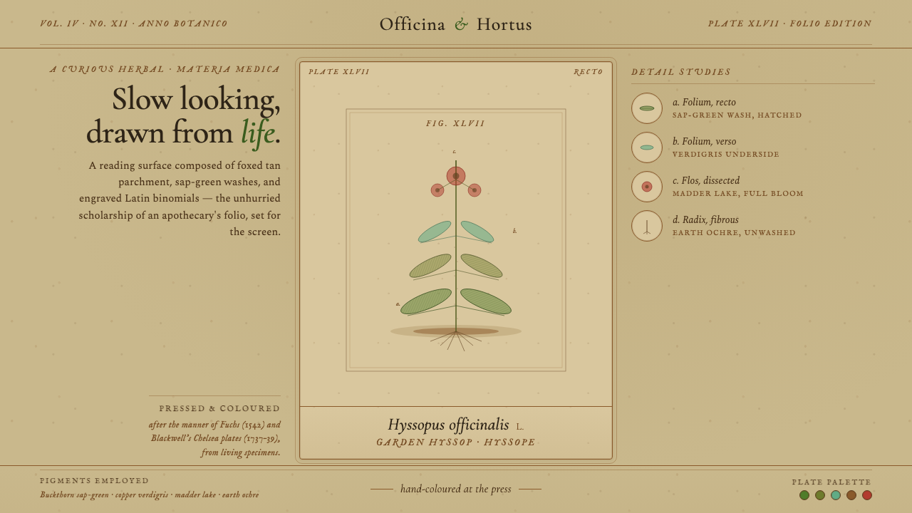 Herbal PharmacopoeiaSlow scholarship of the apothecary folio. Foxed tan parchment, sap-green wash…
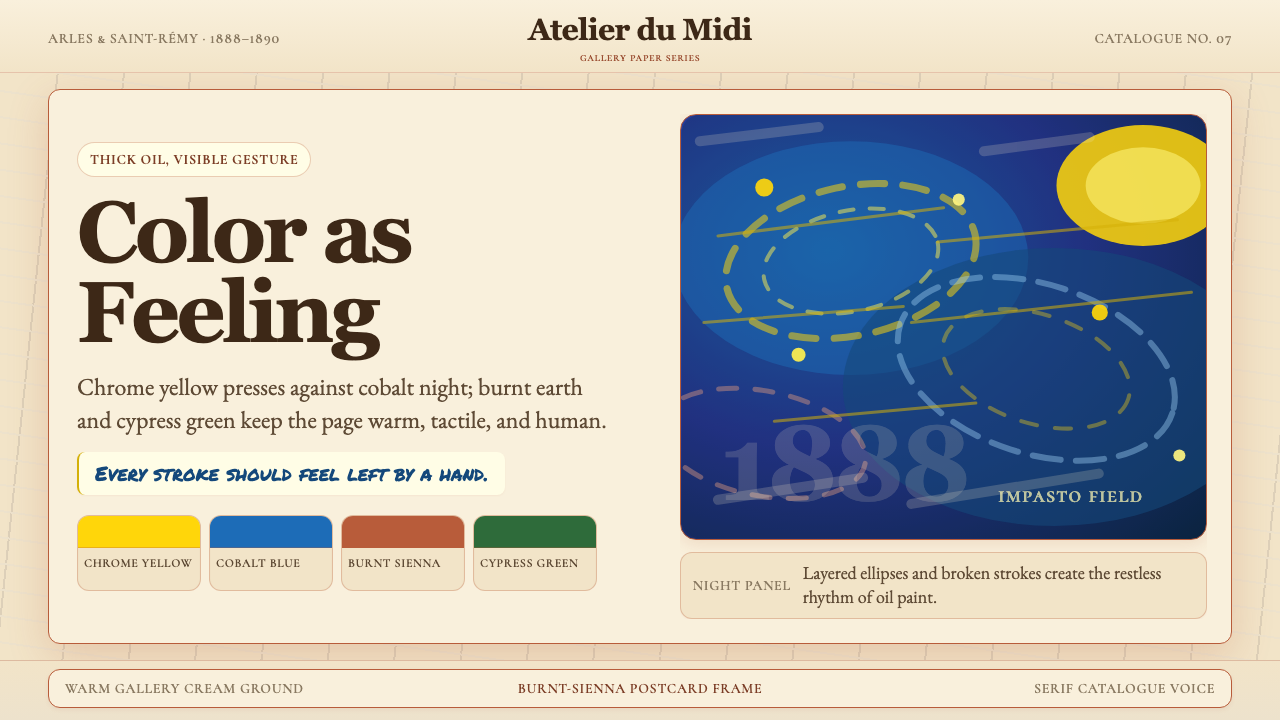 Van Gogh Post-ImpressionistFeeling made visible. Chrome yellow meets cobalt swirls on warm gallery cream.
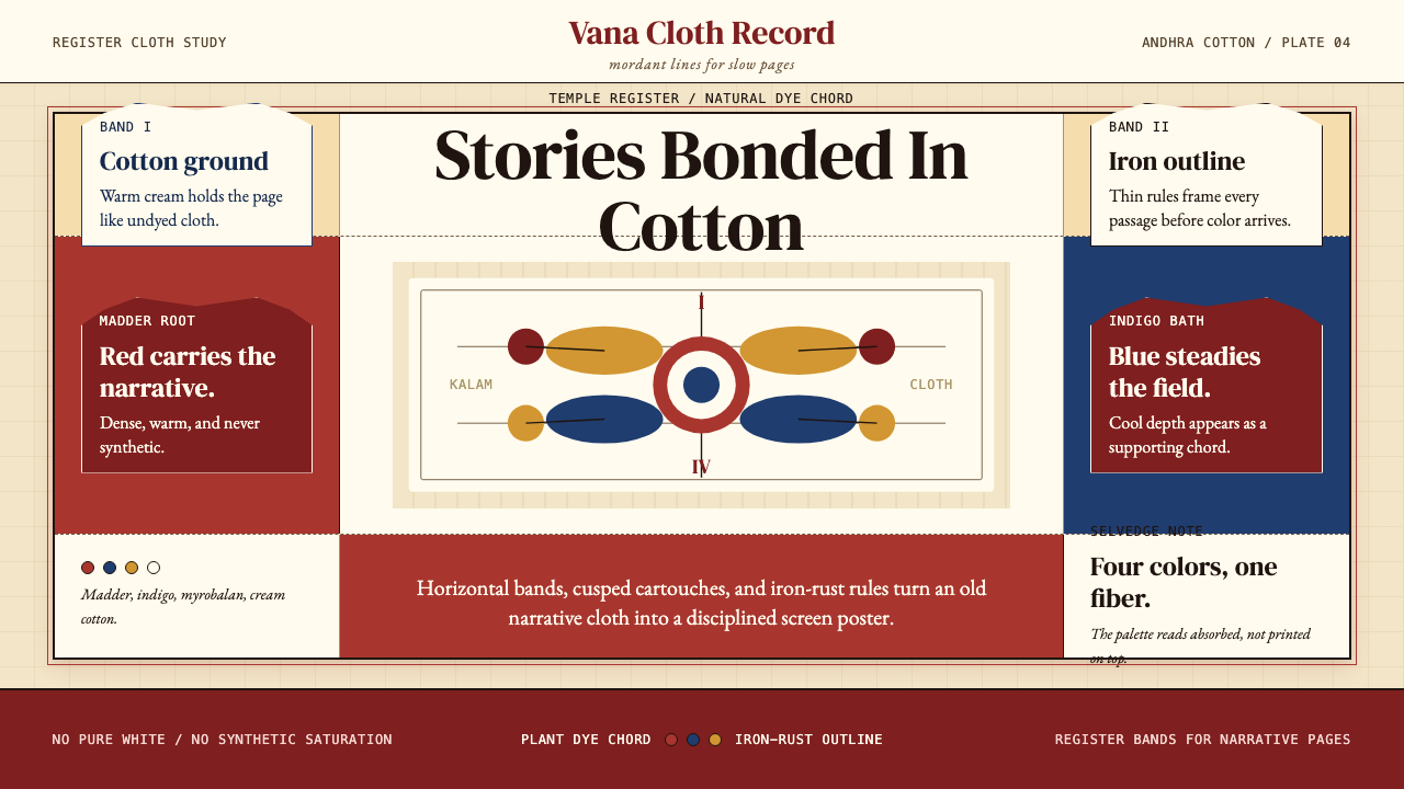 Kalamkari (Andhra Pradesh)Cloth becomes narrative. Madder bands, indigo panels, and iron rules stack li…
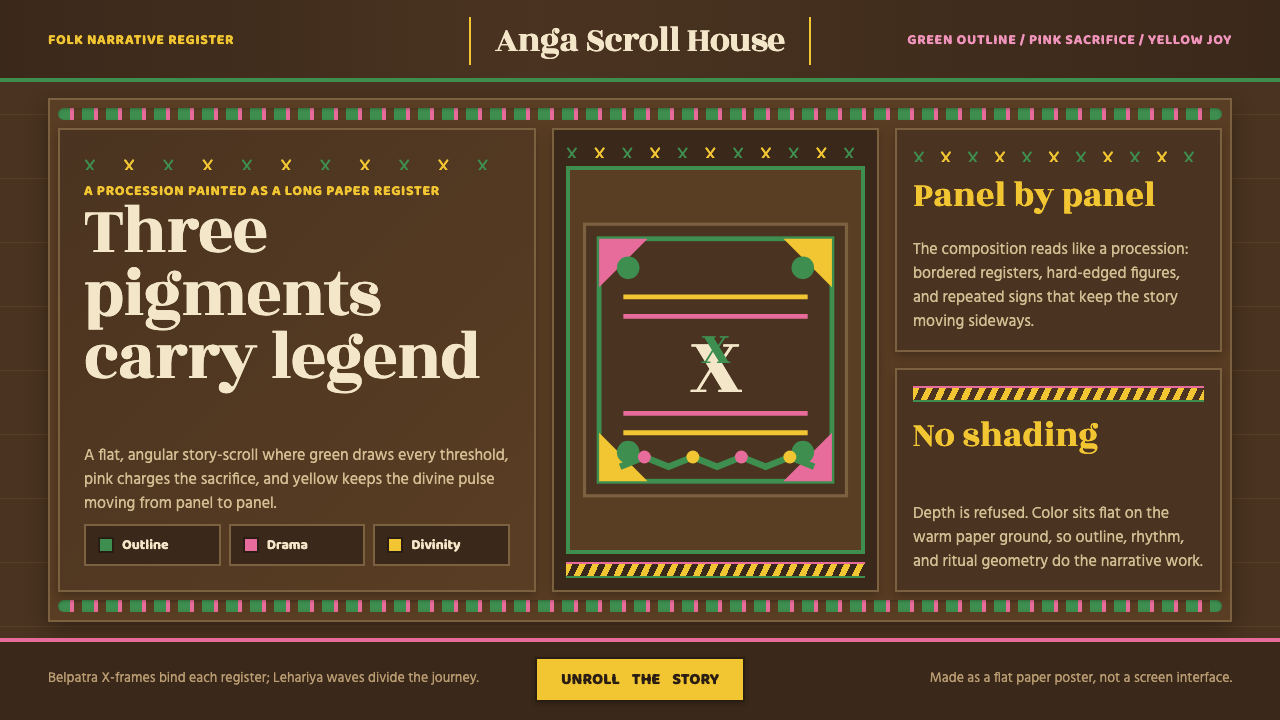 Manjusha Anga Snake-ScrollLegend moves in three pigments. Green outline, pink drama, yellow divinity on…
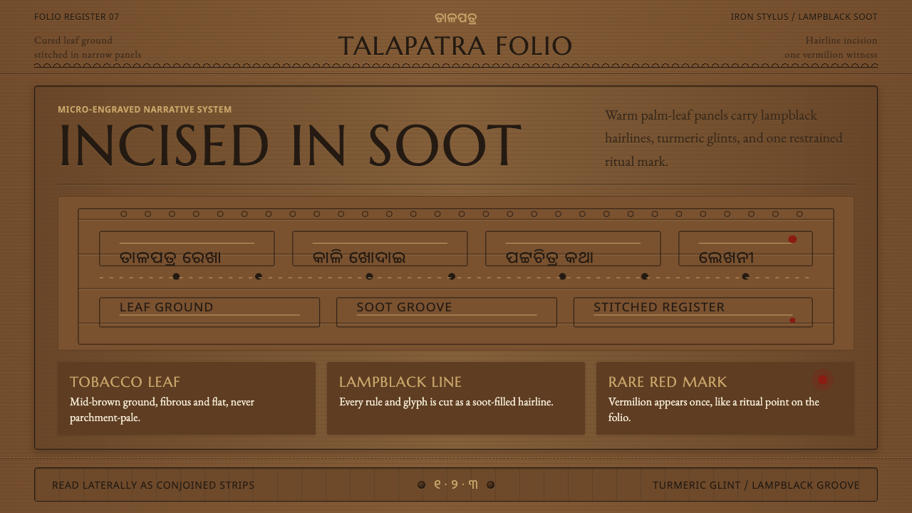 Odisha Palm-Leaf EtchingSacred narrative goes microscopic. Lampblack hairlines cut tobacco-brown leaf…