What is Svaneti Repoussé Icon?
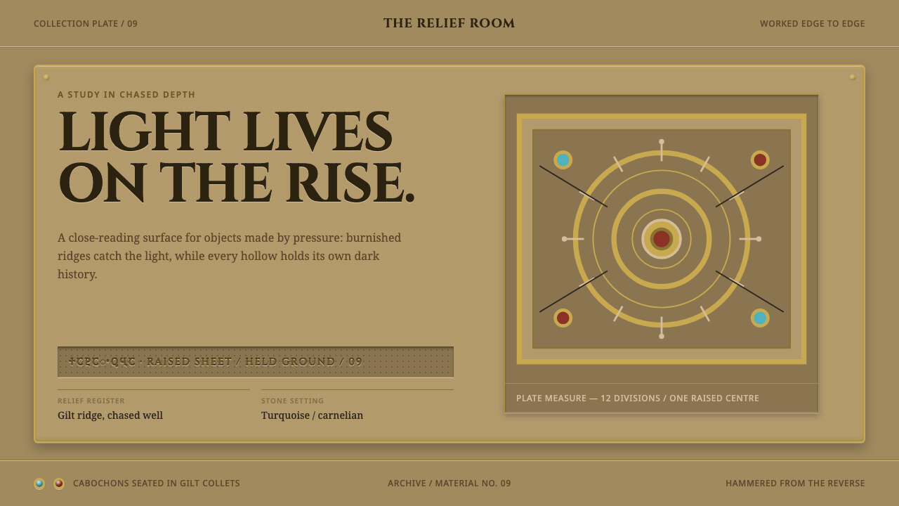
In the stone-tower villages of Upper Svaneti, icons were wrapped in hammered, gilded silver, and the beauty of the result lies in its depth: a golden ground whose darkness is hidden in the hollows of the relief.
Svaneti Repoussé Icon in brief
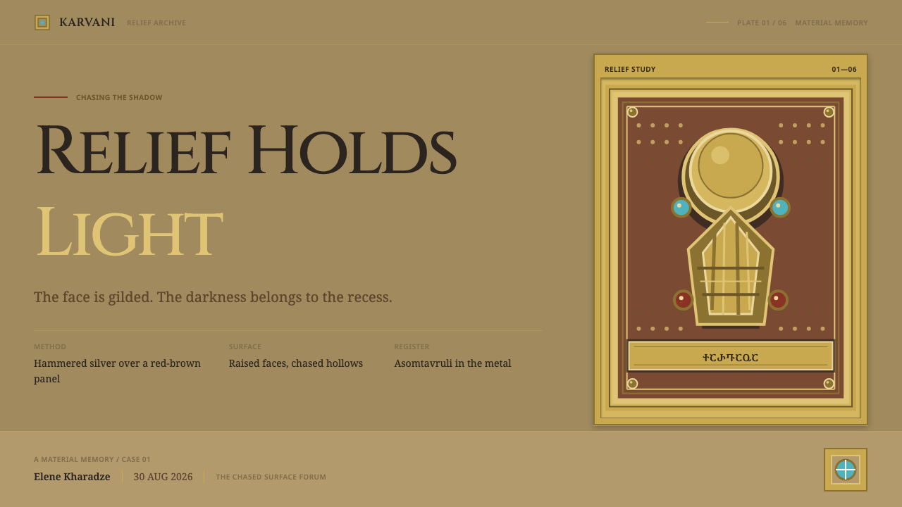
The Svaneti Repoussé Icon style is a design system drawn from the metal-clad icons of Upper Svaneti, a high mountain region of Georgia. In these objects a painted icon was sheathed in hammered silver: a sheet worked from behind into high relief, gilded, and nailed over a red-brown wooden panel. Small turquoise and carnelian cabochons were set into the plate, and an inscription in the monumental asomtavruli script was chased across its surface.
What distinguishes the style is how it uses depth. In most decorative traditions ornament is something laid onto a surface: a pattern, a border, a colour. Here the relief is the ornament. Figures, halos, borders and lettering all rise from the plate, and the interest of the object comes from the way light catches the raised forms and falls away in the recesses between them. The Svan chasers pushed that relief unusually deep.
For a designer, the practical consequence is a reversal of the usual logic of dark surfaces. The ground of this style is never dark. It is the warm, rubbed tone of silver-gilt, handled and polished over centuries. The darkness lives in the recesses, in the channels and hollows that frame each raised form. It is a style where shadow is not an effect added to a layout but a place that the layout has built.
Where does Svaneti Repoussé Icon come from?
Upper Svaneti is a valley region in the Caucasus mountains of Georgia, known for villages of tall stone towers. In those villages, painted icons were not simply hung up to be looked at; they were wrapped. The tradition belongs to Georgian metalwork from the early medieval period through the late medieval one, roughly the ninth to the fifteenth century, and the practice continued into the modern era. The source places the main centres at Mestia and at the church of Lagurka in the village of Kala.
The valley churches served as vaults, and that function explains the survival of the objects. Because the region was remote and its churches served as strongrooms, the icons were kept safe in a place where comparable pieces elsewhere were far more exposed. What survives in Upper Svaneti is the largest body of early medieval icons outside the Monastery of St Catherine on Sinai. For a student of the medium, the valley is therefore a rare place where the full range of a metalworking tradition can still be examined in the setting it was made for.
The technique is repoussé revetment. A silver sheet is hammered from behind to push the design forward, then worked from the front by chasing, a method of refining and defining the surface with tools. The sheet is gilded and fixed to the wooden panel with nails, which become part of the border treatment. Gems are set into the plate, and an inscription is chased across it. The Svan deep-relief chasing school is distinguished by how far it takes the process: the figures stand out more strongly from the plate, and the hollows around them are deeper than in most other Georgian work.
The inscription is a part of the design rather than a caption. Asomtavruli is the monumental lettering of Georgia, a script of rounded, upright and geometric capitals that is closely tied to church and monument. Inscriptions of this kind commonly identify the holy figure or the person who commissioned the work, and on these plates they are chased with the same seriousness as the images. The source names three lines of makers: the Gvazavaisdze brothers, the master of the Shaliani repoussé Crucifixion, and the anonymous chasers of the paired Archangel icons of Lagurka and Mestia. That mixture of named families, a known masterpiece and anonymous hands is typical of medieval metalwork.
What defines the Svaneti Repoussé Icon look?
Rubbed Silver-Gilt Ground
The base colour of the page is a warm, soft gilt, closer to old silver-gilt than to bright yellow. It carries the memory of handling: slight softening at the high points, a faint cooler silvery cast where the gilding has thinned. It should look like metal that has been touched by many hands, not like a shiny new coat of gold paint. The ground is luminous, never dark.
Depth as the Ornament
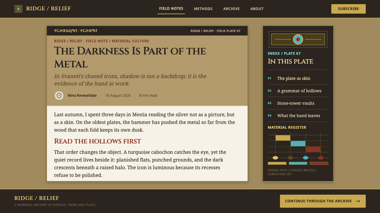
Raised forms and recessed channels do the work that pattern does elsewhere. Frames, panels, buttons and headings read as parts of one hammered plate, standing out from it or sunk into it. Layout becomes a matter of choosing what rises and what recedes, and visual interest comes from that relationship, not from adding more decoration. A few strong planes beat many fussy ones.
Darkness in the Recesses
Shadow is confined to the hollows: a deep, warm brown that gathers in the channels around raised forms and under their edges. It is never spread across the ground and never used as a general dark background. This gives each element a clear, sculpted edge. The shadow is a structural feature, as it is on the metal, where it is simply what the relief leaves behind.
Chased Lines and Punched Texture
Fine incised lines define outlines, drapery folds and borders, and small punched marks can fill backgrounds with a quiet glitter. These details are precise but small, a counterweight to the bold relief. In a layout they suggest hairline rules, thin engraved-looking borders and subtle fine texture used only in limited areas, never as an overall pattern across the page.
Cabochon Settings
Turquoise and carnelian appear as small domed stones, each in a simple collar of metal. Blue-green and orange-red are the only chromatic accents, and they are scattered with restraint at corners, crossings and focal points. The stones are polished and smooth, not faceted. In a layout, a handful of small coloured dots or lozenges can serve as status markers, indicators or points of emphasis.
Monumental Inscription
Lettering is large, upright and geometric, taken from the asomtavruli tradition of rounded capitals, and it is treated as architecture rather than as running text. An inscription runs as a band across a plate or frame, a single line of capitals with generous spacing. Headings in this style should feel carved or chased, short and weighty, with everything else subordinate to them.
The Panel Beneath
The metal is nailed onto a red-brown wooden panel, and the panel shows at the margins as a quiet rim of warm earth colour. The nail heads form a regular beaded border. This second material gives the design a frame and a grounded, earthy counterpoint to the glow of the gilt, and it reminds the viewer that the shining plate is an object with a body.
Who shaped Svaneti Repoussé Icon?
The brothers are among the named craftsmen the source points to in the Svan tradition. Their names are among the few that survive from a field in which most chasers remained anonymous, as the Archangel icons show. They represent the family-workshop character of the craft, and they remind a designer that a style with a strong collective idiom still depends on the hands of individuals.
This maker is known by a single work, the Shaliani repoussé Crucifixion, rather than by name. The piece stands for the highest ambition of the Svan school: a figural scene pushed into deep relief so that bodies and drapery appear to stand out of the plate. In the design it is the reference point for the principle that depth is the ornament.
Two Archangel icons, one connected with the church of Lagurka at Kala and one with Mestia, form a pair whose makers remain anonymous. Their significance for the style is consistency: two plates, held in different places, share a recognisable handling of relief and line. They model the discipline of a design system, in which separate pieces look related because they follow the same rules about depth, edge and ornament.
How do you use Svaneti Repoussé Icon today?
Svaneti Repoussé Icon is a rich, warm and sculptural style that works where an object, a heritage or a craft is the subject. Its ideas, a luminous gilt ground, depth as ornament, shadow in the recesses and a few precious accents, can be applied well beyond religious imagery. The key is to treat it as the language of a hand-worked object: slow, deliberate and substantial.
For presentation slides, a cover can be one large gilt plate with a deeply inset title, a thin chased border and two or three small jewel-coloured dots at the corners. Content slides can be treated as panels, each a raised form set into the gilt ground with a visible shadowed channel around it. Data slides work best when charts are kept simple and sit inside a framed, relief-edged panel, with the single key value marked by a turquoise or carnelian accent.
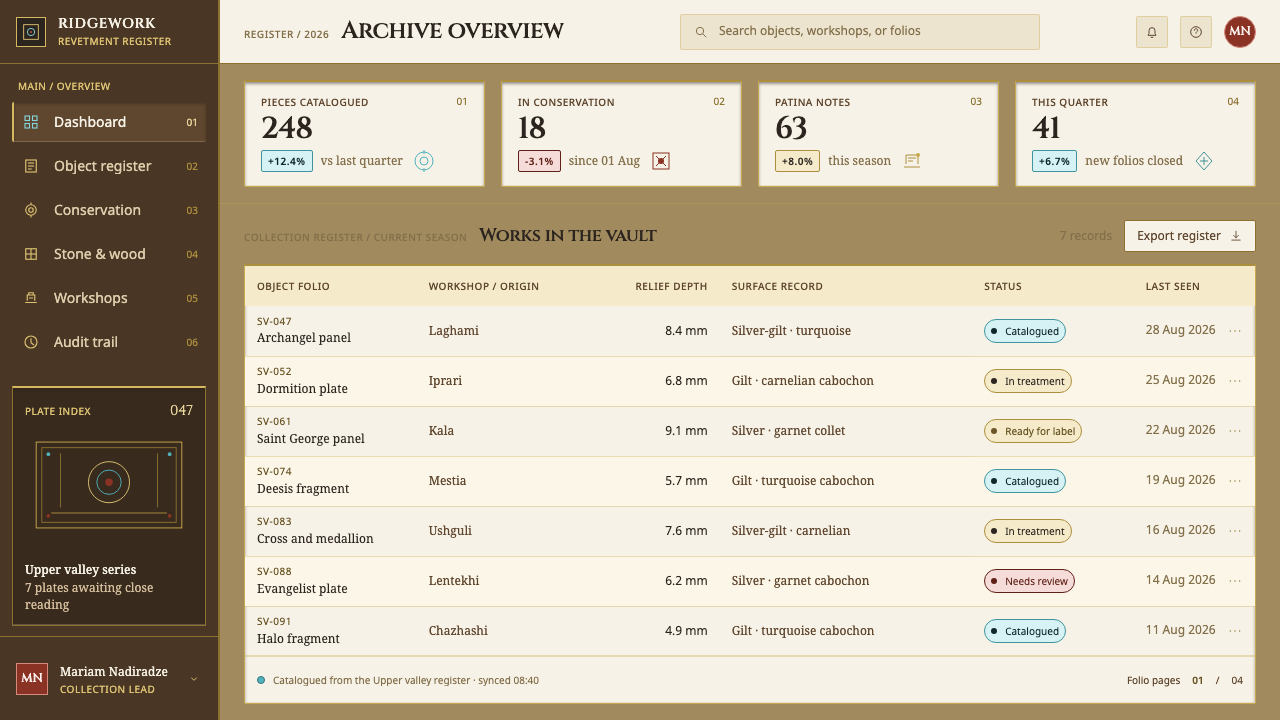
For web interfaces, the style suits heritage brands, museums and archives, jewellery and craft e-commerce, hospitality, wedding and cultural sites, and storytelling pages. Use raised cards with soft, tightly bounded recesses, headings in short capital lines, and small gem-coloured badges for state. Keep text areas calm and flat, so that reading is never competing with relief, and use the sculpted effects at the edges of components rather than behind running text.
For editorial and marketing work, the style supports feature articles on craft, religion, art history, travel and architecture, as well as premium product pages. A chapter opener might use a chased band of capital letters; pull quotes might sit in a raised plate. Marketing should lean on material richness, close detail and slow pacing rather than on speed and urgency, with a single gem-coloured call to action.
The most common mistake is to read it as a generic gold luxury theme. Bright yellow gradients, mirror-like chrome highlights and floodlit glow destroy the worn silver-gilt character. A second mistake is to place the shadow across the ground, which turns the whole page dark and removes the reversal that makes the style distinctive. A third is overusing jewels or relief, so that every element competes for attention; a few strong planes and a few precious stones are enough.
Svaneti Repoussé Icon — FAQ
What are repoussé and chasing, and how do they translate to screen design?
Repoussé is the technique of hammering a metal sheet from behind so that the design rises on the front. Chasing is the finishing work done from the front with tools, which sharpens outlines and adds fine detail. On a screen, the first idea becomes layered surfaces that appear to rise from or sink into a single plate, and the second becomes fine lines and small texture applied sparingly to define edges. Both are done with restraint so that the result feels sculpted, not busy.
Is this just a gold luxury theme?
No. Generic luxury styling relies on bright, glossy gold with smooth gradients and shine. This style works with a worn, soft silver-gilt, keeps its shadows inside the recesses and uses precious colour sparingly. It values the look of a hand-worked object that has been handled for centuries, which is quieter and more tactile than the typical gold theme. The depth comes from structure, not from sparkle.
Why does the shadow sit in the recesses instead of across the background?
Because that is where it falls on the original object. In deep relief, the darkest areas are the hollows between and around the raised forms, while the high points catch the light. Keeping shadow inside those hollows leaves the ground luminous and makes every raised element read as a form with edges. Spreading shadow across the background would turn the plate into a dark surface and lose the reversal of expectations that gives the style its character.
Do I need Georgian lettering to use the style?
No. The idea behind asomtavruli is monumental lettering: large, upright, rounded capitals set as an architectural band. In other scripts, a similar effect comes from simple, geometric capitals with generous spacing and a heavy, carved feel, used for short headings. Using Georgian text is a legitimate choice for projects connected to Georgia, but the style does not require it.
Where does the Svaneti Repoussé Icon style struggle?
It struggles in dense, utilitarian interfaces such as admin tools and data-heavy dashboards, where relief and recessed channels take space and attention away from the content. It is also hard to use for small text, since texture and shadow can reduce legibility. It performs best at larger scales and in contexts where the object, the heritage or the craft is itself the subject of the page.
Related design styles
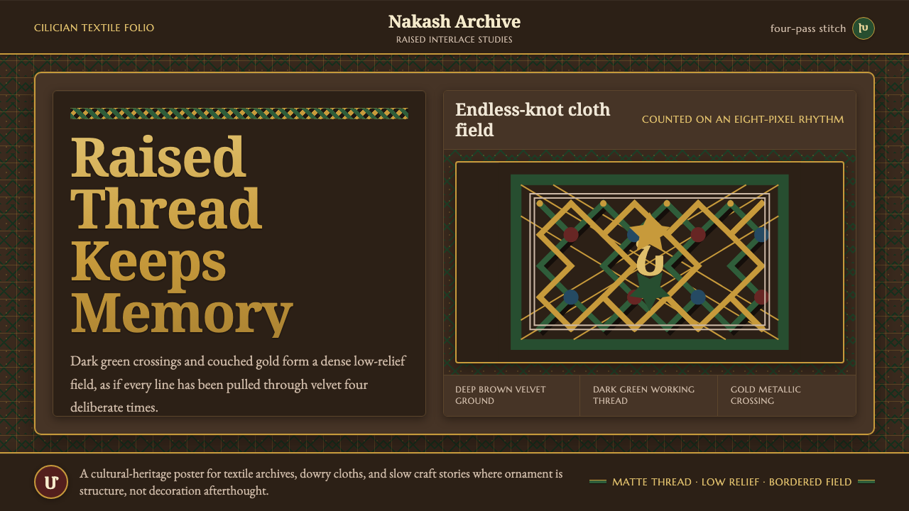 Armenian Marash Interlace EmbroideryDense memory in raised thread. Green-gold interlace locks over deep brown clo…
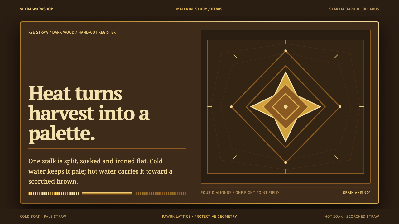 Belarusian SolomkaOne harvest, a tonal ladder. Straw diamonds turn pale gold to scorched brown…
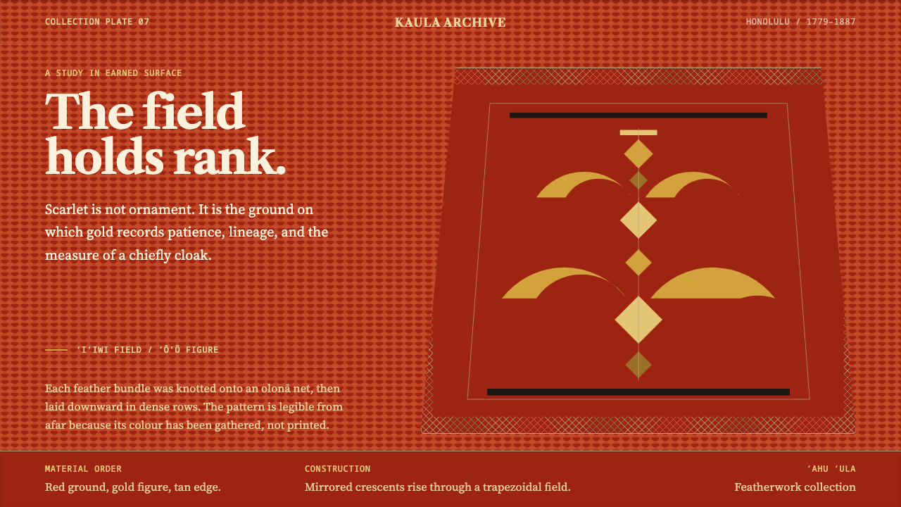 Hawaiian ʻAhu ʻula FeatherworkRank becomes a field. Scarlet nap carries sparing gold crescents in a mirrore…
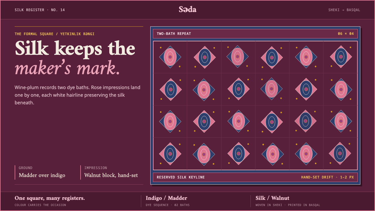 Kelaghayi Silk ScarfFormality keeps the maker’s mark. Rose blocks drift across wine-plum silk in…
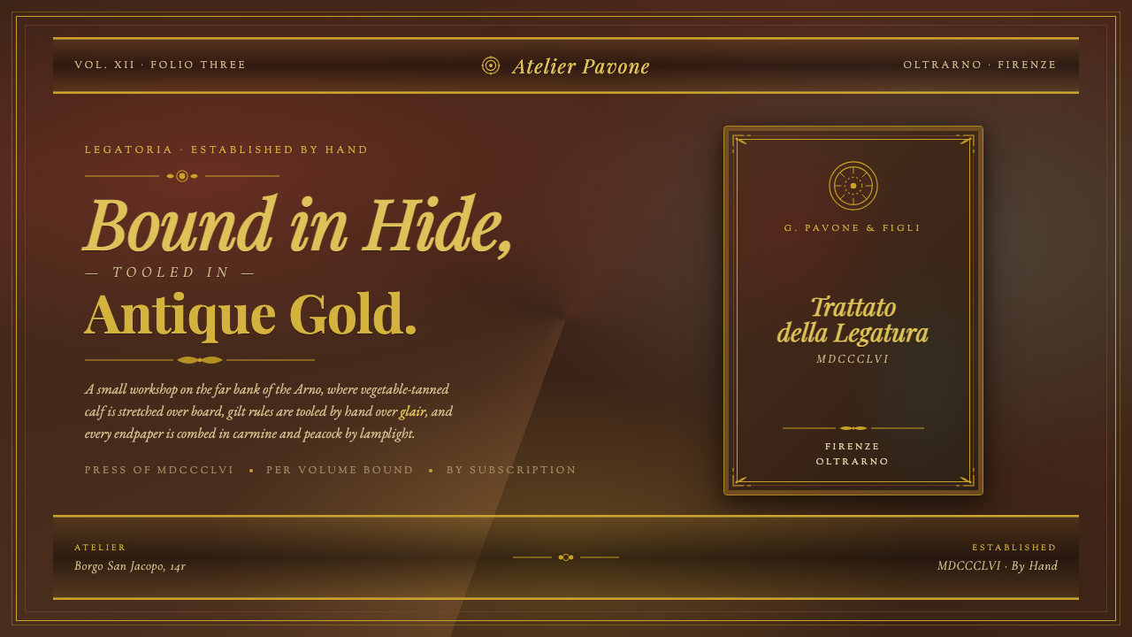 Florentine Leather BinderyRenaissance craft as luxury. Tanned hide, antique gold tooling, carmine-and-p…
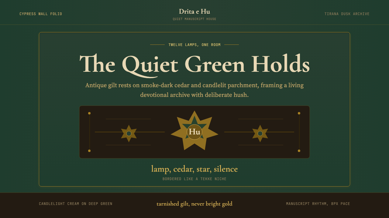 Albanian Bektashi Sufi (Tekke)Sacred quiet in cypress green. Gilt stars and Cormorant type frame a dusk tek…