What is Kelaghayi Silk Scarf?
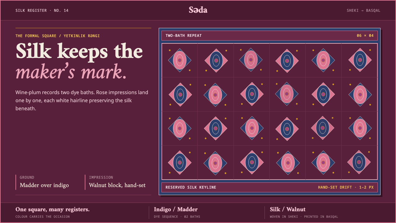
A kelaghayi is a square of gossamer silk stamped by hand with wax-resist blocks — and its wine-plum ground, rose-pink buta and unpainted white outlines turn a social code into a design language.
Kelaghayi Silk Scarf in brief
The kelaghayi is an Azerbaijani silk scarf: a single square of very fine, almost transparent silk, reeled and woven in Sheki and printed in Basqal with hand-cut walnut blocks. As a design style it names a particular kind of surface — a deep wine-plum field carrying rows of rose-pink paisley forms, each one outlined in the bare white of the unpainted silk — and a particular attitude, in which the traces of handwork are kept rather than corrected.
The visual logic comes straight from the process. Wax resist is stamped onto the cloth, the cloth goes into a dye bath, the wax protects whatever it covers, and the next dye reaches only what was left exposed. Because every colour is the residue of a protected area, pattern and ground are made of the same decisions. Nothing is drawn on top; shapes are simply what the dye was not allowed to touch. That is why the finished cloth reads as layered, tonal and faintly mineral, rather than as a picture laid over a background.
In Curio's reading the style is formal rather than festive. The plum ground belongs to the adult register of the scarf's colour code, so the mood is composed, warm and a little solemn. Rose and white lift off the dark field gently, without neon brightness or glossy contrast, and the overall impression is closer to a quiet evening room than to a bazaar. A design system built on it prints that field from edge to edge and leaves the maker's mark visible on every surface.
Where does Kelaghayi Silk Scarf come from?
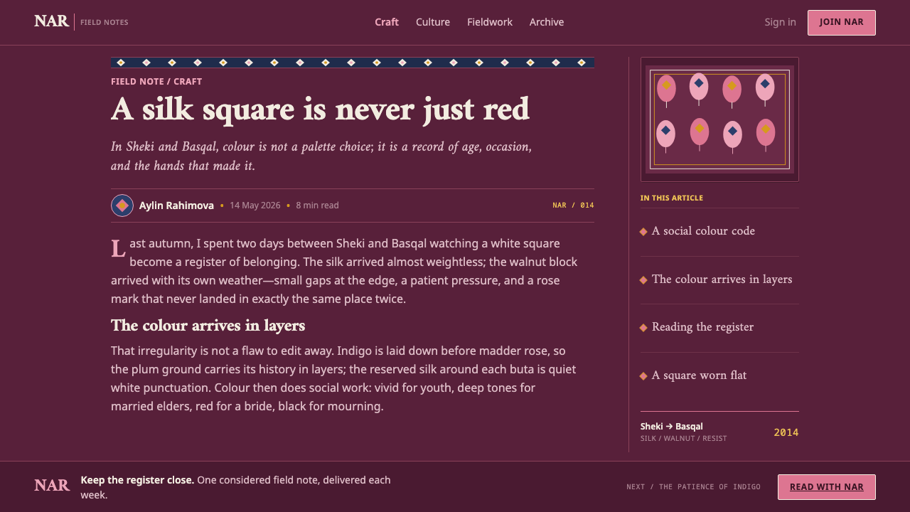
Kelaghayi is a two-town craft. Raw silk is reeled and woven into gossamer squares in Sheki, where the reference material points to a tradition of silk-reeling houses. The cloth is then carried to Basqal, in the Ismayilli district, where the printing happens — the stage that gives the scarf its identity. This split matters for design, because it explains the two textures of the style: the cloth itself is smooth, light and anonymous, while the printed layer on top of it is rough-edged, local and unmistakably made by a person.
The source material records no famous individuals for this craft, only trades. Basqal's qalibchi are the block-cutters who carve each pattern into walnut; Basqal's basmachi are the printers who stamp the wax resist onto the silk one impression at a time; and the Sheki reeling houses supply the silk that makes all of it possible. Authorship here belongs to workshops rather than to named masters, and that collective, handed-down quality is part of the style's feel. It also explains why the repeat pattern is never mechanical: each stamp is a separate act by a separate hand.
The colour sequence is the heart of the technique. The first resist is stamped and the cloth goes into indigo; the oval shapes that were kept clear are then sealed a second time; and finally the whole piece is overdyed in madder rose. Blue under red does not produce a true red. It produces a sunk wine-plum, and the protected buta forms come out of that plum in rose-pink, outlined by silk that never took any dye at all. The ground is therefore not a palette decision but the accumulated result of dyeing in order, which is why it looks deep rather than flat.
Colour in the kelaghayi tradition is a social code more than a matter of taste: bright tones for the young, dark tones for married elders, red for brides and black for mourning. The plum-ground scarf sits in the adult, formal register. The source places the tradition at 'pre-1900 to present', a loose lower bound that claims no single founding date, and notes that UNESCO inscribed the craft on its list of Intangible Cultural Heritage in 2014. The style also sits within two wider families — Caucasian resist-dye textiles and the buta (boteh) motif, the teardrop-and-flame form better known abroad as paisley.
What defines the Kelaghayi Silk Scarf look?
Wine-plum field
The ground is a sunk, dark plum rather than a pure red or purple, the natural result of madder rose dyed over indigo. It is the style's anchor: warm enough to feel human, dark enough to feel formal. Because it comes from layered dye, it carries small tonal variations rather than one perfectly even tone, and a good interpretation keeps a trace of that depth instead of flattening it into a single swatch.
Rose-pink buta
The motif is the buta, the teardrop or flame form that sits in the paisley family, rendered in a soft rose against the plum. It is repeated in rows but never reads as wallpaper, because each impression is slightly different from the next. The motif is the one place the style allows warmth to rise, and it should do so quietly: rose, not pink-neon, and never competing with the ground for attention.
Reserve outlines
Every contour line is the bare white of unpainted silk, a line made of absence rather than ink. The outline is therefore soft-edged and slightly irregular, with none of the crispness of a vector stroke. In design terms, this is a thin, warm off-white line separating shape from ground, not a pure white and not a black keyline, and it works because the wax resist sealed that line away from every dye bath.
Handwork kept visible
Wooden blocks drift out of true and ink bleeds slightly at the edge of a stamp. The source is explicit that these imperfections are what separate the cloth from a printed reproduction and should not be cleaned up. For interface and layout work this means soft misregistration, slightly uneven spacing in repeated elements, and edges that are allowed to feel pressed rather than plotted.
Gossamer translucency
The cloth is thin enough to let light through, and that quality shapes the whole mood: soft, airy and calm, even on a dark ground. The style avoids hard black and heavy contrast, preferring layered tones that feel as though light were passing through silk. Surfaces should feel light in weight even when their colour is dark, which is the opposite of a heavy, opaque luxury look.
Edge-to-edge printing
The pattern field runs to the borders of the square rather than sitting inside a margin, and the composition is built from the repetition of individual stamps rather than from one large drawn picture. The style therefore suits layouts that treat the whole surface as the canvas, with content set on top in calm, generous blocks, and with the pattern behaving as a ground, not a decorative frame.
Colour as social code
Bright for the young, dark for married elders, red for brides, black for mourning: in this tradition colour tells you who someone is and what the occasion is. Carrying that into design means choosing hue with intention. The plum register signals maturity and formality, so a candy-bright or pure black reinterpretation changes the meaning of the style, not only its look.
Who shaped Kelaghayi Silk Scarf?
The qalibchi are the block-cutters of Basqal, who carve each motif by hand into walnut. Their work defines the vocabulary of the whole craft, since every repeat, border and buta shape begins as a carved block. For designers, the lesson is that the pattern library of this style is physical and finite: a small set of cut shapes combined in many ways, not an infinite generative texture.
The basmachi are the printers who stamp the wax resist onto silk, one impression at a time. They are the reason the pattern has rhythm and drift: the hand pressing the block decides the spacing, the pressure and the small misalignments. The style's refusal to tidy those traces is a tribute to this trade as much as an aesthetic preference.
The reeling houses of Sheki supply the silk itself, reeled into thread fine enough to be woven into gossamer squares. They sit at the beginning of the chain and are the reason the cloth is as light as it is. In the style, their contribution shows up as the quiet, translucent, unforced softness of the ground rather than as any visible mark.
In 2014 the craft was inscribed on UNESCO's list of Intangible Cultural Heritage. The listing matters to design practice as a reminder of context: this is a living craft practised by real workshops, not a free pattern pack. Using the style well means crediting its origin and treating its motifs and colour meanings with the care due to heritage.
How do you use Kelaghayi Silk Scarf today?
The kelaghayi style rewards restraint. Its strength is a single deep field with one warm accent, a soft outline and a visible hand, and it works best when the layout adds as little as possible on top of that. Treat the plum ground as the surface of the work, the rose-pink as a rare accent, and the unpainted-silk white as the line and text colour, and let the rest be silence.
For presentation slides, a cover works well as an almost full-bleed plum field with a single band of buta pattern along one edge and the title set in warm off-white. Content slides should stay calm: generous margins, one or two text levels, and the pattern reduced to a small corner mark or a narrow divider rather than repeated across every page. Data slides suit a limited range of rose, warm white and a lighter plum tint against the dark ground; avoid rainbow series, which break the colour code the style depends on.
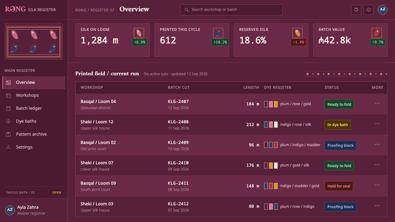
For web interfaces, the style is well suited to dark dashboards, account areas and premium or heritage-oriented products. Cards can sit as slightly lighter plum surfaces with fine warm-white outlines, with interactive states shown in rose. Pricing pages benefit from a single highlighted tier in rose while the others stay tonal. Keep type calm and legible, with generous line spacing, and use the buta motif as a header band or empty-state illustration rather than as a repeating background behind body text.
For editorial and marketing work, the style gives a tone of quiet craft and cultural depth, suited to stories about makers, travel, fashion, food, textiles and heritage. A hero image can be framed by a narrow patterned border, and long articles can use the pattern as a section break. Campaign material benefits from showing the process itself — blocks, wax, dye — since the style's credibility comes from how the cloth is made.
The most common mistake is to clean the style up. Vectorising the motif into perfectly even rows, sharpening the outlines to hairline precision or smoothing out the tonal variation of the ground strips away exactly what the source says should be kept. The second mistake is to brighten the palette into candy tones or swap the ground for black, which changes the meaning of the colour code rather than just the mood. The third is to run the pattern under body text, where it competes with reading.
Kelaghayi Silk Scarf — FAQ
What exactly is a kelaghayi?
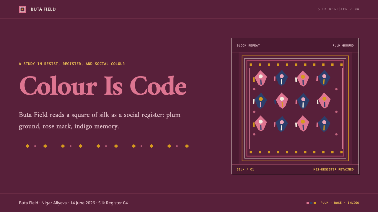
It is an Azerbaijani silk scarf made from one square of very fine silk, woven in Sheki and block-printed in Basqal with a wax resist. The pattern is created by protecting parts of the cloth from dye rather than by painting on it. As a Curio design style, it refers to the look of that cloth: a dark wine-plum ground, rose-pink buta motifs, white reserve outlines and a visible hand-printed quality.
Why is the ground plum instead of red?
Because of the dye order. The cloth is dyed indigo first, with the motif areas protected by wax, and then overdyed in madder rose. Red over blue sinks into a dark wine-plum rather than a clean red, and the protected forms come out in rose-pink. In the colour code of the tradition, red belongs to brides, so a plum ground reads as the adult, formal register instead.
Is the buta motif the same as paisley?
They belong to the same family of teardrop-and-flame forms found in many textile traditions. Buta (also written boteh) is the local name in this setting. The Curio style does not use paisley as a generic decoration; it draws on the specific Basqal version, with rose-pink forms stamped from walnut blocks and outlined in unpainted silk white.
Should I keep the imperfections in an interface?
Yes, within reason. The source treats drift in the blocks and slight bleed of the ink as the quality that separates this cloth from a printed reproduction, and it advises against cleaning them away. In practice that means allowing soft edges, mild irregularity in repeated motifs and a hand-pressed feel in decorative elements, while keeping text, controls and spacing fully legible and consistent.
Can the style work on a light background?
The style is defined by its dark plum field, and the source marks it as a dark system. A light variant is possible by letting the unpainted-silk white become the ground and using plum and rose as the ink, but it then becomes a different register of the same craft. The faithful version keeps the deep ground, the soft rose accent and the white as line colour.
Related design styles
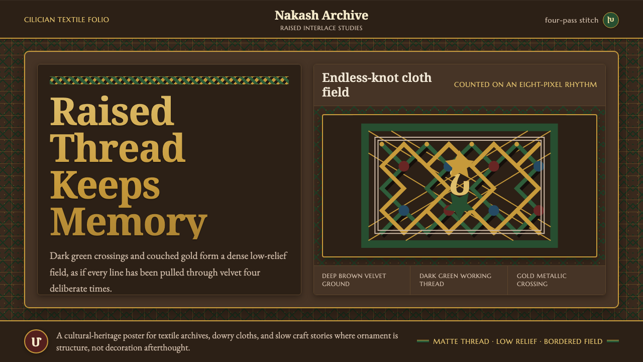 Armenian Marash Interlace EmbroideryDense memory in raised thread. Green-gold interlace locks over deep brown clo…
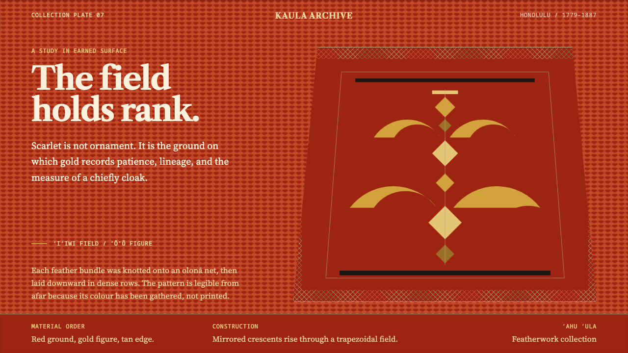 Hawaiian ʻAhu ʻula FeatherworkRank becomes a field. Scarlet nap carries sparing gold crescents in a mirrore…
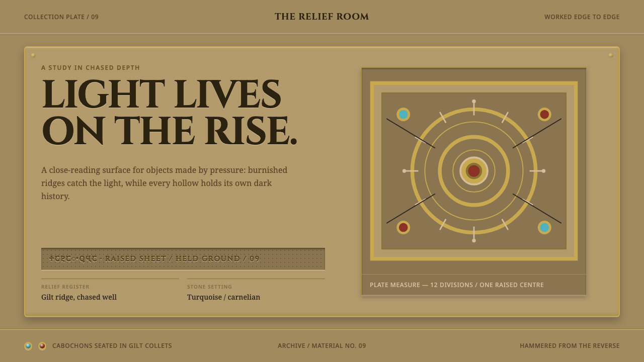 Svaneti Repousse IconDepth is the ornament. Gilt relief, chased shadows, and small turquoise-carne…
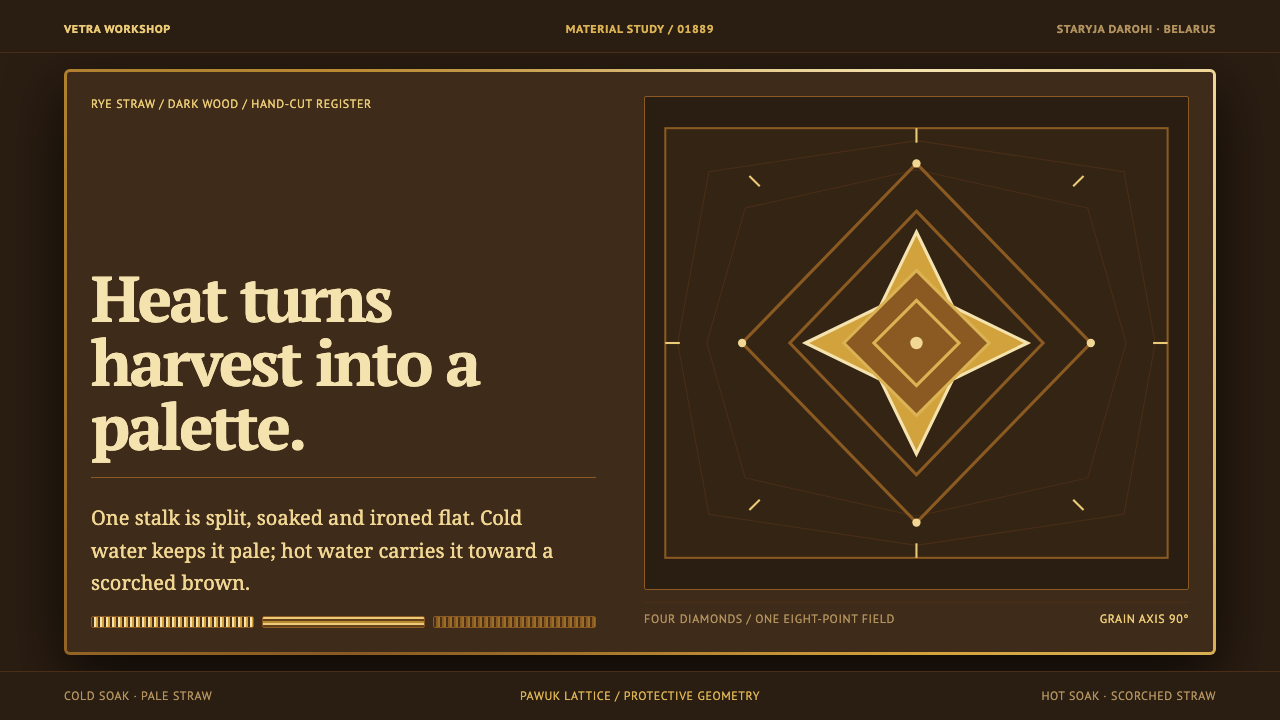 Belarusian SolomkaOne harvest, a tonal ladder. Straw diamonds turn pale gold to scorched brown…
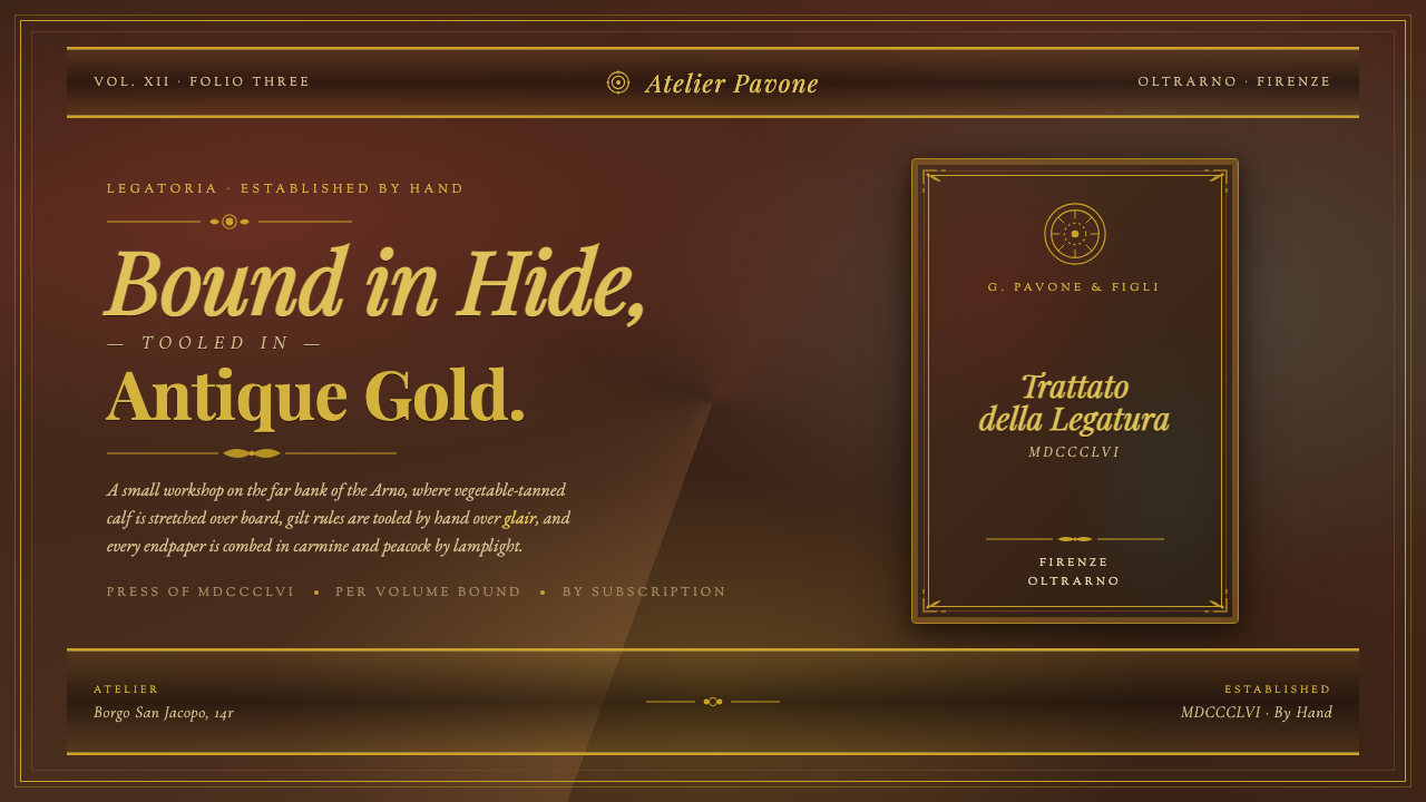 Florentine Leather BinderyRenaissance craft as luxury. Tanned hide, antique gold tooling, carmine-and-p…
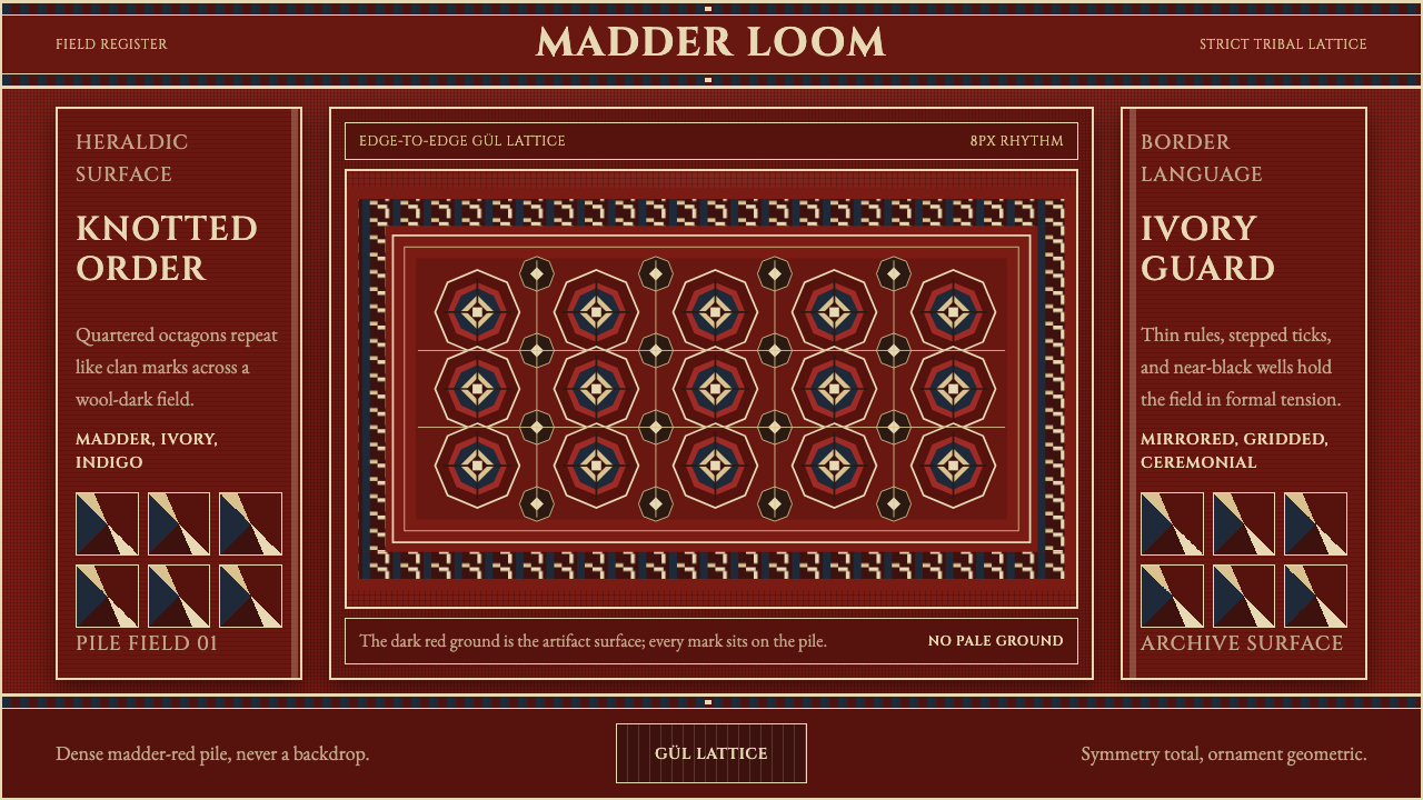 Turkmen Bukhara RugHeraldic and earthbound. Madder red, ivory hairlines, and octagonal güls lock…