What is Surviving Mars?
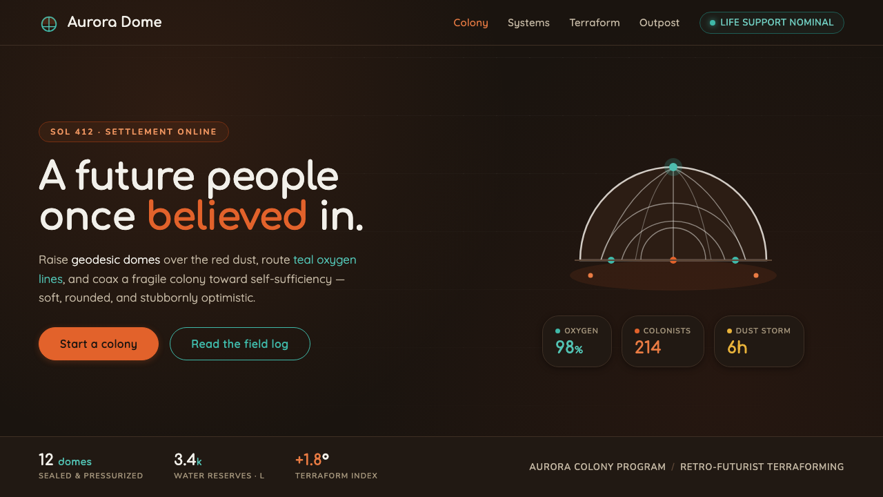
Surviving Mars turns the red planet into a gentle promise: white geodesic domes and teal life-support lines glowing through rust-orange night.
Surviving Mars in brief
Surviving Mars is the visual language of Haemimont Games and Paradox Interactive’s 2018 colony-building simulation, shaped by a retro-futurist vision of terraforming the red planet. Its emotional reference point is not a bleak, industrial Mars but the bright optimism of 1960s science fiction: a future imagined as orderly, humane, technologically capable, and worth building. White geodesic domes stand against deep Martian night, while teal systems and rust-orange dust give the world both precision and warmth.
The design system translates that fiction into a compact visual grammar. Rounded forms replace hard corners. Dome-grid geometry suggests shelter, engineering, and collective life. Pill buttons and softened panels make complex systems feel approachable rather than militarized. White is the color of habitat and possibility; teal belongs to life support, energy, and functioning infrastructure; rust orange carries the material presence of Mars. The result is dark, but never hopeless.
Its defining tension is between hostile environment and generous interface. The background belongs to the cold immensity of space and the red planet, while the foreground is organized around friendly, legible objects. Nothing needs to look aggressive to feel advanced. The aesthetic imagines technology as a partner in survival: calm, rounded, luminous, and confident enough to make an alien world feel inhabitable.
Where does Surviving Mars come from?
The immediate source is Surviving Mars, released in 2018 as a colony-building sim by Haemimont Games and Paradox Interactive. Its subject is terraforming and settlement: people arrive on Mars and must make life possible inside an environment that is visually defined by darkness, dust, distance, and exposure. The design language therefore begins with a clear environmental opposition. The planet is rust orange and severe; the human answer is white, organized, illuminated, and domed.
The deeper lineage comes from 1960s retro-futurist optimism. That period’s imagined future treated technology as an instrument of collective improvement rather than a symbol of collapse. Its visual world favored rounded machinery, bright habitats, clean surfaces, and forms that promised safety through intelligent construction. Surviving Mars carries that optimism into a planetary-scale setting. The future is not pristine because the environment is pristine; it is hopeful because people build systems capable of sustaining life within difficulty.
Mid-century rounded modernism provides the formal bridge between optimism and interface behavior. A rounded shape feels less defensive than a sharp one and more compatible with the idea of a habitat designed for living. The geodesic dome is especially important because it combines geometry with protection: its pattern is visibly engineered, while its overall silhouette remains calm and sheltering. In this system, geometry is never merely decorative. It explains how a fragile human settlement can hold together.
Colony and terraforming science fiction completes the conceptual frame. The interface is not presenting an abstract technology showcase; it is describing a living network of habitats, support lines, and managed resources on another world. That is why teal functions as more than an accent color. It is the visual evidence that the colony is alive and connected. White domes express habitation, teal expresses continuity, and rust orange keeps every achievement tied to the reality of Mars.
What defines the Surviving Mars look?
Dark Martian Ground
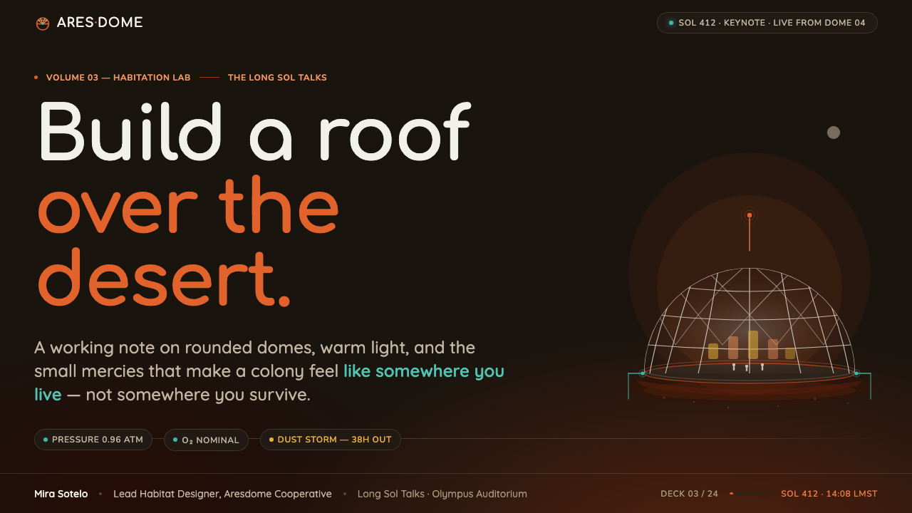
The foundation is a deep, nearly lightless field that evokes Martian night and outer space. It gives the interface immediate atmospheric depth without relying on visual clutter. Against this ground, white habitat forms and teal system lines become signals of human presence. Darkness is not used to create menace; it creates the distance that makes every illuminated structure feel purposeful. The background should remain quiet, allowing the colony’s life-support network to read as a constellation of functioning decisions.
White Habitat Forms
White is reserved for the objects that make life possible: domes, shelters, vessels, and other primary forms of human habitation. It reads as clean, protective, and optimistic against the dark ground. White surfaces should feel solid but not heavy, with rounded silhouettes that soften the technological subject matter. The visual impression is architectural rather than ornamental: each bright form suggests a place where people can gather, rest, work, and remain alive.
Teal Life Lines
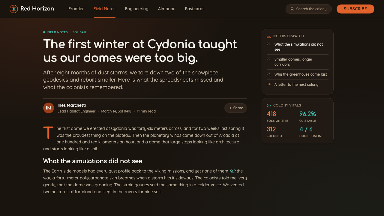
Teal marks the systems that keep the colony functioning. It belongs to life-support lines, connections, status signals, and the visible flow of infrastructure. Because it sits between blue and green, it feels technological without becoming sterile, and alive without becoming organic. Use it as a concentrated signal rather than a wash across the whole interface. A teal line crossing the dark field should feel like proof of continuity: a quiet indication that air, energy, or communication is still moving.
Dome-Grid Geometry
The geodesic dome supplies the system’s most recognizable geometry. Its repeated structural pattern communicates engineering, enclosure, and efficient use of space while retaining a friendly overall silhouette. Grid lines may appear as framework, map overlays, panel divisions, or subtle internal patterning. They should support the sense of a colony assembled from dependable modules. The geometry is rounded at the level of the whole object, even when the internal pattern is precise and technical.
Rounded Confidence
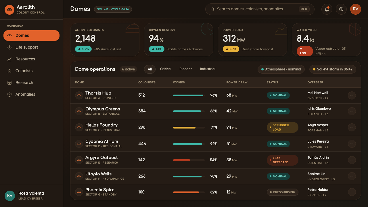
Nothing in the visual language needs a sharp corner to appear capable. Rounded containers, softened cards, circular indicators, and pill-shaped controls create a sense of technological confidence without aggression. This softness is not decorative sweetness; it is a statement about the relationship between people and machines. The system imagines advanced infrastructure as something designed around human comfort. Components should therefore feel approachable at first glance and dependable after interaction.
Rust-Orange Material Warmth
Rust orange keeps the design connected to the physical planet. It evokes regolith dust, exposed ground, and the warm material presence of Mars. Within a dark interface, it prevents the white and teal system from becoming too immaculate or abstract. Rust orange works best as environmental context, a surface cue, or a measured accent that reminds the viewer what the colony is overcoming. It gives the future a temperature: hopeful, inhabited, and still touched by dust.
Who shaped Surviving Mars?
Haemimont Games is the studio behind the 2018 colony-building simulation that provides the immediate source for this design language. Its Mars setting establishes the system’s central visual problem: how to make survival infrastructure feel humane, legible, and hopeful within a hostile environment. The studio’s association with Surviving Mars anchors the rounded domes, teal support lines, and rust-orange atmosphere in a world of settlement and terraforming rather than abstract science fiction.
Paradox Interactive is the publisher associated with Surviving Mars and helps place the work within a broader tradition of systems-driven strategy and simulation. In this visual interpretation, that systems quality appears through connected infrastructure, readable status signals, and modular settlement forms. The design does not treat the colony as a static illustration. It presents habitation as an organized, functioning network whose visual clarity supports the idea that a future can be planned, maintained, and shared.
The 1960s retro-futurist lineage supplies the emotional tone. Its future is bright, rounded, and socially constructive, with technology imagined as a means of extending human possibility. In the Surviving Mars vocabulary, that optimism appears in white domes, clean interfaces, and the refusal to make advanced systems look threatening. The aesthetic is nostalgic without becoming historical costume. It remembers an earlier belief in progress and relocates that belief onto the surface of Mars.
Colony and terraforming science fiction gives the style its narrative purpose. The dome is not simply a futuristic icon; it is a practical response to an uninhabitable world. Teal lines are not merely luminous decoration; they represent the continuity of systems that sustain settlement. Rust-orange ground is not a background texture without meaning; it is the environment that makes the human-made structures necessary. Together, these elements turn visual identity into a compact story about making a home elsewhere.
How do you use Surviving Mars today?
For presentation slides, use the aesthetic to establish a clear contrast between environmental darkness and human-made hope. Cover slides can place a luminous white dome or rounded habitat form against a deep Martian field, with the title treated as a calm, confident signal rather than a dramatic announcement. Content slides should organize information inside softened panels and connected modules. Data slides benefit from teal system lines, white structural marks, and rust-orange environmental accents, so charts feel like colony instruments rather than generic business graphics.
For web interfaces, the style is especially effective for dashboards, management tools, and pricing pages that need to make complex systems feel approachable. Keep the overall field dark and let white establish primary surfaces, while teal indicates active connections, healthy states, or available paths through the system. Use rounded cards and pill controls to reduce friction. Pricing tiers can read as habitat modules, with white for the dependable base, teal for connected capability, and rust orange for context or emphasis. The visual hierarchy should feel engineered but never severe.
For editorial and marketing work, Surviving Mars supports a strong narrative of optimistic infrastructure. Articles can pair large atmospheric openings with concise technical sections, using dome-like containers or curved diagrams to separate ideas. Marketing pages can alternate between dark planetary fields and bright habitat-focused blocks, allowing each transition to feel like movement from hostile environment toward human control. Product claims should remain concrete and legible, while the palette and rounded forms supply the emotional promise of a future that welcomes people in.
A common mistake is to interpret the style as generic space futurism and fill every surface with glowing lines, neon color, or decorative technology. That weakens the central idea. The system depends on restraint: white should remain associated with habitation, teal with functioning life-support infrastructure, and rust orange with the planet itself. Another mistake is making rounded shapes childish or inflated. The forms need to be soft, but they also need the confidence of engineered objects. Friendliness comes from proportion, clarity, and purpose.
The style also works best when its optimism remains grounded in difficulty. If the background becomes bright, the domes lose their sense of refuge; if teal is used everywhere, it stops reading as a life signal; if rust orange becomes a loud brand color, Mars disappears into decoration. Begin with the environmental contrast, establish the habitat as the primary human form, then let the supporting colors explain what is alive, connected, and being built.
Surviving Mars — FAQ
Is Surviving Mars a dark sci-fi style?
It uses a dark setting, but its emotional character is optimistic rather than dystopian. The deep Martian background represents distance and environmental difficulty, while white domes and teal support lines show that people are building a viable future within that darkness. The style becomes less effective when it leans into menace, decay, or militarized technology. Its defining mood is hopeful engineering: advanced systems made calm, legible, and suitable for human life.
Why are white, teal, and rust orange so important?
Each color has a different narrative responsibility. White belongs to the human habitat and expresses cleanliness, shelter, and possibility. Teal identifies life-support systems, connections, and ongoing operation. Rust orange anchors the design in Martian ground and dust, preventing the future from becoming abstract or overly immaculate. The palette works because it separates human structure, living infrastructure, and planetary environment instead of treating color as surface decoration.
Can this style work on a light background?
It can, but the dark Martian ground is important to the identity because it creates the contrast that makes the habitats feel luminous and protective. A light variant should preserve the same relationships through other means: white forms need clear separation, teal must remain a focused system signal, and rust orange should still refer to the planet rather than become a general accent. Without environmental contrast, the design may retain rounded shapes but lose the feeling of building a home in a difficult world.
What makes the rounded forms feel futuristic rather than playful?
The answer is structural context. Rounded forms should belong to a visible system of domes, grids, support lines, and habitat modules. Their softness must be balanced by consistent geometry and clear function. A pill control feels futuristic when it reads as part of a dependable interface; it feels playful when it floats without purpose. Keep the silhouette welcoming, but let the internal organization communicate engineering, continuity, and the practical work of sustaining life.
What products suit this aesthetic best?
It suits products that need to make infrastructure, planning, or complex systems feel welcoming: dashboards, management tools, educational interfaces, strategy products, and pages centered on organized services. It is especially strong when a product wants to communicate intelligent construction and collective progress. It is less suitable when the central promise depends on luxury ornament, organic richness, or intimate softness without a technological frame. The style should support the product’s values, not merely make it look futuristic.
Related design styles
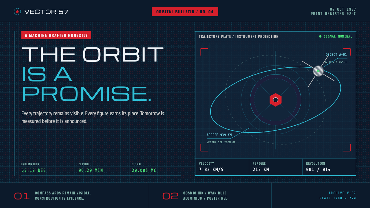 Atompunk Sputnik EraTomorrow, drafted precisely. Cyan orbits cross cosmic ink with red poster blo…
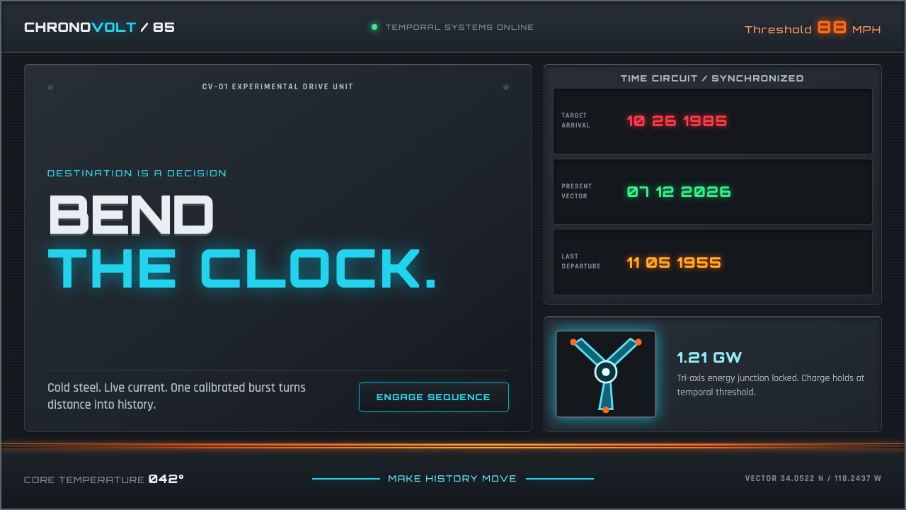 Back to the Future (1985)Cold steel, live current. Cyan circuits and orange trails turn the dashboard…
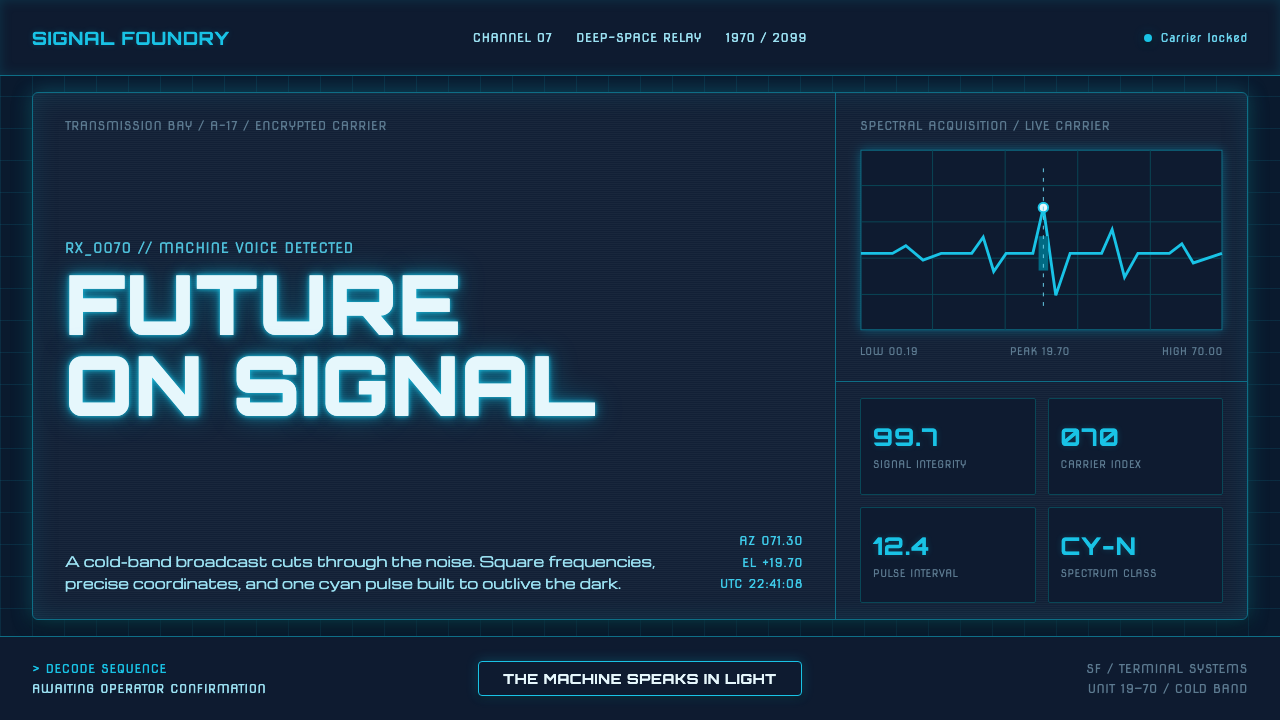 Data 70 Techno DisplayThe machine speaks in light. Cyan CRT type burns through a gridded blue-black…
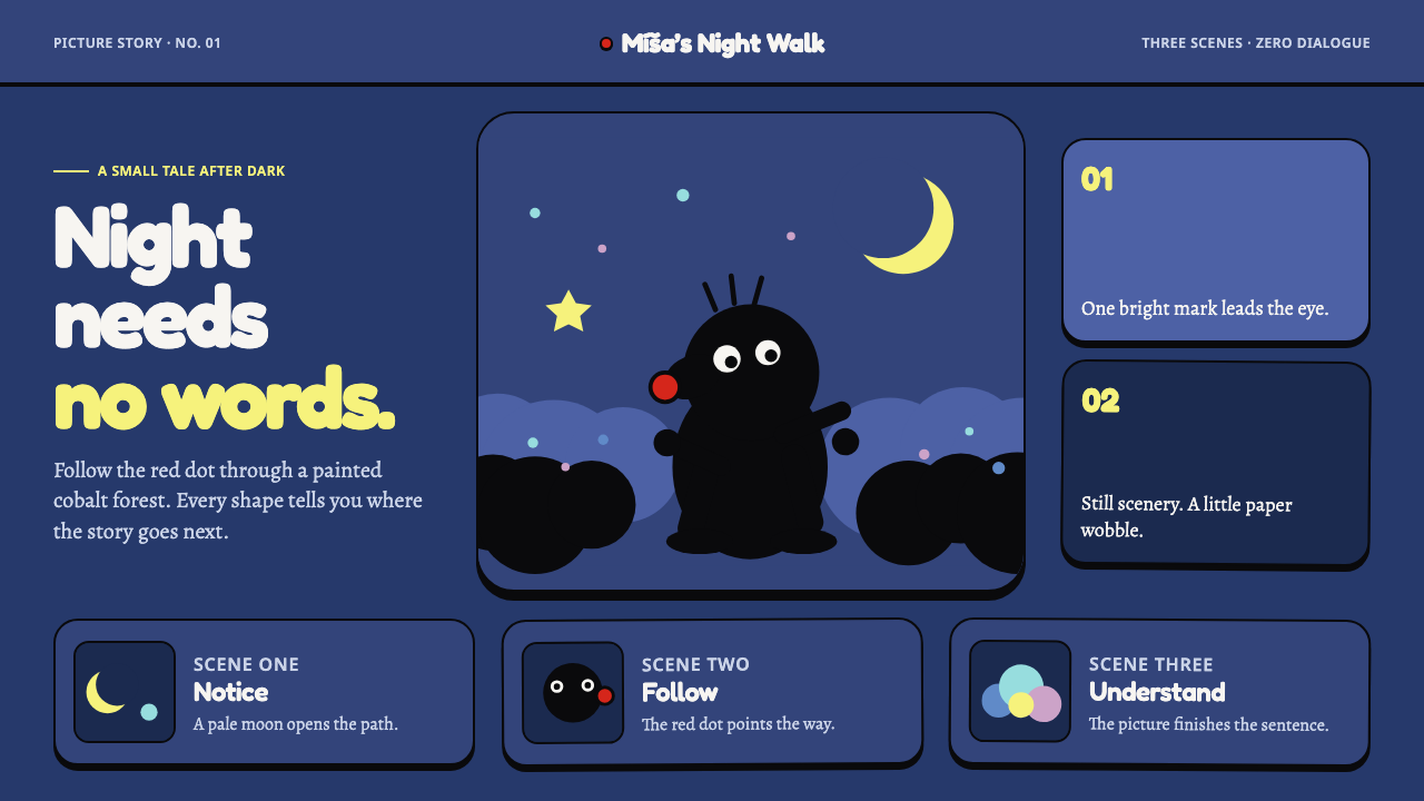 Krtek AnimationWordless wonder. Cobalt gouache stages black paper forms, guided by one red d…
 Alien: IsolationLo-fi dread glows. Amber phosphor and terminal green pulse through bordered C…
 Atari 2600 (Woodgrain)Woodgrain meets raw pixels. Walnut panels frame Bungee type and CMYK raster b…