What is Supergraphics?
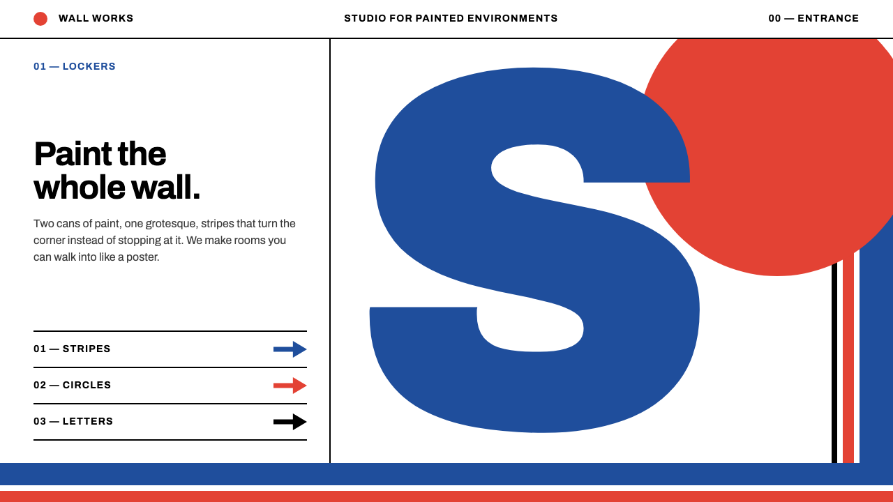
Supergraphics turned a plain white wall into a building-sized poster: wide stripes that turn corners, a vermilion circle, and a grotesque alphabet taller than a person, cropped by the architecture itself.
Supergraphics in brief
Supergraphics is a design style that takes graphic design out of the page and puts it on the architecture. The word names a practice that peaked between 1966 and 1975: enormous painted stripes, arcs, arrows and letters applied to walls, ceilings, stairs and floors, scaled to the building rather than to the viewer's hand. Its signature example is the work painted in 1966 at The Sea Ranch in Sonoma County, California.
Translated to screens, the recipe is short. White pages. Two flat paint colours, in this case a deep navy blue and a vermilion red, plus black. One grotesque typeface, set enormous and cropped by the edge of the viewport the way the original letters were cropped by a wall corner. Stripes that run across a layout and turn corners instead of stopping politely at the margin. Each screen makes only a few large gestures.
The effect is confident and slightly theatrical. Nothing is shaded, nothing is blurred and nothing is small for its own sake. The page behaves like a wall that someone has painted in a single afternoon, and its power comes from scale, contrast and the willingness to let a letter or a circle be cut in half.

Where does Supergraphics come from?
In 1966 the designer Barbara Stauffacher Solomon took two cans of paint and a sign painter into the locker rooms of the Moonraker Athletic Club at The Sea Ranch, a new coastal development in Sonoma County, California. In three days she turned plain white plywood walls into what looked like a poster you could walk into: blue stripes, vermilion circles, arrows and Helvetica letters taller than a person. The stripes turned corners and climbed stairs, and the letters were cut off by the edges of the rooms.
Solomon had studied Swiss graphic design in Basel under Armin Hofmann, so the language she used was the hard-edged geometry and the neutral grotesque of the Swiss International Typographic Style. What she did was change its scale. The movement had been built on the printed page, with its grids, flush-left columns and careful white space. At The Sea Ranch the same vocabulary was enlarged to the size of a room, and it stopped being a page and became an environment.
The setting mattered. The Sea Ranch was a landmark of what is often called the Third Bay Tradition in Northern California architecture, a regional approach to modern building. The architects associated with the project include Charles Moore and William Turnbull, and the landscape architect Lawrence Halprin shaped its larger plan. Against their wood-clad, low-slung buildings, a bold painted graphic was a deliberate counterpoint: modern, urban and slightly irreverent inside a rural coastal landscape.
The work was widely published, including in Life magazine and on the cover of Progressive Architecture, and the term supergraphics spread quickly. Designers, architects and interior decorators began painting giant stripes, numbers and arrows on offices, schools, shops and public buildings, and the idea peaked through the early 1970s before fading from fashion. Its legacy is a durable proposition: that graphic design need not stay on the page, and that a few flat colours at a large scale can transform a space more than any amount of ornament.
What defines the Supergraphics look?
Scale as the main idea
Everything is sized to the architecture, not to the reader's hand. Letters are taller than a person, stripes span an entire wall and circles are large enough to be rooms in themselves. On a screen that means few elements, very large, with one or two dominant gestures per view and nothing decorative competing with them.
Two flat paint colours plus black
The palette is a deep navy blue and a vermilion red on white, with black for type. These are paint colours, applied flat and opaque, with no gradients and no tints beyond a handful of deliberate steps. Because there are only two hues, the contrast between them and the white carries the whole composition.
Stripes that turn corners
Wide bands of colour do not stop at the edge of a panel. They run across a layout, bend around the corner of a section and continue on the other side, as the original stripes ran up stairs and around walls. The stripe becomes a way of connecting spaces rather than decorating one of them.
One grotesque, set huge
Type is a single neutral grotesque in the Helvetica tradition, used at monumental size and often cropped by the viewport edge. Smaller text sits quietly beside it in the same family. The contrast between the enormous letter and the small caption is where the hierarchy comes from.
Cropping as a feature
Letters, circles and arrows are allowed to be cut by the edge of the frame. A half-visible circle or a letter cut through its middle makes the composition feel larger than the screen, as if the graphic continued beyond it. The viewer completes the shape.
Geometry from the Swiss tradition
Underneath the drama is the discipline of the Swiss school: hard edges, flat planes, circles and straight bands, flush-left text and plenty of white. The style looks exuberant but is built on strict, simple forms, which is why it remains legible even at enormous scale.

Who shaped Supergraphics?
Designer who painted the 1966 supergraphics at The Sea Ranch with a sign painter and two cans of paint. She had trained in Swiss graphic design in Basel and enlarged its language to architectural scale.
Architect associated with The Sea Ranch, whose work with his colleagues gave the development its distinctive, regional character.
Architect associated with The Sea Ranch and the Third Bay Tradition, part of the group whose low wooden buildings formed the backdrop for the painted graphics.
Landscape architect who shaped the larger plan of The Sea Ranch and its relationship with the coastal land.
Swiss graphic designer and teacher in Basel under whom Solomon studied; his hard-edged geometric approach is the root of the style.
How do you use Supergraphics today?
On slides, Supergraphics is ideal for covers and section dividers. A single huge word or letter in black on white, cropped by the slide edge, with one navy stripe and a vermilion circle, is the whole design. Content slides should keep the same restraint: a large heading, a small block of text and one coloured band that connects it to the edge. For data, use only the two paint colours and black, so that comparisons read at a glance across a room.
On the web, it suits bold, confident brands that want to look architectural: studios, galleries, event sites, product launches and portfolios. A hero can be a single giant grotesque cropped by the viewport, with a stripe that continues down the side of the page and turns at a section boundary. Navigation and body text should stay small and plain, so that the contrast in scale does the work. Use it sparingly in dense dashboards, where the large gestures would crowd out data.
In editorial and marketing work it excels at posters, covers, signage and campaign graphics. A large cropped letter can stand in for a logo; a stripe can lead the eye from a headline to a call to action; a vermilion circle can mark the one thing to remember. Because the system is only a few shapes, it is easy to apply consistently across print, screens and physical spaces.
The most common mistake is to add too much. The style works because each view has only a few big gestures; once a page has five stripes, three circles and a dozen arrows, it becomes a pattern, and the sense of a single painted wall is lost. A second mistake is to soften it with shadows, gradients or rounded corners, which removes the hard-edged paint quality. A third is to use many colours: the power of the style comes from just two.

Supergraphics — FAQ
What is Supergraphics?
Supergraphics is a design practice, peaking between 1966 and 1975, in which huge stripes, circles, arrows and letters are painted directly onto architecture at the scale of the building. Barbara Stauffacher Solomon's 1966 work at The Sea Ranch is its best-known example.
How is it related to Swiss design?
Solomon studied Swiss graphic design in Basel under Armin Hofmann. Supergraphics takes the Swiss vocabulary of hard edges, flat geometry and a neutral grotesque and enlarges it to the scale of rooms and buildings.
Which colours does the style use?
It uses white grounds, two flat paint colours, a deep navy blue and a vermilion red, and black for type. Colours are applied flat with no gradients, and the small palette is a large part of the style's power.
Can Supergraphics work in a dense interface?
Only in small doses. The style depends on a few very large gestures per view, so it works best on covers, hero sections and landing pages. In dense dashboards, use a stripe or a single large numeral as an accent and keep the rest plain.
What is the most common mistake?
Adding too many stripes, circles and colours. Once a view has many gestures the page turns into a pattern, and the impression of one boldly painted wall disappears. Keep to two paint colours, black, and a handful of large shapes.
Related design styles
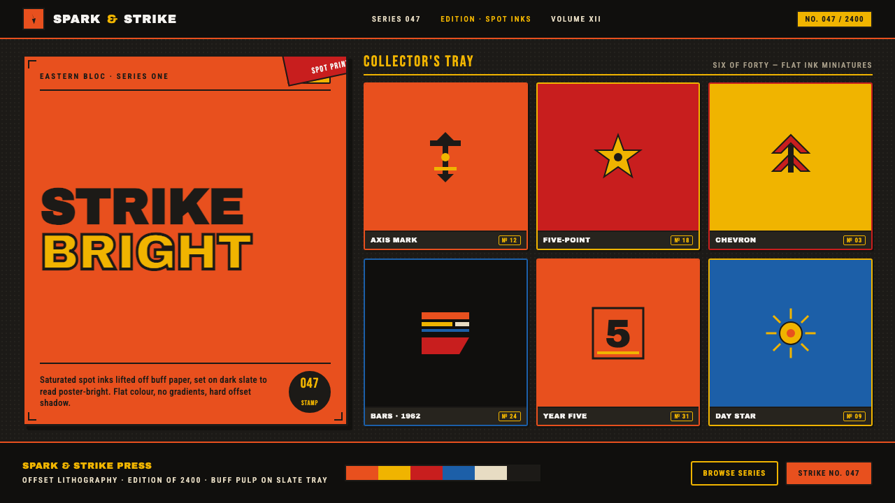 Matchbox LabelPropaganda for the pocket. Flat orange-red-yellow spot inks on dark slate, co…
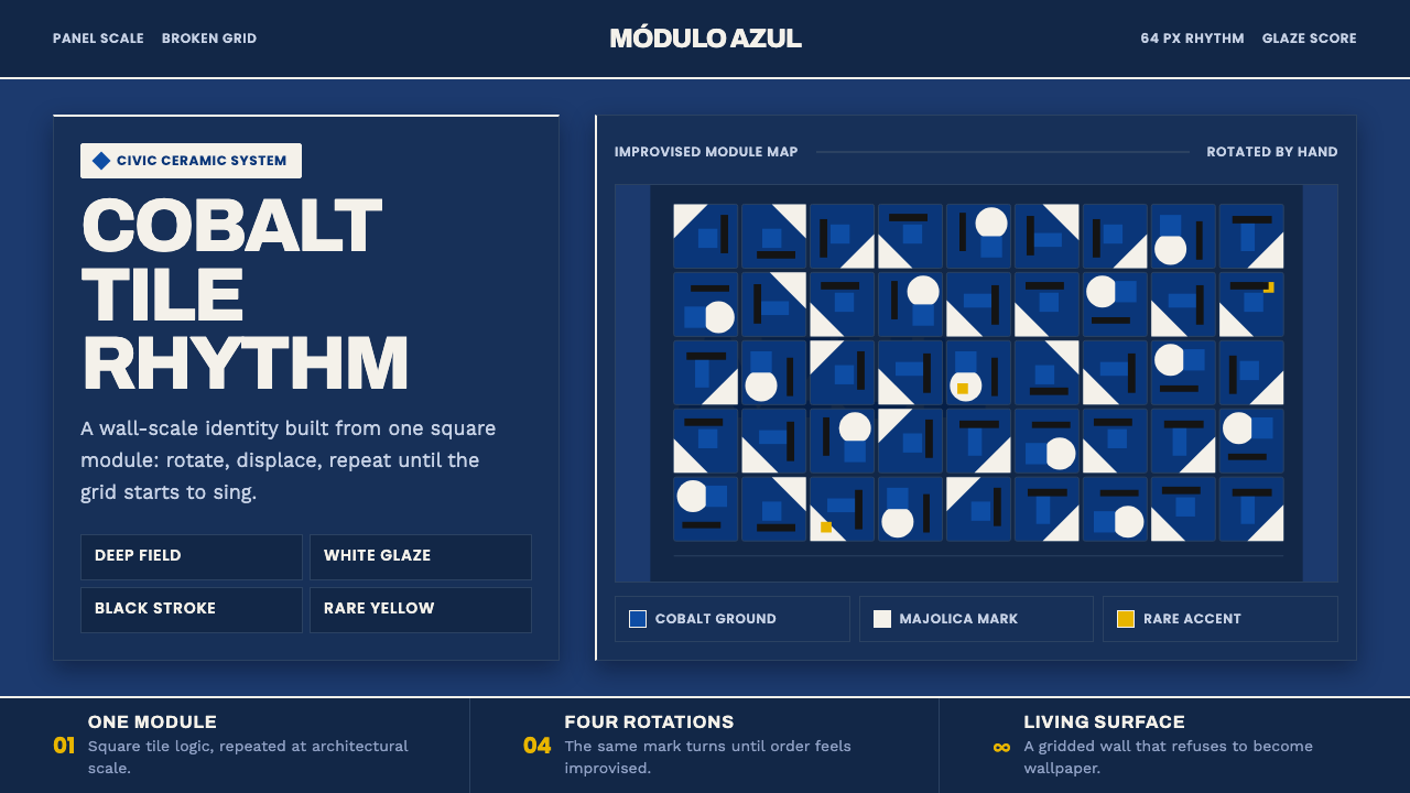 Athos Bulcão Azulejo PanelCobalt grid, alive. Majolica white marks rotate across a broken navy tile fie…
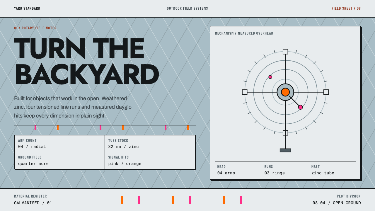 Hills Hoist SuburbiaUtility takes the lead. Weathered zinc, black outlines and dayglo hits set a…
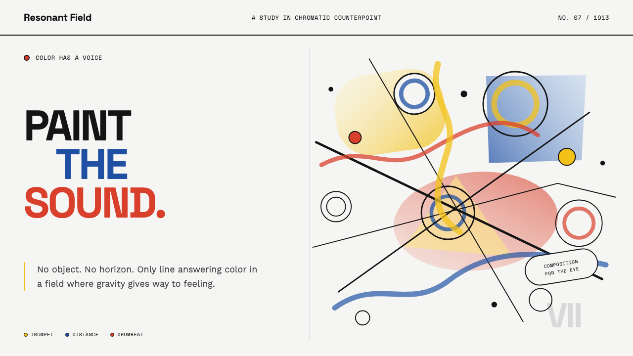 Kandinsky Composition (1913)Color becomes sound. Primary washes, hollow circles, and black diagonals coll…
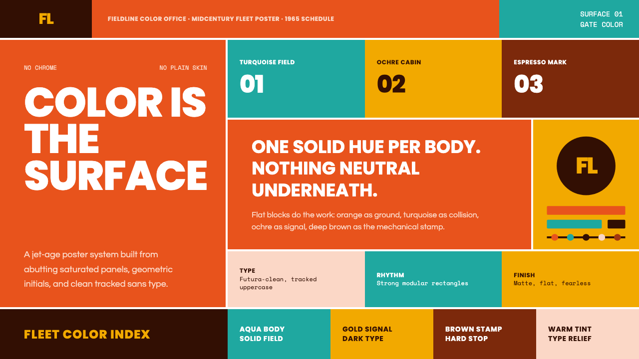 Braniff (Girard)Color becomes fuselage. Jellybean orange, turquoise blocks, and geometric san…
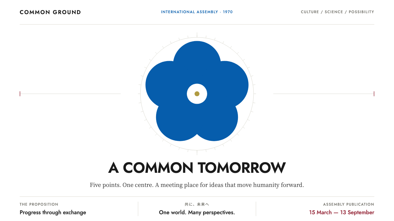 Expo '70Optimism on a single axis. Emblem blue discs, carmine details and geometric t…