What is Athos Bulcão Azulejo Panel?
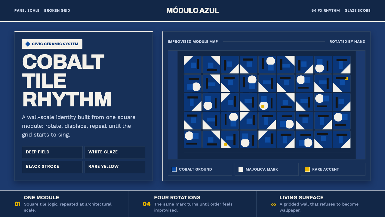
Athos Bulcão turned the tile grid into a living score — a deep cobalt field where white glazed marks rotate, drift, and make architectural space feel improvisational.
Athos Bulcão Azulejo Panel in brief
Athos Bulcão Azulejo Panel is a design language drawn from the glazed majolica panels Athos Bulcão created for the modernist architecture of Brasília in collaboration with Oscar Niemeyer. Its essential image is a saturated cobalt or navy tile field animated by crisp white marks and dark geometric strokes. The surface is not meant to read as an empty blue background with decoration placed on top. It should feel occupied, active, and architectural, as though the wall itself is moving.
The system begins with a square white tile carrying a cobalt-blue and black geometric motif. That module is rotated and shuffled into an improvised arrangement, producing a rhythm that is visibly related to a grid but never mechanically repetitive. Regularity is established only to be displaced. White marks turn, break, and reappear across the field, while dark strokes give the pattern weight and interruption.
The aesthetic belongs to Brazilian modernism and mid-century architectural ceramics, but its character is more animated than orderly. The panel behaves like a blue-and-white score: the cobalt ground supplies depth, the white glaze supplies light, and the black geometry supplies pauses and accents. Yellow and green may appear as later, sparser interventions, but they should remain subordinate to the cobalt, white, and black relationship.

Where does Athos Bulcão Azulejo Panel come from?
The system is rooted in Brasília, Brazil, during the period of Brasília modernism from 1958 to 1980. Its material language is the azulejo panel: glazed majolica tiles assembled across architectural surfaces rather than treated as isolated decorative objects. The tile field belongs to the building, and the building gives the pattern its scale. This relationship is essential to the style. The motif is not simply printed on a page; it is imagined as a surface capable of extending across space.
Athos Bulcão designed these panels while working hand in hand with Oscar Niemeyer. Their collaboration connects geometric ceramic pattern with modernist architecture, allowing the panel to operate between image and structure. The architectural setting gives the tile field a sense of continuity, while the rotated modules prevent that continuity from becoming stiff or monotonous. The result is a surface that belongs to the building but retains the freedom of a drawing.
The visual method depends on transformation rather than multiplication. A single square module carries the initial white, cobalt, and black relationship; rotation and shuffling then create variation across the wall. Because the arrangement is improvised and near-random, the viewer can sense the underlying system without being able to predict the next mark. The panel therefore holds two conditions at once: a real grid and a deliberate refusal to let the grid dictate every event.
The azulejo panels continued through the 1970s, within the wider context of Brazilian modernism and mid-century architectural ceramics. In this design interpretation, the historical material is treated as a living surface rather than a fixed pattern sample. Cobalt and navy establish the field, white majolica marks provide the active rhythm, and black geometry maintains contrast. Yellow and green remain reserved for later, more restrained interventions, preserving the original sense of a blue ground animated by carefully limited departures.
What defines the Athos Bulcão Azulejo Panel look?
Cobalt Field
The dominant surface is a saturated cobalt or deep navy field. It carries the visual weight of the panel and should feel continuous, dense, and architectural rather than pale or paper-like. The blue is not a passive background; it is the atmospheric body of the composition, a field through which white and black marks acquire their force. Variation between cobalt and navy may create depth, but the overall impression must remain a unified blue ground.
White Majolica Marks
White appears as crisp glazed marks rather than as a neutral empty space. These marks may be geometric, partial, or interrupted, but they should retain the sense of ceramic brightness against the dark field. Their role is rhythmic and luminous: they catch the eye, create pauses, and make the surface feel animated. White should not flatten the panel into a white composition with blue decoration; cobalt must remain the surrounding force.
Rotated Module
The pattern begins with a square tile module and gains character through rotation. Repetition is allowed to remain visible, but orientation should shift often enough that the module feels alive rather than stamped. A mark that points in one direction in one position may turn, invert, or become a different visual gesture nearby. The eye should recognize a family resemblance without finding a single predictable reading path.
Broken Grid
The grid is real, but it is never allowed to become a cage. Tile boundaries, repeated intervals, and aligned edges establish an underlying order; rotation and displacement then break that order at selected moments. This tension is the central structural quality of the style. Too much regularity produces a pattern sample. Too much disorder removes the architectural basis. The intended result is controlled irregularity: a system that shows its rules by bending them.
Black Geometry
Black geometric strokes give the panel density and articulation. They may function as separators, directional gestures, or compact counterweights to the brighter white marks. Black should not become a second dominant field, nor should it soften into gray decoration. Its strength lies in interruption: a dark stroke cuts through the cobalt and makes the white glaze feel sharper by comparison. The most effective black marks are decisive and economical.
Architectural Continuity
The panel should feel capable of extending beyond the frame. Its rhythm is not confined to a single card, poster, or screen; it implies a larger wall whose surface continues around corners and across structural divisions. This does not require literal edge-to-edge repetition. It requires visual continuity: a sense that the cobalt field, tile logic, and rotating marks belong to a larger environment. Components should feel installed rather than merely placed.
Restrained Intervention
Yellow and green are reserved for later and sparser interventions. Their purpose is to signal a departure from the main cobalt, white, and black conversation, not to compete with it. A small intervention can feel consequential because the surrounding palette is disciplined. If yellow and green spread too widely, the panel loses its deep blue identity and the white marks no longer function as the primary light source. Scarcity preserves their expressive charge.

Who shaped Athos Bulcão Azulejo Panel?
Athos Bulcão is the central designer associated with the azulejo panel language described here. He created glazed majolica panels for the modernist architecture of Brasília, using a square tile module whose cobalt-blue and black geometric motif could be rotated and shuffled into improvised arrangements. His contribution lies in treating repetition as a source of variation: the tile system establishes order, while each rearrangement gives the architectural surface a new rhythm.
Oscar Niemeyer is the architectural figure connected to Bulcão through their work on Brasília modernism. The panels were designed in close relationship with his buildings, so the ceramic surface and the modernist structure could operate together. In this context, Niemeyer represents the architectural framework that lets Bulcão's modular marks expand from an individual tile into a continuous environment.
Brasília modernism is the regional and architectural context in which the panels gained their identity. The period from 1958 to 1980 provides the broader historical frame, while the azulejo panels continued through the 1970s. Its relevance to the style is not a list of formal rules but a shared scale of ambition: architecture, surface, and pattern are conceived as parts of one modern environment.
Mid-century architectural ceramics names the material movement surrounding the panels. It places the work between craft and architecture, where glazed ceramic is not a small ornamental insert but a surface capable of carrying rhythm, color, and structure across a building. This context explains why the style values continuity, modular transformation, and the visible relationship between material brightness and architectural space.
How do you use Athos Bulcão Azulejo Panel today?
For presentation slides, use the cobalt field as the organizing surface across both cover and content pages. A cover can introduce a broad navy ground with a few rotated white and black marks, leaving the title to occupy a clear architectural opening rather than competing with the pattern. Content slides should preserve the same tile logic in quieter form: a strong blue field, a restrained cluster of glazed marks, and a deliberate interruption that identifies the section. Data slides can treat bars, segments, or diagram fragments as tile-like marks, but the underlying rhythm should remain legible rather than becoming a decorative texture.
For web interfaces, the style suits dashboards and pricing pages that need a distinctive surface without losing structural clarity. Use cobalt or navy to establish the primary environment, then reserve white for the clearest reading surfaces and black for decisive controls, dividers, or status marks. Cards should feel like installed ceramic panels rather than floating soft objects. A pricing page can use rotated motifs to distinguish tiers, while the underlying grid keeps comparisons aligned. Yellow and green are best reserved for exceptional states or later interventions, not distributed evenly across every component.
For editorial and marketing work, the panel language creates a strong relationship between deep color and active white space. An article can begin with a broad cobalt opening, a title placed within a calm interruption in the tile field, and section transitions marked by changes in module direction rather than ornamental rules. Pull quotes and metadata can use white glazed forms as visual anchors, while black geometry provides the sharper editorial punctuation. Marketing pages can extend the pattern beyond individual blocks, allowing the identity to feel architectural and continuous rather than assembled from unrelated cards.
For identity systems and campaign surfaces, the rotated module is more valuable than a single fixed pattern. Create a family of related arrangements in which the same cobalt, white, and black vocabulary shifts from one application to another. A poster, social card, interface header, or printed panel can each feel distinct while still belonging to the same system. The important continuity is not that every tile matches, but that every variation preserves the sense of a real grid being animated by controlled displacement.
The common mistake is to treat the style as a generic blue-and-white geometric pattern. A flat repeating texture loses the architectural scale, while excessive randomness loses the grid that makes the improvisation meaningful. Another mistake is allowing yellow and green to become equal partners with cobalt, white, and black. The system works when the blue field remains dominant, the white marks remain the primary light, black provides interruption, and every deviation feels intentional enough to reveal the hidden module beneath it.

Athos Bulcão Azulejo Panel — FAQ
Is this style a regular tile pattern or an improvised one?
It is both, but at different levels. The square tile module and the underlying boundaries establish a real grid, while rotation and shuffling produce near-random variation across the field. The style depends on the viewer sensing the order without seeing a rigid repeat. If the arrangement is completely regular, it becomes a pattern sample; if it is completely unstructured, it loses the architectural logic that makes the improvisation readable.
Why must the background be deep cobalt or navy?
The deep blue field is the identity-bearing surface of the system. It gives the panel architectural density and allows the white majolica marks to function as light rather than as ordinary flat shapes. A pale background would reverse that relationship and make the work feel like white paper carrying blue decoration. The cobalt or navy ground should therefore be treated as an active material field, not merely as a color choice behind the motif.
Can yellow and green become the main colors?
They should remain later and sparser interventions. The approved system is built around cobalt or navy, white majolica marks, and black geometry. Yellow and green can create a meaningful departure when they appear selectively, especially as a signal of a later layer or exceptional state. If they become dominant, the deep blue identity weakens, the white marks lose their role as the primary light, and the composition begins to belong to a different visual system.
How should the style be adapted for a small screen or compact layout?
Preserve the hierarchy of the material relationship rather than trying to reproduce every tile event. Keep the cobalt or navy field clearly dominant, use a small number of white and black marks, and allow a calm opening for text or controls. The module can be implied through a few rotated gestures instead of being shown everywhere. Compact applications need the sense of a larger architectural surface, not a miniature wall crowded with every possible variation.
What separates an authentic adaptation from a generic geometric blue pattern?
An authentic adaptation preserves the relationship between material field, modular repetition, and controlled displacement. It makes cobalt or navy feel like a continuous architectural surface, treats white as glazed light, uses black to interrupt, and lets rotation reveal an underlying square module. A generic blue geometric pattern may borrow the colors but ignore the structure: it may repeat mechanically, scatter shapes without a grid, or use yellow and green too freely. The distinction is not the presence of geometry alone, but the discipline governing its movement.
Related design styles
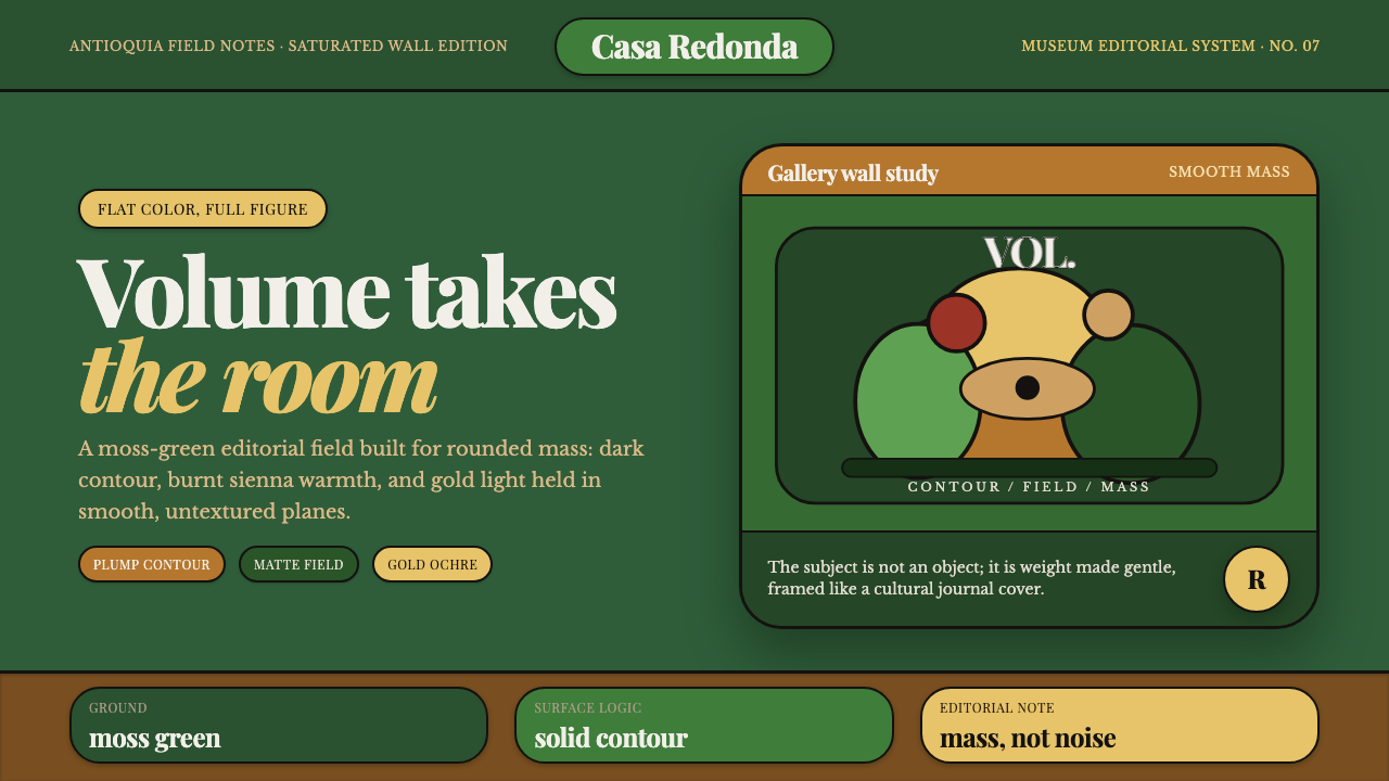 Botero Boterismo VolumeVolume becomes gentle. Moss green fields, dark contours, and gold ochre make…
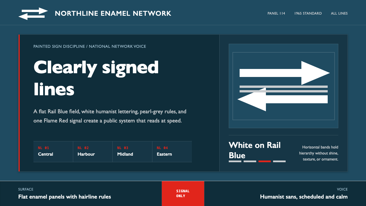 Gill Sans British RailPublic authority, enamel-flat. Rail Blue bands, white humanist type, one red…
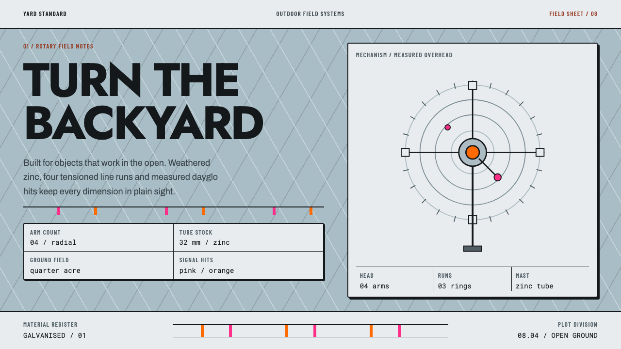 Hills Hoist SuburbiaUtility takes the lead. Weathered zinc, black outlines and dayglo hits set a…
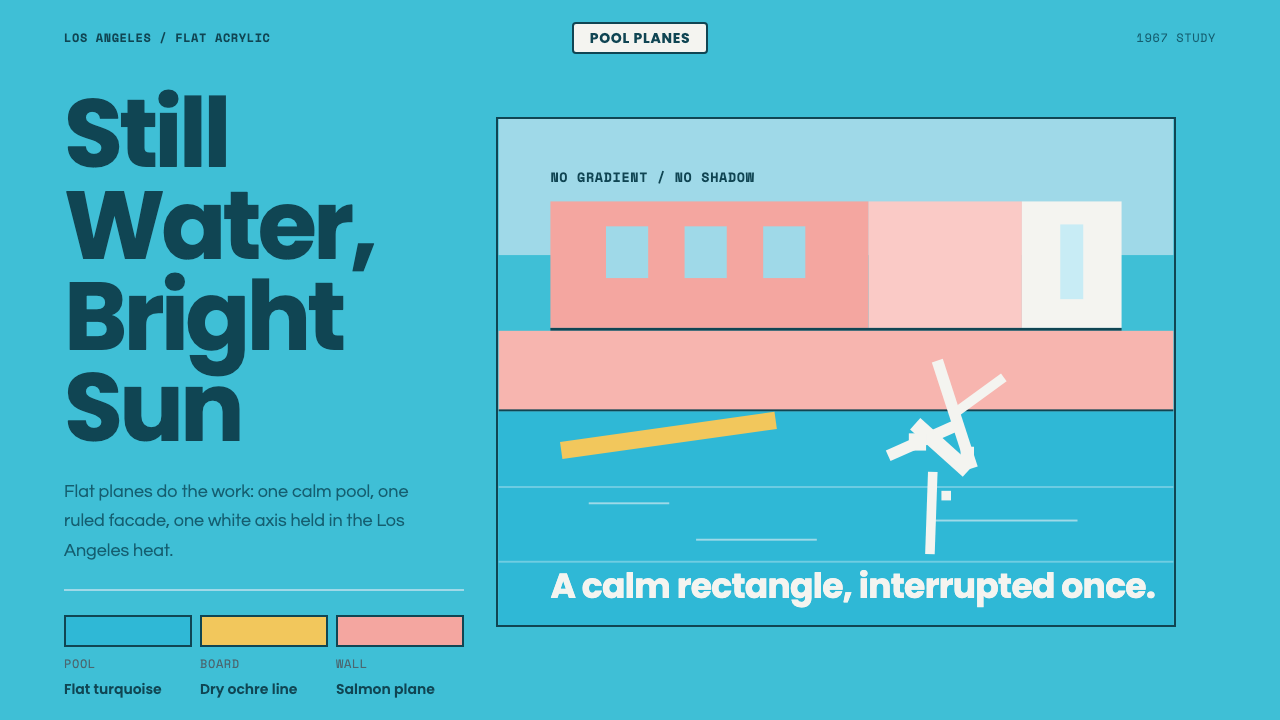 Hockney Pool BlueSerenity turns graphic. Turquoise planes, salmon edges, one white splash.
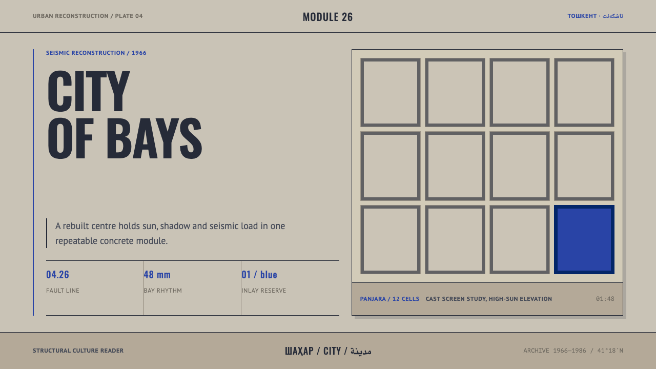 Tashkent Seismic ModernismStructure keeps its cool. Sun-bleached concrete grids hold one reserve of Tim…
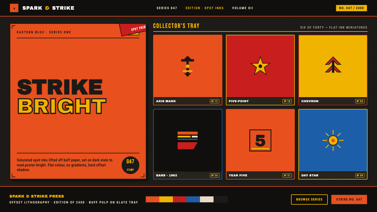 Matchbox LabelPropaganda for the pocket. Flat orange-red-yellow spot inks on dark slate, co…