What is Botero Boterismo Volume?
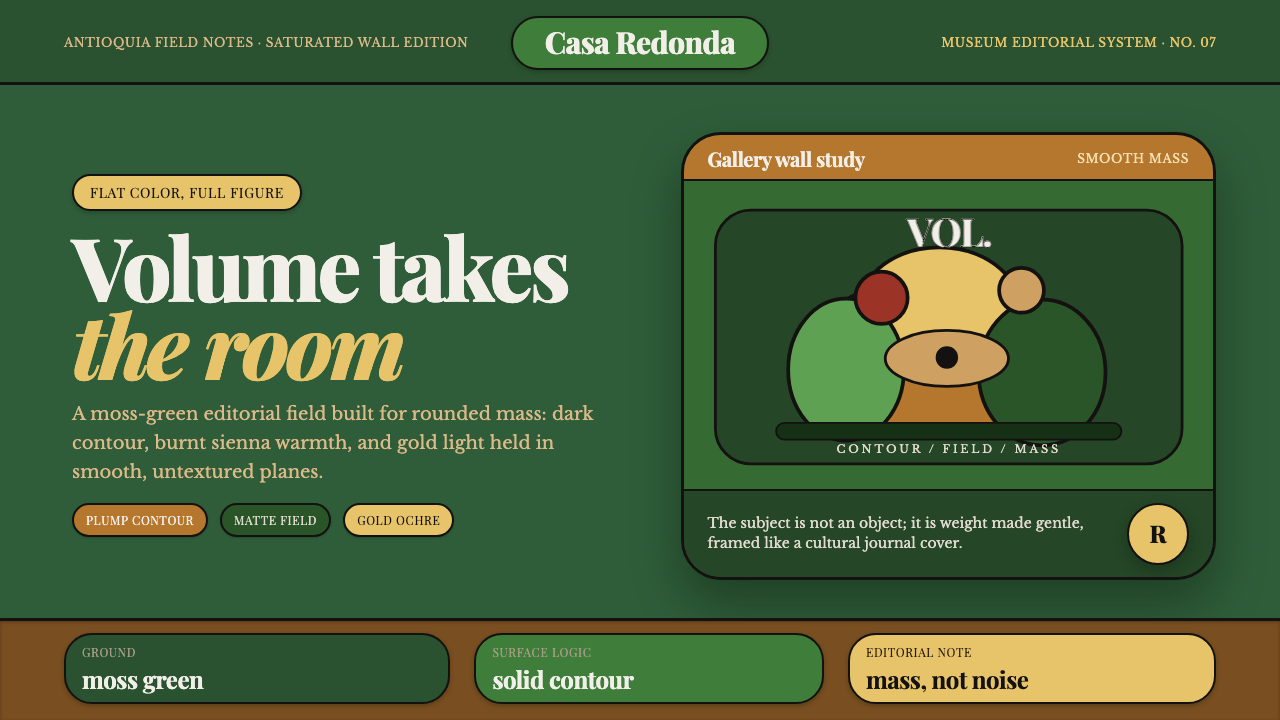
Boterismo makes mass feel buoyant — rounded figures, moss-green fields, dark contours, and gold ochre turn weight into a calm, luminous presence.
Botero Boterismo Volume in brief
Boterismo is Fernando Botero’s unmistakable visual signature: figures, fruit, and animals expand into smooth, rounded volume, while the surface remains quiet and free of visible brushwork. These forms sit against flat, saturated color planes rather than atmospheric scenery, so the silhouette carries much of the image’s identity. The result is monumental without becoming severe, generous without becoming soft.
After Botero’s 1956 stay in Mexico, the palette became more vivid, drawing on burnt sienna, moss green, and ochre associated in the source material with the landscape and light of Antioquia. Hot reds and glowing gold appear as accents. The color is not ornamental noise; it gives the inflated forms a grounded, earthly presence while allowing their scale to feel strangely buoyant.
The interface translation keeps that logic intact. A deep matte moss-green ground replaces the usual white or cream field. Plump rounded components receive strong dark contours instead of hairline rules, and the type system adopts a Latin-modern, museum-editorial voice through Playfair Display, Libre Baskerville, and Prata. The system feels substantial, warm, and composed rather than playful or cartoonish.

Where does Botero Boterismo Volume come from?
The source places mature Boterismo within Fernando Botero’s principal period from the 1960s through the 2000s, in Colombia and Latin America, with Antioquia as its regional anchor. It is associated with Boterismo and Figurative Modernism. This origin matters because the style is not simply a treatment applied to ordinary subjects; it is a way of making the subject’s physical presence, volume, and silhouette become the central event.
Botero’s characteristic language is built from a deliberate transformation of familiar forms. A person, animal, or piece of fruit is not described through fleeting gesture or visible painterly texture, but through expanded, smooth mass. The source material emphasizes the absence of visible brushwork and the use of flat saturated planes, creating a visual world where volume is communicated by contour, proportion, and color relationship rather than by surface effects.
The 1956 stay in Mexico marks an important shift in the supplied account of the palette. Afterward, the colors became vivid, with burnt sienna, moss green, and ochre connected to Antioquia’s landscape and light, plus hot red and glowing gold. The palette therefore belongs to the style’s identity at the same time as the rounded body: it gives the forms their regional warmth and keeps their exaggerated scale from feeling weightless or synthetic.
The design system translates this mature visual language into contemporary interface terms without pretending that an interface is a painting. The historical foundation supplies the forms, contours, saturated planes, and earthy color atmosphere; the digital adaptation supplies a deep matte ground, rounded components, and a museum-editorial typographic voice. Its success depends on preserving the relationship between mass and calm, not on copying isolated visual motifs.
What defines the Botero Boterismo Volume look?
Volumetric Mass
The defining characteristic is expansion. Bodies and objects become broad, smooth, and rounded, with volume treated as a positive visual force rather than a defect to be corrected. In interface work, this suggests generous cards, full controls, rounded containers, and imagery whose silhouette feels almost sculpted. The form should appear composed and intentional: inflated, but never loose or amorphous.
Flat Saturated Fields
Color arrives as a plane: clean, saturated, and visually self-contained. Backgrounds do not dissolve into atmosphere, and surfaces do not require decorative texture to feel rich. Moss green, burnt sienna, ochre, hot red, and glowing gold establish a warm yet grounded field. In a dark interface, the matte green ground carries the composition while brighter hues identify emphasis and movement.
Dark Contours
Strong dark contours give rounded forms their authority. They separate a generous silhouette from its ground and prevent the palette from becoming hazy. The contour is not a delicate outline or technical border; it is a structural embrace around mass. Applied to interface components, it can define cards, controls, illustrations, and selected states with a confident, almost print-like edge.
Quiet Surface
The absence of visible brushwork is as important as the presence of volume. Boterismo does not announce effort through rough marks, distressed texture, or simulated material. Its richness comes from proportion, contour, and color. A digital application should therefore keep surfaces matte and controlled, allowing the forms to carry attention. Texture may support atmosphere, but it should never compete with the mass.
Buoyant Weight
The central paradox is that large forms do not feel oppressive. Rounded silhouettes, warm ochres, and generous spacing make mass feel buoyant. This is different from weightless minimalism: the design remains substantial, but its substance is calm and inviting. Components should occupy space with confidence while retaining enough surrounding quiet for the composition to breathe.
Museum-Editorial Type
The typographic voice combines Playfair Display, Libre Baskerville, and Prata to create a Latin-modern editorial register. Serif forms bring cultural gravity and exhibition-like authority, while the surrounding dark ground and rounded shapes keep the voice contemporary. Type should feel carefully set and spacious, with hierarchy created through scale, contrast, and placement rather than through decorative effects.

Who shaped Botero Boterismo Volume?
Fernando Botero is the sole named artist in the supplied source and the origin of the visual vocabulary. His mature Boterismo is defined by figures, fruit, and animals expanded into smooth volumetric mass, with no visible brushwork and with flat saturated color planes providing the ground. The interface system takes its essential lesson from this combination: exaggeration becomes coherent when contour, surface, and color all serve the same sense of presence.
Boterismo names the recognizable language associated with Botero’s mature work from the 1960s through the 2000s. Its defining move is not merely making things larger, but giving enlargement a smooth, self-possessed physical logic. For design, that means rounded volume should appear deliberate, stable, and quietly monumental, supported by saturated fields and strong dark edges.
Figurative Modernism provides the broader movement context named in the source. In this system, recognizable subjects remain present, but they are reorganized through volume, proportion, and color rather than through naturalistic detail. That balance makes the style useful for interfaces that need character and cultural atmosphere while still requiring clear structure and legible information.
How do you use Botero Boterismo Volume today?
For presentation covers, let one generous rounded form or cropped volumetric image occupy the visual field against deep matte moss green. Keep the title in the museum-editorial type voice, with strong contrast between display and supporting text. Gold ochre or hot red can provide a focused point of energy, while dark contours keep the composition legible. The cover should feel like an exhibition poster: substantial, calm, and immediately recognizable.
For content slides, use the rounded language to organize information rather than decorate it. A large heading can sit beside a plump image, chart, or diagram, with dark contours defining the major blocks. Data slides should turn bars, circles, or highlighted values into clear volumetric signs, using ochre, red, or gold selectively against the moss ground. Avoid filling every region with color; the quiet field is part of the hierarchy.
For web dashboards and pricing pages, Boterismo works when dense information is given a hospitable physical presence. Cards can feel full and rounded, controls can carry confident outlines, and selected states can use hot red or glowing gold as deliberate signals. Keep the background matte and deep, reserve the warm accents for actions or meaningful differences, and let typography provide the editorial authority. The result should be expressive without sacrificing scanning.
For editorial and marketing work, build a strong relationship between headline, image, and color plane. A large rounded subject can anchor an article opening, while narrow text measures and generous surrounding space keep the page composed. Campaign sections can alternate moss green, ochre, and dark fields, with one warm accent repeated across calls to action. The style suits cultural, educational, and premium positioning especially well because it combines warmth with unmistakable formal control.
The common mistake is confusing Boterismo with generic softness. Excessive pill shapes, playful icons, glossy gradients, or many competing bright colors remove the style’s weight and cultural gravity. Another mistake is using a dark background while leaving contours weak, causing the forms to dissolve. Keep the mass clear, the surface quiet, the palette disciplined, and the type editorial. The goal is buoyant volume, not visual inflation without structure.

Botero Boterismo Volume — FAQ
What makes Boterismo different from a generic rounded interface?
Generic rounded design usually treats softness as a friendly surface treatment. Boterismo treats volume as the organizing idea. Rounded forms are supported by strong dark contours, flat saturated fields, earthy color, and a quiet matte surface. The result has mass and cultural gravity. If the interface only uses soft corners without a disciplined relationship between silhouette, color, and ground, it is not expressing the system’s central logic.
Can this style work with a dark background?
Yes. The supplied system is explicitly built around a deep matte moss-green ground rather than a white or cream background. The dark field makes ochre, hot red, and glowing gold feel luminous, but it also requires strong separation between forms and background. Contours should remain confident, and accents should be selective. A dark ground works when it supports buoyant mass instead of turning every component into a glowing object.
How should the palette be balanced?
Begin with moss green as the grounding field, then use burnt sienna or ochre to carry warmth through the major forms. Hot red and glowing gold are strongest as accents for emphasis, action, or visual punctuation. The palette should feel saturated but not crowded. Keeping some regions quiet allows the warm colors to retain their luminous force and prevents the interface from becoming a collection of unrelated color blocks.
Why use Playfair Display, Libre Baskerville, and Prata together?
The supplied type pairing is intended to create a Latin-modern museum-editorial voice. These serif choices give the system cultural weight, exhibition-like authority, and a sense of considered presentation that balances the exaggerated forms. They should be assigned clear roles and allowed to breathe. The typography must support the mass of the imagery without competing through excessive styles or decorative treatment.
Does Boterismo suit every product?
It suits products that benefit from warmth, recognizability, cultural atmosphere, and a strong sense of form: museum-like experiences, editorial platforms, educational products, dashboards, and premium presentation. It is less suitable when the product depends on weightless neutrality or extremely technical restraint. The exaggerated mass should align with the product’s character. If the subject needs to feel invisible and purely utilitarian, this system may add more personality than the experience can support.
Related design styles
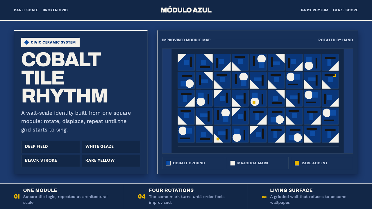 Athos Bulcão Azulejo PanelCobalt grid, alive. Majolica white marks rotate across a broken navy tile fie…
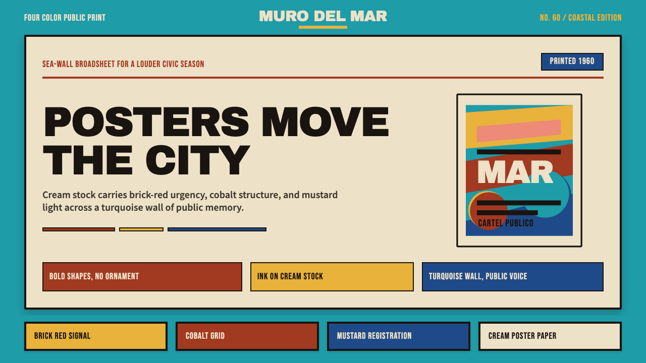 Cuban Malecón 1960 PosterPublic voice in flat ink. Turquoise wall, cream stock, brick red and cobalt b…
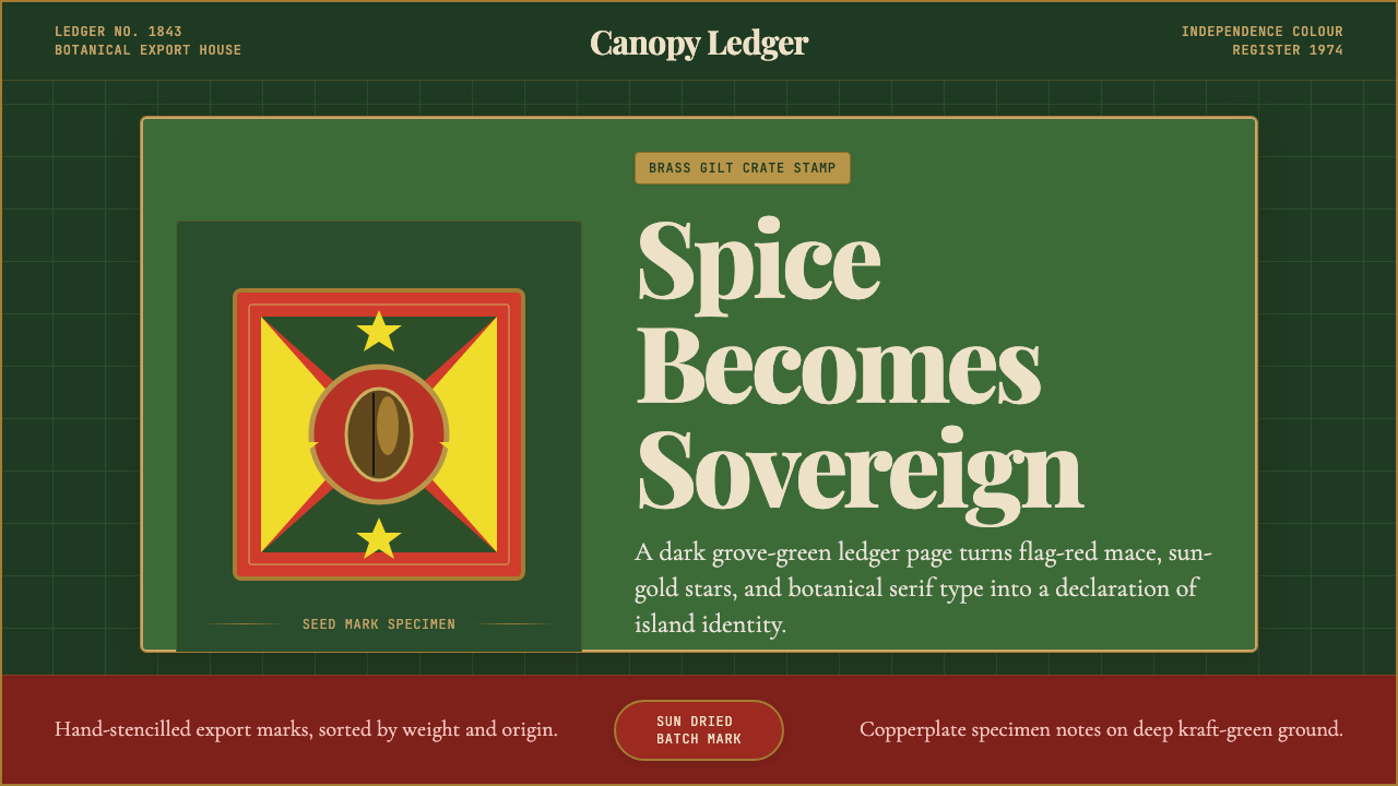 Grenadian Spice & Nutmeg FlagSpice becomes sovereign. Grove green, flag red, brass borders, and serif ledg…
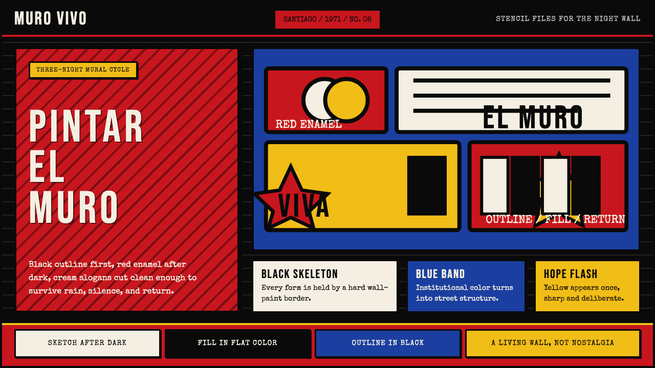 Chilean BRP Ramona Parra 1971Resistance stays alive. Blood red panels, black outlines, and stencil type re…
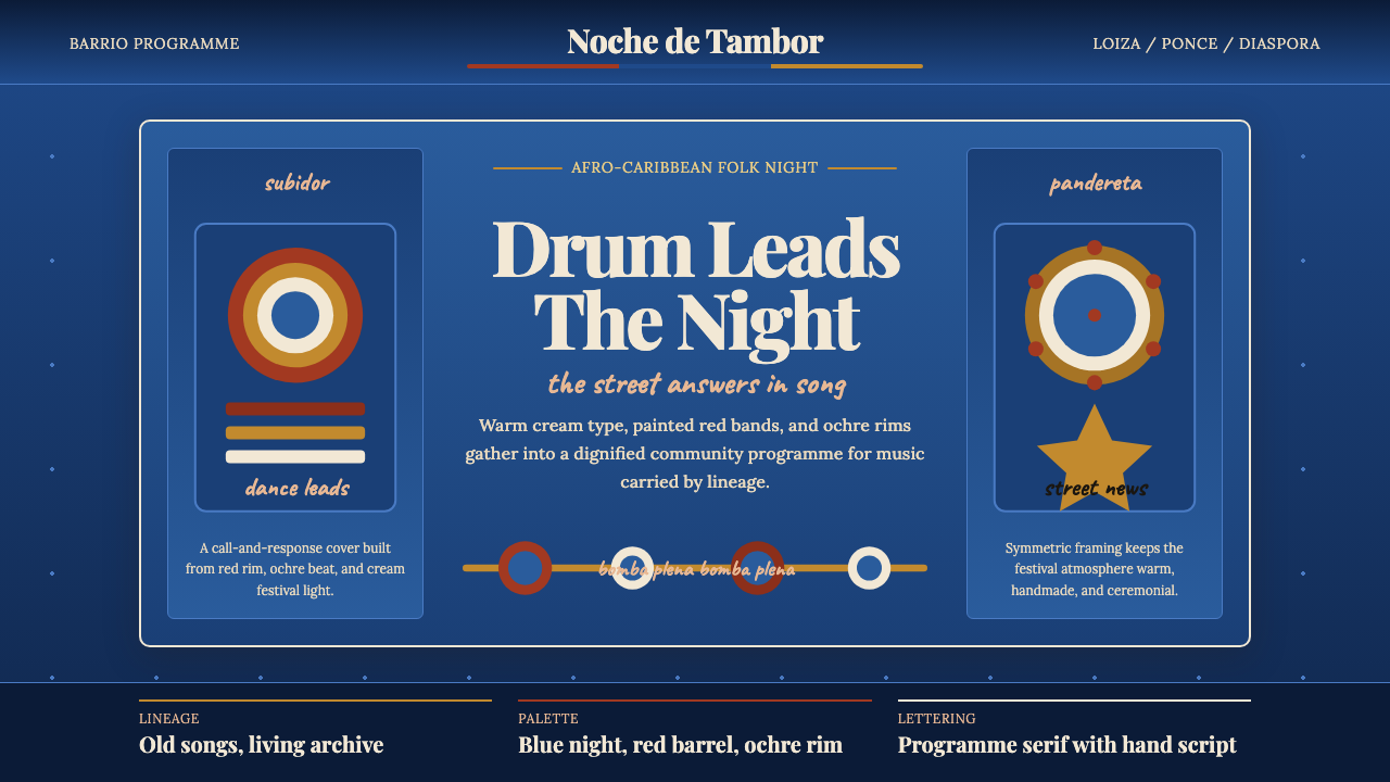 Puerto Rican Bomba & PlenaNight festival dignity. Drum-red stripes and cream Playfair type on deep trop…
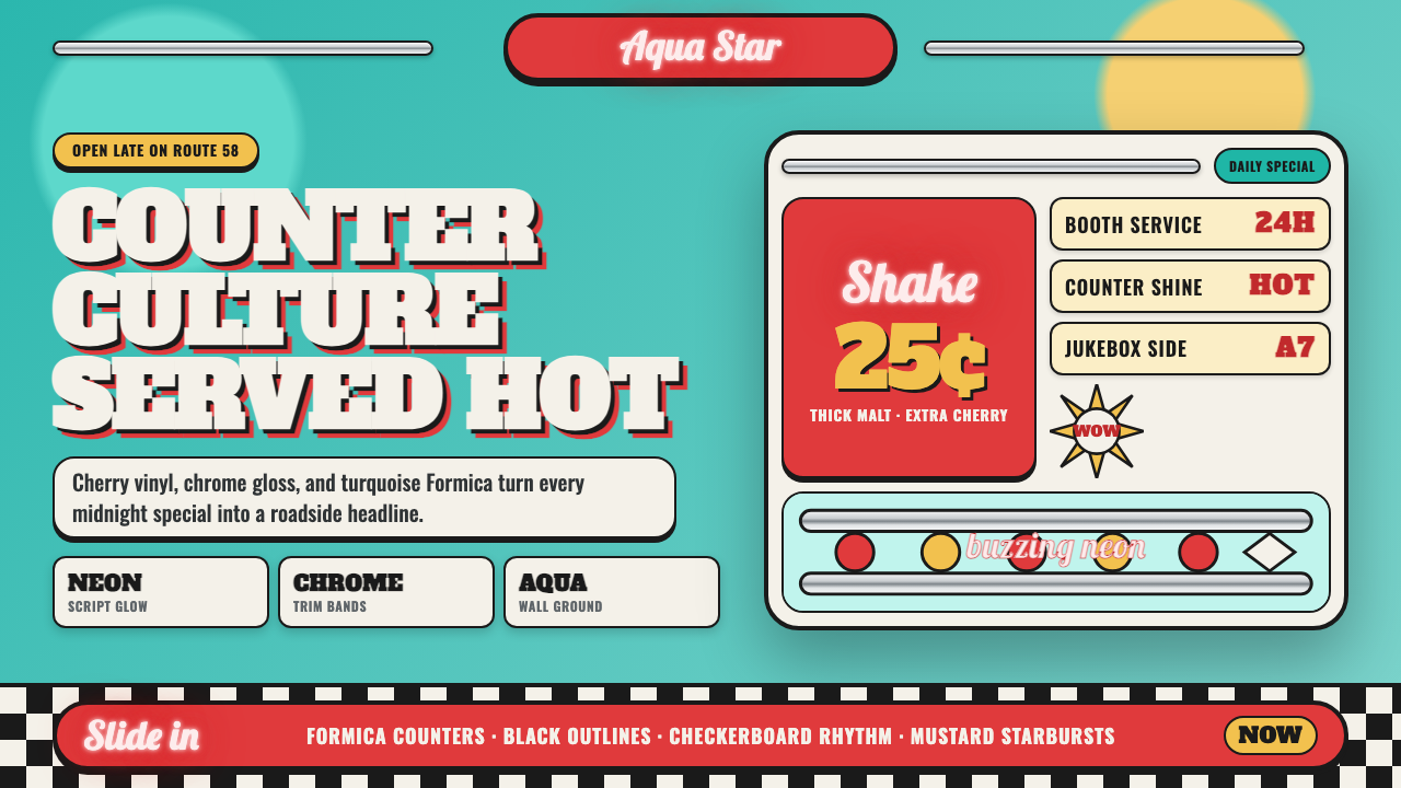 1950s Diner AquaRoadside optimism shouts. Aqua walls, cherry vinyl, chrome bands, and neon sc…