About Supergraphics
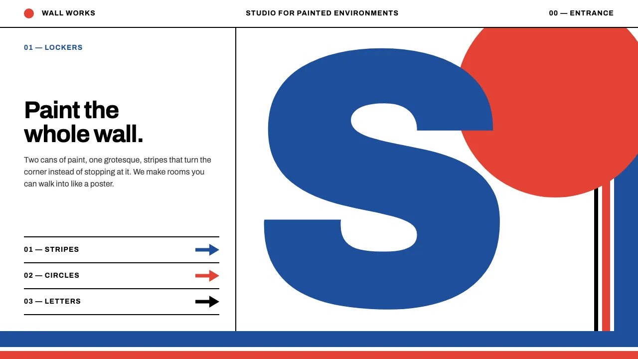
In 1966 Barbara Stauffacher Solomon took two cans of paint and a sign painter into the Moonraker Athletic Club locker rooms at The Sea Ranch and, in three days, turned plain white plywood into a building-sized poster: blue stripes, vermilion circles, arrows and Helvetica letters taller than a person.
This system brings that move to screens. White pages, two flat paint colours plus black, one grotesque set huge and cropped by the viewport edge, and stripes that turn corners instead of stopping at them.
- Origin
- The Sea Ranch, Sonoma County, California, USA
- Era
- 1966 painted at The Sea Ranch; supergraphics peak 1966–1975
- Key figures
- Barbara Stauffacher Solomon · Charles Moore · William Turnbull · Lawrence Halprin · Armin Hofmann
- Movements
- Supergraphics · Swiss International Typographic Style · Third Bay Tradition
Supergraphics design spec
Colors
Background
Surface
Primary
Secondary
Accent
Text
Typography
ArchivoHeadings
Unlock for 1 credit
The other 11 sections — buttons, cards, spacing, motion, techniques and more — open once you unlock. Download the DESIGN.md or send it to your AI in one click. Unlock once, yours forever.
Sign up nowHave an account? Sign in
Styles similar to Supergraphics
Also inspired by design movements, with a close feel.
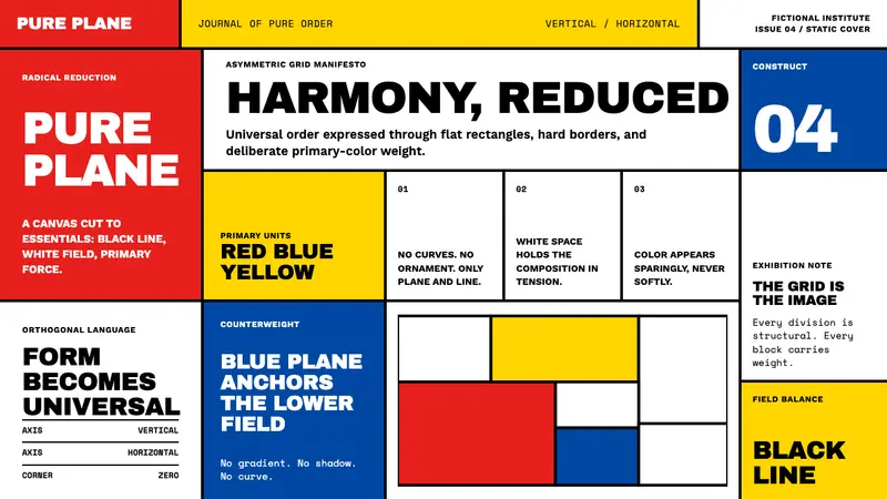 De StijlPrimary colors, locked in a black grid. Mondrian's compositions, in thick borders and flat fills.
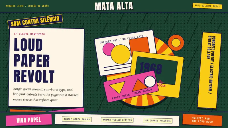 Brazilian Tropicália (1968)Art must be loud. Jungle green, banana yellow Anton type, and hard-shadow collage erupt.
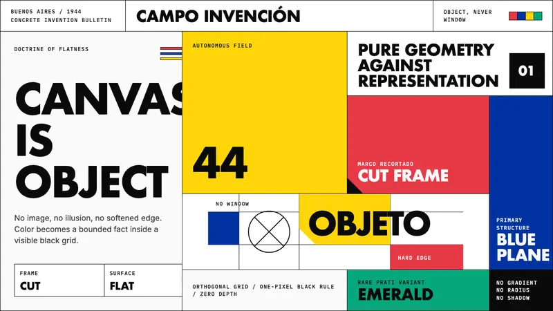 Argentine Arte ConcretoCanvas becomes object. Primary blocks, black hairlines, and a cut-frame grid enforce flatness.
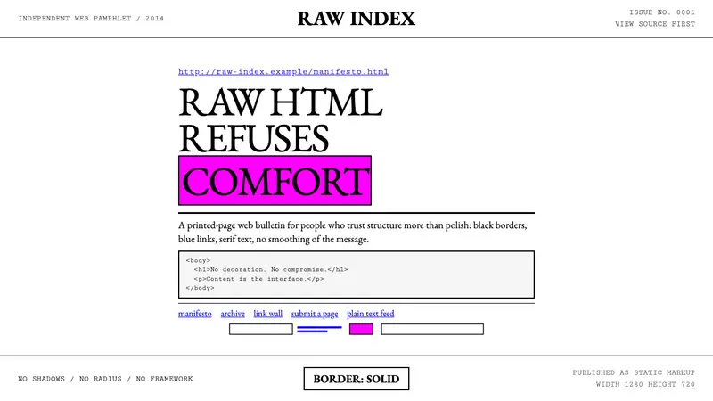 Brutalist Web 2014Browser defaults, weaponized. Times New Roman, electric-blue links — raw HTML as message.