What is Expo '70?
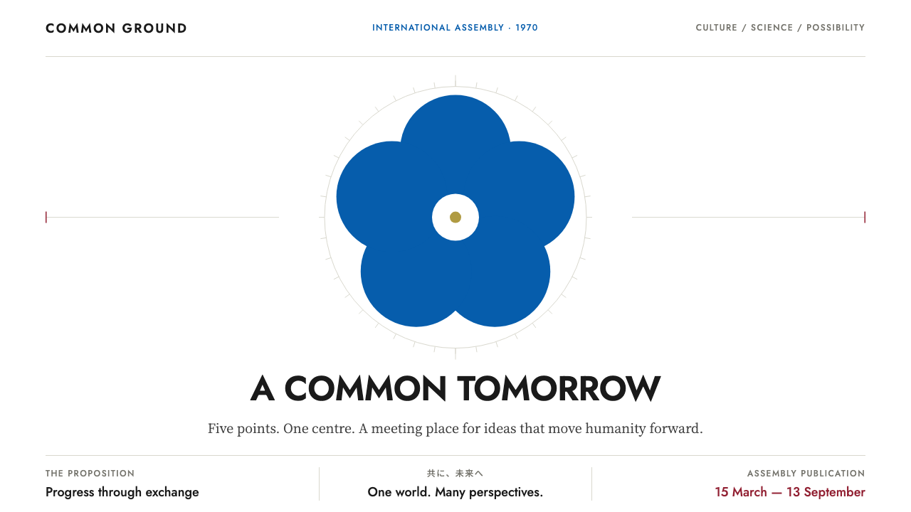
Expo '70 turned a single emblem, a single axis and a single great tower into the graphic memory of postwar Japan's optimism, all flat color on white.
Expo '70 in brief
Expo '70 is the visual language of the 1970 world's fair held on the Senri Hills in Suita, Osaka, the first world's fair ever staged in Asia. It ran for 183 days under the theme Progress and Harmony for Mankind, and its look is built from a handful of unforgettable images: a five-petal cherry blossom emblem on a white field, a vast triangulated space-frame roof, and a monumental sculpted tower thrusting up through that roof.
As a design style, Expo '70 is a graphic system of order and optimism. Everything is arranged around a central emblem or a central axis. Color is flat and printed rather than blended, white is the ground, and a small cast of colors, namely a deep carmine, an emblem blue and a restrained gold, each carries a clear job. There are no gradients and no glossy effects; the surface feels like offset printing on good paper.
What makes the style distinctive is the tension it holds. It is rigorously modernist in its geometry and its sans-serif lettering, yet it is also warm, ceremonial and slightly utopian, because it was designed to welcome the world and to say something hopeful about the future. It is a corporate-clean look with a festival heart, and that combination is why it still reads as confident today.

Where does Expo '70 come from?
The fair was planned and designed between 1965 and 1970 and opened to the public on 15 March 1970, closing on 13 September. It arrived at a particular moment: Japan had hosted the Tokyo Olympics in 1964, its economy was surging, and the country wanted to present itself to the world as a modern, peaceful and technologically confident nation. A world's fair on this scale was less a trade show than a national statement, and every piece of its graphic identity was asked to carry that message clearly.
The emblem is the keystone. Takeshi Otaka's mark places five cherry blossom petals on a white field, and it manages to be both unmistakably Japanese and unmistakably modern. The petals are read as a ring of people, a gesture toward the five continents and the harmony of the theme. Because the emblem is so simple, it could be repeated across signage, tickets, posters and souvenirs without ever losing its identity, and that discipline of repetition is what the style inherits.
The architecture supplied the rest of the imagery. Tange Kenzo designed the vast triangulated space-frame roof that sheltered the central festival plaza, a structure that looked like the future made literal. Through a gap in that roof rose Okamoto Taro's Tower of the Sun: a white sprayed-concrete body, a gilded face at the top, and arms marked with deep carmine lightning-like stripes. The tower is deliberately defiant. It contradicts the cool geometry around it with raw, archaic energy, and the contrast between the two is the emotional core of the fair.
Behind all this stood the Japanese postwar modernist and Metabolist circles, in which architects such as Kurokawa Kisho imagined buildings as growing, replaceable organisms, and the strong tradition of 1960s Japanese graphic design that had grown up around the Olympics. Expo '70 is where those currents met a mass audience. The design style that carries its name is a distillation of that meeting: ordered like a master plan, bold like a poster, and unembarrassed about optimism.
What defines the Expo '70 look?
Ground and emptiness
White is the ground and the dominant presence on every page. It is not empty so much as ceremonial, a clean stage on which the emblem or the axis can be seen at once. Generous white space gives the style its sense of calm and its air of public, civic confidence, and it keeps the saturated colors from ever feeling crowded.
Color roles
A deep carmine is reserved for action and emphasis, an emblem blue handles information and structure, and gold is held back for honours and the single point that deserves to stand out. Each color has a job, and they are not mixed or softened. The effect is closer to a printed ceremonial program than to a modern interface palette.
Central emblem or axis
Layouts are organized around one central emblem or a single vertical axis, echoing the way the fair itself was organized around the central plaza and the Tower of the Sun. Content is arranged symmetrically or in balanced columns on either side of that spine. The result feels planned, like a master plan drawing, and it makes hierarchy obvious without any decorative help.
Flat printed color
Surfaces are flat. There are no gradients, no soft glows and no glossy highlights; edges are crisp and shapes are filled with a single solid color. This echoes the spot-color printing of the period and gives the style a graphic honesty. Depth, where it appears, comes from overlap and scale rather than from simulated light.
Geometric lettering
Type is geometric and sans-serif, clear and even in weight, closer to signage than to literary typography. Headlines are set confidently and held on the axis, while smaller information is kept tidy and quiet. The lettering belongs to the same family of mid-century modernism as the emblem, so words and symbol feel drawn by the same hand.
Monumental accent
The strict order is deliberately punctured by one monumental, slightly raw gesture, the way the Tower of the Sun rises through the roof. In graphic terms that can be a single oversized figure, a golden detail or a bold carmine mark that breaks the symmetry just enough. It keeps the style from feeling merely corporate and gives it a pulse.

Who shaped Expo '70?
The artist behind the Tower of the Sun, the white sprayed-concrete tower with a golden face and crimson lightning-striped arms that rose through the fair's great roof. His tower is the style's counterweight: archaic, intense and defiantly un-modular, it supplies the emotional charge that the rest of the cool, ordered system is organized around.
The architect of the vast triangulated space-frame roof over the central plaza. His structure gave the fair its signature silhouette and its sense of a future built from rational geometry. Its repeating triangles are the architectural equivalent of the style's disciplined grid and flat color.
The designer of the five-petal cherry blossom emblem on a white field. The mark is the graphic root of the whole identity: simple enough to repeat everywhere, specific enough to be unmistakable, and the reason the style insists on one emblem at the center of the page.
A leading figure of the Metabolist movement, which treated architecture as something that grows and can be replaced piece by piece. His presence in the fair's circle points to the experimental, future-facing climate in which the visual identity was made, a climate that valued bold, modular, forward-looking forms.
How do you use Expo '70 today?
For slide decks, the style suits ceremonial and announcement moments: a cover with a single central emblem on white, a section divider built on one strong vertical axis, and content slides that keep a calm symmetrical structure. Use carmine for the one action or takeaway per slide and blue for supporting information. Data slides work well because flat color blocks and clear labeling read from the back of a room, and gold can mark the single figure worth celebrating.
In web interfaces and dashboards, treat the style as a disciplined layout language. Keep a clean white canvas, put navigation and key content along a clear central spine, and assign colors by function so that a user learns quickly what carmine, blue and gold mean. Pricing and comparison pages benefit from the balanced, symmetrical column structure, with the recommended option marked by the single accent rather than by shadows or badges stacked on top of each other.
For editorial and marketing work, the style is strongest on commemorative and institutional subjects: anniversaries, cultural programs, civic campaigns, exhibitions and product launches that want to feel optimistic and official at once. Posters can build everything around one emblem and one axis, with tidy blocks of small type beneath. Printed matter and landing pages alike benefit from the flat, offset-print finish, which feels trustworthy and period-aware without turning into costume.
The monumental accent deserves care. One bold, slightly raw gesture, such as a large carmine shape or a golden detail, gives the system its life, and it is the equivalent of the tower piercing the roof. It works because it is the only moment of rule-breaking. Choose it deliberately, place it close to the axis, and let everything else stay quiet around it.
The most common mistake is to treat the look as generic retro or to dilute it. Adding gradients, drop shadows or glossy buttons destroys the flat printed honesty that defines it, and scattering the accents across the page removes the hierarchy that the colors are meant to supply. Another error is dropping the emblem or axis altogether, which leaves a pile of nice colors with no structure. Keep one center, keep the colors in their roles, and keep the white ground generous.

Expo '70 — FAQ
What is the Expo '70 design style?
It is a graphic system drawn from the 1970 Osaka world's fair: a white ground, flat printed colors in carmine, emblem blue and gold, geometric sans-serif lettering, and layouts organized around a single central emblem or axis. It combines postwar Japanese modernism with a ceremonial, optimistic mood, and it avoids gradients and gloss entirely.
Where does the style come from?
It comes from Expo '70, the first world's fair held in Asia, staged on the Senri Hills in Suita, Osaka, from 15 March to 13 September 1970 under the theme Progress and Harmony for Mankind. Its imagery combines Takeshi Otaka's cherry blossom emblem, Tange Kenzo's space-frame roof and Okamoto Taro's Tower of the Sun, within the wider world of Japanese postwar modernism and Metabolism.
Is it the same as Swiss International Style?
No, though they share a love of order. Swiss International Style emphasizes the rigorous grid, neutral typography and an asymmetric balance. Expo '70 leans on symmetry, a central emblem and a ceremonial warmth, and it assigns specific colors to specific jobs. Think of it as a modernist grammar spoken with a festival accent rather than a neutral one.
Which products suit this style best?
It suits anything that needs to feel official, optimistic and clear at once: public-interest campaigns, cultural institutions, anniversaries, event and exhibition sites, announcements and keynote presentations. It is less suited to playful, ornament-heavy or intensely dark products, because its strength lies in calm order, a white ground and flat color.
What is the quickest way to get the look right?
Start with a white page, place one emblem or one vertical axis at the center, and give each of the three colors a single job: carmine for action, blue for information, gold for honours. Keep surfaces flat, keep lettering geometric, and add exactly one bold, slightly raw accent that breaks the symmetry. If a gradient or shadow has crept in, take it out.
Related design styles
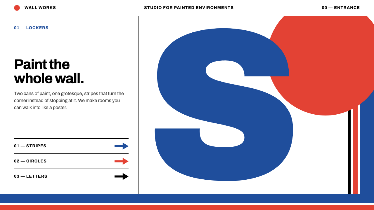 SupergraphicsTwo cans of paint, one huge grotesque. Blue stripes and a vermilion circle, c…
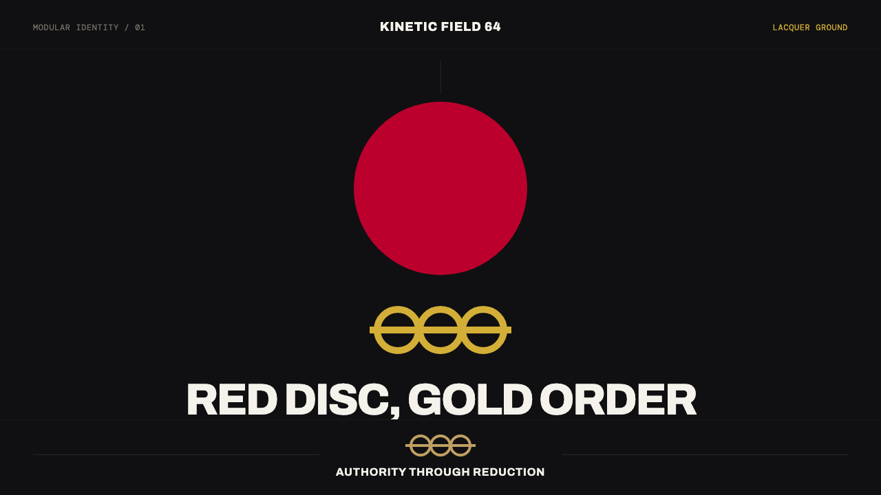 Tokyo 1964 (Kamekura)Ceremony reduced to a mark. Crimson disc and gold rings lock to a black axial…
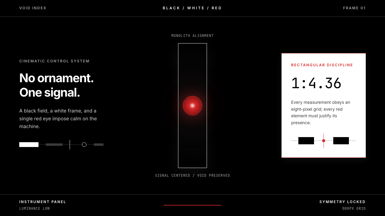 2001 — A Space OdysseyAbsolute restraint. Black void, white monolith geometry, one HAL-red signal.
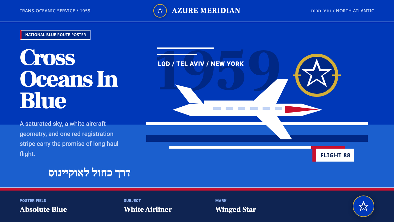 El Al Israel AirlinesNational blue takes command. White aircraft geometry cuts a flat jet-age post…
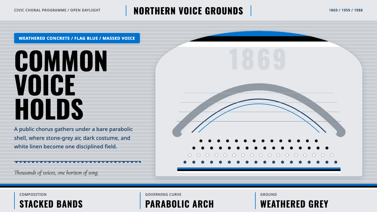 Estonian Song FestivalCivic monumentality sings. Blue-black-white bands meet a concrete arch.
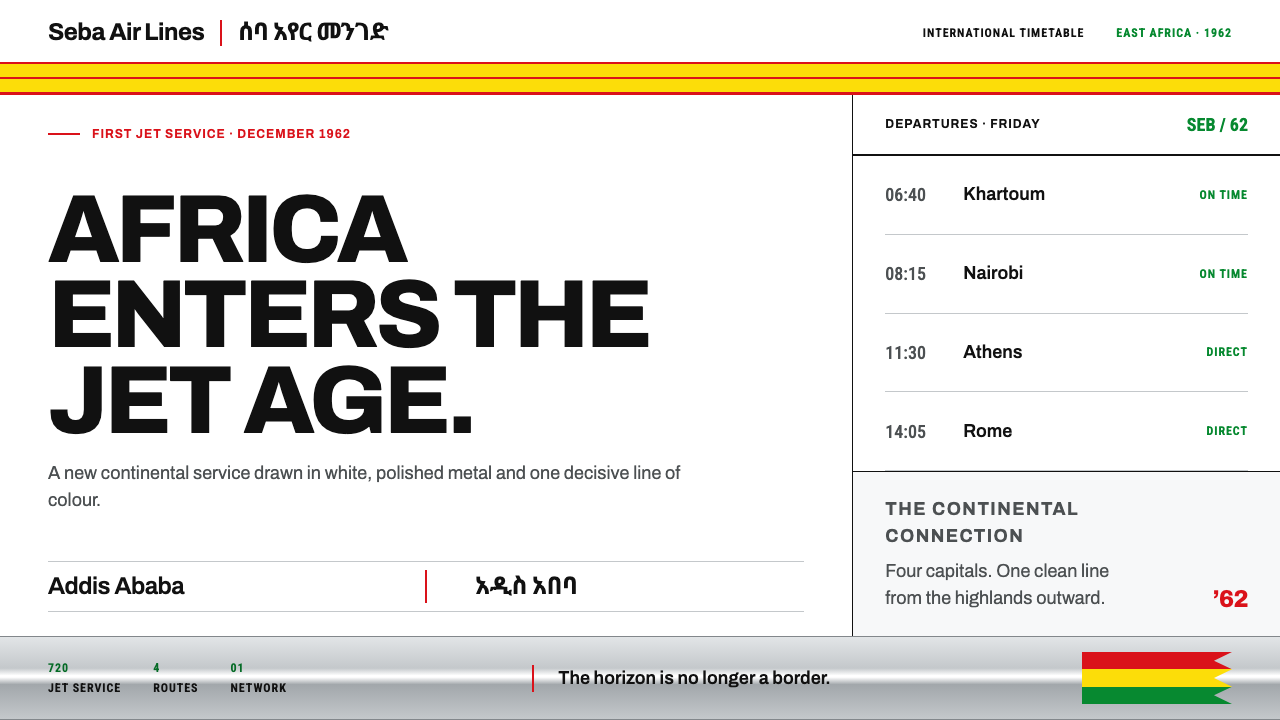 Ethiopian Airlines 1960sJet-age confidence, drawn flat. Yellow bands and red hairlines cut across whi…