What is Super Famicom?
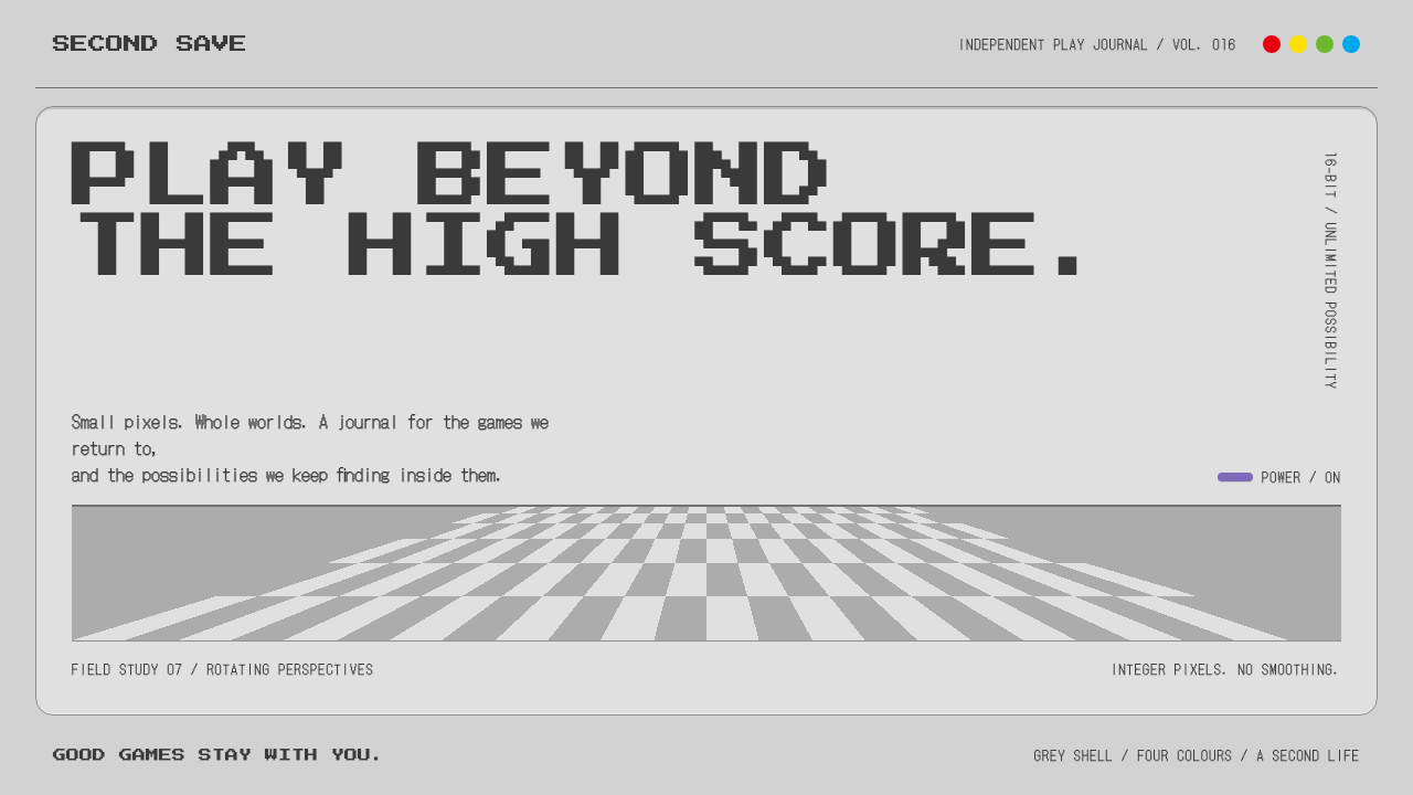
The Super Famicom style is an industrial language of grey plastic and hard pixels, with one loud purple accent and a four-dot mark for data.
Super Famicom in brief
The Super Famicom style is drawn from two things at once: the physical console that Nintendo released in 1990, and the pixel world that ran on it. The console is matte light-grey ABS with a darker recessed top panel, charcoal switches and a charcoal D-pad. On the North American SNES, the two purple A and B buttons are the single loud colour in the player's hands.
On screen, the style is equally disciplined. Headings are set in bitmap type, pixels are scaled by whole-number multiples with no smoothing, and a Mode 7 floor rotates toward the horizon to create a sense of depth. A four-dot mark in red, yellow, green and blue, taken from the Super Famicom's button colours, is reused as a status and data palette.
It is not a nostalgia filter. The style treats the console as a piece of industrial design and the screen as a hard, precise surface, and it builds an interface language from both. The result is serious about play: orderly, tactile and unapologetically mechanical.

Where does Super Famicom come from?
The Super Famicom launched in Japan in November 1990, with the North American Super Nintendo Entertainment System following in August 1991. Production continued until 2003, giving the console a very long life across two decades of changing technology. It belongs to the 16-bit console generation, which brought richer colour, larger sprites and more complex sound than the generation before it, and it set the visual standard for what many people still picture when they think of classic video games.
The hardware was shaped by Japanese consumer-electronics industrial design. Masayuki Uemura, who had overseen the original Famicom, led the engineering and design effort in Kyoto. The Japanese Super Famicom used a softly rounded grey body with four coloured face buttons, while the North American version was redesigned by Lance Barr at Nintendo of America in Redmond, Washington, with a more angular shell and the purple A and B buttons. The two designs are two readings of the same product, and the style draws on the Japanese and American looks together.
The software side carried its own visual rules. Games built for the console ran at a fixed low resolution, so artists crafted every sprite and letter at the pixel level, and the display's limits turned into a style. Bitmap headings, hard pixel edges and tightly chosen palettes were not decorative choices but consequences of the hardware. Shigeru Miyamoto, whose games defined much of the platform's identity, exemplified how clarity and playfulness could be achieved within those limits.
The 1990s pixel-art and bitmap-type tradition is the final strand. The era produced an enduring vocabulary of icons, health bars, menus and dialogue frames, and it remains a reference point for designers who want an interface to feel precise and playful at once. The style described here recovers that discipline, using integer-scaled pixels and restrained colour, and pairs it with the console's grey plastic as a counterweight.
What defines the Super Famicom look?
Matte grey plastic
The base surface is a matte light grey modelled on the console's ABS shell. It is neutral, slightly warm and non-reflective, a deliberate contrast to the saturated colour on the television. In an interface, it fills backgrounds and large panels, giving the screen the quiet weight of a manufactured object.
Recessed panels
Content areas sit in darker, inset panels that look pressed into the grey, as the console's top panel is. Depth is expressed through hard-edged highlight and shadow lines, never through blur. This inset construction gives the layout a tactile, machined quality and clearly separates containers from the ground around them.
Purple accent
A single purple, borrowed from the North American A and B buttons, is the one loud colour on the page. It marks the primary action and key emphasis, and because everything else is grey and charcoal, it is instantly noticeable. Using it sparingly is what makes the whole system feel disciplined rather than playful for its own sake.
Bitmap headings
Headings are set in a bitmap face whose letters are visibly assembled from square pixels. It is used at whole-number scales so that edges stay crisp and no letter is blurred by interpolation. Body text is kept plain and highly legible, so the pixel type works as a signature for titles and labels rather than a burden on long reading.
Integer-scaled pixels
Pixel art and icons are enlarged only by whole multiples, with smoothing turned off, so every pixel stays a sharp square. This is a rule of craft as much as of look: blurry scaling would betray the whole premise. It applies equally to sprites, icons and decorative borders, and gives the style its precise, engineered feel.
Four-dot status palette
Red, yellow, green and blue circles, from the console's logo and button colours, are reused as a compact palette for status indicators and chart series. Because the four hues are clearly separated and always appear as small flat dots, they can label categories without introducing gradients. They give charts and dashboards a recognisable identity.

Who shaped Super Famicom?
Uemura led the hardware engineering and design at Nintendo in Kyoto, having overseen the original Famicom before the Super Famicom. His approach combined technical pragmatism with a clear sense of what a household product should look like. The Japanese console's grey body and four coloured buttons are central to the style's identity.
Barr was the industrial designer at Nintendo of America in Redmond who reshaped the console for North America. His redesign gave the SNES a more angular shell and the purple A and B buttons that became the one loud colour in this style. His work shows how a regional adaptation can produce a distinct visual identity.
Miyamoto's games defined much of the platform's personality and set expectations for clarity and playfulness within tight pixel limits. His work illustrates the principle that constraints can sharpen design. The style inherits that spirit of precise, inventive play.
The company produced the console in Japan and North America from 1990 to 2003, a long lifespan that made its look a shared cultural memory. Its combination of consumer-electronics discipline and playful software established a visual language that later designers still return to.
How do you use Super Famicom today?
For slides, the Super Famicom style is excellent for tech, game, hardware and retro-culture presentations. Use a matte grey slide with one recessed dark panel for the title, a bitmap heading and a single purple highlight. Content slides should be orderly and modular, like the controls on a console, with consistent spacing between panels. It communicates craftsmanship and play at once.
For data slides, use the four-dot palette for chart series and status labels, drawing bars and markers as flat, hard-edged shapes. Place each chart in a recessed panel and keep the axes simple. Avoid gradients and drop shadows, which contradict the system. A small row of four coloured dots can serve as the legend, tying the data back to the console's mark.
In web UI, the style suits game-related sites, developer tools, retro hardware shops, emulator front ends and playful dashboards. Make panels look inset, buttons look pressed in, and primary actions purple. Use bitmap type for headings and navigation labels while keeping body text in a clear sans face. Pixel icons scaled by whole multiples will give the interface its crispness; fractional sizes will blur them and weaken the effect.
In editorial and marketing work, use it for gaming features, anniversary retrospectives, collectible product pages and event posters. A grey plastic texture, a purple accent and a Mode 7 style tilted floor can create an immediate sense of the era without relying on screenshots. Keep headlines short, in bitmap type, and avoid reproducing the console's logos directly, which are protected marks.
The most common mistake is treating the style as generic retro: neon colours, scanlines and glitch effects have little to do with it. The identity is grey plastic and hard pixels, with a single purple. Another mistake is scaling pixel art by fractional amounts, which blurs the edges and undermines the premise. Finally, avoid overusing the four-dot colours as large fills; they work as small, flat, informative marks.

Super Famicom — FAQ
Is this the same as 8-bit or generic retro pixel style?
No. It is tied specifically to the 16-bit Super Famicom and SNES: grey ABS plastic, recessed panels, one purple accent, bitmap headings and a four-dot status palette. Generic retro styles often rely on neon, scanlines or heavy nostalgia. This one is more industrial and restrained, and its colour logic comes from the physical console.
Why does the style use purple?
The purple comes from the A and B buttons on the North American SNES, which Lance Barr's redesign made the one colourful element on an otherwise grey console. In the style, it plays the same role: a single bright accent in a neutral field, reserved for the primary action and the key emphasis.
What is Mode 7 and why does it appear here?
Mode 7 is the Super Famicom graphics mode that could rotate and scale a flat background layer, producing floors that tilt away toward the horizon. It became a signature of the console's look. The style echoes it with a tilted, receding floor in hero areas, giving pages a sense of depth without any soft effects.
Can I use it for a modern business app?
Yes, for products with a playful or technical audience, such as developer tools, creative utilities and gaming platforms. Use it on headings, icons and the status palette while keeping the main body typography clear. For conservative sectors the pixel type and purple accent may feel out of place, so use them sparingly.
Related design styles
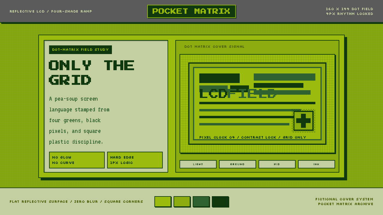 Game Boy DMG Green ScreenOnly the grid remains. Olive LCD tones, pixel type, and hard black borders.
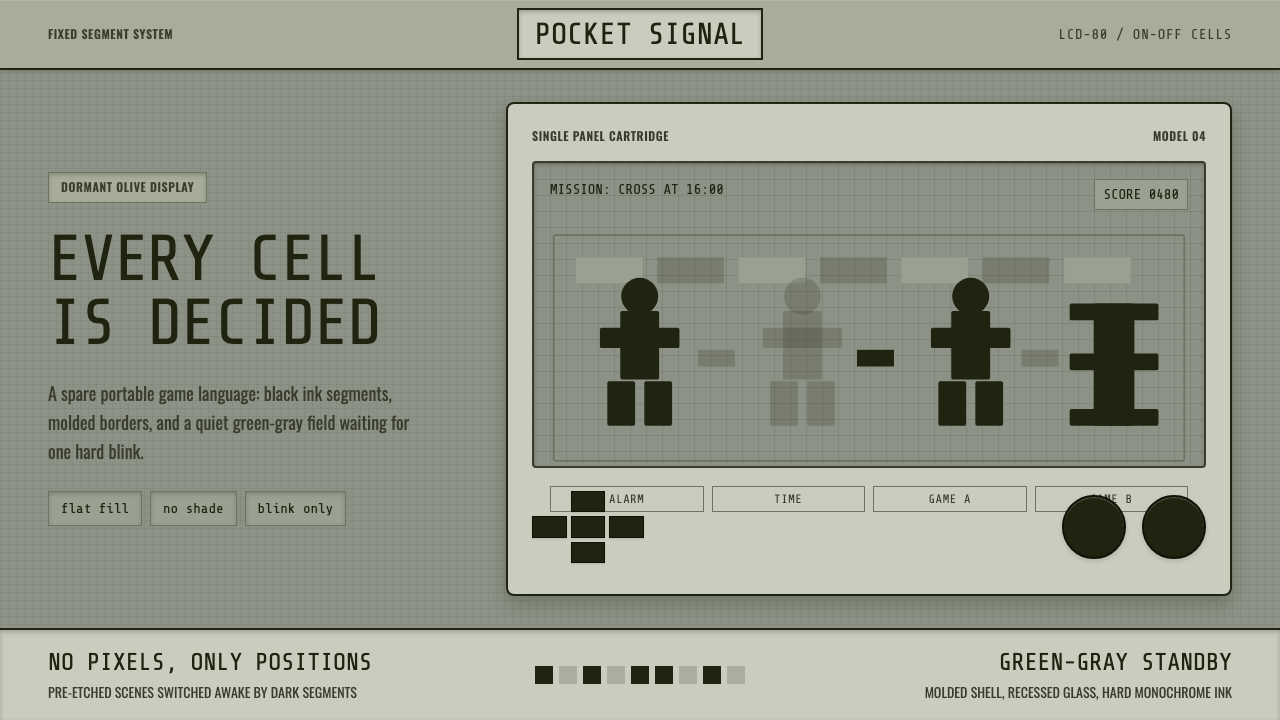 Handheld LCD GameConstraint is the charm. Olive LCD grid, black segment ink, tight molded beze…
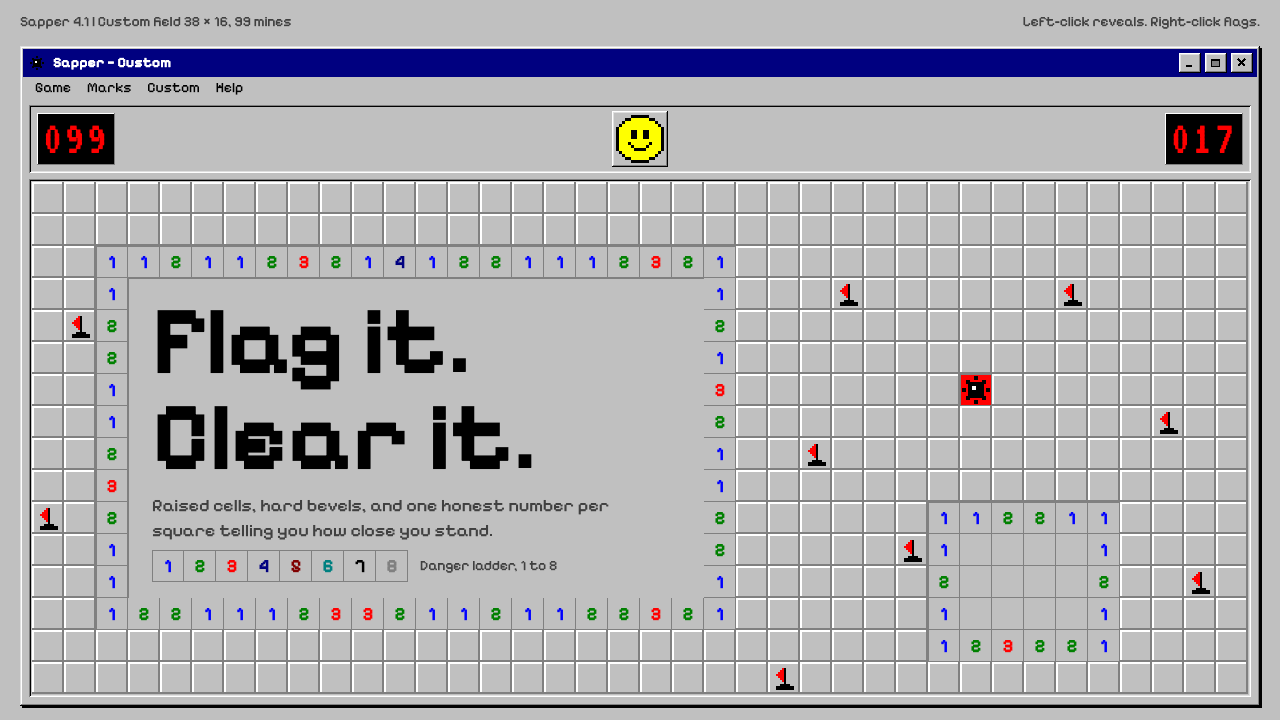 MinesweeperCold logic, warm nostalgia. Silver bevelled cells, VGA numerals, red seven-se…
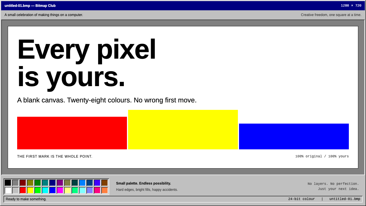 MS PaintFirst-computer freedom. Navy captions, grey bevels and 28 fixed colours frame…
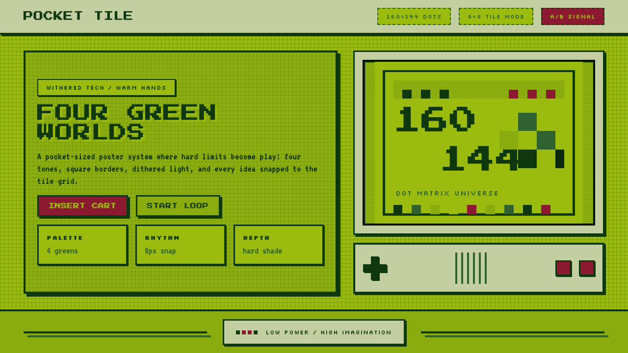 Nintendo Game BoyConstraint becomes play. Four swamp greens, pixel type, and an 8×8 grid do th…
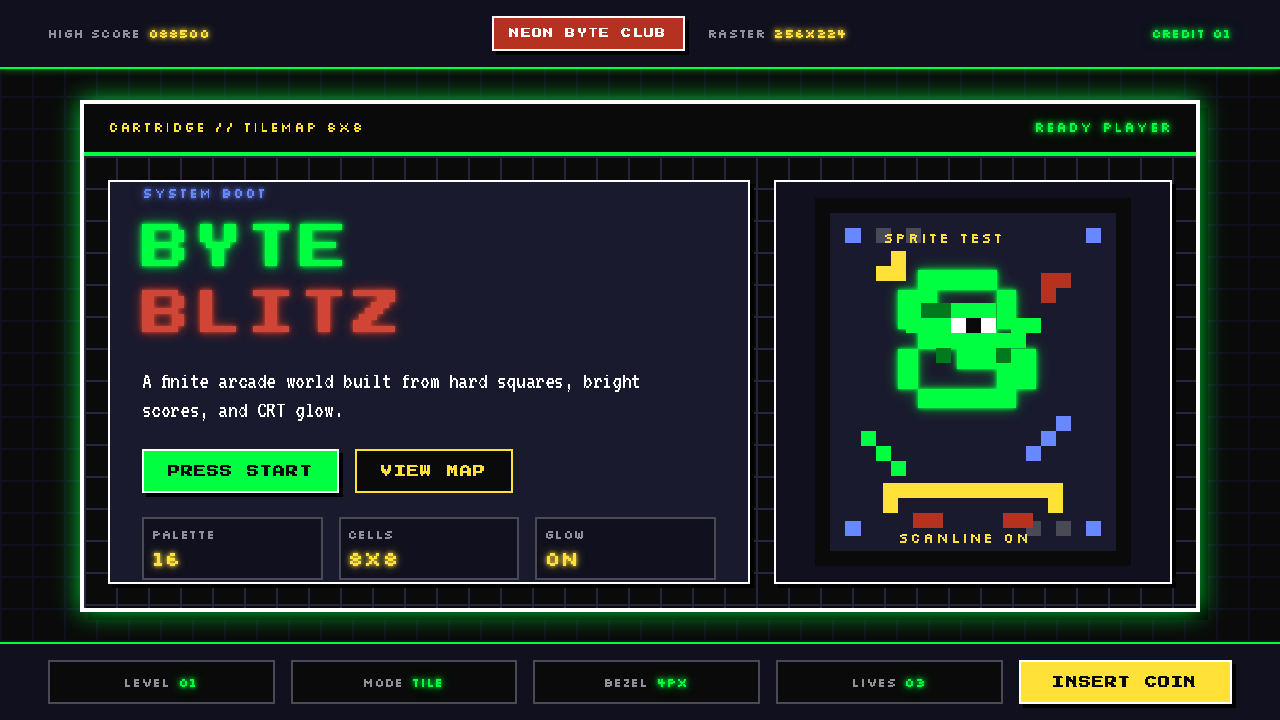 Pixel Art / 8-bit RetroHard-edged digital joy. CRT black, phosphor green, and 8x8 grids snap every p…