What is Minesweeper?
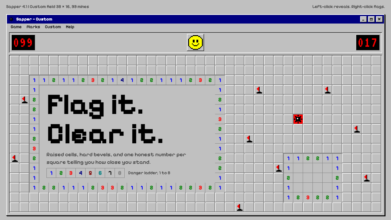
Minesweeper's look is the Windows desktop at its most literal: raised silver squares, hard bevels, sixteen VGA colours, red digital counters and one yellow smiley face.
Minesweeper in brief
Minesweeper is the logic puzzle that sat in the Games folder of nearly every Windows PC for a decade. As a visual style it means a field of raised silver squares, each with a white highlight on its upper-left edges and a grey shadow on its lower-right ones, that sink into flat ground when clicked and reveal small coloured numerals: a blue 1, a green 2, a red 3 and so on.
The look is the late-twentieth-century desktop interface reduced to its essentials. Controls appear to be physical keys that can be pressed in and released. There are no rounded corners, no soft shadows and no gaps between cells. The palette is the system's fixed sixteen colours, the type is a plain pixel-era sans, and the top bar carries two red seven-segment counters on black, one for mines left and one for elapsed time, with a yellow smiley between them that opens its mouth when you press, wears sunglasses when you win and shows crossed eyes when you lose.
It feels cold, precise and slightly stubborn, yet nostalgic at the same time. That mix of logic and warmth is why designers return to it when they want a product to feel dependable like old desktop software but a little playful like a game.

Where does Minesweeper come from?
Minesweeper's lineage goes back to 1990, when it appeared in the Microsoft Entertainment Pack 1, a collection of small games for Windows. The source credits Curt Johnson and Robert Donner for the version most people know. It was then bundled with Windows 3.1 in 1992, which is the moment it left the world of optional add-ons and became something every user of the operating system could open from the Games folder at the start of a break or a boring afternoon.
It stayed there for years. The source notes that its appearance remained visually unchanged through Windows XP in 2001, which means a single design, with the same bevels, the same counters and the same face, served as a constant presence across more than a decade of desktop computing. It joined the other bundled desktop pastimes, such as Solitaire and FreeCell, which taught millions of people to use a mouse by giving them something to do with it.
The visual language comes from two things that were true of that era. The first is the three-dimensional look of Windows 3.x and Windows 95 controls: buttons that looked bevelled and physical, with a light edge on one side and a dark edge on the other, so that pressing them swapped the two and created the impression of depth. Minesweeper's squares use exactly that trick. The second is the VGA sixteen-colour system palette, a small, fixed set of strongly saturated colours from which numerals, backgrounds and indicator lights were all drawn.
The seven-segment counters belong to a third tradition, that of calculators, digital clocks and lab instruments, where numbers were built from lit bars on a dark ground. Together these influences make Minesweeper feel like a tiny instrument panel: a place where information is exact, rule-bound and instantly legible. The style survives because it is a clean snapshot of how software used to look when interface design meant making flat pixels pretend to be physical buttons.
What defines the Minesweeper look?
Bevelled cells
Every cell is a raised silver square with a white highlight on the top and left edges and a dark grey shadow on the bottom and right. Clicking flips this relationship so the square appears to sink into the board. The bevel is hard and crisp rather than soft, and it is the single most recognisable feature of the whole system.
No corners, no gaps
Nothing is rounded. Cells are packed edge to edge in a gapless grid, and panels meet at right angles. This gives the interface its dense, engineered, slightly severe feel, and it means all the depth comes from the bevel rather than from spacing or shadow.
Sixteen-colour palette
Colour is limited to the fixed VGA sixteen-colour set. The surface is system silver, the numerals use saturated primaries and darker secondaries, and each number has its own hue so players can read the board at a glance. There are no gradients, tints or transparencies, only a handful of flat, strongly saturated colours.
Seven-segment counters
Two counters sit at the top of the window, red digits on a black ground, built from the familiar lit bars of a digital display. One counts the remaining mines and the other counts elapsed time. They give the interface the credibility of an instrument and provide a strong, high-contrast anchor above the grid.
The single friendly face
A yellow smiley sits between the counters and is the only warm, human element on screen. It reacts to the game: open-mouthed on a press, sunglasses on a win, crossed eyes on a loss. It works as both a reset button and a status indicator, and it is what keeps the otherwise severe interface from feeling cold.
Pixel-era type
Text is set in a plain, small, system-style sans serif, hard-edged and unadorned. Numbers inside cells are bold and sit centred. There is no typographic flourish, which keeps the system's reading experience as direct and functional as the logic of the game itself.

Who shaped Minesweeper?
Credited in the source as one of the two people behind the Minesweeper that shipped in Microsoft's early Windows games. His name is tied to the version that spread from the Entertainment Pack into the operating system itself.
The other credited name in the source. Together with Curt Johnson, he is associated with the design that stayed visually unchanged from its 1992 bundling with Windows 3.1 through Windows XP in 2001, an unusually long run for a piece of interface.
The 1990 collection in which Minesweeper first appeared, alongside other small games for Windows. It is the delivery vehicle that carried the game to its first audience before the Windows 3.1 bundle made it universal.
How do you use Minesweeper today?
In slide decks, Minesweeper's style suits retrospectives, gaming talks, developer conferences and any presentation about the history of computing. A cover slide can be a silver window frame with a title bar and a field of bevelled tiles, and a section divider can be a red seven-segment number counting the chapter. Content slides work best as a gapless grid of equal-sized beveled panels, because the system's strength is repetition and alignment.
For data slides, use the counter style to display the one headline metric in red digits on black, and arrange supporting figures in a grid of bevelled cells with the numeral colours doing the encoding. Resist adding gradients or soft shadows, which would break the effect. A table of uniform raised cells, with a few sunk cells to show selected or resolved items, communicates state with almost no additional ornament.
In web and product UI, the style fits retro-themed utilities, developer tools, dashboards that want an old-school desktop flavour and game-adjacent products. Buttons should have hard bevels that invert when pressed, forms should look like classic dialog boxes, and status panels can use seven-segment digits for timers and counters. Because there are no rounded corners and no gaps, layouts feel dense, so give them enough surrounding space to breathe.
In editorial and marketing work, the style signals deliberate nostalgia. It reads well on posters, newsletters and campaign pages that want the warmth of early personal computing without the clutter of a full pixel-art world. Pair it with short, direct copy, since the interface itself already sounds like a rule-bound machine.
The common mistake is mixing eras. Adding rounded cards, blurred glass or soft drop shadows next to a bevelled grid makes the whole thing look unresolved. Another mistake is using the full sixteen colours at once; keep the surface silver and let the colours appear mainly in numerals and indicators, with the yellow face as the only warm accent.

Minesweeper — FAQ
Where does the Minesweeper look come from?
It comes from the Windows 3.x and Windows 95 era, when controls were drawn as bevelled, physical-looking buttons, and from the fixed VGA sixteen-colour system palette. The seven-segment counters borrow from calculators and digital instruments. The game first appeared in 1990 in Microsoft Entertainment Pack 1 and shipped with Windows 3.1 in 1992.
Why are there no rounded corners or gaps in this style?
Because the effect depends on hard, pixel-exact bevels. Rounded corners and gaps would soften the contrast between the light and dark edges that creates the raised-button illusion. The tightly packed grid is also part of what makes the interface feel like a precise, rule-bound instrument.
How many colours does the system use?
It sticks to the sixteen fixed colours of the VGA system palette. In practice the surface is a single silver grey, the numerals use distinct saturated hues so they can be read quickly, the counters are red on black, and the smiley is the only yellow element. There are no gradients or tints.
Is it a light or a dark theme?
It is a light theme. The main surfaces are silver-grey, the way classic Windows windows looked. The only dark areas are the black display panels behind the red counters, which act as small high-contrast accents rather than as the base of the interface.
When should I avoid this style?
Avoid it for products that need to feel soft, luxurious or contemporary, such as wellness brands or high-end consumer apps. Its density and hard edges communicate rules, precision and nostalgia, which is the wrong signal when the goal is warmth or elegance.
Related design styles
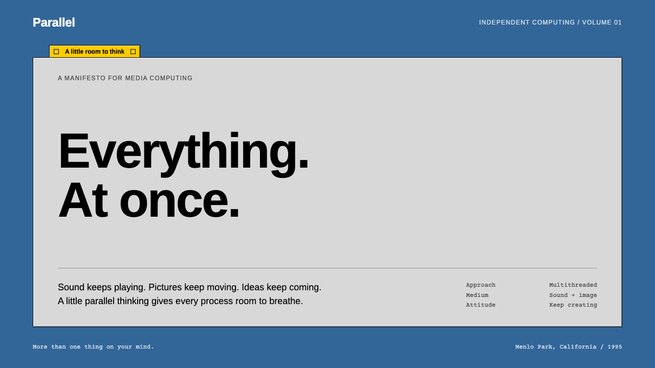 BeOSQuiet chrome, restless spirit. Blue desktop, grey bevels, one short yellow ta…
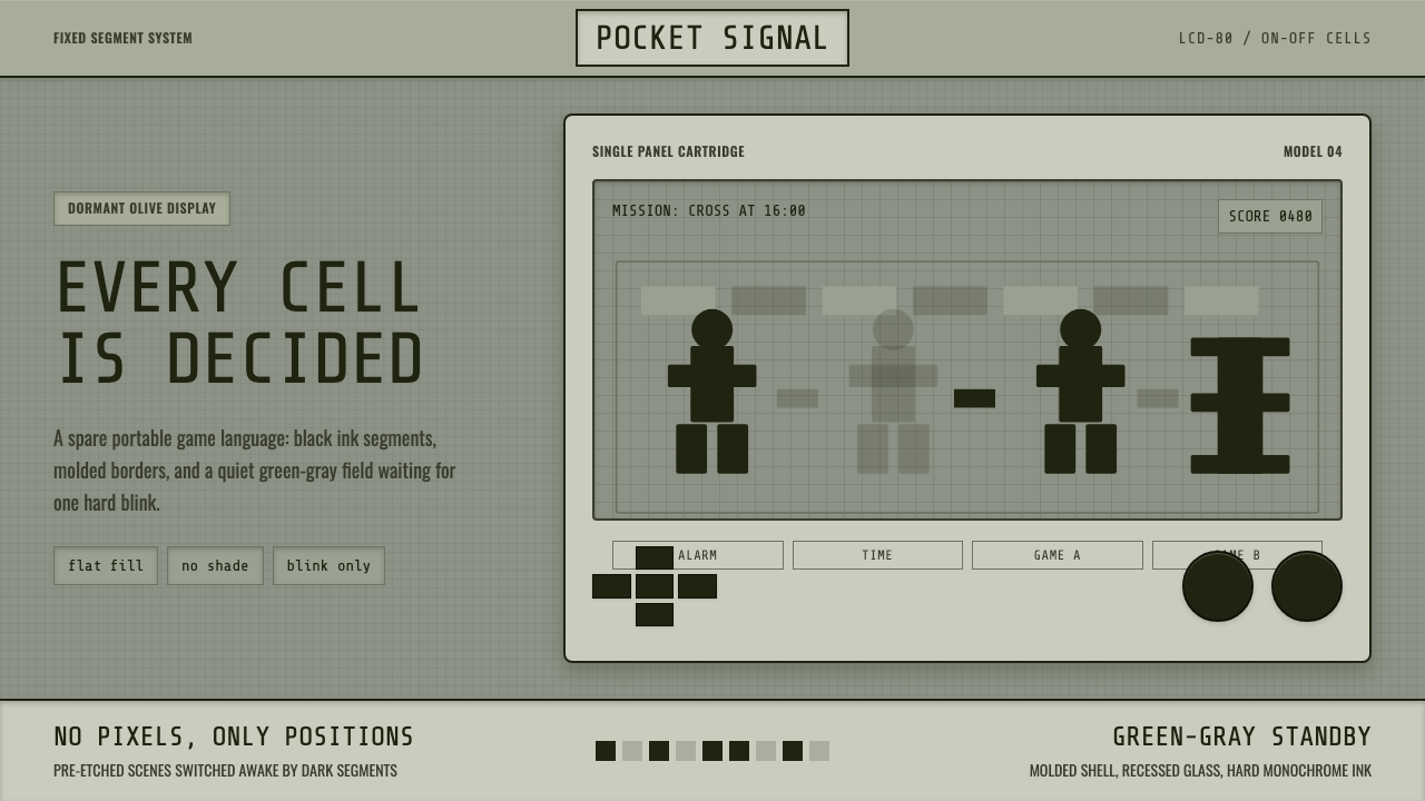 Handheld LCD GameConstraint is the charm. Olive LCD grid, black segment ink, tight molded beze…
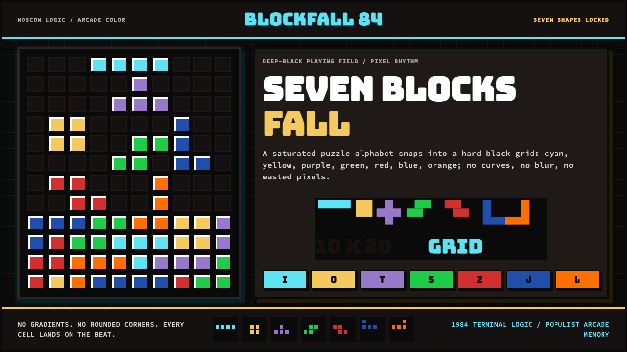 Tetris (1984)Arcade gravity, pixel exact. Black grid, Bungee type, seven saturated blocks.
 Chrome DinoWit from almost nothing. One grey ink on pale paper, pixel-font score digits,…
 i-modeA whole world in a few dots. Bitmap type, white space and yellow bring the po…
 MS PaintFirst-computer freedom. Navy captions, grey bevels and 28 fixed colours frame…