What is BeOS?
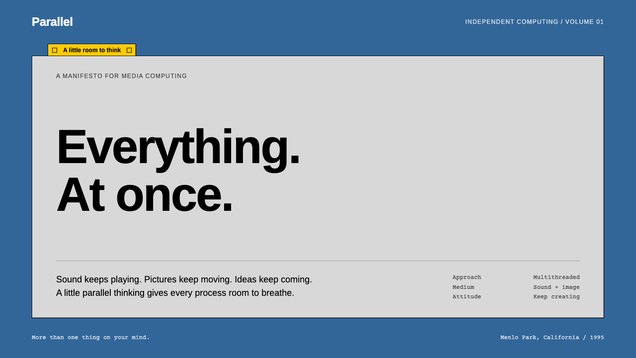
BeOS is the operating system that looked like nothing else: a flat blue desktop, quiet grey windows and one stubby yellow tab that holds only a title.
BeOS in brief
BeOS was a desktop operating system created by Be Inc., a small company based in Menlo Park, California. It was designed for media work: fast, built around pervasive multithreading, and able to use several processors at once. It first appeared alongside the BeBox, a dual-processor computer that the company unveiled in 1995.
Visually, it is one of the most recognisable interfaces of the 1990s. The desktop is a solid, flat blue. Windows are drawn in a modest grey with square corners and a fine bevel at the edges. Each window wears a short yellow tab at the top that is exactly as wide as the title it carries, and that tab can slide along the window's upper edge.
The Tracker is the file manager and desktop shell, and its windows define the look. The style that grew out of it is quiet and orderly, closer to a well-organised workshop than to the glossy, ornamental systems that came later. Depth and colour are not spread across the chrome; they are saved for the icons and for the one yellow tab that tells you which window is active.

Where does BeOS come from?
Be Inc. was founded by Jean-Louis Gassée, a former Apple executive, with a clear conviction: personal computers were about to become media machines, and the existing operating systems were not built for that job. Rather than adapt an old design, the company started again, and the BeBox, a machine with two processors, was the hardware showcase for that approach.
Technically, the system's identity came from symmetric multiprocessing and pervasive multithreading, in which every part of the system was written to share work across processors. This was uncommon in the personal computing of the mid-1990s, and it gave BeOS its reputation for fluid audio and video. Engineers such as Steve Sakoman and Dominic Giampaolo are associated with the company's early system and file-system work.
The look that most people remember belongs to the releases from R3 to R5, between 1998 and 2000. By then the interface had settled into its grey windows, blue desktop and yellow title tabs, with icons drawn from a slightly raised three-quarter viewpoint. The design was disciplined because the company was small and wanted its tool to look like a precision instrument rather than an entertainment product.
Be Inc. never became a mainstream platform, but the system did not disappear. In 2001 a volunteer project called Haiku began rebuilding it as open-source software, and it has carried the BeOS look and philosophy forward since then. For designers, BeOS is a reminder that a strong interface identity can come from restraint, a single colour accent and consistent small details rather than from visual effects.
What defines the BeOS look?
A flat blue desktop
The background is a single, solid blue with no wallpaper, texture or gradient. It makes a calm stage on which grey windows and detailed icons stand out, and it is the colour most people associate with the system.
Quiet grey chrome
Window frames, toolbars and controls are rendered in mid and light greys. They carry information about structure, not decoration, so the eye is never pulled toward the frame and away from the content inside it.
The stubby yellow tab
The title tab is short, yellow and only as wide as its text. It is the single warm accent in the interface and marks the active window. Because it is the only bright thing on the frame, the user always knows where focus is.
Fine bevels, square corners
Edges are given a thin light-and-dark bevel that suggests a raised panel, but corners stay sharp and nothing is rounded. There are no soft shadows or glows. Depth is signalled with the barest minimum of lines.
Colourful, dimensional icons
While the chrome is plain, the icons are drawn with rich colour and a slightly tilted, three-quarter view, as if small objects were sitting on a desk. They are where the interface lets itself be expressive.
Small, dense, utilitarian type
Text is small, tightly spaced and set in a plain sans-serif. It is meant for people who work with many files at once and want to see a lot at a glance. There is no ornament in the lettering.

Who shaped BeOS?
Former Apple executive and founder of Be Inc., who set the company's direction around media computing.
Engineer associated with the early BeBox hardware and system work at Be.
Engineer associated with the file system work in BeOS, a central part of its technical reputation.
How do you use BeOS today?
In slides, BeOS suits a technical, nostalgic talk about operating systems, retro computing, open source or the history of software. A solid blue cover with a single grey window holding the title, and a short yellow tab above it, reads as an instant reference. Keep content slides flat and grey, and use the yellow only to mark the slide or window that matters. For data slides, draw charts inside window frames, with plain grey axes and a handful of bright icon-like markers.
On the web, the style works for developer tools, documentation sites, file-heavy dashboards, system monitors and playful engineering portfolios. Build the layout from grey panels on a blue page, give each panel a short yellow title tab, and let one panel at a time carry the tab to show focus. Buttons should be flat grey rectangles with fine bevels, and form fields should be plain boxes. Keep the interface dense and orderly rather than airy.
In editorial and marketing work, it fits retro-computing posters, anniversary pieces about the history of personal computing, conference materials for open-source projects and product pages that want to signal craftsmanship. Because the system is so dark and technical in mood, it shines when the subject is itself a piece of engineering.
It also gives a nice dark-mode-adjacent flavour for apps whose users value density and control, such as media tools, audio and video utilities and terminal-adjacent products, without needing glossy effects.
The most common mistake is to add what the original deliberately left out: rounded corners, drop shadows, gradients on the window frames or several accent colours competing with the yellow. The second mistake is to colour the chrome. Colour and depth belong in the icons and in the single active tab; the frame should stay grey.

BeOS — FAQ
What is the BeOS design style?
It is the look of the BeOS operating system and its Tracker shell: a flat blue desktop, grey square-cornered windows with fine bevels, and a short yellow title tab marking the active window. It is quiet, dense and utilitarian.
Who made BeOS and when?
Be Inc., founded by Jean-Louis Gassée in Menlo Park, California, built it. It appeared with the BeBox in 1995, and the look most people remember comes from the R3 to R5 releases between 1998 and 2000.
What is Haiku and how is it related?
Haiku is an open-source operating system that began in 2001 as a volunteer effort to recreate BeOS. It carries the BeOS interface and philosophy forward.
Which projects suit this style?
Developer tools, documentation, system dashboards, retro-computing content, open-source project pages and nostalgic technical talks. It is less suitable for soft, luxurious or highly emotional brands.
How do I keep it from looking dated in a bad way?
Commit to the discipline: keep the frame grey, use the yellow tab only for focus, and invest in good icons. A confident, consistent application reads as deliberate and charming rather than outdated.
Related design styles
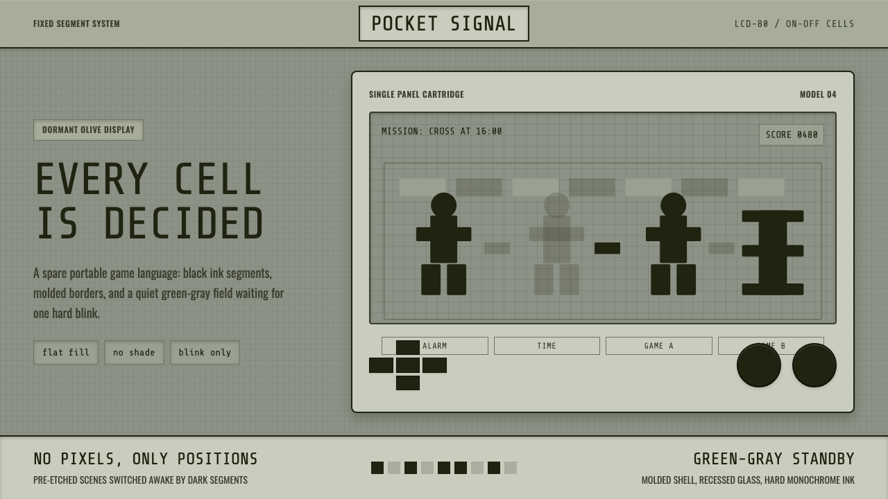 Handheld LCD GameConstraint is the charm. Olive LCD grid, black segment ink, tight molded beze…
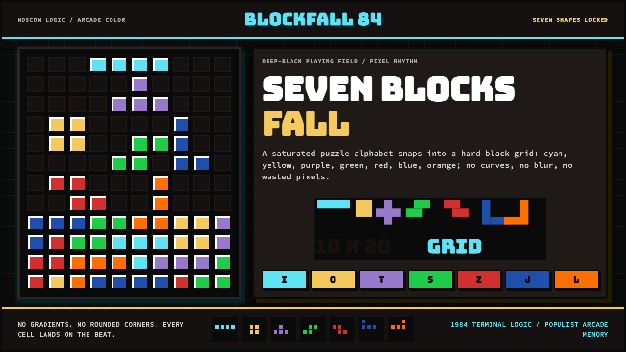 Tetris (1984)Arcade gravity, pixel exact. Black grid, Bungee type, seven saturated blocks.
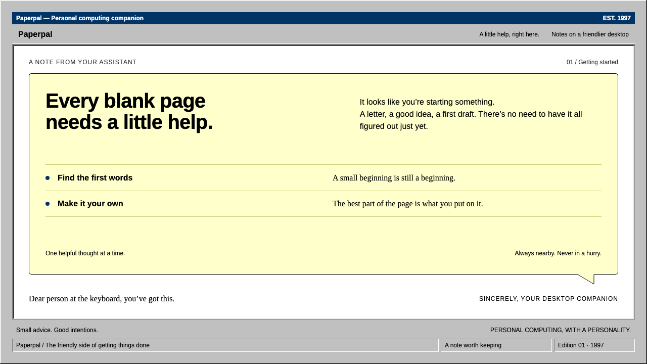 ClippyHelp with a human touch. Pale-yellow balloons, navy trim and hard grey bevels.
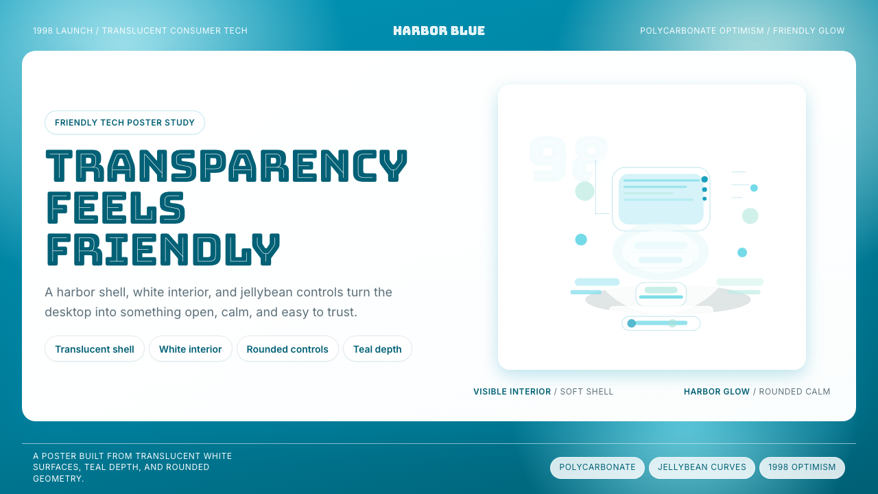 iMac G3 Bondi Blue (1998)Transparency feels friendly. Bondi blue, white glass, and pill curves set the…
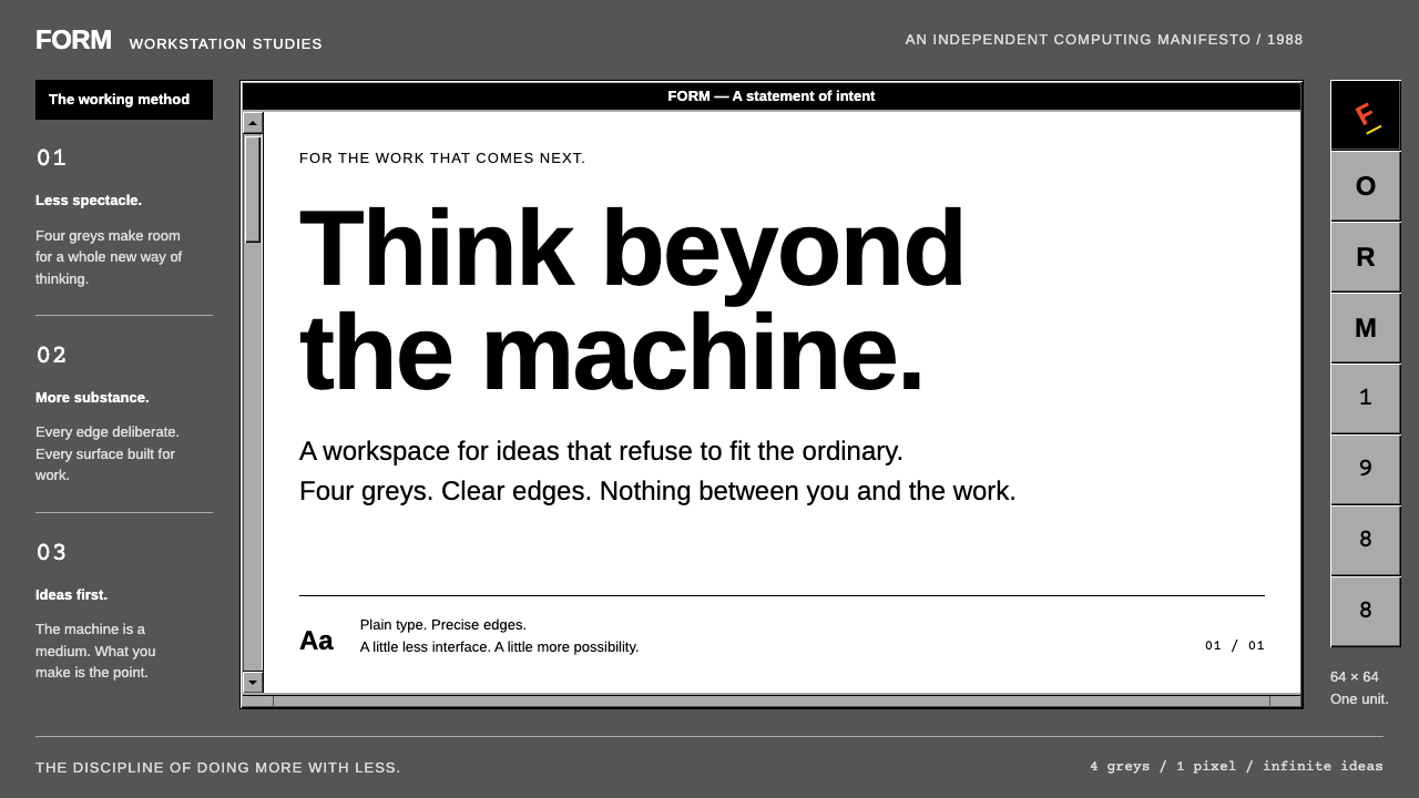 NeXTSTEPWorkstation discipline. Four greys, black title bars and one-pixel bevels kee…
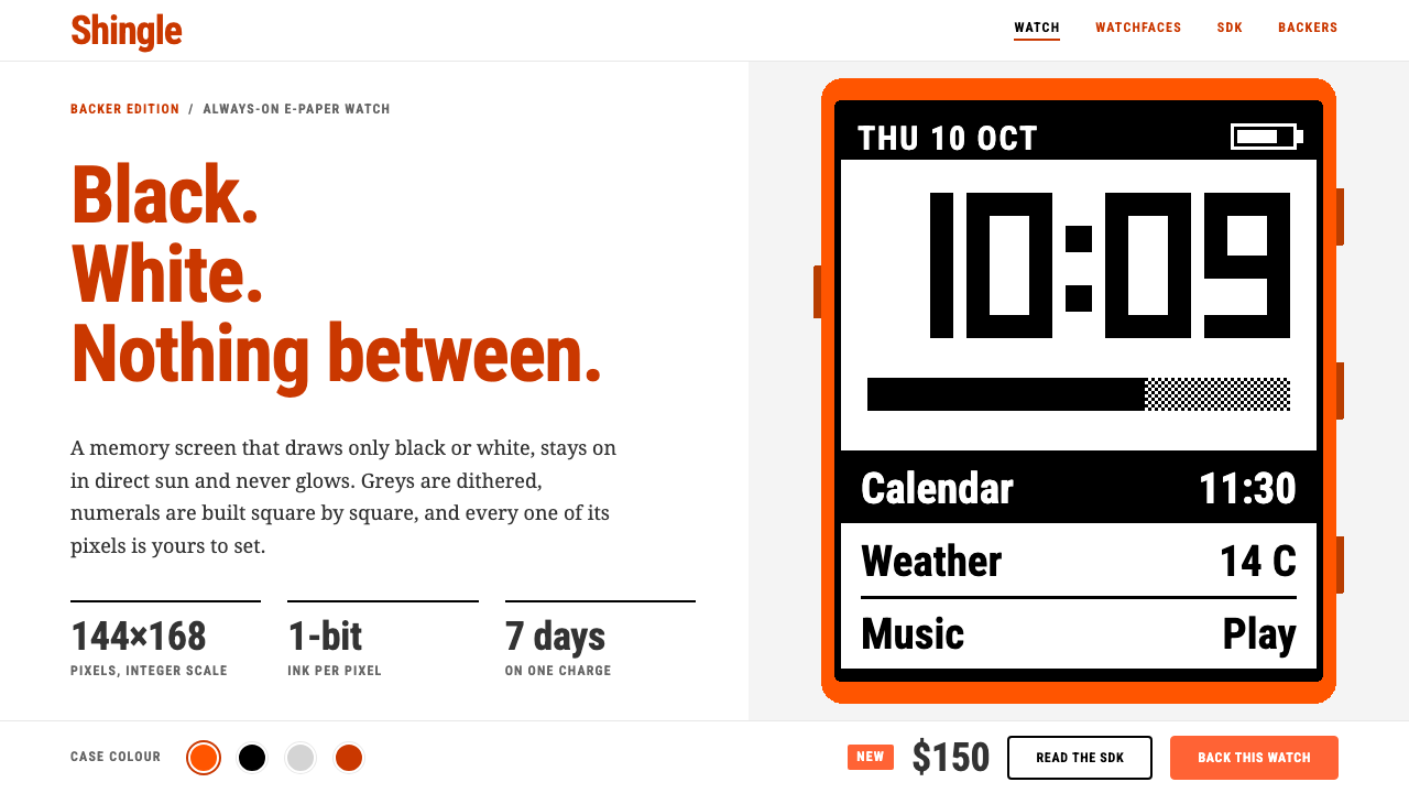 PebbleTwo colours, no greys. Burnt-orange headings on white frame a 144×168 one-bit…