What is Clippy?
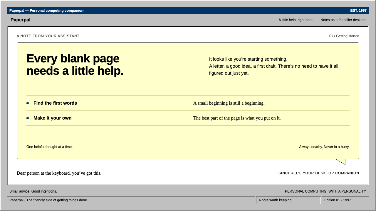
Clippy is help with a human touch: a pale yellow balloon, navy trim and hard grey bevels, rebuilt from the desktop-software era of Office 97.
Clippy in brief
Clippit, known to everyone as Clippy, shipped with Office 97 as the default Office Assistant. He was a wire paper clip with expressive eyebrows who lived in a small window with a navy title bar, floating over a white Word document. When he had something to offer, a pale yellow balloon with a thin black outline appeared next to him. The famous line was: it looks like you are writing a letter.
This design system rebuilds that moment literally. It uses the grey, three-dimensional buttons and toolbars of Windows 9x, a navy title bar, a pale yellow balloon with a pointed tail aimed at the character, very small interface type and a serif body for the document. Everything is flat-filled, hard-edged and dense, the way desktop office software looked in the late 1990s.
It does not treat Clippy as a joke. The aim is to reproduce, with care, the look of a productivity application from that era, in which a friendly helper lived inside a serious tool. The warmth comes from the character and the balloon; the rest of the interface remains sober.

Where does Clippy come from?
Clippy was a product of the 1990s idea that software should feel social. After Microsoft Bob, an earlier attempt to give the computer a friendly face, the company moved the same thinking into its flagship office suite. The result was the Office Assistant, a family of animated characters built on Microsoft Agent technology, with Clippit as the default.
The character was drawn by Kevan J. Atteberry. His design is deliberately simple: a bent wire body, large eyes and moving eyebrows that could express curiosity or concern. The simplicity is what makes it readable at tiny sizes and in a handful of animation frames, which was important on the computers of the time.
Research influenced the thinking. The scholars Clifford Nass and Byron Reeves had argued that people respond to computers as they do to social actors, applying politeness and expectations from human relationships. The Office Assistant tried to use that insight to make help feel less like a manual and more like a colleague leaning over your shoulder.
The interface around the character belonged to the Windows 9x family, whose look relied on three-dimensional bevels on buttons and toolbars. Clippy ran from Office 97 to Office 2003. It was switched off by default from Office XP in 2001 and removed from Office 2007. Its reputation as an interruptive helper made it a well-known joke, but it also remains a vivid case study in friendly interface design.
What defines the Clippy look?
Pale yellow balloon
The help balloon is a soft, pale yellow rectangle with a thin black outline and a pointed tail aimed at the character. It is the warmest object on the screen and the visual signature of the style.
Navy title bar
Windows and the assistant's small frame carry a deep navy title bar with white bold text. It anchors each window and gives the interface a formal, businesslike spine.
Grey three-dimensional bevels
Buttons, toolbars and panels are filled with a flat light grey and edged with a light top-left and a dark bottom-right line, so that they look raised. When pressed, the lines swap and the button looks pushed in.
Tiny, dense interface type
Menus, labels and toolbars use very small sans-serif type, packed closely. The density is part of the period feeling: a lot of function visible at once, with no breathing room.
Serif document body
The white page in the middle uses a conventional serif at a modest size, black on white. It contrasts with the sans-serif interface and makes the document feel like a printed letter.
Flat fills, hard edges
There are no soft shadows, gradients or rounded corners. Surfaces are flat colour, divided by crisp lines, and every element is a clean rectangle. It looks plain, but it is also clear and legible.

Who shaped Clippy?
Illustrator who drew Clippit, the paper-clip character that became the face of the Office Assistant.
Scholar whose research on how people treat computers as social actors informed the friendly-agent approach.
Scholar who worked with Nass on the idea that people respond to media and computers socially.
How do you use Clippy today?
In slides, Clippy is ideal for talks about office software history, productivity, onboarding, help systems and humour about technology. A cover slide that looks like a grey application window with a navy title bar, and a pale yellow balloon containing the title, is instantly funny and warm. For content slides, use grey panels, a serif body and balloons for callouts. For data slides, use simple flat charts inside bevelled frames, with a balloon pointing at the key number.
On the web, the style suits onboarding tours, help centres, tooltips, tutorials and friendly empty states. A balloon with a pointed tail is an excellent tooltip: it attaches clearly to what it describes and feels like a person speaking. Dialogs can borrow the navy title bar and bevelled buttons, and forms can use plain boxes with sunken borders. Keep the density, but make sure type is still readable.
In editorial and marketing work, it fits nostalgic campaigns, anniversary pieces about 1990s computing, humour columns and product launches that want to poke fun at themselves. It is especially strong when a message benefits from a gentle, self-aware voice.
It can also serve as an honest design language for internal documentation or training material, where an approachable helper makes dry procedures less intimidating.
The most common mistake is to turn the style into a pure parody, with exaggerated colours, sarcastic copy and broken layouts. The original worked because it was earnest and tidy. The second mistake is to add modern decoration, such as rounded cards, soft shadows and gradients, which dissolves the hard-edged desktop character.

Clippy — FAQ
What is the Clippy design style?
It recreates the look of Office 97 and its Office Assistant: grey Windows 9x bevelled controls, a navy title bar, a pale yellow help balloon with a pointed tail, small dense interface type and a serif document body.
Who created Clippy?
The character Clippit was drawn by Kevan J. Atteberry. It belonged to the Office Assistant family at Microsoft in Redmond, Washington, built on Microsoft Agent technology after the earlier Microsoft Bob.
When was Clippy in Office?
From Office 97 to Office 2003. It was off by default from Office XP in 2001 and removed in Office 2007.
Which projects suit this style?
Onboarding flows, help centres, tooltips, tutorials, nostalgic or humorous campaigns and talks about software history. It is less suited to luxury, minimal or serious medical and financial contexts.
How do I use the balloon well?
Keep it short, point its tail at the thing it explains, and use it for one idea at a time. A single balloon per screen keeps it friendly rather than intrusive.
Related design styles
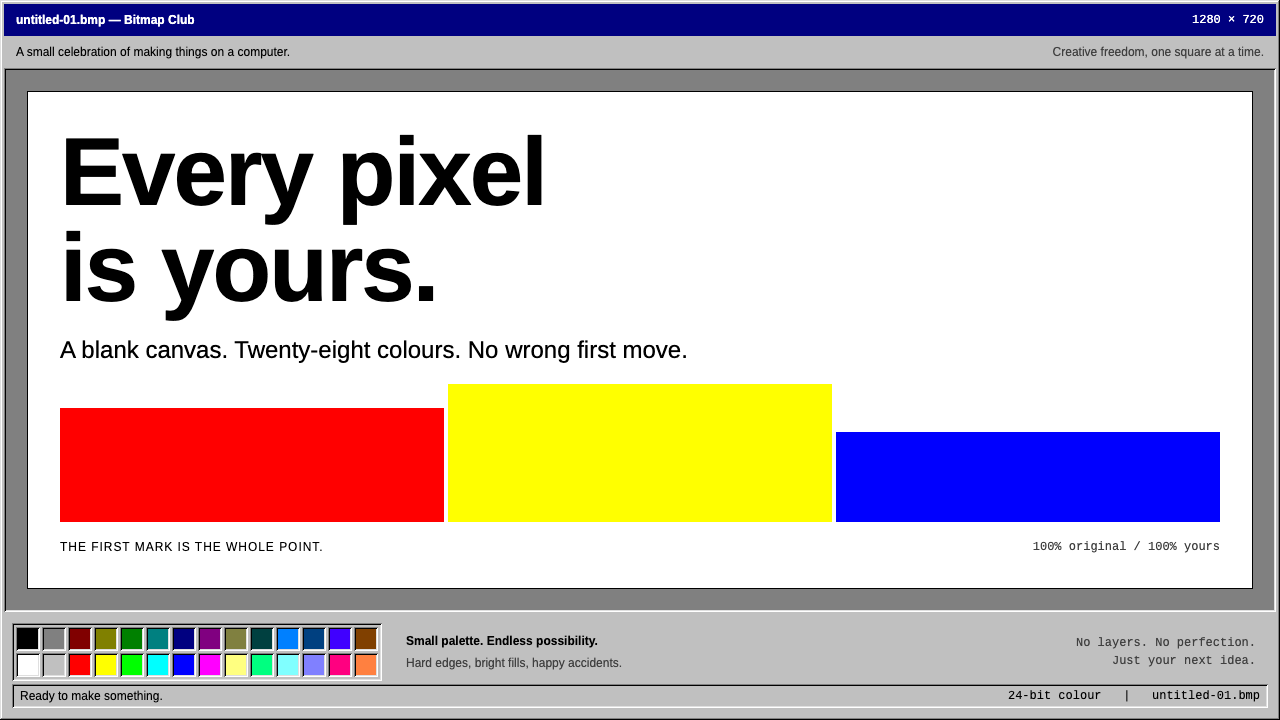 MS PaintFirst-computer freedom. Navy captions, grey bevels and 28 fixed colours frame…
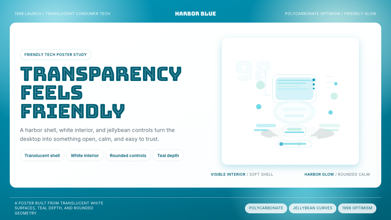 iMac G3 Bondi Blue (1998)Transparency feels friendly. Bondi blue, white glass, and pill curves set the…
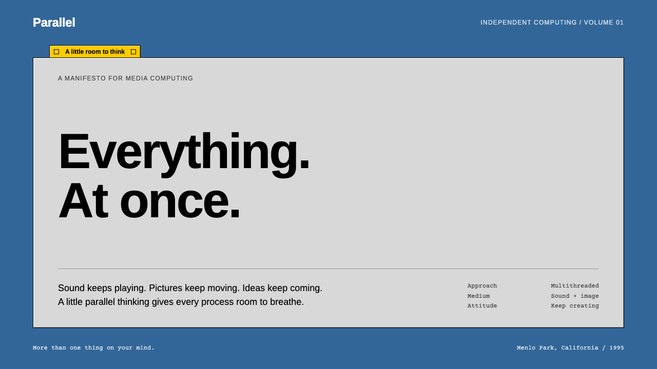 BeOSQuiet chrome, restless spirit. Blue desktop, grey bevels, one short yellow ta…
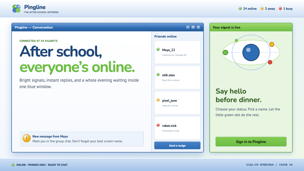 MSN Messenger (2001)Dial-up optimism, online. Luna-blue chrome and bright status dots keep every…
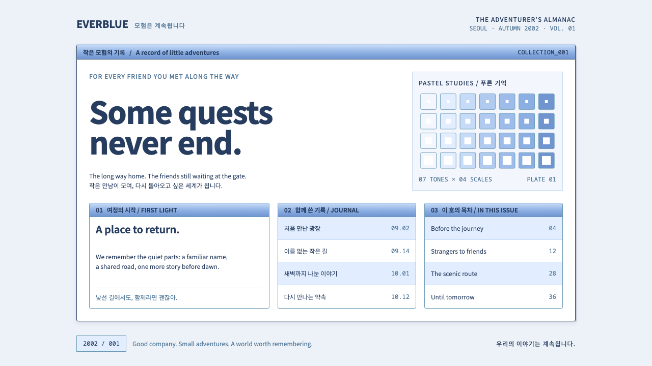 Ragnarok OnlineSmall adventures, lasting warmth. Periwinkle chrome, navy hairlines and dense…
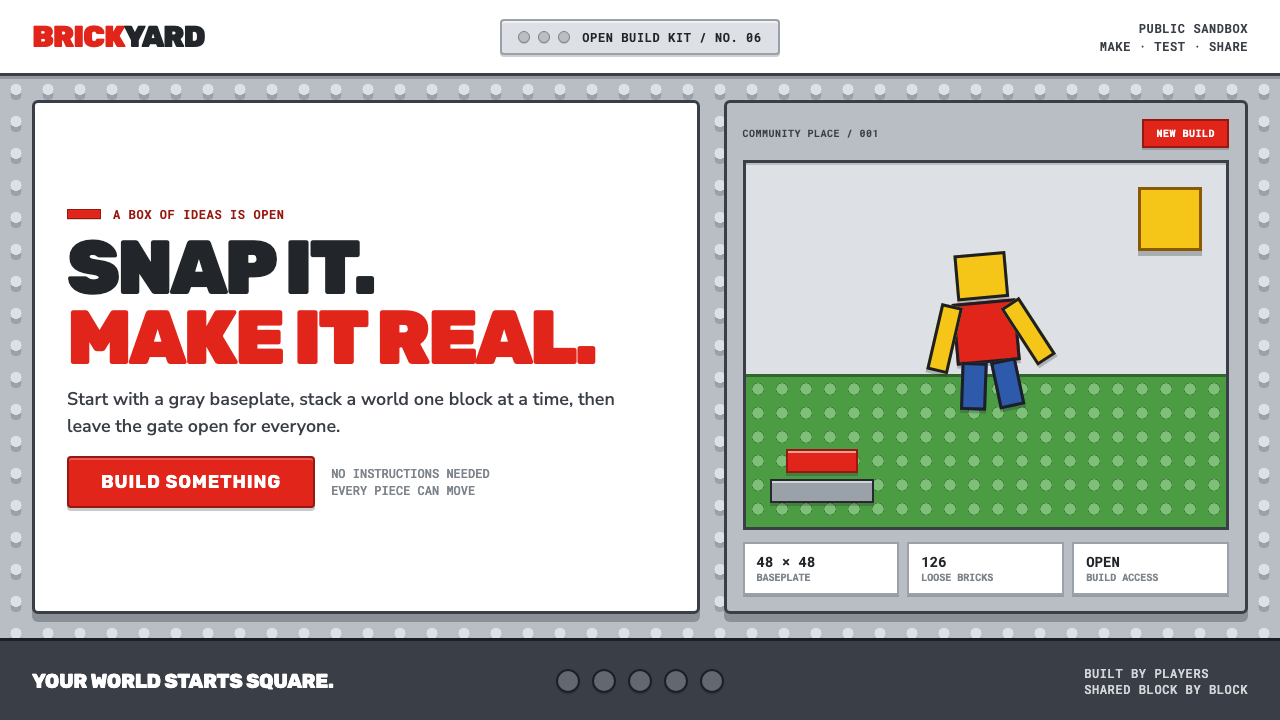 Roblox (2006)Play begins with a click. Fire-engine red cuts through a hard-edged gray stud…