What is MS Paint?
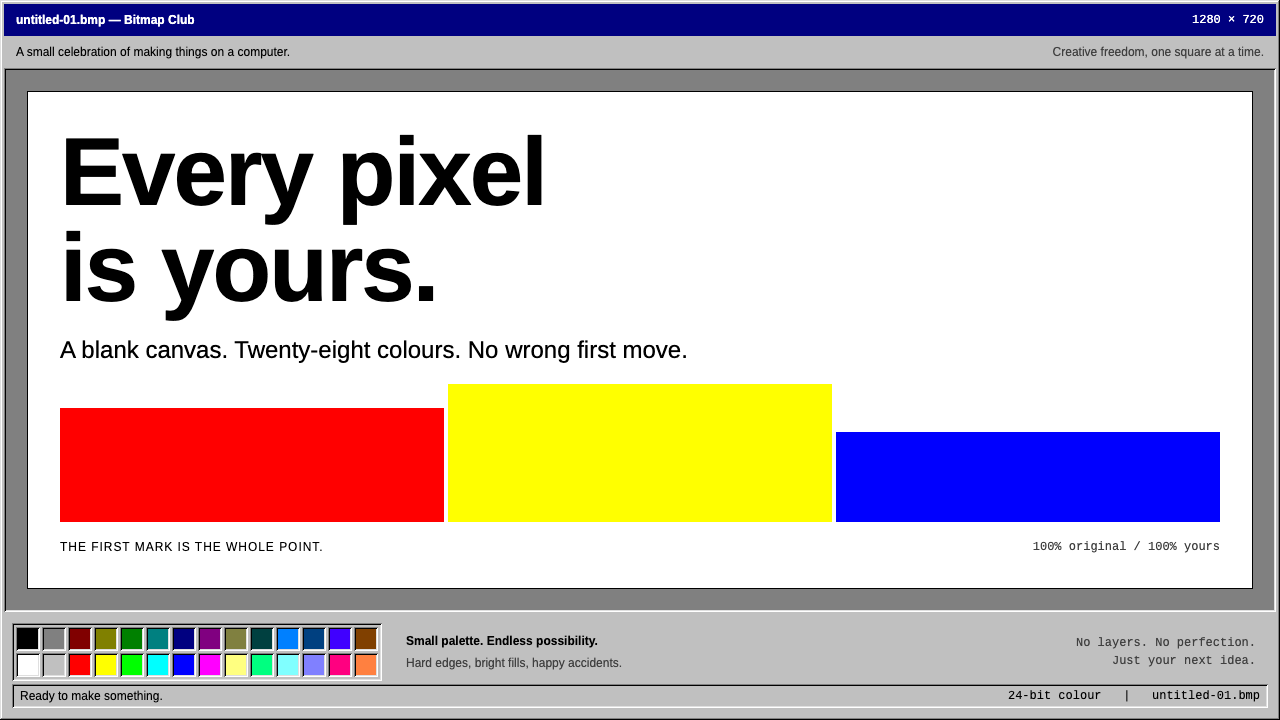
MS Paint is the first creative freedom many people ever had on a computer, and its grey bevels, navy title bar and tiny colour box still say 'draw something' to anyone who grew up with Windows.
MS Paint in brief
The MS Paint Windows style is the look of the Paint program in Windows 95 and Windows 98, the version in which a generation first scribbled on a computer. It is a style built from a few ingredients: a white canvas titled 'untitled' sitting in a grey workspace, a tool box with two columns of small icons on the left, a fixed colour box of swatches in two rows along the bottom, and window chrome made of nothing but thin highlight and shadow lines.
Those thin lines are the secret of the look. They create a three-dimensional bevel without gradients or blurred shadows: a light edge on the top and left of a button, a dark edge on the bottom and right, and it appears to stand out from the surface. When pressed, the lines swap and it appears to sink in. The effect is tactile, and wholly made of hard pixel edges.
Colour is limited and functional. A deep navy is reserved for the title bar, selections and menu highlights, always with white text. Everything else is flat silver grey, with pure colours appearing only in the swatch box and in the user's own drawing. Combined with hard pixel edges, flood fills that flood an entire shape at once and airbrush clouds of scattered dots, the result is a style that looks like a tool for play.

Where does MS Paint come from?
The first Paint arrived in 1985 with Windows 1.0, in the early years of bitmap paint programs, when drawing on a computer with a mouse was a novelty. The program had roots in earlier painting software for personal computers, and the name ZSoft Corporation, the company behind a well-known early paint program, is among those connected with its beginnings. Mark Zachmann is another name associated with the early program. These early versions were black and white and small in scope, but they established the model: a canvas, a box of tools and a box of colours.
The visual style described here, however, belongs to the mid-1990s. The version in Windows 95 and Windows 98 gave Paint the look that most people remember, from about 1995 to 1998. It came with the Windows 95 three-dimensional bevel interface, in which every control was built from thin highlight and shadow lines and grey surfaces. The Windows team at Microsoft designed that interface language as a whole, and Paint wore it more clearly than most programs because its own tools were so simple.
Paint reached enormous numbers of people because it shipped with Windows. It required no purchase, no installation and no skill. For many children and adults it was the first program in which they made a picture, filled a shape with colour, wrote a word on a drawing or used a spray can. Because the experience was shared across schools, homes and offices, it became a common memory, in the same way that certain video games or cartoons are.
That shared memory is why the style has lasted. The grey bevels, the navy title bar and the little colour box now work as a shorthand for first-computer freedom, and for a particular moment when personal computers were becoming ordinary household tools. Designers and artists often return to this look when they want playfulness, honesty and a deliberately unpolished handmade feeling, and this system recreates the Windows 95 and 98 version faithfully.
What defines the MS Paint look?
Bevel lines
Every raised or sunken surface is made from fine highlight and shadow lines, with no gradients. A light line on the top and left and a dark line on the bottom and right make a button look raised; reversing them makes it look pressed. This is the signature of the Windows 95 interface, and it makes a flat grey surface feel physical.
Navy title bar
A deep navy is kept for the title bar, menu highlights and selections, and always carries white text. Because navy is used for nothing else, it clearly marks what is active or chosen. The narrow strip of dark colour across the top of each window anchors the whole interface.
Silver-grey chrome
Toolbars, status bars, menus and window frames are all one flat, medium-light grey. The colour is neutral on purpose, so that nothing competes with the artwork on the canvas. It gives the interface a feeling of being a workshop bench, practical and slightly dull, which makes the colours in the drawing stand out.
Two-column tool box
Tools sit in a narrow box on the left in two columns of small square icons, with the selected tool shown pressed in. Each icon is a pixel drawing of a pencil, a paint bucket, an airbrush, an eraser or a magnifier. The compact grid makes the tools feel like a small kit within easy reach.
Fixed colour box
Colours are offered as a fixed set of small square swatches in two rows along the bottom, with the current foreground and background colours shown at the left end. The palette is limited and every colour is pure, which pushes users toward bold, graphic choices rather than subtle blends.
White canvas on a grey workspace
The drawing area is a plain white rectangle, labelled untitled, set inside a darker grey workspace. The contrast makes the canvas the clear focus of the screen. It is a blank invitation: nothing is drawn yet, and anything can happen.
Hard pixel edges and tool textures
Lines are jagged and unsmoothed. Flood fills pour a flat colour into a whole shape, and the airbrush leaves a cloud of scattered dots. The type in the text tool stands in for the Arial and Times New Roman of its day, using the open fonts Arimo and Tinos. All of this contributes to a deliberately raw, handmade character.

Who shaped MS Paint?
Mark Zachmann is listed among the key figures connected to the first Paint program. His name is associated with the early bitmap paint software that established the canvas, tool box and colour box model later carried into Windows.
ZSoft Corporation was the company behind an early paint program for personal computers, and it is among the names connected with Paint's beginnings. Its work belongs to the first generation of bitmap paint tools, when drawing on a computer was still new.
The Windows team at Microsoft shipped Paint with Windows and designed the three-dimensional bevel interface of Windows 95, which is the look this style recreates. Their decision to include Paint in the operating system, free and ready to use, is why so many people met it as their first creative program.
How do you use MS Paint today?
For slides, this style suits nostalgic, playful or deliberately lo-fi presentations: a talk on early computing, a design workshop, a children's project or a team retrospective with a sense of humour. A cover can be a grey window with a navy title bar and white text, containing a white canvas with the title written on it. Content slides can use the tool box and colour box as decorative frames. Data slides can use the swatch colours directly, since they are pure and easy to tell apart.
On the web, the style fits retro portfolios, small game sites, children's creative tools and playful product pages. A page can be built as a desktop window: navy title bar, grey menu strip, white content area, status bar at the bottom. Buttons use the bevel lines and show a pressed state. Keep text in a plain sans-serif or serif and keep colour to the navy and the swatches. It works best on small, expressive sites rather than on large information-heavy applications.
In editorial and marketing work, the style is valuable for campaigns that want a generational wink. An announcement, a poster or a social post can be laid out as a Paint window with a doodle on the canvas. The look signals openness and the idea that anyone can make something, so it suits creative-tool launches, community events and educational projects. It is also an easy way to tell an audience that a project does not take itself too seriously.
The common mistake is to smooth the style out. Adding gradients, rounded corners or soft shadows removes the bevel lines and the hard pixel edges, and what remains is a generic grey interface. Another mistake is to use the navy as a general accent: it belongs to the title bar and selections, so spreading it elsewhere weakens its meaning. Finally, avoid an overly clean layout. The style depends on a certain handmade roughness, such as a slightly jagged line or an uneven doodle.

MS Paint — FAQ
Which version of Paint is this style based on?
It is based on the Paint program in Windows 95 and Windows 98, the classic visual of roughly 1995 to 1998. The first Paint appeared in 1985 with Windows 1.0, but that early version was black and white and looked quite different.
How are the bevels made without gradients?
They use two fine lines: a light one on the top and left edges and a dark one on the bottom and right. Raised controls show this arrangement and pressed controls reverse it. The effect is entirely made of hard-edged lines, which is part of its charm.
What fonts does the style use?
Arimo and Tinos, open fonts that stand in for the Arial and Times New Roman that appeared in Paint's text tool. This keeps the look close to the original while using fonts that can be freely loaded on the web.
Is it a good fit for serious business software?
Usually not. It is designed to feel playful and nostalgic. It can work for internal tools with a sense of humour or for creative products, but for software that must feel authoritative or premium, a calmer system is a better choice.
Related design styles
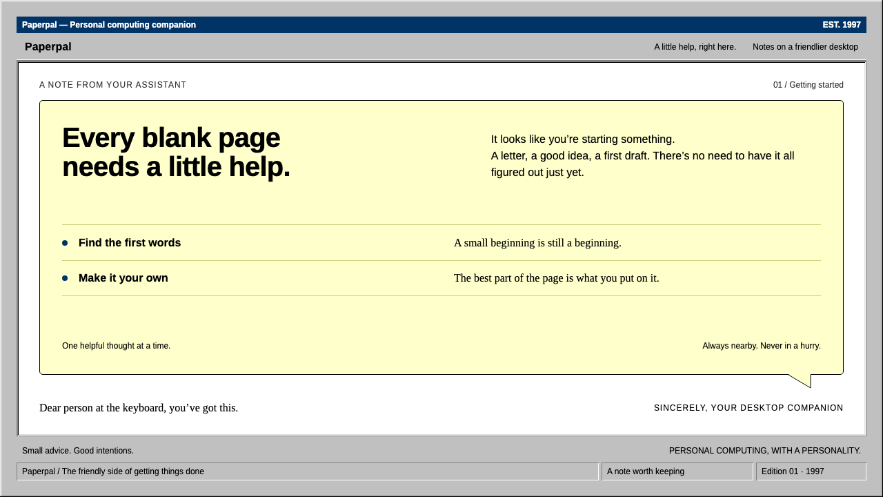 ClippyHelp with a human touch. Pale-yellow balloons, navy trim and hard grey bevels.
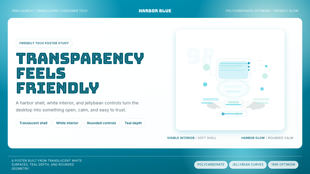 iMac G3 Bondi Blue (1998)Transparency feels friendly. Bondi blue, white glass, and pill curves set the…
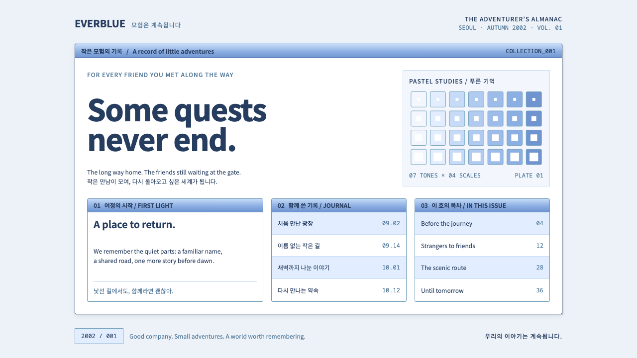 Ragnarok OnlineSmall adventures, lasting warmth. Periwinkle chrome, navy hairlines and dense…
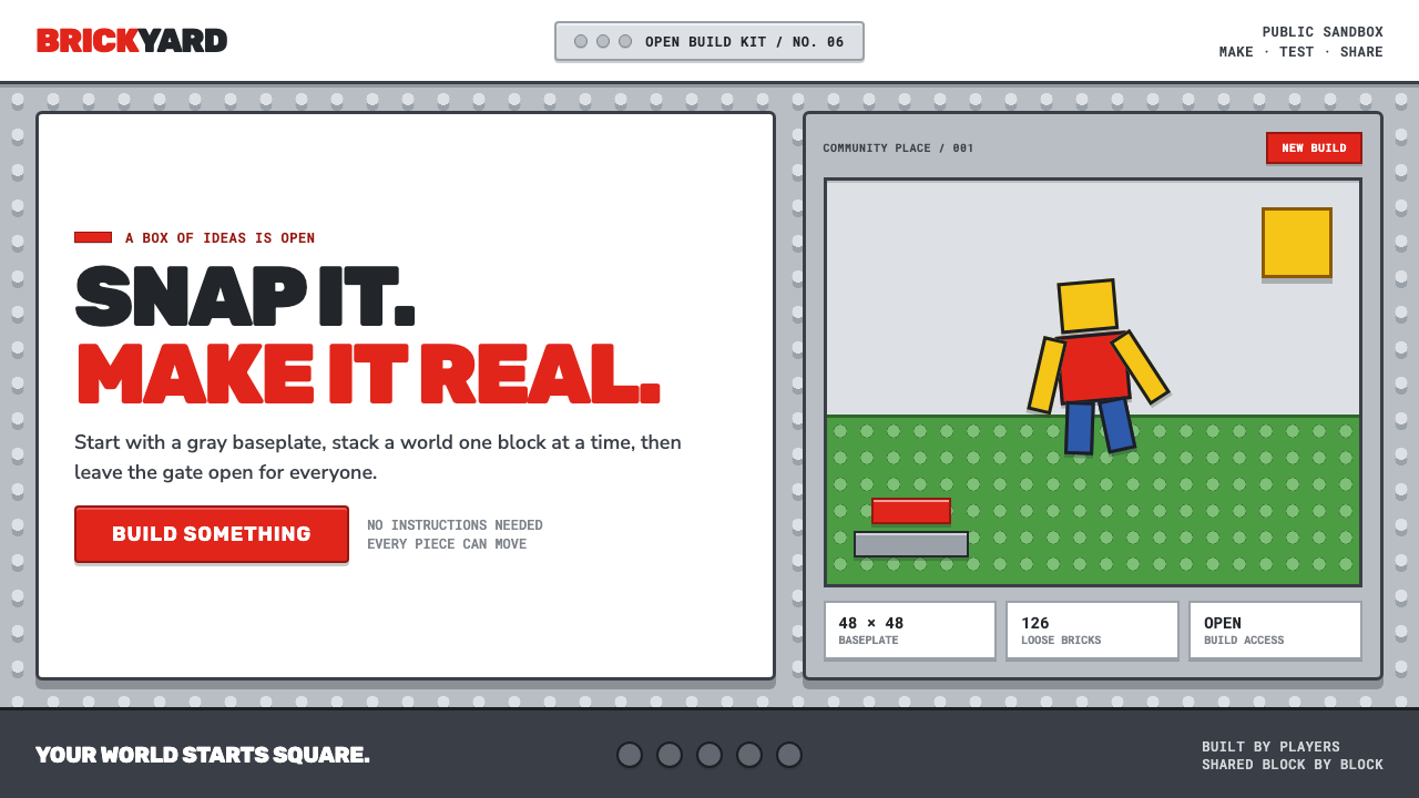 Roblox (2006)Play begins with a click. Fire-engine red cuts through a hard-edged gray stud…
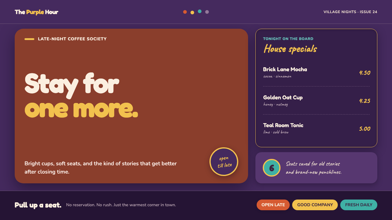 Friends Central Perk (1994)Sitcom warmth, turned TV-bright. Grape walls, couch orange, and bouncing colo…
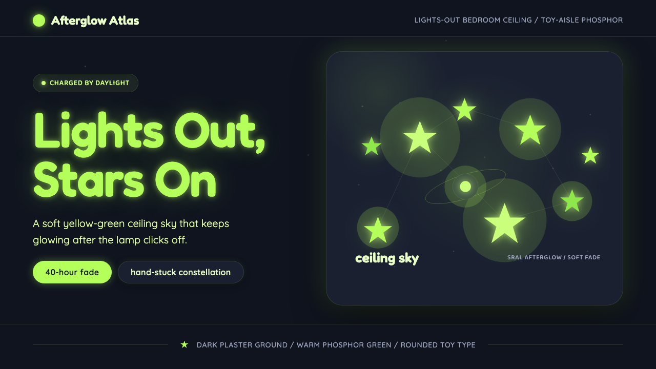 Glow-in-Dark Ceiling StarsTurns lights-out into wonder. Yellow-green stars glow across a dark blue-gray…