What is Ragnarok Online?
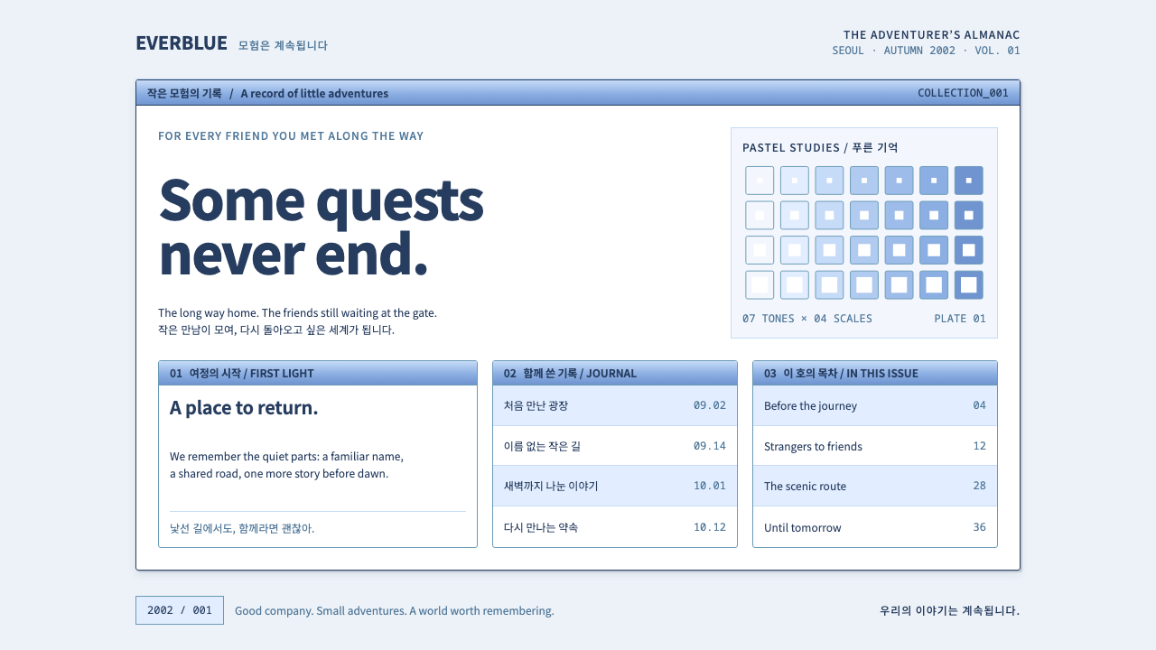
The Ragnarok Online style is the inventory window left open on a PC bang monitor: pale blue-white panels, periwinkle title bars, fine navy outlines and small, dense Korean type.
Ragnarok Online in brief
The Ragnarok Online style is a nostalgic game-interface language taken from Gravity's 2002 MMORPG and its early websites. In the game, hand-drawn two-dimensional sprites walk through low-polygon three-dimensional towns such as Prontera, beneath pastel skies and among round, jelly-like Porings. The design system ignores the characters and keeps the frame around them: the windows, panels and lists of the client and the early Korean and international sites.
Its look is gentle and orderly. The ground is a pale blue-white. Window title bars are periwinkle. Borders are fine navy lines, lists are striped in pale blue, and text is small and dense, set for Korean characters. Nothing is flashy; instead there is a feeling of many tiny things packed neatly into a small space, like the inventory and status windows of an online RPG.
The emotional register is warmth and memory. For many players, these windows were the background of long evenings in internet cafes. The style recreates that clean, cute, information-rich surface, with the quiet comfort of a familiar menu, and offers it to products that want to feel friendly, collectible and slightly nostalgic.

Where does Ragnarok Online come from?
Ragnarok Online is a massively multiplayer online role-playing game made by Gravity in Seoul, South Korea. It had a beta in 2001 and began commercial service in Korea in 2002. It is based on the manhwa Ragnarok by Lee Myung-jin, whose soft, rounded fantasy characters supplied the game's look. Kim Hak-kyu is a key name connected with Gravity and its launch, and the studio SoundTeMP is associated with the game's music, which became as memorable as its visuals.
The game belongs to the early-2000s wave of Korean online games, a period when broadband spread rapidly in South Korea and online RPGs became a social pastime. It also belongs to PC bang culture: the internet cafes, known in Korean as PC bangs, where players gathered to play together for hours. Many of the interface's quirks, from its dense lists to its small buttons, were designed for this shared, screen-close way of playing.
Technically, the game used a distinctive hybrid approach: two-dimensional sprites placed in three-dimensional scenery. Characters were drawn by hand and looked like illustrations, while the world around them was built from low-polygon geometry. The interface sat on top as a set of flat, window-like panels with pale colours and thin lines. That sprite-on-scenery approach is often called 2.5D, and it gave the game a soft, storybook feeling that was different from the grittier look of many Western fantasy games.
The web chrome of the early Korean and international sites echoed the client, using the same periwinkle bars, pale backgrounds and navy outlines for forums, rankings and guides. The design system gathers the shared parts of these sources into a single set of rules. It stands at the junction of the early-2000s Korean MMORPG wave, 2.5D sprite art and PC bang culture, and treats them as an interface style that can be reused.
What defines the Ragnarok Online look?
Pale blue-white ground
The page ground is a soft blue-tinted white, lighter and cooler than plain paper. It is the colour of a sky seen through a window, and it makes panels look clean and slightly cute. Large areas stay calm because the tint is gentle and never saturated.
Periwinkle title bars
Window and panel headers are filled with a periwinkle blue, a soft violet-leaning blue. These bars are the main source of colour and signal each window's identity. Titles sit inside them in white or very light type, as in a classic game client.
Fine navy outlines
Panels and buttons are bordered with thin navy lines. The lines are crisp and precise, like pixel-sharp edges on an old monitor. They define each box without needing shadows, so the interface looks flat, tidy and a little handcrafted.
Striped pale-blue lists
Lists and tables alternate between two pale blue tones, making long rows of items easy to follow. This striping suits inventories, rankings, item databases and forum threads. It is one of the most recognisable patterns of the style and is purely functional.
Small, dense Korean type
Text is set small and tight, designed for Hangul and for pages that carry a lot of information. This density is part of the charm: the interface seems to hold a whole world in a few lines. Latin text should follow the same compact settings so mixed-language pages feel consistent.
Soft pastel accents
Occasional accents in pale pink, mint or butter yellow recall the pastel skies and jelly creatures of the game world. They mark badges, item rarity, notices and small illustrations. They remain soft so that the blue-and-navy structure stays dominant.
Round, friendly characters
Mascots such as round jelly creatures appear as small icons and empty-state illustrations. They are drawn with soft outlines and simple expressions, echoing the hand-drawn sprites of the game. They give a dense interface a point of warmth without adding clutter.

Who shaped Ragnarok Online?
Creator of the manhwa Ragnarok on which the game is based. His soft, rounded fantasy characters set the tone for the sprites, mascots and gentle atmosphere of the style.
A key name connected with Gravity and the launch of Ragnarok Online in Korea. The game's commercial rollout in 2002 is the moment its interface became an everyday sight for players.
The music team associated with the game. Its melodies gave the world an equally gentle sound, and the style's calm, friendly mood is tuned to match.
How do you use Ragnarok Online today?
In slides, the Ragnarok Online style is perfect for nostalgic, community and game-related decks. A cover can look like a game window, with a periwinkle title bar across the top, a navy outline and a pale blue-white panel containing the title. Content slides can be built as panels with striped lists for items, rankings or schedules. Data slides suit tables with alternating rows, and a pastel accent can mark the key row. It works for esports retrospectives, fan communities, game-studio updates and anything about internet-cafe memories.
In web interfaces, the style suits game portals, wikis, guides, item databases, forums, fan sites and tools that handle large lists of items. Navigation can be a row of small panel tabs with periwinkle headers. Dashboards work well because the style was made for dense information: each widget is a window with a title bar and thin outline. Pricing and shop pages can imitate an in-game store, with striped lists of items and prices. Keep type compact and let the structure, not decoration, do the work.
In editorial and marketing work, it suits anniversary pages, retrospectives, nostalgia campaigns, community newsletters and posters that want to evoke early online gaming. A header made from a title bar and thin outline is instantly legible to anyone who played games in that era. Mascot-style illustrations can be placed in the corners of panels. Because the look is gentle, it is also effective for products that want a friendly and approachable feel despite carrying a great deal of information.
The most common mistake is making it too modern. Large rounded cards, soft shadows and generous whitespace belong to a different style and erase the dense, window-like charm. Another mistake is using strong saturated colours or dark mode, which break the pastel mood. A third is making the type too large, which removes the sense of many things packed into a small space. Finally, do not copy the game's characters or artwork directly; the style is about the frame, not the creatures inside it.

Ragnarok Online — FAQ
What is the Ragnarok Online design style?
It is a nostalgic game-interface style taken from Gravity's 2002 MMORPG and its early websites. It uses a pale blue-white ground, periwinkle title bars, fine navy outlines, striped pale-blue lists and small, dense type, evoking an inventory window on a PC bang monitor.
What is a PC bang and why does it matter?
A PC bang is a Korean internet cafe where people play games together for hours. Ragnarok Online's compact, window-based interface was shaped by this shared, screen-close way of playing, and the style's nostalgia is tied to those memories.
Where does the game come from?
It was made by Gravity in Seoul, with a beta in 2001 and commercial launch in Korea in 2002. It is based on Lee Myung-jin's manhwa, and its music is associated with the team SoundTeMP.
Which projects suit this style?
Game portals, wikis, item databases, fan communities, nostalgia campaigns, dashboards with many small widgets and any product that wants to feel friendly while holding a lot of information.
How do I keep it from looking outdated in a bad way?
Keep the structure consistent and the details crisp: aligned panels, thin precise outlines, tidy striping and well-set compact type. The nostalgia works when it looks deliberate and carefully made, not when it looks neglected. Use pastel accents sparingly.
Related design styles
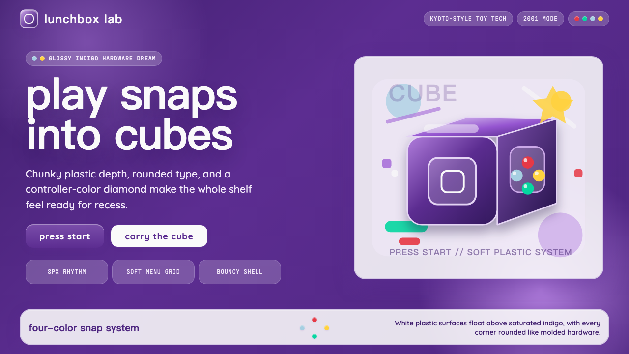 Nintendo GameCube (2001)Toy-tech refuses restraint. Indigo plastic, glossy cubes, and four-color butt…
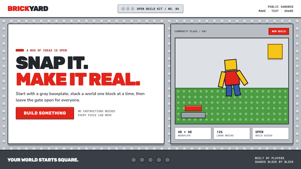 Roblox (2006)Play begins with a click. Fire-engine red cuts through a hard-edged gray stud…
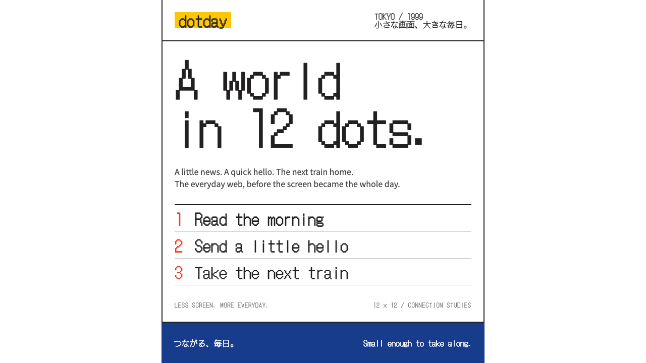 i-modeA whole world in a few dots. Bitmap type, white space and yellow bring the po…
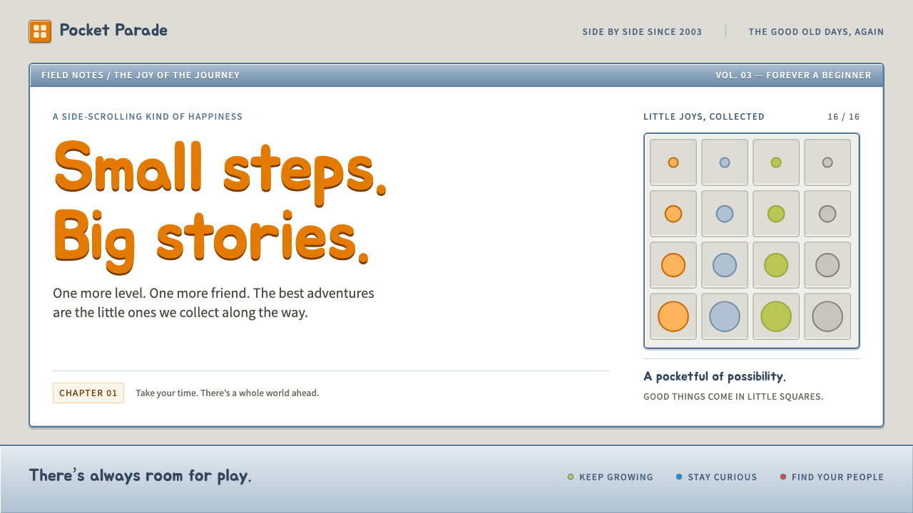 MapleStoryLittle windows, big nostalgia. Steel-blue bevels, grey slots and bouncy orang…
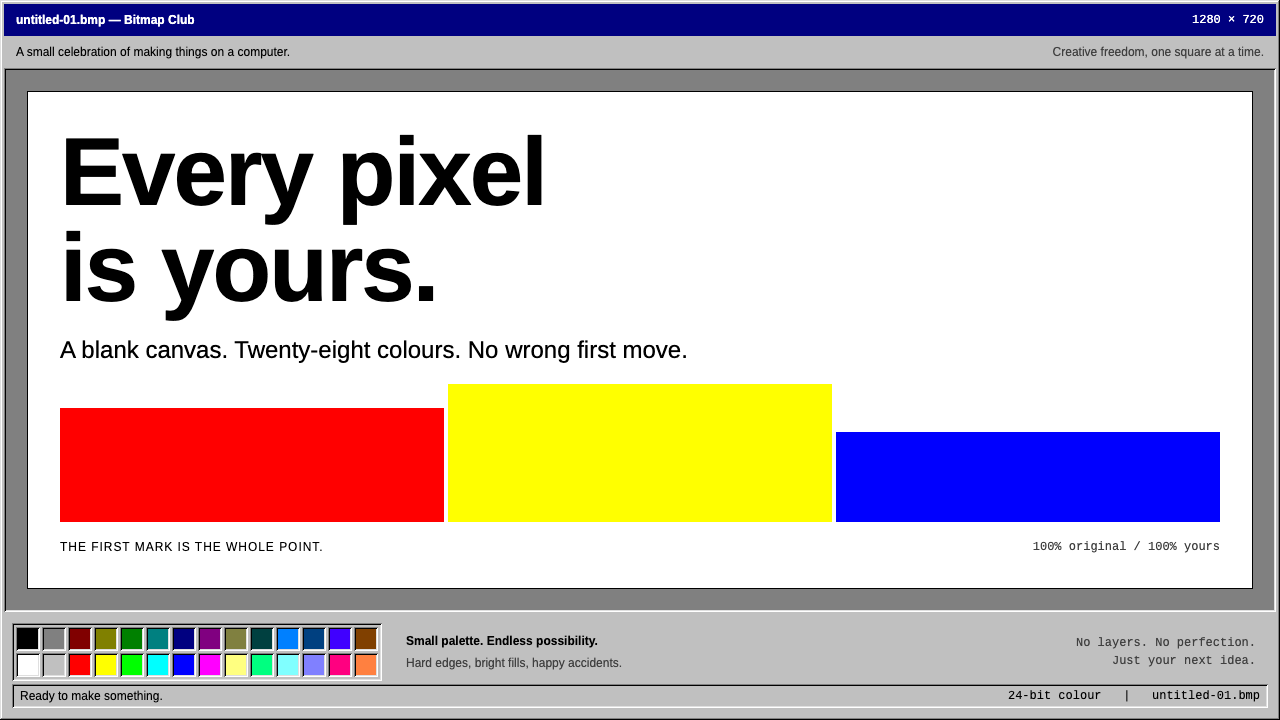 MS PaintFirst-computer freedom. Navy captions, grey bevels and 28 fixed colours frame…
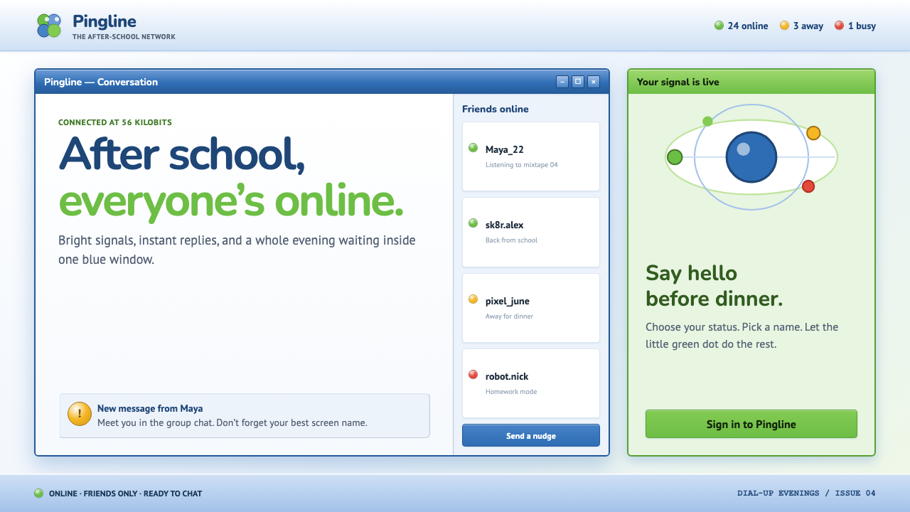 MSN Messenger (2001)Dial-up optimism, online. Luna-blue chrome and bright status dots keep every…