What is MapleStory?
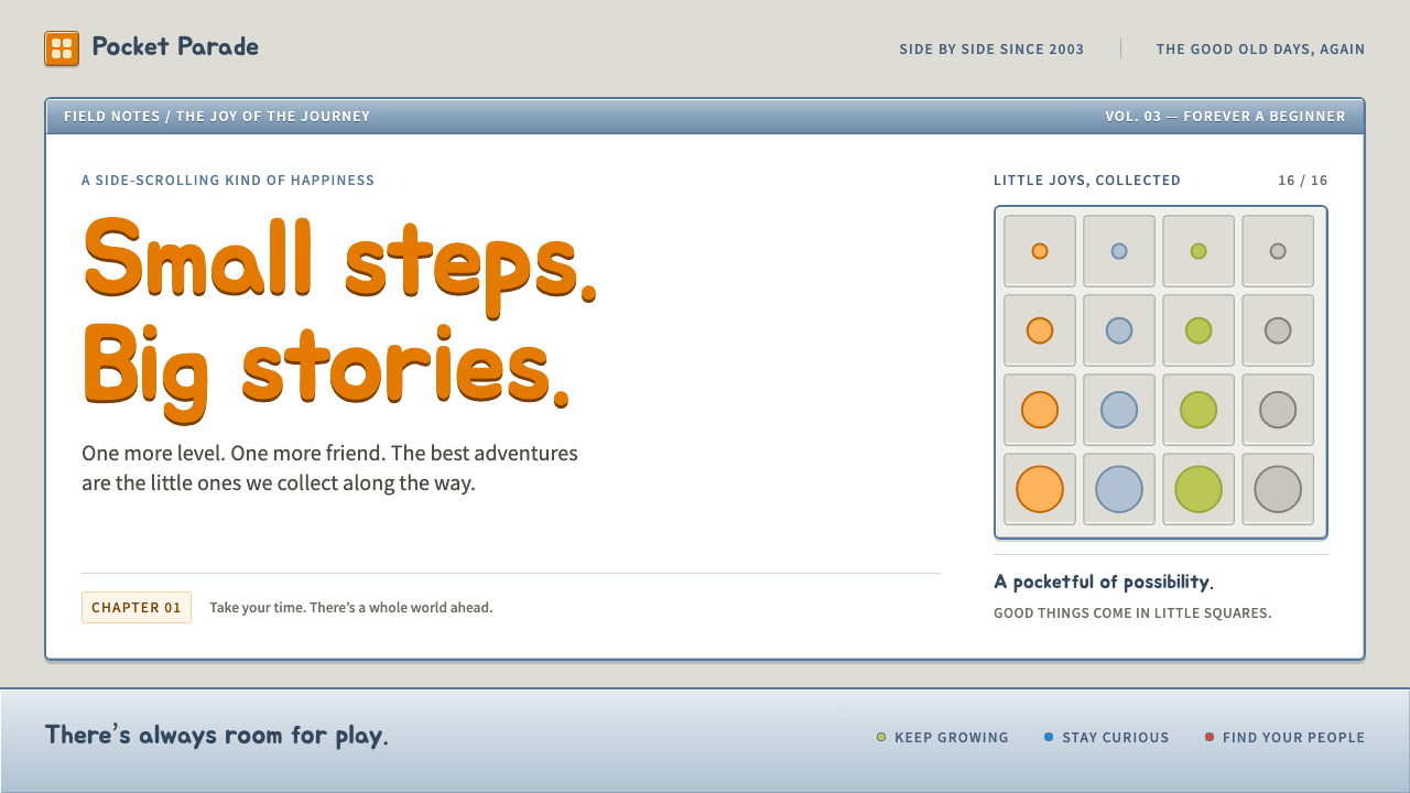
The classic MapleStory interface is a small, bevelled, bouncy window onto a childhood world — steel-blue frames, grey inventory slots and a bottom bar of glowing gauges.
MapleStory in brief
The MapleStory side-scroller style is the interface language of the original MapleStory client, the cartoon-like 2D online game developed by Wizet in Seoul and launched by Nexon in South Korea in 2003. It is the look of the game before its 2010 'Big Bang' overhaul: white windows wrapped in bevelled steel-blue frames, inventories laid out as grids of light-grey square slots, and a long status bar along the bottom of the screen carrying level, name and the HP, MP and EXP gauges.
What defines the style is not any single element but the feeling of a toy-like operating system laid over a platform game. Windows are small and stack on top of each other. Buttons look pressed out of plastic. Everything is rounded just enough to feel friendly, and nothing is allowed to be sleek. It reads as a world built for players who are meant to open a dozen little panels while a character hops between ledges in the background.
Colour follows the game's cast rather than a corporate palette. The orange of the Orange Mushroom cap drives primary actions and level-up banners, maple-leaf red is reserved for the logo, health and danger, and a handful of bright accents — magenta, lime green and the blue of non-player characters — tag attributes, gains and the 'next step' links. Motion borrows from the sprites: elements bounce and settle the way a chibi character lands after a jump.

Where does MapleStory come from?
MapleStory arrived in an unusually specific moment in games history. In the early 2000s South Korea was the world's laboratory for online play. Broadband was already widespread, internet cafes were social centres, and free-to-play games supported by item shops were turning into a major industry. Nexon, the Korean publisher that launched MapleStory in 2003, was one of the companies that made that model mainstream, and Wizet, the Seoul studio that built the game, shaped it as a two-dimensional side-scroller in which cartoon avatars climb ropes, ride platforms and fight cute monsters.
The art direction came from the traditions of Korean online games of the 2000s and of 2D pixel side-scrollers more broadly. Chibi proportions — big heads, short bodies, expressive faces — made characters readable at small sizes and endlessly customisable. That customisation became the economic engine: avatar culture, with hats, outfits and accessories sold through an item shop, meant the interface had to be a good shop window as well as a control panel. The grid of equal slots in the inventory is both a game mechanic and a display case.
Lee Seung-chan, Wizet and Nexon are the names usually attached to this early version of the game. The Korean release came first in 2003, followed by a global version in 2005, which carried the same interface to players across Asia, North America and Europe. For many of them it was a first online world. Because the client stayed visually stable for years, the interface became fixed in memory as 'what MapleStory looks like'.
The classic interface lasted until the 2010 Big Bang update, which redesigned characters, maps and menus in a cleaner, more modern direction. That is why designers and fans now speak of a 'pre-Big Bang' look. Nostalgia for it is strong precisely because it was replaced: the old steel-blue windows have become a shorthand for a particular stretch of early-internet youth, in the way pixel fonts and dial-up sounds evoke theirs. This design system is a deliberate return to that classic era, not a copy of the later, glossier client.
What defines the MapleStory look?
Colour
The base is white and soft grey, framed by a muted steel blue. Orange is the action colour, taken from a mushroom cap, and appears on primary buttons and celebration banners. Maple red is kept for danger, the logo and health. Magenta, lime and a clear blue act as small tags for stats, gains and links. The effect is cheerful but organised: a lot of colour, assigned a clear job each.
Bevelled frames
Windows are not flat. A lighter edge on one side and a darker edge on the other makes each panel look raised, like a plastic tray or a physical console. The frames are a clear steel blue, which separates the content area from the game world behind it and gives every dialogue a tangible, tactile border.
Slot grids
Inventories, equipment and shop lists are arranged as grids of identical light-grey square slots. Items sit inside them like objects on shelves. The regularity gives the screen order even when the art inside each slot is chaotic, and it makes the interface instantly legible to anyone who has played a role-playing game.
Status bar
A broad bar along the bottom of the screen gathers level, name and the three gauges for health, mana and experience. It is the anchor of the whole screen, always present, always reporting. Gauges are saturated and glossy, so that a glance at the corner is enough to know whether a character is in trouble.
Shape language
Corners are small but rounded, outlines are soft, and buttons look puffy rather than sharp. Nothing has hard geometry or severe cuts. The shapes echo chibi character art: simple, round and slightly oversized, as if the whole interface had been drawn by the same hand as the sprites.
Rounded display type
Headings use a plump, rounded Korean display face called Jua, set in orange for emphasis. It looks like a friendly hand-lettered sign, with thick strokes and soft terminals. Body text stays plain and compact so that the tiny windows can still hold a lot of information.
Bouncy motion
Transitions overshoot slightly and settle back, the way a small character lands after jumping between platforms. Panels pop open and buttons spring. The motion is playful and quick, never smooth in a corporate sense, and it reinforces the toy-like character of the whole system.

Who shaped MapleStory?
Lee Seung-chan is one of the key figures listed for the early MapleStory era. His name is associated with the original game that Wizet built in Seoul, whose chibi art direction and side-scrolling structure set the basis for the interface style described here.
Wizet is the Seoul studio that developed the classic MapleStory client. Its team made the game's cartoon world, character art and windowed interface, building a self-contained look in which every panel feels like it was drawn by the same hand as the sprites.
Nexon is the Korean publisher that launched MapleStory in 2003 and brought the global version out in 2005. As a leading company of the Korean free-to-play era, it helped make item-shop avatar culture mainstream, which in turn shaped how the interface treats inventories and shops as showcases.
How do you use MapleStory today?
For slides, the MapleStory style suits decks that are openly playful or nostalgic: a gaming community retrospective, a studio's year in review, or a talk about the early internet. A cover can use a white window inside a bevelled steel-blue frame with a plump orange title, and a bottom bar that doubles as a footer with a progress gauge for the slide count. Content slides work well as dialogue windows, with a short heading and two or three lines. Data slides can borrow the slot grid, giving each metric its own small square, or the gauge bars, which turn percentages into the familiar HP and EXP strips.
On the web, the style is a natural fit for game community sites, item shops, fan wikis and lightweight dashboards. An inventory-style product grid makes a shop feel like a game, and a status bar pinned to the bottom of the page can show account level, currency and progress. Pricing tables can be framed as quest windows or shop menus, with orange for the main button and red kept for the real warning. Because windows are small, the layout favours dense but tidy panels over big hero sections.
In editorial and marketing work, the style gives a campaign an unmistakable generational flavour. A launch for a retro re-release, a newsletter for returning players, or a nostalgia feature can use the bevelled windows as cards and the rounded display type as headlines. The look carries a clear emotional promise of coming back to somewhere warm, so it works best where that promise is true. A serious financial report in the same dress would feel like a joke.
The common mistake is to take only the colours and drop the structure. Orange and blue on a flat, modern layout look like a generic cheerful brand, not like MapleStory. The style depends on the frames, the slots, the small rounded shapes and the bounce. A second mistake is to over-polish: removing the bevels, adding soft shadows or using large amounts of white space will erase the cramped, handmade, toy-like feel that makes the look recognisable.
A practical rule of thumb is to ask whether the audience would smile when they saw the interface. If the answer is yes, the style is probably right. If the audience needs to feel authority, calm or luxury, choose a different system. Used with a light touch — a bevelled frame here, a gauge bar there — it can add a little warmth even to an otherwise neutral layout, but the full effect needs the full set of frames, slots and bounce.

MapleStory — FAQ
Which version of the MapleStory interface does this style come from?
It comes from the classic client of the early years: the Korean launch of 2003 and the global version of 2005, which ran until the 2010 Big Bang redesign. The later interface was cleaner and more modern, and it is not the source of this style.
Is this style only suitable for games?
It is strongest for games, fan communities, item shops and nostalgia features, but it can also suit children's creative tools, playful portfolios and lightweight dashboards. It is a poor fit for formal, high-trust products such as banking or legal services, where the toy-like tone works against credibility.
Why does the style use orange as its main colour?
The orange is taken from the cap of the Orange Mushroom, one of the game's best-known early monsters. Using a colour from the cast, rather than from a corporate brand, ties the interface to the game world and gives primary actions a warm, friendly emphasis.
What makes the layout feel like MapleStory rather than a generic cute interface?
The structure. Bevelled frames around white windows, inventories laid out as grids of equal slots, a status bar with three gauges along the bottom, and bouncy motion together create the specific toy-console feeling. Colour alone does not carry it.
Related design styles
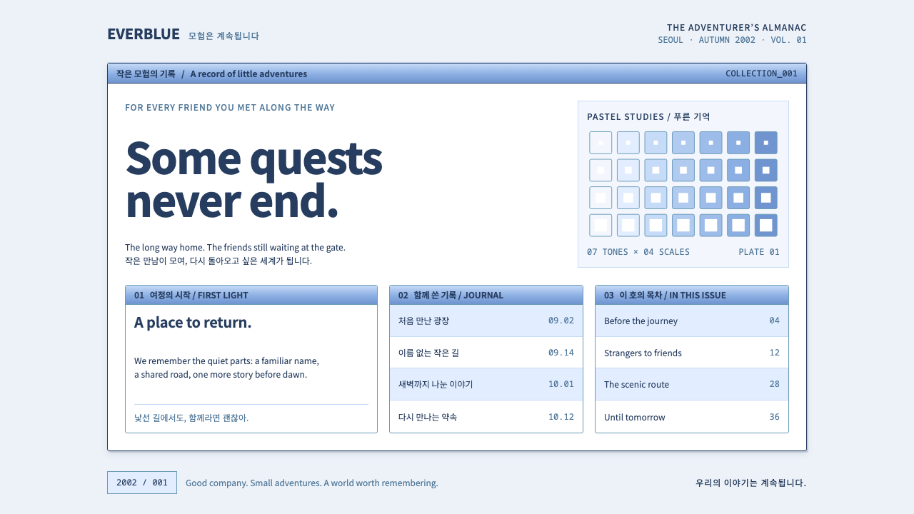 Ragnarok OnlineSmall adventures, lasting warmth. Periwinkle chrome, navy hairlines and dense…
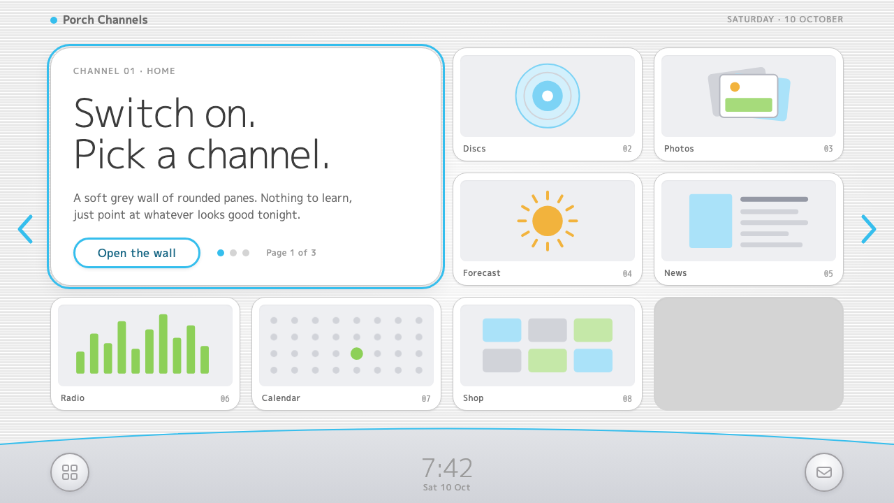 Wii MenuSwitch-on calm. White TV panes on a grey scanline wall, one thin blue line on…
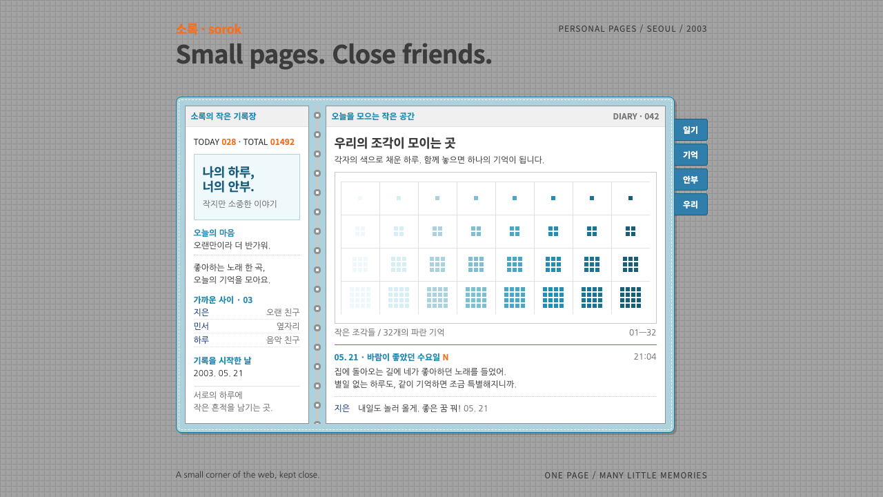 CyworldIntimacy at 12px. White diary pages in a stitched sky-blue binder, orange vis…
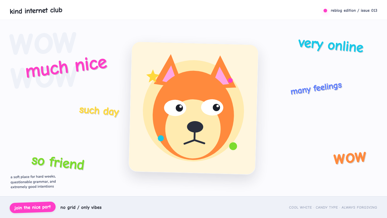 Doge Meme (2013)Anti-design becomes pure joy. Candy Comic Neue captions drift at lazy angles…
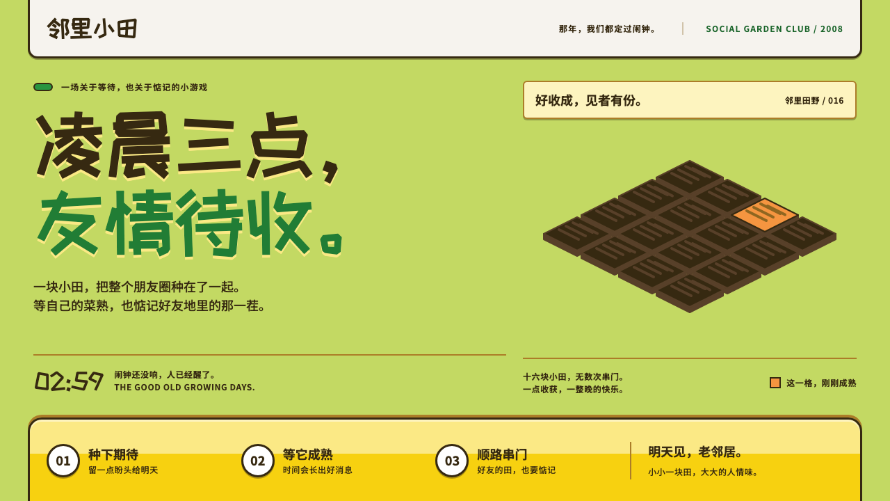 Happy FarmFriendship ripens after midnight. Lawn green, soil outlines and chunky yellow…
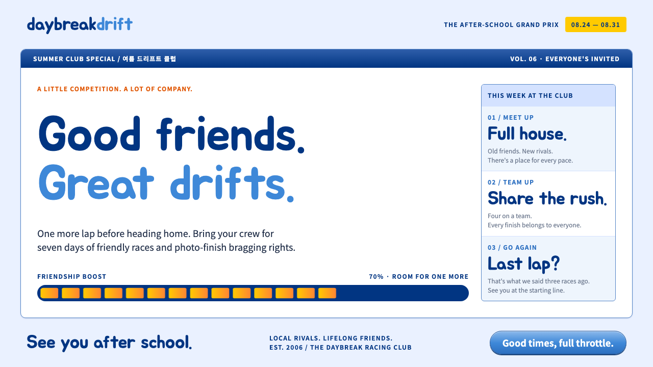 KartRiderCheerful, full-throttle nostalgia. Rounded Jua, blue panel frames and yellow…