What is KartRider?
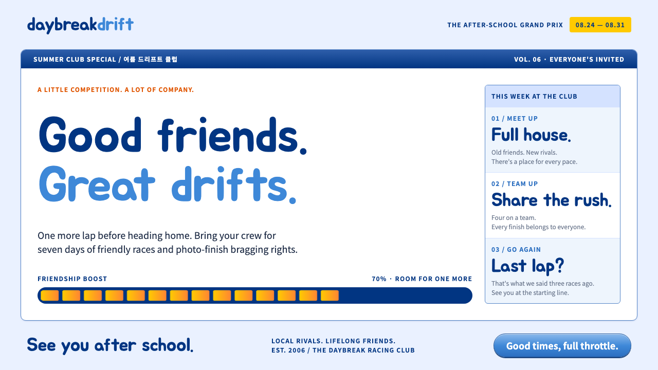
KartRider is the look of a mid-2000s Korean game portal: boxed panels on pale periwinkle, mid-blue frames around every screenshot and a cheerful, crowded order that feels like a PC bang after school.
KartRider in brief
This style is drawn from KartRider, the free-to-play kart racing game that Nexon launched in South Korea in 2004. It captures not the racing itself but the website around it: a fixed-width portal page of boxed panels, news lists, rankings and event banners, with the busy, friendly density of a game community in the mid-2000s.
The visual identity is easy to describe. The background is a pale periwinkle. Content sits in white boxes, and every screenshot is wrapped in a mid-blue frame. Header bars are navy, news links are orange, date badges are yellow and buttons are glossy pills. Headings use the rounded Jua typeface, and big bold numbers stand in for race positions and scores.
The overall effect is cheerful and slightly noisy, but never chaotic. Every panel has a clear border and a place in the grid, so the page reads as an organised noticeboard rather than a mess. It is a system for products that want warmth, energy and community, and a bit of old-fashioned online-game nostalgia.

Where does KartRider come from?
KartRider launched in 2004 from Nexon, a Seoul-based publisher that helped define the Korean free-to-play online game market. Its portal-style website in the mid-2000s, roughly 2006 to 2008, is the visual source for this system. The game belonged to the lineage of kart racing descended from Super Mario Kart, but its social features and cartoon characters, notably Dao and Bazzi, made it a mainstream phenomenon for a generation of players.
The context matters. In South Korea, the PC bang, a pay-by-the-hour internet cafe, was the main place where many young people played online games with friends. A game's website was therefore not an afterthought. It was the daily entry point to patch notes, event schedules, rankings and community boards, and it was designed to be scanned quickly by people who came back every day. That is why the pages are so dense and so carefully boxed.
Nexon's founder Kim Jung-ju is part of the story as one of the figures associated with the company that built this online games business. The studio's willingness to treat a casual racing game as a long-running service shaped the site's tone: friendly, event-driven and always ready to announce something new, with orange links and yellow dates pointing at whatever changed today.
The original service closed in March 2023 and was relaunched in 2026, which gives the style an unusual double identity as both history and revival. For designers it offers a ready-made vocabulary of cheerful panels and gauges, the opposite of the minimal dark game launcher. The system keeps the portal's busy, well-ordered feel and updates the details, such as glossy pill buttons, rounded headings and boost-style gauges, so it can be used in a modern interface without feeling like a museum piece.
What defines the KartRider look?
Pale periwinkle ground
The page background is a light, slightly purple-tinted blue. It is soft enough to let white panels pop, and it carries the playful, youthful tone of the era without becoming childish. Because the ground is light but not white, boxed content separates clearly from it.
Mid-blue frames
Every screenshot, thumbnail and featured image sits inside a thin mid-blue frame. This single rule unifies images of very different content into a coherent set, and it gives the page its distinctive boxed look. The frames make the interface feel like a collection of labelled windows.
Navy header bars
Panel titles and navigation sit on deep navy bars with light text. They provide the structural weight of the page and make the section order obvious at a glance. Against the pale ground, the navy gives a firm, trustworthy anchor to what could otherwise feel too sugary.
Orange and yellow signals
Orange marks new and clickable headlines, and yellow marks dates and badges. They are warm accents against the cool blues and are used consistently as signals, so a regular visitor can scan the page for what is new. Orange means read this, yellow means when.
Glossy pill buttons
Buttons are fully rounded pills with a soft highlight across the top, like a plastic game-console button. They invite clicks and match the playful tone. The gloss should be subtle: enough to feel tactile, not so strong that it competes with the content.
Rounded headings and boost gauges
Titles use a rounded, friendly display face, and numbers such as ranks and scores are set large and heavy, like finishing positions. Progress bars and meters look like boost gauges, filling in yellow as if about to burst. These details give even a data table a sense of motion and competition.

Who shaped KartRider?
The studio team behind KartRider built both the game and the community portal that surrounded it. Their portal pages, with their boxed layouts and event banners, are the visual origin of this system and show how a game's website can act as its daily social space.
Kim Jung-ju is associated with Nexon as a founder, and the company's long-running free-to-play model is the business context in which KartRider's portal flourished. His name stands for the institutional side of the story: a publisher committed to keeping a game alive as a continuous service rather than a one-off product.
Dao is one of the game's best-known cartoon mascots. Characters like Dao give the portal its personality, and their round, cheerful forms are echoed in the pill buttons and rounded headings of the system. Designers can borrow that friendliness without copying the characters.
Bazzi is the other well-known mascot of the series and, together with Dao, shaped the game's playful identity. Their popularity helped make the portal a place players wanted to visit every day, which in turn explains the site's emphasis on events, rankings and community content.
How do you use KartRider today?
KartRider is a style for energy and community. It rewards dense, well-organised layouts where every module has a clear box and a label, so think of it as a noticeboard system. Keep the grid disciplined, because the cheerful colours can easily tip into clutter if the structure slips.
For presentation slides, use pale periwinkle backgrounds with white panels and mid-blue framed images. Covers can feature a navy title bar and a big bold number or word set in the rounded face. Content slides work as stacks of boxed modules, and data slides are especially strong: rankings, leaderboards and progress gauges look natural in this vocabulary, with yellow fills showing completion.
For web interfaces, the style suits game portals, event pages, community boards, leaderboards, fan sites, education platforms for younger audiences and any product with a social or competitive layer. Primary actions use glossy pills, news and updates use orange links, and dates use yellow badges. A dashboard becomes a set of boxed widgets with navy headers, and a pricing page can use a row of framed cards with a single highlighted plan.
For editorial and marketing work, it fits campaign pages for casual games, seasonal events, nostalgia-driven launches and community newsletters. Use the frame rule consistently on every image and keep headlines short and punchy. The style is a natural carrier for countdowns, ranking tables and prize announcements, where the gauge motif can add a sense of momentum.
Common mistakes include breaking the frame and panel rules, so images float without borders and the page loses its structure, and using too many accent colours at once, which dilutes the orange-and-yellow signal system. Another is making the gloss too heavy so buttons look dated rather than playful. Finally, avoid reproducing the game's characters or logos; use the portal's visual logic of boxes, frames and gauges to build your own identity.

KartRider — FAQ
What is the KartRider design style?
It is a design vocabulary taken from the portal website of KartRider, the free-to-play racing game Nexon launched in South Korea in 2004. It uses pale periwinkle backgrounds, white boxed panels, mid-blue image frames, navy header bars, orange links, yellow date badges, glossy pill buttons and rounded headings.
Why does it feel so dense and boxed?
Because the original portal was a daily noticeboard for players who visited from PC bangs, the pay-by-the-hour internet cafes where many people played online games. Patch notes, events, rankings and community posts all had to be scannable at a glance, so everything was boxed, labelled and colour-coded.
What do the orange and yellow colours mean?
They work as a signal system. Orange marks new or clickable headlines, and yellow marks dates, badges and gauge fills. Keeping those roles consistent lets returning visitors scan for what has changed, so do not use them as general decoration.
Is the game still around?
The original service closed in March 2023 and was relaunched in 2026. That gives the portal's look a double life as a piece of online-game history and as part of a revival, which makes it useful for nostalgic as well as current projects.
Can I use it for a serious product?
It works best for friendly, social or competitive products such as games, communities, leaderboards and youth education. For serious contexts such as finance or healthcare, its cheerful tone can undermine credibility, though a toned-down version with fewer accents and flatter buttons may still work for dashboards and tools.
Related design styles
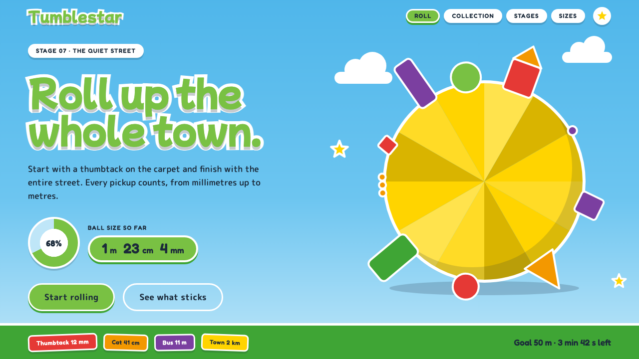 Katamari DamacySmall to huge in one roll. Cyan sky, green lettering ringed in white, one fac…
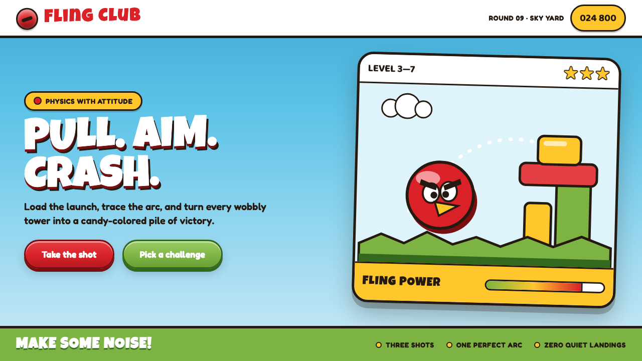 Angry Birds (2009)Adorable aggression takes flight. Candy primaries, chunky outlines, and a dot…
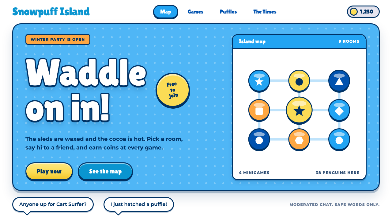 Club PenguinA snow-white island that talks like a kid. Sky-blue panels, navy outlines on…
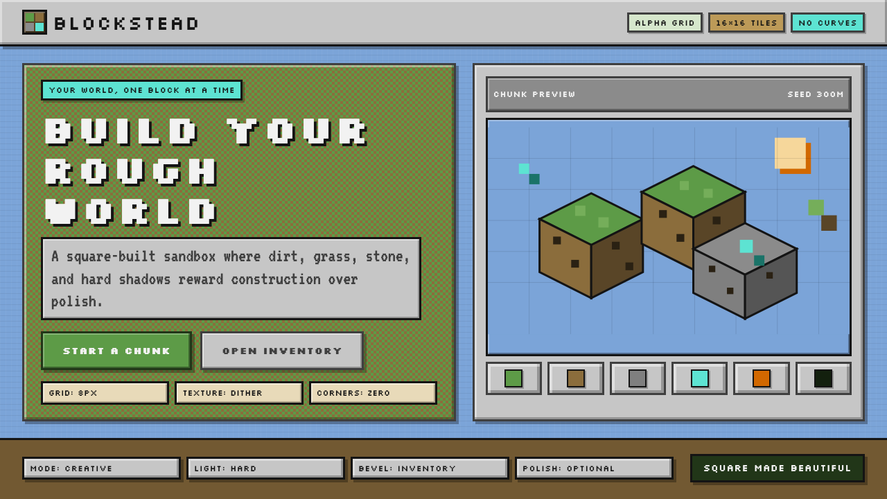 Minecraft VoxelUgly becomes buildable. Grass green, dirt brown, hard bevels, and 16×16 grids…
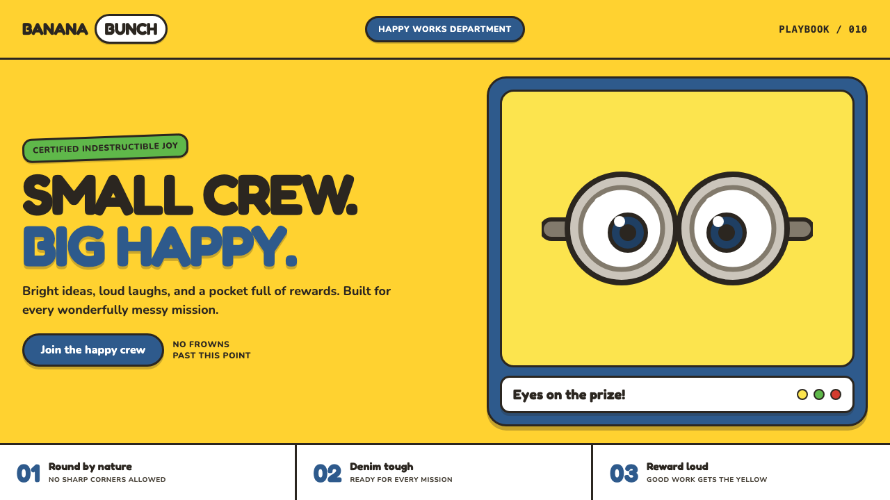 Minions (Despicable Me, 2010)Indestructibly cheerful. Minion yellow, denim blue, and chunky goggle geometr…
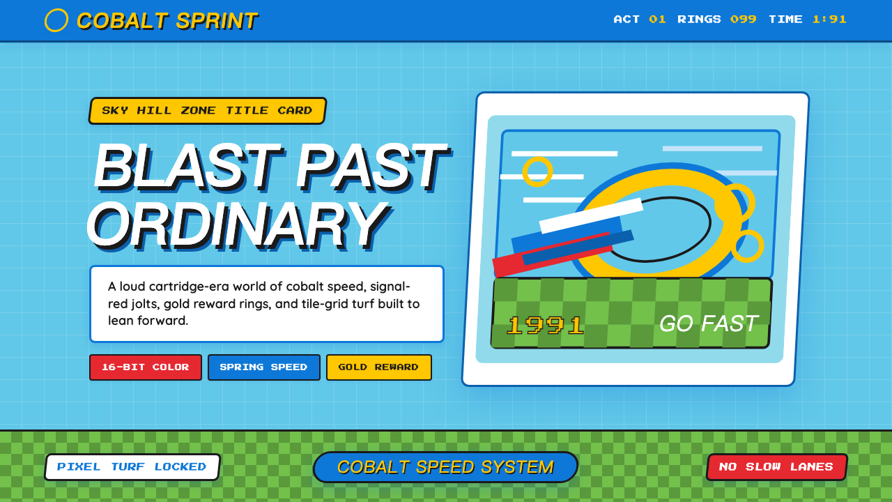 Sonic the Hedgehog (1991)Velocity has teeth. Sky-cyan, cobalt slant type, gold rings, checkerboard tur…