What is Happy Farm?
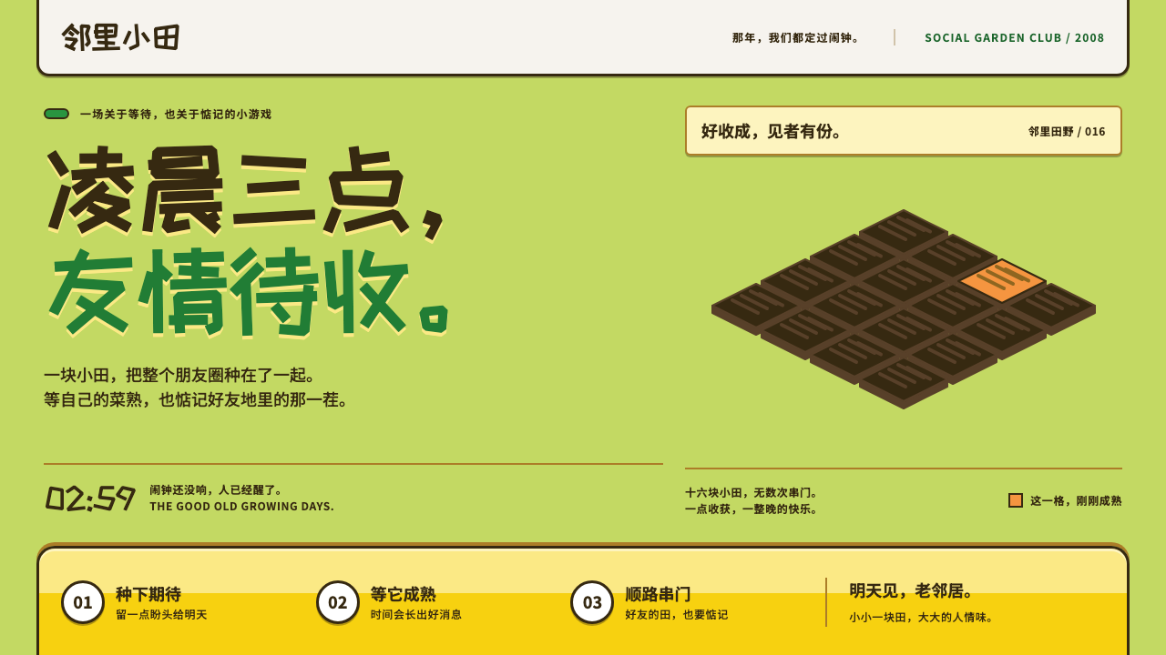
Happy Farm is the look of a game you checked at two in the morning: lawn green, soil-brown plots and a fat yellow tool bar, drawn in the chunky flat language of Flash-era social gaming.
Happy Farm in brief
Happy Farm is the visual language of a Flash farming game that appeared on a Chinese campus social network in 2008 and turned the whole network into one large allotment. Players tilled dark-brown plots on an isometric yellow-green lawn, waited for crops to ripen, and, in the part everyone remembers, crept into friends' fields at night to steal the harvest. The stealing was the point: it made a farming game into a social ritual.
As a design style it is cheerful, rounded and unmistakably cartoon. Outlines are heavy and warm rather than black, surfaces are flat colour with little shading, and everything seems slightly inflated, as if drawn for a small screen and a quick glance. A pale stats bar runs along the top carrying level and coins, and a thick yellow tool bar sits at the bottom holding the hoe, the watering can, the pesticide and the open hand that does the stealing.
The mood is playful but not childish. It belongs to the early years of the Chinese social web, when a browser game could become a shared joke across an entire university generation. The style carries that memory: it feels warm, a little bouncy, and slightly mischievous, which makes it a natural fit for products that want to be played with rather than merely used.

Where does Happy Farm come from?
Happy Farm launched in 2008 on Renren, which was then still known by its earlier name, the campus network Xiaonei. It was made by a small Shanghai studio, 5 Minutes, and it arrived at the moment when social networks in China were looking for something for users to do beyond posting messages. Games that ran inside the network's own pages, with no download and no installation, fitted that need exactly.
The game's mechanics were simple and unusually social. Seeds were planted, crops ripened on a timer, and a friend who knew the time could visit your plot and take what had grown before you did. That small asymmetry created the craze usually summed up as the vegetable-stealing phenomenon. People set alarms to be awake when friends' crops matured, and the word for stealing vegetables became a kind of national shorthand well beyond the game itself.
Visually, the game belongs to the era of Flash web games, roughly 2008 to 2010, when interface art was drawn as vector shapes, outlined in a darker tone of the fill, and animated with simple squash and bounce. The look was shaped by technical limits as much as by taste. Flat fills and bold outlines were cheap to render, scaled cleanly, and stayed legible inside a small embedded window. The yellow-green lawn, the brown soil, the wooden fences around grey stone paths and the cartoon logo all follow from that practical, hand-drawn approach.
The success was quickly noticed. A wave of imitators and rivals followed, and the large platform operators moved to offer their own farm games inside their networks, so that what began as one studio's game became a genre. This is the Chinese social-game boom of 2008 to 2010. The original game was eventually closed in 2013, but its screen survived in memory as one of the clearest pictures of that moment, and it is that picture the design style reproduces.
What defines the Happy Farm look?
Color
The palette is taken straight from the game screen. A yellow-green lawn fills the ground, dark soil brown carries outlines and plots, leaf green marks actions and growth, and a saturated warm yellow is reserved for the tool bar and key buttons. A pale, washed-out tone sits behind the stats bar so the numbers stay readable. Colours are bright and friendly, and each has a clear job, so the screen reads like a map of what you can do.
Outline
Every object is drawn with a thick outline, but the outline is a dark soil brown rather than black. This warms the whole picture and keeps shapes crisp against bright fills. The line weight stays consistent from icons to buttons to panels, which is what makes the interface feel hand-drawn as a single set rather than assembled from different sources.
Isometric Ground
The farm is laid out on a diagonal grid. Plots are diamonds of dark soil sitting on the lawn, lined up in rows that recede toward the top of the screen. The diagonal gives a sense of space without any true perspective, and it makes a repeated unit, the plot, feel like a board you can tap into. It is the single most recognisable structural idea in the style.
Chunky Tool Bar
A fat yellow bar is docked at the bottom edge and holds the player's tools as large, tappable icons. Its weight is deliberate: it anchors the screen, tells the player where actions live, and makes the controls look like objects on a shelf. A paler stats bar sits on the opposite edge at the top and carries level and coins. Together they frame the playing field like the rim of a tray.
Flat Shading and Hard Shadow
Surfaces are flat colour with, at most, a simple darker band to suggest volume. Shadows, where they appear, are hard offset shapes rather than soft blurs. There are no glossy gradients and no photographic textures. This is partly a Flash-era production habit and partly a style decision: flatness keeps the screen legible and the cartoon character intact.
Rounded, Bouncy Type
Headlines and the logo use a round, cartoon display face that echoes the inflated shapes of the game's original mark, while body text is handled by a plain, readable sans-serif. The pairing keeps personality in the places where it is wanted and gives long text a calm, neutral face. Headings are short and punchy, and numbers such as coins and levels are set large because they are part of the reward.
Bouncy Motion
Motion is simple and elastic. Elements squash slightly when pressed, bounce back, and pop in with a small overshoot, the way Flash symbols were often animated. The movement is quick and never decorative on its own; it exists to confirm that an action happened and to make small rewards feel good, such as a crop appearing or a coin counter ticking up.

Who shaped Happy Farm?
Listed among the key figures behind Happy Farm. The game is associated with his name as part of the small Shanghai team that created it, and his involvement is the human thread through a project that otherwise tends to be remembered as a phenomenon rather than as authored work.
The Shanghai studio behind the game. A small team making a browser game for a social network, it hit on a loop of planting, waiting and stealing that spread faster than almost anyone expected. As a design reference, the studio represents the hand-drawn, Flash-built sensibility the style preserves.
The campus social network where the game launched in 2008. Its user base of students and their friends supplied the social graph the game depended on, since stealing is only fun when the field belongs to someone you know. The platform and the game grew together, and the game's screen is inseparable from that network's moment.
One of the large platform operators whose own farm game belongs to the wave Happy Farm set off. Its inclusion in the record shows how quickly a single studio's idea became an industry-wide genre, and how the visual vocabulary of cartoon plots and yellow tool bars spread across competing products.
How do you use Happy Farm today?
Happy Farm works best where a product wants to feel like a game you drop in on rather than a tool you operate. Its strengths are warmth, immediate legibility and a sense of shared play. Its weaknesses are the flip side of the same qualities: it is loud, rounded and nostalgic, and it will undercut anything that needs to look sober or authoritative.
For presentation slides, the style suits cover pages and section dividers for casual, community-minded, or nostalgic topics: a retrospective on early internet culture, a team-building deck, a campus event. A cover can put the title on the lawn green with a thick yellow bar along the bottom edge, echoing the tool bar. Content slides stay simple: soil-brown outlines on cards, one leaf-green accent for the main point, and short lines of text. Data slides benefit from the chunky look, with bars drawn as thick, outlined shapes and the key number set large like a coin counter.
For web and app interfaces, it suits lightweight social products, campaign mini-sites, event pages and small game-like interfaces. Dock the main actions in a heavy yellow bar at the bottom, keep a quiet stats strip at the top, and let the central area carry a diagonal grid of tappable cards. Buttons should be large, outlined in soil brown and slightly bouncy on press. It is a good model for onboarding flows that reward small steps, where every completed action produces a visible, cheerful response.
For editorial and marketing work, the style gives a strong, friendly voice. A nostalgia-driven campaign can use the lawn green as a full-bleed ground, plain brown outlines on illustrations, and the round display face for headlines, while keeping body copy in a neutral sans-serif. Seasonal and playful promotions, harvest themes and community events are natural fits. Keep the layout simple, because the palette already does a lot of the talking.
A common mistake is to treat the style as a licence for clutter. The original screen worked because each colour had one job and each icon was large and clear. Piling on extra gradients, glossy highlights or soft shadows breaks the flat cartoon logic and makes the result look like a bad imitation rather than a faithful one. The other frequent error is to use it for serious financial, medical or legal content, where its bounce and sweetness will read as unserious.

Happy Farm — FAQ
What was Happy Farm?
It was a Flash farming game that launched in 2008 on the Chinese campus social network Xiaonei, later known as Renren. Players grew crops on plots and, famously, stole from friends' fields at night. It was closed in 2013, but its screen remains one of the best-known images of the Chinese social-game boom.
What are the defining visual traits of this style?
A yellow-green lawn, dark-brown diamond plots on a diagonal grid, thick soil-brown outlines, a fat yellow tool bar docked at the bottom, a pale stats bar on top, flat colour with hard shadows, and a round cartoon display face. Motion is elastic, with squash and bounce on press.
Is it suitable for professional or corporate work?
Only selectively. It works well for consumer, community and entertainment products, event pages and nostalgic campaigns. It is a poor match for anything that needs to feel sober, such as financial reporting or legal services. If you want a corporate context to borrow its warmth, use the palette and outlines sparingly rather than the full chunky treatment.
Why is the outline brown rather than black?
Brown ties the outline to the soil, which is the dominant element of the game. It keeps the picture warm and friendly where black would feel harder and more graphic. It also matches the Flash-era habit of drawing an outline in a darker shade of the fill, so shapes look like part of one natural palette.
How should dark mode be handled?
The style is a daylight look by nature, built on bright greens and yellows. A dark version is possible but should be treated as a deliberate night-time scene, in the spirit of checking your farm after midnight, with the same outline and flat-colour rules and a deep soil-brown ground. Avoid simply inverting the palette, because the yellow bar loses its role as a warm anchor.
Related design styles
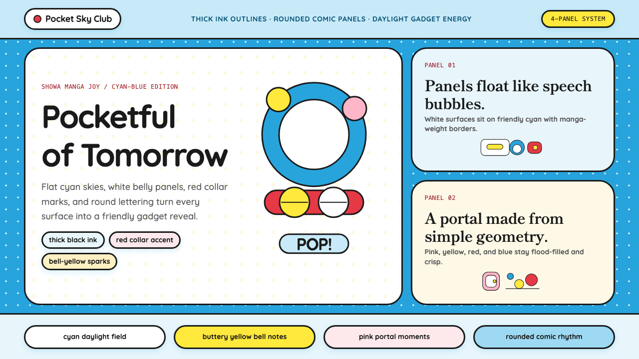 DoraemonChildhood joy, inked bold. Cyan fields, white panels, red collars, and rounde…
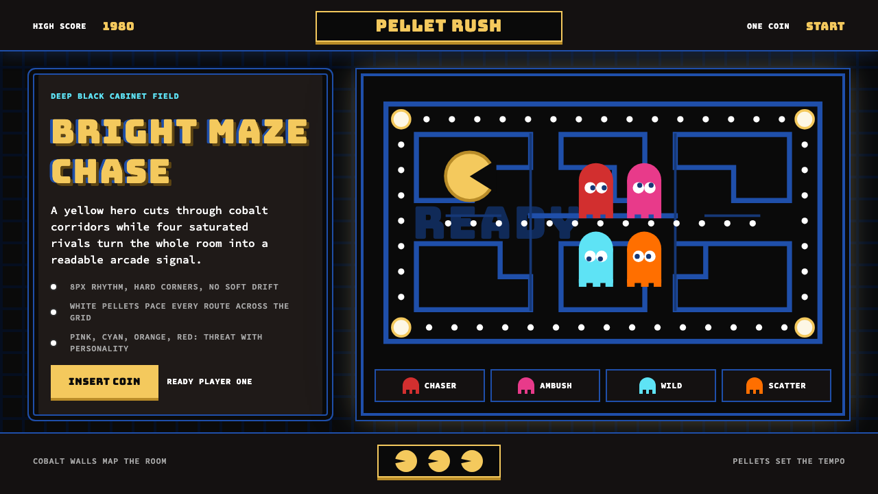 Pac-Man (Namco 1980)Arcade joy burns bright. Yellow disc, cobalt maze, and four ghost hues snap o…
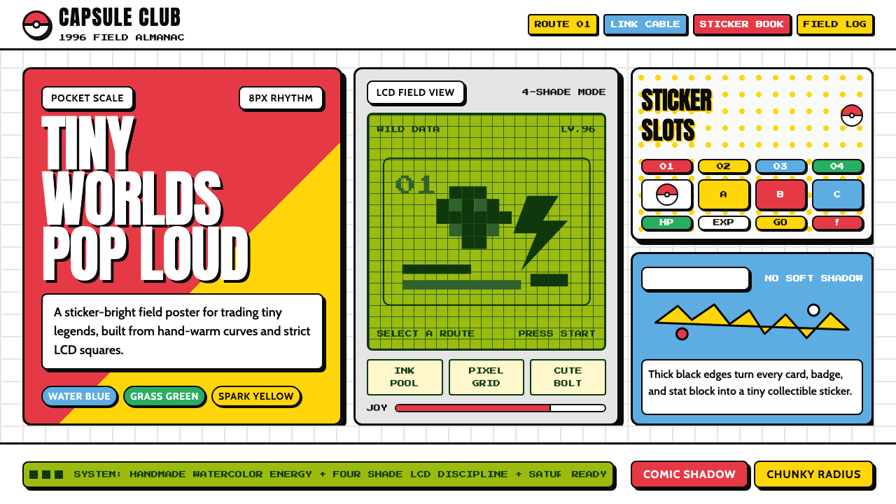 Pokémon Game BoyKawaii meets cartridge logic. Capsule red, LCD green, Anton heft, and 8px gri…
 Sonic the Hedgehog (1991)Velocity has teeth. Sky-cyan, cobalt slant type, gold rings, checkerboard tur…
 Aardman ClaymationHandmade warmth, visibly touched. Clay-orange panels, Caveat notes, thumbprin…
 Ace AttorneyQuiet testimony. One red shout breaks the navy calm, with bitmap dialogue bel…