What is Ace Attorney?
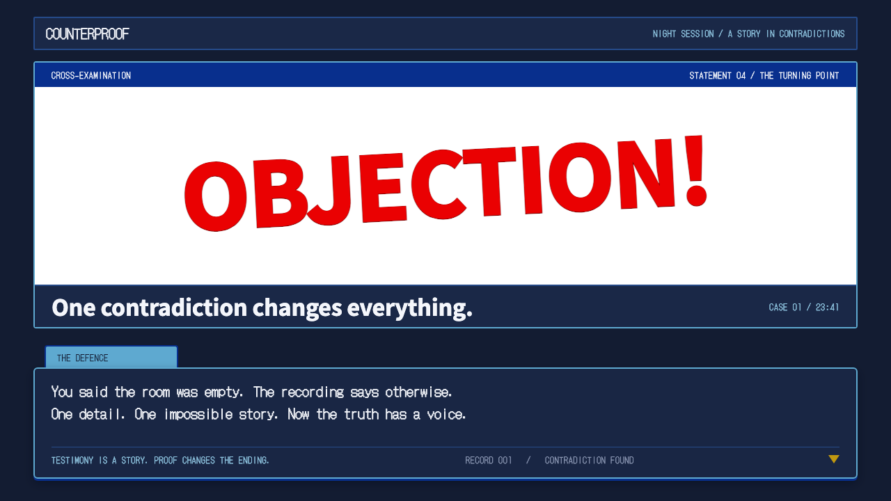
Ace Attorney turns a courtroom into a quiet stage for short lines of text, then lets a single red shout overturn the whole case.
Ace Attorney in brief
Ace Attorney is the interface language of Gyakuten Saiban, the courtroom adventure Capcom released for the Game Boy Advance in 2001 and that later reached international players as Phoenix Wright: Ace Attorney. Its look is that of a visual novel staged in a trial: a low, translucent navy dialogue box sits over a wood-and-gold witness stand, a light-blue name tab is clipped to the corner of the box, and every line of testimony types out one letter at a time in a bitmap face.
What makes the system distinctive is its rhythm rather than any single element. Most of the time the screen is calm and restrained. Characters speak in short lines, evidence waits in a tidy grid, and the palette stays in cool, dark blues against warm wood. Then, at the moment a lie is caught, the calm breaks: red lettering bursts out of a jagged white speech bubble, the screen shakes, a flash of white light crosses the frame, and the direction of the case turns.
As a design reference it is best understood as a system for pacing. It teaches an interface how to spend its loudness: keep the everyday surface quiet and legible, and reserve one saturated, theatrical gesture for the few moments that deserve it. That is why the style suits products that tell a story in small steps and land a handful of big reveals.

Where does Ace Attorney come from?
Gyakuten Saiban was made in Osaka and released in Japan in 2001 for the Game Boy Advance. The idea behind it was unusual for its time: instead of a swordsman or a space marine, the player controls a rookie defense attorney, and the main verbs of the game are listening, examining and pointing out contradictions. The man credited with writing and directing it is Shu Takumi, and the series is closely tied to his sense of comic timing and plot construction.
The game grew out of the Japanese adventure and visual-novel tradition, where a story is delivered through text boxes, still backdrops and a menu of choices. Ace Attorney kept that format but gave it a clear structure: investigation scenes in which you collect facts, followed by trial scenes in which you cross-examine witnesses line by line. The interface had to carry all of this on a very small handheld screen, which is why it is built from a few large, legible pieces rather than many small ones.
The bitmap look is a direct product of the hardware. Working within the limited resolution and colour handling of the Game Boy Advance, the artists, including Masakazu Sugimori as the character designer, relied on flat colour fields, strong outlines and expressive sprite poses to convey emotion. Producer Tatsuro Iwamoto is also counted among the key people behind the project. The jagged speech bubble and exaggerated gestures borrow from manga courtroom drama, where a single panel can carry an entire reversal.
The series was remade for the Nintendo DS in 2005, which is also when it was first released in English, and the three original games were later gathered into the Trilogy collection in 2019. Each re-release redrew the artwork in higher fidelity, but the structural identity — the dark dialogue box, the name tab, the evidence record, the red objection — stayed intact, which is a measure of how fully that identity had been settled from the start.
What defines the Ace Attorney look?
The Dialogue Box
The central object is a low, semi-transparent navy panel that sits across the lower part of the screen. It is dark enough for light text to read at once, yet translucent enough that the scene behind it never disappears. Text appears letter by letter, which turns reading into a small performance and gives the player time to feel the pause before an important line. In interface terms this is a typewriter reveal, and it works because the box itself never competes with the words inside it.
The Name Tab
A small light-blue tab is clipped to the upper-left corner of the dialogue box and carries the speaker's name. It is the only bright element in the resting layout, and it answers one question instantly: who is talking. Because speakers change constantly in a trial, this tab is what keeps a fast exchange readable. It also shows a general principle, that a tiny, consistently placed label can do the work of a whole character-introduction system.
Wood and Gold Stage
Behind the interface, the courtroom is rendered in warm wood tones with gold trim on the witness stand and bench. This warmth is the counterweight to the cool navy panel. The dark panel feels like a transcript, while the wood feels like a place, and the contrast keeps the screen from becoming a flat wall of blue. The gold accents suggest authority and ceremony without any need for ornament in the interface itself.
Bitmap Lettering
Dialogue is set in a pixel-built face with a clear, even rhythm. The lettering is not trying to be elegant; it is trying to be unmistakable at small size on a low-resolution display. That honesty is part of the charm. Used today, a bitmap or bitmap-inspired face signals retro adventure at once, and it pairs well with large, sparing text blocks where each line is short enough to be read in a single glance.
The Court Record
Evidence is stored in a menu called the court record, laid out as a grid of small square cards, each carrying a tiny icon and a one-line description. Selecting one reveals a short explanation. The structure is a catalogue: uniform tiles, a clear selected state, and a detail pane. It shows how a story-driven interface can still hold dense information, by letting the player open a layer on demand instead of keeping everything on screen at once.
The Objection Burst
The famous moment is a jagged white bubble from which heavy red lettering bursts, accompanied by a screen shake and a white flash. Everything in the burst is the opposite of the resting interface: saturated instead of muted, angular instead of rectangular, loud instead of quiet, centred instead of tucked low. The system works because that contrast is total, and because the burst is used rarely. If every line were shouted, none would land.
Short Lines, Slow Reveal
Underneath the visuals is a writing discipline: lines are short, each one carries a single idea, and information is released in small pieces so the player can notice a contradiction before it is announced. A design that borrows Ace Attorney should borrow this as well. Long paragraphs break the spell, while a sequence of brief statements, each held on screen just long enough, keeps the tension that the style depends on.

Who shaped Ace Attorney?
Credited as the writer and director of the original games, Takumi shaped the series' tone: earnest courtroom procedure punctuated by absurd characters and sharp comic timing. The way the interface paces its quiet lines against its loud reversals reflects that writing sensibility directly.
Iwamoto is counted among the key people behind the 2001 release at Capcom. His role was to help turn an unusual premise, an adventure about defending clients rather than fighting enemies, into a shipped product on handheld hardware.
Sugimori is the artist associated with the series' character designs. His flat-coloured, strongly outlined figures and highly expressive poses supplied the visual vocabulary that the interface frames, and they carry emotion even at the small scale of the Game Boy Advance screen.
How do you use Ace Attorney today?
Ace Attorney is a strong reference when an interface has to tell a story in short lines and land a few big moments. Its logic transfers well beyond games: keep the everyday surface dark, quiet and legible, make the text the star, and hold back one bold, saturated gesture for the point where the user's situation changes. The style is a discipline about contrast and timing, not a decorative skin.
For presentation slides, the cover can borrow the stage: a dark navy band across the lower portion with a short title typed into it, a small light-blue tab for the speaker or section name, and warm wood or gold tones behind it. Content slides work as a sequence of brief statements, one idea per slide, each revealed in order. Evidence or data slides can use the court-record grid, with uniform small cards that each hold a single fact and a one-line caption. Save the red burst for the one slide that carries the decisive finding.
For web interfaces, the style fits narrative products: interactive explainers, onboarding that unfolds step by step, quizzes, case-file or investigation tools, and game-adjacent landing pages. A translucent dark dialogue panel with a name tab can host guided messages, while a card grid handles collections. On dashboards it is best treated as an accent language, with the ordinary data view kept calm and a dramatic alert state reserved for genuine reversals such as a failed check or a major milestone. On pricing pages, keep plans quiet and let a single highlighted offer take the red treatment.
For editorial and marketing work, the style gives a ready-made structure for serialised or dramatic storytelling: a campaign that unfolds as a trial with testimony, evidence and a verdict, a product reveal staged as a reversal, or a newsletter that presents a case in short steps. Because the type is bitmap-flavoured and the layout is boxed, it also lends a clear nostalgic identity to anything aimed at players of retro adventure games.
The most common mistake is to use the objection treatment everywhere. Red lettering, angular bubbles and screen shake lose all force when they are constant, and they turn a witty stage into a noisy one. A second mistake is to make the dialogue box fully opaque and heavy, which hides the scene behind it and loses the sense of place. Keep the panel translucent, keep the lines short, and allow the burst only when something truly changes.

Ace Attorney — FAQ
Where does the Ace Attorney interface style come from?
It comes from Gyakuten Saiban, Capcom's courtroom adventure released for the Game Boy Advance in 2001 and later known internationally as Phoenix Wright: Ace Attorney. It was made in Osaka and descends from the Japanese adventure and visual-novel tradition, adapted to the limits of a handheld bitmap screen.
What are the defining visual elements?
A low translucent navy dialogue box, a light-blue name tab clipped to its corner, letter-by-letter bitmap text, a wood-and-gold courtroom behind it, an evidence grid called the court record, and the red objection burst that comes out of a jagged white bubble with a screen shake.
Is this style only suitable for games?
No. Its core idea, spending loudness sparingly, transfers to any product that tells a story in short steps: interactive explainers, onboarding flows, case-file tools, quizzes, campaign pages and presentations. It is especially effective wherever a few moments need to feel like genuine reversals.
Why is the dialogue box translucent and dark?
Dark enough to make light text readable instantly, translucent enough that the courtroom behind it never disappears. The panel reads like a transcript while the scene still feels like a place, which keeps the screen from collapsing into a flat block of colour.
How should the red objection treatment be used?
Sparingly. Reserve it for the one or two moments that change the situation, such as a decisive finding, a failed check or a major milestone. Used constantly it stops working, because its power comes entirely from contrast with the quiet surface around it.
Related design styles
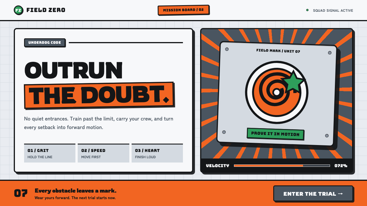 Naruto (2002 anime era)Underdog energy refuses the background. Hazard orange strikes steel-gray grid…
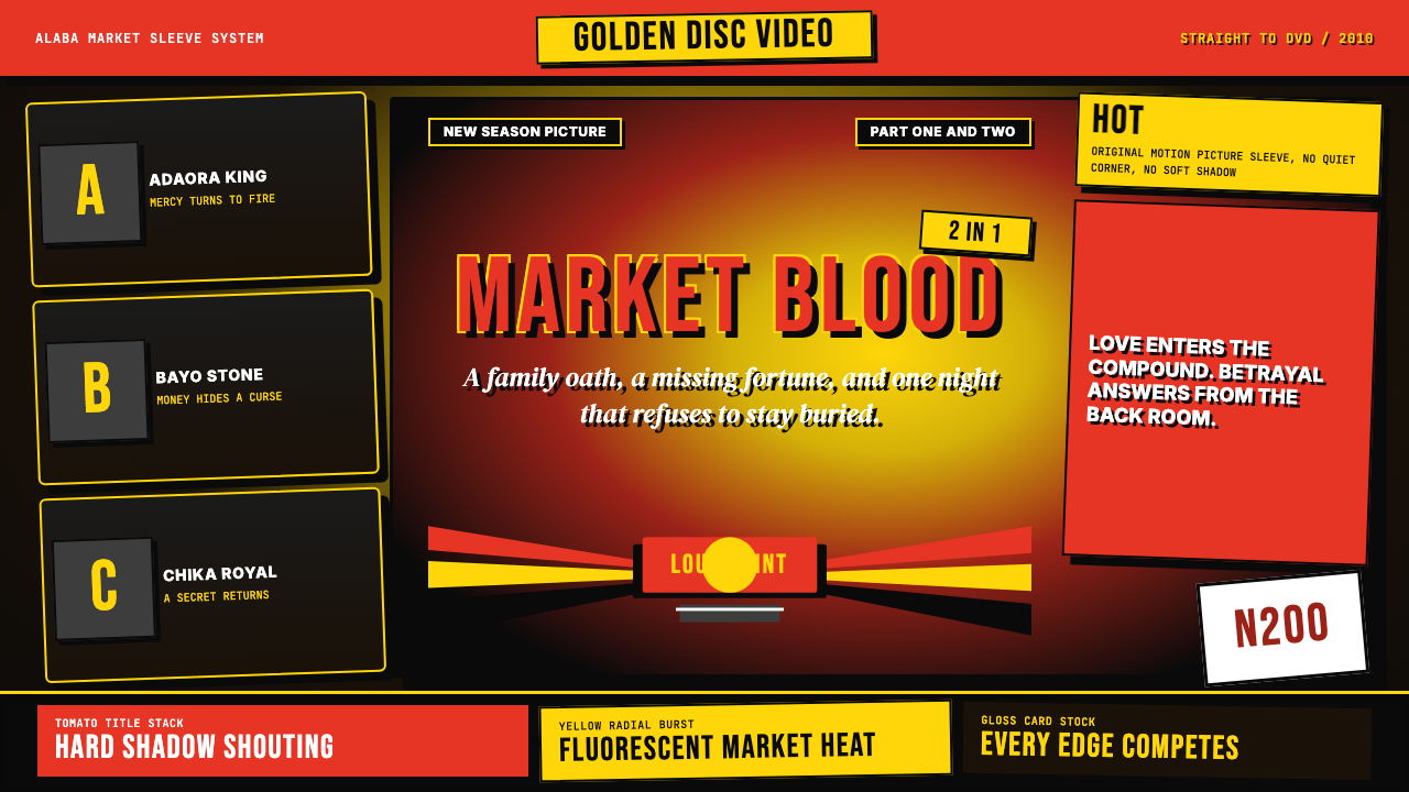 Nigerian Nollywood DVD Poster (2010)Market-stall cinema shouts. Tomato red type and yellow burst collide on jet b…
 CelesteA quiet night climb. Plum sky, navy cards, one dash-pink signal, hard 8px off…
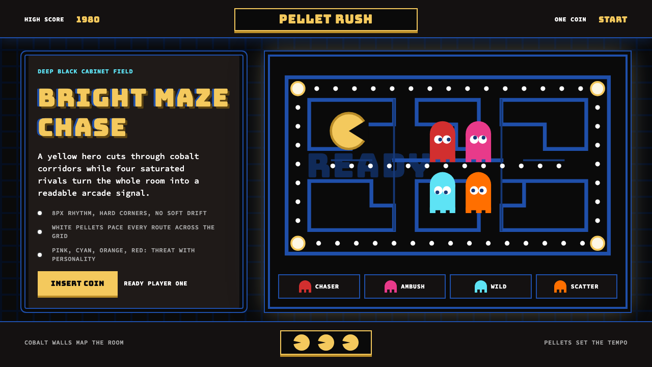 Pac-Man (Namco 1980)Arcade joy burns bright. Yellow disc, cobalt maze, and four ghost hues snap o…
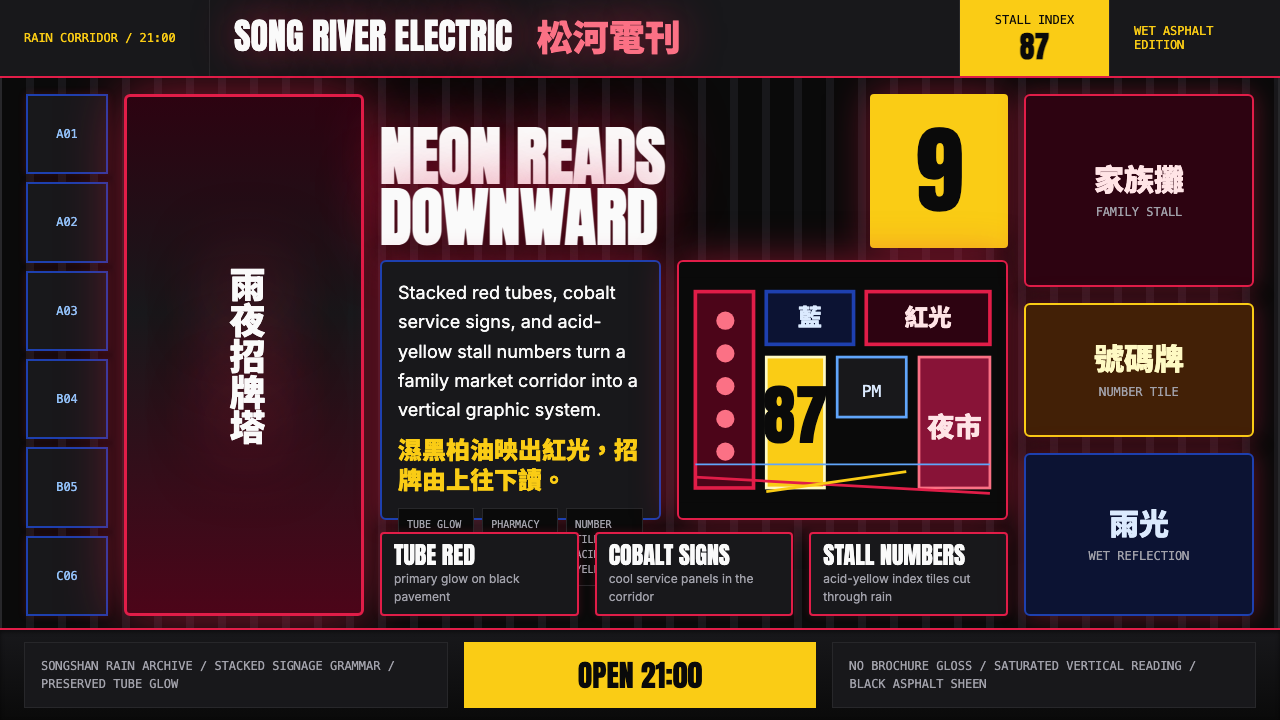 Taiwanese Raohe Night Market NeonTaipei night reads vertically. Neon red, cobalt panels, and acid-yellow numbe…
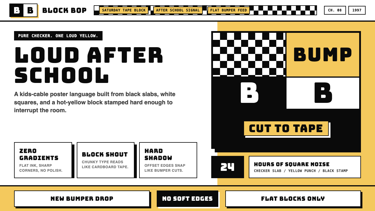 Cartoon Network 90s BlocksKids-cable noise, squared. Black-white checkerboards crash into hot-yellow Bu…