What is Celeste?
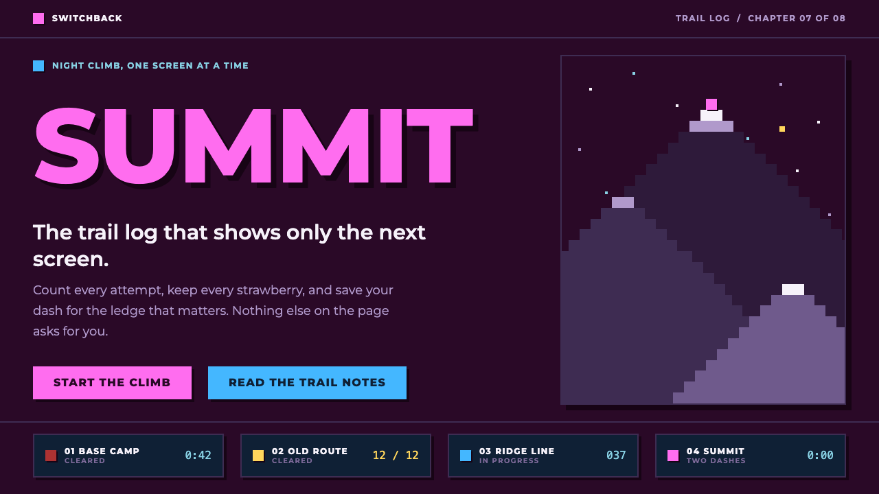
The Celeste style is a quiet pixel night climb: a plum sky, navy cards, lavender text and a single dash-pink signal, all snapped to a hard-edged grid.
Celeste in brief
Celeste is a precision platformer released on 25 January 2018 by a small Vancouver team, and the style named after it distils the look of its box art and its night-time chapters into a usable design system. The page takes the plum-coloured sky from the official cover. Cards and dialogue boxes are the deep navy of the in-game night. Body text is the lavender of the mountain in the logo. Together they make a calm, dusky ground that feels like climbing under stars.
One colour does the persuading. Pink, taken from the hair of the protagonist Madeline when she has two dashes available, marks headings, links and anything the reader should press. The rest of her palette becomes a small semantic vocabulary: red hair, kept for strawberry counts and warnings; the blue hair of a spent dash, used for secondary actions and focus; and gold, reserved for rewards.
Everything snaps to a pixel grid. Edges are sharp, shadows are hard offsets without blur, and the interface keeps itself small and quiet. The aim is the same as in the game: the player should see the climb, not the menu. The style suits narrative indie game pages, pixel-art portfolios, and tools that want some warmth without becoming childish.

Where does Celeste come from?
The style grows out of Vancouver, British Columbia, and a lineage of independent precision platformers. The people credited in the source material include Maddy Thorson, Noel Berry, Pedro Medeiros, Amora Bettany and Lena Raine. Its roots go back to a 2015 prototype built for the PICO-8 fantasy console, known as Celeste Classic, a tiny game that already contained the core idea of a climber on a mountain, one screen at a time.
That PICO-8 background is important to the look. A fantasy console imposes tight limits on resolution and palette, and designers who work within such limits learn to make every colour and every pixel count. When the prototype grew into the full game, released on 25 January 2018, the team kept the discipline: a restricted, deliberately chosen set of colours, each with a job, and imagery built from chunky, legible pixels instead of smooth rendering. The Farewell chapter followed in 2019 and extended the game’s world.
Celeste also belongs to the wider movement of modern pixel art, where pixels are chosen as an expressive medium and not as a technical constraint. The art direction is soft in mood but hard in form. Skies are dusky, mountains are lavender and snow is pale, yet nothing is blurred; shapes are clean silhouettes against flat colour. The design system carries this paradox into the interface, with warm, quiet colours on hard edges.
The colour logic comes straight from the character. Madeline’s hair changes colour with the number of dashes she has left, and players learn to read that signal instantly. The design system borrows it: pink for what you can still do, blue for what has been spent, red for danger and strawberries, gold for reward. The game’s colour language is a user interface in itself, and the web style turns it into an explicit palette.
What defines the Celeste look?
Plum night sky ground
The page background is a deep plum, taken from the official box art. It is dark but warm, closer to dusk than to black, which separates the style from cold, technical dark themes. The colour sets the emotional tone at once: calm, a little lonely, quietly determined. Large areas of it give the other colours a stage without competing with them.
Navy cards and lavender text
Cards, dialogue boxes and panels use the navy of the in-game night, which sits a step cooler and deeper than the plum ground. Body copy is set in the lavender of the mountain on the logo, a soft purple that reads comfortably on dark backgrounds. Because both colours belong to the same dusky family, long passages stay easy on the eyes while still having clear hierarchy between ground, container and text.
Dash-pink as the single signal
Pink is the hair colour of Madeline with two dashes available, and in the interface it marks headings, links and every element a visitor is meant to press. It is bright against the dusky ground, so it works as a beacon. The rule of the system is that pink means actionable or important. Using it for decoration would remove its meaning, in the same way that a game would lose clarity if its hero changed hair colour at random.
A small semantic palette
Red, blue and gold are kept for specific meanings. Red counts strawberries and flags warnings. The blue of a spent dash handles secondary actions and focus states. Gold is reserved for rewards and achievements. Each colour is rare enough to keep its force. Together they let a designer communicate state without long labels, the same way the game communicates dash count through hair colour.
A strict pixel grid
All sizes, spacing and positions snap to a small base unit. This produces the crisp, regular rhythm that pixel art needs: nothing sits half-way between steps, and nothing looks accidentally aligned. The grid also helps accessibility and consistency, because spacing is predictable. It is the interface equivalent of the tile-based precision that a platformer demands of the player.
Hard-edged offset pixel shadows
Shadows are solid blocks of darker colour displaced to one side, with no blur and no feathering. They give cards and buttons a tactile, sprite-like depth while staying faithful to flat pixel art. Pressed states simply move the element into its shadow. The result feels playful and physical without leaving the visual language of the game.
A quiet, uncluttered interface
The system deliberately shows less. There are few ornaments, few competing colours at once, and generous spacing between groups. The principle is that the less the interface says, the more clearly the content, whether a story, an artwork or a tool, can be heard. This restraint is the main reason the style feels gentle and warm rather than loud or retro for its own sake.

Who shaped Celeste?
Thorson is the first of the credited creators of Celeste and is closely linked to the Vancouver team behind it. The game’s emphasis on precise, readable mechanics, where every input has a clear result, is mirrored in the system’s insistence on clear states and predictable spacing.
Berry is credited alongside Thorson and is part of the lineage that starts with the 2015 PICO-8 prototype. The tight limits of that fantasy console explain why the design system uses so few colours and gives each of them a defined role.
Medeiros is credited among the people behind the game and is associated with its pixel art. The clean silhouettes, flat colour and legible shapes that define the look of the mountain and its characters are the visual source of this style’s hard edges and uncluttered layouts.
Bettany is another credited member of the team. Her name belongs in an account of the style because the look of Celeste was a collaborative result, and the design system draws on the finished game rather than the work of any single hand.
Raine is the fifth credited name. As the game’s music is a major part of its calm, determined atmosphere, she represents the emotional side of the system: the same gentleness that the quiet colours and uncluttered layouts try to convey on screen.
How do you use Celeste today?
For slides, the cover can be the plum sky filling the frame, with a pink title in a blocky pixel-friendly face, a short lavender subtitle and a single hard-shadowed card. Content slides use navy panels on the plum ground, with lavender text and pink only on the one line that carries the main point. Data slides can use pink for the primary series, blue for secondary series, red for warnings and gold for the one reward-like highlight, such as a record or a goal reached.
For web pages and product interfaces, the style fits narrative indie game sites, pixel-art portfolios, creative tools and small utilities that want a human touch. A landing page might open with a dusk-coloured hero, a single pink call to action with a hard offset shadow, and a row of navy cards describing features. Forms and dashboards benefit from the clear state colours: focus in blue, errors in red, success rewards in gold.
For editorial and marketing work, build around mood. Short paragraphs, plenty of empty space and one bright signal per section give the layout the pacing of a quiet level. Illustrations should use flat colour and clean silhouettes, with pixel textures used sparingly. The tone of the writing should be warm and plain, because the style invites sincerity more than slogans.
The most common mistake is using pink everywhere. If every heading, icon, decoration and background panel is pink, the signal disappears and the page loses its hierarchy. A second mistake is softening the edges, adding blurred shadows or gradients, which breaks the pixel language and makes the interface feel like a generic dark theme with purple tint.
A third mistake is ignoring the grid. The style depends on regular steps, and a layout that mixes arbitrary spacings will look sloppy rather than charming. Finally, avoid turning it into pure nostalgia. The system is quiet and modern in spirit; a page covered in loud retro effects, scanlines and flashing text misses what the original game was actually like.

Celeste — FAQ
What is the Celeste design style?
It is a dark pixel-art-inspired interface style based on the game Celeste. A plum sky ground, navy cards and lavender text carry a single dash-pink signal for headings, links and primary buttons, with red, blue and gold held back for specific meanings. Edges are hard and shadows are solid offsets.
Where do the colours come from?
The plum sky comes from the official cover art, the navy from the in-game night, and the lavender from the mountain in the logo. The accent colours come from the protagonist’s hair: pink with two dashes, red for strawberries and warnings, blue when the dash is spent.
Why are the shadows hard instead of soft?
Pixel art does not blur. A solid, offset block of darker colour gives depth in a way that stays true to the flat, grid-based look of the game, and it makes pressed states easy to express by moving an element into its shadow.
Which projects suit this style?
Narrative independent game pages, pixel-art portfolios, creative tools and small utilities that need a warm, human tone. It suits projects that value quiet focus over loud spectacle.
How can I keep it from feeling like generic retro?
Limit pink to real actions, keep the grid strict, avoid blur and gradients, and leave plenty of empty space. The originality comes from restraint and meaningful colour, not from nostalgic effects.
Related design styles
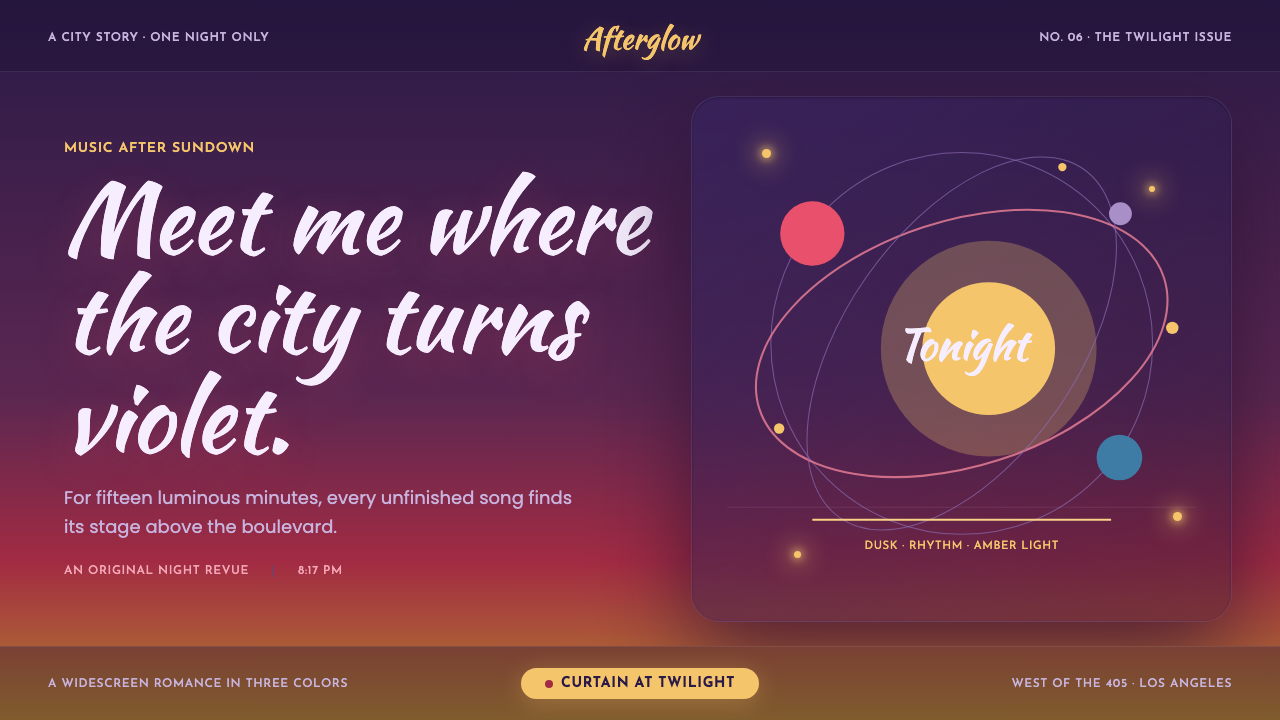 La La Land (2016)Twilight waits for a dance. Violet dusk, rose horizons and amber bulbs frame…
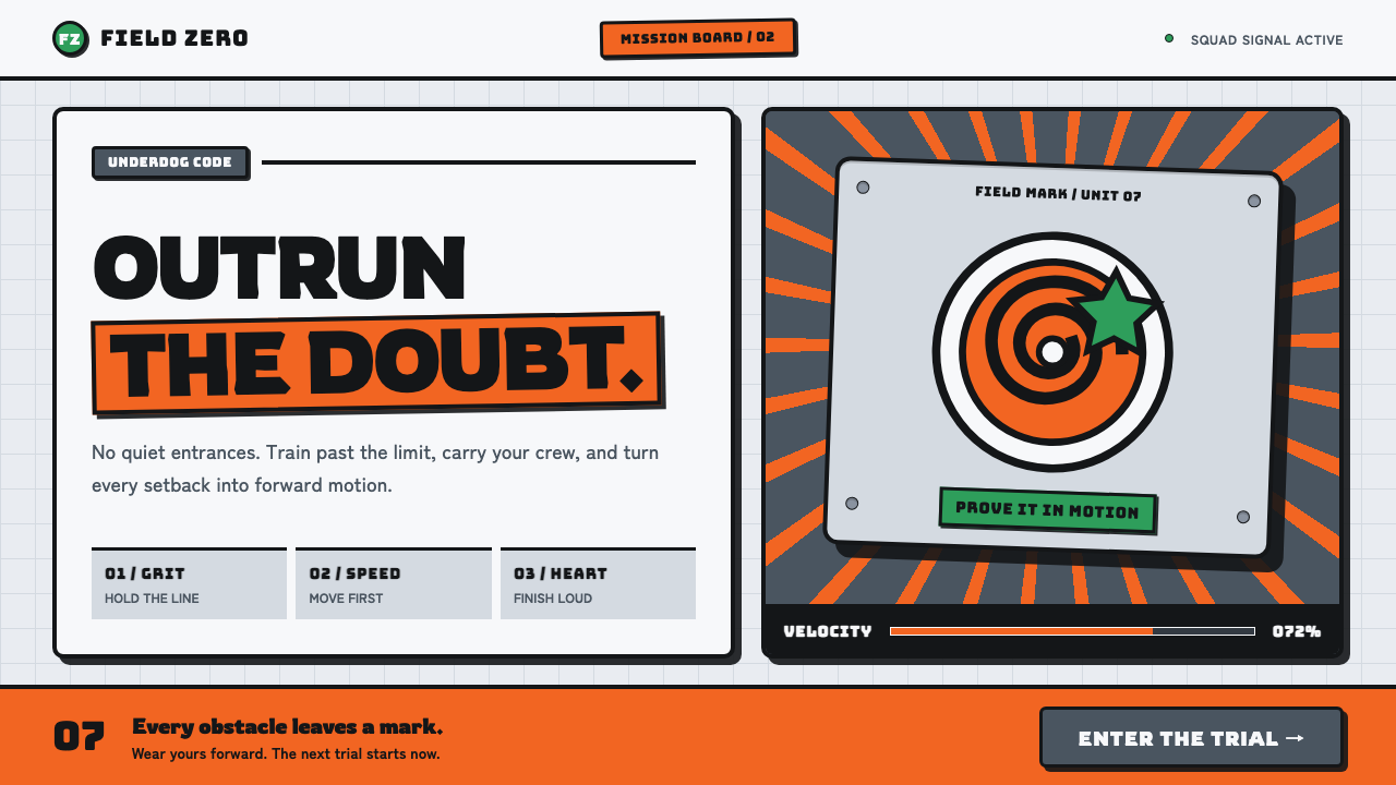 Naruto (2002 anime era)Underdog energy refuses the background. Hazard orange strikes steel-gray grid…
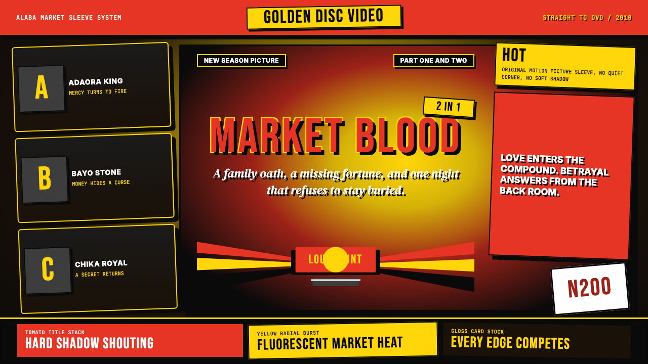 Nigerian Nollywood DVD Poster (2010)Market-stall cinema shouts. Tomato red type and yellow burst collide on jet b…
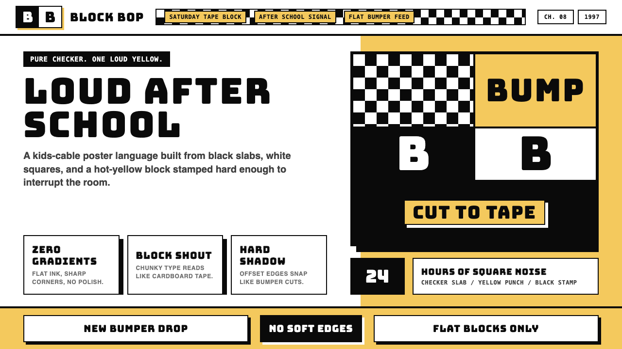 Cartoon Network 90s BlocksKids-cable noise, squared. Black-white checkerboards crash into hot-yellow Bu…
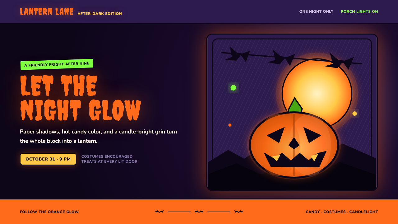 Halloween Jack-o'-LanternFriendly fright, lit from within. Pumpkin orange glows through ink-black cuts…
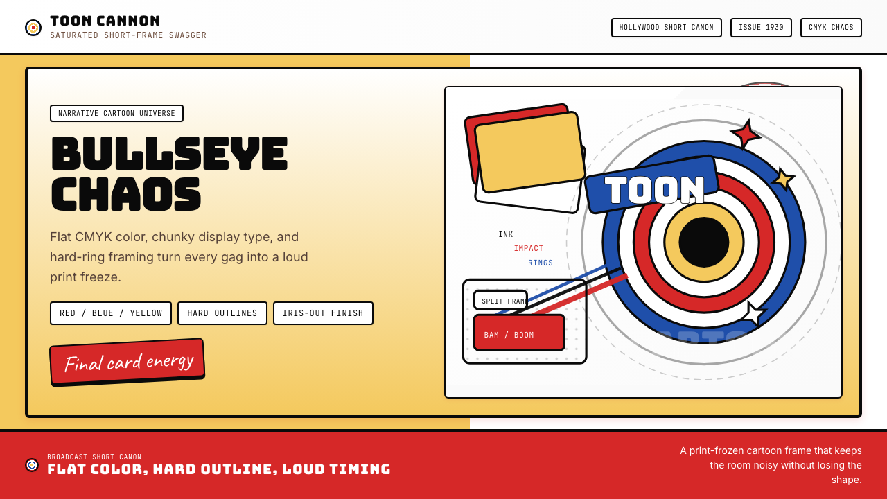 Looney Tunes (Warner Bros.)Pure cartoon chaos. Bull's-eye rings, Bungee type, and red-blue-yellow blocks.