What is Naruto (2002 anime era)?
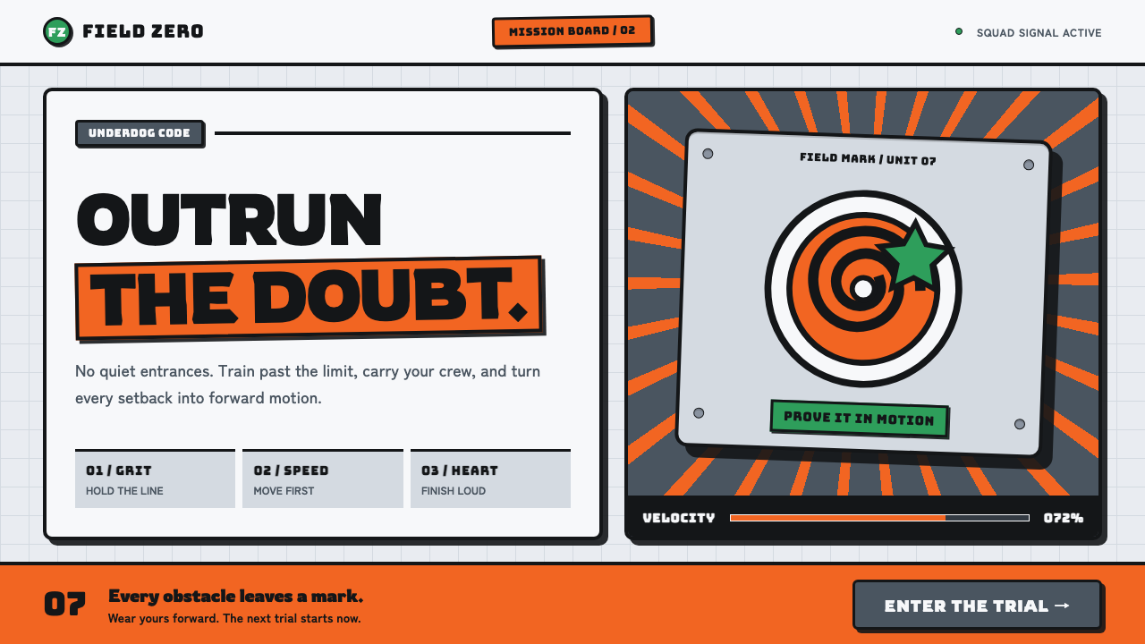
Naruto’s early-anime visual language turns underdog momentum into a graphic system: hazard orange against steel-gray, black ink, and the feeling that every mission notice has been nailed up in a hurry.
Naruto (2002 anime era) in brief
Naruto’s 2002 anime-era look distills Studio Pierrot’s television animation and Masashi Kishimoto’s inked manga pages into a high-energy visual vocabulary. Its defining elements are tracksuit orange, cool steel-gray fields, thick black outlines, brushed-metal forehead plates, rivet marks, leaf-vortex insignia, mission-scroll framing, and diagonal lines that imply sudden acceleration. The style is recognizably shonen: direct, physical, emotionally legible, and unwilling to disappear into a neutral background.
The system feels built from objects that have been used, carried, pinned up, or struck. Metal plates appear engraved and bordered; paper edges look torn or rolled; panels are contained by hard black rules; shadows land as solid offset ink rather than atmospheric haze. Flat color and decisive outline make every form feel portable, like a badge, a dossier marker, or a sign on an academy corridor.
Its emotional register matters as much as its materials. Orange is not a decorative accent here; it is the visible assertion of a character who refuses to be ignored. The steel-gray ground supplies discipline, training, and institutional pressure, while black ink keeps the composition blunt and readable. Together, these elements create a world of effort, velocity, and earned visibility rather than polished luxury.
Where does Naruto (2002 anime era) come from?
The source period is 2002–2007, rooted in a manga that debuted in 1999 and in the Studio Pierrot television anime that premiered in October 2002. The setting of origin is Tokyo, Japan. This timing matters because the look belongs to an early-digital television-anime environment while retaining the emphatic linework and immediate page-to-panel clarity associated with printed shonen manga.
Its stated movements are shonen manga, early-2000s television anime, and the Weekly Shonen Jump house style. Those references explain why the design language privileges readable silhouettes, forceful contrast, motion cues, and symbols that can carry identity quickly. A forehead plate, a spiral-leaf mark, a torn mission-scroll edge, or an orange field can establish genre and atmosphere before a viewer reads a full block of text.
The visual language joins two kinds of authority. The manga-derived side is the hard ink contour, the abrupt shadow, the compressed emotional beat, and the energy of a line that seems to move before the figure does. The television-anime side is the broad field of flat color, the clearly separated foreground objects, and the graphic economy needed to keep action intelligible in a serialized format.
Masashi Kishimoto, Hayato Date, Tetsuya Nishio, and Toshio Masuda are identified in the source material as key figures for this era. Kishimoto is directly connected to the manga ink pages from which the style draws. Across the period, the look is best understood not as a single surface treatment but as a shared vocabulary: steel, paper, insignia, outline, orange, and motion all reinforce the story of a young fighter pushing toward recognition.
What defines the Naruto (2002 anime era) look?
Hazard Orange
Orange is the visual engine. It arrives as a concentrated burst against restrained gray and black surroundings, making the focal subject feel active, exposed, and impossible to overlook. Use it where resolve, motion, or a call to action needs to break through the field; spreading it evenly across every element weakens the underdog charge that gives it meaning.
Steel and Insignia
Brushed-metal forehead plates establish an industrial, equipment-like material language. Engraved marks and small rivet dots imply manufacture and attachment, while the swirling leaf emblem gives the system a memorable symbolic center. These motifs work best as identity-bearing objects, not as ornamental texture scattered across a page.
Hard Ink Outline
Thick black borders separate forms with the certainty of manga ink. They make flat fills feel weighty, hold busy compositions together, and preserve legibility when text, symbols, and motion cues compete. The outline should read as a deliberate contour, not as a soft halo or a generic interface border.
Mission-Scroll Surfaces
Torn paper, rolled edges, pinned notices, and framed panels make information feel issued, carried, and acted upon. The effect is tactile without becoming rustic. A scroll-like container should suggest urgency and use: a field report, a training brief, or an assignment awaiting a response.
Velocity and Direction
Diagonal speed lines give the composition a forward lean. They should guide attention toward the main title, emblem, or action point rather than merely filling empty space. Because they imply impact and rapid movement, a small number of decisive directional gestures is stronger than a dense field of competing streaks.
Offset Ink Shadow
Depth is created with solid, hard-edged shadows placed clearly away from their objects. The shadow behaves like another printed shape and reinforces the cut-paper, inked-panel quality of the style. It should sharpen hierarchy and impact, never imitate a diffuse natural light source.
Who shaped Naruto (2002 anime era)?
Kishimoto is named as a key figure and is directly associated in the source material with the inked manga pages that inform the visual language. The style’s thick contours, abrupt shadows, and refusal of visual softness are therefore tied to a manga-derived sense of graphic decisiveness.
Hayato Date is identified as a key figure for the 2002–2007 anime era. In this account, his name anchors the television-anime side of a visual system that translates ink-page intensity into clear, serial action imagery.
Tetsuya Nishio is listed among the key figures for the era. His inclusion situates the look within a collaborative animation vocabulary rather than treating it as an isolated illustration style or a purely digital interface trend.
Toshio Masuda is also named as a key figure in the approved material. Alongside the other figures, he belongs to the creative context through which the era’s energetic, mission-driven identity is recognized.
How do you use Naruto (2002 anime era) today?
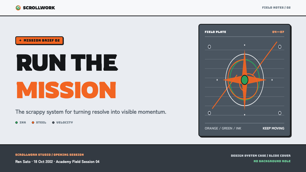
For presentation covers, treat the page like a mission notice with one immediate conflict. Let a steel-gray field create restraint, then introduce a single orange focal object, a bold inked title, and a directional line that drives the eye inward. A forehead-plate-inspired label or leaf-vortex emblem can establish identity, but it should support the title rather than compete with it. The cover should feel like an invitation to move, not a collage of references.
On content slides, build clear framed sections that resemble panels on a posted briefing. Use black outlines to separate concepts, reserve orange for the key takeaway or current step, and allow gray areas to carry supporting information quietly. For data slides, charts should feel like mission indicators: direct bars, compact markers, hard-edged callouts, and decisive annotations. Avoid gentle fades, glass-like cards, or decorative motion that conflicts with the graphic bluntness of the source language.
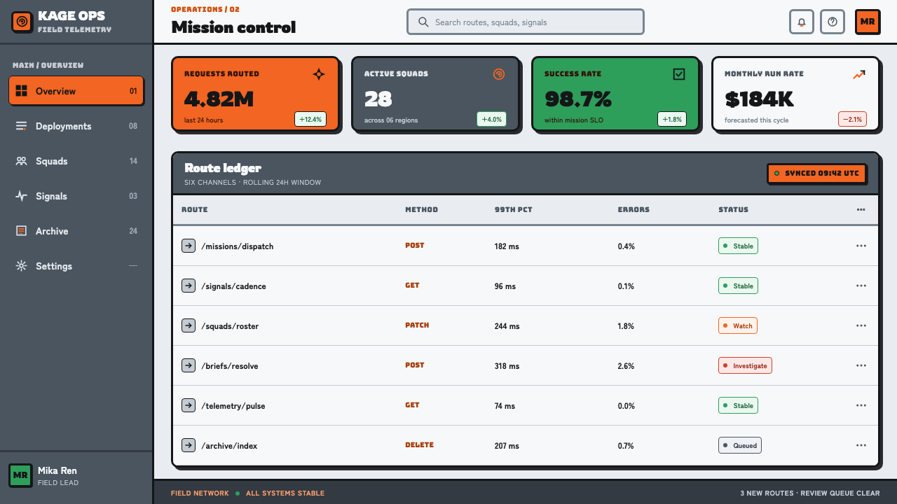
For web interfaces, the style works especially well for dashboards, progress views, learning tools, challenge systems, and pricing pages that need to make status visible. Steel-like panels can contain account information, while an orange state identifies active progress, priority, or a recommended action. Use strong labels, icon-like insignia, and obvious boundaries so that the interface reads quickly even when it carries dense information.
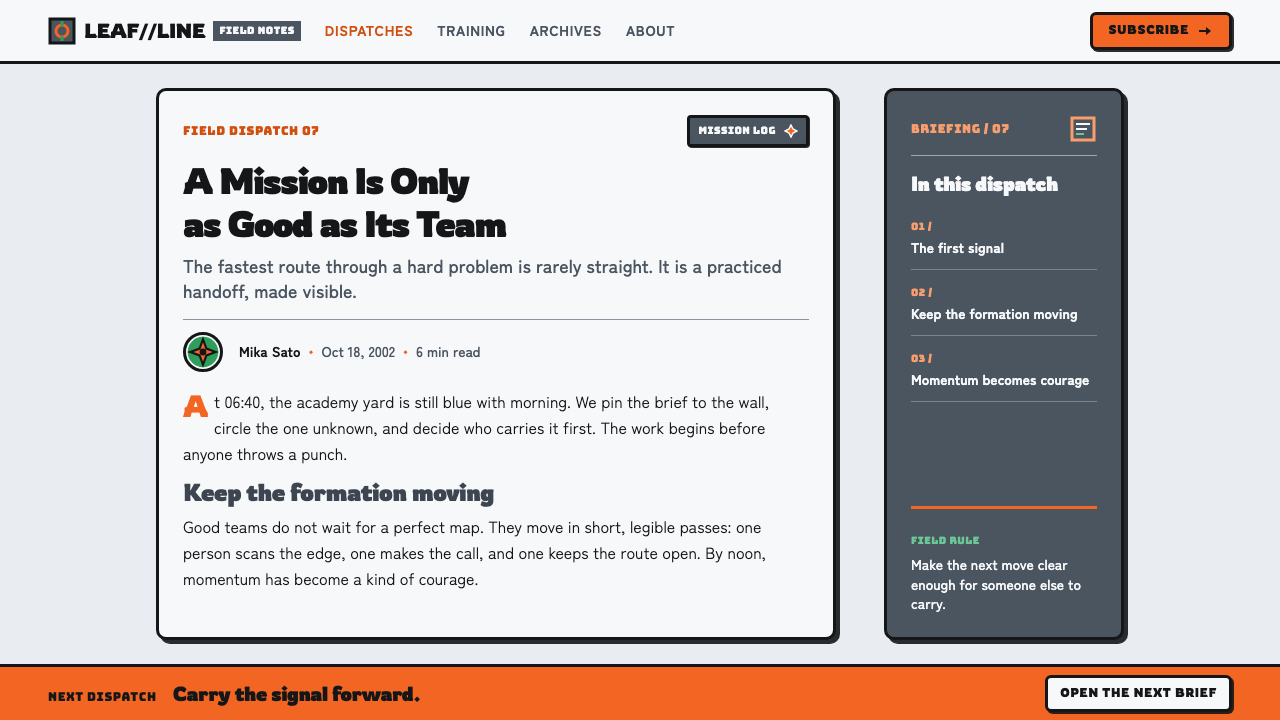
For editorial and marketing work, use the mission-scroll idea to turn ordinary content into an assignment with stakes. An article can open with a pinned-looking brief, use torn-paper dividers for narrative shifts, and place pull quotes or evidence in stamped panels. Landing pages can alternate calm steel-gray sections with orange moments of arrival, emphasizing the journey from uncertainty to action rather than relying on glossy spectacle.
The common mistake is to reduce the style to orange, a leaf symbol, and random diagonal lines. That produces costume-like imitation instead of the original’s structural energy. The real system depends on contrast between restraint and release: cool equipment-like surfaces against one urgent color, hard ink against flat fills, and motion cues aimed at a meaningful objective. If every area shouts, the central refusal to stay in the background disappears.
Naruto (2002 anime era) — FAQ
Is this style only suitable for Naruto-related content?
No. Its transferable principles are underdog energy, equipment-like framing, hard graphic contrast, and purposeful motion. These can support educational challenges, fitness progress, creator tools, game-adjacent products, or campaign-like editorial work. Avoid presenting unrelated work as official Naruto material or relying on recognizable franchise identifiers when the project needs its own identity.
Why are steel-gray and orange more effective together than orange alone?
Their contrast creates the narrative built into the source material. Steel-gray suggests equipment, discipline, and a cool institutional setting; orange interrupts that order with visible will and velocity. Orange without a restrained field can become ordinary emphasis. Against steel and black ink, it reads as a deliberate act of emergence.
Can the aesthetic use soft gradients or blurred shadows?
They are a poor fit for its central language. The approved material describes flat fills, hard borders, and hard offset ink shadows instead of soft blur. If depth is needed, create it through a clearly displaced solid shadow, layered panels, or a metal-plate edge. The result should feel printed, cut, or assembled rather than softly illuminated.
How should typography behave in this style?
Typography should be forceful, compact, and easy to scan. Treat headlines as action cues and labels as equipment markings. Strong size contrast, black outline logic, and clean framing are more important than decorative letterforms. Text should look capable of surviving a busy mission board, where every word must earn space through clarity.
Where does this style struggle?
It can struggle where softness, quiet luxury, sensory calm, or delicate emotional trust are the primary goals. The hard outlines, alert-like orange, and forward momentum may feel too confrontational for contemplative wellness, intimate hospitality, or understated premium branding. In those contexts, borrow only the clarity and mission framing, then reduce the visual aggression.
Related design styles
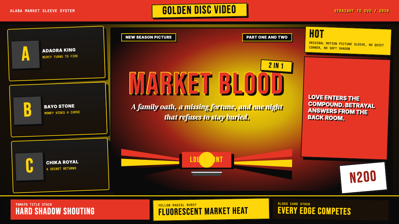 Nigerian Nollywood DVD Poster (2010)Market-stall cinema shouts. Tomato red type and yellow burst collide on jet b…
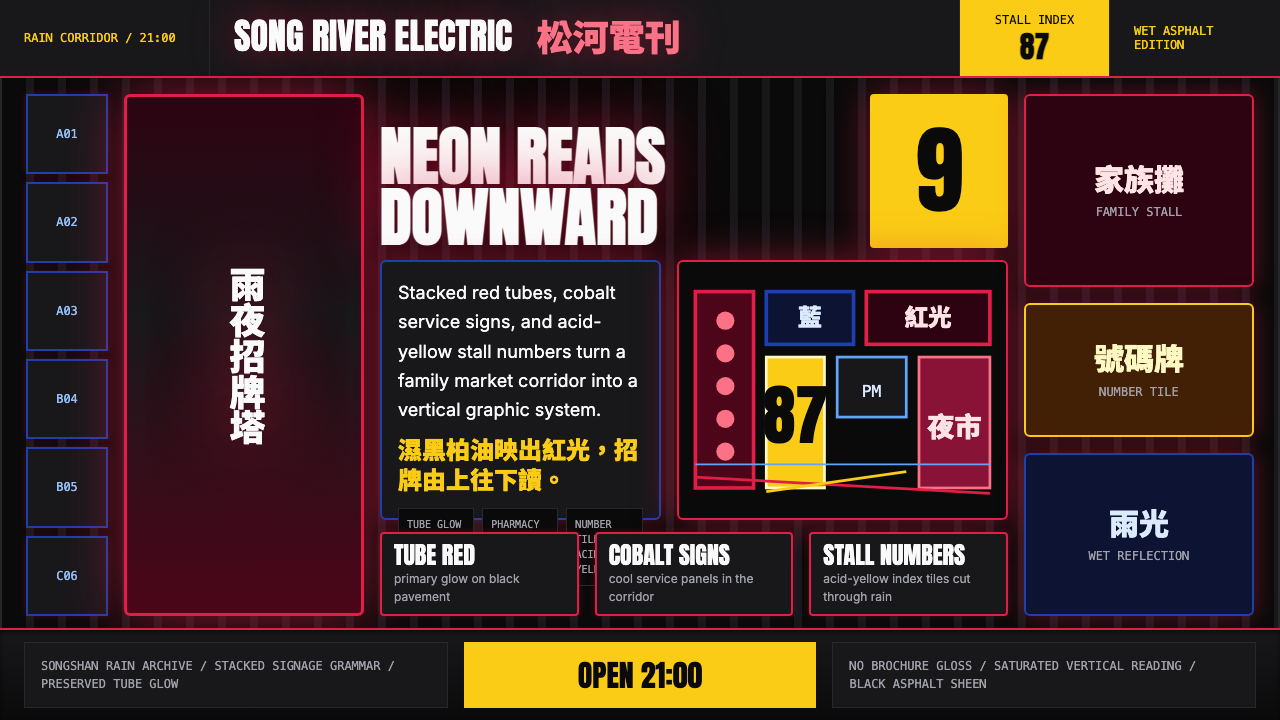 Taiwanese Raohe Night Market NeonTaipei night reads vertically. Neon red, cobalt panels, and acid-yellow numbe…
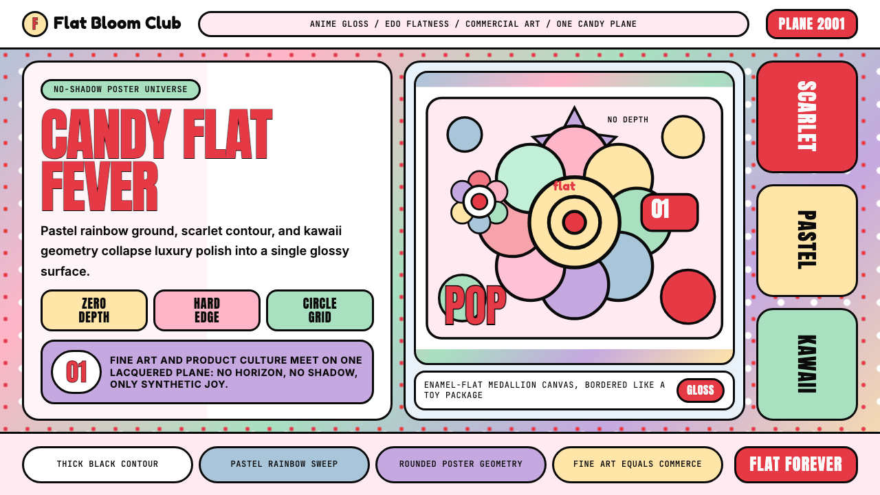 Takashi Murakami SuperflatJoy has no depth. Pastel rainbow, scarlet accents, and black contours flatten…
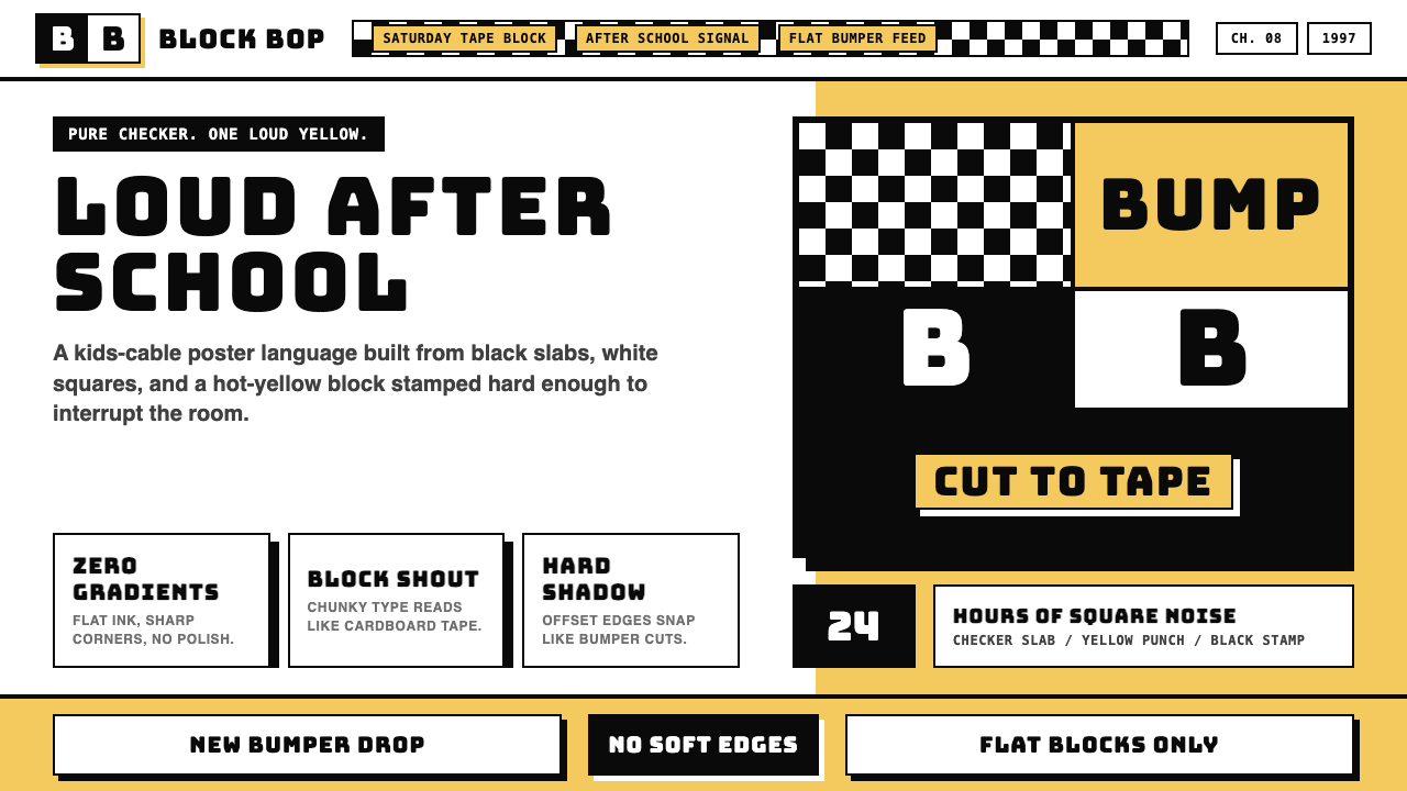 Cartoon Network 90s BlocksKids-cable noise, squared. Black-white checkerboards crash into hot-yellow Bu…
 Pojangmacha Soju TentNight appetite glows. Orange tarp panels burn over black, cut by Hangul neon…
 Taipei Shilin Night Market NeonLoud by design. Hot pink, neon yellow, and stacked TC serif signs break the g…