What is Cyworld?
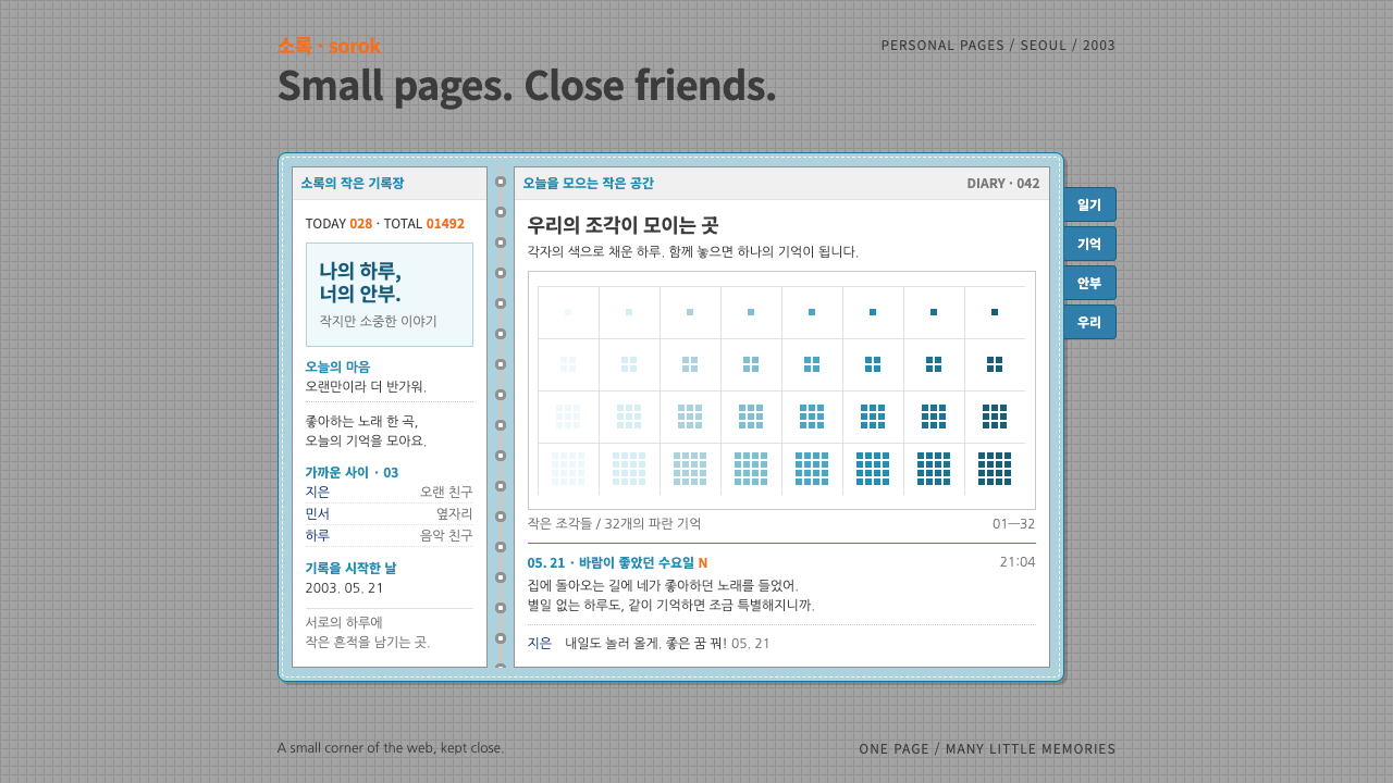
Cyworld's minihompy is a tiny diary window drawn as a two-page ring binder: white pages in a stitched sky-blue cover, pixel-art rooms, dense small type, and orange used only for visitor counts.
Cyworld in brief
Cyworld is the social network that Korean internet users of the early 2000s lived inside, and its minihompy is the visual form this design system reproduces. Every member's profile was a small pop-up window drawn as a two-page ring binder: white diary pages held in a sky-blue stitched cover and floating on a grey graph-paper grid. The left page carried the profile photo, a mood line and a TODAY and TOTAL visitor counter. The right page held a pixel-art mini room with a tiny avatar, a minimi, standing in it.
As a design system, it keeps that window intact. The interface is not a responsive page that stretches to fill space; it is a fixed object with a definite size, like a physical notebook. Type stays small and dense, rules stay hairline-thin, pixel art is shown at its native scale and never smoothed, and the brand orange appears only on counters, new marks and the logo.
The emotional register is intimacy rather than performance. Where later social platforms emphasized feeds and reach, the minihompy emphasized a personal room that friends visited one at a time. The design therefore feels handmade and domestic: stitched edges, paper whites, soft blue, small tidy columns of text, and a sense that every pixel was placed by the owner.

Where does Cyworld come from?
Cyworld launched in 1999 in Seoul, and the minihompy and mini rooms arrived in 2001. Its peak ran from about 2003 to 2009 under SK Communications, during which it became part of the daily routine of young people in South Korea. The source material names Lee Dong-hyung and SK Communications among the key actors in its story. For many users, a Cyworld page was their first personal space online, and the interface they remember is this binder window.
It belongs to a distinct Korean early-2000s web culture. Broadband spread fast in South Korea, and internet cafes, online communities and personalized pages were central to youth life. The minihompy fit that moment perfectly: it was small enough to load quickly, rich enough to be personal, and structured enough that every visit felt familiar. You looked at a friend's page, then followed the list of friends to the next one, a kind of walking from room to room that users called surfing.
Its two most influential ideas were the pixel avatar and micro-payment personalization. The minimi was a tiny pixel figure that represented you, and the mini room was a pixel stage you could furnish. Skins, furniture, music and avatar clothing were bought with a small virtual currency called dotori, the acorn. That small purchase habit meant that every page was visibly different, and that a person could express taste through a few well-chosen items rather than through writing.
The design vocabulary came from stationery. The ring binder, the stitched cover, the graph-paper desktop and the lined diary pages were all familiar objects from school life, and they made a digital space feel safe. This is why the system is so insistent on small details: a hairline rule, a stitched dashed border and a pixel at exact scale are not ornament but the building blocks of the intimacy the original produced.
What defines the Cyworld look?
Ring-binder window
The whole interface is a single fixed-size object shaped like an open two-page binder. It does not stretch to the viewport; it sits in the center of the screen like an object on a desk, with a clear edge and a sense of physical scale.
Stitched sky-blue cover
The frame around the pages is a soft sky blue with a dashed white stitching line along its inside edge. It signals handcraft and stationery, and it is the one place where a large area of color appears.
White diary pages on graph paper
The inside is paper white, and the binder floats on a faint grey graph-paper grid. The contrast keeps content clean and readable while the grid hints at a desk surface, so the window feels placed rather than pasted.
Dense small type and hairline rules
Text is set small and tightly, in the manner of a diary or a classified page, and divided by the thinnest possible rules. Hierarchy is made by position and a few weight changes rather than by large size, which gives the page a quiet, private tone.
Pixel art at native scale
Avatars, furniture and mini rooms are drawn in crisp pixels and displayed at their native scale, never blurred or smoothed. The hard edges of the pixels are part of the charm and give the interface its handmade, toy-like warmth.
Orange only for counts and marks
The brand orange is deliberately rationed. It appears on visitor counters, new markers and the logo, and nowhere else. Because it is so scarce, it works as an instant signal that something is alive or recently changed.
Mood line and visitor counter
A short personal mood line and the TODAY and TOTAL counter sit together on the left page. They turn a profile into a living space: you say how you feel, and the page shows how many people came by.

Who shaped Cyworld?
Named in the source material as a key figure in the founding of Cyworld in Seoul.
The company that ran Cyworld during its peak from about 2003 to 2009, when the minihompy became part of daily life in South Korea.
The pixel avatar that represented each member inside their mini room, and the clearest emblem of the whole visual system.
How do you use Cyworld today?
In slides, the style works for intimate, personal presentations: memory-themed decks, retro internet culture talks, community retrospectives and nostalgic product stories. Use the binder window as a frame for a single idea per slide, with the left page for a short statement and the right page for an image or pixel illustration. For data, present one or two small counters in orange, with the rest in quiet black and grey, as though reading the numbers on a diary page.
On the web, it suits profile pages, personal journals, community directories, guest books and any interface that wants to feel like a small private room. A fixed-size card centered on a patterned background is the core layout. Navigation can be reduced to small tabs along the edge of the binder, and notifications to a single orange marker. Because the original is not responsive, mobile adaptations should scale the whole object rather than reflow it.
For editorial and marketing, it makes strong nostalgia material: retro-themed campaigns, throwback posts, anniversary features and anything that revisits the early internet. Pixel illustrations at native scale, stitched borders and graph-paper backgrounds can make a poster look like a screenshot of a lost room. It carries a particular warmth, so it works best when the message is personal rather than corporate.
Keep the orange scarce, and keep pixel assets crisp. Scaling pixel art by a non-integer amount, or applying smoothing, destroys the effect immediately. Likewise, do not enlarge the small type to fit modern screens; adjust the surrounding space instead, so the density remains part of the personality.
The most common mistake is to modernize it: rounding every corner, adding soft shadows, stretching the layout to full width and using a large friendly sans-serif. That produces a generic card UI in light blue. The system's identity is its constraint: one small window, one paper white, one scarce orange, and a lot of tiny things carefully placed.

Cyworld — FAQ
What is the Cyworld design style?
It is a design language based on the Cyworld minihompy, a fixed-size pop-up window drawn as a two-page ring binder. White diary pages sit in a stitched sky-blue cover on a grey graph-paper grid, with dense small type, hairline rules, native-scale pixel art and orange reserved for counters and new marks.
When was Cyworld popular?
Cyworld launched in 1999 in Seoul, introduced the minihompy and mini rooms in 2001, and peaked from about 2003 to 2009 under SK Communications. It was a central part of early-2000s Korean web culture.
What are minimi and dotori?
A minimi is the small pixel avatar that represents a member inside their mini room. Dotori, meaning acorns, was the small virtual currency used to buy skins, furniture, music and avatar clothing, which let each page express personal taste.
Why is the interface a fixed-size window?
The original was a self-contained object, like a physical notebook, rather than a stretching page. Its fixed size keeps density, pixel scale and proportions under control and gives each page the feeling of a small private room.
What is the easiest way to get it wrong?
Modernizing it. Rounding every corner, adding soft shadows, stretching it full width, smoothing the pixel art or spreading orange everywhere turns it into a generic light-blue card interface and removes the intimacy.
Related design styles
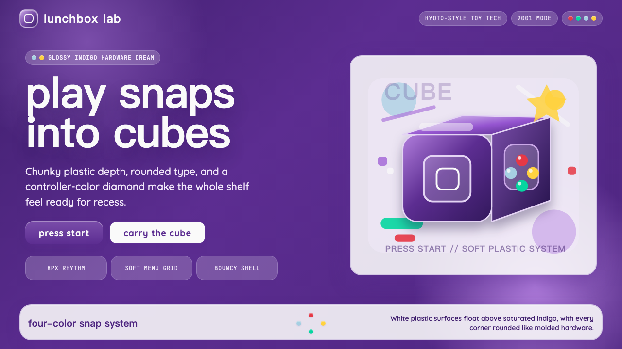 Nintendo GameCube (2001)Toy-tech refuses restraint. Indigo plastic, glossy cubes, and four-color butt…
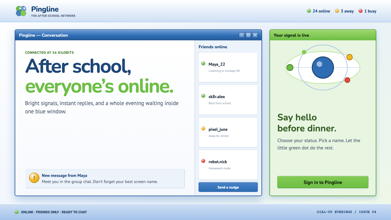 MSN Messenger (2001)Dial-up optimism, online. Luna-blue chrome and bright status dots keep every…
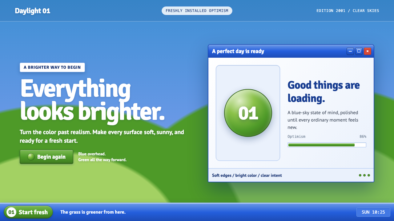 Windows XP Bliss (2001)Fresh-install optimism. Sky blue, hill green, and glossy gel chrome turn real…
 i-modeA whole world in a few dots. Bitmap type, white space and yellow bring the po…
 MapleStoryLittle windows, big nostalgia. Steel-blue bevels, grey slots and bouncy orang…
 Ragnarok OnlineSmall adventures, lasting warmth. Periwinkle chrome, navy hairlines and dense…