What is i-mode?
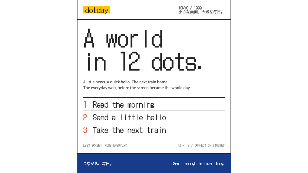
i-mode put a whole world in a few dots: black bitmap type on white, numbered menus, and the tiny pictographs that became the first emoji.
i-mode in brief
The i-mode style is the look of the mobile web as it first reached ordinary people in Japan: a narrow white screen, black bitmap text, menu lines with numbers that you chose with the d-pad or a number key, and small pictographs drawn dot by dot. It is the visual language of a handset page from February 1999, rebuilt for today's screens.
Its rules are strict and few. White space is generous. Type is a bitmap gothic with hard, unsmoothed edges. Icons are flat and single-coloured. The only bright note is the yellow of the i-mode logo, used for the mark itself and for solid blocks, while links and selected lines are given a red-orange. There are no gradients, no rounded corners and no depth.
What makes it appealing now is its honesty. Every element is a pixel decision and every screen is a list that tells you exactly what to press. It brings a nostalgic charm to modern products, but it also teaches a real lesson in clarity: when the screen is small and the instructions are numbered, nobody gets lost.

Where does i-mode come from?
i-mode launched in Tokyo in February 1999, introduced by NTT Docomo on the F501i handset. It was the first time ordinary people could browse a purpose-built mobile web from a flip phone. The sources name Mari Matsunaga, Takeshi Natsuno and Keiichi Enoki among its key figures. The service worked by using a compact version of HTML, so that pages could be light enough for the narrow connections and tiny monochrome screens of the day. Colour LCDs arrived from the 502i series onward, and the style gradually gained colour while keeping its structure.
The design culture behind it was Japanese keitai culture: the world of mobile phones as personal companions, with straps, decorations and a daily life of messages, news, weather and trains read on a thumb-sized screen. Content was organised as numbered menus because the keypad was the interface. You pressed a number and you arrived. That simplicity shaped the visual logic of the whole system: a list, a link, a page, back.
Inside this system a set of small pictographs was created by Shigetaka Kurita. Drawn on a tiny square grid of a dozen dots per side, the 176 glyphs gave messages a way to carry a smile, a sun, an umbrella or a heart in a few dots of space. They are widely recognised as the first emoji. In 2016 they were acquired by New York's Museum of Modern Art, which treated them as a landmark of pixel pictograph design.
Three lineages meet in the style: the compact-HTML mobile web, which fixed the rules of layout; keitai culture, which made the screen a personal object; and the craft of pixel pictograph design, which gave the icons their character. A design system based on i-mode takes those constraints as virtues. The restrictions of a low-resolution screen, black text and a single bright accent become a recognisable identity rather than a limitation.
What defines the i-mode look?
Pure white ground and generous space
The page is plain white with wide breathing room between lines and groups. On the original handsets this was a necessity; here it is a choice. White space makes numbered lines easy to scan and lets the few coloured elements read at once.
Bitmap gothic type
Text is set in a bitmap gothic whose letterforms are built from visible square dots, with hard, unsmoothed edges. It looks like it came from a handset, and it has a sturdy, instrument-like clarity. Anti-aliasing is avoided so the dot structure remains visible.
Flat single-colour pixel glyphs
Icons are small pictographs drawn on a tiny grid, each in one flat colour. They are meant to be read at a glance and to carry emotion with very little information. Outlines are hard-edged and there is no shading, so they look the same on any background.
i-mode yellow as a mark and a block
The bright yellow of the logo is the single strong colour of the system. It is used for the mark and for solid blocks such as headers or highlights, never as text colour on white. Its rarity gives it presence, and it keeps the page cheerful without ornament.
Red-orange for links and selection
Links and the currently selected line are given a red-orange, which stands out clearly against both white and yellow. This separates interaction from branding: yellow means identity, red-orange means you can press this. The rule is simple and consistent.
Numbered menu lines
Navigation is a vertical list, each line prefixed with a number: one for news, two for weather, and so on. This mirrors the number keys of the handset. The pattern makes structure explicit and teaches the interface in a single glance.
No gradients, rounded corners or depth
The system forbids anything that was impossible on the original screen. Boxes have square corners, separators are plain lines or blank space, and nothing casts a shadow. This discipline is what keeps the style coherent; one rounded button would break it.

Who shaped i-mode?
Creator of the original set of 176 pictographs for i-mode, widely regarded as the first emoji; the set entered the collection of New York's Museum of Modern Art in 2016.
Named among the key figures of the i-mode service at its launch in Tokyo in 1999.
Another key figure credited with the shaping of i-mode and its content ecosystem.
Listed in the sources among the people behind the launch of NTT Docomo's mobile internet service.
How do you use i-mode today?
On slides, the i-mode style is excellent for retro-tech talks, history of the internet, mobile culture and emoji-themed presentations. A cover can be a white slide with a single bitmap headline and a yellow block carrying a pixel glyph. Content slides work as numbered menu lines: one idea, one number. Keep everything flush to a simple grid and let the white space do the layout.
For data slides, favour tables and lists over charts. If a chart is needed, build it from flat blocks with hard edges, in black and one accent, with labels in the bitmap face. A ranked list with numbers in front is the most native form of all. Avoid smooth curves; stepped lines and square markers fit the pixel logic better.
On the web, the system suits personal sites, nostalgic landing pages, links directories, small utilities, chat or messaging features and any product that wants a deliberately lo-fi identity. Build pages as vertical lists with numbered links, a yellow header block and red-orange for the selected row. Provide a legible fallback for body text if long reading is required, but keep the structure unchanged.
In editorial and marketing work, the look excels at anniversaries, explainers about the early mobile internet and emoji, campaigns that play with memory, and brands with a playful, digital-native voice. Pixel glyphs can serve as bullets, stickers or section markers. Write in short lines, plainly, as though space on the screen were scarce, because that tension is the charm.
The most common mistake is to soften it. Adding rounded corners, soft shadows, translucent layers or smooth anti-aliased fonts turns an honest handset page into a generic retro costume. A second mistake is yellow overuse: if yellow becomes text or fills every section, it loses its role as a mark. Finally, do not make the pixel grid arbitrary; glyphs should sit on one consistent small grid so they feel like a set.

i-mode — FAQ
What is the i-mode design style?
It is the look of NTT Docomo's i-mode mobile web from 1999 rebuilt for modern screens: white ground, bitmap gothic type, numbered menu lines, flat single-colour pixel glyphs and the logo's yellow, with no gradients, rounded corners or depth.
What is the link between i-mode and emoji?
Shigetaka Kurita drew a set of 176 small pictographs for i-mode on a tiny square grid. They are widely regarded as the first emoji, and in 2016 the set was acquired by New York's Museum of Modern Art.
When did i-mode launch?
In February 1999 in Tokyo, on the F501i handset. Colour LCDs came with the 502i series and later, so the style evolved from monochrome to colour while keeping its structure.
Why are there no rounded corners or shadows?
Because the original screens could not display them. The system treats that limit as its identity: square corners, plain separators and flat colour keep the page honest and make it instantly recognisable.
Is it usable for modern products?
Yes, for products that want a deliberately lo-fi, nostalgic or playful voice: personal sites, small tools, campaigns and tech-history content. For dense or long-reading products, use it as an accent rather than the whole interface.
Related design styles
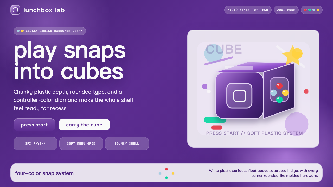 Nintendo GameCube (2001)Toy-tech refuses restraint. Indigo plastic, glossy cubes, and four-color butt…
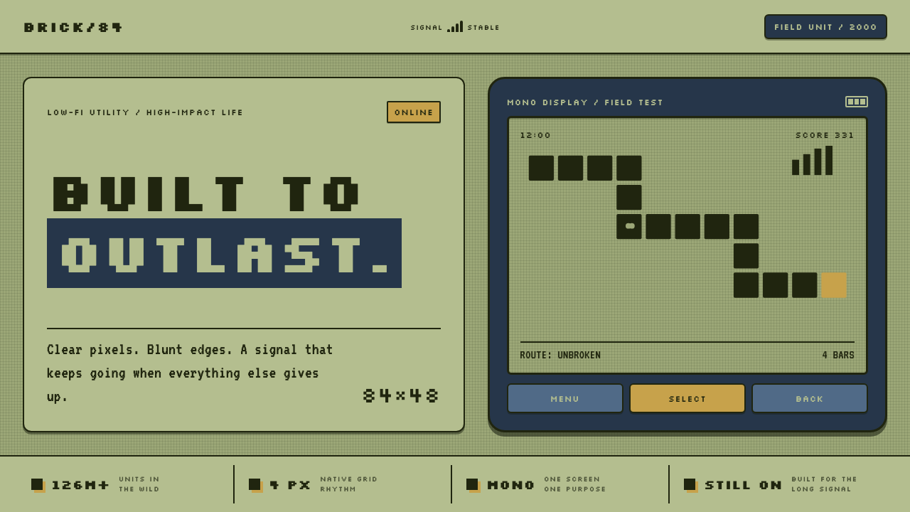 Nokia 3310 (2000)Built to outlast. Dark pixels march across olive glass inside a matte navy fr…
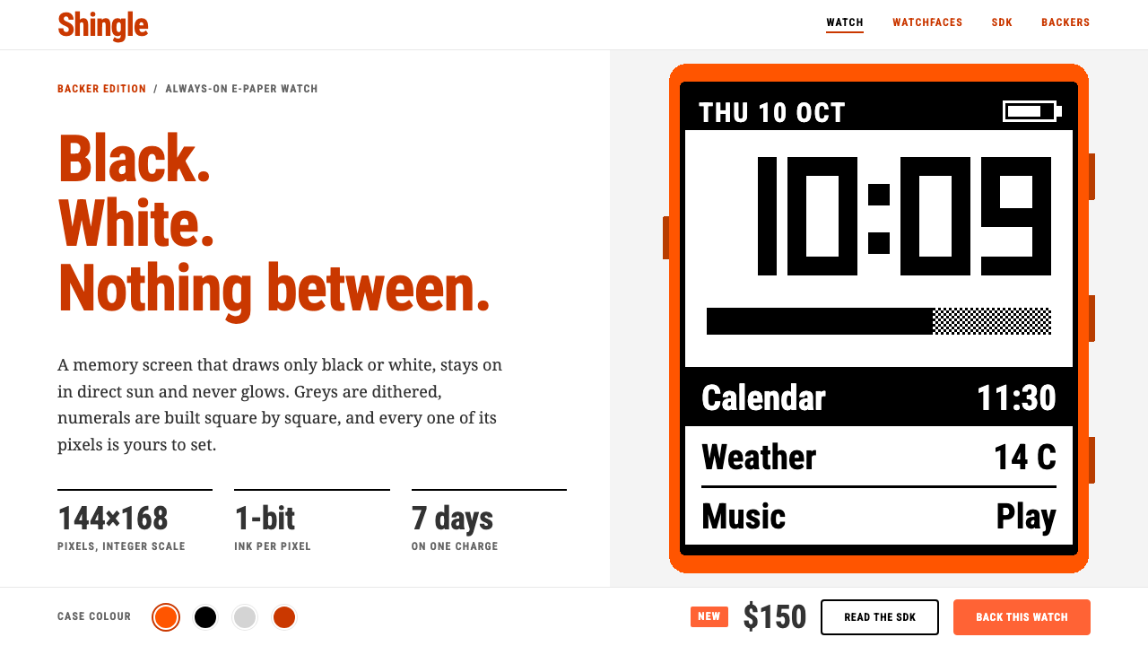 PebbleTwo colours, no greys. Burnt-orange headings on white frame a 144×168 one-bit…
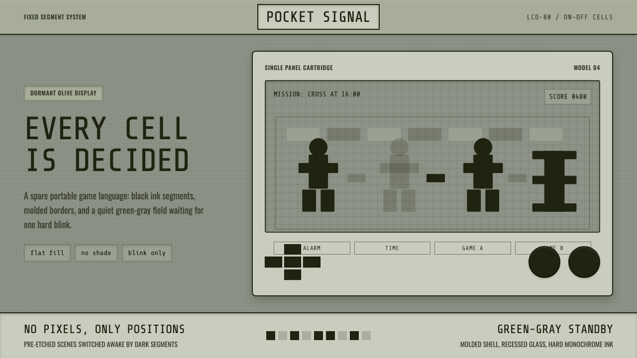 Handheld LCD GameConstraint is the charm. Olive LCD grid, black segment ink, tight molded beze…
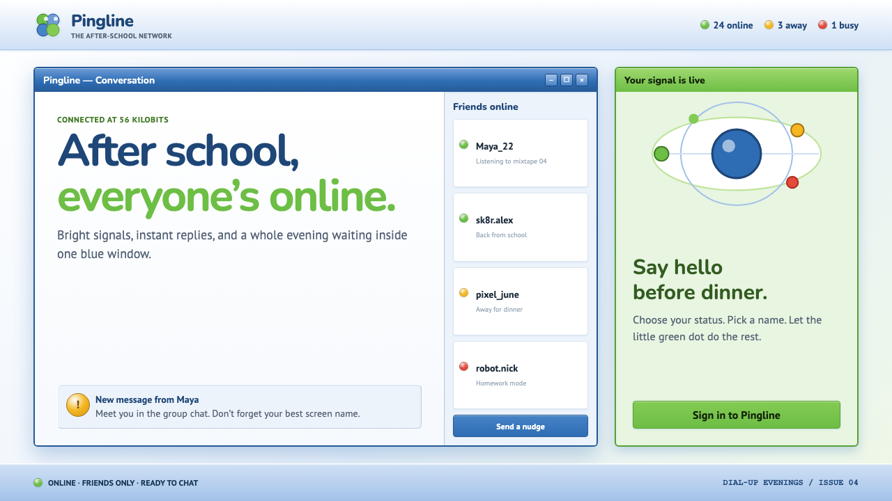 MSN Messenger (2001)Dial-up optimism, online. Luna-blue chrome and bright status dots keep every…
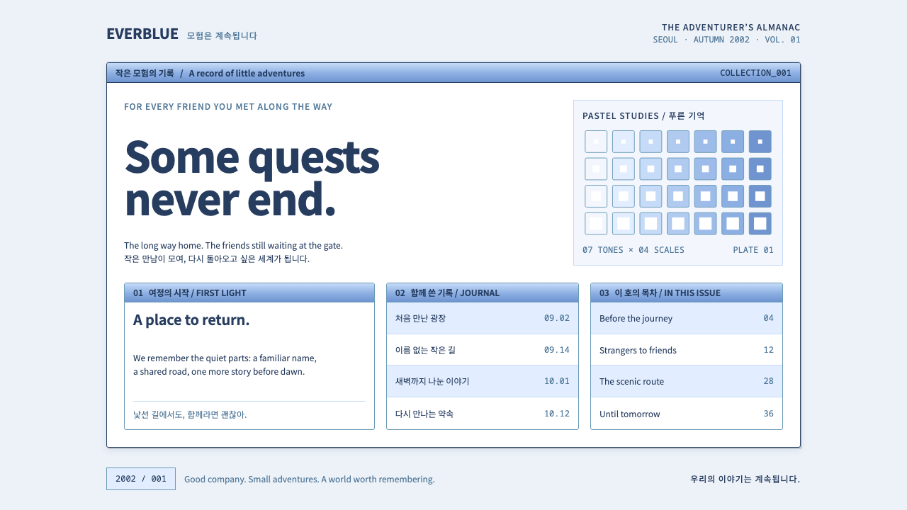 Ragnarok OnlineSmall adventures, lasting warmth. Periwinkle chrome, navy hairlines and dense…