What is NeXTSTEP?
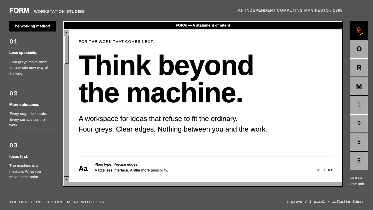
NeXTSTEP is what a computer interface looks like when it trusts four greys, a black title bar and a bevel to do all the talking.
NeXTSTEP in brief
NeXTSTEP is the graphical desktop that NeXT Computer unveiled in October 1988 alongside its black magnesium cube workstation. As a design language it is defined by restraint: a dark grey workspace, lighter grey windows with fine bevelled edges, black title bars carrying white Helvetica Bold, and pure white document areas. That is essentially the whole palette. Four greys, applied with discipline, do the work that later systems would hand to gradients, translucency and colour.
What makes it distinctive is not only what is missing but where things were placed. The main menu hangs as a vertical column at the top left instead of stretching across the screen. The Dock lines up large icon tiles in a single column along the right edge. Scrollers sit on the left side of a window rather than the right. Each of these choices was made deliberately, and together they give the interface a recognisable personality that neither the Macintosh nor Windows ever shared.
In a design library NeXTSTEP is valuable as a counterweight to the soft, glassy interfaces of the 2010s and 2020s. It shows how far a product can get with right angles, hard edges and grey scale, and how powerful it is to reserve colour for a single place. On the original screen, the only colour that belonged to the system itself was Paul Rand's tilted cube logo, which therefore read as a signature rather than decoration.

Where does NeXTSTEP come from?
The look comes from a specific moment and place. NeXT was the company Steve Jobs founded after leaving Apple, based in Redwood City, California, and its machine was shown to the public in October 1988. The software was positioned for serious workstation users: researchers, engineers and developers. Its interface therefore had to feel like a precise tool rather than a friendly toy, and the grey scale, the black title bars and the thin bevels all communicate that seriousness.
The release history stretches over several years. NeXTSTEP 1.0 shipped in 1989, colour display support arrived with version 2.0 in 1990, and release 3.3 followed in 1995. The visual identity barely changed across these revisions, which is itself a statement about confidence: once the grey vocabulary was settled, the team spent its energy on the tools underneath. Those tools mattered historically. Interface Builder and the Objective-C object-oriented environment let developers assemble applications by connecting visible objects, and Display PostScript meant that what appeared on screen shared a rendering model with what came out of a printer.
The machine also carries an unusual place in computing history. The first web browser was written on a NeXT computer at CERN by Tim Berners-Lee, which means a large share of the web began life inside this grey interface. After Apple acquired NeXT in the late 1990s, the underlying system became the foundation of Mac OS X, so the lineage of today's Mac and iPhone software runs straight back to the cube.
As a style, NeXTSTEP belongs to late-1980s workstation computing, a culture that valued density, clarity and engineering honesty over consumer charm. Its hard edges and grayscale discipline also echo older modernist print design, in which a single accent mark does the work of identity. Keeping the system pure — no gradients, no rounded corners, no colour except the logo — is what keeps it from reading as mere retro cosplay.
What defines the NeXTSTEP look?
Four-grey palette
The entire interface is built from four greys: a dark workspace, lighter window surfaces, black title bars and white document areas. Hierarchy is expressed through value contrast alone, so a design in this style should resist the urge to add accent hues.
Fine bevels, hard edges
Windows and buttons are given depth by thin light and dark edges that imitate a raised or pressed surface. Corners stay square and there are no soft shadows, blurs or translucency; depth is drawn, not simulated.
Black title bars, white Helvetica Bold
Each window is capped with a solid black bar carrying a short title in white Helvetica Bold. It acts as a strong horizontal anchor and gives every window a clear, label-like identity.
Menus as a vertical column
The main menu hangs as a stack at the top left, and its submenus can be torn away and kept on screen. The layout treats commands as a list you read downward rather than a bar you scan across.
Dock of large tiles on the right
Application icons stack as large square tiles down the right edge of the screen. The Dock is a tidy column of objects rather than a floating strip, reinforcing the sense of a workbench with tools laid out in order.
Scrollers on the left
Scrollers sit on the left of the window instead of the right. It is a small oddity, but it signals that the interface was designed from first principles rather than copied from existing conventions.
Colour reserved for the cube
The only colour that belongs to the system is Paul Rand's tilted cube logo, together with icon artwork. Because the surroundings are neutral, that single colourful object becomes the brand's entire signature.

Who shaped NeXTSTEP?
Founded NeXT after leaving Apple and presented the cube workstation and its software in October 1988.
A key software engineer on the NeXT system, connected to the operating-system foundation that later underpinned Mac OS X.
Listed among the people associated with the NeXT interface and graphic identity work.
The graphic designer behind the tilted cube logo, the single splash of colour in an otherwise grey interface.
How do you use NeXTSTEP today?
On slides, NeXTSTEP suits technical talks, engineering reviews and retrospectives on computing history. A cover can be a dark grey field with a single black title bar and a white label, and the only colour allowed is one logo or icon. Content slides should lean on the window metaphor: each chart, code sample or table lives inside a bevelled panel with its own black title bar. Data slides work best in strict greyscale, using value contrast to separate series, and with colour reserved for the one number the audience must remember.
In web interfaces and dashboards the style is a natural fit for developer tools, admin consoles, documentation sites and internal utilities. Use square corners, a dark workspace behind lighter panels, and a narrow column of navigation on one side. Pricing pages can follow the same logic: plain white content panels, black header bars, and a single accent on the recommended plan. Because the style depends on hierarchy through contrast rather than decoration, it also stays highly legible and fast to scan.
In editorial and marketing work, NeXTSTEP is excellent for product histories, anniversary features, hardware launches that want an engineering mood, and posters that celebrate computing culture. A restrained grey layout with a bold black header strip and one tilted, colourful emblem can look confident and expensive precisely because it holds back. Pair it with plain, tightly set Helvetica-style type and generous alignment to a visible grid.
The most common mistake is softening it. Adding rounded corners, drop shadows, gradients or glassy blur instantly destroys the hard-edged character, and so does sprinkling several accent colours across buttons and links. A second frequent error is using the bevel everywhere, which turns every element into a button; keep bevels for things that can actually be pressed or moved, and leave flat areas flat. Finally, remember that the style is dark-leaning and technical, so it will feel wrong for warm, playful or luxurious briefs.

NeXTSTEP — FAQ
What is NeXTSTEP?
NeXTSTEP is the operating system and graphical desktop of NeXT Computer, first shown in October 1988 with the black cube workstation. Its visual style is defined by four greys, black title bars, thin bevels and a distinctive arrangement of menus, Dock and scrollers.
Why is the interface almost entirely grey?
The designers used grey scale so that hierarchy would come from contrast and structure instead of hue. It also fit the product's target audience of developers and researchers, and it let the single colourful logo act as the system's signature. Colour display support arrived later, in version 2.0 in 1990.
How is NeXTSTEP connected to the web and to macOS?
The first web browser was written on a NeXT computer at CERN by Tim Berners-Lee. After Apple acquired NeXT in the late 1990s, the underlying system became the base of Mac OS X, so modern Apple software descends from it.
What kinds of projects suit this style?
It suits developer tools, admin consoles, technical presentations, computing-history features and any brief that wants a serious, engineered mood. It is a poor match for warm, playful or luxury-focused work.
What is the biggest mistake when recreating NeXTSTEP?
Softening it. Rounded corners, soft shadows, gradients and extra accent colours all undermine the hard-edged, grey-scale discipline. Keep corners square, keep colour for the logo or one key element, and use bevels only where something can be pressed.
Related design styles
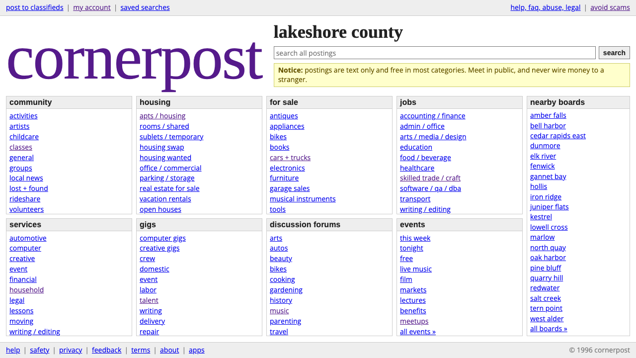 craigslistNothing designed, everything findable. Blue underlined links and a purple ser…
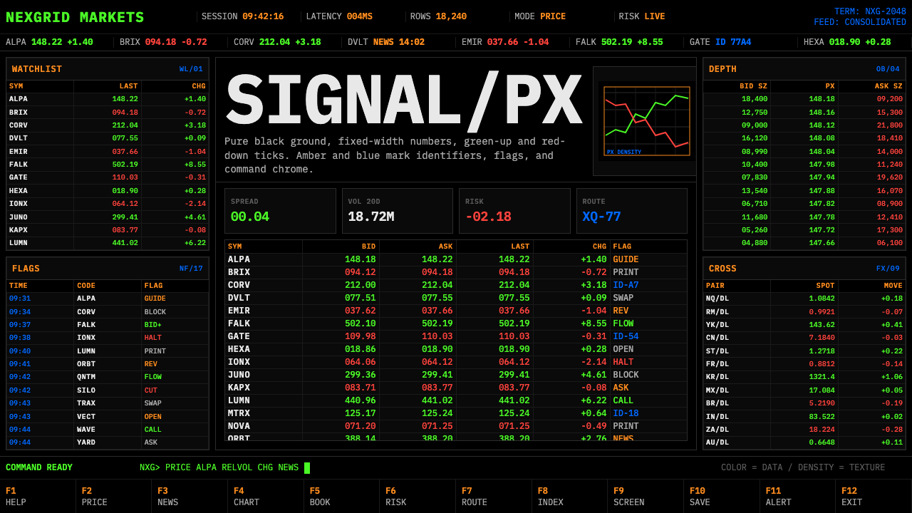 Financial Terminal MonoMaximum signal per pixel. Pure black, IBM Plex Mono, green-red ticks, amber-b…
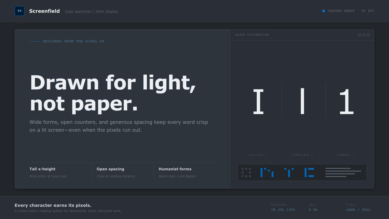 Verdana Screen SansBorn digital, built for clarity. Wide humanist letters glow in cool grey on a…
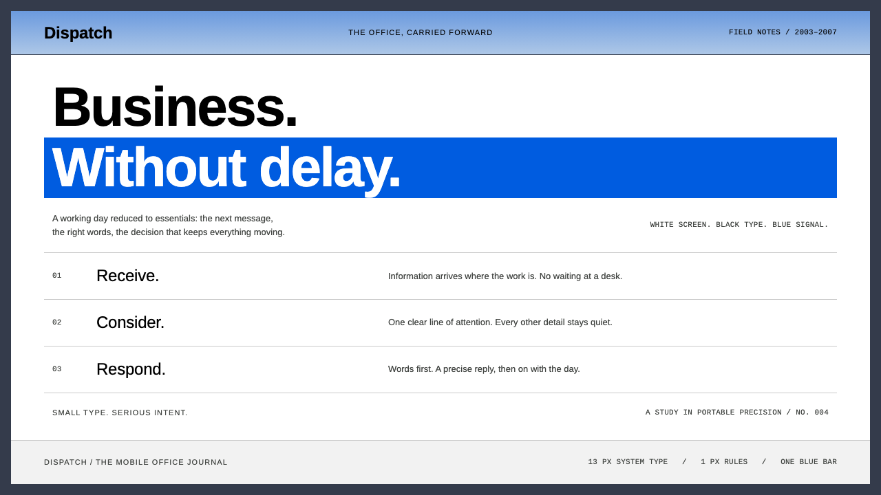 BlackBerryPortable precision. Dense black Arimo, white ruled rows and one decisive blue…
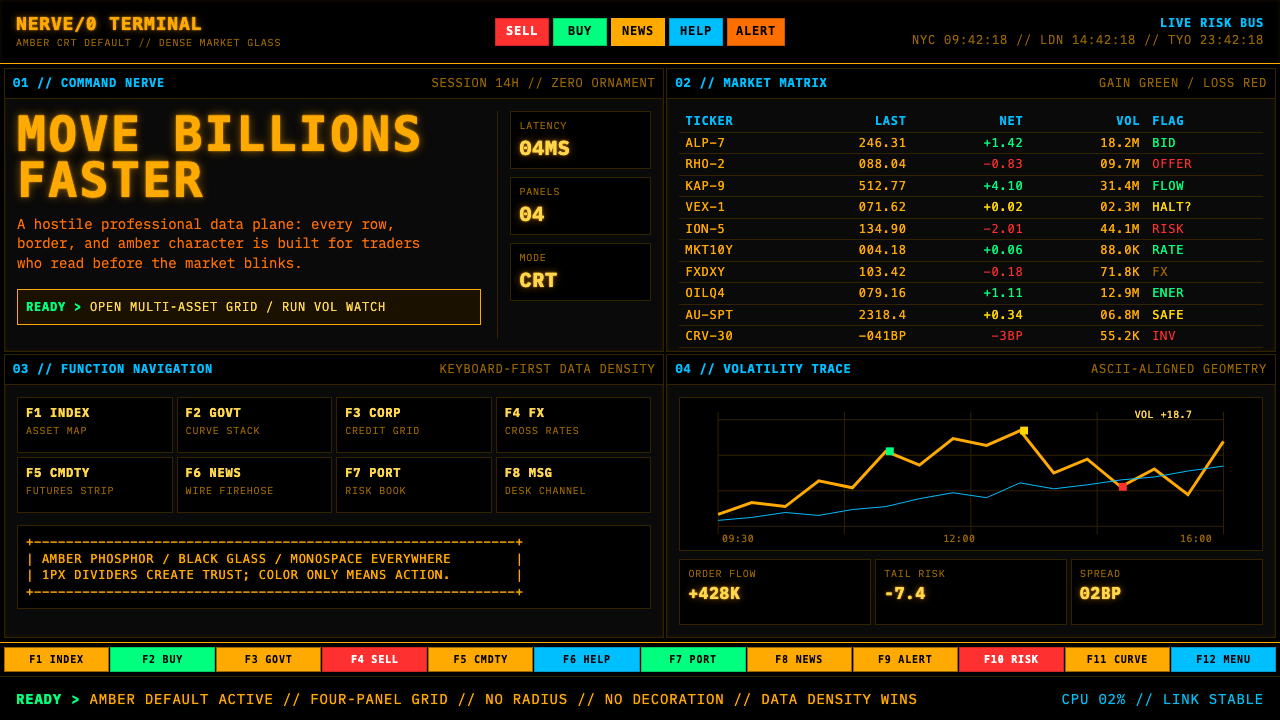 Bloomberg Terminal (Amber CRT)Hostile data authority. Amber mono grids and four hard panels make black glas…
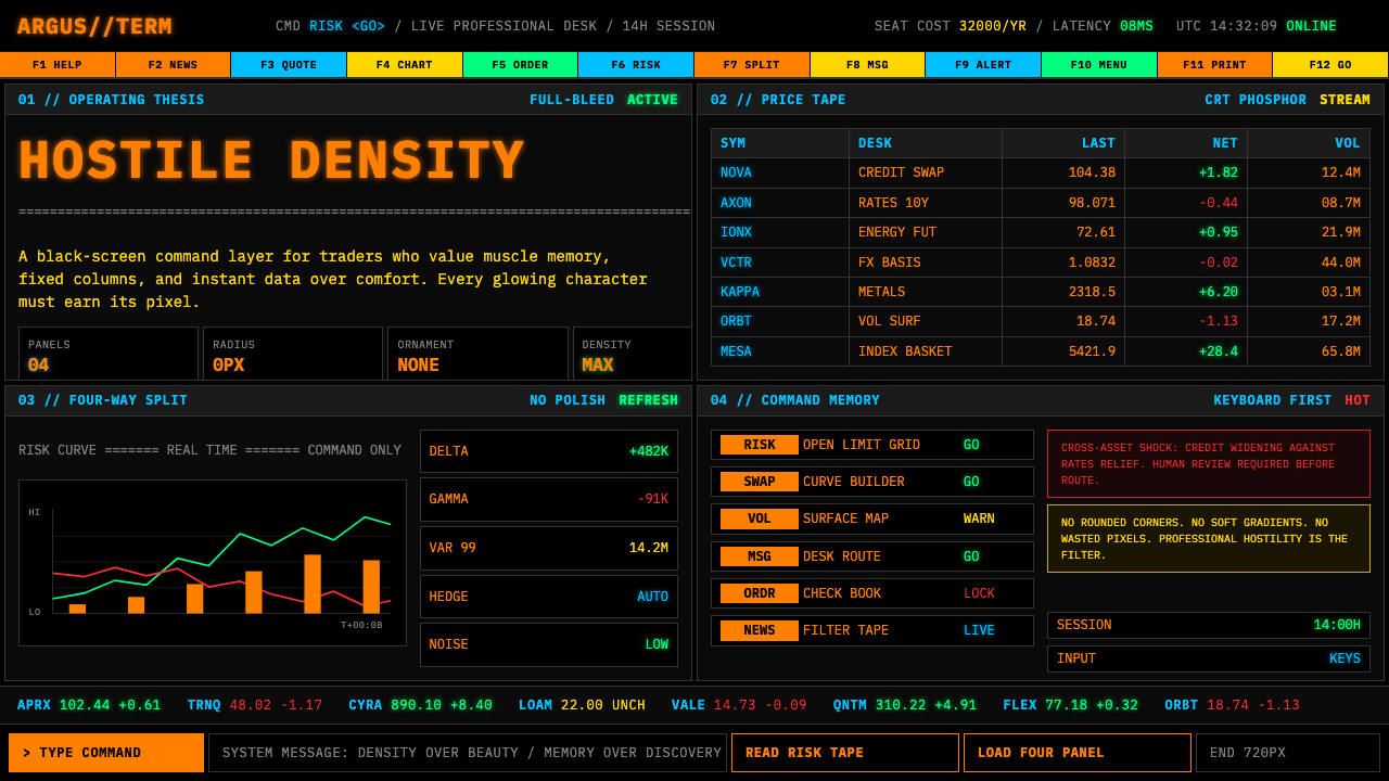 Bloomberg Terminal (CRT Green)Hostile density wins. Orange CRT mono, black grids, and four-panel data walls.