What is Chrome Dino?
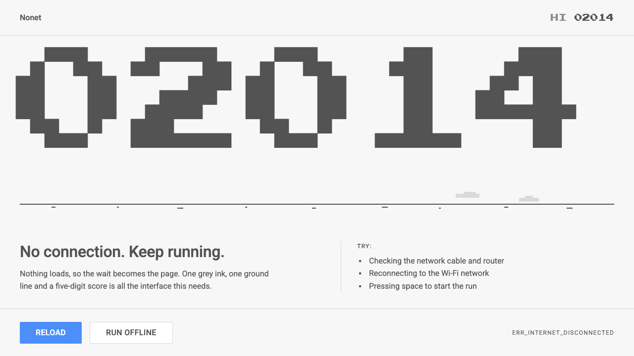
Chrome Dino turned the most frustrating moment of browsing, the dead connection, into a joke: one grey pixel T-rex, one ground line, and a score that only goes up.
Chrome Dino in brief
Chrome Dino is the visual language of the offline error page in Google's Chrome browser and the hidden runner game that lives inside it. When the network drops, a small grey pixel tyrannosaur appears above a plain list of things to try. Press the space bar and the page stops being an error and becomes a game: the dinosaur jumps cacti, ducks under pterodactyls, and a five-digit score ticks upward in the corner.
The look is built from almost nothing. The page is a pale, slightly warm grey. Every sprite, from the dinosaur to the cacti to the score digits, is drawn in one single dark grey ink. A few faint clouds drift in a lighter grey, and a thin ground line runs across the lower third. There is no gradient, no shadow, no second accent colour. At night the whole canvas inverts, so the dark grey becomes the paper and the pale grey becomes the ink.
The typography is split into two jobs. The error message and its suggestions are set in an ordinary, friendly sans-serif of the kind used across Google products. The score is set in a blocky pixel face that looks like arcade lettering. That small contrast is the whole joke: a serious system message sits right above a toy, and neither one apologises for the other.

Where does Chrome Dino come from?
The dinosaur arrived in 2014, when Chrome's offline page stopped being only an apology. Until then a dropped connection produced a plain error with a small icon of a sad, broken page. The team behind the page decided that the moment of failure was also the moment when users had the most spare attention, and that it could be turned into something people would remember. The dinosaur was the answer: a character old enough to feel timeless, cheap enough to draw in a handful of pixels, and instantly funny because it is stranded, like the user.
Public accounts of the project credit a small group of Chromium designers and engineers. The people most often associated with it are Sebastien Gabriel, Alan Bettes and Edward Jung. What they built was not a grand design programme but a very restrained one: a single character, a single running mechanic, and a ruleset that fits in one sentence. The design brief amounted to making being offline feel a little less lonely, without ever hiding that you are offline.
The look draws on two older traditions. The first is the pixel art of early handheld and arcade games, where every sprite had to survive a tiny grid and a limited palette. Working in one ink on one ground is the extreme version of that discipline: the character has to read from its silhouette alone. The second is the Chromium open-source habit of treating error pages and security interstitials as designed objects. Around 2015 the same pages received a more unified visual treatment in the browser, and the dinosaur's quiet grey tone sits comfortably inside that family.
The dinosaur then did something rare for an easter egg: it became a brand moment. People who had never thought about the browser's design could still describe the little grey T-rex, and the game kept shipping, release after release, long past its first year. It is still present in Chrome today. That longevity is the best evidence that the design works: a system built from a single ink survived a decade of visual trends because there was nothing in it to date.
What defines the Chrome Dino look?
Color
The palette is deliberately monochrome: a pale grey page, one dark grey ink used for every sprite and digit, and a lighter grey for clouds and secondary marks. There is no accent colour at all. Contrast comes from value alone, which keeps the system legible and lets it invert cleanly for night use without redrawing anything.
Typography
Two voices share the page. A neutral, rounded sans-serif handles the error title and the list of suggestions, so the message reads like any other Google product. A blocky pixel face handles the score and game labels. The pairing separates information from play without needing a single extra colour.
Sprites and silhouette
Every character is a flat, single-ink silhouette on a coarse pixel grid: the upright T-rex with its tiny arms, the cacti in several clusters, the pterodactyl with flapping wings. Detail is sacrificed for recognisability, and the shapes are slightly goofy on purpose.
Ground and space
The world is one hairline-thin ground line, a few faint clouds and a great deal of empty page. Nothing is boxed or carded. The emptiness is part of the humour, because it makes the dinosaur look small and alone, which is exactly how offline feels.
Motion
Movement is stepped and mechanical rather than smooth: the ground scrolls, the dinosaur alternates two leg frames, obstacles slide in at a gradually increasing pace. Speed is the only dramatic device, and it rises slowly enough that a player feels progress before they feel danger.
Tone of voice
The system is wry and self-aware. It does not dress up the failure or blame the user; it states the problem plainly and then offers a toy. That mix of honesty and playfulness is as much a part of the style as the colours.

Who shaped Chrome Dino?
Chromium designer publicly credited with the offline dinosaur character and its game.
Designer associated with the project's early visual direction in the Chrome team.
Engineer associated with building the dinosaur runner on top of the browser's error page.
How do you use Chrome Dino today?
In slides, Chrome Dino works best for cover slides and section breaks where a single idea deserves a lot of silence. Put one small silhouette and one line of text on the pale grey ground and leave the rest empty. Content slides should stay in the one ink, using weight and size rather than colour to rank information. Data slides suit the style well when the data is simple: a single bold figure in the pixel face, with a thin rule underneath, reads like a score counter.
In web interfaces it suits error, empty-state and offline screens most naturally, since that is where the style was born. A 404 page, an empty inbox or a lost-connection notice can reuse the structure directly: a short, honest line, one friendly sans-serif list of next steps, and a small playful object. For dashboards, the single-ink rule is a useful discipline for secondary charts, but keep a real accent colour for anything that needs urgent attention. Pricing pages can borrow the plainness, with generous space and no decoration around each plan.
In editorial and marketing work, the style is a good fit for developer tools, utilities and anything that wants to seem confident without shouting. A launch post, newsletter header or landing page can lean on the arcade score digits for statistics and keep the body in calm sans-serif. The humour should come from the contrast between serious copy and a small toy, never from adding more jokes to the layout.
The common mistake is to treat the limitation as something to fix. Adding colour accents, gradients or soft shadows to make it look more finished destroys the entire joke, because the charm is that a whole world is drawn with one ink. The second mistake is scale: the pixel face and sprite must stay coarse and blocky, and smoothing them out turns a witty system into a generic grey one.

Chrome Dino — FAQ
What is the Chrome Dino style?
It is a single-ink, pixel-art style taken from Chrome's offline error page: a pale grey ground, one dark grey for every sprite, a thin ground line, and score digits in a pixel face. Its character is wry, minimal and slightly lonely.
When did the Chrome dinosaur appear?
The runner game arrived in 2014, and the offline interstitial received more unified styling around 2015. It is still shipping in Chrome today.
Which projects suit this style best?
Error pages, empty states, developer tools, utilities and playful but confident product pages. It also works for minimal slides where one idea needs plenty of silence.
Can I add colour to Chrome Dino style?
You can add one accent for genuinely urgent states, but the style depends on single-ink restraint. If everything gets colour, the joke of drawing a whole world with one grey disappears.
Does it work in dark mode?
Yes. Because it uses only two values, the night version simply inverts them, with the dark grey becoming the page and the pale grey becoming the ink, so no redesign is needed.
Related design styles
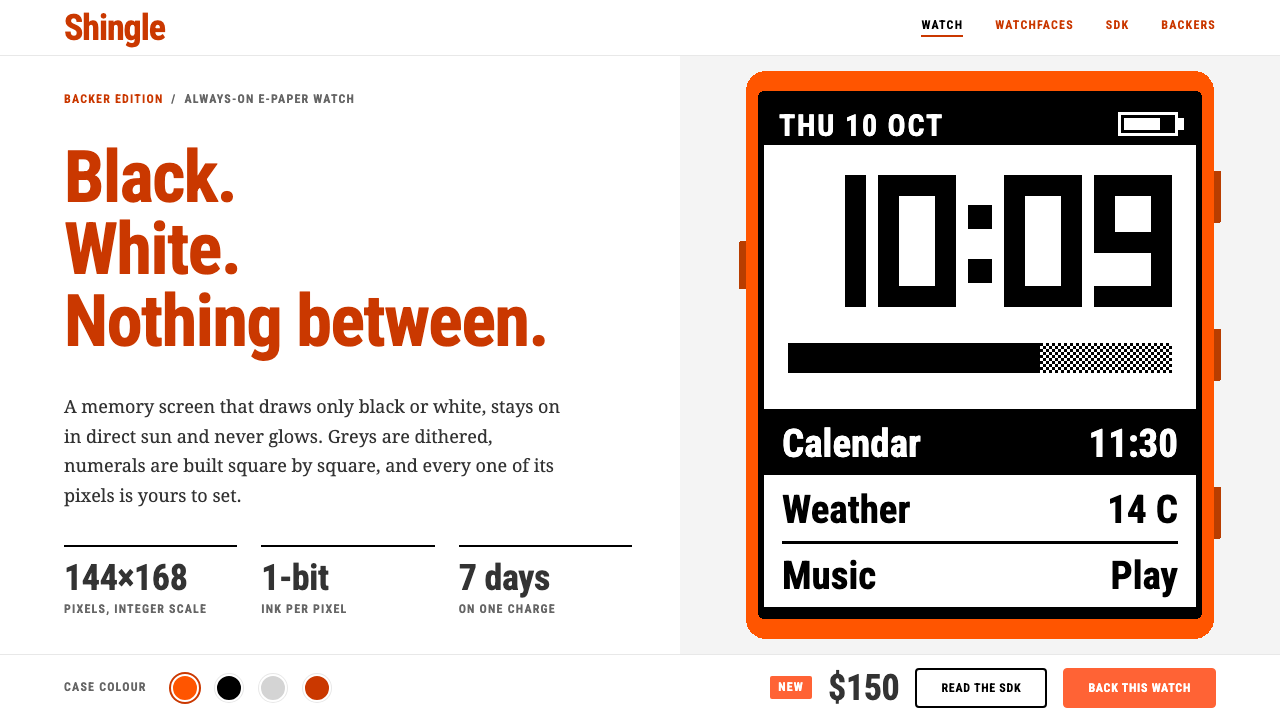 PebbleTwo colours, no greys. Burnt-orange headings on white frame a 144×168 one-bit…
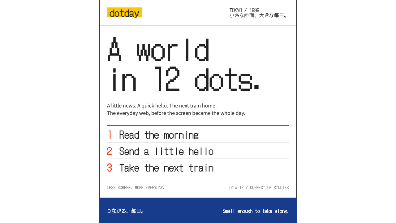 i-modeA whole world in a few dots. Bitmap type, white space and yellow bring the po…
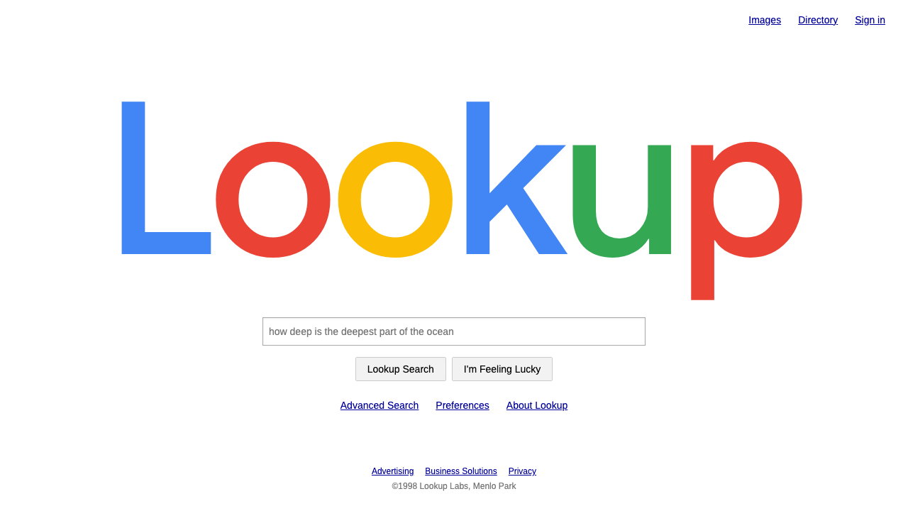 Google SearchA white page and a box to type in. Giant four-colour wordmark, Arial text, no…
 MinesweeperCold logic, warm nostalgia. Silver bevelled cells, VGA numerals, red seven-se…
 Nokia 3310 (2000)Built to outlast. Dark pixels march across olive glass inside a matte navy fr…
 Palm webOSEvery app is a card you flick away. Charcoal gloss pills and blue labels on g…