What is Google Search?
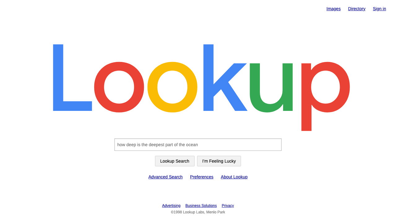
The 1998 Google homepage was an act of subtraction: a white page, a four-colour wordmark and a single box, at a time when every rival was shouting.
Google Search in brief
The late-1990s Google homepage is one of the most influential pages in the history of the web, and one of the plainest. It consists of a pure white page, black text in an Arial-style sans serif, a multi-coloured wordmark centred above a single rectangular search field, and two plain buttons: one that searches and one that jumps straight to the first result. There are no banners, no news columns, no weather, no stock tickers and no slogan.
Its power comes from what it refuses to include. The portals of the era, Yahoo and Excite among them, filled their front pages with headlines, directories, advertisements and widgets, each competing for a visitor's attention. Google offered a single task and a single place to do it. The emptiness communicated confidence: the product was good enough that nothing else needed to be on the page.
As a design system, it is built from a tiny vocabulary. The wordmark follows a fixed colour order of blue, red, yellow, blue, green and red. Body text is black on white. Links use the old-web dark blue with an underline. There are no cards, no shadows and no gradients. The page is useful to this day as a model for any product whose whole job happens in a single input.

Where does Google Search come from?
Google began in the late 1990s at Stanford University, where Larry Page and Sergey Brin were working on a search engine, and moved soon afterwards to Menlo Park and then Mountain View, California. The google.com site went live in 1998 in beta form. That geography matters to the look: the page was built by engineers in an academic and start-up setting, with little time or money for decoration, and the plain HTML of the early web was both a constraint and a style.
The wordmark has its own history. The 1999 logo, drawn in the serif face Catull, is associated with Ruth Kedar, who worked on the identity, while the Catull typeface itself is credited to Gustav Jaeger. The Catull wordmark remained in use from 1999 until 2015, with a lighter shadow introduced in 2010. In September 2015 Google replaced it with a flat, geometric logo in its Product Sans typeface. The system described here sits on the earlier side of that break, with the darker, more saturated shades of the Catull years and the old navy link colour.
The context in which the page appeared is also part of its meaning. This was an early plain-HTML web in which most commercial sites were trying to be portals, offering everything a user might want in one crowded place. A sparse search page ran against that grain, and it succeeded precisely because the search results were good enough to justify it. The design was therefore a statement about product confidence as much as visual taste.
The later history is a reminder of how durable the idea was. Even after the 2015 identity change replaced the serif wordmark with a flat geometric one, the front page kept its essential structure: a white field, a centred wordmark and a search box. The visual details changed, but the logic of subtraction stayed the same.
What defines the Google Search look?
Color
The page itself is pure white, and all colour is concentrated in the wordmark. The logo runs on four hues, blue, red, yellow and green, in a fixed sequence that deliberately breaks the pattern with a green letter near the end. The Catull-era versions use darker, more saturated shades than the later flat logo. Links use the old navy blue of the early web. Everywhere else the page is black on white.
Typography
Body text is set in an Arial-style sans serif in black, at modest sizes. The only expressive type is the wordmark, which in the Catull years used a serif face with a soft shadow, giving it a slightly handmade, playful look against the otherwise neutral page. The contrast between a plain interface and a characterful logo is central to the effect.
Layout
Everything is centred on a single vertical axis: wordmark above, search field in the middle, two buttons below. The generous white space around the group is the main design material, and the page needs no grid, no columns and no sidebar. Content arrives only after the user acts, on a separate results page.
Controls
The search field is a plain rectangle with a simple border, and the two buttons are standard, system-like buttons labelled with their actions. There is nothing rounded, glossy or animated. The controls look like they belong to the browser itself, which makes the page feel like a utility rather than a brand experience.
Absence
What is missing is as important as what is present: no cards, no shadows on the interface, no slogan, no imagery, no promotional banners. Each missing element is a decision. The restraint is what makes the page memorable, and it is the quality most worth preserving when borrowing the style.
Tone
Confident, utilitarian and a little playful. The page says little, but the one place where it plays, the wordmark colours and the second button, shows that the tool has a personality. It treats the user as someone who knows what they want and just needs a place to type it.

Who shaped Google Search?
Page was one of the two founders who began Google as a research project at Stanford. His name is associated with the company's early product decisions, including the insistence that the front page remain minimal and fast, with search results doing the persuading.
Brin was the other founder, working alongside Page at Stanford and then in Menlo Park and Mountain View. Together they shaped a company culture in which engineering took precedence and decoration was kept to a minimum, a culture visible in the plainness of the original page.
Kedar worked on Google's identity around the time the Catull-based wordmark was established in 1999. Her association with the logo ties the page's most characterful element to a specific design intervention, set against an otherwise engineered interface.
Jaeger is credited as the designer of the Catull typeface on which the long-running wordmark was based. The wordmark's soft, slightly old-fashioned serif character, which stood out against the neutral page, comes from his letterforms.
How do you use Google Search today?
On slides, the style is ideal for covers and for any slide with a single clear question. Use a pure white background, centre a bold wordmark-like title, and put a single input-shaped rectangle beneath it containing the key question or the main number. Content slides can follow the same restraint: black text on white, one coloured highlight, no cards or decorative panels. For data slides, use black and the four brand hues sparingly, and let the white space do the organising.
In web interfaces, it suits search tools, documentation indexes, command palettes, directories, status pages and any product that does one thing through one input. Put the input at the centre, keep the surrounding page empty, use the old blue for links and avoid boxes, shadows and gradients. A pricing or landing page can follow the same logic: one statement, one action, and no competing sections above the fold.
In editorial and marketing work, the style is a statement of confidence. An announcement, a manifesto page or a product launch can use white space, a single coloured wordmark and plain text to suggest that the product needs little explanation. It works best for brands that want to look like a utility rather than a spectacle.
The most common mistake is to add things. A tagline, a background image, a card, a shadow or a row of feature icons turns the page back into a portal, and the contrast that gave it force disappears. Another is to lose the colour discipline: the wordmark's four hues are concentrated in one place so that they mean something, and spreading them over buttons and headings dilutes the identity. A third is to use too many fonts; the page is plain because it uses one.
A good test is to ask what happens if you remove one more element. If the page still works, remove it. The system only holds together when every remaining piece is doing real work, and when the single input is clearly the centre of the page.

Google Search — FAQ
What is the 1998 Google homepage design style?
It is a minimalist search-page style: a pure white page, black Arial-style text, a four-colour wordmark centred above a single search field, two plain buttons, navy underlined links and nothing else. No cards, shadows or taglines. It is the design of a product confident enough to need only one input.
How did the Google wordmark change over time?
The 1999 wordmark used the serif face Catull and stayed in use until 2015, with a lighter shadow from 2010. In September 2015 Google switched to a flat, geometric logo in Product Sans. The system described here uses the earlier, darker and more saturated Catull-era shades.
What colours are in the Google logo?
Four hues, blue, red, yellow and green, in the order blue, red, yellow, blue, green, red. The green letter near the end breaks the pattern deliberately. The colour is concentrated in the wordmark, while the rest of the page remains black on white.
Which products suit this style?
Search tools, documentation indexes, directories, command palettes, status pages and any product whose entire job happens in a single input. It also works for announcement and manifesto pages that want to project confidence. It is a poor fit for content-heavy portals, where its restraint would feel empty.
What is the biggest mistake when borrowing it?
Adding things. Taglines, banners, cards, shadows and icons bring back the clutter the page was defined against. Spreading the four logo colours across buttons and headings is a close second. Keep the page empty, the colour concentrated and the single input at the centre.
Related design styles
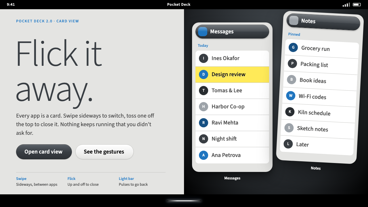 Palm webOSEvery app is a card you flick away. Charcoal gloss pills and blue labels on g…
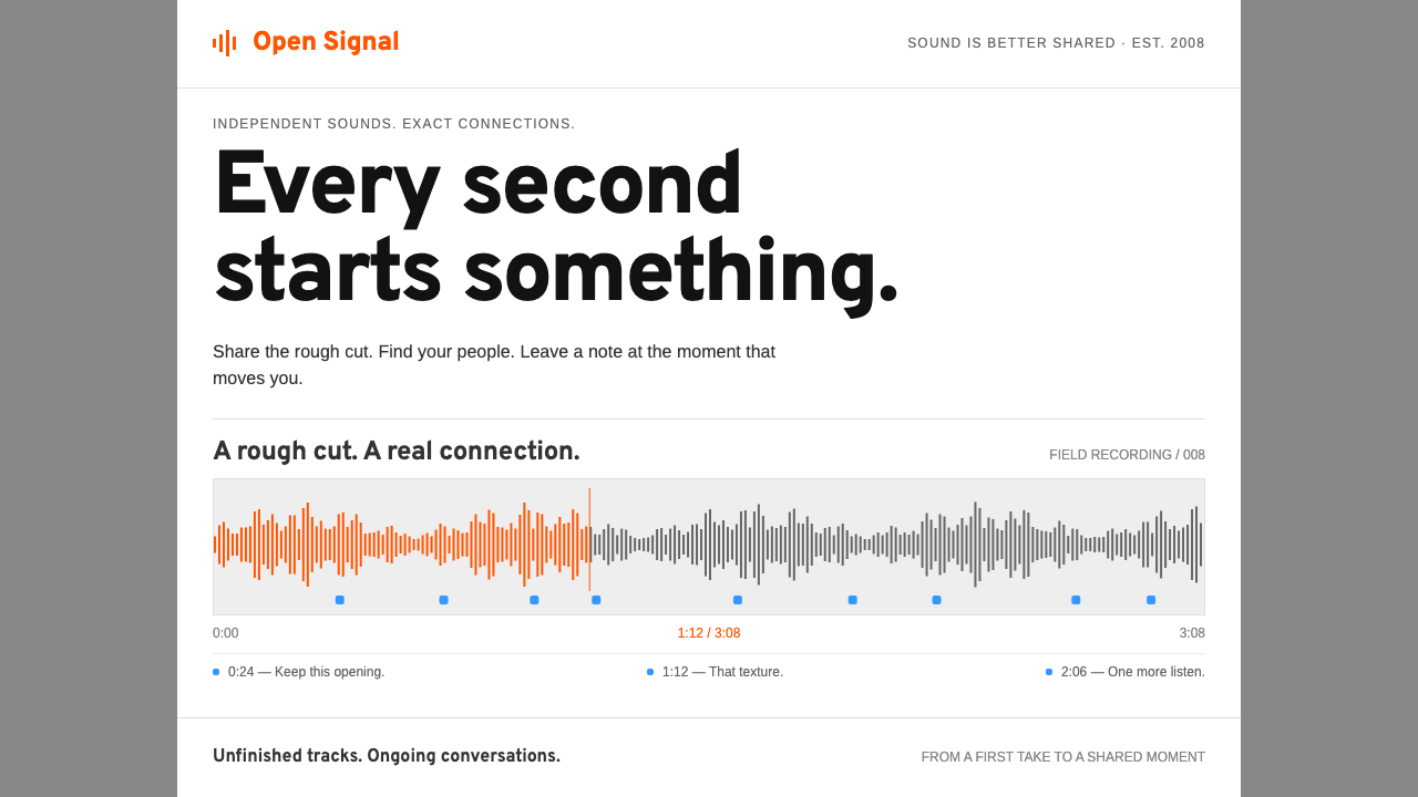 SoundCloudEvery second connects. Orange waveforms and blue notes give a white-and-grey…
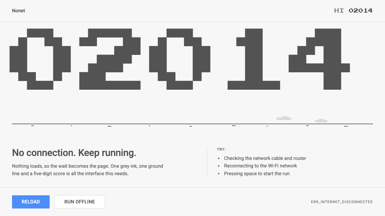 Chrome DinoWit from almost nothing. One grey ink on pale paper, pixel-font score digits,…
 RedditCuriosity comes first. Blue link lists, pale-blue rules and one Orangered arr…
 Stack OverflowUseful answers rise. Blue links, square tags and pale-green resolutions on a…
 BlackBerryPortable precision. Dense black Arimo, white ruled rows and one decisive blue…