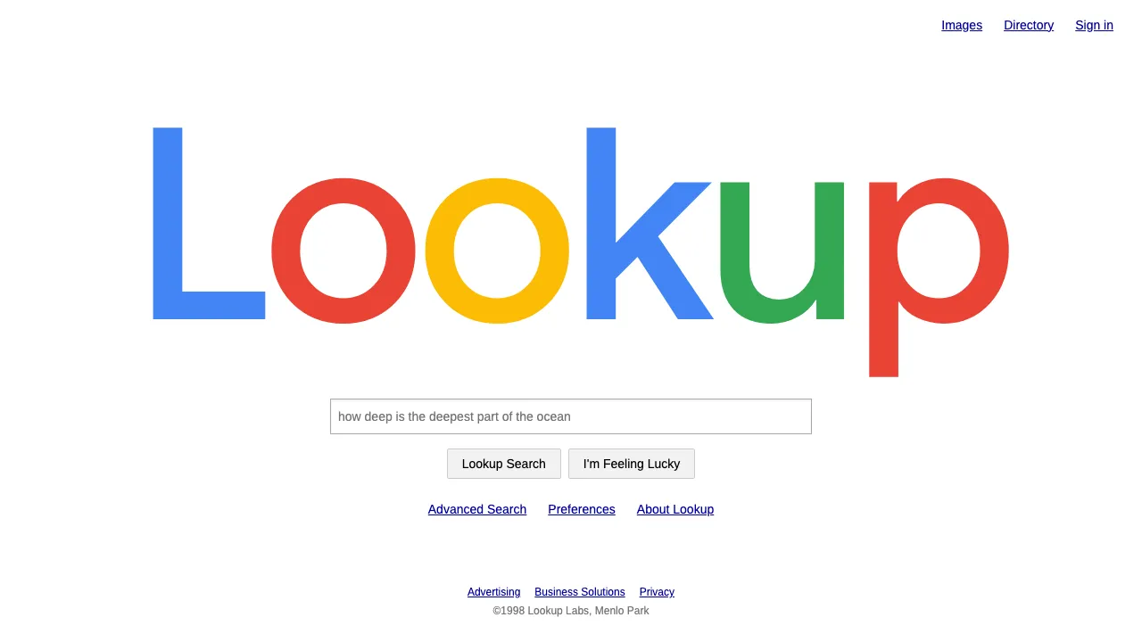
About Google Search
A system built from the late-1990s Google homepage: a pure white page, black Arial-style text, and a four-colour wordmark centred above a single rectangular search field and two plain buttons. Everything that isn't the search gets pushed out.
The palette runs on the logo blue, red, yellow and green, the darker Catull-era shades, and the old navy link colour. Use it for search tools, documentation indexes and any product whose whole job happens in a single input.
- Origin
- Stanford, Menlo Park and Mountain View, California, USA
- Era
- 1998 google.com beta; Catull wordmark 1999–2015 (lighter shadow from 2010); flat Product Sans logo from September 2015
- Key figures
- Larry Page · Sergey Brin · Ruth Kedar · Gustav Jaeger
- Movements
- Early plain-HTML web · Sparse search page against the portals · Google 2015 flat geometric identity
Google Search design spec
Colors
Background
Surface
Primary
Secondary
Accent
Text
Typography
Google Sans FlexHeadings
ArimoBody
CousineMono
Unlock for 1 credit
The other 11 sections — buttons, cards, spacing, motion, techniques and more — open once you unlock. Download the DESIGN.md or send it to your AI in one click. Unlock once, yours forever.
Sign up nowHave an account? Sign in
Styles similar to Google Search
Also inspired by brands & products, with a close feel.
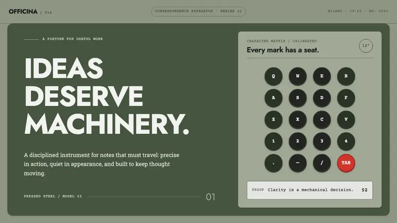 Olivetti LetteraEngineered, never styled. Grey-green enamel, precise type blocks and one red control.
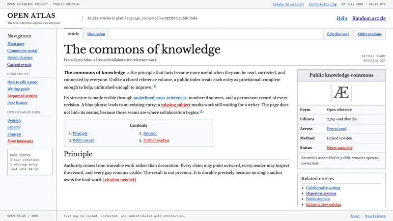 Wikipedia (2001)Content needs no ornament. Black serif text, gray hairlines, and blue links expose the structure.
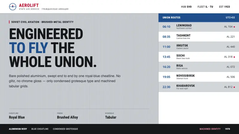 Aeroflot Soviet AirlineEngineered restraint rules. Silver ground, royal-blue cheatlines, and flat grotesque type set order.
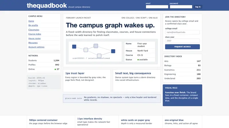 Facebook 2004Dorm-web austerity. Original blue, 980px grid, 1px borders, tiny Lucida Grande type.