关于 Google 搜索首页
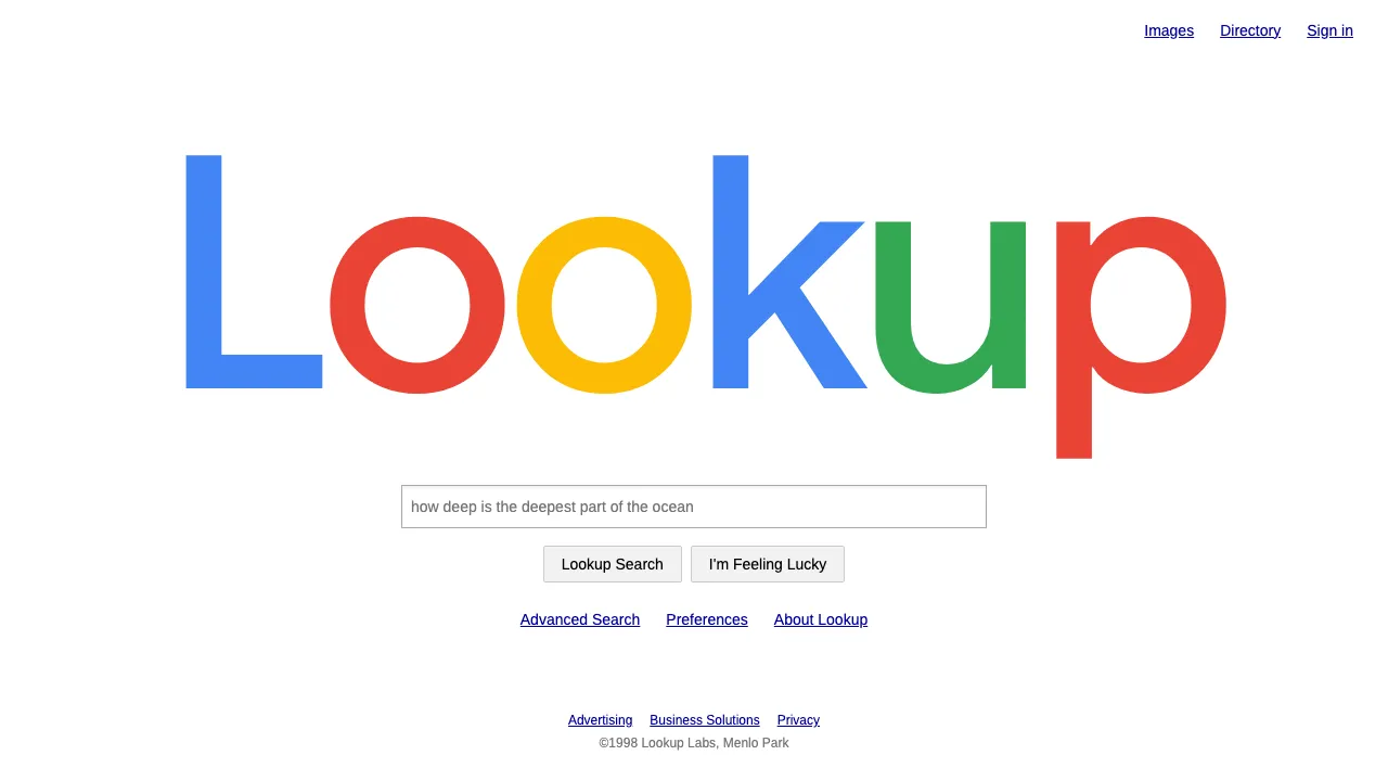
1998 年的 google.com 只有一页白纸:正中一个彩色字标,下面一个输入框,再下面两个按钮——“Google 搜索”和“手气不错”。同一时期的雅虎、Excite 门户首页塞满新闻、天气和股票,Google 偏偏什么都不放,反倒成了互联网上最出名的一页。
这套设计系统保留的就是这股“少”:纯白底、黑字、Arimo 正文,字标严格按蓝红黄蓝绿红排色,链接用老网页的深蓝下划线。没有卡片、没有投影、没有标语,适合搜索工具、文档索引,以及所有“一个输入框就能把事办完”的产品。
- 来源
- 美国加州斯坦福、门洛帕克与山景城
- 年代
- 1998 google.com beta; Catull wordmark 1999–2015 (lighter shadow from 2010); flat Product Sans logo from September 2015
- 代表人物
- Larry Page · Sergey Brin · Ruth Kedar · Gustav Jaeger
- 所属运动
- Early plain-HTML web · Sparse search page against the portals · Google 2015 flat geometric identity
Google 搜索首页的设计规格
气质相近的风格
同样来自品牌与产品,气质相近。