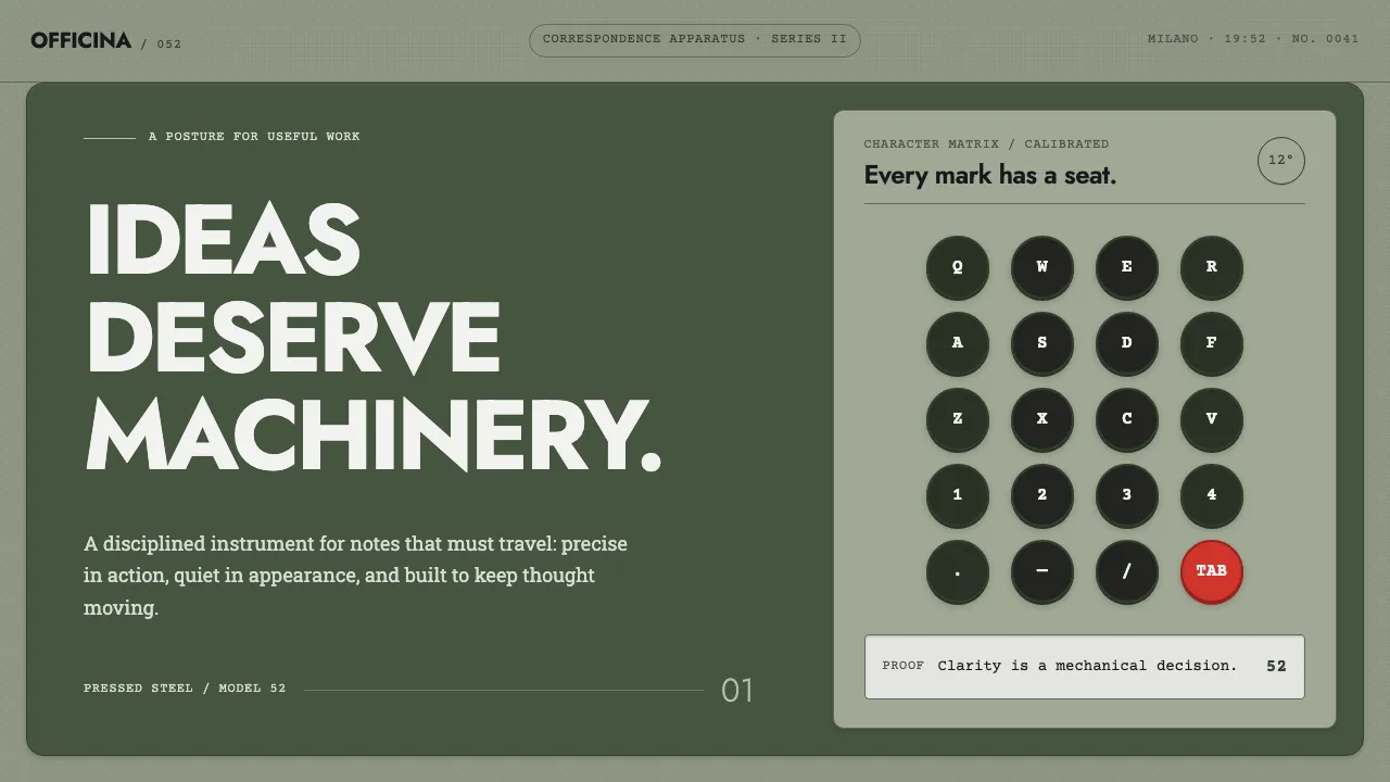
About Olivetti Lettera
Olivetti did not run a styling department. The typewriter, the poster, the showroom and the factory town of Ivrea were all decided by the same posture, so a Lettera 22 and a Pintori advertisement read as one voice.
This system takes the machine literally. The page is the enamel shell — a matte grey-green with no gloss. Type sits in a small precise block against a large flat field. Controls are round keys with a visible seat. There is one red thing on screen, the tabulator, and never a second.
- Origin
- Ivrea, Italy
- Era
- 1950–1990 — Lettera 22 in 1950, Lexikon and Studio through the 1950s–60s, Valentine 1969
- Key figures
- Marcello Nizzoli · Giuseppe Beccio · Ettore Sottsass · Giovanni Pintori · Adriano Olivetti
- Movements
- Italian postwar industrial design · corporate design coherence · Nebiolo-era Italian typography
Olivetti Lettera design spec
Colors
Background
Surface
Primary
Secondary
Accent
Text
Typography
JostHeadings
ArchivoBody
Courier PrimeMono
Unlock for 1 credit
The other 11 sections — buttons, cards, spacing, motion, techniques and more — open once you unlock. Download the DESIGN.md or send it to your AI in one click. Unlock once, yours forever.
Sign up nowHave an account? Sign in
Styles similar to Olivetti Lettera
Also inspired by brands & products, with a close feel.
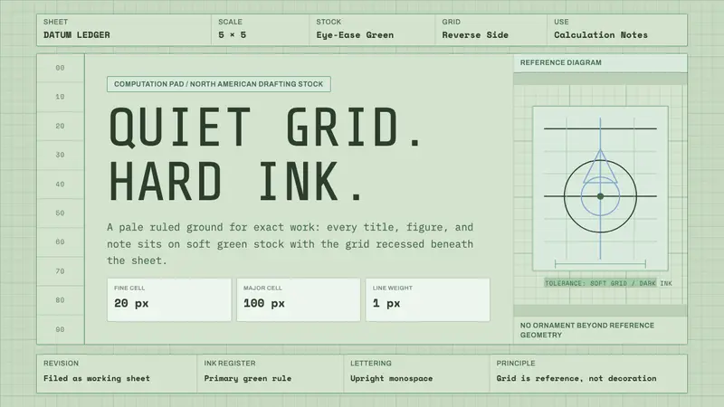 Engineering Graph PadQuiet precision. Eye-ease green, monospace title blocks, and a faint reverse-side grid.
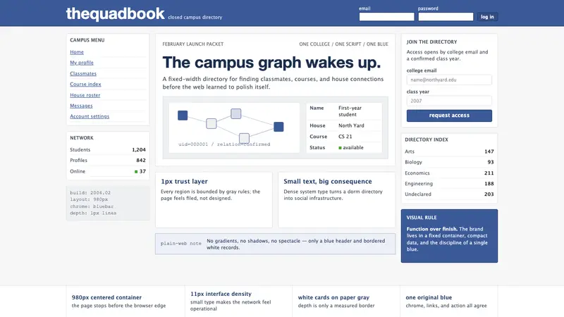 Facebook 2004Dorm-web austerity. Original blue, 980px grid, 1px borders, tiny Lucida Grande type.
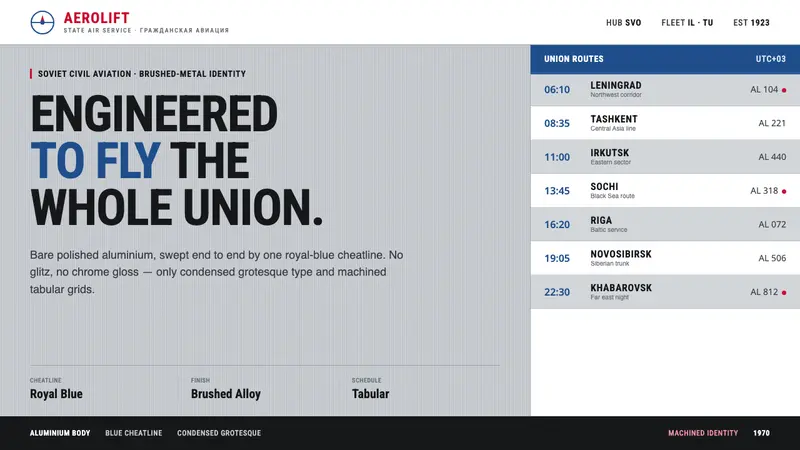 Aeroflot Soviet AirlineEngineered restraint rules. Silver ground, royal-blue cheatlines, and flat grotesque type set order.
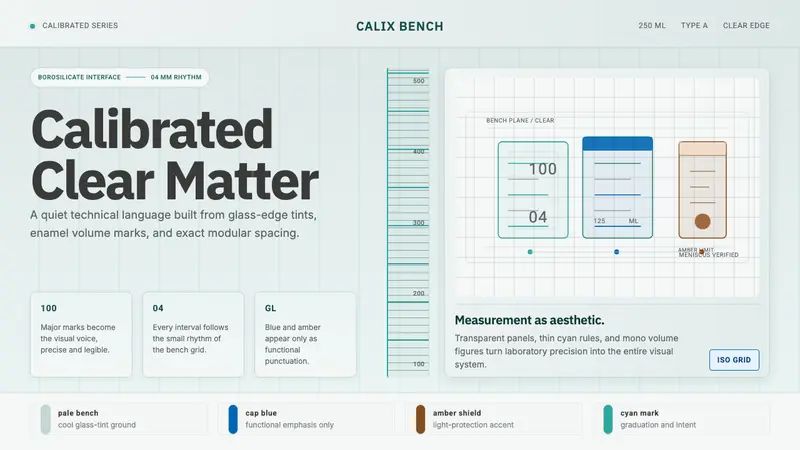 Laboratory GlasswareClarity is the system. Pale glass cyan, volume marks, and bordered bench grids.