What is Olivetti Lettera?
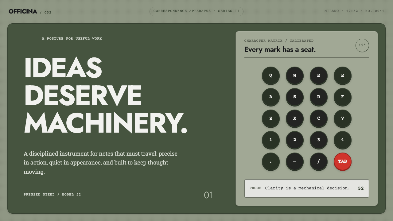
Olivetti never ran a styling department — the same restrained posture governed the typewriter, the advertisement, and the factory town of Ivrea, so a Lettera 22 and a Pintori poster read as one voice speaking through different objects.
Olivetti Lettera in brief
The Olivetti visual system is defined by the absence of a distinction that most companies maintain: there is no separate department deciding how the product should look, another deciding how the advertisement should look, and a third deciding how the factory should look. Marcello Nizzoli's typewriters, Giovanni Pintori's posters, and the buildings of the company town at Ivrea were all produced within a single design culture, so the visual grammar of one transfers directly to the others. A page built in this style should feel like it could just as easily have been a machine casing or a printed advertisement — the same restraint applies regardless of the medium. This is a much harder discipline to sustain than it looks, since it requires every downstream decision, from a poster's margin to a building's window proportion, to answer to the same underlying posture rather than to the separate conventions of print, product, or architecture.
That restraint takes a specific physical form. The page is treated as though it were the enamel shell of a typewriter: a matte grey-green surface with no gloss and a fine, almost imperceptible grain, never a flat digital flat colour or a glossy sheen. Type sits in a small, precise block, placed asymmetrically against a much larger flat field rather than centred or evenly distributed — a deliberate imbalance that mirrors how a compact, precisely engineered mechanism sits within a larger plain housing.
Controls and interactive elements follow the machine's own hardware literally. Buttons behave like the typewriter's round keys, each with a visible seat or rim suggesting it can be physically pressed. Input fields behave like the paper carriage — something that receives and moves material through the system. And colour is rationed with mechanical precision: across the entire visual field there is exactly one red element, mirroring the typewriter's single red tabulator key among an otherwise black-and-white keyboard. Nothing else on the page is permitted that colour.
Where does Olivetti Lettera come from?
The unified vision originated with Adriano Olivetti, who led the company on the conviction that industrial design, graphic communication, architecture, and even the welfare of the workforce should all express one coherent identity rather than being treated as separate concerns. Under his direction Ivrea itself, the town built around the factory, became part of the same design project as the products it manufactured — a postwar Italian industrial culture in which corporate coherence was treated as a design problem in its own right, not an afterthought to be handled once the product was finished.
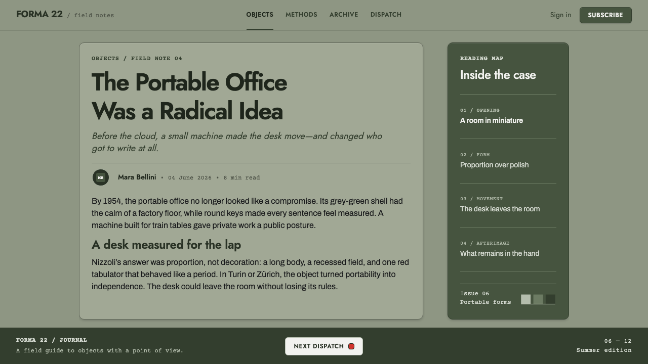
In 1950, the industrial designer Marcello Nizzoli, working with Giuseppe Beccio, produced the Lettera 22, a portable typewriter housed in a powder-coated grey-green shell. This object set the vocabulary that everything after it would follow: the matte, ungilded surface finish, the compact and precisely bounded typing mechanism, and the restrained use of colour. It was not the first Olivetti product, but it became the reference point the visual language kept returning to.
Through the 1950s and 1960s the vocabulary extended across the product line — the Lexikon and Studio typewriter series carried the same grey-green restraint and mechanical precision — while, in parallel, the graphic designer Giovanni Pintori produced the advertising posters that translated the same flat geometric discipline into print, working within an Italian typographic culture shaped by the Nebiolo type foundry's influence on the period's lettering.
In 1969, Ettore Sottsass designed the Valentine, a bright red portable typewriter that pushed the brand toward a bolder, more pop-inflected visibility even as the rest of the product line held to Nizzoli's original restraint. The tension between the two — an austere, precisely engineered grey-green industrial rationalism on one side, and a single loud pop-culture object on the other — sits within the same unified design culture rather than contradicting it, which is exactly why the "one red thing" rule reads as coherent rather than arbitrary: red had always meant emphasis at Olivetti, whether on a single key or on an entire machine. Across the four decades spanned by this era, from the Lettera 22 to the Valentine, the constant was never a fixed shape but a fixed relationship between restraint and the rare moment where restraint was deliberately broken.
What defines the Olivetti Lettera look?
Surface Finish
The base surface is a matte grey-green enamel with a fine grain and no gloss, treated exactly as though the page itself were a powder-coated metal shell rather than a printed or digital flat colour.
The Single Red Rule
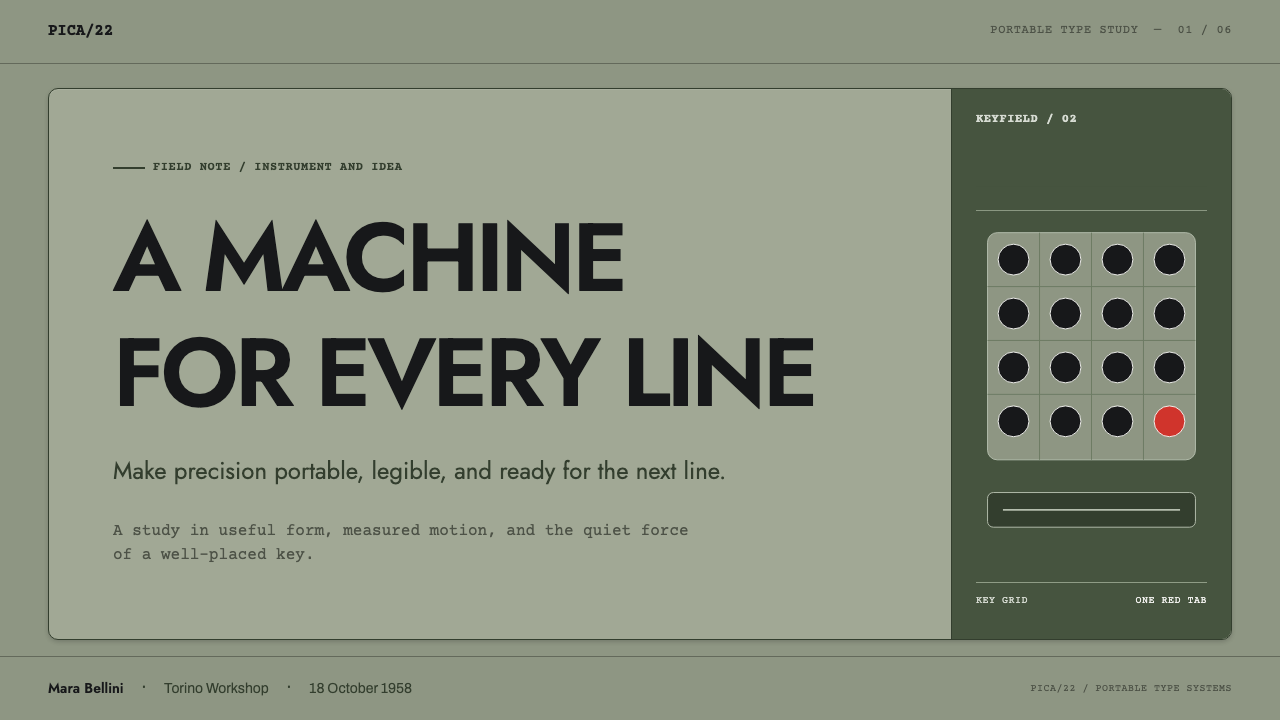
Exactly one element on the page is allowed to be red, mirroring the typewriter's single red tabulator key among otherwise black-and-white controls. Red means emphasis precisely because it appears nowhere else.
Type Block Placement
Text is set in a small, precisely bounded block placed asymmetrically within a much larger flat field, rather than centred — echoing a compact mechanism sitting inside a plain, oversized housing.
Tactile Controls
Buttons are treated as round keys with a visible seat or rim, suggesting they can be physically pressed, rather than as flat, borderless digital tap targets.
Mechanical Metaphor
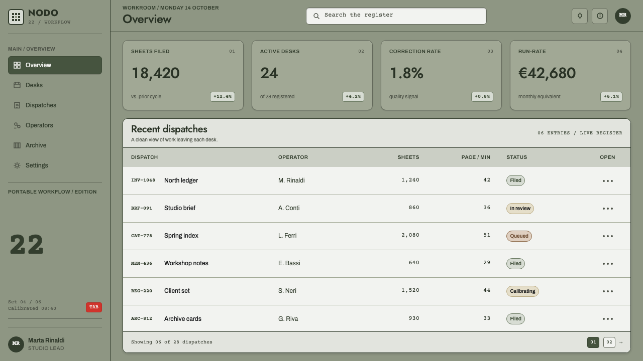
Interface elements borrow directly from the typewriter's own mechanism: an input field behaves like the paper carriage receiving and advancing material, and a card behaves like a stamped sheet of steel.
Corporate Coherence
Product design, advertising, and architecture are treated as expressions of a single design culture rather than separate disciplines, so a poster and a machine casing can share the exact same visual logic.
Who shaped Olivetti Lettera?
Nizzoli was the industrial designer behind the 1950 Lettera 22, the object whose matte grey-green enamel shell, compact typing mechanism, and restrained colour use established the vocabulary that the rest of the Olivetti visual system continued to follow.
Beccio worked alongside Nizzoli on the Lettera 22, contributing to the engineering and form of the machine that became the reference point for Olivetti's entire postwar visual language.
Sottsass designed the 1969 Valentine, a bright red portable typewriter that pushed Olivetti's visual identity toward a bolder, more pop-inflected register while remaining consistent with the company's long-standing use of red as a signal of singular emphasis.
As Olivetti's graphic designer, Pintori translated the company's flat geometric, restrained visual logic into advertising posters, working within an Italian typographic culture shaped by the Nebiolo foundry, so that the printed material read as an extension of the products themselves.
As the company's leader, Adriano Olivetti held that product design, graphic communication, architecture, and the welfare of the workforce should all express one coherent identity, a conviction that produced the factory town of Ivrea as part of the same design project as the typewriters themselves.
How do you use Olivetti Lettera today?
For presentation slides, a cover page works well with a full-bleed matte grey-green field and a single small, precisely bounded title block placed off-centre — treating the whole slide as the enamel shell and the title as the one engineered detail on it. Content slides should carry that same restraint: one flat field, one small text block, and the single red rule applied to exactly one number, label, or icon that the audience needs to notice first.
In web interfaces, the style suits admin tools and internal dashboards where a calm, mechanical precision is the goal. Buttons should be rendered as round, seated forms rather than flat rectangles; the one red element should be reserved exclusively for a genuinely critical state — an error, a required action — never used for a second accent or a decorative highlight, since diluting the rule immediately breaks the logic that makes it legible.
For editorial and marketing layouts, Pintori's poster work provides the direct model: flat geometric shapes standing in for photographic imagery, a restrained type block, and a limited palette dominated by the grey-green ground. This suits brand storytelling built around engineering, precision, or heritage, where the goal is calm authority rather than visual excitement.
The mechanical metaphors extend naturally into form design — an input field can visually suggest the paper carriage receiving text, and a settings panel can be laid out like a keyboard, with each control given the same seated, tactile treatment as a physical key. This works best in contexts where the underlying product itself has a mechanical or precision-engineering identity to reinforce.
The most common mistake is treating the single red element as a starter accent colour rather than a strict rule — applying it to multiple buttons, links, and icons across one page. That defeats the entire logic: red at Olivetti always meant one specific, singular thing, whether it was the tabulator key or the Valentine's entire shell, and spreading it thin removes the emphasis it exists to provide. A second, related mistake is applying the grey-green surface as a flat digital colour without any of the fine matte grain the enamel finish implies — the texture is not decorative, it is what tells the viewer the surface is a manufactured object rather than a rendered rectangle.
Olivetti Lettera — FAQ
Why is only one element allowed to be red?
The rule mirrors the Olivetti typewriter itself, where every key was black except the single red tabulator key. Red at Olivetti signals one specific point of emphasis; spreading it across multiple elements removes the very quality that makes it meaningful.
What role did the town of Ivrea play in this design language?
Under Adriano Olivetti's leadership, Ivrea — the factory town built around the company — was treated as part of the same coherent design project as the typewriters and advertising, rather than as unrelated corporate infrastructure.
How does Sottsass's Valentine fit with Nizzoli's earlier, more restrained work?
The Valentine's bright red shell looks like a departure from the grey-green restraint of the Lettera 22, but it follows the same underlying logic: red at Olivetti always signalled singular emphasis, whether concentrated in one key on a grey-green machine or expanded to cover one entire, deliberately loud object.
Does this style work for consumer apps that want a lot of colour?
Not well. The style depends on colour being rationed with near-mechanical strictness — one red element, nothing more. A product that wants a rich, varied palette should look elsewhere; applying this system loosely just produces a grey-green interface with no coherent logic behind its accents.
Why is the surface always matte rather than glossy?
The matte, fine-grained enamel finish is treated as a material fact carried over literally from the typewriter's powder-coated shell. A glossy or gradient surface would contradict the system's core principle of engineering honesty rather than applied decoration.
Related design styles
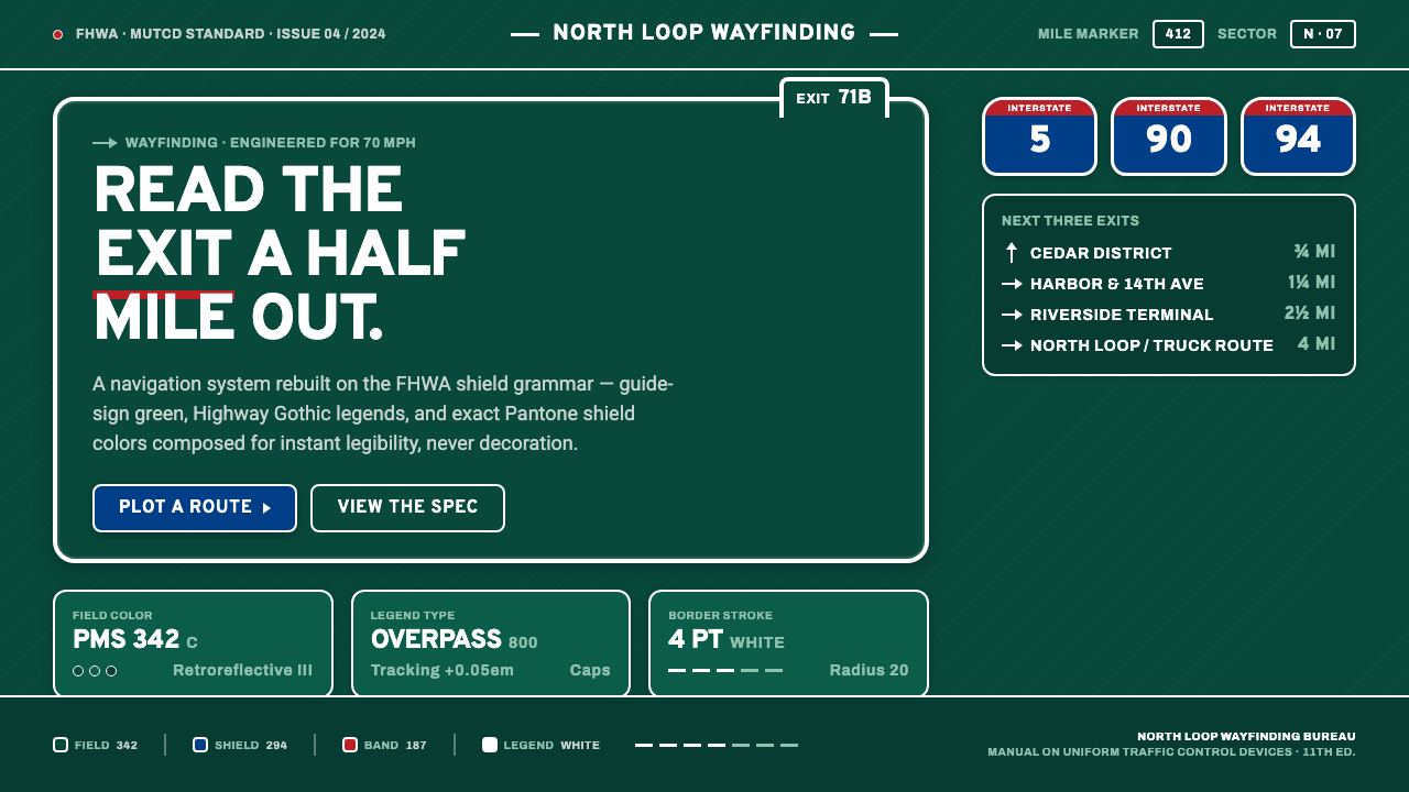 Interstate Highway ShieldEngineered for 70 mph. Guide-sign green, Pantone shield blue and red, Highway…
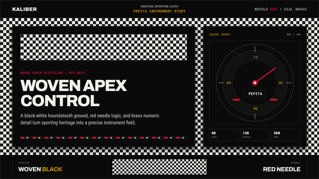 Porsche PepitaHeritage runs on instruments. Pepita checks, brass numerals, and red needles…
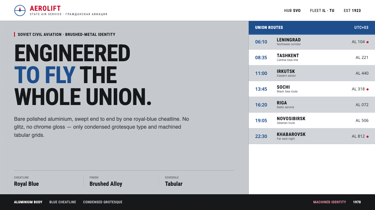 Aeroflot Soviet AirlineEngineered restraint rules. Silver ground, royal-blue cheatlines, and flat gr…
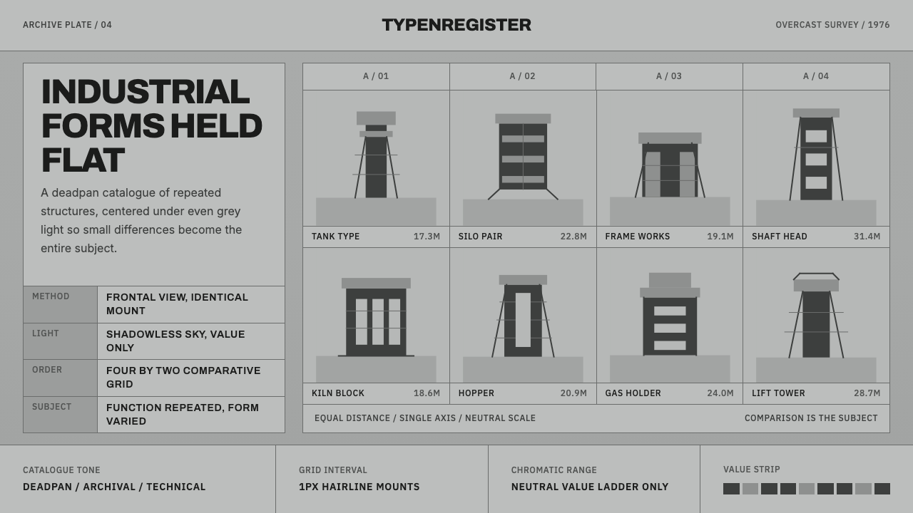 Bechers Industrial TypologyDeadpan order. Mid-grey ground, Archivo labels, and strict hairline grids rev…
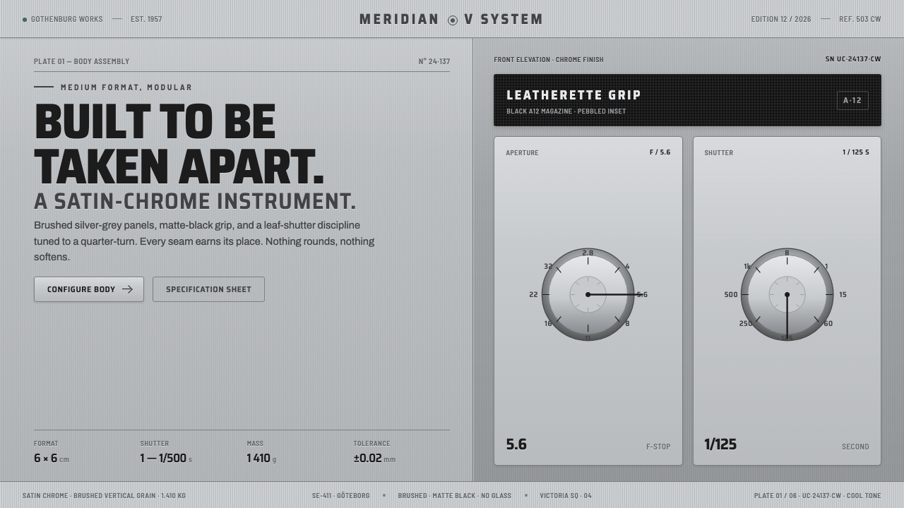 Hasselblad 500C ChromeBuilt to be taken apart. Brushed silver-grey panels, matte-black leatherette,…
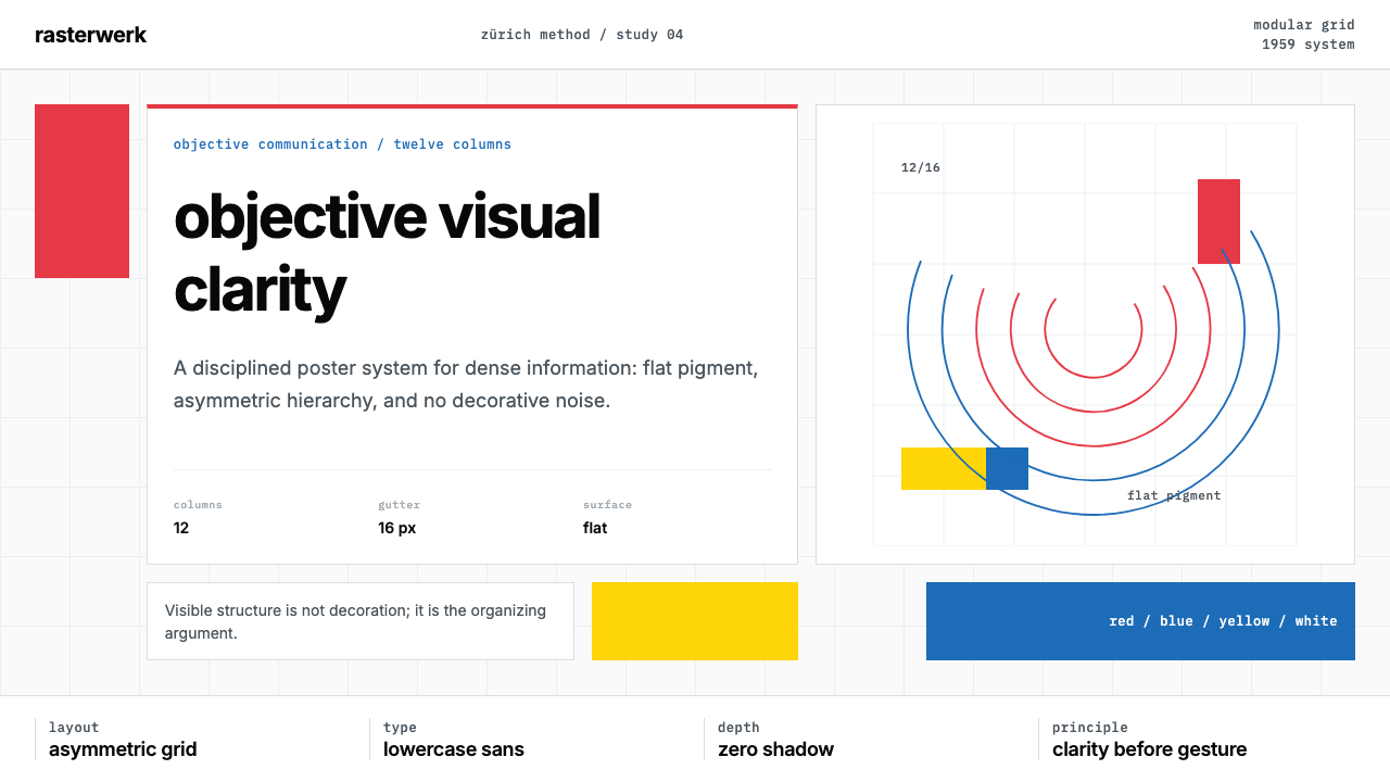 Müller-Brockmann SwissClarity is the system. Inter grids, red-blue blocks, and concentric arcs make…