What is Tandberg Radio?
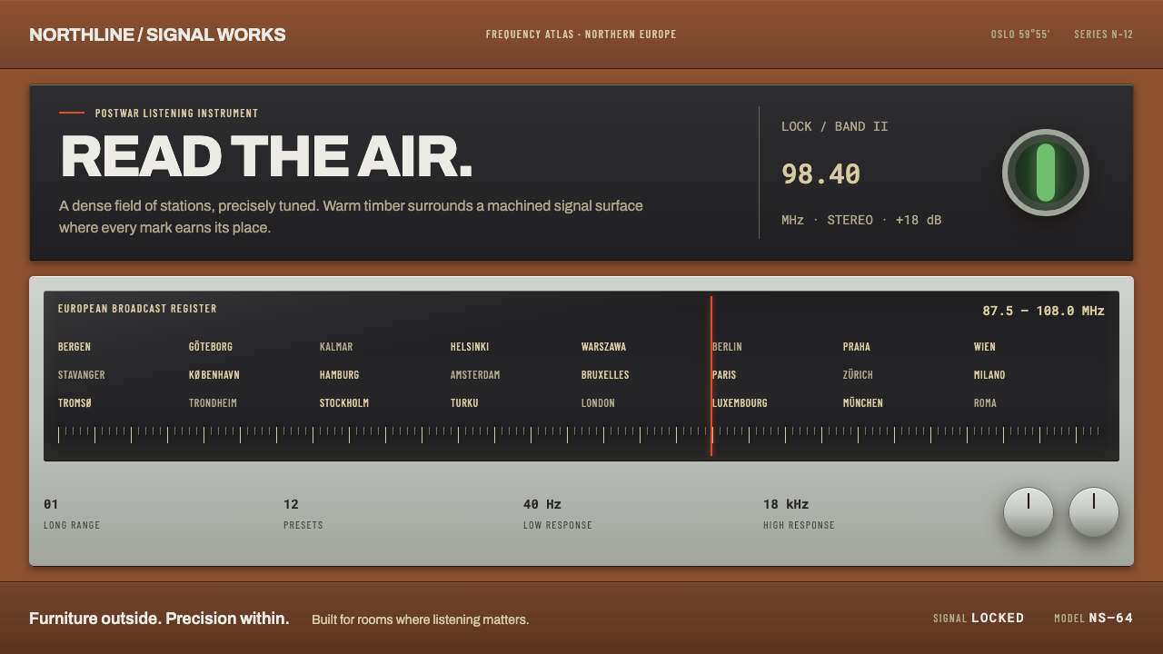
The Tandberg Sølvsuper turned a radio's face into a readout: teak bands, a brushed silver panel, a dense scale of pale straw station names and a single red pointer, all lit from behind the glass.
Tandberg Radio in brief
Tandbergs Radiofabrikk built the Sølvsuper table radios in Oslo, and the system takes its look from them. Each set is an oiled teak box with a slatted teak grille wrapping the front and, set into that wood, a recessed panel of brushed anodised aluminium. That silver panel gave the model its name: Sølvsuper means silver super, the second word being the old shorthand for a superheterodyne receiver. The face of the set is not decoration. It is a readout.
A long dial glass carries a micro-grid of European station names in pale straw lettering. A red pointer slides across it, and a green magic-eye tube narrows as the signal locks in. Everything on the front serves tuning, and everything that serves tuning is legible at a glance, provided one looks closely enough. This is precision treated as a visual pleasure.
The design system takes that logic literally. It is built from horizontal bands, milled panels, tick scales and light that seems to come from behind the glass instead of from a flat white page. It is dark, warm and exact, and it avoids anything that would turn the object into a costume: no ageing, no wear, no atomic-age starbursts. The radios were new and expensive when they were made, and the system keeps them that way.

Where does Tandberg Radio come from?
Tandbergs Radiofabrikk was an Oslo manufacturer, and the system's origin note places its era between 1950 and 1990, with the Sølvsuper models peaking from 1955 to 1965 in the 8, 10 and 12 versions. The company carries the name of Vebjørn Tandberg, and its radios belong to the larger picture of Scandinavian postwar industrial design, where domestic objects were expected to be well made, quietly confident and good company in the living room.
The Sølvsuper was sold as furniture as much as electronics. The cabinet came in teak, rosewood and oak, at stepped prices, and the finish of the wood was part of the product. In a period when plastic cases were becoming common, an oiled hardwood box with a slatted front said that the radio was a serious household object, built to sit among the sideboards and bookshelves rather than apart from them.
The front panel's typography points to a second tradition: Swiss typographic panel legending, in which scales, labels and numerals are arranged with a disciplined grid on a functional surface. The station names, the tick marks and the frequency figures are not scattered ornament. They are information laid out with a clean sans-serif hand, in condensed letterforms for dense scale legends and a monospaced style for numbers, which is exactly the kind of order that makes a dial feel precise.
The third element is time. These are teak-era domestic electronics, made new for buyers who paid for quality. The design system therefore refuses the usual nostalgia treatments. A faded sticker, a scratched dial or a retro-futurist star would misreport the object. What it preserves is the look of an instrument that had just left the factory: crisp milling, an oiled wood grain, glass that was clear, and a pointer that moved cleanly across its scale.
What defines the Tandberg Radio look?
Color
The palette is warm and restrained: the brown of oiled teak, the cool brightness of brushed silver, the pale straw of the dial lettering, and two small signals, a single red for the pointer and a single green for the magic eye. Everything sits on a dark ground, so that light looks like it is coming from inside the set. Red and green never appear as large fields; they are tiny, meaningful indicators.
Teak Banding
The front of the radio is organised in horizontal bands: slatted teak, a silver panel, the dial, more teak. The slats are evenly spaced and run in one direction, giving a calm, rhythmic texture that frames the instrument. In a layout, this translates into stacked horizontal zones with a clear order and a warm, wood-toned structure around the content.
Milled Metal Panels
The silver is not a coating; it is a recessed panel of brushed anodised aluminium, set into the wood like a plate in a frame. Its surface has a fine directional grain and a cool, even sheen. The recess matters: the metal sits below the surrounding wood, so edges feel cut and fitted rather than drawn on top.
The Dial as Readout
The dial glass carries a micro-grid of European station names in pale straw lettering, tick marks and numerals. Density is the point: so much information is organised so precisely that it feels calm. The dial turns type into texture and texture into function, and it makes the idea of a long, narrow readout the centre of the composition.
Pointer and Magic Eye
A single red pointer slides over the dial, and a green magic-eye tube narrows as the signal locks. Together they are the system's whole vocabulary of live state: one marks position, the other signals success. Because there is only one of each, they carry full meaning and never become decoration.
Backlit Glass
Light comes from behind the glass rather than from a flat white page. The dial glows softly, and the pale straw lettering reads as illuminated rather than printed. In design terms, this suggests a dark base with luminous information on top, and a restrained glow that never spills onto the wood or the metal around it.
Typographic Legending
Lettering follows a Swiss-lineage panel tradition: a clean sans-serif for titles and interface labels, a condensed face for dense scale legends, and a monospaced face for frequencies and model numbers. The three voices have separate jobs and never overlap. Alignment, spacing and consistency matter more than any single typeface.

Who shaped Tandberg Radio?
The company's name comes from Vebjørn Tandberg, and his name stands for the combination of engineering rigour and household craftsmanship that defines the radios. He is the human reference point for a brand that treated an electronic appliance as a serious piece of domestic equipment, closer to a good instrument or a good cabinet than to a disposable gadget.
The Oslo manufacturer is the collective author of the system. Its radios belong to Scandinavian postwar industrial design and to the era of teak-cabinet domestic electronics. The company's output shows how a product could combine mass production with furniture-grade finish, and it is the reason this design system looks more like an instrument panel set in wood than a typical appliance interface.
These models were the peak of the series between 1955 and 1965. Offered in teak, rosewood and oak, they carried the same basic face: slatted wood grille, recessed brushed silver panel, long dial, red pointer and green magic eye. The repeatable face is what makes the series so useful as a system, since the elements are consistent from one model to the next.
How do you use Tandberg Radio today?
The Tandberg system is best when a project values precision, warmth and instrumentation together. It suits products where state, measurement and control are part of the story, and it rewards dense but orderly layouts. Its attitude is confident and quiet rather than loud, and it does not need nostalgia to be effective.
On a cover slide, build a dark base with a few horizontal wood-toned bands, then set the title on a recessed silver-toned panel with a pale straw secondary line. A single red marker, thin and short, can sit on a ruled scale below the title as a stand-in for the pointer. Content slides should keep the banded structure, with tick-scale rules for dividers and small condensed labels for annotations. Data slides are a natural fit: use scale-like axes, one red marker for the current or highlighted value, and green only for a confirmed or locked state.
For web interfaces, the style fits dashboards, audio and media tools, monitoring panels and premium hardware sites. Treat cards as recessed panels set into a wooden frame, keep the background dark, and let information glow softly against it. A pricing page can arrange plans as panels along a single horizontal band, using the red pointer idea to mark the recommended plan and keeping the rest quiet. Status indicators work best when they follow the radio's two signals: a position mark and a success mark.
For editorial and marketing work, use the horizontal band as the organising principle. A feature can open with a wide band of warm wood tone, move into a narrow silver title panel, and set body text in a calm, evenly spaced measure. Product pages and spec sheets are especially suited to this approach, because the dial already shows how to make dense data look elegant instead of cluttered.
The most common mistake is to treat the style as vintage. Fake wood grain textures, scratches, yellowed paper and atomic-age ornaments all misread the object, because the radios were new and expensive when they were made. Other errors include using red or green as large decorative fields, which destroys their meaning as indicators, and making the dial text so small and low in contrast that precision becomes illegibility. Density is welcome only when it stays readable.

Tandberg Radio — FAQ
What is a Sølvsuper?
It is a series of table radios built by Tandbergs Radiofabrikk in Oslo. The name means silver super, referring to the brushed silver panel set into the teak front and to the superheterodyne receiver design. The sets are known for their furniture-grade cabinets, their dense dial glass with European station names, a red pointer and a green magic-eye tuning indicator.
Is this a retro or vintage style?
Not in the usual sense. The radios were new, premium goods when they were made, so the system keeps the look of a freshly finished object: crisp panels, oiled wood, clear glass. It avoids distressed textures, fading, scratches and retro-futurist starbursts. The era matters because it gives the system its materials and logic, not because it asks the viewer to feel nostalgic.
What does the magic eye do in a design system?
In the radio, the green tube narrows as the signal locks, telling the listener that the tuning is right. In the system, it becomes the model for a single, small success indicator: a green mark that signals a confirmed or aligned state. It works because it is rare. Used everywhere, it would lose the clarity that makes it meaningful.
Why is the system dark?
Because the radio's face is a lit readout. The glass is illuminated from behind, so the information appears to glow against a dark ground. A dark base also lets the warm teak tones and the silver panel read as materials rather than as colours. A white page would flatten the effect and turn the dial from a backlit instrument into a printed chart.
Does the style work beyond audio products?
Yes, wherever measurement, state and control matter: analytics tools, monitoring dashboards, developer tools, hardware brands and premium editorial pages about technology. It struggles in playful consumer contexts and in very sparse, airy layouts, because its strength is in dense but orderly information and a single, deliberate accent of colour for status.
Related design styles
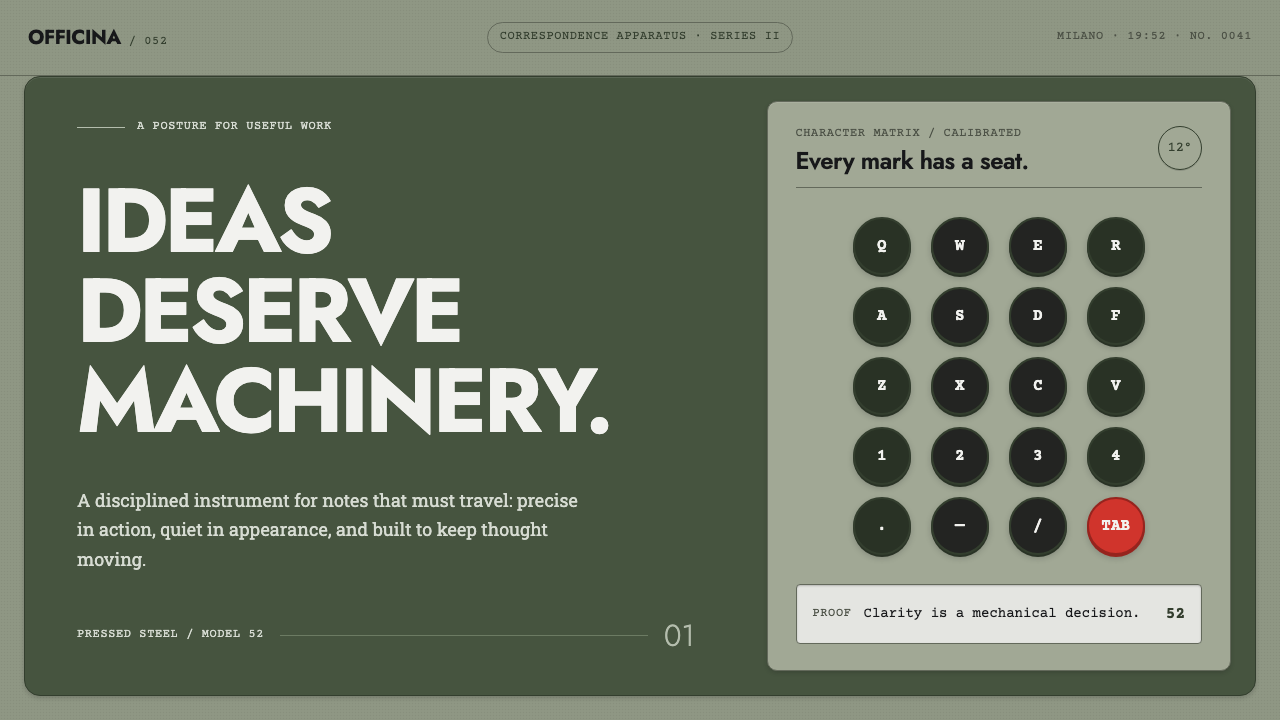 Olivetti LetteraEngineered, never styled. Grey-green enamel, precise type blocks and one red…
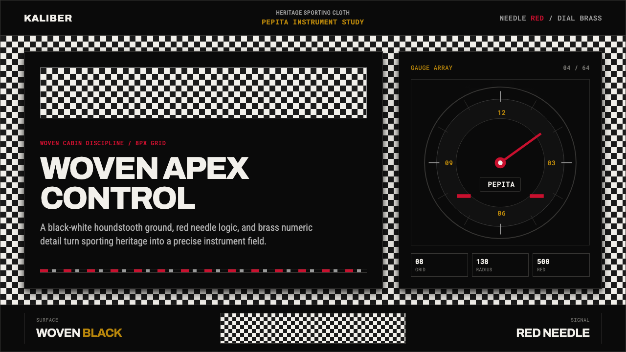 Porsche PepitaHeritage runs on instruments. Pepita checks, brass numerals, and red needles…
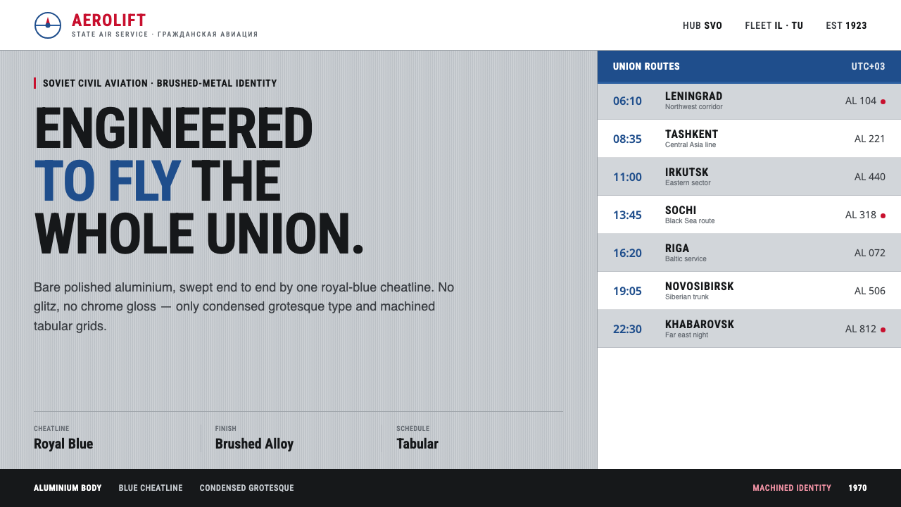 Aeroflot Soviet AirlineEngineered restraint rules. Silver ground, royal-blue cheatlines, and flat gr…
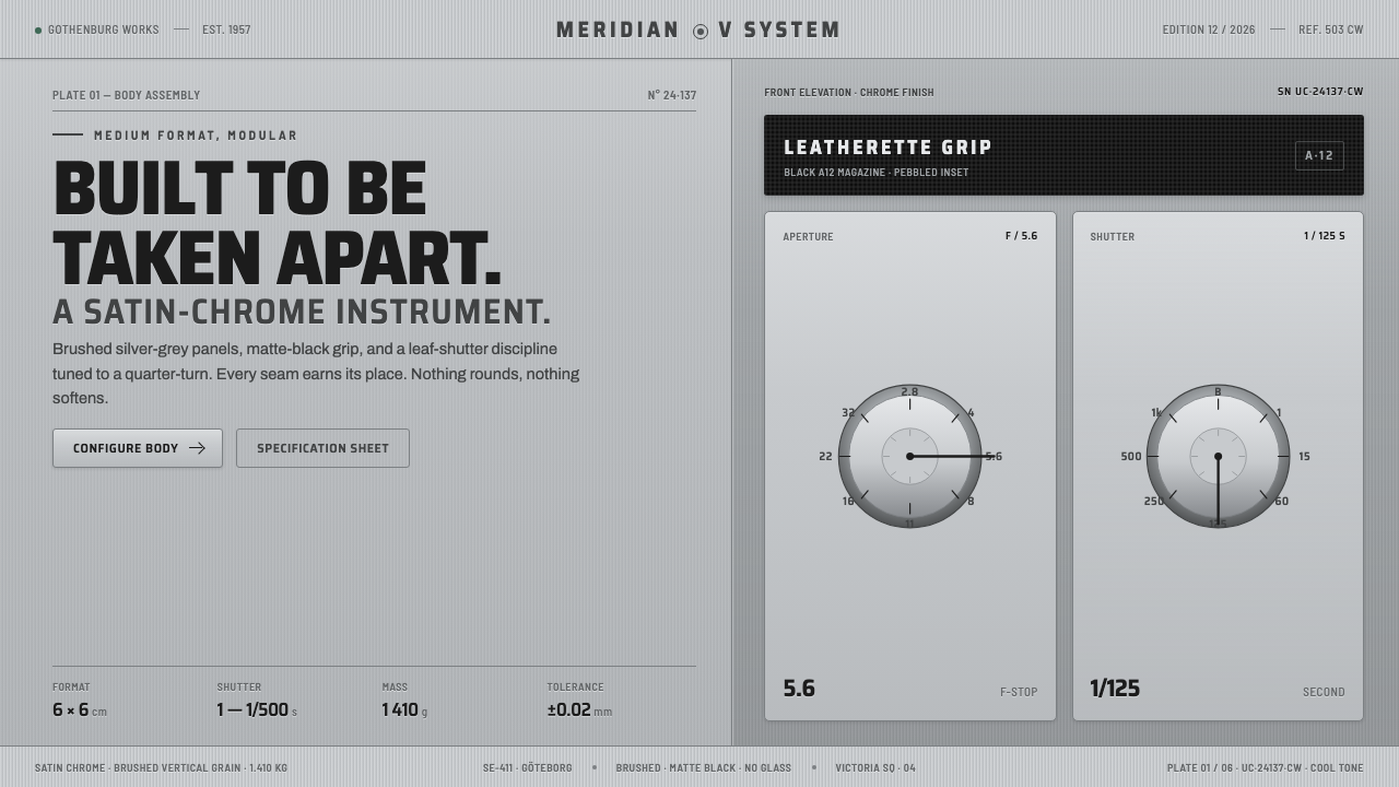 Hasselblad 500C ChromeBuilt to be taken apart. Brushed silver-grey panels, matte-black leatherette,…
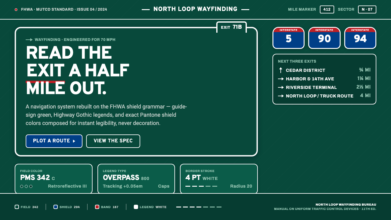 Interstate Highway ShieldEngineered for 70 mph. Guide-sign green, Pantone shield blue and red, Highway…
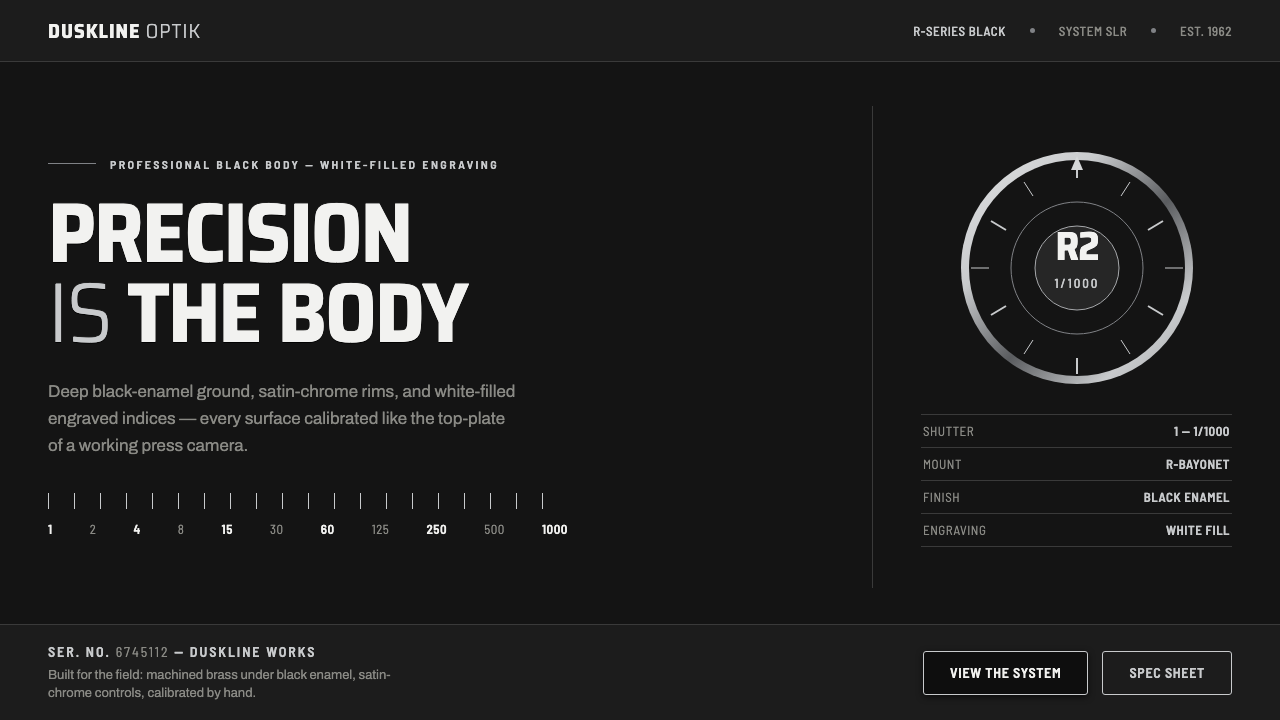 Nikon F Professional BlackMechanical precision as brand. Black-enamel ground, chrome rims, white-filled…