What is SoundCloud?
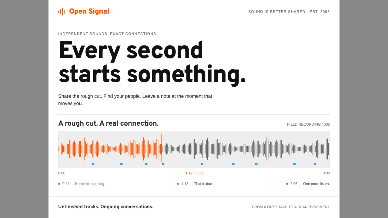
Early SoundCloud turned sound into a picture you could point at: a thin waveform on a white card, an orange seekhead filling it as it played, and blue markers where listeners left a comment.
SoundCloud in brief
The SoundCloud style recreates the audio platform's interface as it appeared between roughly 2009 and 2011. Its central object is the track card: a white rectangle holding a title, an artist name and one long, thin waveform stretched across its width. When a track plays, an orange seekhead sweeps along the wave and tints it, so progress is something you see as shape rather than a bare line.
Around that object the page is plain and sturdy. A fixed white column sits on a mid-grey page, with cards stacked down it in a feed. Headings are set in a sturdy sans, body text in a neutral, readable one, and thin hairline rules separate rows. Buttons are orange with a slight gradient of the era, which gives them a faint dimensional lift without tipping into gloss. Nothing decorative is added; the sound is the decoration.
What makes the style distinctive is the timeline. Listeners could pin a comment to an exact second of a track, and the comment appeared as a small blue marker along the waveform. This turned social interaction into spatial information: you could see where in a song people reacted. The look is a stream-and-player interface for audio, feeds and anything else with a timeline, using orange for movement and blue for human response.

Where does SoundCloud come from?
SoundCloud was founded in Stockholm in 2007 by Alexander Ljung and Eric Wahlforss, and it made its public launch in October 2008 with a base in Berlin. Its earliest purpose was modest and practical: to let musicians send each other works in progress without wrestling with email attachments. A track could be uploaded, shared with a link and played in the browser, and that simple loop grew into a platform for independent music and DJ-mix distribution.
The interface of the period reflected that origin. In the late 2000s, social platforms were often busy and brightly branded, but SoundCloud's pages were austere: a grey backdrop, a white column, thin lines, orange accents. The waveform was the one extravagant element, and it was extravagant only because it carried information. Seeing a track's loud and quiet parts before pressing play helped listeners decide where to jump, and it gave the page its unmistakable identity.
Embeddability was a defining part of the culture. SoundCloud's player could be placed inside blogs, band sites and other pages as a widget, which meant the card design travelled well beyond its home site. A compact white card with a wave and an orange playhead could sit in a blog post and still read clearly. That portability pushed the design toward self-contained clarity: every card had to make sense without the surrounding page.
The look belongs to the period usually labelled Web 2.0, when sites offered sharing, tagging and commenting as core features, with a slight glossy gradient on buttons as a typographic accent of the era. This system recreates the version from roughly 2009 to 2011, using Overpass headings in place of the original Interstate and Arimo for body text. The movements it touches are Web 2.0 social platforms, independent music and DJ-mix distribution, and the embeddable-widget culture that spread audio across the web.
What defines the SoundCloud look?
The waveform as hero
A long, thin waveform runs across every track card, drawn as fine vertical strokes that rise and fall with the sound. Played portions glow orange against the unplayed grey. It acts as the visual signature and the progress bar at once, and it turns an invisible medium into a readable shape.
Orange for motion
Orange is the only strong brand color and it always signals action or movement: the seekhead, the play button, primary calls to action. Because it is used sparingly against white and grey, it draws the eye to exactly what is live. Buttons carry a slight period gradient that adds a faint lift.
Blue time-pinned notes
Listener comments pinned to a precise second appear as small blue markers along the wave. Blue is thereby the voice of the audience, set apart from orange, which is the voice of the track. The pairing lets two kinds of information share one thin line without confusion.
White column on grey
A fixed-width white column sits centred on a mid-grey page, and cards stack within it like sheets laid on a desk. The fixed width keeps line lengths predictable and the layout calm. The grey frame makes the white feel clean and gives the page a quiet, tool-like seriousness.
Crisp hairline rules
Rows and sections are separated by the thinnest possible rules in a light grey. There are few boxes and almost no heavy borders. The lines organise the feed without adding visual weight, which keeps attention on the waveforms and titles.
Sturdy headings, neutral body
Headings use a sturdy, slightly condensed-feeling sans that stands in for the original Interstate, while body copy is set in a plain, readable face. Titles and artist names take priority; secondary data such as plays and dates is small and grey. Hierarchy is built from contrast of weight and tone rather than from ornament.

Who shaped SoundCloud?
Co-founder of SoundCloud, who started the company in Stockholm in 2007 with Eric Wahlforss.
Co-founder and partner of Ljung, tied to the platform's early sound-sharing concept and its public launch in 2008.
How do you use SoundCloud today?
On slides, the SoundCloud style is ideal for anything built around sequence or time: product roadmaps, campaign schedules, podcast and music pitches, and storytelling decks. Use a mid-grey slide ground with a single white content column, and draw a long thin line across it as a motif. Highlight the current stage in orange and use small blue markers for annotations or comments from the audience. Keep text compact and aligned to the column.
For data slides, treat the waveform as an inspiration for the chart: thin vertical bars or lines on a white card, with an orange portion showing the part you want to discuss and blue dots marking events. Pairing a time series with annotated markers is the style's strongest data idea. Let each card contain one chart and a short title, and avoid putting more than two colors in any visual.
In web and app interfaces, it fits audio players, podcast apps, video timelines, activity feeds, comment threads and collaborative review tools. Build a feed of white cards in a fixed column on a grey page, give each card a title, a small meta line and a timeline element, and let orange buttons carry the primary action. Timeline comments that attach to a precise moment are a natural pattern for any media product.
For editorial and marketing, the style supports music-led storytelling: gig posters, release announcements, mix compilations and artist pages. A white card with a waveform and orange playhead is a compact graphic that communicates audio instantly, even in print. Pair it with plain, confident copy and ample grey surround. Embeddable widget ideas also translate well to newsletters, where a card can summarise an episode or track.
The most common mistake is to add decoration to a style whose point is functional clarity. Extra gradients, shadows or additional accent colors weaken the orange and blue code. Another mistake is to make the waveform thick and heavy; it should stay thin and delicate so that many bars read as one gesture. Keep the column fixed, the rules light and the orange reserved for what moves.

SoundCloud — FAQ
What is the SoundCloud design style?
It is the early 2009 to 2011 SoundCloud interface: a fixed white column on a mid-grey page, white track cards with a long thin waveform, an orange seekhead, blue time-pinned comment markers, and crisp hairline rules.
What do the orange and blue mean?
Orange marks movement and action, such as the part of the waveform already played and the primary buttons. Blue marks the audience, specifically comments pinned to a precise second. Keeping the two roles separate lets one thin line carry two kinds of information.
Where did SoundCloud come from?
It was founded in Stockholm in 2007 by Alexander Ljung and Eric Wahlforss, and opened to the public in October 2008, with a base in Berlin. It began as a way for musicians to share works in progress and grew into a platform for independent music and DJ mixes.
Which interfaces suit this style?
Audio and video players, podcast apps, activity feeds, comment threads, review tools and any product with a timeline. The track card with a progress shape and time-pinned notes is a strong pattern for media and collaboration products.
Which fonts does the system use?
Overpass stands in for the original Interstate in headings, and Arimo handles body text. Both are chosen to keep a sturdy, neutral, readable voice, so the waveform and the orange and blue accents remain the visual focus.
Related design styles
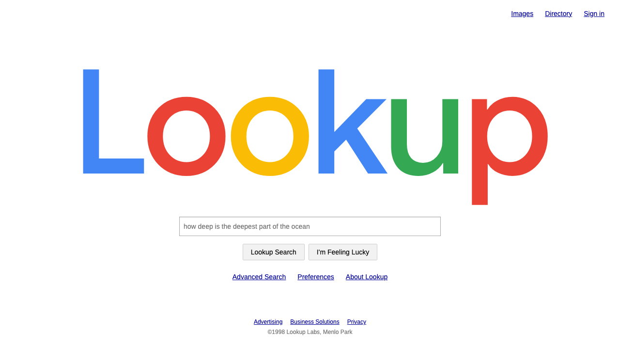 Google SearchA white page and a box to type in. Giant four-colour wordmark, Arial text, no…
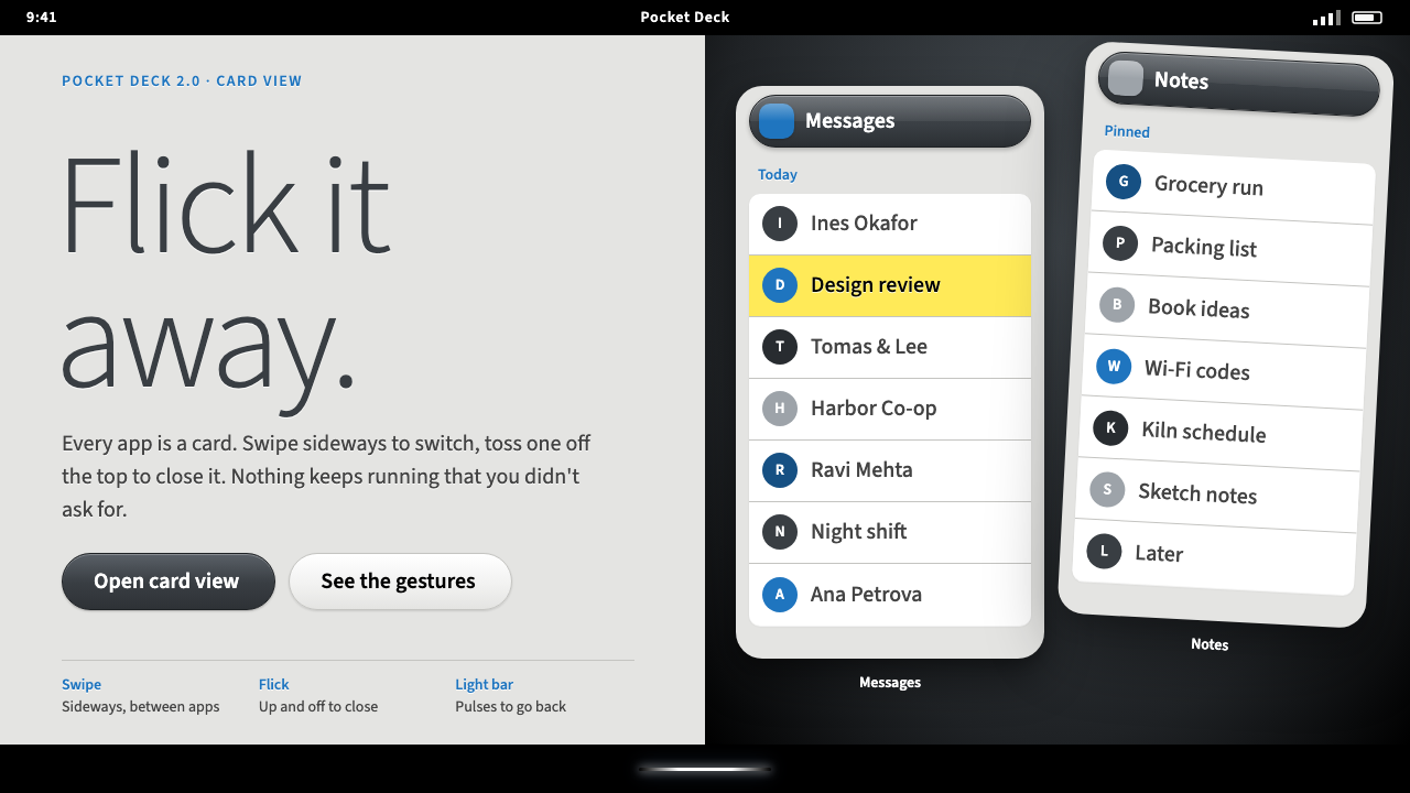 Palm webOSEvery app is a card you flick away. Charcoal gloss pills and blue labels on g…
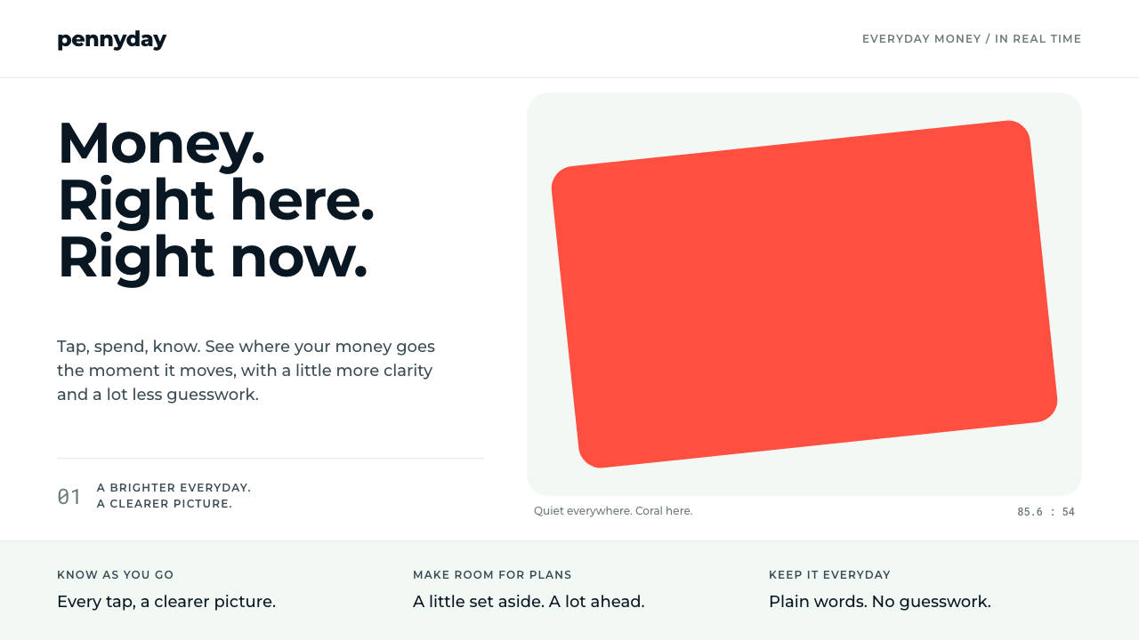 MonzoOne loud coral, everything else calm. Navy type and mint-grey space keep mone…
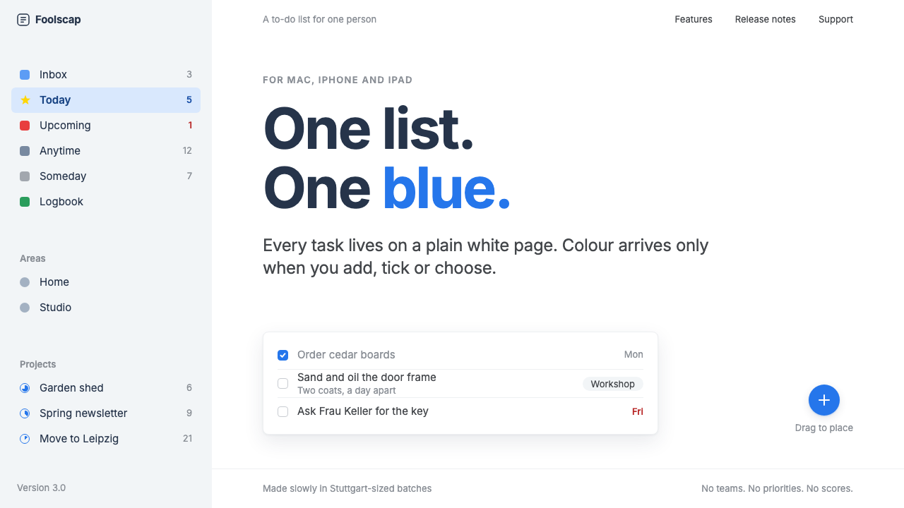 Things 3Colour saved for action. White page, cool-grey sidebar, one blue for the plus…
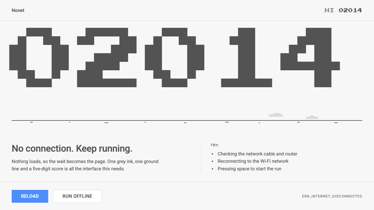 Chrome DinoWit from almost nothing. One grey ink on pale paper, pixel-font score digits,…
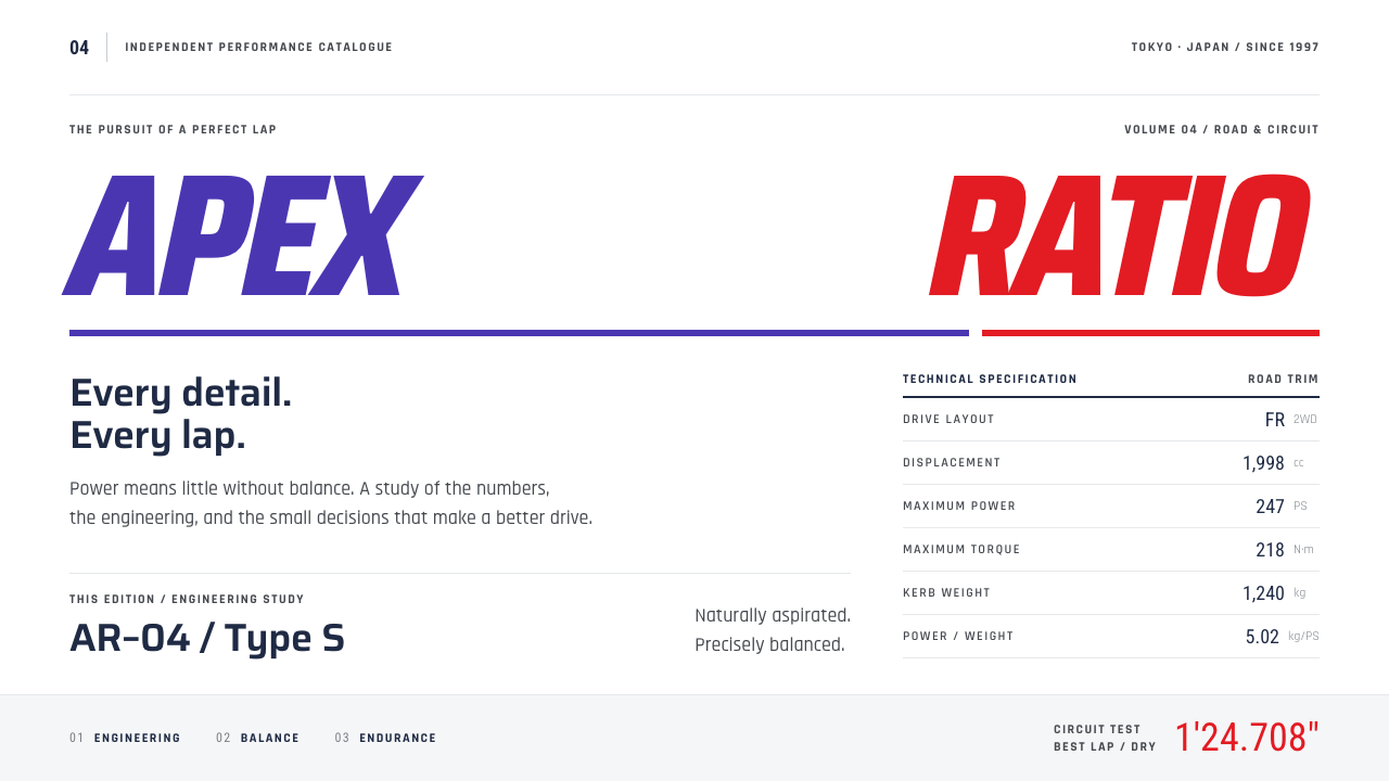 Gran TurismoPrecision without noise. Slanted violet-red type and hairline spec rows on sh…