What is Things 3?
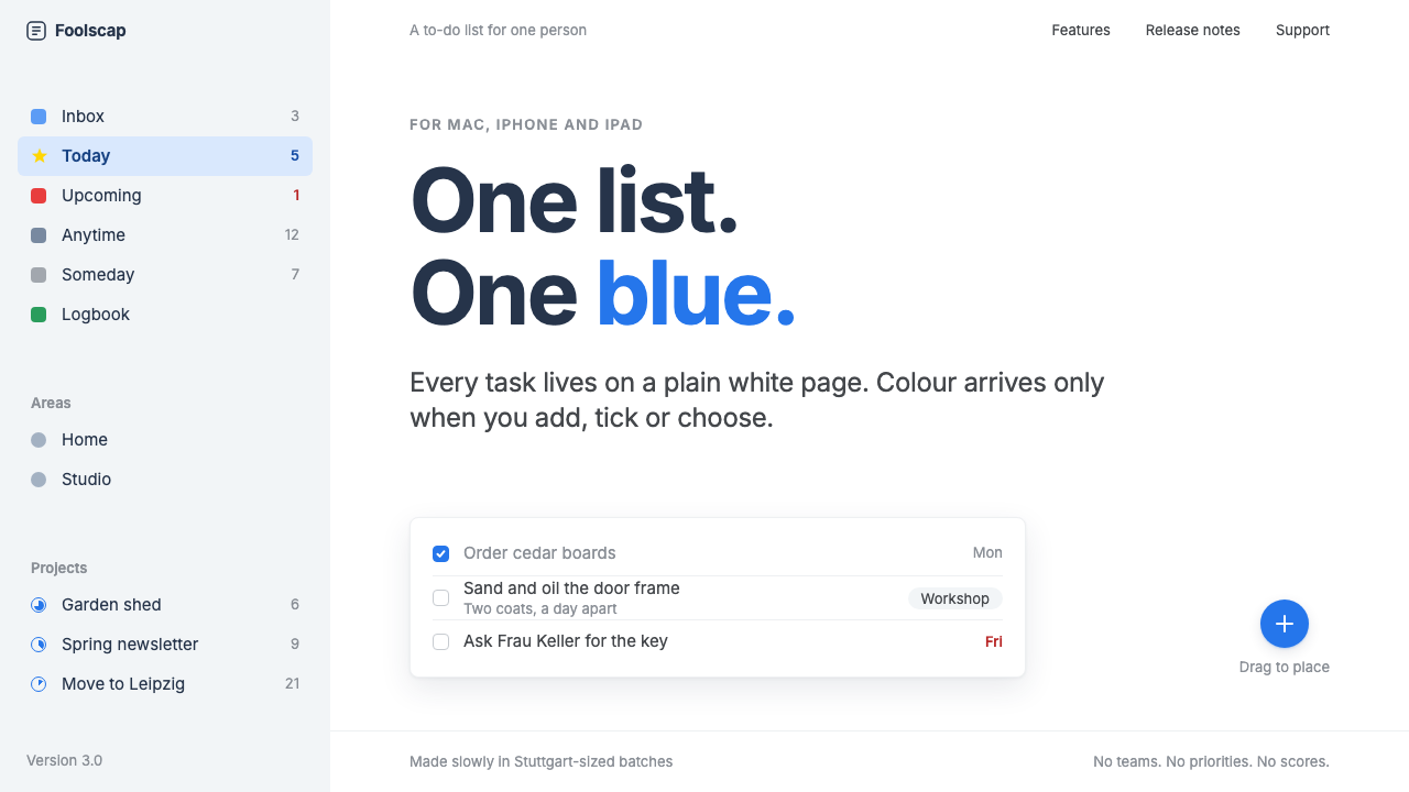
Things 3 saves colour for action: a pure white page, a pale cool-grey sidebar, and one blue that appears only where something happens.
Things 3 in brief
Things 3 is the visual style of the task manager made by Cultured Code of Stuttgart, released in May 2017 after years of redesign. Its main list is a pure white page, set beside a pale cool-grey sidebar. It won an Apple Design Award in the year it came out, and it has remained a reference point for what a calm, personal productivity app can look like.
The system is built on restraint. Blue appears in only three places: the Magic Plus button at the lower right, the ticked square checkbox, and the selected row. Everything else is ink on paper. There are no heavy dividers, no decorative icons and no competing accents, so the user's attention goes to the tasks themselves.
Interaction carries much of the personality. Opening a to-do expands it in place into a white card that holds notes, a checklist and tags, and the motion is short and quiet. Where other apps use decoration to feel polished, Things 3 uses small, well-judged movements, which makes the whole interface feel considered rather than styled.

Where does Things 3 come from?
Cultured Code is a small software company based in Stuttgart, Germany. Its first Things application appeared in 2009 and found a following among people who practised personal task systems. Things 3, shipped on 18 May 2017, was a ground-up reconsideration of that product. The team spent years on it, and the result was recognised with an Apple Design Award in 2017.
Werner Jainek and Jürgen Schweizer are the names tied to the company and its product. Their approach reflects a few intertwined traditions: personal productivity software shaped by the Getting Things Done way of thinking, native craft on Apple platforms, and the paper metaphor in flat interface design. The paper idea is visible in the white list that behaves like a clean sheet, with each task as a line written on it.
What distinguishes Things 3 from many contemporary apps is its refusal to add features as visual noise. Instead of heavy chrome, it relies on typography, spacing and a very small palette. The sidebar is lighter than most, the list has almost no borders, and even the icons are thin and quiet. This made it feel native to the Apple ecosystem while still having a character of its own.
The visual language stayed remarkably stable from 2017 through 2024. That stability is part of its reputation: users know exactly what the app will look like, and the design has aged slowly because it was never tied to a trend. It remains a model for single-user, single-list products that want to feel like a well-made tool.
What defines the Things 3 look?
Pure white page
The main list is a clean white surface with no texture or decoration, closer to a sheet of paper than to a screen full of controls. It gives tasks the whole stage and makes the page feel quiet.
Pale cool-grey sidebar
The sidebar is a soft, slightly cool grey that separates navigation from content without a hard line. The tonal shift alone is enough to show where one area ends and the next begins.
Blue only where action lands
A single blue marks the Magic Plus button, the ticked checkbox and the selected row. Because nothing else uses it, blue becomes a language: wherever you see it, something can be done or has just been done.
Square, tactile checkboxes
Checkboxes are square rather than round, and ticking one fills it with blue and a small mark. The completion moment is clear and satisfying, which suits an app whose daily reward is finishing things.
In-place expanding cards
A to-do opens where it sits, growing into a white card that holds notes, a checklist and tags. The user never leaves the list, so context is preserved and the interface feels continuous.
Quiet, short motion
Animation is brief and understated, used to explain what changed rather than to impress. It stands in for the decoration other apps rely on, and gives the interface its sense of craft.

Who shaped Things 3?
A name closely tied to Cultured Code and the Things application.
A name closely tied to Cultured Code and the Things application.
The Stuttgart software company that made Things and shipped Things 3 in May 2017.
How do you use Things 3 today?
In slides, the style suits personal, thoughtful presentations: planning sessions, workshop agendas, product retrospectives and productivity talks. A cover can be a plain white slide with a restrained title and a single blue element, such as a small checkbox or a plus. Content slides should be spacious, with lists set like to-dos on a page, and the pale grey can be used for a narrow side column that holds the section names.
On the web, it fits task managers, note apps, calendars, habit trackers and any single-user tool built around a list. Use a white content area beside a pale grey navigation column, make rows light and borderless, and reserve blue for the primary add action, checked states and the current selection. Let items expand in place instead of sending the user to a new page, so the interface keeps its calm continuity.
For editorial and marketing work, it suits product pages for tools that want to look thoughtful and unhurried, as well as essays about focus, planning or minimalism. Text should be set in generous spacing with few typographic effects. Screenshots of the interface can serve as the main illustration, since the design is already a good-looking, calm image on its own.
The common mistake is to treat blue as a general accent. If headings, links, icons and badges all turn blue, the colour stops meaning action and the restraint is lost. A second mistake is to add borders, shadows and coloured tags everywhere in the name of clarity; the style depends on a clean page. A third is to use fast or bouncy animation, which contradicts the quiet motion. Keep it white, light and calm.

Things 3 — FAQ
What is the Things 3 design style?
It is a restrained productivity-app style: a pure white list page, a pale cool-grey sidebar, and a single blue used only for the Magic Plus button, ticked checkboxes and the selected row. Quiet, short motion does the work that decoration does elsewhere.
Who made Things 3 and when?
Cultured Code of Stuttgart, Germany shipped Things 3 on 18 May 2017, after years of redesign. It received an Apple Design Award the same year. The original Things appeared in 2009.
Why is blue used so sparingly?
Keeping blue for action turns it into a signal. Wherever it appears, something can be done or has just been done, so the user learns the meaning without being told. Spreading it elsewhere would dilute that meaning.
What kinds of products suit it?
Single-user, list-centred tools such as task managers, note apps, habit trackers and calendars. It is less suitable for dense multi-panel dashboards or products that need many colour-coded categories.
How does the paper metaphor show up?
The white list behaves like a clean sheet with each task written on it, and opening a task expands it into a white card in place. Dividers, textures and heavy chrome are avoided so the page stays paper-like.
Related design styles
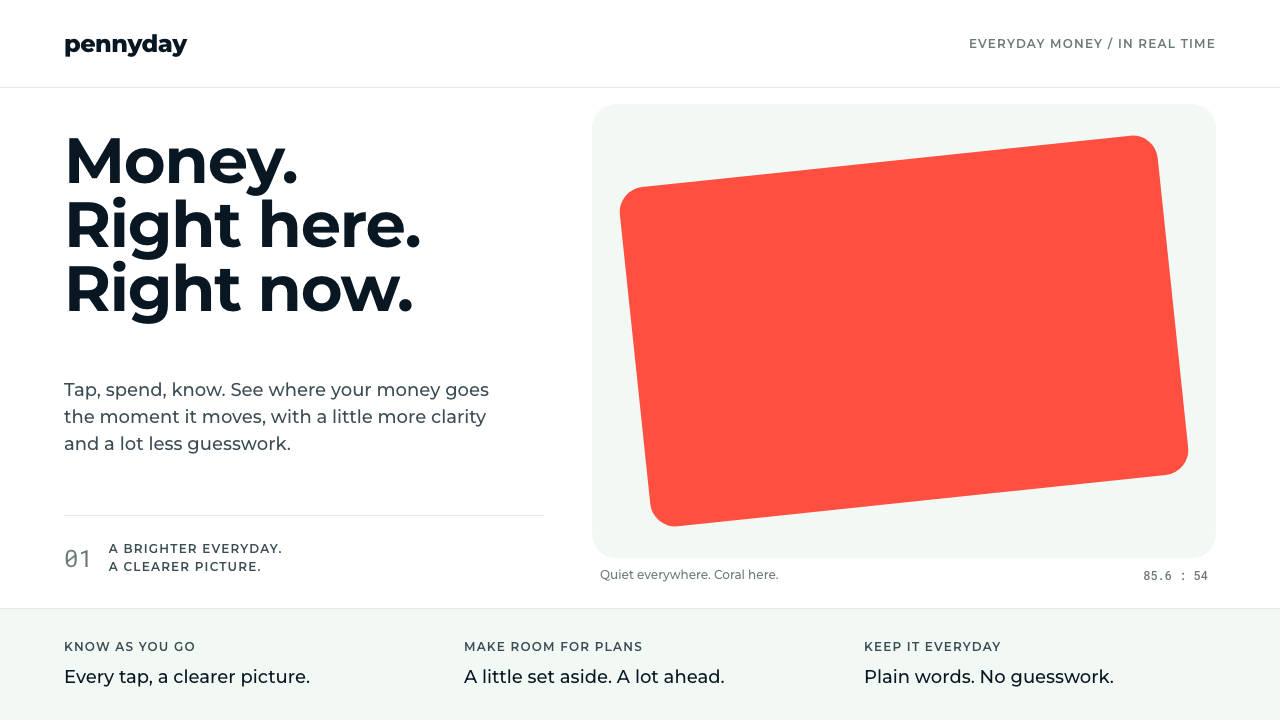 MonzoOne loud coral, everything else calm. Navy type and mint-grey space keep mone…
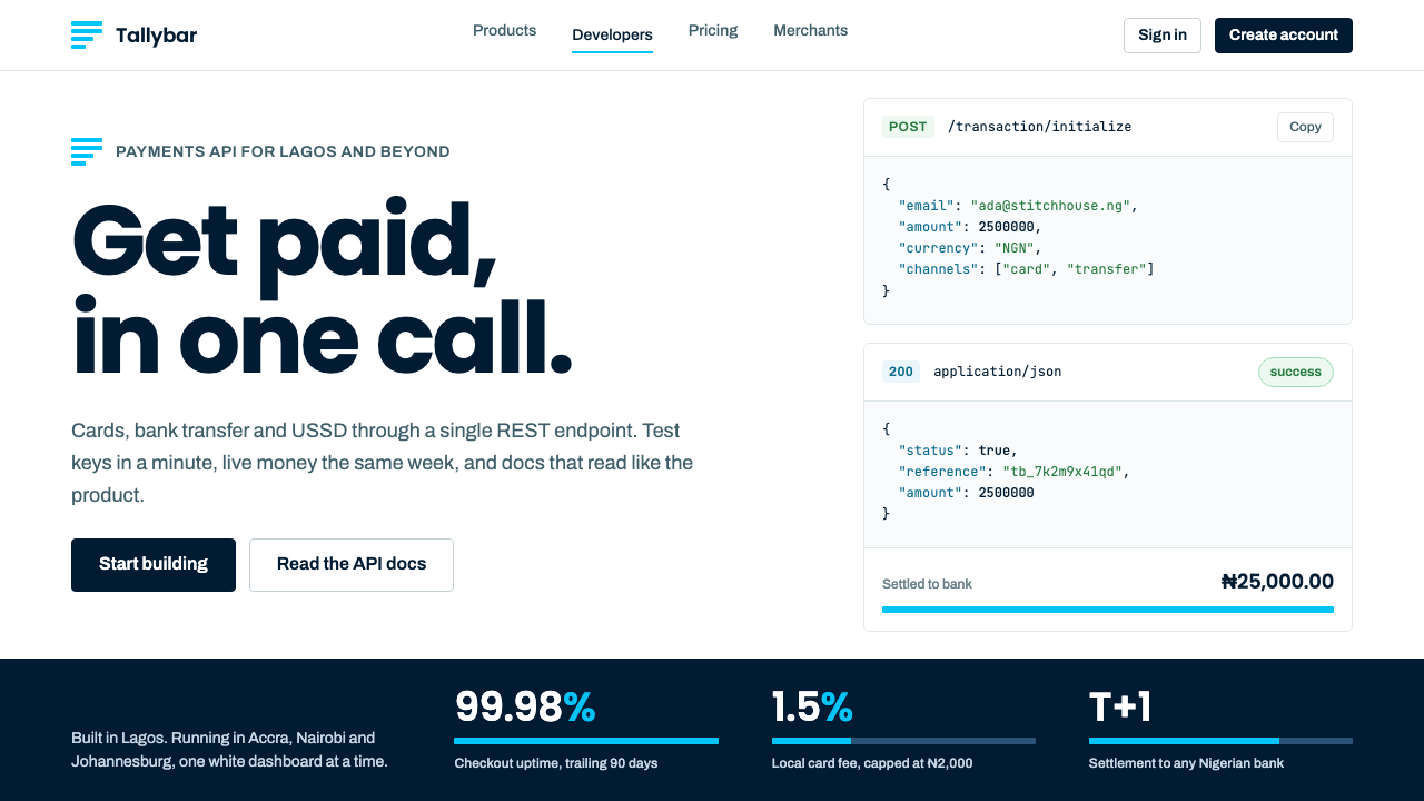 PaystackPlain-spoken payments infrastructure. White page, navy ink, four flat cyan ba…
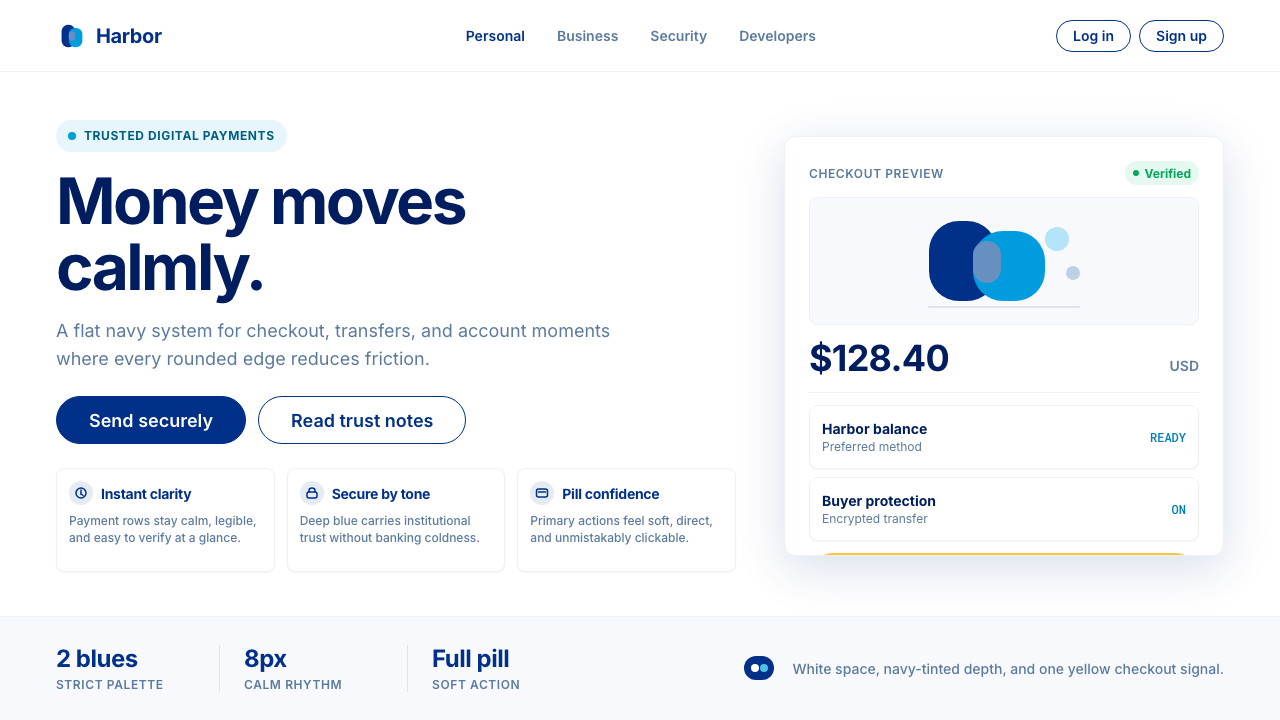 PayPalTrust without coldness. Deep navy, sky cyan, white cards, and pill checkout c…
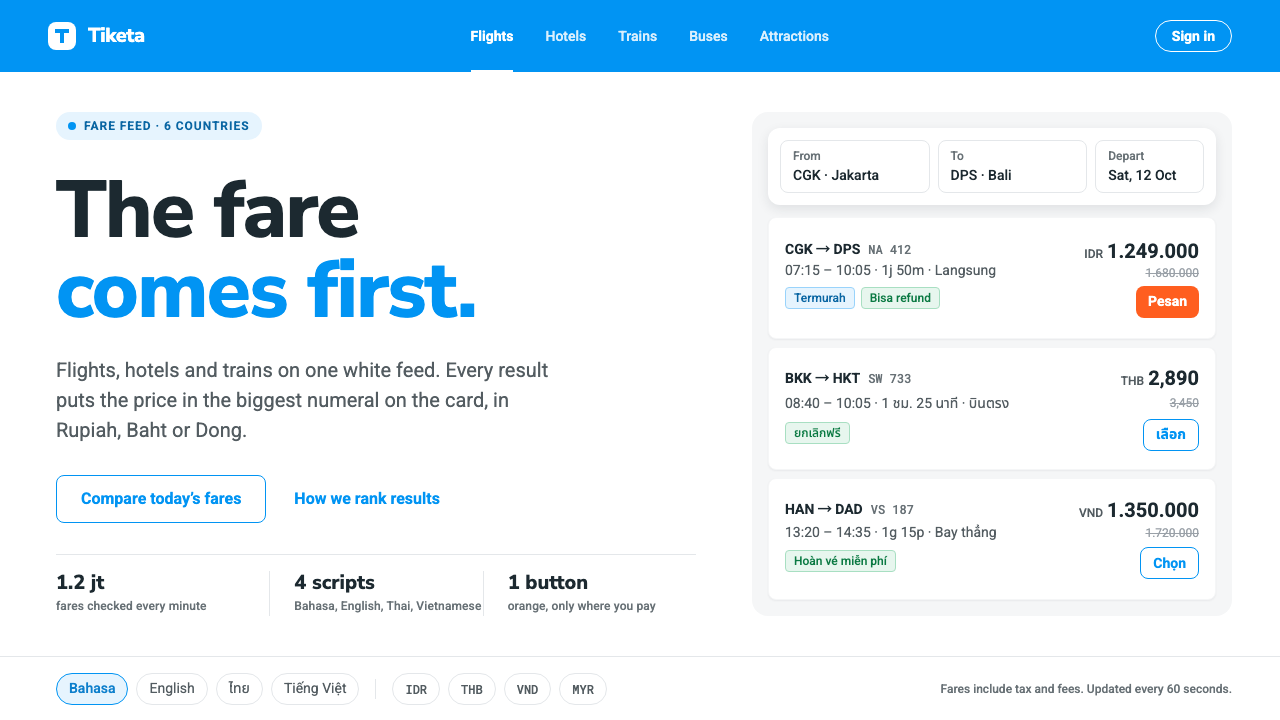 TravelokaThe fare comes first. Azure band, white cards, price as the biggest numeral,…
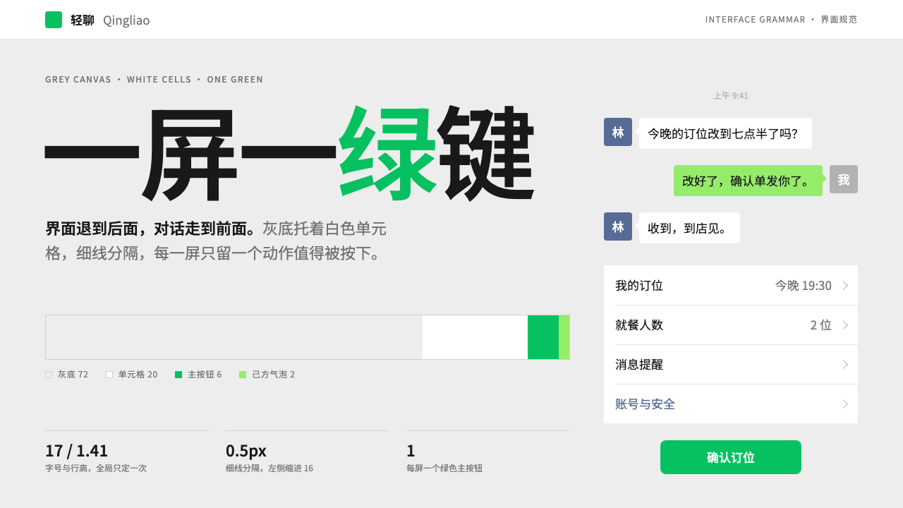 WeChatRecedes on purpose. Grey canvas, white hairline cells, and a single green but…
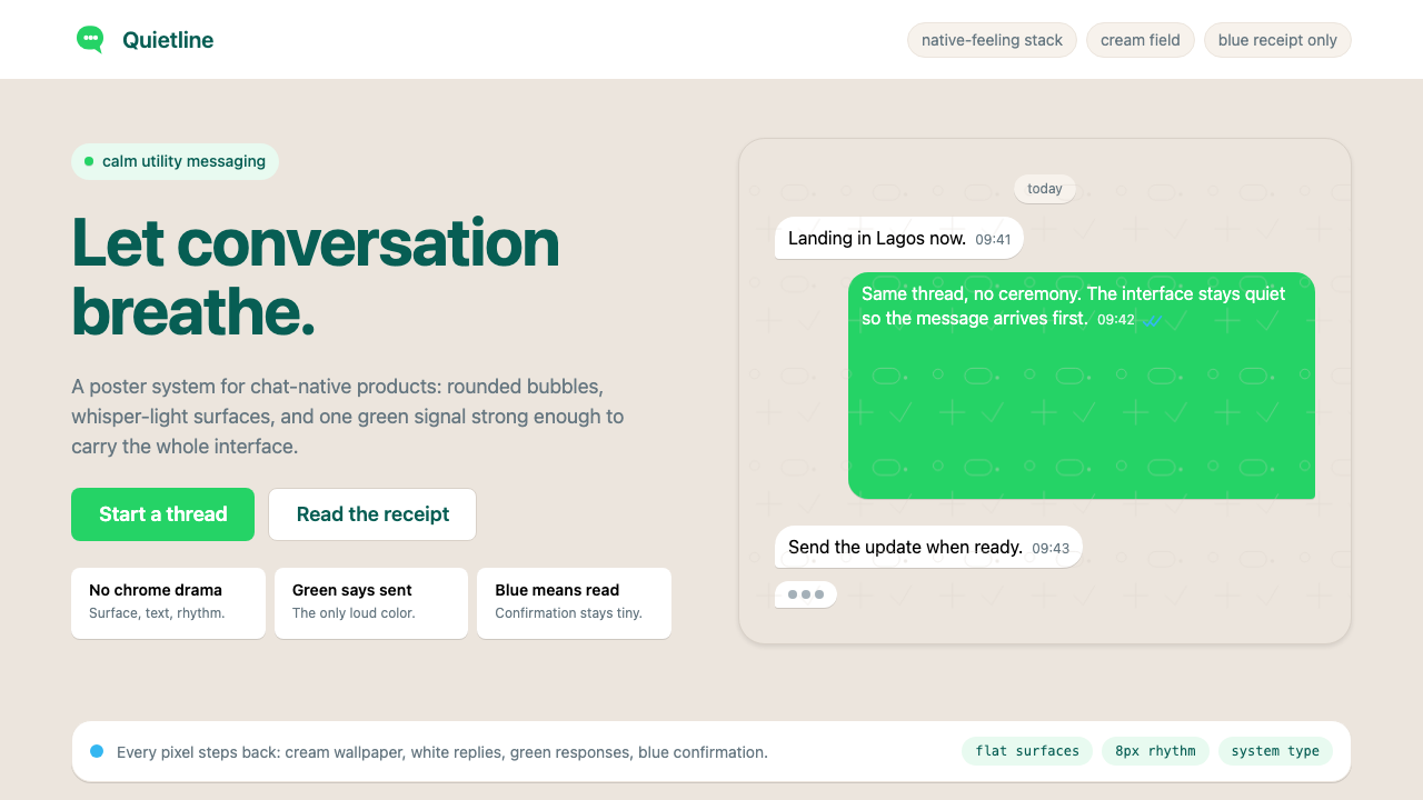 WhatsAppConversation is the interface. Cream wallpaper, green bubbles, and tiny blue…