What is WeChat?
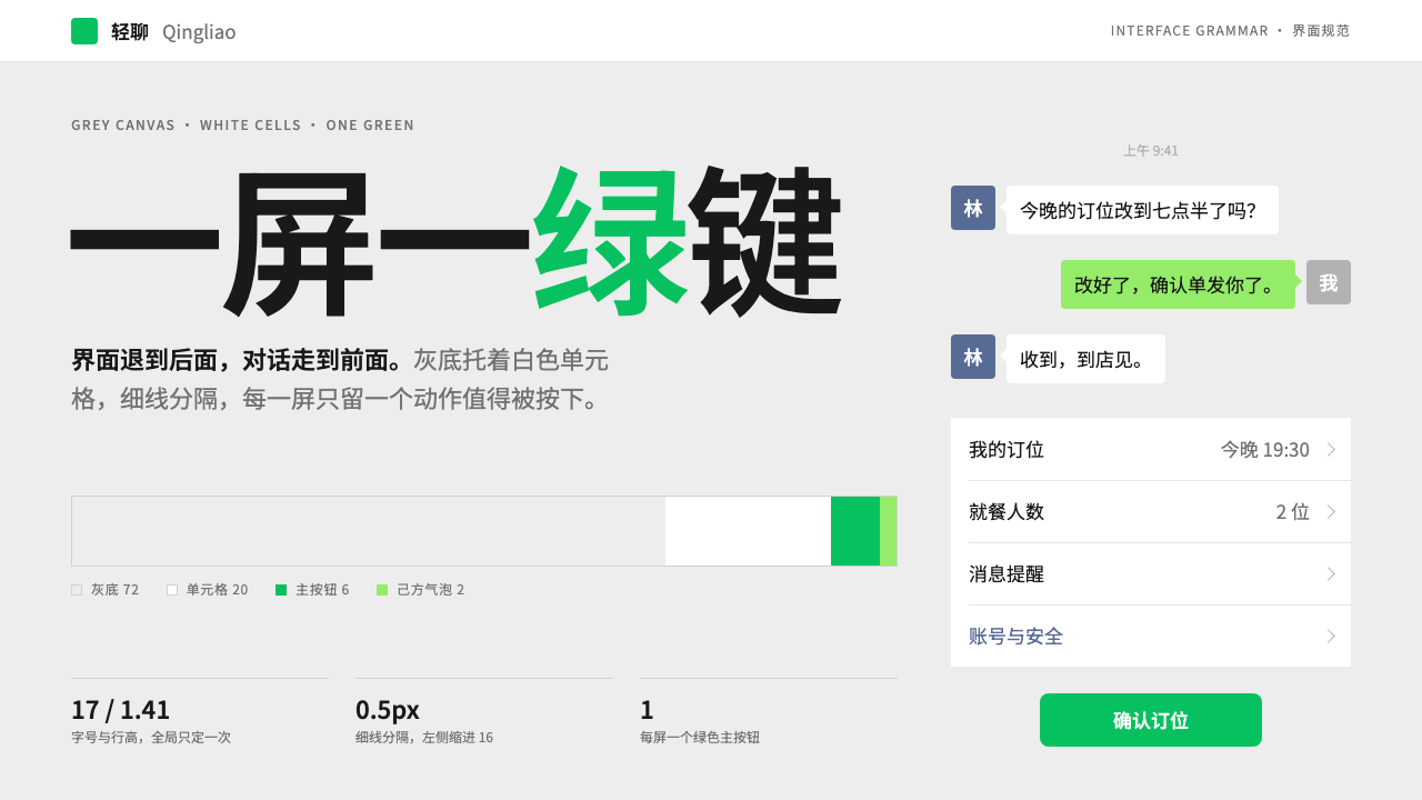
WeChat's WeUI look is an interface that recedes on purpose: a grey canvas, white grouped cells, hairline dividers and one green button per screen.
WeChat in brief
The WeChat style, published by the WeChat design team as the WeUI library, is a mobile-first interface language built around restraint. Its ground is a light grey canvas. Content sits in white cells arranged in grouped blocks, separated by hairline dividers. One green primary button, in WeChat green, appears per screen. Nothing else competes for attention.
The chat view shows the same philosophy. Messages you send sit in pale green bubbles, messages you receive sit in white ones, and avatars are rounded squares. Everything else stays grey and calm. The design is almost invisible, and that is the point: it is the interface of a tool people use many times a day and do not want to notice.
This makes it a distinctive reference among interface styles. It is not trying to impress. It tries to be fast, readable and familiar, so that the user's attention goes to the conversation, the payment or the mini program, not to the chrome around it.

Where does WeChat come from?
WeChat launched in January 2011 out of Tencent's research and development centre in Guangzhou. Its product lead is usually named as Allen Zhang, with Tencent's founder Pony Ma as the other key figure. It started as a mobile messaging tool, a successor to the desktop-era chat applications that Tencent already ran, redesigned for phones where screens were small and connections were uncertain.
The product then grew in stages. Moments, the social feed of friends' posts, arrived in 2012. WeChat Pay arrived in 2013, turning chat into a way to pay at shops and between friends. The visual system was published as WeUI between 2015 and 2016, giving developers outside Tencent the same components that the main app used. Mini Programs followed in 2017, putting lightweight apps inside the chat app itself. The current visual treatment dates from roughly 2019 to 2024.
The movements it belongs to are named as the super-app, mobile-first messaging and mini-program platforms. The super-app idea is the key one: instead of installing a separate app for each task, a user does chat, social, payments, shopping and services inside one container. That puts a unique demand on the design. A single visual language must hold together hundreds of unrelated services built by many different developers, and it must remain calm enough that none of them overwhelms the others.
That is why WeUI was published as a library. By giving everyone the same grey canvas, white cells, hairline dividers and one green action, the platform made third-party pages feel like part of the same place. The restraint is practical. It is a shared grammar that lets a billion people move between very different services without relearning the interface each time.
What defines the WeChat look?
Grey canvas
The page background is a light, neutral grey rather than white. This lets white content cells stand out gently as lifted surfaces without needing borders or heavy shadows. The grey reads as quiet and slightly utilitarian, which suits a tool used all day.
Grouped white cells
Content is organised in white rows, grouped into blocks with small gaps between groups. Each row typically carries an icon or label on the left, a value or chevron on the right, and a hairline divider below. The pattern is so consistent that users can predict how any screen behaves before reading it.
Hairline dividers
Separators are extremely fine, lighter than a normal rule. They organise rows without adding visual weight, so a long list stays airy rather than turning into a grid of boxes. The effect is delicate on dense mobile screens.
One green action
Each screen has at most one primary button in WeChat green. Secondary actions are neutral or plain text. Because the green is scarce, it works as a clear answer to the question what do I do next, and it ties every screen back to the brand.
Green and white bubbles
In conversation, the user's own messages sit in pale green bubbles and the other person's in white. The distinction is made by colour and side, not by decoration. Avatars are rounded squares, which gives the list a soft but orderly rhythm.
Calm by default
There are few gradients, no glow and little shadow. Motion is brief and functional. The interface declines to perform, so that the content a user cares about, whether a message, a payment code or a mini program, carries all the weight.

Who shaped WeChat?
Product lead of WeChat, whose team shaped its restrained, tool-like approach to interface design.
Founder of Tencent, the company that developed and operates WeChat.
How do you use WeChat today?
In slide decks, the style suits product walkthroughs, mobile app reviews and service explanations where clarity matters more than spectacle. A grey background with white grouped blocks makes a tidy way to present steps or settings. Keep the green for the single point you want the audience to remember. Data slides work well when charts are quiet: flat marks, hairline gridlines and one green series.
In web interfaces, it is a strong fit for mobile-first tools, settings pages, forms, lists, account pages and utility products. List rows with a left label and a right value, grouped in white blocks on a grey ground, are an extremely reliable pattern. It also works for dashboards that prioritise scanning, because the airy rows keep dense information readable. Reserve the green button for the single main action on the screen.
For editorial and marketing work, the style is less natural, because it is designed to recede rather than persuade. It can work for help centres, onboarding flows, product documentation and campaign pages for services that want to feel dependable and familiar. If you need drama, add it through photography or a single large headline, not by decorating the interface.
A useful approach is to ask on every screen which single thing is the main action. Give that action the green button and make everything else neutral. This forces clarity in the layout, which is what the style is for.
The most common mistake is to use green everywhere, so that the primary action no longer stands out. The second is to add heavy borders, shadows or gradients to the cells, which defeats the quiet, hairline structure. A third is to treat the restraint as emptiness: the style depends on tight consistency in spacing and alignment, so a loose version simply looks unfinished.

WeChat — FAQ
What is WeUI?
WeUI is the style library published by the WeChat design team, made available between 2015 and 2016 so developers could build pages that look and behave like the main app. It captures the grey canvas, grouped white cells, hairline dividers and single green action that define the WeChat interface.
Why does WeChat look so plain?
The plainness is deliberate. WeChat hosts chat, payments and many third-party mini programs in one app, so its visual language must be neutral enough for all of them to coexist. A quiet interface also respects the fact that people open it many times a day and want to get on with their task.
Why only one green button per screen?
It makes the next step obvious. When green is scarce it works as a clear signal, and the user never has to compare several competing primary actions. It is a simple rule that scales across a vast range of services built by different teams.
How does the chat bubble system work?
Messages you send appear in pale green bubbles and messages you receive appear in white bubbles, with rounded-square avatars beside them. The difference between sender and receiver is carried by colour and position alone, which keeps the conversation view simple and instantly readable.
Can this style be used outside messaging apps?
Yes. The grouped-cell pattern works for settings, account pages, forms and lists in almost any mobile or web product. It is less suitable for brand-led marketing pages, where a more expressive style is needed to persuade. Use it where clarity and familiarity are the goals.
Related design styles
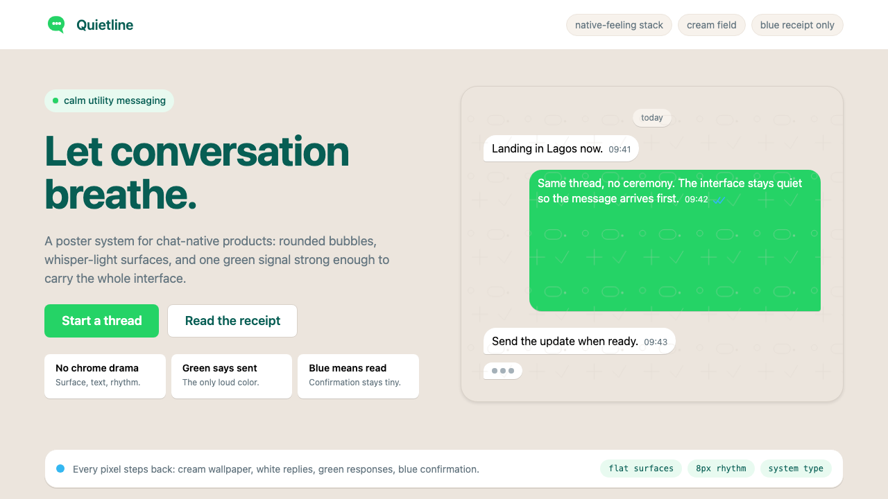 WhatsAppConversation is the interface. Cream wallpaper, green bubbles, and tiny blue…
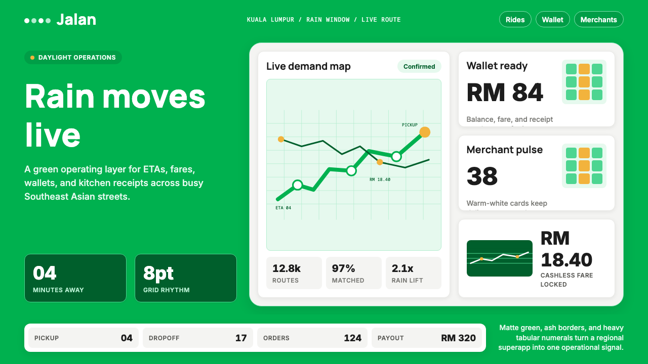 Grab SEA Superapp 2018Operational warmth. Saturated green, Inter numerals, and tight dashboard card…
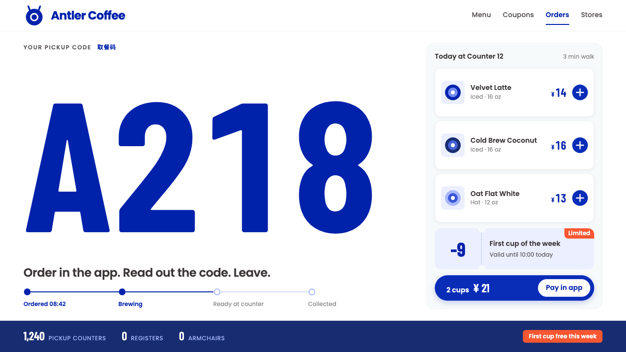 Luckin CoffeeWhite as a paper cup. Deer-blue roundel, tall condensed pickup codes, one ora…
 MonzoOne loud coral, everything else calm. Navy type and mint-grey space keep mone…
 PayPalTrust without coldness. Deep navy, sky cyan, white cards, and pill checkout c…
 PaystackPlain-spoken payments infrastructure. White page, navy ink, four flat cyan ba…