What is Monzo?
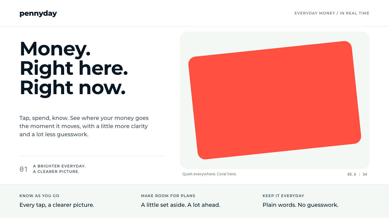
Monzo's look is built on a simple bargain: let one object be loud — a hot coral card — and keep every screen around it calm, navy and clear.
Monzo in brief
The Monzo hot coral card style is the visual language of the British app-only bank that began life in London in 2015 as Mondo. It is organised around a single contrast. On one side is a fluorescent coral card, one of the most recognisable objects in British banking. On the other is a very quiet interface: a white canvas, navy ink, pale mint-grey panels and a live feed of transactions.
The interface does the work of making money legible. Spending is listed as a running stream, so that each purchase appears as an entry the moment it happens. Monthly spending is coloured by category, and budget bars shift from green through orange to red as a limit approaches. Numbers are given room, labels are plain, and the interface avoids the heavy, solemn look that banking apps had traditionally worn.
The result feels friendly without being childish. Navy gives the system a sense of seriousness appropriate to money, while the mint-grey backgrounds and the coral accent keep it from feeling cold. The coral is never spread across the layout; it is saved for the card and a few moments of emphasis, which is exactly why it works.

Where does Monzo come from?
Monzo began in London in 2015 under the name Mondo. The first product was an alpha version of a prepaid card and an app. Its early idea was modest but unusual for British banking at that time: as soon as you tapped your card, your phone told you what you had just spent and where. A notification saying you had spent a few pounds at a coffee shop arrived in seconds, rather than in a statement weeks later. Real-time notifications became a core part of the brand.
The company was founded by Tom Blomfield and others, and belongs to the wave of UK challenger banks, newer app-only banks that set out to compete with the established high-street institutions. These companies had no branches to fill with signage and marble. Their brand lived on the phone and, for the few who held it, in the hand. That is why the physical card carried so much of the identity.
The card's colour was chosen by Hugo Cornejo, then the head of design, who picked a fluorescent hot coral to match his Nike trainers. The choice turned out to be a strategic one. In a category in which banks traditionally wore navy, green or other trustworthy colours, a bright coral stood out in a pub or on a train, and people noticed it. It became the bank's most recognisable object.
The company was renamed Monzo in 2016, and in 2017 it received its UK banking licence and introduced Budget Targets, a feature that put spending limits into the app. The interface developed around these functions: clear categories, live feed, visible progress against a limit. The design system keeps that balance, a loud object in a calm room, as the core of the identity, and it is why the app still reads as a friendly alternative to the traditional bank.
What defines the Monzo look?
One loud coral
Coral is the only high-saturation colour in the system. It belongs to the card and to a few moments of emphasis. Because the rest of the interface is quiet, the coral does not need to be big; it only needs to be unmistakable. Spreading it across headers, buttons and backgrounds would weaken the contrast the system depends on.
Navy ink
Text is set in a deep navy rather than black. It reads with the seriousness appropriate to money, while being softer and more distinctive than pure black. Navy is also the colour that most clearly tells the viewer that this is a bank and not a toy, which balances the playful coral.
Mint-grey space
Panels and section backgrounds use a pale mint grey on a white canvas. The tint separates groups of information without borders or heavy shadows, and it gives the interface a fresh, clean tone. It is a calm colour that makes money feel orderly instead of stressful.
Live transaction feed
Spending appears as a running list, newest first, with merchant name, a small category mark and the amount. Each entry is compact but readable. The feed makes the product feel alive and honest: you see what the money is doing as it does it.
Category colours
Monthly spending is broken down by category, with each category given its own colour. These colours are secondary: softer than the coral and used only in charts, icons and small tags. They help people recognise where their money went without turning the interface into a rainbow.
Budget bars that change colour
Progress bars for budgets begin in green, move through orange and turn red as a limit is approached or passed. The colour change carries meaning without needing words. It turns a number into a signal, which is the clearest example of the system's aim: to make money legible at a glance.
Friendly rounded forms
Cards, buttons and inputs have generous rounded corners and soft edges, and type is set in a clean, open sans-serif. The shapes echo the physical card in the hand. Together they make the interface feel approachable, a deliberate contrast with the sharp, formal look of traditional banking.

Who shaped Monzo?
Tom Blomfield is listed as a key figure in Monzo's founding. He was involved in launching the Mondo prepaid card in 2015 and in the company's growth into a licensed bank, and he is associated with the product's emphasis on real-time notifications and clear spending.
Hugo Cornejo was Monzo's head of design. He is the person who chose the fluorescent hot coral for the card, picking a colour to match his Nike trainers. That decision became the bank's most recognisable visual asset and set the logic of the interface: one loud object, everything else calm.
How do you use Monzo today?
For slides, this style suits fintech, consumer product and startup decks where the message is that complicated things can be made clear. A cover can be a white slide with navy type and a single coral shape, such as a card or a rounded block, as the only bright element. Content slides can use pale mint-grey panels for grouped information. Data slides are a natural fit: use category colours for charts and the green-to-red progression for anything that measures against a target.
On the web and in apps, the style is well suited to banking, budgeting, payments, subscriptions, expense tools and any dashboard where people check numbers about their own lives. Use a transaction-style feed for activity, a clear summary at the top, and progress bars that change colour. Keep the coral for the primary call to action or the single moment you want remembered, and let everything else be navy and mint grey. Pricing and onboarding pages benefit from the same calm.
In editorial and marketing work, the style works for campaigns that want to be friendly and direct about money. A poster or social tile can place a single coral object on a pale field with a short navy line of text. The approach carries over to print, since the identity was built around a physical card as much as a screen. It signals that the company is modern, open and a little irreverent without being careless.
The common mistake is to use coral as a general-purpose brand colour. Coral headers, coral buttons and coral backgrounds destroy the contrast between the loud object and the calm room. A second mistake is to drop the navy and mint grey in favour of pure black and white; that loses the softness that makes the interface friendly. A third is to use red and green carelessly: in this system they communicate budget status, so decorative use dilutes the signal.

Monzo — FAQ
Why is the card coral?
The colour was chosen by head of design Hugo Cornejo, who picked a fluorescent hot coral to match his Nike trainers. It also stood out in a category where banks usually wore darker, more conservative colours, which helped the card become the bank's best-known object.
Was Monzo always called Monzo?
No. It started in 2015 as Mondo, with a prepaid card and an app. It was renamed Monzo in 2016, and in 2017 it received a UK banking licence and introduced Budget Targets.
Can I use coral for all the buttons?
It is better not to. The style relies on coral being rare. Use it for the primary action or the one moment you want remembered, and keep secondary controls in navy or neutral tones so that the accent keeps its force.
What are the red and green bars for?
They show budget progress. A bar starts green, moves through orange and turns red as a limit is approached or passed. They carry meaning, so keep them for status and avoid using red and green as decoration.
Related design styles
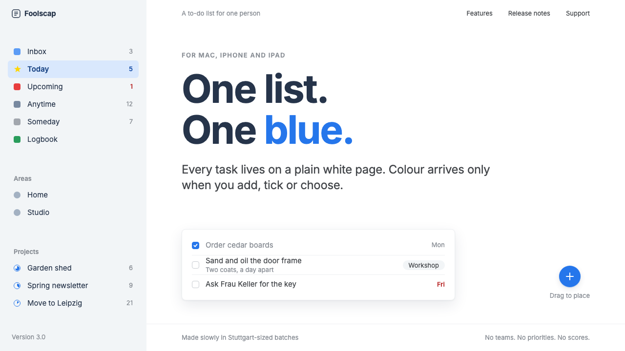 Things 3Colour saved for action. White page, cool-grey sidebar, one blue for the plus…
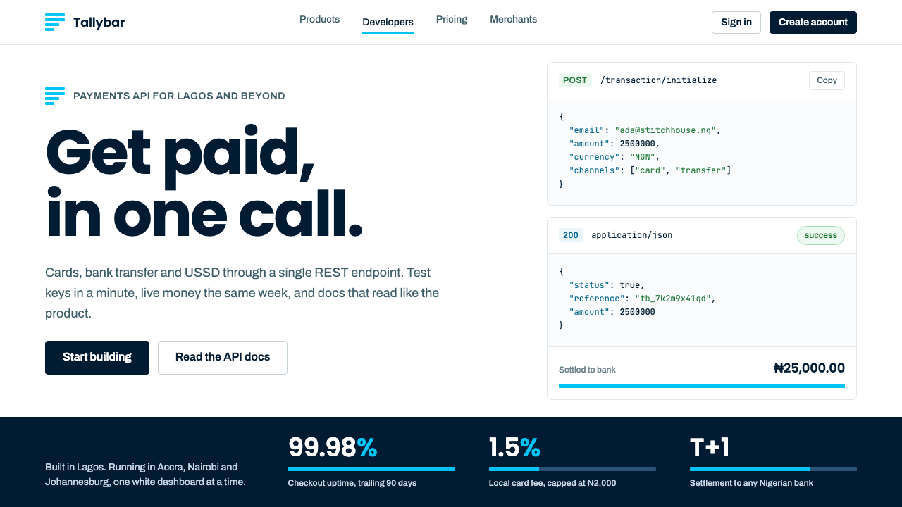 PaystackPlain-spoken payments infrastructure. White page, navy ink, four flat cyan ba…
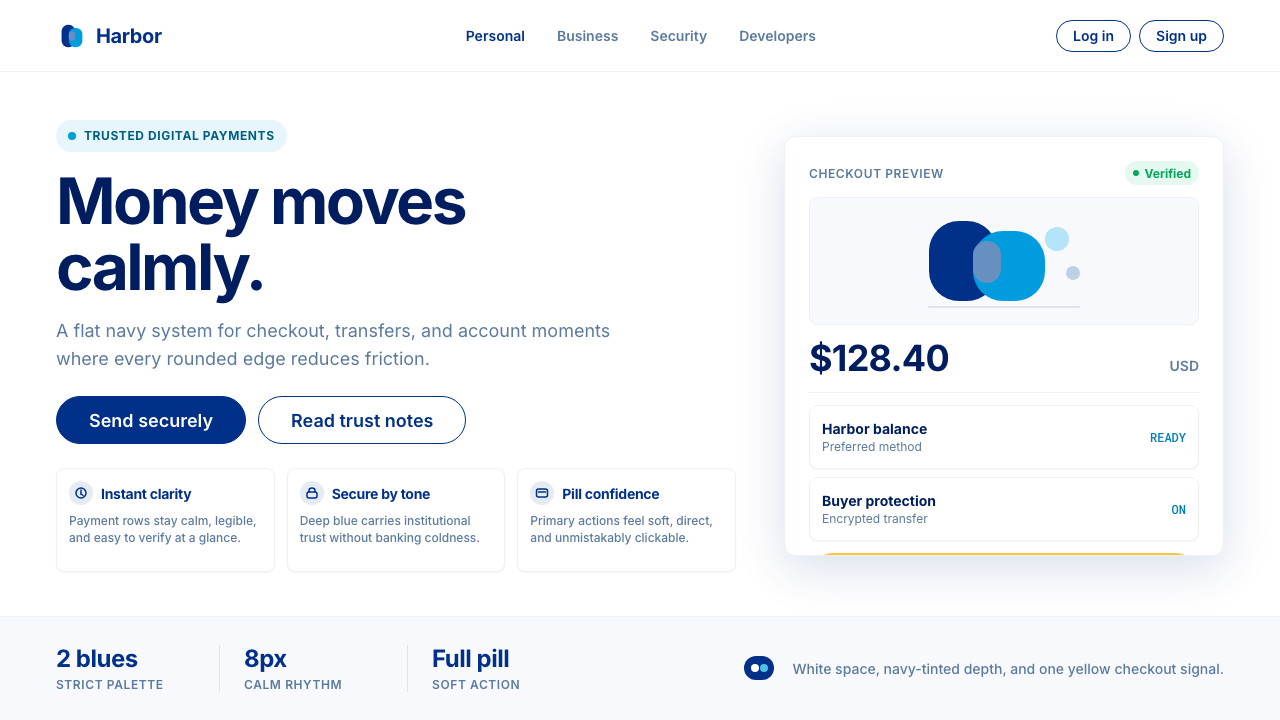 PayPalTrust without coldness. Deep navy, sky cyan, white cards, and pill checkout c…
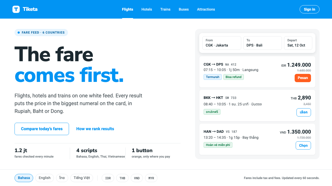 TravelokaThe fare comes first. Azure band, white cards, price as the biggest numeral,…
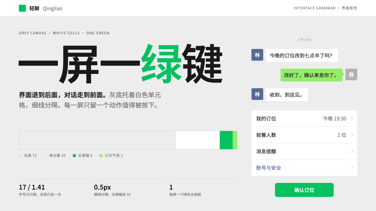 WeChatRecedes on purpose. Grey canvas, white hairline cells, and a single green but…
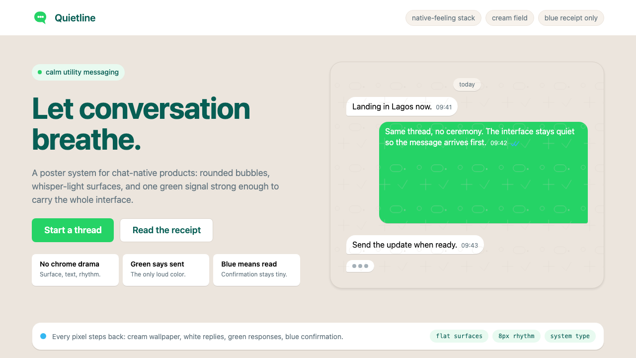 WhatsAppConversation is the interface. Cream wallpaper, green bubbles, and tiny blue…