What is Stack Overflow?
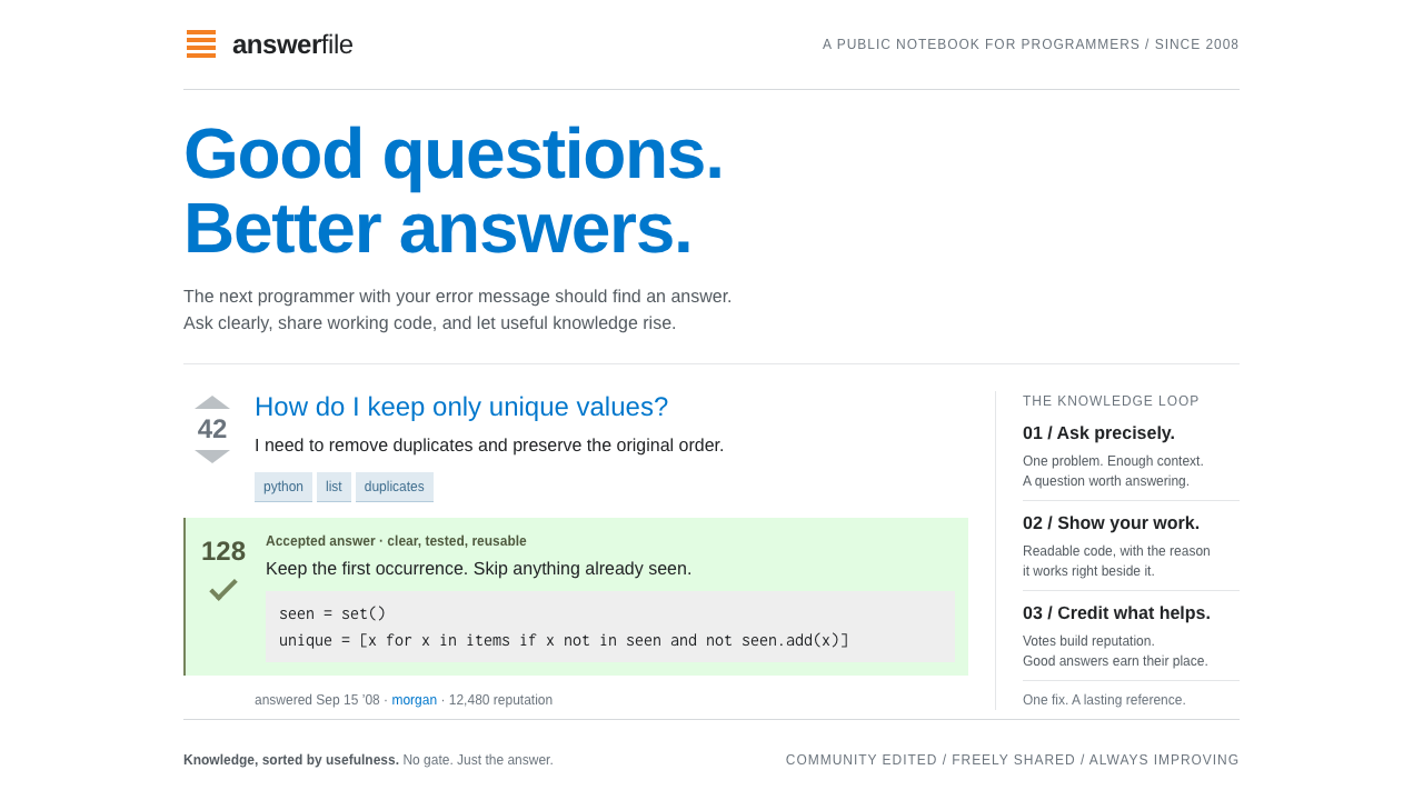
Stack Overflow looked like a document, not an app: a dense white page where a question, a vote cell and a stack of answers did all the work, and a pale-green tint quietly marked the one that solved it.
Stack Overflow in brief
The Stack Overflow style recreates the interface of the programming question-and-answer site around its early years, approximately 2008 to 2010, when it used a fixed-width white layout. Every page is a plain document. A question sits at the top, a vote cell beside it, and answers are stacked underneath, each with its own score. The design is text-first and very dense, with almost nothing present that does not help someone find, judge or read an answer.
Colour is tightly rationed. Orange is kept for the logo and the Ask Question tab. Blue is used for links. Powder blue fills square tag chips. A pale green tint, together with a check mark, marks the accepted answer. Code blocks sit on a light grey ground in monospaced type. The rest is white, black text and thin gray rules, which makes the few coloured elements carry real meaning.
The look is built around a simple social mechanism: good answers rise. Votes sort the page, reputation points reward contributors, and gold, silver and bronze badges turn helpfulness into a game people take seriously. The visual design supports that mechanism by making vote counts large, clear and always in the same place.

Where does Stack Overflow come from?
Stack Overflow was created by Jeff Atwood and Joel Spolsky. It went through a private beta in August 2008 and opened to the public on 15 September 2008, with its people spread between New York City and California. Jarrod Dixon and Geoff Dalgas were among the early team members associated with building the site. The founders' stated aim was practical: to give programmers a better place to land after pasting an error message into a search engine, a place where the answer would be short, correct and findable.
That purpose determined the look. The earlier landscape of programming help was forums, mailing lists and long threads in which an answer might be buried across many pages and many contradictory replies. Stack Overflow replaced the thread with a structure: one question, a set of answers ranked by votes, the accepted answer marked and moved into view. The interface did not need decoration, because the structure was the product. A fixed-width white layout kept the reading column steady and the line lengths comfortable for text and code.
The reputation system is part of the visual language. Points beside names, small coloured badge counts and the vote arrows with their scores turn each page into a scoreboard of trust. Gold, silver and bronze give the community a shared, slightly playful vocabulary for status. Because the design avoids ornament, these small signals stand out and are quickly scanned; a reader can judge an answer's credibility in a glance.
Stack Overflow belongs to the Web 2.0 community-site tradition, and it also belongs to the family of gamified reputation and badge systems that shaped online participation in those years. It later became the centre of the Stack Exchange network, with the same document-like interface applied to many other subjects. The style is now a reference for knowledge bases, documentation sites and forum-like tools that want dense, trustworthy clarity above all.
What defines the Stack Overflow look?
Document-like white page
The page is a plain white document in a fixed-width column. There are no hero images or decorative panels; content starts at once. The result reads like a well-edited reference sheet, with line lengths that are comfortable for prose and code alike.
The vote cell
Beside every question and answer sits a narrow vote cell with an up arrow, a score and a down arrow. It is always in the same place and the same size. The repeated position teaches readers where to look for quality, and the score becomes the page's main ranking signal.
Pale-green accepted answer
The answer chosen as the solution carries a green check mark and a faint green tint. The green is quiet but unmistakable against a white page, and it appears for only one purpose: resolution. That strict meaning makes it the most important colour on the page.
Square powder-blue tags
Topic tags are small square-cornered chips filled with a powder blue and set in darker blue text. They are compact enough to sit in a row beneath a question without clutter. The square corners distinguish them from rounded buttons and give the page a utilitarian, tool-like feel.
Orange kept scarce
Orange appears in the logo, which looks like a stack of paper trays, and on the Ask Question tab. It is never used for decoration. Because it is so scarce, it directs attention to the one thing the site most wants people to do: ask or contribute.
Code on light grey
Code blocks use monospaced type on a light grey ground, clearly separated from surrounding prose without strong borders. Inline code gets the same treatment on a smaller scale. This keeps the reading flow intact while making code instantly findable.
Reputation and badges
Reputation numbers sit beside usernames and gold, silver and bronze badge counts follow them in small coloured dots. The scale is deliberately tiny. These signals add trust and a game-like layer without distracting from the answer itself.

Who shaped Stack Overflow?
Co-creator of Stack Overflow, who with Joel Spolsky launched the site in 2008 as a better home for programming answers.
Co-creator of the site alongside Atwood, whose partnership shaped its question, answer and reputation model.
Early team member associated with building and running the site.
Early team member connected to the site's development and community.
How do you use Stack Overflow today?
On slides, the Stack Overflow style is a good fit for developer-facing talks, internal knowledge sharing, onboarding material and any deck that is mostly text and code. Use a clean white slide, a narrow column of left-aligned type, and one orange element as the title mark. Present a question and a short list of answers with vote-style numbers on the left. Use the pale green tint for the recommended answer and keep everything else black on white.
For data slides, favour compact tables and ranked lists over decorative charts. A leaderboard in the manner of a reputation list, with small badge dots, communicates ranking at a glance. Use blue for links and references, light grey for code or raw values, and green only for confirmed or resolved items. Dense is fine here, as long as alignment and spacing stay strict.
In web and app interfaces, the style suits question-and-answer sites, documentation, internal wikis, support forums, issue trackers and community help centres. Build pages as documents: a title, metadata, a vote or rating cell, and a stack of responses sorted by usefulness. Add tag chips with square corners, show reputation figures near names, and mark the accepted solution clearly. The structure does the persuading, so resist anything that interrupts the reading column.
For editorial and marketing, the style communicates trust and plainness. Developer newsletters, technical blog posts and help articles can adopt the white page, blue links and code-on-grey treatment to feel credible and quick to scan. Orange works as a single call-to-action accent. Avoid hero photography and decorative flourishes; the voice should be that of a helpful colleague, not a campaign.
The most common mistake is to add colour. Extra accents, rounded decorative cards and gradients destroy the meaning of the few colours the system relies on, especially the single green that says solved. Another is to make the layout airy; the density is part of the effect. Keep the column fixed, the vote cell consistent and the orange scarce, and the page will feel trustworthy.

Stack Overflow — FAQ
What is the Stack Overflow design style?
It is the early 2008 to 2010 look of the Q and A site: a dense white document page in a fixed-width column, vote cells beside every post, blue links, square powder-blue tag chips, code on light grey, and a pale-green tint marking the accepted answer.
Why is orange used so little?
Orange is saved for the logo and the Ask Question tab, which is the main action the site wants. Keeping it scarce means it always points at something important, and it never competes with the content on the page.
Who created Stack Overflow?
Jeff Atwood and Joel Spolsky created it, with early team members including Jarrod Dixon and Geoff Dalgas. It had a private beta in August 2008 and launched publicly on 15 September 2008.
What kinds of products suit this style?
Q and A sites, documentation, wikis, support forums, issue trackers and knowledge bases. It is ideal anywhere that dense, scannable, trustworthy text matters more than visual flair.
How does the style show which answer is best?
Through two signals: the vote score in the cell beside each answer, and the pale-green tint with a check mark on the accepted answer. Together they let readers judge credibility at a glance without any extra decoration.
Related design styles
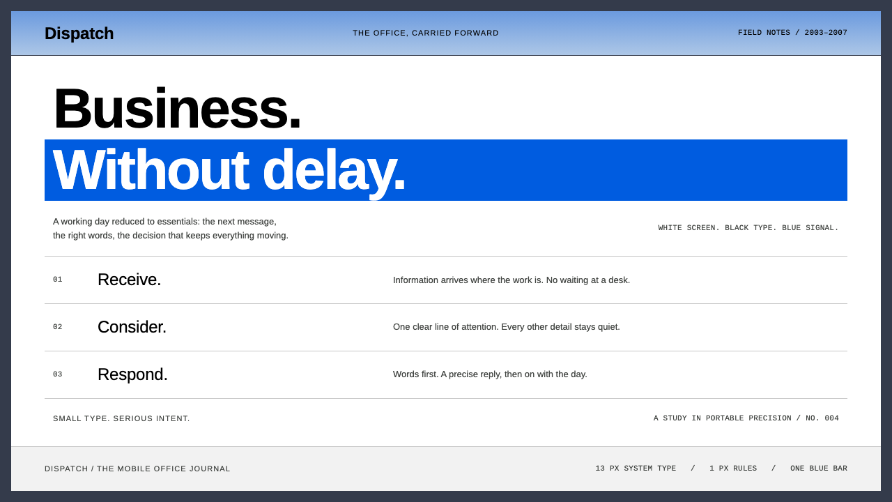 BlackBerryPortable precision. Dense black Arimo, white ruled rows and one decisive blue…
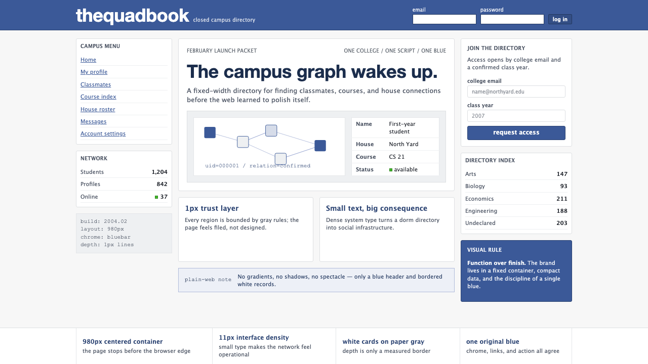 Facebook 2004Dorm-web austerity. Original blue, 980px grid, 1px borders, tiny Lucida Grand…
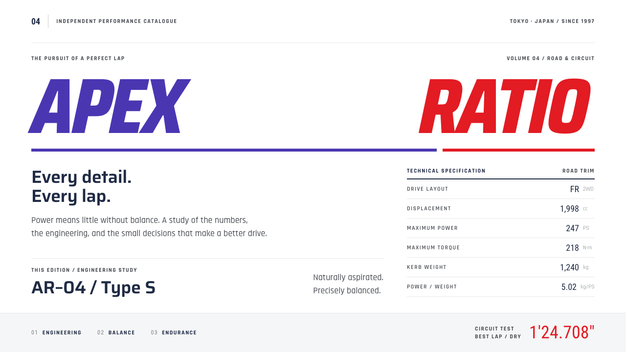 Gran TurismoPrecision without noise. Slanted violet-red type and hairline spec rows on sh…
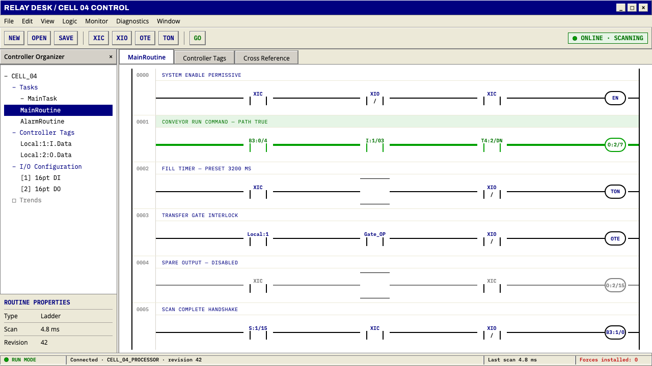 PLC Ladder LogicLogic made visible. Black rails and navy mnemonics turn green wherever the ci…
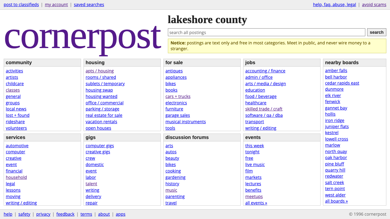 craigslistNothing designed, everything findable. Blue underlined links and a purple ser…
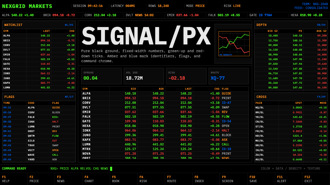 Financial Terminal MonoMaximum signal per pixel. Pure black, IBM Plex Mono, green-red ticks, amber-b…