About Super Famicom
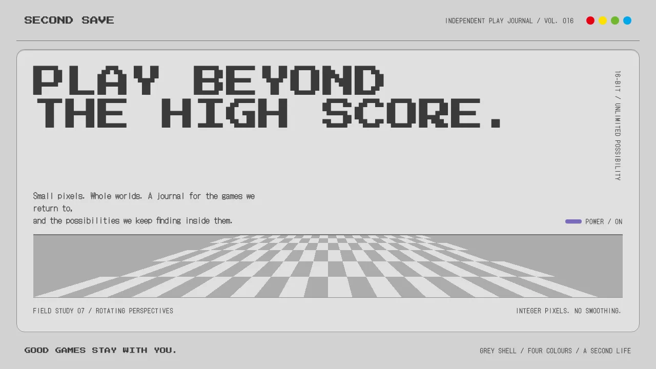
A design system cut from the Super Famicom shell: matte light-grey ABS, a darker recessed top panel, charcoal switches and a D-pad, and the purple A/B buttons of the US SNES as the one loud colour in the hand.
On screen it runs at 256x224. Bitmap headings, integer-scaled pixels, a Mode 7 floor that rotates toward the horizon, and the red, yellow, green and blue four-dot mark used for status and data.
- Origin
- Kyoto, Japan; Redmond, Washington, USA
- Era
- 1990-2003 (Japan launch November 1990; North America August 1991; production ended 2003)
- Key figures
- Masayuki Uemura · Lance Barr · Shigeru Miyamoto
- Movements
- 16-bit console generation · Japanese consumer-electronics industrial design · 1990s pixel art and bitmap type
Super Famicom design spec
Colors
Background
Surface
Primary
Secondary
Accent
Text
Typography
Press Start 2PHeadings
DotGothic16Body
Unlock for 1 credit
The other 11 sections — buttons, cards, spacing, motion, techniques and more — open once you unlock. Download the DESIGN.md or send it to your AI in one click. Unlock once, yours forever.
Sign up nowHave an account? Sign in
Styles similar to Super Famicom
Also inspired by brands & products, with a close feel.
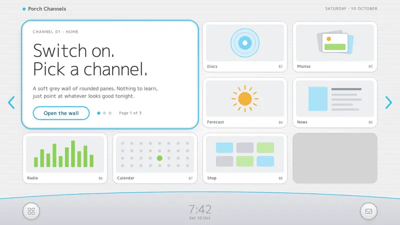 Wii MenuSwitch-on calm. White TV panes on a grey scanline wall, one thin blue line on a silver dock.
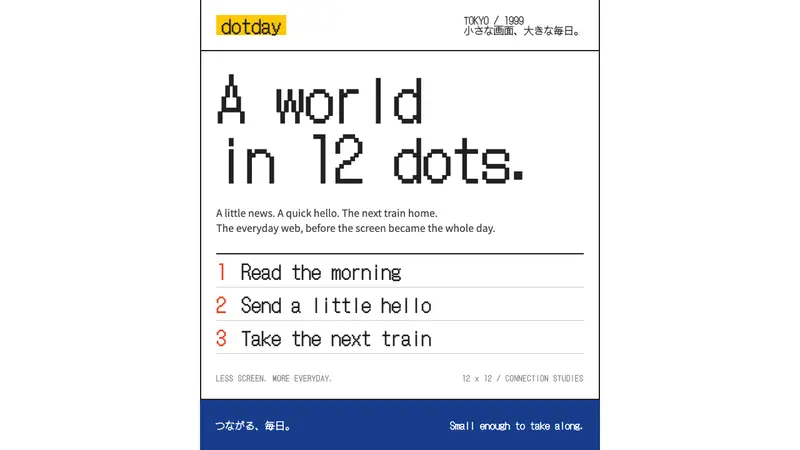 i-modeA whole world in a few dots. Bitmap type, white space and yellow bring the pocket web back.
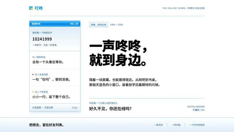 Tencent QQFriendship in a little blue frame. Glossy sky-blue chrome, white panes, tiny red signals.
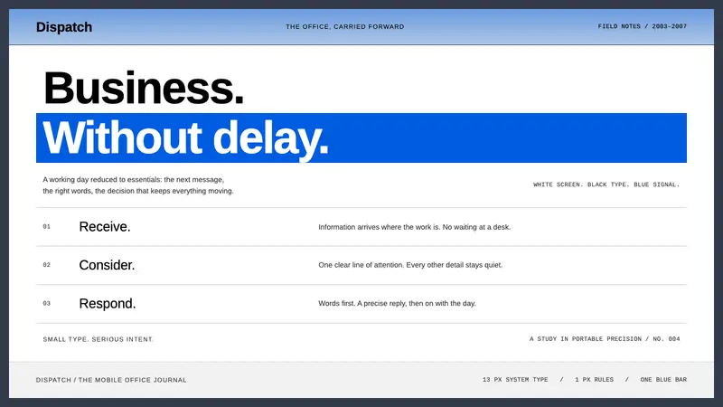 BlackBerryPortable precision. Dense black Arimo, white ruled rows and one decisive blue bar.