What is Sumerian Cuneiform Tablet?
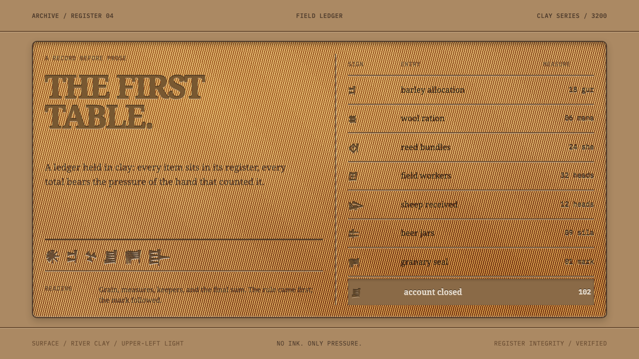
Sumerian cuneiform design treats the page as a slab of river clay ruled into a ledger grid, where marks are pressed into the surface instead of printed on it.
Sumerian Cuneiform Tablet in brief
The Sumerian cuneiform tablet is the oldest data design that survives, and this style takes it literally. An administrative tablet is a palm-sized slab of river clay, ruled into columns and horizontal registers with a straightedge before a single sign was pressed into it. What went onto those grids was not literature. It was barley, sheep, rations, names and totals, each one locked to a rule.
The visual consequence is a surface rather than a sheet. The page is clay, not paper, so type sits in the surface instead of on it, dividers are scored grooves with real width instead of hairlines, and the ledger grid carries the layout instead of decorating it. Marks are impressed, which means they have a darker upper edge and a lighter lower edge, the look of a shape pressed into something soft.
Nothing on a tablet is ornamental. The table is the protagonist, alignment is flush left along the grid lines, and the slab itself is a plain block. The result reads as calm, material and precise at once: the visual language of the first place where people wrote things down so that the numbers would add up.
Where does Sumerian Cuneiform Tablet come from?
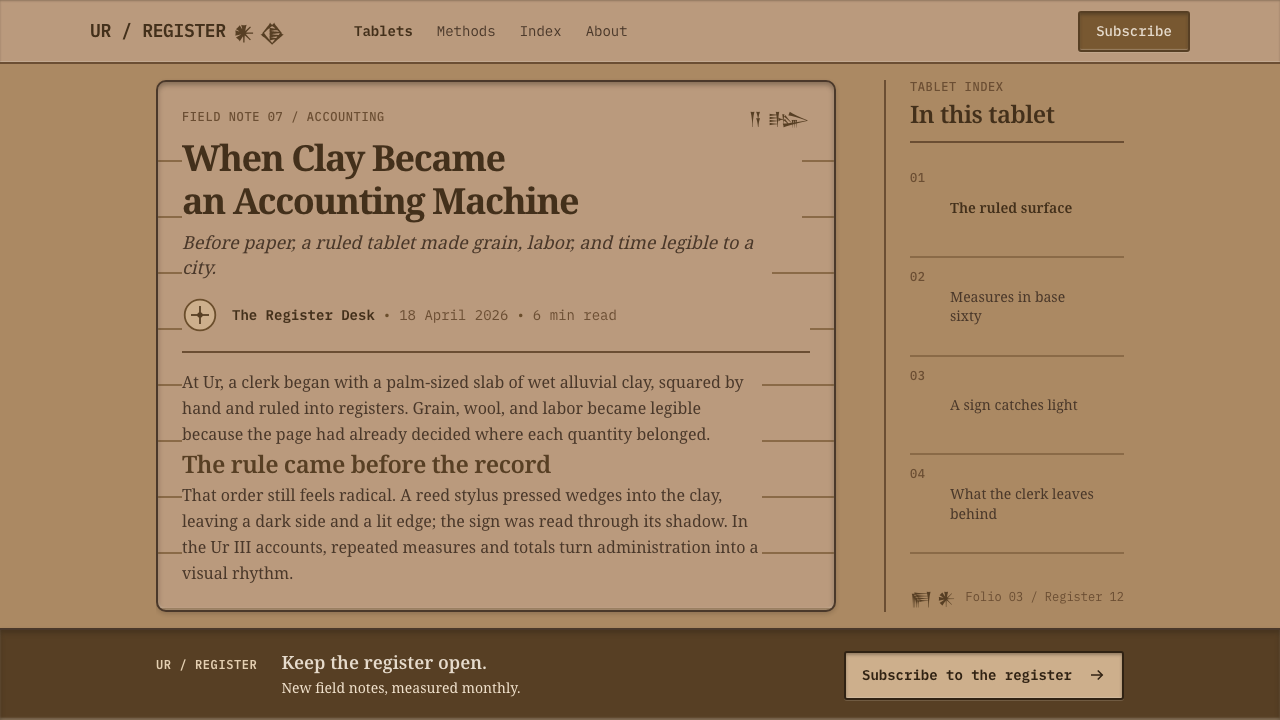
Before anyone wrote a sentence, someone in Uruk wrote a table. In the library's record, the story of cuneiform begins around 3200 BCE with proto-cuneiform bookkeeping in southern Mesopotamia, in cities such as Uruk, Ur and Jemdet Nasr in present-day Iraq. The earliest scribes were not poets or royal historians. They were accountants, tracking barley, sheep, rations and people for the administrations they served.
The method was physical. A scribe formed a slab of damp river clay that fit in the hand, ruled it into columns and horizontal registers with a straightedge, and then pressed signs into the surface with a reed pen, one wedge-shaped impression at a time. The wedge gives cuneiform its name. Because the clay was pressed rather than drawn on, every sign is a small relief with a shadowed upper edge, a property this design system deliberately reproduces.
The tradition matured over more than a thousand years. The library's range runs from the Uruk IV proto-cuneiform stage through the Ur III archives, around 2000 BCE, when palace administration produced ledgers of great regularity: columns, cells and totals arranged so clearly that a modern reader still recognises a report. The movements listed for this style are proto-cuneiform bookkeeping, Ur III palace administration and Sumero-Akkadian tabular formatting, and they are three moments in one history of making records legible.
Later readers brought the tablets back into view. Henry Rawlinson's work on deciphering cuneiform and Samuel Noah Kramer's work on Sumerian literature and society made the clay legible to modern readers, while Enheduanna stands for the moment when the same technology carried authored poetry. Together they show that the earliest data design came first, and that the written tradition which followed was built on the same clay.
What defines the Sumerian Cuneiform Tablet look?
River-Clay Ground
The ground is a mid-tone, earthy clay colour, neither white nor dark. It is not a paper tint; it is the material of the object. Because the surface is mid-tone, both a darker shadow and a lighter highlight can be seen on it, which is exactly what the impressed marks and scored grooves need. Large pale or pure white areas would turn the tablet back into a sheet of paper.
Impressed Marks
Type is pressed into the surface rather than printed on it, so letters carry a shadowed upper edge and a lighter lower edge, like a shape stamped into something soft. The faces are calm, sturdy serifs whose terminals suggest the entry of a stylus, and the contrast between letter and ground is gentle, as it is on real clay. Marks should feel structural, not decorative.
Scored Grooves
Dividers are scored lines with measurable width, not hairlines. Each has two edges, a shaded side and a lit side, and they read as channels cut into the slab. They are the structure of the page: columns and horizontal registers are drawn before any content exists, and content then sits inside the cells the grooves define.
The Ledger Grid
The ledger grid carries the layout rather than decorating it. Columns hold categories, rows hold entries, and each item locks to a rule. Barley, sheep, rations and names each have a place, and totals sit where a reader expects them. Whatever the content is, the grid decides its position first and its look second.
Flush-Left Alignment
Everything aligns left along the grid lines. Text lines have a natural ragged right edge, headings are not centred, and nothing floats off the structure for visual effect. This is not austerity for its own sake: in a ledger, alignment is how the eye travels from a name to a quantity across a row.
Totals as Hierarchy
Hierarchy on a tablet comes from structure, not from styling. An entry belongs to a row, a row belongs to a register, and the total closes the register where the reader expects to find it. Emphasis is therefore positional: the important figure is the one that sits at the foot of the column, set in the same impressed mark as everything else. Bold weights, coloured badges and callout boxes are not needed, because the rule already says what counts.
Zero Ornament
A tablet is a plain block, and the style keeps it plain. There are no flourishes, no decorative borders, no ambient glow and no illustration. Interest comes from material, meaning the clay, the grooves and the shadow in each mark, and from the exactness of the grid. The restraint is the argument: this is the oldest data design we still have, used as a data design.
Who shaped Sumerian Cuneiform Tablet?
Enheduanna is the best-known name from the Sumero-Akkadian world and is widely regarded as the earliest author known by name. She served as a high priestess at Ur and is credited with hymns. She matters to this style because she marks the point where the clay medium, which began as a ledger for barley and sheep, was also used for authored voice. The library lists her as a key figure of the tradition the system draws on.
Rawlinson was a nineteenth-century British officer and scholar whose work on the trilingual inscription at Behistun was central to the decipherment of cuneiform. Without decipherment the tablets would remain beautiful but unreadable objects. His place in this style's record is a reminder that our sense of what a tablet 'looks like' was shaped by the people who learned to read it.
Kramer was a twentieth-century Sumerologist who did much to bring Sumerian writing, literature and everyday life to a wide audience. His work shows the other side of the tablet: beyond ledgers, the same clay preserved poems, proverbs and myths. For a design system built on ledger logic he is a useful counterweight, a reminder that a table is only one thing the surface can hold.
How do you use Sumerian Cuneiform Tablet today?
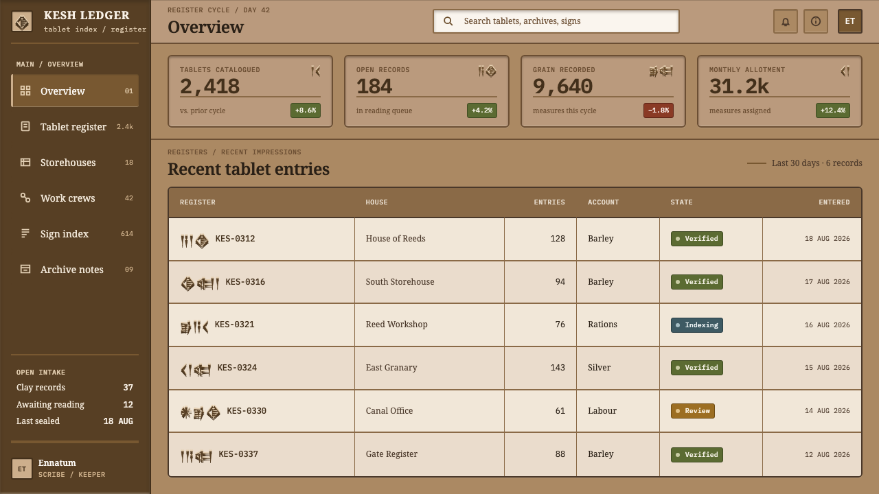
Sumerian Cuneiform Tablet is a data-first style. It suits content that is already structured, such as schedules, inventories, comparisons, logs and archives, and it works best when the grid is real, meaning the layout is actually built from columns and rows rather than painted on.
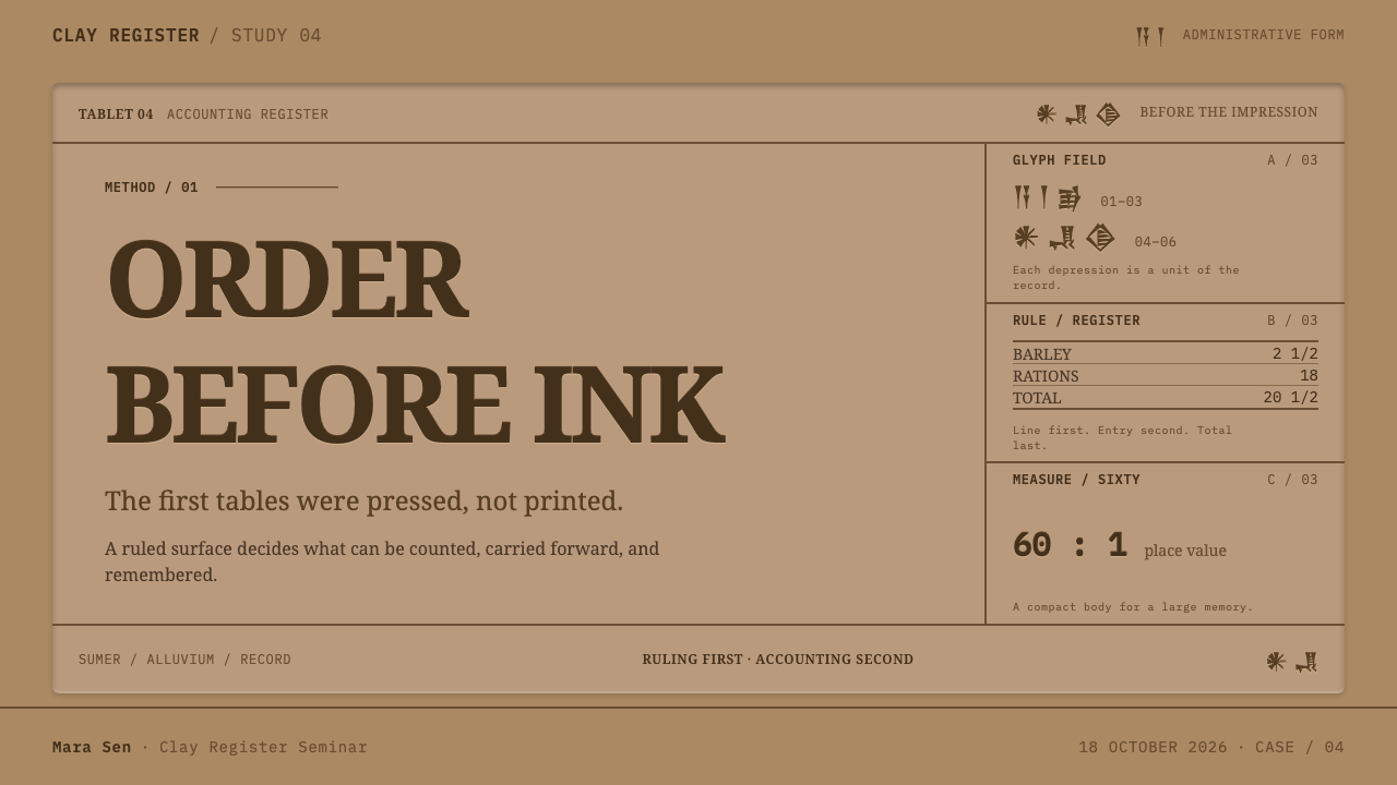
For slides, the cover can be a single slab: a mid-tone clay field, the title pressed into it, one scored groove beneath. Content slides should be tables, even when the material is prose; set key statements in the first column and supporting detail across the row. Data slides are the natural home of the style, since a bar chart or comparison matrix can sit in the same ledger grid as the text, with groove-like gridlines, impressed numerals and a clearly marked totals row.
For web interfaces, the style fits dashboards, admin tools, billing pages, pricing comparison tables, changelogs and documentation indexes. Panels read as recessed or raised slabs, input fields as pressed-in wells, and dividers as grooves with a shaded and a lit edge. Keep the alignment flush left and let position in the table, not decoration, communicate hierarchy. Avoid hairlines and soft blurred shadows, which would turn clay back into paper.
For editorial and marketing work, it suits archives, museum and history projects, finance and accounting products, data journalism and annual-report spreads: anywhere the pitch is that the numbers can be trusted. Lead with a table or a ruled register rather than a hero image, and let a single large number or name sit in the grid as the focal point.
The most common mistake is to read 'ancient' as 'aged parchment' and add cracked textures, torn edges, sepia filters or pseudo-cuneiform display typefaces. None of that is in the source. The style is not a costume; it is a discipline of surface, groove and grid. The second mistake is to use hairline rules and soft shadows, which gives you a clean modern table in clay-coloured paint and loses the pressed, material quality.
Sumerian Cuneiform Tablet — FAQ
Do I need cuneiform glyphs or a cuneiform font?
No. The style takes its structure and material from the tablets, not their script. Use a calm, legible serif for real content and let the impressed look come from shadow and highlight. Imitation cuneiform lettering usually turns the page into a theme-park prop and makes ordinary text harder to read.
Why is the style built around tables instead of text?
Because that is what the earliest tablets were. Before anyone wrote a sentence, someone in Uruk wrote a table: the administrative tablets record barley, sheep, rations, names and totals in ruled columns and registers. The style honours that by letting the grid carry the layout and by making tabular content the default case rather than a special component.
How does it differ from a parchment or ancient-scroll look?
A parchment look is a texture applied to a normal page. The tablet style changes how objects behave: marks are pressed in rather than laid on, dividers have width and two lit edges, and the page is a bounded slab you could hold in one hand. It is also much stricter, with no flourishes and no decorative borders.
Can the style work in a dark theme?
Only with care. The identity depends on a mid-tone clay surface where a shadowed edge and a lit edge are both visible. A very dark ground flattens the highlight and a very light one flattens the shadow. If a dark variant is needed, keep the material feeling and the grooves, darken the clay without turning it black, and check that numerals stay clearly legible.
What content does the style handle worst?
Content that wants atmosphere, imagery or emotional pull: lifestyle brands, photography-led storytelling, entertainment and anything that depends on large open space to feel generous. The tablet is a bounded, material object built for records. It rewards structured, repeatable information and punishes designs that try to use it as a backdrop for mood.
Related design styles
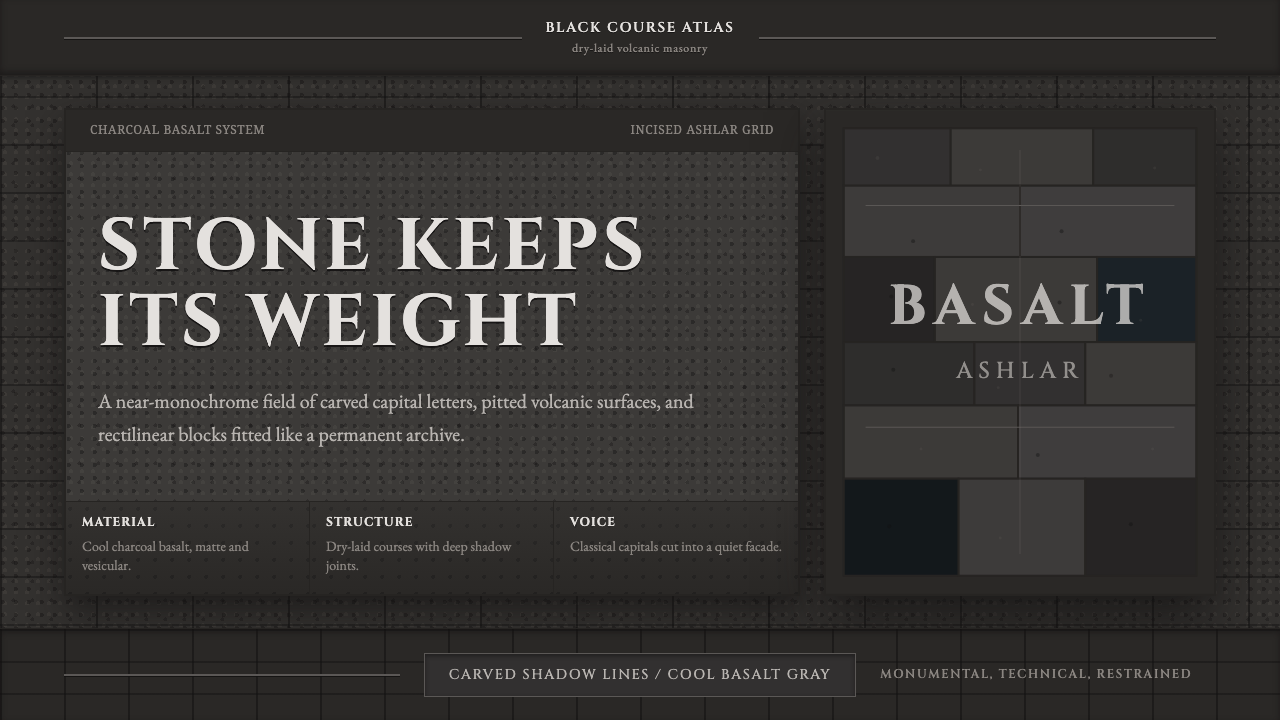 Hauran Basalt StoneMonolith refuses shine. Charcoal Cinzel capitals lock into dry-laid basalt gr…
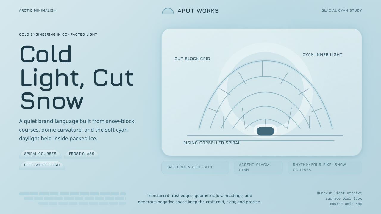 Inuit IglooCold craft, clear light. Glacial cyan and Jura type trace a spiral-block dome…
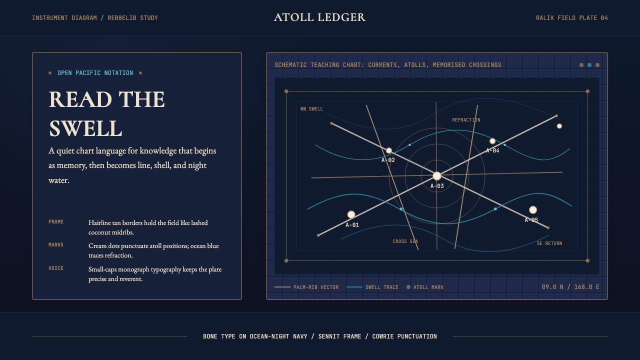 Marshallese Stick ChartQuiet ocean science. Bone Cormorant type and sennit lines chart swells on ink…
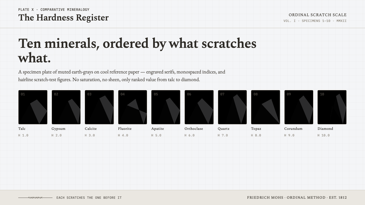 Mohs Hardness ScaleRanked by what scratches what. Ten mineral-gray chips on cool chart-white, en…
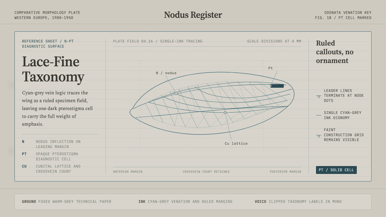 Dragonfly Wing VenationPrecision, nearly weightless. Cyan-grey veins rule a foxed paper taxonomy pla…
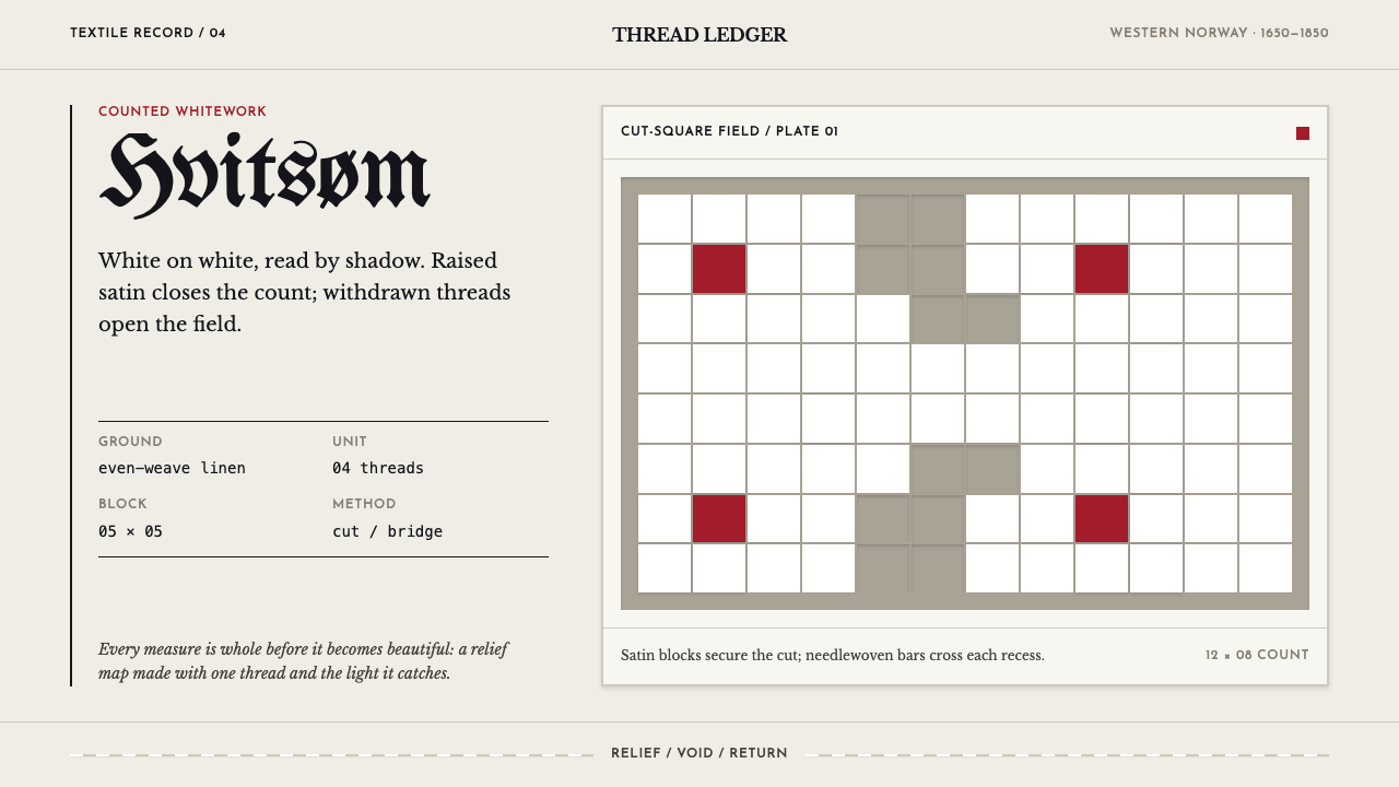 Hardangersøm WhiteworkPrecision becomes relief. White satin and recessed cut squares make linen spe…