What is Marshallese Stick Chart?
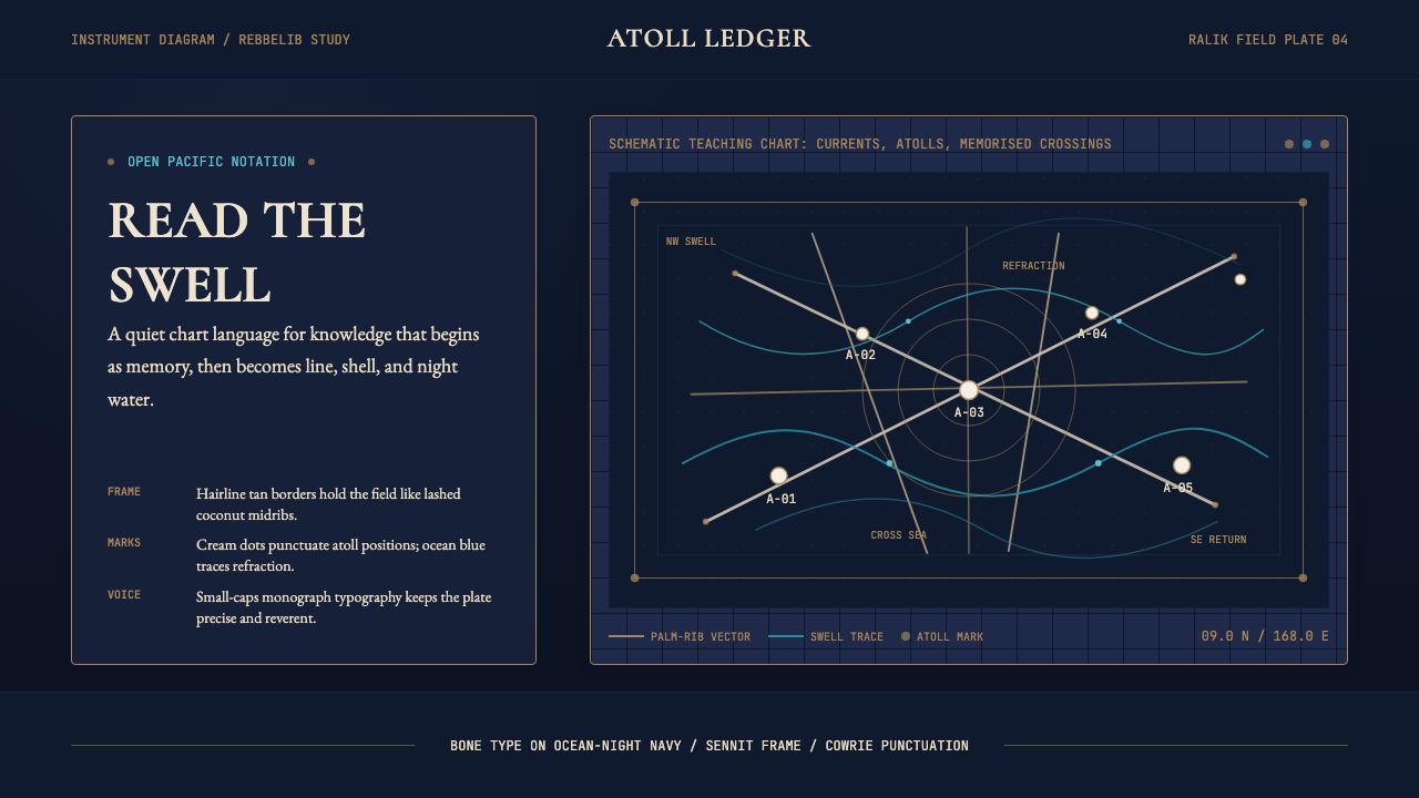
Carved from coconut-leaf ribs and lashed with sennit cord, the Marshallese stick chart is the most beautiful navigation instrument ever made — and a design system that turns ocean knowledge into visible geometry.
Marshallese Stick Chart in brief
Marshallese stick chart is a design aesthetic derived from the rebbelib and mattang navigation charts of the Marshall Islands — physical instruments woven from split coconut-leaf midribs, sennit cord, and cowrie shells that encoded centuries of Pacific wayfinding knowledge into a compact, portable object. As a visual system, it translates that tradition into a digital palette: deep ocean-night navy as the ground, bone-pale elements for structure and type, sennit tan as a secondary accent, and ocean-swell blue for punctuation. The result reads like an instrument diagram from a nineteenth-century Royal Geographical Society monograph — schematic, precise, and quietly reverent.
The stick chart's aesthetic logic is fundamentally diagrammatic. Every element earns its place by encoding information: the curving strokes of the midribs represent swell refraction around atolls, the knots of sennit mark convergence zones, the shells fix the positions of specific islands. Nothing is decorative. This same principle governs the design system — bone-white lines on navy are not ornamental; they are carriers of meaning, the visual equivalent of wave patterns read by a navigator lying on the hull of a canoe at night.
What distinguishes this aesthetic from other ocean- or nautical-themed systems is its scientific rather than romantic sensibility. This is not the weathered-rope-and-anchor vocabulary of sailing nostalgia. It is the vocabulary of empirical measurement — the coolness of an instrument, the authority of a chart, the satisfaction of knowledge made legible. Applied well, it evokes precision, deep expertise, and an unhurried confidence rooted in centuries of tested observation.
Where does Marshallese Stick Chart come from?
The Marshall Islands occupy roughly two million square kilometres of open Pacific, organised into two parallel chains of low-lying coral atolls — the Ralik (sunset) Chain to the west and the Ratak (sunrise) Chain to the east. Long before European contact, Marshallese navigators had developed an extraordinary system for reading the ocean itself: the regular swells generated by distant trade winds produce predictable refraction and convergence patterns around each atoll, and a skilled navigator could feel these patterns through the hull of the canoe, detecting the presence of land beyond the horizon. The stick charts were the pedagogical instruments used to teach and transmit this knowledge.
Three types of charts existed. The mattang was a small, abstract teaching tool used on land to explain the general principles of swell behaviour — how waves bend around an island, how two sets of swells interfere with each other. The rebbelib covered a larger section of the island chain, showing the relative positions of atolls and the swell patterns connecting them. The medo was the most comprehensive, mapping the entire chain. Critically, these instruments were not carried aboard canoes during voyaging — they were memory aids and teaching tools, not in-voyage maps. The knowledge they encoded was meant to be internalised.
European documentation of the charts began in earnest in the 1860s, when the German naturalist Otto Finsch collected specimens and the French naval officer and ethnographer A. Cheyne recorded observations. The American anthropologist William Davenport produced the first systematic academic analysis in the 1960s, followed by the New Zealand sailor and historian David Lewis, whose fieldwork in the 1970s attempted to understand the charts from the perspective of practising navigators. Their work established that the charts represented a coherent, empirically tested body of oceanographic knowledge — not mythological or decorative objects, as some early European observers had assumed.
Like many Indigenous knowledge systems, Marshallese wayfinding faced severe pressure through the colonial period. German administration from 1885, Japanese mandate from 1914, and American administration from 1944 each brought disruptions that weakened the transmission of navigational knowledge between generations. By the mid-twentieth century, the number of practising navigators who could read swells had dwindled dramatically. The revival began seriously in the 1990s and 2000s, led by figures including the navigator Korent Joel and the anthropologist Joseph Genz, whose collaborative work at the University of Hawaii documented surviving knowledge and supported a new generation of learners. Their efforts connected Marshallese wayfinding to the broader Polynesian voyaging revival associated with organisations like the Polynesian Voyaging Society, whose reconstruction voyages aboard traditional canoes had demonstrated the practical viability of non-instrument Pacific navigation from the 1970s onward.
What defines the Marshallese Stick Chart look?
Color Palette
The palette is built around three tonal registers drawn directly from the natural materials and environment of the charts themselves. Deep ocean-night navy — the color of the Pacific at midnight — serves as the primary ground, creating the sense of navigating through open darkness. Bone pale, the shade of sun-bleached coconut midrib and cowrie shell, appears for structural elements, typographic characters, and ruled lines. Sennit tan, the warm cord-brown of lashed fibre, provides secondary warmth without competing with the dominant cool. Ocean-swell blue is used sparingly as punctuation — the color of a breaking crest. The palette is scientific, not decorative: each tone maps to a physical material in the original instrument.
Line Weight and Structure
Lines are the primary building block of this aesthetic, as they are of the stick charts themselves. Structural lines — the equivalents of the midrib frame — are confident and even in weight, neither hairline-thin nor assertively heavy. Curved lines, representing swell arcs, have a natural, handmade quality rather than the mechanical smoothness of computed splines. Intersections are explicit — knot-points where two lines meet are marked or emphasized rather than allowed to dissolve. Grid lines, rules, and borders are all rendered in this same vocabulary: instrumental rather than decorative.
Typography
Type in this system has the quality of labelling on a scientific instrument — clear, unobtrusive, and clearly secondary to the diagram it annotates. Small capitals and restrained letterforms suit the register; condensed proportions allow labels to sit close to structural elements without crowding. Type is rendered in the bone-pale tone against the dark ground, creating legibility without any sense of visual competition with the diagrammatic structure. Type size is governed by information hierarchy rather than visual drama: the smallest readable size for secondary annotation, a modest step up for primary labels, a clear jump for navigational headings.
Whitespace and Silence
The original stick charts were objects of considerable negative space: the frame defined a territory, and within it, the lines and shells indicated only what mattered. Empty ocean — the unmarked dark between the structural elements — was not absence but information. The visual system inherits this quality. Large areas of the deep navy ground are left unmarked. Elements do not crowd each other. The space between a line and its annotation, between one structural block and the next, is as deliberately measured as the elements themselves. Overcrowding breaks the instrument quality immediately — the silence is part of the message.
Iconography and Markers
In the original charts, shells mark atoll positions — small, specific, unmistakably purposeful. The design system translates this into a marker vocabulary that is minimal and precise rather than illustrative. A position marker is a small geometric node, not a pictographic pin. A data point is a calibrated dot, not a filled emoji. Wherever icons appear, they are constructed from the same line-and-node vocabulary as the structural elements: geometric, restrained, and clearly part of the same instrument rather than decorative additions from a different visual register.
Texture and Surface
Despite the handcrafted origin of the reference object, the design system does not simulate craft texture. There are no linen grain effects, no roughened edges, no simulated fibre. The surface is flat and digital, which paradoxically preserves the instrument quality better than texture would. Texture would imply materiality and age; flatness implies precision and function. Where visual interest is needed, it comes from the tonal contrast between the deep navy ground and the bone-pale structural elements, not from applied surface effects.
Hierarchy Through Tone
With a restricted palette, hierarchy is established through tonal brightness rather than hue variation. The bone-pale structural lines and primary labels are the brightest elements on the dark ground and therefore the most immediately legible. Secondary annotation sits at an intermediate tone — perhaps a softer ivory or the muted sennit tan. Tertiary elements, where they appear, barely lift above the navy ground, visible on close reading but not competing for immediate attention. This tonal graduation mirrors the way a navigator reads a stick chart: the primary swell patterns first, then the secondary convergence markers, then the finest details.
Who shaped Marshallese Stick Chart?
Korent Joel is one of the last navigators who carried direct knowledge of swell-reading techniques passed down through traditional Marshallese apprenticeship. His collaboration with the anthropologist Joseph Genz in the 2000s and 2010s produced the most detailed documentation of surviving wayfinding knowledge and resulted in practical revival efforts — including open-ocean voyages undertaken to test and demonstrate the techniques. Joel's work made clear that stick-chart knowledge was not merely symbolic or historical but described real, recoverable navigational practice.
An anthropologist based at the University of Hawaii at Hilo, Genz spent more than a decade collaborating with Marshallese communities to document and revive wayfinding knowledge. His published research on the rebbelib charts and his work co-designing revival voyages with Korent Joel represent the most rigorous contemporary scholarship on the tradition. Genz's approach — treating Marshallese navigators as expert partners rather than informants — shaped the methodological ethics of the revival and produced documentation that could actually be used to teach the practice.
The American anthropologist William Davenport produced the first systematic scholarly analysis of Marshallese navigation charts in the 1960s, publishing work that distinguished between the three chart types and attempted to decode the oceanographic principles they encoded. His research established the charts as legitimate scientific instruments rather than decorative or ceremonial objects, and opened the field to subsequent analysis by navigators and oceanographers. Davenport's framing — that the charts described real, empirically valid hydrodynamic phenomena — was foundational for everything that followed.
David Lewis was a New Zealand physician, sailor, and historian whose 1972 book We, the Navigators became the defining text on traditional Pacific wayfinding. Lewis spent years sailing with indigenous navigators across Polynesia and Micronesia, learning their techniques firsthand and attempting to decode how star paths, swell patterns, and biological indicators (bird movements, phosphorescence) combined into a complete navigational system. His work on Marshallese swell-reading techniques brought the stick charts to the attention of an international audience and argued persuasively for their practical effectiveness.
The German naturalist and ethnographer Otto Finsch was among the first European scholars to collect and document Marshallese stick charts systematically, during his Pacific expeditions in the 1870s and 1880s. Finsch brought specimens back to European museum collections, where they became available for later scholarly analysis. His collecting work — whatever its colonial context — meant that physical examples of the charts survived into the twentieth century in museum archives, providing the material basis for Davenport's and Lewis's later analyses.
How do you use Marshallese Stick Chart today?
The Marshallese stick chart aesthetic is most powerful in contexts where precision, deep expertise, and calm authority are the desired signals. It suits products where the user is expected to engage seriously with complex information — scientific dashboards, data-dense research platforms, specialist tools for oceanography, logistics, meteorology, or any field that benefits from an instrument-like quality of interface. It is a poor fit for consumer-facing contexts that prioritize warmth, approachability, or playful discovery.
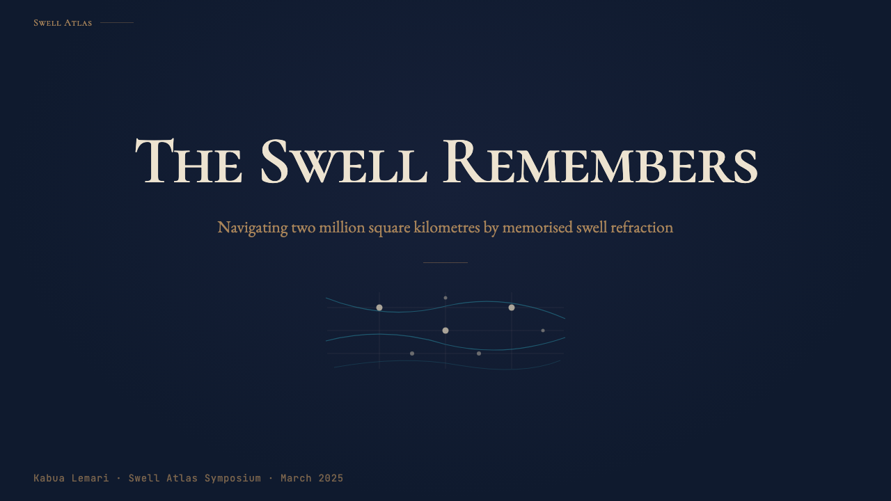
For presentation slides, the style works with great clarity on both covers and content pages. A cover benefits from a single large diagrammatic motif — a simplified arc or convergence pattern rendered in bone-pale lines on the deep navy ground — with the title set in small capitals at a controlled size. The restraint is the statement. Content slides should follow the same tonal discipline: one or two levels of type hierarchy established purely through size and brightness, data presented as geometric markers on a dark field, and consistent margins of unmarked ground framing every element. Data slides in this aesthetic become genuine instrument readouts — bar charts and scatter plots rendered as bone-on-navy diagrams with the minimum embellishment needed for legibility.
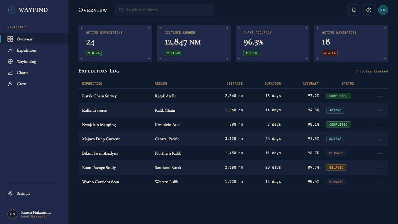
For web user interfaces, the system suits dashboards and monitoring interfaces where users need to extract information quickly and reliably. The approach: a very dark navy ground, bone-pale type and structural lines, tonal variation rather than hue variation for hierarchy, and the sennit tan reserved for a small number of interactive or highlighted states. Navigation should be typographic and minimal — labels only, no icon decoration beyond simple geometric indicators. Pricing pages in this aesthetic communicate authority and clarity without the usual warmth-and-approachability signals that consumer SaaS often deploys; appropriate for specialist or professional tools where the product's seriousness is itself a selling point.
For editorial and marketing work, the style supports strong typographic hierarchy and the quiet drama of a dark ground. An article layout in this aesthetic uses the navy ground as a stage: body text in the lighter bone tone, pull-quotes set in a slightly warmer ivory with additional leading, section breaks marked by a single ruled line rather than a decorative ornament. Marketing pages can deploy the diagrammatic motifs — simplified swell arcs, node networks, convergence patterns — as structural illustrations, filling the visual role that photography or illustration might play in a warmer system. The style is not naturally photographic; if imagery is needed, high-contrast treatment and strong cropping work better than naturalistic colour photography.
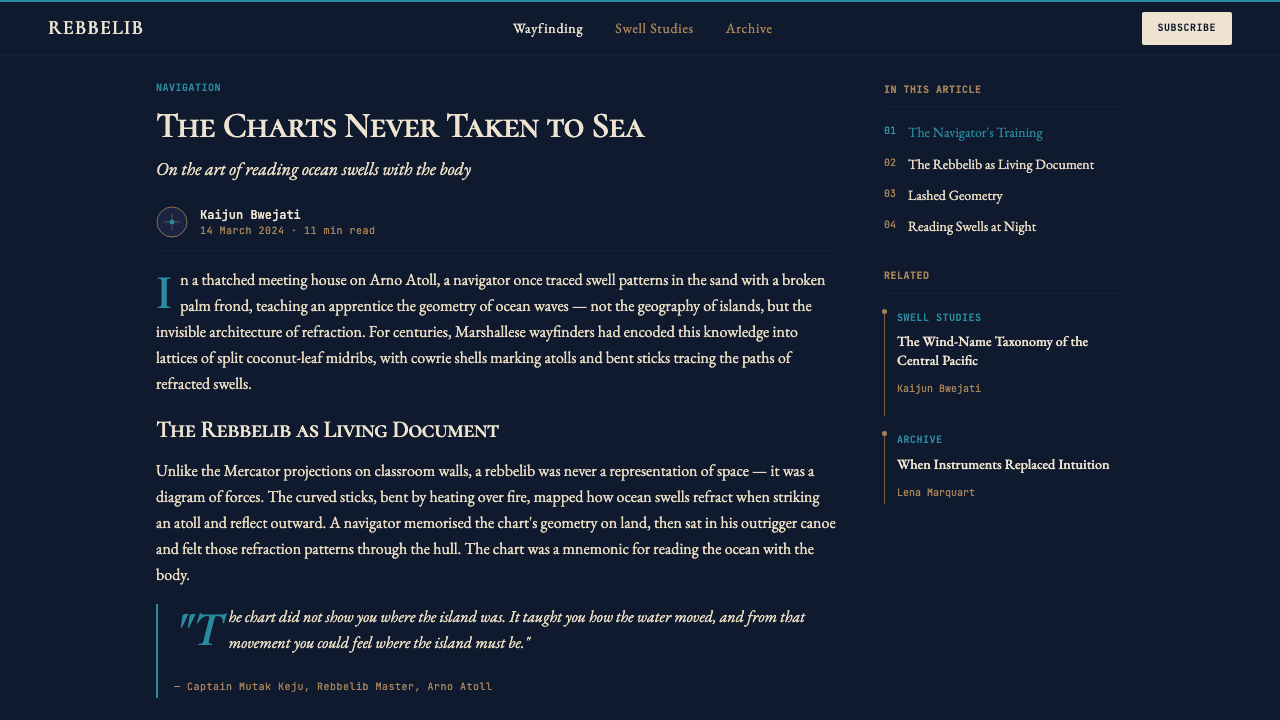
A common mistake when applying this aesthetic is decorating it. The temptation is to add texture (simulated linen or paper grain), warmth (amber or terracotta tones borrowed from craft imagery), or illustrative elements (wave drawings, fish, canoe silhouettes). Any of these moves the result from instrument toward artifact — from a navigation chart to a piece of maritime folk art. The discipline the style requires is treating every element as functional and every absence as intentional. If an element cannot be justified by what it communicates, it should not appear. The silence of the deep navy ground is the aesthetic's most powerful tool.
Marshallese Stick Chart — FAQ
Is this a dark-mode aesthetic, or can it work on a light background?
The canonical form of this aesthetic is dark-ground: ocean-night navy with bone-pale elements. The deep ground is not a preference or a trend choice — it is structural to the meaning of the system. The original stick charts were read by navigators at night, by touch as much as sight; the darkness is part of the instrument. A light-ground inversion is possible — bone-pale or warm white backgrounds with dark navy structural elements and sennit-tan accents — but it reads as a different register: more archival, more cartographic-print than instrument-diagram. The choice should be determined by context rather than platform dark-mode conventions.
How does this aesthetic differ from other Pacific or ocean-themed design systems?
Most ocean-themed design systems draw from the romantic vocabulary of seafaring: weathered ropes, anchor motifs, wave illustrations, shell textures, and the warm teal and sandy tones of tropical tourism. The Marshallese stick chart aesthetic is deliberately opposite in register. It draws from the scientific and instrumental rather than the romantic and sensory. Its palette is cool and nocturnal rather than warm and saturated; its lines are diagrammatic rather than illustrative; its reference is a navigation instrument, not a beach. If other ocean aesthetics evoke the experience of being at sea, this one evokes the cognitive act of understanding the sea — measuring it, mapping it, reading it as a system.
Does the style work for data visualization and information graphics?
It is exceptionally well suited. The original stick charts are themselves a form of data visualization — they encode oceanographic information (swell direction, refraction patterns, convergence zones) into a spatial diagram that can be read without a legend, because the encoding conventions are so clear and systematic. A design system built on this reference naturally produces interfaces where data feels like cartography: each element has a precise meaning, the ground is not decorative, and the reader is expected to engage analytically. Line charts, scatter plots, and network diagrams are the most natural fit; bold colour fills and cartoonish chart types sit in conflict with the aesthetic's instrument quality.
How should I handle colour accents without breaking the palette discipline?
The palette's fourth tone — ocean-swell blue — is the designated accent, and it should be used as sparingly as a cowrie shell on a stick chart: one or two marks that carry precise meaning, not a general decorative fill. Reserve it for a single interactive state (hover, focus, or active), a single category in a legend, or a single call-to-action element per screen. When ocean-swell blue appears frequently or fills large areas, it loses its punctuation quality and begins to compete with the bone-pale structural elements. The sennit tan, by contrast, can be used more broadly as a secondary tier of warmth — for borders, sub-labels, or supporting annotation — without disrupting the tonal hierarchy.
Is this aesthetic culturally sensitive to use commercially?
The questions worth asking are about intent and specificity. Using the aesthetic vocabulary of the stick charts — their diagrammatic structure, tonal palette, and instrument quality — as a design reference is a different act from reproducing or claiming the charts' specific navigational content, which is living knowledge belonging to Marshallese communities. Acknowledging the tradition clearly and accurately — as this design system does — rather than vaguely invoking a generic Pacific or nautical aesthetic is the more considered approach. Avoiding the reproduction of specific chart patterns as decoration, and not marketing the aesthetic as a cultural artifact rather than a design reference, are the practical lines. Supporting organisations working on Pacific wayfinding revival is one way to make the relationship less extractive.
Related design styles
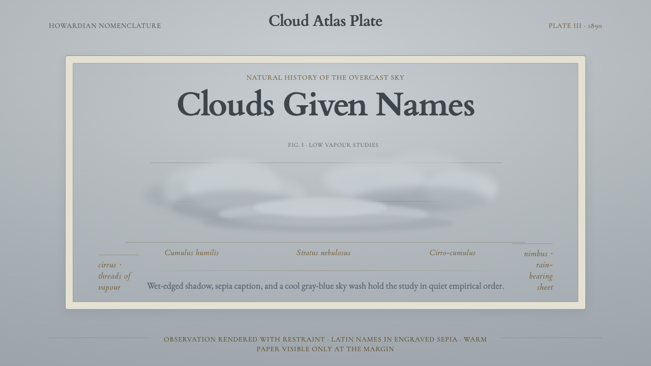 Cloud Atlas PlateObservation becomes atmosphere. Gray-blue wash, soft clouds, and sepia Latin…
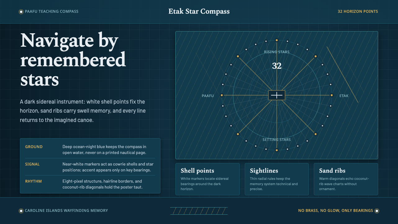 Micronesian Etak Star CompassNavigation as memory. White star points and sand ribs map a 32-point ocean-ni…
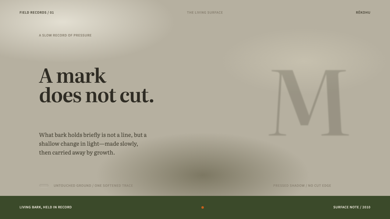 Moriori Rakau MomoriPressure, not incision. Literata shadows sink softly into pale, lichened bark.
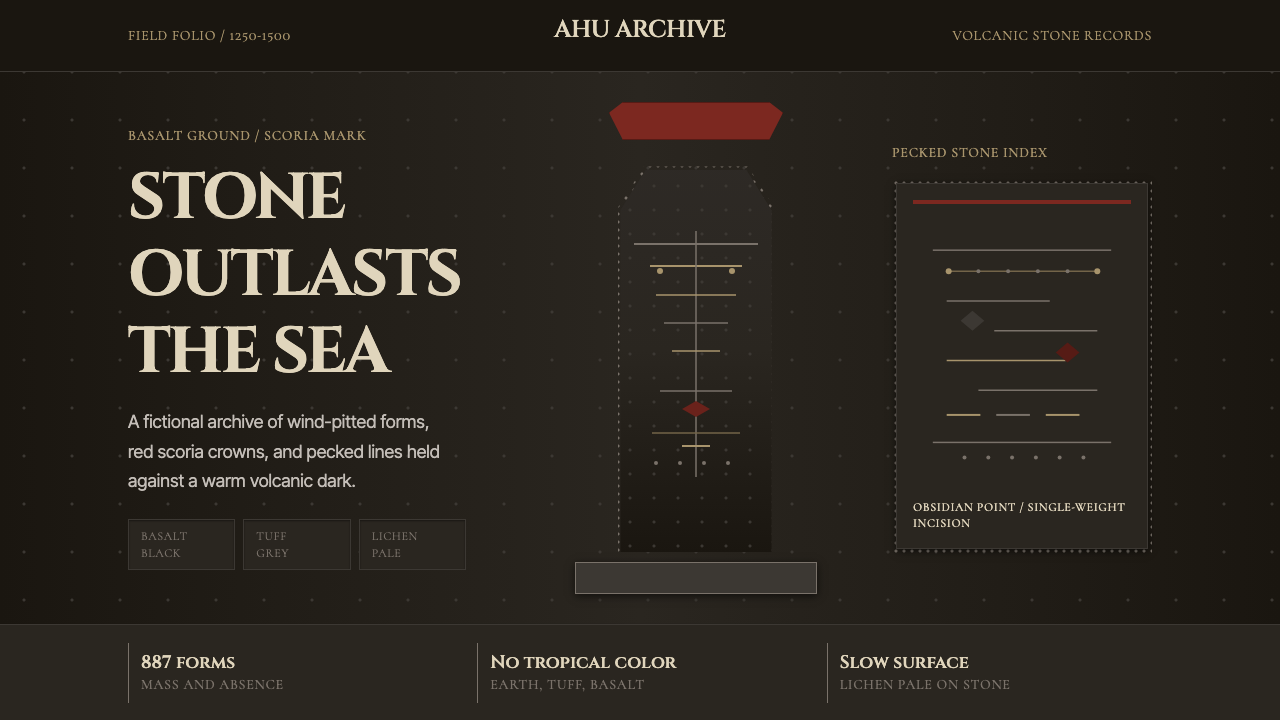 Rapa Nui Moai PetroglyphMonumental sparseness. Basalt black, scoria red, and pecked-dot borders hold…
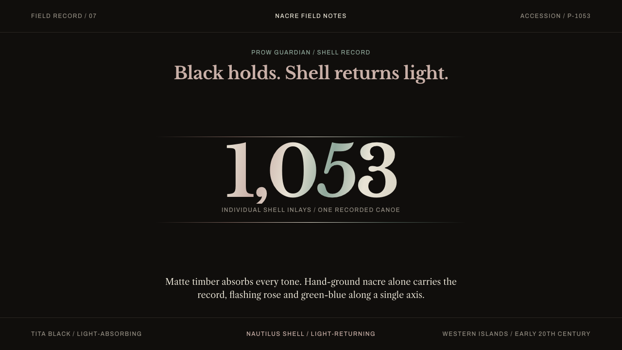 Solomon Islands NguzunguzuBlack swallows light; nacre gives it back. Rose and green-blue flashes hold a…
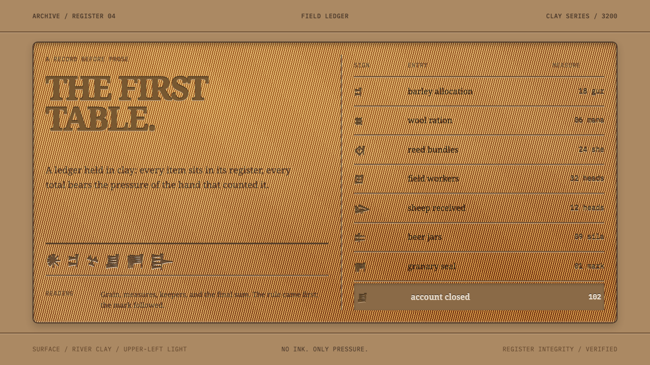 Sumerian Cuneiform TabletData began as pressure. A clay ledger uses scored grids and shadowed Noto Ser…