What is Song Landscape Painting (1100)?什么是 Song Landscape Painting (1100)?
Northern Song landscape painting distills the cosmos into ink-washed silk — monumental peaks, swirling mist, and a single cinnabar seal holding centuries of scholarly silence.北宋山水画将宇宙凝练于水墨绢素之上——巍峨山峦、流动云岚,一枚朱砂印章承载着数百年文人的静默。
Song Landscape Painting (1100) in briefSong Landscape Painting (1100) 速览
Northern Song landscape painting, produced at its height between roughly 950 and 1100 CE, represents one of the most sophisticated visual philosophies ever committed to a painted surface. Working on silk and paper with ink ground to varying densities, artists such as Fan Kuan, Guo Xi, and Li Cheng developed a pictorial language governed not by realistic depiction but by the felt experience of natural grandeur. Mountains were not topographic records; they were philosophical presences — embodiments of permanence, cosmic order, and the relationship between human transience and geological time.北宋山水画在约公元950至1100年间达到顶峰,代表了有史以来施于画面之上最为深邃的视觉哲学之一。范宽、郭熙、李成等画家以绢本纸本为载体,以浓淡相宜的墨色为媒介,发展出一套不以写实再现为目标、而以山川宏大的内在感受为依归的图像语言。山,不是地形记录,而是哲学存在——永恒、宇宙秩序以及人类短暂与地质时间之关系的化身。
The visual hierarchy of a Northern Song hanging scroll is immediately legible and profoundly deliberate. The foreground contains near details — boulders, gnarled pines, a traveler or fisherman rendered at diminutive scale. The middle ground dissolves into mist, a zone of atmospheric uncertainty where solid form yields to suggestion. The far distance reasserts itself as pale, towering peaks, rendered in lighter ink washes so that they seem to float. This three-zone recession, combined with the vast unpainted silk that stands for sky, cloud, and void, creates a sense of space that Western perspective systems of the same era never quite matched for psychological depth.北宋立轴的视觉层级直观而深思熟虑:近景陈列巨石、古松与渺小人物;中景消融于云岚,实体形态在此化为暗示;远景重现为淡墨皴染的高峻峰岭,仿佛漂浮于虚空之中。这种三段式退晕,配合以大片未涂绢素充当天空、云彩与虚无的空间,造就了一种心理纵深感,远超同时代西方任何透视体系所能企及。
As a design language translated into digital contexts, Song landscape painting offers a tonal palette anchored in warm, undyed-silk grounds, dense ink passages graduating from charcoal to near-black, and the punctuating accent of vermilion that appears in artists' seals. The compositional logic is asymmetric and breathing: heavy tonal masses cluster in one region while vast open fields of ground color expand elsewhere. Everything in the system resists symmetry, avoids loudness, and insists on the expressive power of restraint.作为一套转化入数字语境的设计语言,宋代山水画提供了一套以暖调未染绢色为底的色彩基调,搭配由炭灰渐变至近黑的浓墨笔触,以及画家钤印中跳出的朱砂红点睛之笔。构图逻辑非对称而富呼吸感:厚重的墨色团块集聚于一隅,大片开阔的底色向另侧伸展。整套体系抵制对称,回避喧嚣,坚持以克制本身作为最有力的表达。
See the Song Landscape Painting (1100) design system查看 Song Landscape Painting (1100) 完整设计系统
Where does Song Landscape Painting (1100) come from?Song Landscape Painting (1100) 从何而来?
The Northern Song dynasty (960–1127 CE) unified China after the fragmented Five Dynasties period and established its capital at Bianjing, the city now known as Kaifeng, in the Central Plains. The court supported an extraordinarily rich cultural life. The Imperial Painting Academy (Hanlin Huayuan) trained and employed professional painters, while the literati class — scholar-officials who had passed the civil service examinations — pursued painting as a form of philosophical self-cultivation rather than professional practice. These two streams, court professionalism and literati idealism, produced a generation of artists who synthesized technical mastery with cosmological ambition.北宋(公元960—1127年)在五代十国的分裂之后统一中国,定都中原汴京(今开封)。朝廷扶持了极其丰盛的文化生活。翰林画院训练并任用职业画家,而通过科举考试的士大夫阶层则以绘画作为哲学修身之道,而非职业实践。宫廷专业主义与文人理想主义两股力量,共同造就了一代将技艺精湛与宇宙抱负融为一体的艺术家。
The intellectual climate that shaped Song landscape painting drew heavily from Neo-Confucian philosophy, which was codified during this period by thinkers such as Cheng Yi and later Zhu Xi. Neo-Confucianism held that the patterns underlying natural phenomena (li, or principle) were also the patterns of moral and social order — that to contemplate a mountain was, in some sense, to study the structure of the cosmos and the proper conduct of human life. Guo Xi articulated this explicitly in his treatise Linquan Gaozhi (The Lofty Message of Forests and Streams), written around 1080, in which he described landscape painting as a substitute for the actual mountain experience that a busy official could not always seek out. The painting was not a representation of nature; it was nature, reorganized and distilled.塑造宋代山水画的思想氛围深受程颐、后来的朱熹等人在这一时期建构的理学哲学影响。理学认为,自然现象背后的规律(理)与道德社会秩序的规律同出一源——凝视一座山,在某种意义上就是研究宇宙的结构与人类生活的正当之道。郭熙在约1080年撰写的画论《林泉高致》中明确阐述了这一点:山水画是忙碌官员无暇亲赴山林时的替代体验。画非自然之表现,画即自然——经过重组与提炼的自然。
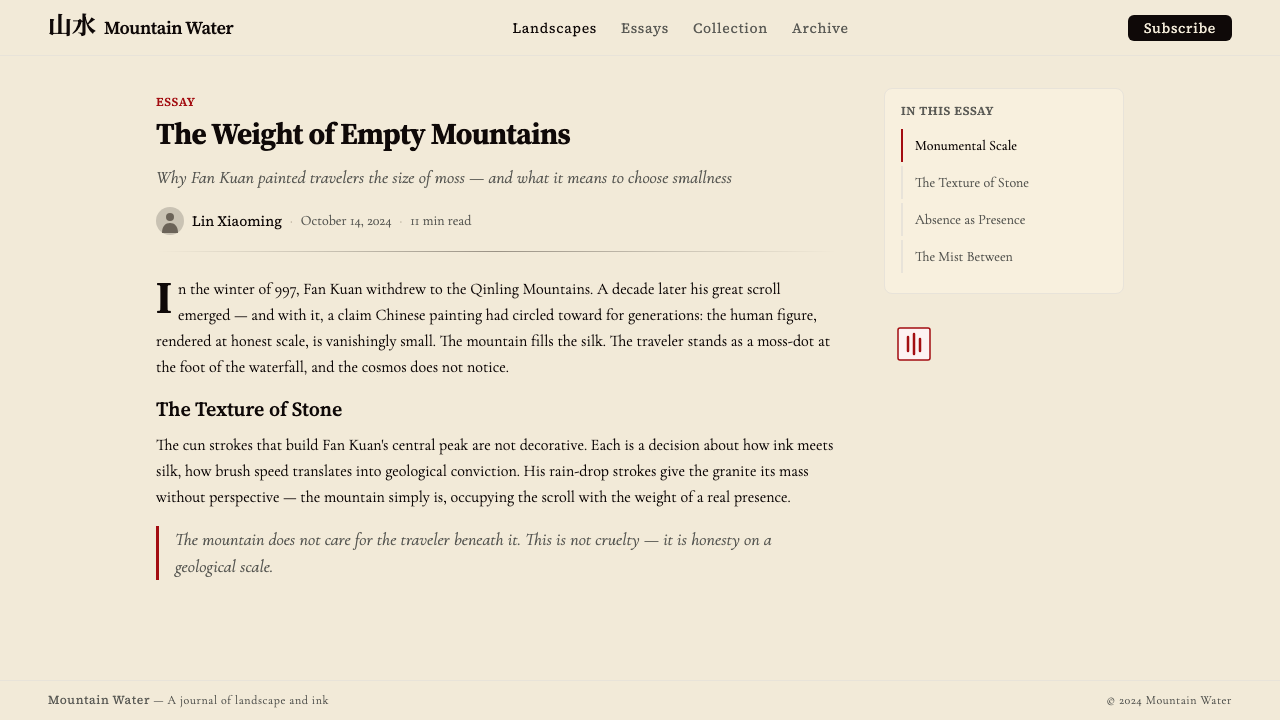
Fan Kuan, working in the late tenth and early eleventh centuries, developed the monumental style that became the defining model of Northern Song landscape. His surviving masterwork, Travelers Among Mountains and Streams (currently held in the National Palace Museum, Taipei), presents a nearly vertical cliff face that fills the picture plane from edge to edge, with a thin waterfall thread descending through its center and a caravan of traders barely visible at its base. The sheer scale of the mountain relative to the human figures was not dramatic license — it was philosophical statement. Fan Kuan lived as a recluse in the Zhongnan Mountains and is said to have spent years simply observing the landscape before painting it.活跃于十世纪末至十一世纪初的范宽,开创了成为北宋山水典范的纪念碑式风格。他现存的代表作《溪山行旅图》(现藏台北故宫博物院)呈现了几乎充满整个画面的垂直崖壁,细如银线的瀑布从其中贯穿而下,商旅驮队在山麓几不可辨。山体相对人物的绝对体量并非戏剧性夸张,而是哲学陈述。范宽隐居终南山,据说耗费数年单纯观察山川,而后方才落笔。
Guo Xi, active in the mid-to-late eleventh century and serving as a court painter under Emperor Shenzong, extended the monumental tradition toward greater atmospheric complexity. His Early Spring (1072, also in the National Palace Museum, Taipei) depicts a mountain emerging from mist with a quality of seasonal transformation — the forms are not fixed but caught in a moment of becoming. Guo Xi articulated the concept of the 'three distances' (sanyuan): the deep distance looking down from above, the level distance looking straight across, and the high distance looking up — a spatial vocabulary that organized the hanging scroll's vertical format into a legible system of recession. Mi Fu, the scholar-calligrapher, later developed a looser, horizontally accumulating dot-brush technique (Mi dots) that dissolved mountain form into atmospheric pattern, prefiguring the literati abstraction that would fully flower in the Yuan dynasty.郭熙活跃于十一世纪中后期,以宫廷画家身份供职宋神宗朝,将纪念碑传统推向更丰富的大气层次。他的《早春图》(1072年,同藏台北故宫博物院)描绘山体自云雾中显现,具有季节交替的变化感——形态并非凝固,而是被捕捉于生成的瞬间。郭熙提出「三远」之说:高远(仰视峰顶)、深远(俯视深谷)、平远(远眺平野)——这套空间词汇将立轴的竖向格式组织成可读的退晕体系。书法家米芾后来发展出一种更为自由、以横向积点为特征的「米点」技法,将山的形体消融入大气意象,预示着在元代将全面开花的文人抽象美学。
What defines the Song Landscape Painting (1100) look?Song Landscape Painting (1100) 的视觉特征是什么?
Tonal Palette墨色调性
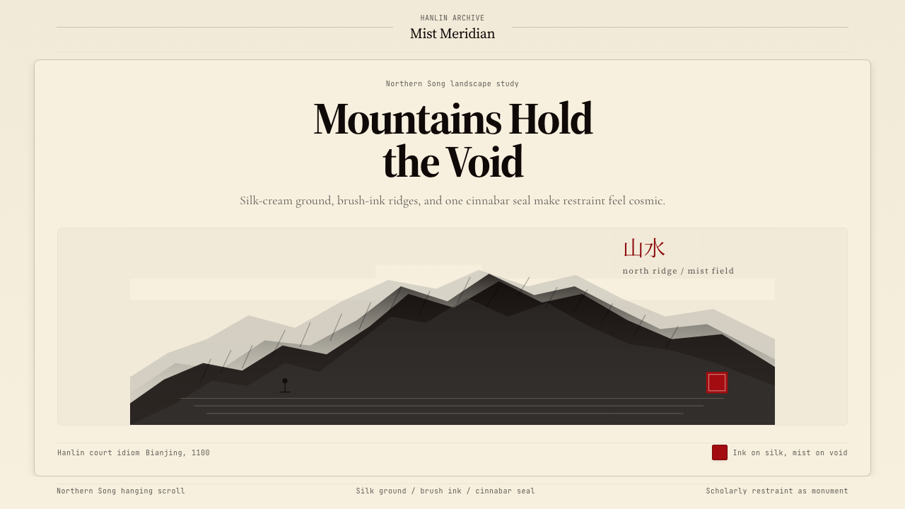
The system is built on two anchoring tones and a single accent. A warm, undyed-silk ground — neither pure white nor beige, but something between the two, with the faint golden warmth of aged textile — provides the base. Against this ground, ink moves through a full range from pale diluted wash to near-black concentrated brushwork. The only departure from this monochrome range is the vermilion of the artist's seal: a small, dense rectangle or square of saturated red that anchors the composition at its lower corner. This red functions as a full stop — compositionally and philosophically terminal.整套体系建立于两种锚定色调与一个点睛色彩之上。温润的生绢底色——既非纯白也非米黄,而是介于两者之间、带有旧织物淡金暖意的色调——构成基底。在此之上,墨色从淡薄渲染一路延伸至近黑浓重笔触,涵盖完整的单色范围。唯一脱离这一单色体系的,是画家钤印的朱砂红:构图下角一枚小巧而饱满的矩形或方形朱印。这抹红是句点——构图上的,也是哲学意义上的终结。
Atmospheric Void留白与大气
Unpainted ground — the bare silk left untouched by ink — is not absence but active presence. It reads simultaneously as mist, cloud, sky, water surface, and the philosophical void out of which form emerges. The proportion of unpainted area to painted area is typically generous, often exceeding the ink-worked passages. This breathing negative space is the quality most often lost when the style is translated by designers who mistake emptiness for incompleteness.未施墨色的底面——绢素上未经着墨的空白——并非缺席,而是积极的存在。它同时可被读作云烟、天空、水面,以及形态从中涌现的哲学虚无。未画区域与已画区域之比通常是慷慨的,往往超过施墨部分。这种呼吸般的留白空间,是最常在设计师将此风格转化时最先流失的品质——因为他们误将空旷当作未竟。
Monumental Scale Contrast纪念碑式的尺度对比
Scale relationships in Song landscape are philosophically charged rather than naturalistically observed. Mountains and cliff faces occupy the vast majority of the pictorial field; human figures, boats, and dwellings appear at a fraction of their comparative real-world scale. This is not a perspective error but a value system made visual: nature is vast, permanent, and indifferent; the human presence is transient and small. In design application, this translates to compositions that let one dominant formal element — a large tonal mass, a commanding typographic block — overwhelm its surroundings intentionally.宋代山水中的尺度关系是哲学赋予的,而非自然观察的结果。山峦岩壁占据画面的绝大部分;人物、舟楫与屋舍则以与现实相比极为渺小的比例出现。这不是透视错误,而是价值体系的视觉化:自然是宏大、永恒而漠然的;人的存在是短暂而渺小的。在设计应用中,这转化为刻意让一个主导形式元素——大面积墨色团块、强势的字体方阵——有意压倒其周围环境的构图逻辑。
Brushwork Texture皴法肌理
Rock and mountain surfaces in Northern Song painting are described through accumulated brushstrokes called cun (texture strokes or wrinkle strokes). Fan Kuan favored the raindrop cun — short, dense, vertical marks that cover a rock face like rain stippling a surface — which gives his mountains a rough, granular presence. Guo Xi developed the cloud-scroll cun, in which curling, organic strokes suggest stone formed by millennia of water and wind. Translated into digital design, this texturing principle suggests surfaces that carry subtle directional grain — not smooth or gradient, but built through accumulation.北宋画中的岩石与山体表面通过积叠的笔触——皴法——来表现。范宽擅用雨点皴,短促密集的垂直笔触覆盖岩面如雨点密布,赋予山体粗粝而颗粒感的质量。郭熙发展出卷云皴,卷曲有机的笔触暗示千万年水蚀风化而成的石质。转化至数字设计,这一肌理原则暗示着承载微妙方向性纹理的表面——不是光滑或渐变的,而是由积叠构建而成的。
Asymmetric Composition非对称构图
Northern Song hanging scrolls are organized around a strong vertical axis but are never symmetrically balanced about it. The main mountain mass typically anchors one side — often the right — while the opposing side opens into mist and distance. Weight and counterweight are achieved through tonal contrast: a dense ink mass on one side answered by a smaller but more intense accent (the seal, a dark cluster of pines) on the other. This is balance through tension rather than balance through mirroring, and it produces compositions that feel both stable and dynamic simultaneously.北宋立轴围绕强烈的竖轴组织,却从不关于中轴对称。主山体通常锚定画面一侧——多为右侧——而对侧则向云雾与远景敞开。重量与反重量通过墨色对比实现:一侧浓重墨团,被另一侧更小但更为紧致的点睛元素(钤印、松树暗簇)所平衡。这是张力之平衡,而非镜像之平衡,造就了既稳定又充满动势的构图同时并存的特质。
Three-Zone Recession三段式空间退晕
Guo Xi's doctrine of the three distances — high, deep, and level — structured the hanging scroll into three distinct spatial zones that correspond to different viewing experiences and tonal densities. The foreground is most textured, darkest, and most resolved. The middle ground is atmospheric and intermediate. The far distance is palest, least detailed, and treated with diluted ink that gives peaks a quality of near-dissolution. In screen design, this translates to depth through tonal value rather than shadow blur: foreground elements are richest, mid-tier elements softer, background elements near-monochrome.郭熙的三远之说——高远、深远、平远——将立轴的空间组织为三个不同的层次,分别对应不同的观看体验与墨色浓度。近景最富肌理、最为深重、刻画最为完整。中景大气而模糊。远景最为淡薄、细节最少,以稀释的淡墨皴染,使峰峦呈现近乎消融的质感。在屏幕设计中,这转化为通过色调明度而非阴影模糊来营造深度:前景元素最为丰富,中景元素较为柔和,背景元素趋近于单色。
Seal as Accent印章作为强调
The artist's seal — typically carved in negative on a small block of stone and impressed in vermilion paste — provides the composition's single chromatic departure from the ink-and-silk range. Its placement is never casual: the seal appears at the lower margin of the scroll, grounding the composition and simultaneously signaling authorship, authenticity, and the passage of connoisseurs' hands through time (later owners and collectors added their own seals, creating a palimpsest of red marks). In design terms, the seal is the one element of high-chroma color in a predominantly achromatic system — used sparingly, placed deliberately, and never multiplied.画家的钤印——通常以阴刻小方石印蘸朱砂印泥而成——是构图中唯一偏离水墨绢色范围的色彩点。其位置从不随意:印章出现于手卷或立轴的下方边缘,在锚定构图的同时,也标记着作者身份、真实性与历代藏家过手的时间印记(后世收藏者会加钤自己的印章,形成层叠的朱色痕迹)。在设计意义上,印章是以近乎无彩色为主的系统中唯一的高纯度色彩元素——使用克制,位置审慎,绝不重复叠加。
See the Song Landscape Painting (1100) design system查看 Song Landscape Painting (1100) 完整设计系统
Who shaped Song Landscape Painting (1100)?谁塑造了 Song Landscape Painting (1100)?
Fan Kuan (active c. 960–1030) is considered the founding master of the Northern Song monumental landscape style. He lived as a recluse in the Zhongnan Mountains south of the Tang capital Chang'an, reportedly spending years in direct observation of the mountain environment before attempting to paint it. His Travelers Among Mountains and Streams is among the most studied works in the history of Chinese painting: a vertical cliff that fills the entire format, its surface described in thousands of individual raindrop-cun brushstrokes, dwarfing the caravan of traders below. The work established the fundamental compositional and philosophical logic — human smallness before cosmic nature — that would define the style.范宽(活跃于约公元960—1030年)被视为北宋纪念碑式山水风格的开山宗师。他隐居于唐代旧都长安以南的终南山,据说在尝试作画之前,曾在山川环境中进行多年的直接观察。他的《溪山行旅图》是中国绘画史上研究最为深入的作品之一:一堵充满整个画面的垂直崖壁,以数千笔雨点皴描绘其表面,将山下的商旅驮队彻底压倒。这件作品确立了最根本的构图与哲学逻辑——人类在宇宙自然面前的渺小——并由此定义了这一风格的核心。
Guo Xi (c. 1020–1090) served as a court painter under Emperor Shenzong and was the most influential theorist of Northern Song landscape practice. His treatise Linquan Gaozhi articulates both the philosophy and the technique of the monumental landscape — the three-distances spatial system, the importance of seasonal transformation, the instruction to paint a mountain from the perspective of someone who truly inhabits it. His Early Spring (1072) is the technical summit of Song atmospheric landscape: a mountain that seems to breathe, dissolving into mist at its shoulders and reforming above the clouds. His cloud-scroll brushstroke vocabulary became the standard against which later court painters measured themselves.郭熙(约1020—1090年)以宫廷画家身份供职宋神宗朝,是北宋山水画实践最具影响力的理论家。他的画论《林泉高致》系统阐述了纪念碑式山水的哲学与技法——三远的空间体系、季节变化的重要性、以及真正栖居其中之人的视角作画的指引。他的《早春图》(1072年)是宋代大气山水的技术顶点:一座仿佛在呼吸的山,在肩部消融于云雾,又在云层之上重新凝聚。他的卷云皴笔墨词汇成为后世宫廷画家衡量自身的标准。
Li Cheng (919–967) predated the height of Northern Song monumental landscape but established many of the conventions that Fan Kuan and Guo Xi would develop further. His compositions favored a level-distance view — looking across a wide, open terrain rather than up at an overwhelming peak — with bare winter trees rendered in the distinctive 'crab-claw' branch pattern that became his signature. Li Cheng's work introduced the element of seasonal desolation and quietude that gave Song landscape its characteristic emotional register: not sublime terror before nature, but a contemplative melancholy within it. His reputation was so great that even in his own lifetime, authentic works were rare and forgeries abundant.李成(919—967年)早于北宋山水全盛期,但他确立的许多程式,后来被范宽与郭熙进一步发展。他的构图偏好平远之景——横向眺望宽阔旷野,而非仰视压倒性的峰峦——以独特的「蟹爪枝」笔法描绘冬日枯树,成为他的标志性符号。李成的作品引入了季节萧索与静寂的气质,赋予宋代山水特有的情感基调:不是面对自然的崇高恐惧,而是置身其中的沉思哀愁。他的声望之高,使得即便在他在世之时,真迹已极为稀少而赝品充斥。
Mi Fu (1051–1107) was primarily a calligrapher and connoisseur — one of the great collectors and critics of his age — who also developed a radically experimental painting technique that dissolved the mountain-as-solid-form in favor of the mountain-as-atmospheric-impression. His signature Mi-dot technique accumulated horizontal oval brushstrokes to build up misty hillsides that seem to evaporate rather than stand. Mi Fu was deeply critical of the monumental tradition's attachment to descriptive technique and viewed his own method as a return to the calligraphic essence of painting. His approach influenced literati painting theory for the next eight centuries and provided the conceptual bridge between Song monumental landscape and Yuan dynasty ink abstraction.米芾(1051—1107年)首先是一位书法家与鉴藏家——他那个时代最杰出的收藏家与批评家之一——同时也发展出一种激进的实验性绘画技法,将「山作为实体形态」消融为「山作为大气印象」。他标志性的米点积叠横向椭圆笔触,堆砌出仿佛在蒸发而非屹立的云山丘壑。米芾对纪念碑传统执着于描述性技法深感不满,视自己的方法为对绘画书写本质的回归。他的路径在此后八个世纪持续影响文人画理论,也为宋代纪念碑山水与元代水墨抽象之间搭建起思想桥梁。
Emperor Huizong (reigned 1100–1125) was himself a gifted painter and calligrapher who reorganized the Imperial Painting Academy into a formal institution with examination requirements modeled on the civil service. He favored meticulous court painting — precisely observed birds, flowers, and genre scenes — rather than the monumental landscape, but his administrative patronage created the institutional context in which the late Northern Song synthesis occurred. His reign marked both the cultural apex of the dynasty and its political catastrophe: the Jurchen Jin dynasty captured Bianjing in 1127, taking Huizong and his son into captivity, ending the Northern Song. The tragedy of his captivity gave the entire Northern Song cultural achievement a retrospective quality of lost grandeur that influenced how later dynasties remembered and idealized the period.宋徽宗赵佶(在位1100—1125年)本人是一位才华出众的画家与书法家,他将翰林画院改组为效仿科举制度设有考试要求的正式机构。他本人偏爱精工的院体画——精确观察的花鸟与风俗画——而非纪念碑式山水,但他的制度性庇护为北宋晚期的文化综合创造了体制语境。他的在位期间既是王朝的文化顶峰,也是其政治灾难:女真金国于1127年攻陷汴京,徽宗与其子被掳北去,北宋就此终结。这段被俘经历赋予整个北宋文化成就一种「失去的辉煌」的追溯色彩,影响了后世朝代记忆与理想化这一时期的方式。
How do you use Song Landscape Painting (1100) today?今天怎么用 Song Landscape Painting (1100)?
Song landscape painting is among the most demanding historical styles to apply in digital design, because its power depends almost entirely on proportion, restraint, and tonal calibration rather than on recognizable surface elements. Applying it correctly means internalizing its compositional logic — the breathing void, the asymmetric tonal mass, the single chromatic accent — rather than simply adding ink-wash textures to an otherwise conventional layout.宋代山水画是数字设计中最难驾驭的历史风格之一,因为它的力量几乎完全依赖比例、克制与色调校准,而非依赖可辨识的表面元素。正确地应用它,意味着内化其构图逻辑——呼吸的留白、非对称的墨色团块、单一的色彩点睛——而不仅仅是在常规版面上叠加水墨肌理。
For presentation slides, the style works with exceptional authority on cover pages and section dividers. A cover built on this logic uses the warm silk-toned ground as the full bleed background, places a large tonal mass (a deep ink-gradient illustration, a heavy typographic block) to one side and toward the upper register, and leaves the opposing lower field entirely open. The title appears at a scale that commands the composition rather than merely labeling it. A single vermilion element — a dot, a line, a seal-like rectangle — anchors the lower corner. Content slides should be treated as minimal: wide margins as breathing voids, body text in warm near-black against the ground color, with section hierarchy built through size contrast alone. Data visualizations translate naturally: bar charts and area charts rendered in graduated ink tones, with a single accent color used only for the most significant data series.在演示文稿中,这种风格在封面页与章节分隔页上具有卓越的气场。以这套逻辑构建的封面,以温润的绢色调为满版底色,将大块墨色团块(深墨渐染的插图、厚重的字体方阵)置于画面一侧偏上的位置,而将对侧的下方区域完全留白。标题以主导构图而非仅仅标注内容的尺度出现。一个朱砂色元素——一个点、一条线、一枚印章般的矩形——锚定下方角落。内容页应保持简约:宽阔留白作为呼吸空间,正文以暖近黑色置于底色之上,层级仅以尺寸对比建立。数据可视化自然地融入其中:柱状图与面积图以渐变墨色渲染,仅最重要的数据系列使用单一强调色。
For web interfaces, the palette and compositional logic suit premium editorial products, long-form reading environments, documentation sites, and any context where the desired user experience is one of calm authority and considered depth. Dashboard applications can apply the three-distance principle to information hierarchy: dense and detailed in the immediate foreground (active metrics, primary actions), softer and more atmospheric in the mid-tier (trend charts, secondary data), near-absent in the background layer (structural grid, quiet navigation). The key discipline is maintaining the proportion of void to content: resist the impulse to fill every grid cell. Navigation and pricing pages benefit from the seal logic — one saturated accent color reserved exclusively for the primary call to action, used nowhere else.对于网页界面,这套色彩与构图逻辑适合高端编辑产品、长文阅读环境、文档网站,以及任何期望用户体验是平静权威与深思熟虑的语境。仪表板应用可将三远原则应用于信息层级:近景最为密集详尽(活跃指标、主要操作),中景更为柔和大气(趋势图表、次要数据),背景层近乎隐没(结构网格、静默导航)。关键纪律是维持留白与内容的比例:抵制填满每个网格单元的冲动。导航与定价页面受益于印章逻辑——一种饱和强调色专属于主要行动号召,不出现于其他任何位置。
For editorial and marketing work, the style supports a register of quiet prestige that few other historical systems achieve. A brand identity or editorial spread built on this palette reads as assured, unhurried, and culturally literate without resorting to pastiche. The warm silk ground translates well to paper stocks and screen backgrounds alike. Marketing pages can alternate between silk-ground and deep-ink sections — the ink sections carrying reversed-out near-white type — with the vermilion accent appearing only in the most emphatic calls to action. Photography, when used, should be treated as a tonal element: desaturated or converted to warm near-monochrome, cropped to emphasize abstract form over representational content.对于编辑与营销内容,这种风格支持一种极少有其他历史体系能够企及的静谧贵气。以这套色板构建的品牌形象或编辑版面,读来从容、笃定、具有文化底蕴,却不流于仿古。温润的绢色底调在纸张与屏幕背景上同样转化出色。营销页面可在绢色底与深墨色区块之间交替——深墨色区块承载反白的近白色文字——朱砂强调色仅出现于最需强调的行动号召之处。摄影图像在使用时应被当作色调元素处理:去饱和度或转为暖调近单色,裁切时强调抽象形态而非具象内容。
A common mistake when applying this style is mistaking 'ink wash' for the system's essential character and applying painted or illustrated textures to otherwise standard layouts. The result looks decorative rather than structural — a costume rather than a grammar. The actual logic is compositional and tonal: how much ground is left open, where the heaviest mass sits, how the single accent is placed. A second common error is overusing the vermilion. In original Song paintings, the seal is one small element in an overwhelmingly restrained composition; its impact derives from its singularity. A design that applies the accent color to headlines, buttons, borders, and icons simultaneously has misunderstood how the system creates its effect. Use the accent once, deliberately, and trust the restraint to do the work.应用这种风格时最常见的错误,是将「水墨肌理」误认为这套系统的核心特质,在常规版面上叠加手绘或插画质感。结果是装饰性而非结构性的——像是一件戏服,而非一套语法。真正的逻辑是构图性与色调性的:多少底面被留为空白,最重的墨色团块落在何处,单一强调色如何安置。第二个常见错误是过度使用朱砂色。在原作宋画中,印章是压倒性克制构图中的一个小小元素,其冲击力来自于它的唯一性。将强调色同时施于标题、按钮、边框与图标的设计,误解了这套系统制造效果的方式。只使用一次强调色,审慎地使用,相信克制本身会完成剩下的工作。
See the Song Landscape Painting (1100) design system查看 Song Landscape Painting (1100) 完整设计系统
Song Landscape Painting (1100) — FAQSong Landscape Painting (1100) · 常见问题
How is this style different from other Chinese ink-painting traditions?这种风格与其他中国水墨画传统有何不同?
Northern Song monumental landscape is specifically a court-era, large-format, vertical hanging-scroll tradition focused on mountains and atmospheric space. It differs from later literati painting (Yuan dynasty onward), which is smaller, more gestural, and foregrounds the artist's personal emotional state over objective natural grandeur. It differs from Tang figure painting in its near-absence of human narrative. It differs from the Southern Song academic tradition (after the dynasty moved to Hangzhou in 1127) in scale and ambition: Southern Song masters like Ma Yuan and Xia Gui favored one-corner compositions of lyrical intimacy rather than the overwhelming scale-contrast of the northern school. When designers reference 'ink wash aesthetics,' they may mean any of these traditions; Song monumental landscape is the most architecturally structured and formally severe among them.北宋纪念碑式山水是一种特定的宫廷时代、大幅竖向立轴传统,以山岳与大气空间为核心。它不同于后来的文人画(元代以降)——后者体量更小、笔触更为意笔,以艺术家个人情感状态凌驾于客观自然的崇高之上。它不同于唐代人物画,因为它几乎没有人物叙事。它也不同于南宋院体传统(1127年王朝迁都杭州之后)——在规模与抱负上截然不同:马远、夏圭等南宋大家偏爱充满抒情意味的一角式构图,而非北派的压倒性尺度对比。当设计师援引「水墨美学」时,他们可能指涉以上任何一种传统;宋代纪念碑山水是其中最具建筑感结构与形式严肃性的一脉。
Can this style work effectively in dark-mode interfaces?这种风格能在深色模式界面中有效运用吗?
The historical canon is entirely light-ground — silk is warm and pale, and the ink works against this luminous base. A dark inversion is possible but requires a fundamental reinterpretation: the deep-ink passages become the ground, and light values become the mark. In practice, a dark variant works best when it commits to deep, warm charcoal rather than cold black for the background, uses near-white passages that suggest the luminosity of pale ink wash, and retains the vermilion accent with care — against dark grounds, saturated red tends to vibrate aggressively, so it may need to be proportionally smaller or slightly warmed. The three-zone atmospheric recession still functions: the nearest elements are highest-contrast, mid-tier elements fade toward the ground tone, and distant elements nearly dissolve.历史原作全部以浅色底面为基础——绢素温润而浅淡,墨色在这一发光底面上生发。深色反转版本是可能的,但需要根本性的重新诠释:浓重的墨色部分变为底面,浅色值成为笔触。在实践中,深色变体最有效的做法是以深沉温暖的炭灰色而非冷黑色作背景,用近白色的笔触暗示淡墨渲染的发光质感,同时审慎保留朱砂红——在深色底面上,饱和红色倾向于强烈振动,可能需要比例更小或色调略微偏暖。三段式大气退晕仍然有效:近景元素对比度最高,中景元素向底色过渡,远景元素几近消融。
Does the style require actual ink-wash illustration, or can it work with type and flat shapes alone?这种风格是否需要真正的水墨插画,还是仅凭文字与平面形态就能实现?
The style does not require illustration to function. The compositional and tonal logic — a warm ground, a heavy asymmetric mass in ink tones, generous void, one vermilion accent — can be achieved entirely through typographic and geometric means. A large block of deep-toned text, a wide ruled line, a heavy rectangular shape, or a full-bleed photograph treated to near-monochrome all serve the same compositional function as a painted mountain mass. In fact, some of the most successful contemporary applications of this aesthetic use no illustration at all: the design system's logic operates through proportion, tone, and the deliberate use of empty space. Illustration adds richness but is not the prerequisite.这种风格的实现并不依赖插画。其构图与色调逻辑——温润底色、墨调的不对称重量、慷慨留白、一处朱砂强调——可以完全通过字体与几何手段来达成。一块深色调的大段文字、一条宽阔的直线、一个厚重的矩形形态,或是经近单色处理的满版摄影,都与画面上的山体团块服务于同样的构图功能。事实上,当代对这一美学最成功的一些应用完全没有使用插画:设计系统的逻辑通过比例、色调与刻意留白来运作。插画增添丰富性,但并非前提条件。
What kinds of brands or products is this style poorly suited for?哪些类型的品牌或产品不适合这种风格?
The style carries cultural and tonal associations that limit its range. It reads as scholarly, contemplative, and prestige-oriented — qualities that align well with financial services, premium publishing, luxury goods, and cultural institutions, but that work against categories requiring immediacy, playfulness, accessibility, or broad populist appeal. Consumer technology products targeting fast adoption, children's education platforms, fitness and wellness applications, food and beverage brands, and any product whose primary emotional register is energetic or celebratory will find this style resistant. Its restraint can also read as exclusive or opaque in contexts where warmth and approachability are strategic priorities. The question is whether the product's values — patience, depth, authority, permanence — genuinely align with what this visual language communicates, or whether the aesthetic is being applied as prestige borrowing without substantive fit.这种风格携带的文化与情感联想限制了其适用范围。它读来是学者式的、沉思的、以精英品位为导向的——这些特质与金融服务、高端出版、奢侈品与文化机构高度契合,但与需要即时感、趣味性、亲和力或广泛大众吸引力的品类相悖。面向快速采纳的消费科技产品、儿童教育平台、健身与健康应用、食品饮料品牌,以及任何主要情感基调是充满活力或喜庆的产品,都会发现这种风格难以配合。在温暖感与亲和力是战略优先级的语境中,其克制还可能被解读为排他性或难以接近。关键在于:产品的价值观——耐心、深度、权威、永恒——是否真正与这套视觉语言所传达的内容对齐,还是将这种美学作为一种没有实质契合的声望借用。
How should the vermilion accent be used in a multi-screen digital product?在多屏幕数字产品中,朱砂红强调色应如何使用?
The seal's logic in the original paintings is instructive: one occurrence, small relative to the whole, placed with deliberate compositional intent, never decorative. In a digital product, this translates to reserving the vermilion accent for a single, consistent semantic role — the primary call to action, the active navigation state, the error indicator, or the brand mark — and never using it for multiple purposes simultaneously. Its scarcity is what gives it force. A useful test: if the accent color were removed entirely from the interface, would the product still function legibly? If yes, the accent is being used correctly as a signal amplifier rather than a structural load-bearer. If removing it would cause the layout to collapse in hierarchy, it is being overloaded. The warm-ground, ink-tone palette should carry all structural communication; the vermilion is reserved for the moment of decision or emphasis.原作中印章的逻辑具有指导意义:出现一次,相对整体较小,以审慎的构图意图放置,绝非装饰。在数字产品中,这转化为将朱砂强调色保留给单一、一致的语义角色——主要行动号召、激活的导航状态、错误提示,或品牌标识——且绝不同时用于多个目的。正是其稀缺性赋予了它力量。一个有用的测试:若将强调色从界面中完全移除,产品是否仍能清晰地被理解和使用?如果是,强调色被正确地用作信号放大器而非结构承载者。如果移除后层级崩溃,则说明它承担了过多负担。温润底色与墨调色板应承载所有结构性传达;朱砂红被保留给决策或强调的瞬间。
Related design styles相关设计风格
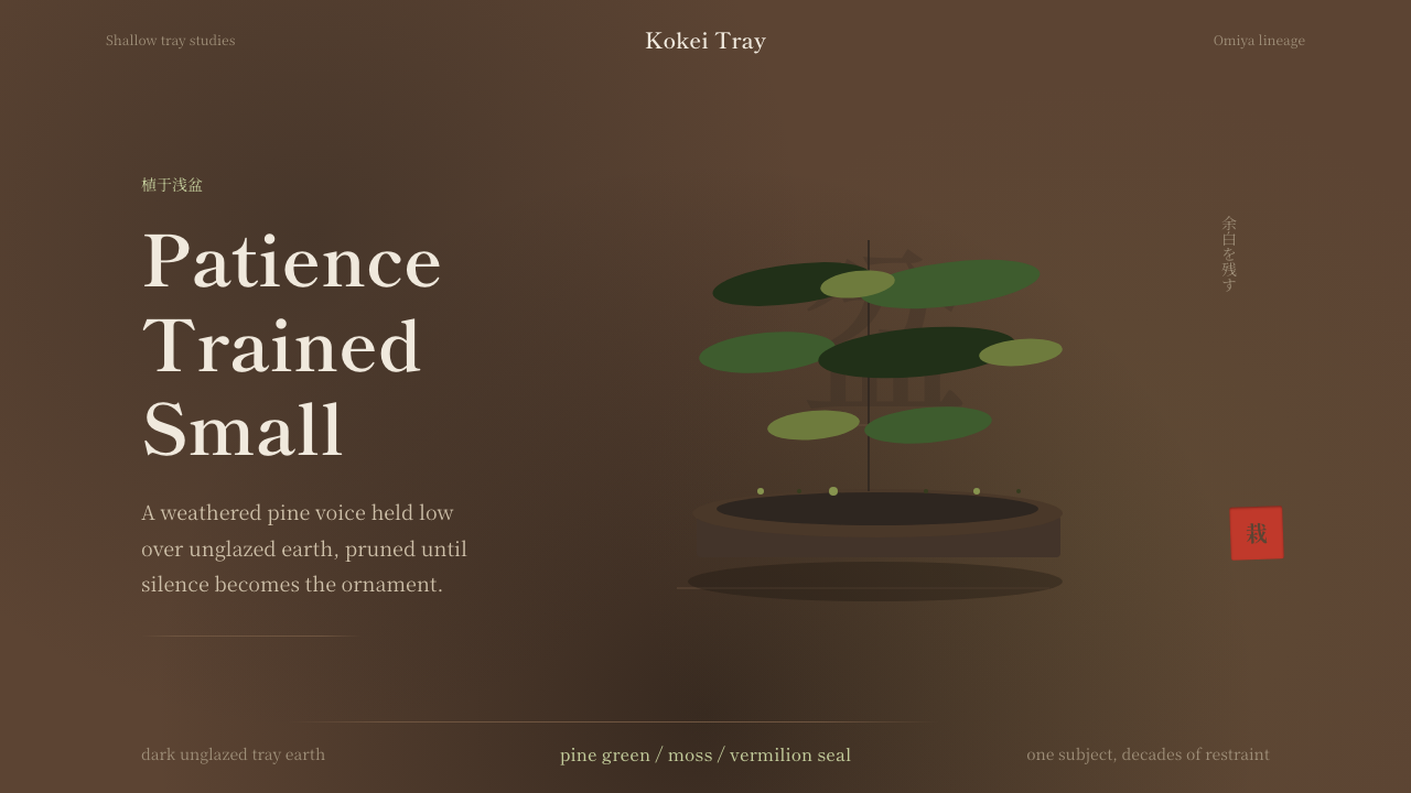 Bonsai CultivationQuiet asymmetry. Pine green rests on dark tray earth, sealed by one vermilion…沉静不对称。苍松绿落在深陶土上,一方朱印收束。
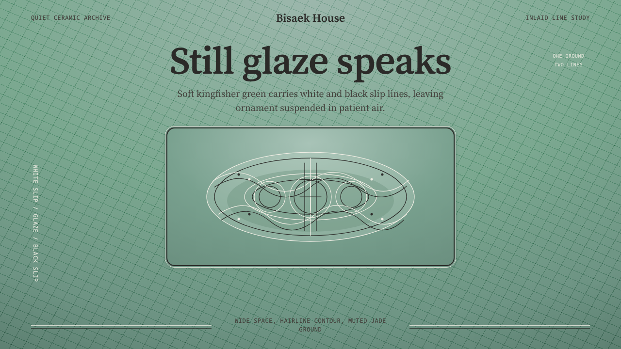 Goryeo Celadon 高麗青瓷Stillness carries ornament. Bisaek jade ground holds white and black hairline…静中见纹:翡色釉底承托黑白发丝镶嵌线。
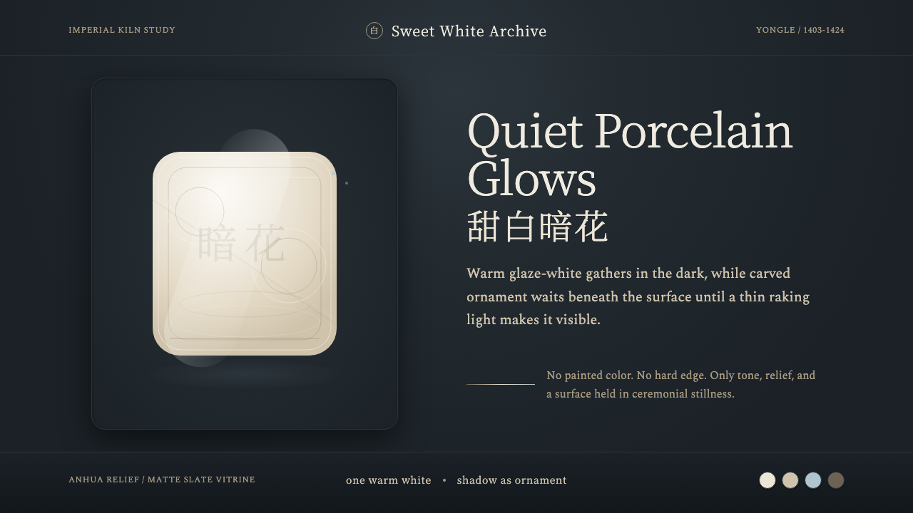 Jingdezhen BlancQuiet porcelain glows. Warm glaze-white on slate reveals hidden anhua incisio…静默瓷光:深板岩底上的温润甜白,暗花随斜光浮现。
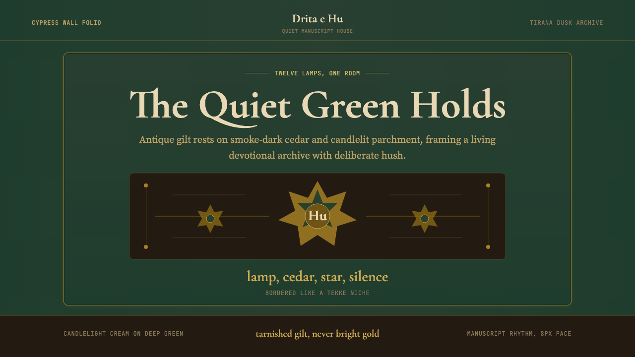 Albanian Bektashi Sufi (Tekke)Sacred quiet in cypress green. Gilt stars and Cormorant type frame a dusk tek…柏绿中的神圣静默。鎏金星纹与Cormorant字框出黄昏修道院壁龛。
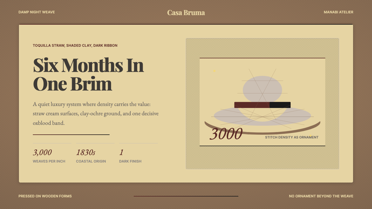 Ecuadorian Montecristi Panama HatLuxury disappears into density. Straw cream, clay ochre, and one oxblood ribb…奢华隐入密度:草色、陶土赭与一道牛血红帽带。
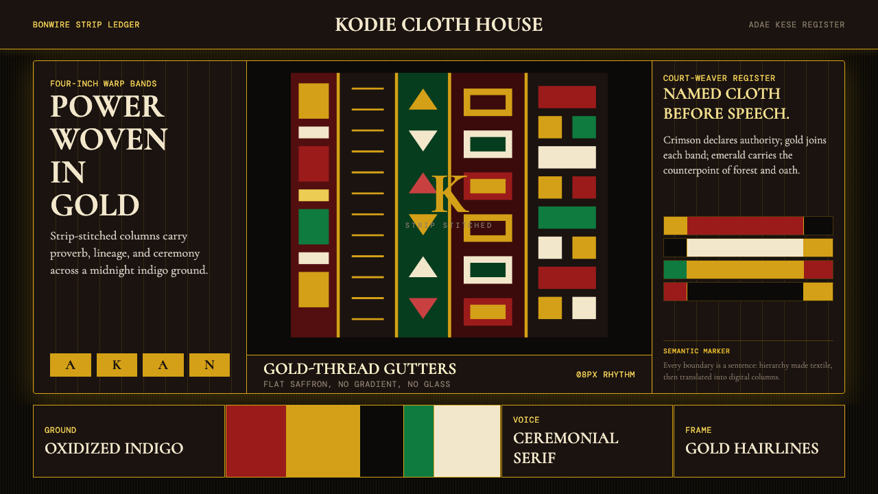 Ghanaian Kente (Asante Royal Gold)Royal authority, woven dark. Gold gutters stitch crimson and indigo strips in…暗色中的王权。金线栏缝合绯红与靛蓝条带。