What is Hardangersøm Whitework?
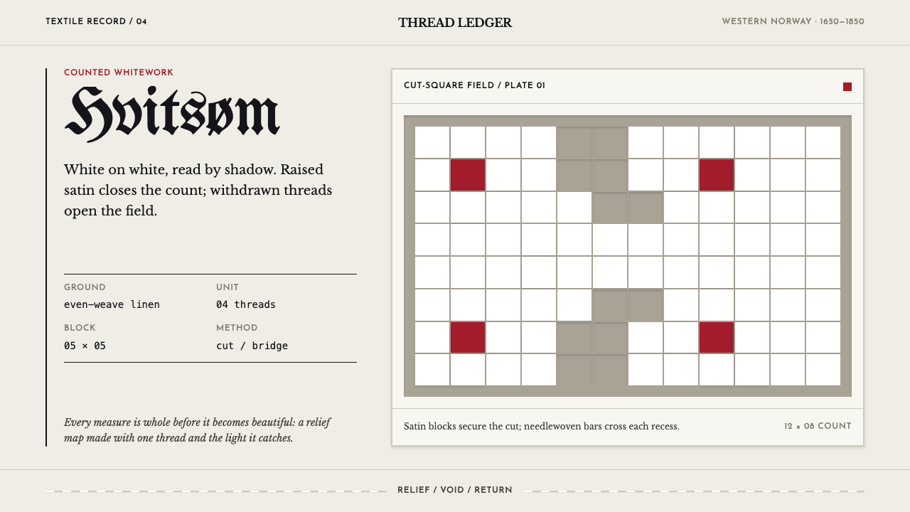
Hardangersøm is white thread on white linen, where satin blocks rise, squares are cut away and the whole pattern is read as relief — light and shade, never colour.
Hardangersøm Whitework in brief
Hardangersøm is counted whitework from the Hardanger district of western Norway, where it is often simply called hvitsøm, white sewing. It is worked in white thread on white even-weave linen, and for generations it decorated the aprons and shirt fronts of the region's costume. The linen belongs to the story too: in Hardanger the flax was grown, spun and woven locally, so ground and embroidery came from the same district.
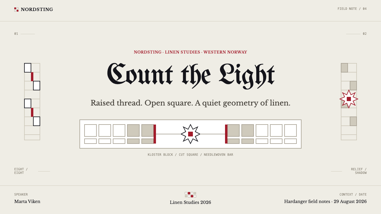
The technique has a strict order of work. Thick satin blocks, known as kloster blocks, are laid first, each stitch counted against the threads of the linen. Then, inside the squares that the blocks enclose, the warp and weft are cut and withdrawn, leaving open spaces. Those spaces are not left empty: they are rebridged with needlewoven bars, so a delicate lattice replaces the cloth that was removed. Raised surface, hollow and bridge are the three states of the technique, and every pattern is made from their interplay.
What makes this a design language rather than a mere technique is that nothing in it is coloured. The pattern is read entirely as relief. The satin catches the light and stands slightly proud; the cut squares drop away into shade. Eight-pointed stars, diamonds and sawtooth borders run either square to the cloth or on the diagonal, and every dimension is a whole number of threads, so the geometry is exact before it is beautiful. The style's promise is precision that turns into depth.
Where does Hardangersøm Whitework come from?
Hardanger is a district in Vestland, western Norway. The record dates the embroidery to before 1900 and places its flourishing between about 1650 and 1850, a long span of local practice. The continuity of materials is part of its character: flax grown, spun and woven in the district gave a bleached-linen ground that every embroiderer could count on, and fibre, cloth and stitch all stayed within reach of one another.
In that period the work was done on the aprons and shirt fronts of western Norwegian dress, the garments that would later be called the bunad. The placement is telling. An apron front and a shirt front are the two parts of a costume that face the world, and white-on-white work there announces skill without announcing colour. It is a restrained kind of display, one that depends on the viewer standing close enough to see light move across the satin and shade gather in the cut squares.
From the 1890s the embroidery was taken up by the national-costume revival that produced the Hardangerbunad, and the record describes this as the moment it was codified. Codification means that what had been local practice became a recognised vocabulary: which motifs belonged, how blocks and cut squares were arranged, how the costume should look as a whole. The revival is also the reason small touches of red and green appear in the design language derived from it. They are a trace of warmth carried by the costume, not part of the whitework itself.
The record places the style at the meeting of three lines. Norwegian hvitsøm supplies the local tradition; European counted drawn-thread and cutwork supplies the wider technical family, in which threads are counted, withdrawn and rebridged in many countries; and the Hardangerbunad revival supplies the national-costume frame. The record's reference points reflect that wider life: TRC Leiden and the Embroiderers' Guild of America sit next to the Norwegian names, a reminder that Hardanger work has been studied and taught well beyond the fjords.
What defines the Hardangersøm Whitework look?
White on White
There is no colour in the work itself. Thread and ground are both white, close to bleached linen, and the only variation is the small shift of tone made by light falling on different surfaces. Where colour does enter the derived design language, as tiny touches of red and green taken from the costume, it is confined to very small areas and never carries the pattern. The page ground is a warm, bleached-linen off-white rather than a clinical blue-white.
Satin Kloster Blocks
The raised part of the pattern is made of thick satin blocks laid side by side, each stitch counted. They are the solid, light-catching mass of the style, the nearest thing it has to a filled shape. Because they are laid first and everything else is cut around them, they define the whole composition: a block is a decision, and the cut squares are what the blocks leave behind.
Cut Squares and Needlewoven Bars
Inside the squares enclosed by the blocks, warp and weft are cut and withdrawn, and the resulting openings are rebridged with needlewoven bars. The effect is of a fine lattice hung in a hollow. Light passes through, shade gathers at the edges, and the surface gains a second layer that reads as depth rather than as ornament. In digital terms, these are windows and recesses, not drawn lines.
Relief as the Only Language
The pattern is read entirely as relief: satin catching light, cut squares dropping into shade. Hierarchy comes from what stands proud and what sinks, not from hue or weight. This is the style's most distinctive and most demanding trait, because it asks a designer to build emphasis out of elevation and recess, and to keep the lighting consistent so that raised always means raised.
Counted Geometry
Every dimension is a whole number of threads, so every block, gap and bar sits exactly on the cloth's own grid. Nothing is estimated or eyeballed. The geometry is exact before it is beautiful, and that exactness is what makes the finished piece feel calm. A layout in this style should feel the same: modules that line up, spacing that repeats, no accidental offsets.
Star, Diamond and Sawtooth Motifs
The motif vocabulary is small and geometric: eight-pointed stars, diamonds and sawtooth edges. Each runs either square to the cloth or on the diagonal, and none is curved. Repetition does most of the work, with the same unit turned, mirrored and repeated to make borders and fields. The limited vocabulary is a strength: a few shapes, endlessly arranged, produce a recognisable identity.
Even-Weave Linen Ground
The cloth is even-weave linen, with warp and weft of equal weight, which is what makes counting possible. Its texture is quiet but present, a fine grain beneath the stitching. A digital equivalent is a lightly warm ground with a barely perceptible grain, never a glossy white, so that the satin blocks have something soft to stand against.
Who shaped Hardangersøm Whitework?
Her name is the one most often attached to the national-costume revival that, from the 1890s, codified the Hardangerbunad and with it the embroidery. The record cites her as a key figure for that moment. The practical significance for the style is that it moved from being what local embroiderers happened to do to being a recognised, describable standard, with the motifs and arrangements that now define it.
Another name from the bunad-revival side of the record. She appears among the key figures as part of the scholarly and practical effort that set out what Norwegian regional dress and its embroidery should be. Together with the revival's other advocates, she belongs to the period in which whitework stopped being an unremarked local habit and became something to describe, teach and defend.
The Textile Research Centre in Leiden appears in the record as a scholarly reference. Its presence signals that counted drawn-thread and cutwork embroidery is studied as a technical family across Europe, not only as a Norwegian curiosity. For designers it is a useful pointer: the vocabulary of this style has been documented with technical precision, and its structure can be described accurately without recourse to guesswork.
A needlework organisation in the United States, listed in the record among the key names. It stands for how this embroidery is taught and practised outside Norway, and represents the living, international afterlife of the technique: a style that began in one western Norwegian district now has stitchers and teachers on other continents. Its inclusion shows that the visual logic of hardanger travels well because it is built from counted, learnable steps.
How do you use Hardangersøm Whitework today?
Hardangersøm is a style of delicacy and exactness. It suits work that wants to feel crafted, quiet and precise, and it asks the designer to give up the most obvious tool in digital design, colour, in favour of light, shade and structure. Used with discipline it produces layouts that look expensive without looking loud.
On presentation slides, a cover can sit on a warm, bleached-linen off-white with a single raised panel and one cut-square window, title set in a quiet dark ink so that it stays legible. Content slides can use tone-on-tone panels separated by gentle elevation instead of rules or coloured boxes. Data slides suit lattice-like tables and bar charts in which bars read as raised blocks and gaps as recesses, with value labels in a clearly readable ink.
For web interfaces the style fits tools and products that want a calm, premium feel: note-taking, stationery, hospitality, heritage and craft commerce. Build the hierarchy from elevation. A raised surface marks the primary action or the featured pricing tier; recessed surfaces hold inputs and secondary content, like cut squares in the cloth. Keep every light source consistent, and keep the grid exact, with spacing in whole repeating units.
In editorial and marketing work, the style supports stories about textiles, regional craft, heritage brands and slow making. Hairline lattice dividers, sparing block-like initials and generous margins carry the tone, and photography works best when it is close, raking-light macro of linen and thread. A tiny touch of warm red or green, kept to a very small area, can nod to the costume without breaking the white.
The common mistake is relying on shading alone for anything that must be read. Whitework is seen by light, and screens are unreliable lights, so essential text and controls must keep strong contrast; relief should organise the surface, not carry the message. The second mistake is reaching for colour or heavy drop shadows to rescue a flat-looking layout, which turns delicate relief into generic interface effects. Subtle, consistent elevation is the whole language.
Hardangersøm Whitework — FAQ
What does 'hvitsøm' mean, and how does it relate to Hardangersøm?
Hvitsøm is simply Norwegian for white sewing, the broad local name for white-thread embroidery on white cloth. Hardangersøm is the version from the Hardanger district, distinguished by its satin blocks and cut-and-bridged squares. The record lists Norwegian hvitsøm as one of three lines of context, alongside European counted drawn-thread work and the bunad revival.
What is a kloster block?
A kloster block is a group of satin stitches laid side by side to form a thick, solid, slightly raised rectangle. In hardanger work the blocks are laid first, and the squares between them are then cut and withdrawn. For a designer, the kloster block is the solid, light-catching mass of the style, and the cut square is its counterpart: the two together make the pattern.
Why does the style depend so heavily on whole numbers?
Because it is counted whitework: every stitch, block and bar is placed by counting threads of even-weave linen. Every dimension is therefore a whole number of threads, and the geometry is exact before it is beautiful. Translated to layout, the principle is to build every spacing and size from repeating whole units, so nothing in the composition feels arbitrary.
Can I use colour in a Hardangersøm-inspired design?
Very sparingly. The pattern itself is read entirely as relief, and the style's logic is that nothing is coloured. The record notes that small touches of red and green appear in the derived design language as a trace of warmth from the national costume. Keep any such colour to a tiny area and never let it carry the pattern; a design that depends on it has stopped being whitework.
Is this a national Norwegian style or a wider European one?
Both. It is rooted in one district of western Norway and tied to the national-costume revival that codified it from the 1890s. Yet the technique belongs to the broader European family of counted drawn-thread and cutwork embroidery, and it is studied and taught internationally. The best way to use it is to respect its Norwegian source while recognising that its principles, counting, relief and restraint, travel.
Related design styles
 Danish Hedebo CutworkOrnament is cut, not applied. Bleached linen and bound shadow turn voids into…
 Glagolitic ScriptCarved faith in limestone. Cinzel capitals and red rubrics sit in shadowed gr…
 Manipuri PhanekOne border carries the whole cloth. Plum odd-count teeth cut through an expan…
 Nishapur Epigraphic WareRestraint carries the surface. Black Kufic arcs across warm buff clay and ope…
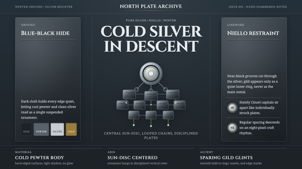 Sakha Yakut Silver BreastplateCold silver hangs in ritual order. Blue-black ground, Roman capitals, and nie…
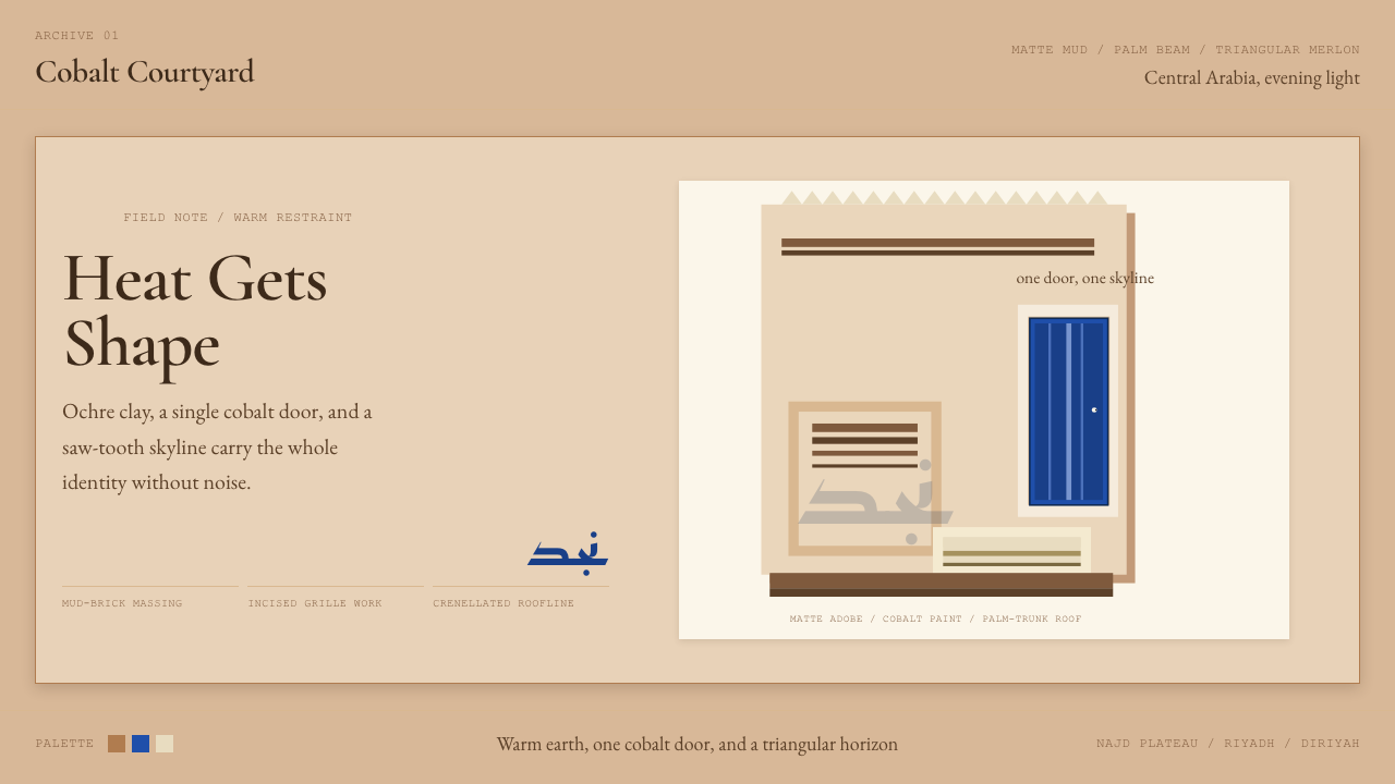 Saudi Najdi Vernacular ArchitectureHeat gets shape. Ochre clay, a single cobalt door, and a saw-tooth skyline.