What is Manipuri Phanek?
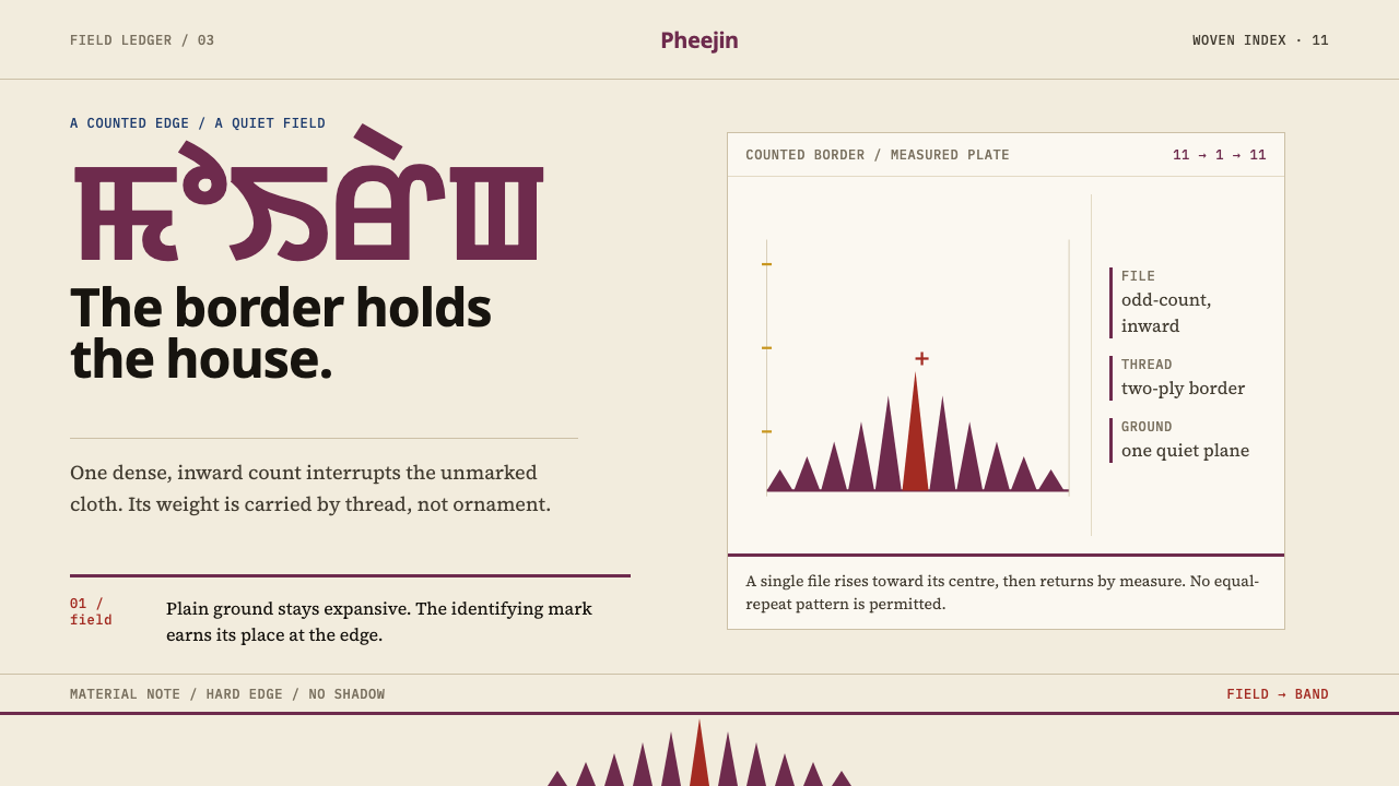
Almost all of the cloth is plain; the design lives in one heavy border of odd-numbered triangular teeth, and that border tells you whose house made it.
Manipuri Phanek in brief
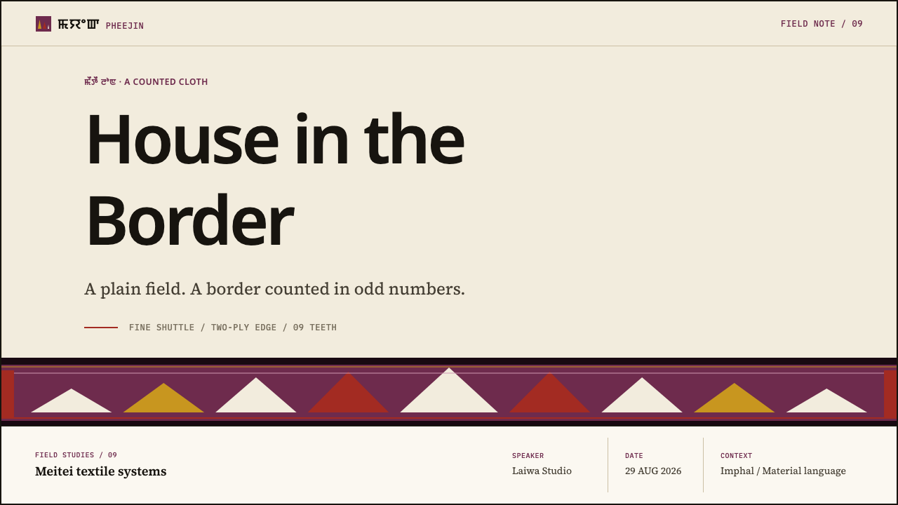
Manipuri Phanek is a design language drawn from the Moirang Phee phanek, a wrapped sarong worn by Meitei women in Manipur, in north-east India. Almost all of the garment is plain cloth. The design lives in a single band, the pheejin: a file of elongated triangular teeth that step inward on odd counts, three, five, nine, eleven, narrowing toward the centre of the band.
The proportion is the point. A wide, calm cream field meets one border that refuses to give way, and the tension between those two decisions is the whole composition. Locally the teeth are read as the teeth of Pakhangba, the pythonic god, so the count of the teeth is structure and meaning at once, not decoration. In a layout this translates into restraint at scale with one insistent edge.
Two shuttles do the work. A fine one weaves the body of the cloth; a bolder two-ply one weaves the border, so the patterned band is physically a heavier cloth than the field beside it. The style carries that fact onto the screen: the border has more mass than the ground, not merely more colour. This is a style about hierarchy by weight, in which the plain area is not empty but generous.
Where does Manipuri Phanek come from?
The cloth is named for Moirang, the old principality in the Imphal valley, and the region in the source is Manipur in north-east India, around Moirang and the Imphal valley. The tradition runs from before 1900 to the present, woven continuously on loin and throw-shuttle looms. It is a living craft rather than a revived one, and that continuity is part of why the cloth carries the weight of a settled convention: it has had generations of weavers to refine what to put in the border and what to leave out of the field.
The people who hold the tradition are Meitei women weavers, who, as the source puts it, hold the mayek naibi patterns as clan property. The patterns are not freely drawn motifs but inherited information, kept by the households that own them and woven by the women who carry them. The Meitei handloom tradition is therefore also a system of authorship and ownership, in which a pattern belongs to someone and its use says something about who is using it.
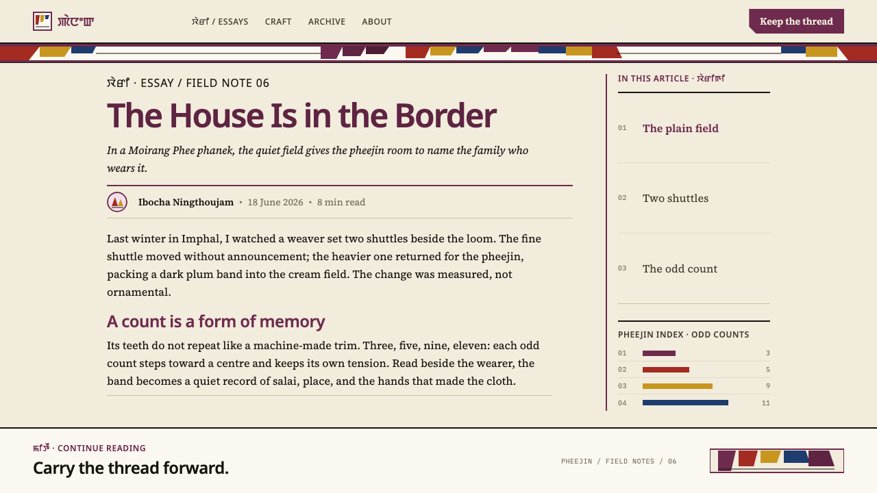
That is what the mayek naibi system does in practice. Each Meitei salai, or clan, has its own phanek, and the border tells you the house. Colour is not ornament here. It is information, closer to a family crest or a uniform than to a fashion choice, which is why the style insists on one border in one colour family rather than a cheerful mixture. To read a phanek is to read a clan, and to design in the style is to give a product a clear, single identity on its edge.
The teeth link the cloth to a wider body of imagery. The source lists Pakhangba iconography among the traditions behind the style, and the border is locally read as the teeth of the pythonic god. The odd counts give the band its stepping rhythm: three, five, nine, eleven, each file narrowing toward the centre so that the eye reads direction and closure in a single movement. The sense of ceremony is built into the count itself, with no flourish added.
What defines the Manipuri Phanek look?
Plum on Cream
The palette is two-part: an expansive cream field and a plum border. The cream is warm and generous, closer to undyed cloth than to white. The plum is deep and even, the colour of a mark that has been decided on rather than blended toward. There is no gradient between them. The border meets the field as a line meets a page, and the contrast is carried by weight and hue together.
The Plain Field
Almost all of the cloth is plain, and the style treats that plainness as an active ingredient. The field is large, quiet and unpatterned, so the border can speak. In a layout, this means committing to real empty space: a calm area that carries no texture, no decorative pattern and no competing graphics. Space here is not leftover; it is the half of the design that makes the other half readable.
The Pheejin Border
The border is the design. It is a single band, not a frame of four sides, and it is heavy: physically a different, thicker cloth than the field, woven with a bolder two-ply thread. On screen this means one strong edge, set along a side or a section break, with enough weight that it does not look like a rule or a divider. If the border can be mistaken for a hairline, it has lost the point.
Odd-Count Teeth
Within the border sits a file of elongated triangular teeth, stepping inward on odd counts: three, five, nine, eleven. The teeth are tall rather than squat, and the counts are not arbitrary. Locally they are read as the teeth of Pakhangba, the pythonic god. In design, the lesson is that rhythm can come from a count: odd numbers create a centre and a symmetrical narrowing that even numbers cannot.
Two Weights of Thread
Two shuttles do the work: a fine one for the body and a bolder two-ply one for the border. The style turns that difference into its central contrast. Fine and quiet against bold and dense: light weights for the field and text, heavy weights for the border and its marks. Mid-weights are weak here, because the system depends on the gap between the two kinds of thread.
Colour as Identity
Under the mayek naibi system, the border colour tells you the house. In a digital system, that becomes a single signature colour per brand, workspace or person, used in the border and in very few other places. The rule is one identity colour at a time. A product that uses five border colours at once is no longer reading a clan; it is just decorating.
Plain Type
The cloth carries no lettering, so the style asks type to stay plain and subordinate. Clean, unadorned letterforms in a single family work best, set in dark, quiet text and given the same generosity as the field. The border is the voice and the text is the garment. Large decorative headings would compete with the one thing the design wants you to look at.
Who shaped Manipuri Phanek?
The source names them as the holders of mayek naibi patterns, which they keep as clan property. They are the authors and custodians of the tradition: the people who decide what goes into the border, who weave it on loin and throw-shuttle looms, and whose work has continued from before 1900 to the present. A designer borrowing from the style is borrowing from their discipline, which is to say a great deal of plain cloth and one border that means exactly what it says.
The old principality that names the cloth, in the Imphal valley of Manipur. Moirang is a place of origin and a mark of authenticity: the Moirang Phee phanek is understood through its home. Its role in the story is to remind designers that a pattern comes from somewhere, and that naming the source is part of using the form with respect.
The pythonic god in whose teeth the border is read. The source lists Pakhangba iconography among the traditions behind the style. The god does not appear as a figure on the cloth; the presence is carried entirely by the teeth, in their odd counts and sharp narrowing. For design it is a lesson in implication: the most important figure can be absent from the picture and still organise it.
How do you use Manipuri Phanek today?
As a slide cover, give the slide a large cream field with the title set small and plain on it, and run one heavy plum band with a file of stepped teeth along the bottom or one side. The emptiness is the point. Resist adding a logo, a photograph and a subtitle bar around the band. A cover with a very large calm field and one border that refuses to give way is more assured than one with ten decisions.
Content slides keep the same proportion: a quiet cream field for text and a single heavy edge that signals where you are. Use the border as the section marker by changing its position or its tooth count between sections, three teeth for an opening, five for the next. For data, give charts the plain field, draw most of the marks lightly, and let one heavy series or bar carry the weight in plum. Do not put frames around every figure; the slide already has its border.
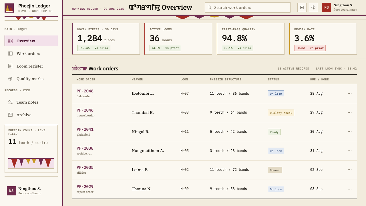
In web interfaces the style suits calm, spacious products such as editors, writing tools, portfolios, learning platforms and dashboards with a lot of white space. Run a persistent heavy edge down one side or along the header in the identity colour, and keep everything else light. On a pricing page, an odd number of plan cards, usually three, sits naturally with the odd-count logic, and the recommended plan can carry the heavy edge. Make sure the border is heavy enough to be read as a structural element, not as a hairline divider.
For editorial and marketing pages, the style gives long-form writing a strong but quiet identity. A wide cream measure, generous margins and one weighty plum band marking the opening of each article can carry a whole publication. Photography should be restrained and set against the plain field, with the border used as its single frame. Marketing copy benefits from the same economy: one statement, one band, plenty of room.
The most common mistake is to treat the teeth as a pattern fill and spread them everywhere: on buttons, cards, backgrounds and icons. The pattern then loses its meaning, which depends on being a single heavy border against a large plain field. The next mistake is a thin border, which loses the physical heaviness that defines the style. Finally, avoid using several border colours together or presenting the pattern as generic ethnic decoration. The patterns are held as clan property, and their colour is information.
Manipuri Phanek — FAQ
What is a phanek, and what is the pheejin?
A phanek is a wrapped sarong worn by Meitei women in Manipur. The Moirang Phee phanek is the variety this style draws on, and the pheejin is its patterned border: a single band of elongated triangular teeth stepping inward on odd counts. Nearly all of the garment is plain cloth, which is why the border carries so much meaning, and why the style is built around one heavy edge against a large calm field.
Why odd counts of teeth?
The source records the counts as three, five, nine and eleven, stepping inward toward the centre, and notes that the teeth are read locally as those of Pakhangba. For design purposes the odd numbers matter because they produce a centre and a symmetrical narrowing, so the eye reads direction and closure at once. Even counts cannot make that kind of centre, which is why the rhythm of the border depends on keeping the numbers odd.
Is this a pattern to repeat, or a proportion to follow?
Mostly a proportion. The pattern is a single band, not a fill, and the style depends on the relationship between a large plain field and one heavy border. If the teeth are repeated across a layout, the proportion is lost. The best use is to treat the teeth as the signature of the border and let the field around them do most of the work, remaining plain.
Can I use other colours for the border?
Yes, with discipline. In the source tradition the border colour identifies the house under the mayek naibi system, so colour is information, not decoration. In a product, pick one identity colour at a time for the border and keep the field cream and plain. Plum is the reference; a different hue works if it is deep, even and used as a single decision rather than as a palette.
Does the style work for dense interfaces?
It works best where there is room. The system relies on a large plain field, and a dense interface with many controls gives it little to work with. If you must use it in a dense product, keep the border as the persistent identity edge, make the content area as calm as possible and avoid adding extra colours or patterns. The lighter the surrounding interface, the stronger the single border reads.
Related design styles
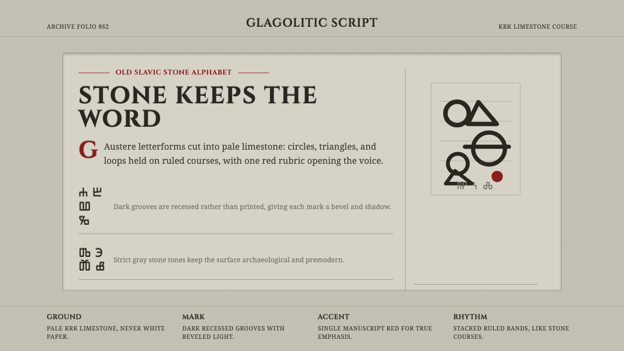 Glagolitic ScriptCarved faith in limestone. Cinzel capitals and red rubrics sit in shadowed gr…
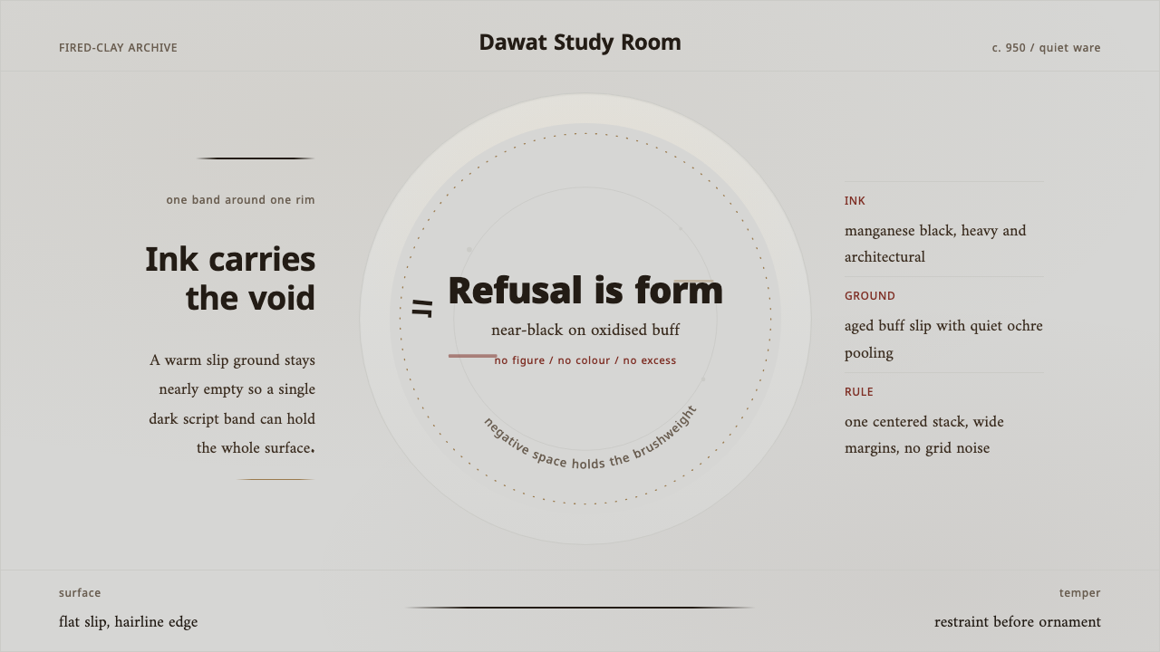 Nishapur Epigraphic WareRestraint carries the surface. Black Kufic arcs across warm buff clay and ope…
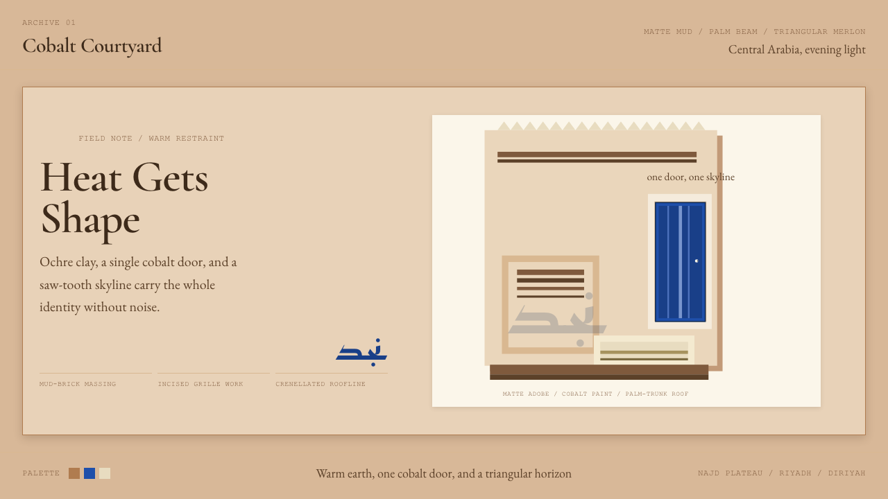 Saudi Najdi Vernacular ArchitectureHeat gets shape. Ochre clay, a single cobalt door, and a saw-tooth skyline.
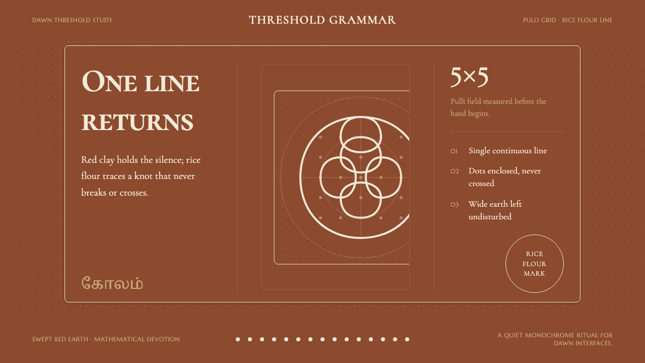 Tamil Kolam (Rice Flour Threshold)Mathematics becomes devotion. Rice-white knots breathe on red-clay negative s…
 Balinese Poleng ClothSacred duality holds. Black-white squares lock the field; one red tile charge…
 Danish Hedebo CutworkOrnament is cut, not applied. Bleached linen and bound shadow turn voids into…